It is obvious that photos are an integral part of our lives. Consequently, we can hardly imagine a website without pictures. Pictures attract the view of the visitors and help to organize the site’s content. Images make a page interesting, information-rich, and improve the user experience.
Oversized images have a negative effect on the performance of a website and images should be scaled according to the active theme. They are important elements on a website and they deserve to be shown in the best way possible. It is very important to serve scaled images on a WordPress site.
The sizes of scaled images adjust to the right size according to the ones defined in HTML and CSS. Yet, not many webmasters pay attention to this important design detail. Take the example of an image with 500 x 500 pixels for a 50 x 50 thumbnail. The web browser has to download the image and scale it down so it can be displayed to the visitor. Clearly, this is inefficient and will slow down the website.
The difference in resolution is not visible and hence the weight that large images bring with them is often unnoticed. Most people are not even aware that this resolution overkill is causing problems and the issue is left unfixed. They leave the problem for the browser to handle.
Table of Contents
Why Serve Scaled Images on a WordPress Site
The main reason for serving scaled images is that full high-quality scaled images slow down a website and increase loading times. A slow page leads to poor user experience and instead of staying and returning, they will leave and stay away. Kissmetrics statistics show that pages that take more than three seconds to load will have a higher bounce rate.
With the image sizes optimized on a website, loading times will be shorter. People are more likely to stay longer on the website and return later. This improves SEO and the website’s ranking will go up.
Large Images Cause Different Problems
- It increases stress on the browser performance. The browser will have to perform extra server requests. It cannot show the image fast but instead will take time and resources to resize the image. Websites with heavy images take longer to load.
- If large high-resolution images are displayed small on a website, they waste time and downloading data. This is the case, for example, when a selfie from a mobile phone is used unprocessed for a tiny Gravatar.
How to Scale Images on WordPress Websites
Manually
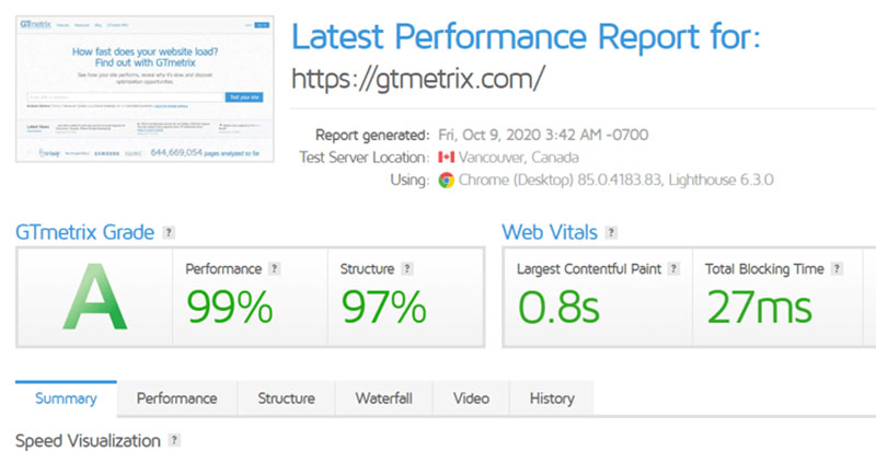
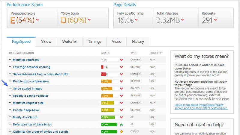
To start at the beginning, analyze the images on the website using a tool like GTMetrix. GTMetrix is a performance analysis tool, designed by GT.net. This company is famous for speed monitoring and optimization, and Pingdom. After GTMetrics analyzes the website, it generates a report. This shows what issues were found and what improvements it recommends.
When reviewing the report, pay special attention to the Structure Tab. In this tab, click on Properly Sized Images. It will show a list of images that are not correctly sized.
WordPress does not automatically shrink images when possible but adds them to the site without processing. To solve this problem there are two options.
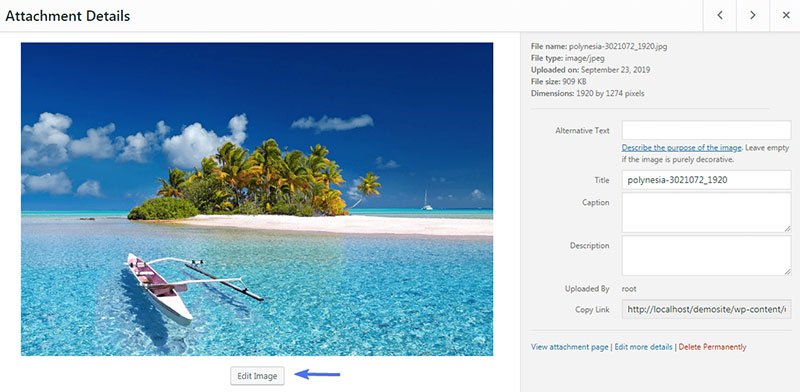
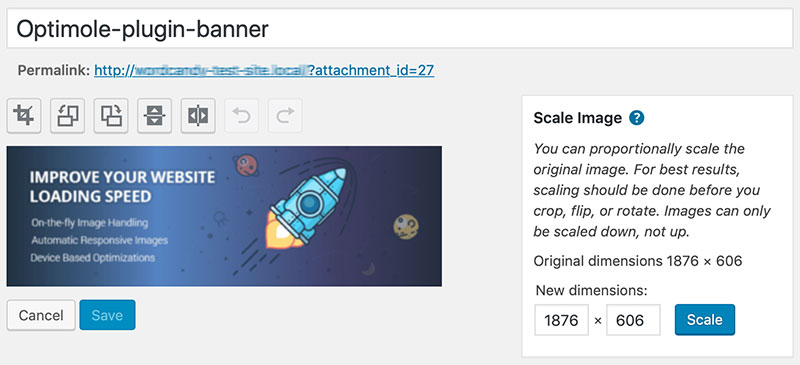
Even if the use of plugins is not the desired way, there are other options. The first way to scale images is to manually adjust the size of each by using a photo editor, like Photoshop. It may seem that this method is inefficient but in reality, it is not.
In Photoshop there are more options besides adjusting the height and width of the image. Another thing to check here is the resolution of the image. Most of the time, for web applications, 72 PPI is enough for a good viewing experience.
The second is to use a plugin to scale images. This option is easy and fast. WordPress has its own feature to do this, srcset. This tool can convert graphics, such as images, to responsive files. Responsive images are automatically adjusted to different devices and screen sizes. Below are some other plugins that do a great job at downscaling image sizes.
Optimole
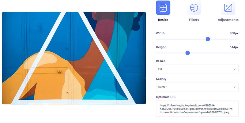
An excellent tool to serve scaled images is Optimole. It is a WordPress plugin that is able to resize images for different devices. It automatically resizes to the optimal size for an image, based on the different types of devices. The results are high-quality scaled images.
These are some of the features that make Optimole an interesting choice:
- The processed images are smaller but retain their quality.
- It is completely automated. It is only a matter of loading the images.
- Optimole supports all image formats.
- It supports different image types, including Retina and WebP
- It supports cloud image libraries.
- Optimole serves global CDN images free of charge.
- There is no need to guess or estimate the desired size. Optimole uses the visitor’s device specifications.
- There is full support for website builders, like Elementor.
The automated image processing feature is a great plus of this plugin option. There is no need to go through a long list of settings; Optimole does it all by itself.
Under Media > Optimole the plugin shows the status of the services, as well as the usage and the optimization achieved.
The Options section is located under the Settings Tab. Here, there are two features that deserve a special mention:
- Enable image replacement. Make sure that this option is enabled to enjoy the advanced image optimization functionality.
- Scale Images & Lazy Load. This is the option that allows the scaling of the images based on the visitor’s screen size. Lazy loading displays these images.
Smush Image Optimization
Smush Image Optimization, Compression, and Lazy Load is the full name on this list of plugins. When downsizing the images ensure that the quality of the image is preserved.
To use WP Smush it is necessary to install and activate it first. Then the Smush icon will appear in the WordPress dashboard. In the dashboard appear the statistics that Smush accumulates and the current status of the different features.
Next to the Total Savings Data, an icon will appear, reporting all images in the media library that require processing. If there are images that need processing, the easiest thing to do is go to the Bulk Smush module. This will downsize all images it flags.
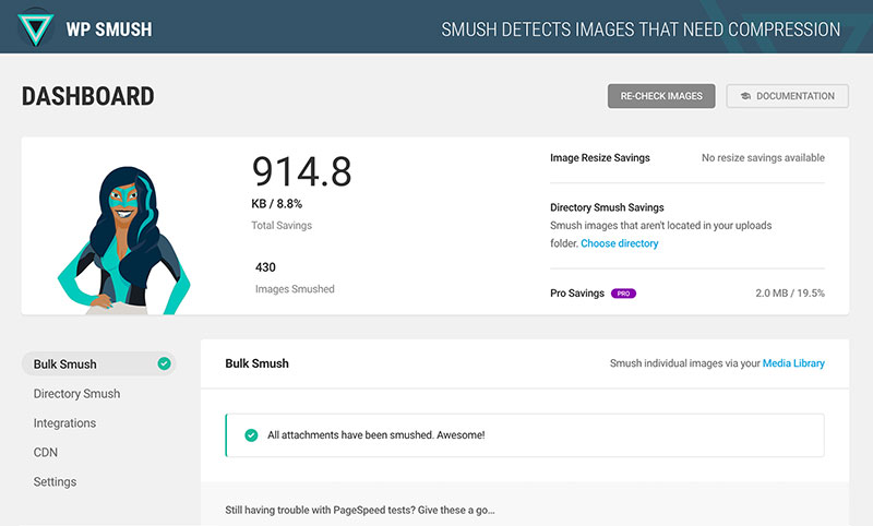
To individually process images, go to the Media Library and click Re-Check Images. This produces a real-time update of pictures that should be processed.
Smush has features that allow the filtering of images by Smush status, and selective scaling of images.
The Smush plugin does not process videos and GIF files. Image files that are left unscaled, indicate that Smush’s power is not used to the full.
EWWW Image Optimizer
The EWWW Image Optimizer is also a WordPress plugin that optimizes image sizes and formats. It works with new uploads and existing images. It features an option that scans all images on a website and optimizes them.
To start using it, download and install it and activate it from the admin area of the WordPress site. While in the Dashboard environment, click on Settings, and then EWWW Image Optimizer. Under Basic Settings, various options are located, like removing metadata from images. The optimization level for GIF, JPG, and PNG should be set to Pixel Perfect. Only the paid version allows the optimization of PDF files as well.
The Resize Tab contains a Resize Detection option. In Resize Images set the maximum permitted height and width of the images on the website. Also, turn on the Resize Other Images and Resize Existing Images options. Do not forget to save the changes.
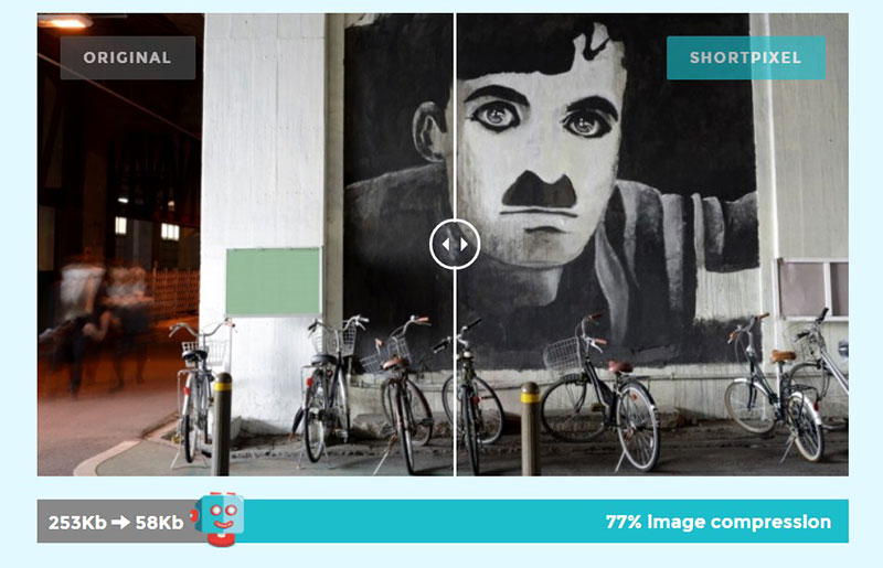
ShortPixel
The final recommendation for serving scaled images is the ShortPixel plugin. This is the right option for those that need to serve scaled images but are tight to a budget. The free version offers 100 image scalings per month.
ShortPixel is straightforward and easy to use. It automatically processes images to the dimensions that the user specifies while uploading to the website. Besides the automatic option, there is also an option to process images manually.
The plugin reduces image size either lossless or with loss of resolution. It is able to process GIF, JPEG, and PNG images and can even optimize PDF files.
FAQ on serving scaled images
Why Do I Need to Serve Scaled Images in WordPress?
So here’s the deal, when you’re running a WordPress site, the speed is a big deal, right? Scaled images, they’re like your best bud in this journey.
Think of it like this: you wouldn’t wear shoes that are three sizes too big, would ya? Same thing with images. Serve ’em at the right size, and boom, your website is running faster than a cheetah. Plus, it’s not just about speed; it’s also about making sure your site looks sharp on all devices. So yeah, scaled images, they’re the real MVP.
What Does It Mean to Serve Scaled Images?
Alright, so serving scaled images, it’s kinda like giving your website visitors the Goldilocks of images. Not too big, not too small, just right.
It means the images are the perfect size for the display they’re being viewed on. No more, no less. So if someone’s looking at your site on a smartphone, they’re not downloading a massive image fit for a cinema screen. It’s all about efficiency and speed, my friend.
How Do I Check if My Images are Scaled Properly?
Oh, this is a good one. So, you’ve got tools like GTmetrix and Google PageSpeed Insights. Run your site through these bad boys, and they’ll tell you straight up if your images are too big.
They’re like the honest friends we all need in life. They’ll give you the deets on what images need a trim and how much you should chop off. Just follow their lead, and you’ll be serving perfectly sized images in no time.
What WordPress Plugins Can Help Me Serve Scaled Images?
Plugins, my friend, are like the superheroes of WordPress. For image scaling, there’s a bunch you can try. Smush, ShortPixel, these guys are top-notch for compressing and resizing images.
They do the heavy lifting, so you don’t have to. Upload your image, and let them work their magic. Your images come out looking fab and fit just right on all devices.
How Does Serving Scaled Images Impact SEO?
Okay, so search engines, they love fast websites. And serving scaled images, that’s like putting your site on a diet. It’s lean, mean, and loads like a dream. Google sees this and thinks, “Hey, this site’s got its act together.” And bam, your SEO gets a boost. Plus, let’s not forget about image alt text. That’s like the secret sauce for SEO when it comes to images. Describe your images well, serve them scaled, and you’re golden.
What’s the Difference Between Image Compression and Serving Scaled Images?
So imagine this: image compression is like taking a puffy jacket and squeezing all the air out so it fits in your bag. It’s smaller, takes up less space, but it’s still the same jacket.
Serving scaled images, on the other hand, is like choosing the right size jacket from the get-go. Both make sure you’re not carrying extra weight, but in different ways. You need ’em both to make your website run like a champ.
Can Serving Scaled Images Improve Mobile Optimization?
Oh, absolutely! You know how everyone’s glued to their phones these days, right? Well, serving scaled images makes sure your website looks awesome and loads fast on those little screens.
It’s like tailoring a suit; it just fits better. Mobile optimization is key, and serving scaled images is a huge part of that. Your mobile visitors will thank you, trust me.
How Does Browser Caching Relate to Serving Scaled Images?
Alright, so browser caching is like your fridge. Stick something in there, and it’s ready for you next time, no waiting. Serve scaled images, combine it with browser caching, and you’ve got yourself a speedy website. The images load faster because they’re the right size and they’re stored right there in the user’s browser. It’s like meal prep for your website.
What Image File Formats Should I Use for Serving Scaled Images?
JPEGs, PNGs, WebP, oh my! Each format’s got its own superpower. JPEGs are like the workhorses, good for photographs and stuff with lots of colors.
PNGs, they’ve got your back when you need transparency. And WebP, that’s the new kid on the block, high-quality and small file size. Choose the right format for the job, serve them scaled, and your website will be flying.
How Do Retina Displays Affect Serving Scaled Images?
Retina displays, they’re like the Ferraris of screens. Everything looks sharper, but they need special attention. You gotta serve up images that are double the size so they look crisp.
But remember, bigger images can slow things down. So, it’s like a balancing act. Serve scaled images, but make sure they’re big enough for those Retina displays. It’s a bit of extra work, but man, it’s worth it. Your images will look stunning.
Ending thoughts on how to serve scaled images
Clearly, there are many ways to serve scaled images on a WordPress site, and doing it does not have to be difficult or expensive. The problem is when the website has been online for a long time and there are many images to process.
Scaling images is an important skill for anyone who builds or maintains a website. It helps to make slow websites faster and provides other performance benefits. The right image specification will improve the speed of any website.
If you enjoyed reading this article on how to serve scaled images in WordPress, you should check out this one about how to make a phone number clickable in WordPress.
We also wrote about a few related subjects like how to embed a Facebook video in WordPress, how to delete WordPress themes, how to scan the WordPress database for malware, how to upload an HTML file in WordPress, how to do a WordPress database cleanup, how to find and replace an URL in a WordPress database and how to hide the author in WordPress