Imagine transforming endless spreadsheets of HR data into vivid, interactive visuals that reveal insights at a glance. What is HR Data Visualization, you ask? It’s the artistry of converting raw data into compelling stories using charts, maps, and graphs.
In today’s data-driven world, understanding patterns in employee performance, recruitment data, and workforce planning isn’t a luxury, it’s a necessity.
With tools like wpDataTables, Tableau, and Power BI, HR professionals can reveal trends, outliers, and gaps that could be the key to unlocking higher productivity and engagement.
This article will guide you through the nuances of HR Data Visualization, emphasizing best practices and real-world applications that make complex data digestible for stakeholders.
Expect to dive into case studies on time-to-start analysis, visualize career paths, and gain actionable insights you can implement immediately.
By the end, you’ll grasp how to leverage HR data insights to build a transparent, data-empowered culture. Buckle up; it’s going to be a visually enriching journey.
Table of Contents
What is HR Data Visualization?
HR Data Visualization involves using graphical representations like charts and graphs to interpret and communicate human resources data, making it easier to identify trends, patterns, and insights for informed decision-making.
The Difference Between HR Data Visualizations and Infographics
Visuals rule the realm of HR analytics software like Keka, but it’s not all the same. Come closer; let’s untangle this.
Structured Narratives of Infographics
Now, infographics – they’re more like elegant storytellers. Picture slick visuals that guide you step-by-step through, say, the recruitment process or talent management.
They hold your hand, presenting facts with flair, charming both your right brain and left.
Data Exploration and Presentation of HR Data Visualizations
On the flip side, HR data visualizations are more like the playgrounds of insight. You dive deeper, exploring data layers upon layers. No structured narrative here.
These are dynamic, letting you slice and dice data to uncover those outliers and trends. Scatter plots, bar charts, human resources analytics – these tools represent a universe of data exploration to formulate data-driven HR strategies.
The Importance of HR Data Visualization
Enhancing Decision Making
Moving from Instinct to Data-Driven Decisions
Ever made decisions by going with your gut? It works… sometimes. But when it comes to managing people, a more reliable compass is forged from data.
HR Data Visualization transforms raw, hard-to-interpret numbers into clear, actionable insights. This allows leaders to step beyond intuition and into the realm of data-driven HR strategies.
Ever stared at a mountain of recruitment data and wondered what it all means? Visualizations like charts and graphs can tell you where to strike gold.
Understanding Patterns, Trends, and Outliers
Patterns aren’t just for wallpaper. Hidden within data sets are trends that can shift your HR approach.
For example, a heat map might reveal a surprising dip in employee engagement in a specific department.
Outliers like unexplained spikes in turnover become visible, demanding attention. It’s about seeing the forest and the trees, understanding both broad trends and the pesky anomalies.
Improving Communication
Simplifying Complex Information
You ever tried explaining a technical concept to someone and all you get back is that blank stare? It’s the same with endless rows of HR metrics.
Visual storytelling simplifies complex information. Picture a simple bar chart showing monthly overtime—suddenly, it’s not just numbers; it’s a narrative.
Increasing Transparency and Understanding
Clear visuals make a pathway for genuine transparency. They invite understanding, not just from the HR team but across the entire organization.
Communicating metrics like employee turnover or diversity metrics visualization in a straightforward way builds trust. It’s easier to digest a pie chart breaking down staff demographics than a 10-page report.
Engaging Stakeholders
Presenting Data to Non-Technical Audiences
Data should not be a foreign language. When you’re presenting recruitment data or workforce planning to stakeholders who aren’t data-savvy, HR data visualizations are your translator.
Spreadsheets might be their kryptonite, but throw that data into a colorful, interactive dashboard and watch them turn into superheroes.
Facilitating Discussions and Buy-In for Initiatives
Let’s face it: everyone loves a good visual. It’s not just about making the data pretty; it’s about fostering dialogue. Imagine presenting your idea for a new talent management initiative with a dynamic visualization.
It’s easier to get buy-in when stakeholders can visually grasp why it matters. As they see patterns and trends, discussions flow, decisions solidify, and initiatives gain momentum.
Types of HR Data Visualizations
Common Types and Their Uses
Charts (line, bar, pie, etc.)
When it comes to visuals, charts are the Swiss Army knives. Line charts trace performance over time. Watching employee retention rates? Spot trends instantly.
Bar charts—perfect for comparing different departments or job roles. Who’s outperforming whom? A quick glance and you know.
And those pie charts? Great for breaking down diversity metrics or budget allocations. Imagine slicing through complexities with a clean, simple graphic.
Scatter plots and heat maps
Scatter plots are like the constellations of your HR data universe. Each point tells a story. Are performance and tenure connected? Find out.
And let’s not forget heat maps—your go-to for visualizing density and intensity. Is turnover unusually high in one department?
When you see that intense red, you know where to dig deeper. Visuals like these turn raw numbers into an insightful journey.
Matrix diagrams and dynamic visualizations
Matrix diagrams bring structure to chaos. They’re ideal for mapping out skills and competencies across teams.
Who’s got what skills and where are the gaps? See it all in one elegant grid. For a dash of excitement, dive into dynamic visualizations.
Tools like Tableau or Power BI create interactive dashboards where data isn’t just shown, but explored. Turnover by year? Click and watch the story unfold.
Specific HR Applications
Recruiting and turnover analysis
Recruitment and retention—two sides of the HR coin. Recruiting data visualization can highlight bottlenecks in the hiring process.
Bar charts showing time-to-hire per position? Gold. And when it comes to turnover, scatter plots can expose hidden patterns. Is tech staff turnover higher than sales?
Visuals unearth the hidden narratives in your workforce.
Retention and productivity visualization
Digging into retention? Heat maps track employee satisfaction, revealing hotspots of disengagement.
Matrix diagrams can map productivity against working hours, showing who’s thriving and who’s merely surviving. With such visuals, predicting burnout isn’t a shot in the dark—it’s a calculated insight.
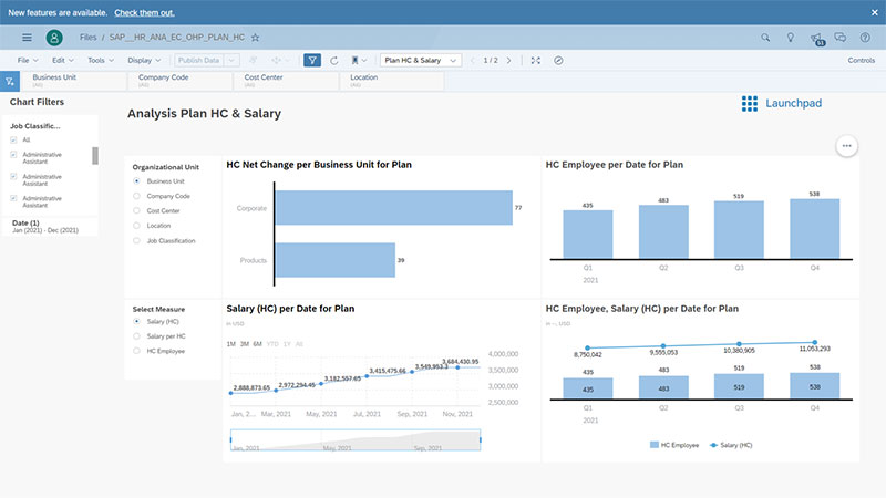
Workforce planning and future trends
Visualizing future trends isn’t sci-fi; it’s strategic HR. Workforce planning tools use dynamic dashboards to forecast headcount needs.
Imagine seeing a visual projection of your team’s growth and knowing precisely when an extra pair of hands becomes critical.
And with a bit of machine learning magic thrown into the mix? Planning for the future just got a whole lot visual and a whole lot smarter.
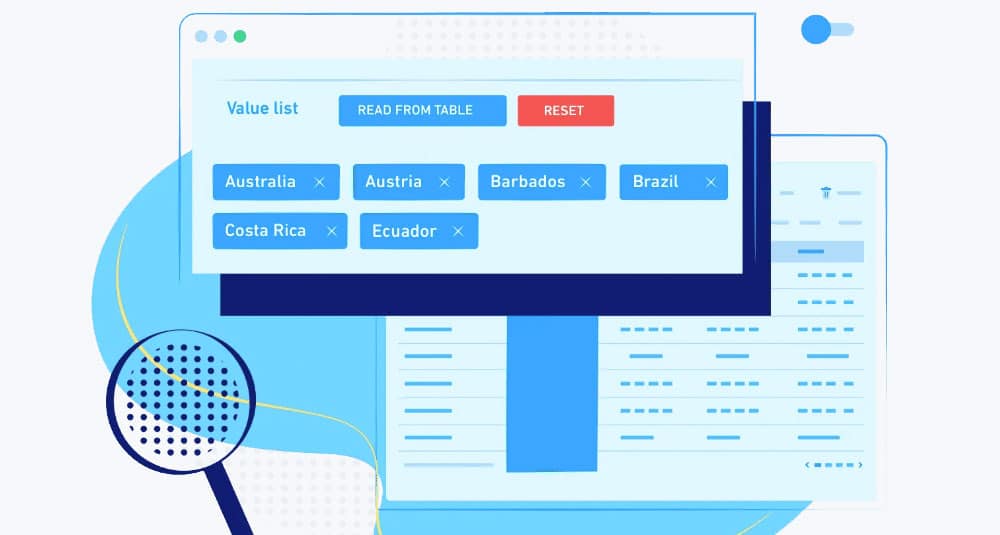
Your beautiful data deserves to be online
wpDataTables can make it that way. There’s a good reason why it’s the #1 WordPress plugin for creating responsive tables and charts.

And it’s really easy to do something like this:
- You provide the table data
- Configure and customize it
- Publish it in a post or page
And it’s not just pretty, but also practical. You can make large tables with up to millions of rows, or you can use advanced filters and search, or you can go wild and make it editable.
“Yeah, but I just like Excel too much and there’s nothing like that on websites”. Yeah, there is. You can use conditional formatting like in Excel or Google Sheets.
Did I tell you you can create charts too with your data? And that’s only a small part. There are lots of other features for you.
Best Practices for HR Data Visualization
Choosing the Right Visualization Type
Matching Visualization to Data Type and Audience
Ever been stuck looking at a sea of numbers and wondering, “How do I make sense of this?” Listen, not all data is created equal, and neither are the people you’re presenting it to. The type of visualization you choose hinges on two things: your data and your audience.
Bar charts are the solid, dependable types—perfect for comparing different categories like employee engagement across departments.
But when tracking performance over time, a line chart sings. Is your audience technical or more on the business side? A heat map can give execs a quick overview of performance hotspots without diving into technical jargon.
When talking about HR Data Visualization, it’s crucial to adapt your tools. Presentation for C-suite executives?
Keep it high-level, visually striking. So, using ChatGPT for presentations can help create compelling narratives and engaging visuals. For the data nerds? Bring out the scatter plots and matrix diagrams.
Examples of Appropriate Visualizations for Common HR Metrics
Alright, let’s talk specifics. Imagine you’re showing diversity metrics. Pie charts break down employee demographics easily, each slice telling a story.
For tracking time-to-hire metrics, a bar chart does wonders, each bar a poignant marker of efficiency—or lack thereof.
Consider employee turnover. Here, a scatter plot can reveal if turnover spikes align with specific events—maybe that company-wide re-org wasn’t so smooth.
Productive feedback loops shift gears from gut feelings to actionable insights when visuals align with metrics. That’s the magic.
Design Principles for Effective Visualization
Clarity and Simplicity in Design
Design is not about making things look pretty—it’s about making them clear. Imagine a dashboard cluttered with a dozen visual types.
Overwhelming, right? Simplicity wins. Aim for clear, direct representations. D3.js might offer fancy animations, but if it muddies the water, it’s a no-go.
Use of Color and Dynamics
Colors convey meaning. Red doesn’t just mean “stop” or “alert”; in a visualization, it can scream “high turnover here”. However, use colors wisely.
Too many, and you drown in a sea of confusion. When utilizing Tableau or Power BI, opt for contrasting colors that highlight what’s important.
Dynamics add flair but keep them minimal—think smooth transitions that guide the eyes, not distract.
Avoiding Clutter and Enhancing Readability
Clutter kills. Your goal? Enhance readability. Ever seen a dashboard that’s a visual assault? Data points should breathe, white space is your friend.
Use Looker Studio for clean, accessible dashboards.
HR metrics demand clarity—each chart, graph, or visualization should judiciously use space to convey its message. No extras. Nothing superfluous. Just pure, unadulterated insight.
Key Components of Good Data Visualizations
Data Accuracy and Quality
Ensuring Correct Data Sets
Ever tried building a house on quicksand? That’s what working with flawed data feels like.
It doesn’t matter how dazzling your HR analytics software is—if your data sets are incorrect, you’re just polishing a turd. Ensuring data accuracy is non-negotiable.
Handling Missing Values and Inconsistencies
The devil really is in the details. Missing values are like potholes in an otherwise smooth road. They can completely derail your insights.
Handling these inconsistencies isn’t glamorous, but it’s necessary—for every employee turnover stat, every workforce planning model—fill those gaps, smooth those wrinkles.
Focusing on the Main Question
Filtering to Focus on Relevant Data
You ever wade through a sea of irrelevant data? A nightmare, right?
Filtering is your lifeline. Strip away the noise. Focus on what’s crucial—HR metrics like employee performance dashboards or recruitment data visualization.
Clarity is everything.
Encoding Questions into Metrics and Visuals
Data on its own is just, well, data. Encode your essential questions into your metrics and visuals.
Want to know why diversity metrics are lagging? Encode that question into a heat map.
Visuals are the ultimate answers to your burning questions. You ask, the data answers. But only if you design it to.
Choosing the Right Visual Patterns
Bar Charts, Line Graphs, and More Complex Visuals
Different questions call for different visuals. Bar charts for comparing department performances.
Line graphs for observing trends over time—think retention and productivity visualization.
For the more curious minds, scatter plots and matrix diagrams reveal deeper insights, like hidden patterns in HR data trends.
Matching Visual Patterns to the Type of Data and Insights Needed
Don’t just throw visuals at data like darts at a board. Match visual patterns to the type of data you’re working with. Need to show relationship dynamics?
Scatter plots have your back. Want to highlight volatility? Line charts will draw that story. Ensure each visual adds value, otherwise, it’s just decoration.
Leveraging Advanced HR Data Visualization Tools
Tools and Technologies
Overview of Popular Tools (e.g., Tableau, Power BI)
Let’s talk tools. Picture a toolbox filled with Tableau and Power BI—these are your hammers and wrenches in the world of HR data.
Tableau, with its sleek dashboards, is like the Ferrari of data visualization; it turns raw workforce analytics into stunning insights. Power BI? It’s your Swiss Army knife—versatile, powerful, and seamlessly integrating into the Microsoft ecosystem.
Got a penchant for interactive HR metrics dashboards? Qlik Sense and Google Data Studio have got you covered.
Meanwhile, SAP SuccessFactors and Workday are bridging the gap between HRIS systems and eye-catching visuals.
Integration with HR Systems and Platforms
But what good is a flashy tool if it doesn’t talk to your HR systems? Picture this: Your HRIS and HR automation tools pump out gallons of data. But you need to filter that into a sleek, understandable dashboard. That’s where integration shines.
But you need to filter that into a sleek, understandable dashboard. That’s where integration shines. Power BI and Tableau weave into systems like an extension of your HR DNA. Workday, PeopleSoft—they feed directly into these tools, making data extraction a breeze.
When employee engagement metrics flow seamlessly into visual dashboards, it’s like flipping a switch—suddenly, your data is alive, interactive, and actionable.
Integration isn’t just about making life easier; it’s about making data work for you, turning recruitment data and employee turnover stats into visual gold.
Self-Service Analytics
Empowering End Users with Data Access
The future is here, and it’s called self-service analytics. Imagine employees, managers—actual end-users—navigating data without calling the IT guy for help.
Tools like IBM Cognos Analytics and R Programming empower users. They don’t just see data; they interact with it.
Got a question about diversity metrics or HR KPI visualization? A click, a swipe, and voila—answers at your fingertips.
Customizing Dashboards and Reports
Customization is king. Cookie-cutter templates? Let’s leave those in the past. In today’s world, dashboards and reports need to mold to your unique needs.
Want to track employee engagement today and retention tomorrow? Go for it.
Looker Studio lets you personalize every detail, while Power BI ensures you have the flexibility to craft reports that truly reflect your HR data insights.
Examples of Effective HR Data Visualizations
Case Studies and Real-World Applications
Time-to-Start Analysis
Ever gaze at a timeline and try to spot inefficiencies? Time-to-start analysis is where data visualization kicks in, scraping through heaps of recruitment metrics like a digital miner.
Picture a line graph tracing each candidate’s path from application to onboarding. Trend lines spike and dip, instantly revealing where the process stalls.
Integrate this with Tableau for real-time updates, and you’ve just turned data into an actionable roadmap.
Employee Turnover by Demographics
Now imagine walking into a meeting with a heat map of employee turnover. Different colors splayed across demographics—red zones signaling issues, green zones showing stability.
Qlik Sense excels here, crafting interactive visualizations that highlight turnover hotspots.
Scatter plots can add another layer, correlating turnover rates to specific demographic factors. Want to know if newer hires are more flight-prone than seasoned pros? It’s all there, in full color.
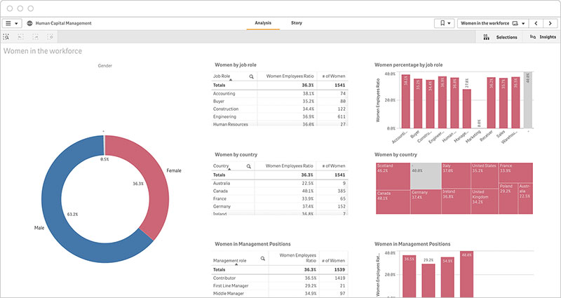
Diversity Metrics Visualization
Diversity isn’t just a buzzword; it’s a necessity. So how do you visualize it? Enter pie charts and bar graphs. Looker Studio provides a clean platform to showcase breakdowns of gender, ethnicity, and age.
Each slice of the pie, each bar, tells a story. Highlight gaps, celebrate diversity highs, create a culture that values transparency. This isn’t just about data—it’s about real people and their representation.
Visualizing Employee Career Paths
Career Development Opportunities
Career paths aren’t always linear, and that’s where the magic of career development visualization comes in.
A matrix diagram mapping skills and growth opportunities across the workforce can act like a treasure map, with potential career paths lighting up like gold trails.
Employees can see their progress, dream about futures. HR can spot talent gaps. It’s a win-win, all thanks to a visual framework.
Succession Planning and Talent Management
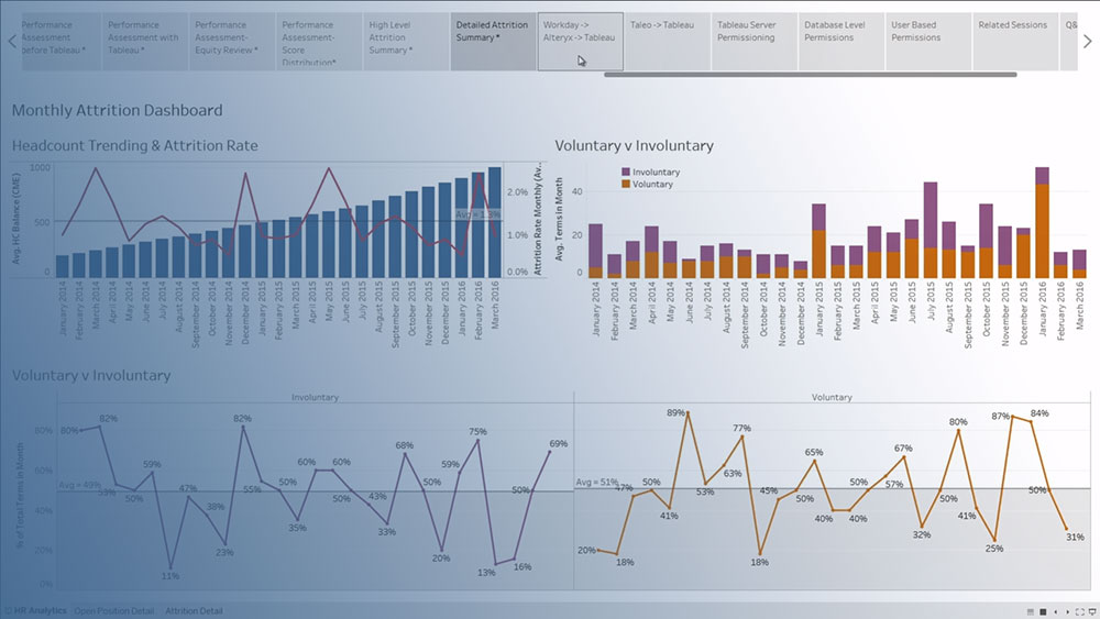
Succession planning could be a stiff, dull task—or it could be a dynamic dashboard in Power BI. Imagine a web of connections, highlighting potential leaders and successors.
Each box and arrow representing an employee’s path, current roles, and future potential. Imagine being able to zoom in and out, to toggle between departments, to see who’s ready to step up.
HR data metrics visualize this seamlessly, transforming plans into interactive blueprints of the future.
Storytelling with HR Data Visualizations
Importance of Narrative in Data Presentation
Engaging Stakeholders Through Storytelling
Imagine a boardroom. On one side, executives with dollars in their eyes. On the other, HR professionals with deep insights but struggling to communicate them.
Enter HR data visualizations. Instead of dry statistics, you get a visual story. Graphs and charts that show the journey, like a narrative unfolding in real-time.
Suddenly, those charts are more powerful than words. They grip the room.
Enhancing Memory Retention and Understanding
Think of your brain like a sponge—eager to absorb but quick to forget without context. Visual storytelling is your hydration. A scatter plot of employee performance?
That’s just dots until you tie a narrative about how performance has evolved over time. Retention data becomes sticky, memorable when it fits into a visual story arc.
Curves of a line graph not just showing but narrating peaks and valleys.
Building a Narrative with Data
Structuring Visuals to Tell a Coherent Story
Data in isolation is like a jigsaw puzzle with pieces strewn everywhere. Your job is to put those pieces together in a way that makes sense. Start with an anchor—perhaps employee engagement metrics for that year. Build around it.
Each bar chart, each heat map, dovetails into the next. It’s a visual tapestry where each section flows logically. Tableau and Power BI are your storyboarding tools.
Using Data to Support Strategic Messages
Numbers are neutral. It’s the narrative that gives them punch. Are you pushing for a new talent management initiative?
Create a dynamic visualization that uses recruitment data to highlight current bottlenecks.
Use employee turnover data to underscore the urgency. When graphs align with strategic goals, they’re not just pretty pictures—they’re your most persuasive arguments.
FAQ On HR Data Visualization
Why is HR Data Visualization important?
It’s the key to unveiling hidden trends, guiding data-driven decisions rather than gut instincts.
By visualizing HR data, organizations can efficiently analyze recruitment metrics, workforce trends, and even diversity metrics, shaping strategies that align with organizational goals.
Which tools are commonly used for HR Data Visualization?
Popular choices include Tableau, Power BI, Google Data Studio, and Qlik Sense. These tools integrate seamlessly with HRIS systems like Workday and PeopleSoft, turning raw data into interactive, visually engaging dashboards.
How does HR Data Visualization aid in decision-making?
By visualizing HR metrics, it allows leaders to quickly spot trends, patterns, and anomalies. For instance, a heat map might reveal high turnover in a department, prompting further investigation and targeted action to mitigate issues.
What types of HR data can be visualized?
Pretty much everything. From employee performance metrics and recruitment analytics to workforce demographics and productivity metrics.
Whether it’s a scatter plot showing gender diversity or a bar chart tracking retention rates, the possibilities are extensive.
What are the best practices for HR Data Visualization?
Start with accurate data. Choose the right type of visualization, like using bar charts for comparisons. Keep designs clean—clarity and simplicity are essential.
Use color wisely to highlight key points but avoid clutter. Tools like Tableau can help ensure effective visualization.
How can HR Data Visualization improve communication?
Simplifying complex data into visual formats like pie charts and line graphs makes it easier to convey insights to non-technical stakeholders.
Visuals increase transparency, making it straightforward to discuss metrics like employee productivity and HR KPIs during meetings.
What are some examples of effective HR Data Visualizations?
Time-to-start analysis, employee turnover by demographics, and diversity metrics visualization are prominent examples.
Tools like Google Data Studio can craft visuals that spotlight how recruitment timelines impact overall productivity or how turnover varies by demographic factors.
How can visualizing employee career paths benefit organizations?
Visualizing career development opportunities and succession planning helps in identifying potential leaders and growth areas.
Matrix diagrams can map out skills across teams, highlighting gaps and paths for progression, thus enabling better talent management.
What challenges might arise in HR Data Visualization?
Potential pitfalls include data inaccuracies and misinterpretation of visuals. Ensuring high-quality data and selecting the right type of visualization is crucial.
Inadequate integration with existing HR systems can also pose challenges, underscoring the need for seamless data flow.
Conclusion
Let’s draw this to a close. Understanding what is HR Data Visualization unveils the art of transforming complex HR metrics into insightful visuals. It’s more than just charts and graphs—it’s about turning data into stories that drive action.
Visual tools like Tableau and Power BI make it easy to interpret data on employee engagement, turnover rates, and workforce planning. These insights enhance decision-making, improve communication, and engage stakeholders.
- Clear insights from employee performance dashboards
- Effective recruitment data visualization
- Strategic workforce planning and future trends
By leveraging these tools, you’re not just presenting data—you’re crafting a narrative that inspires and guides business decisions. Visualizing data effectively means your HR metrics speak volumes, translating raw numbers into clear, actionable intelligence.
Seize the power of HR data visualization. Equip your team, tell your story, drive your strategy.