
Scatter charts are indispensable tools in data visualization and statistical analysis, offering a clear view of the relationship between variables.
Whether you’re analyzing data patterns, identifying outliers, or examining correlations, scatter charts provide a straightforward, visual representation that aids in understanding complex datasets. Data analysts and statisticians, alike, depend on these charts for making significant data-driven decisions.
In this article, you’ll learn how to create and interpret scatter charts effectively. By the end, you’ll understand how to plot data points, utilize X-axis and Y-axis labels, and incorporate trend lines to reveal data insights.
We’ll cover:
- The basics of scatter charts, including chart axes labels and plot markers.
- Tools and software for creating scatter charts, like Excel and Matplotlib.
- Advanced techniques for analyzing data trends and non-linear relationships.
Master these skills to enhance your data visualization and statistical analysis.
Table of Contents
- What Is A Scatter Chart?
- Scatter Chart Example
- When To Use A Scatter Chart
- How To Read A Scatter Chart
- Types Of Scatter Charts
- How To Make A Scatter Chart In WordPress
- How To Make A Scatter Chart In Excel
- How To Make A Scatter Chart In Google Sheets
Table of Contents
What Is A Scatter Chart?
A scatter chart is a type of data visualization that uses dots to represent the values of two different variables, allowing you to see patterns, relationships, or trends. Each dot corresponds to a single record, plotting one variable along the x-axis and another along the y-axis.
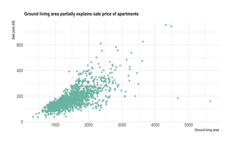
Scatter Chart Example
Chart created with wpDataTables
When To Use A Scatter Chart
Dive into a scatter chart whenever the moment’s ripe to dissect the dynamics between two numerical entities. Suppose we’re noodling over how sales figures cavort with marketing spend; that’s classic scatter chart territory.
They’re like detectives for the data-savvy mind, revealing whether variables tango tightly or if one’s stepping on the other’s toes without a rhyme or rhythm. Kick into gear a scatter chart if you’re hunting for correlations or plotting a course through a treacherous landscape of bi-variate analysis.
When the relationship beckons a detailed look—not just a fleeting glimpse—scatter charts are your go-to crew, illuminating the path, from data points to trend lines. They slice through the fog of numbers, guiding you to those aha! moments when clarity emerges, crisp and unclouded.
How To Read A Scatter Chart
Alright, check it—reading a scatter chart is like peeling back the layers of a story. Kick off by eyeballing the axes—these bad boys anchor your tale.
Now, those dots scattered across the grid? Each is a whisper of data, a breadcrumb of numerical info. See a cluster? You’ve got a potential storyline, a hint at a relationship.
If those dots ascend together, think of them as buddies, showing off a steady, positive correlation. Dissenting dots painting a downhill path? That’s the drama of a negative correlation.
But hey, if it’s just a splat of randomness, you’re staring at variables that don’t jive—they’re like strangers at a party.
Scoop up the insights, hunt for outliers, or let your eyes trace a trend line through the dot-scape. It’s all about piecing together the narrative behind the numbers.
Types Of Scatter Charts
Chart created with wpDataTables
The multitude of scatter charts come decked out with their tools and tales.
First up, the Basic Scatter Chart, the classic workhorse—two variables, a bunch of points, pure simplicity.
Then, there’s the Bubble Chart—it’s the basic one’s quirky cousin. It slaps on a third dimension: bubble size. Now you’re juggling three variables.
Feeling futuristic? The 3D Scatter Plot rockets you into another realm, plotting three numeric variables in space, not just on a flat canvas.
Can’t forget the Time Series Scatter Chart either. This one makes time a player, usually along the x-axis, letting history join the party.
For those who fancy precision, the Error Bars Scatter Plot tosses in vertical or horizontal error bars, adding a layer of uncertainty analysis to the mix.
And, for the matchmakers of the data world, the Scatter Plot Matrix—a grid of scatter plots comparing multiple variables, back-to-back, all at once. Each combo gets its moment to shine.
How To Make A Scatter Chart In WordPress
Creating a scatter chart in WordPress using the wpDataTables plugin involves a series of steps within the plugin’s Chart Creation Wizard:
- Open Chart Creation Wizard:
- Navigate to your WordPress admin panel, go to wpDataTables -> Create a Chart.
- Assign a name to your chart for easy identification later and select one of the available render engines (Google Charts, Highcharts, Chart.js, or ApexCharts).
- Define the Data Source:
- Choose the table that will serve as the data source for your new chart. This is typically done through a simple selection box within the wizard.
- Set the Data Range:
- Specify which parts of your data table you want to include in the chart. This involves selecting the columns (and possibly rows) that contain the data points you wish to plot on your scatter chart.
- Formatting and Preview:
- At this stage, you can customize the appearance and settings of your chart. While the specific options for scatter charts might vary by render engine, you generally have the ability to adjust aspects like chart and axis titles, data point colors, and sizes.
- Use the live preview feature to review the chart’s appearance. If it’s not exactly as you want, you can go back and adjust the settings as needed.
- Finalize and Insert the Chart:
- Once you’re satisfied with the chart, save your work. The plugin will generate a shortcode for your new scatter chart.
- Use this shortcode to insert the scatter chart into your WordPress posts or pages.
Remember, the wpDataTables plugin is designed to simplify the process of creating and managing tables and charts within WordPress, offering a user-friendly interface for a variety of chart types, including scatter charts.
How To Make A Scatter Chart In Excel
To create a scatter chart in Excel, follow these steps:
- Prepare Your Data:
- Start with a worksheet that contains your data arranged in columns. For a scatter chart, you typically need two columns of data: one for the x-values and one for the y-values.
- Select Your Data:
- Click and drag to select the data you want to include in your scatter chart.
- Insert Scatter Chart:
- Go to the
Inserttab on the ribbon. - Click on
Insert Scatter (X, Y) or Bubble Chart. - Choose
Scatter.
- Go to the
- Customize Your Chart:
- Click the chart area to display the
DesignandFormattabs. - Use the
Designtab to change the chart style or switch chart type. - Add chart elements like axis titles or data labels by clicking
Add Chart Elementon theDesigntab. - Customize the chart title by clicking on it and typing your desired text.
- Click the chart area to display the
- Adjust Axis Titles:
- On the
Designtab, clickAdd Chart Element>Axis Titles. - Select
Primary Horizontalfor the x-axis title andPrimary Verticalfor the y-axis title. - Click each title to type the text you want.
- On the
- Format the Chart:
- Click the plot area or any specific element you wish to customize.
- Use the
Formattab to apply different styles, effects, or to adjust the size and shape of chart elements.
- Apply Theme Colors (Optional):
- If you want to change the theme colors, go to the
Page Layouttab, clickThemes, and select the theme you want to use.
- If you want to change the theme colors, go to the
How To Make A Scatter Chart In Google Sheets
To make a scatter chart in Google Sheets, follow these steps:
- Select Your Data:
- Highlight the range of data you want to include in your scatter chart. This typically involves selecting two columns of data that you want to compare.
- Insert the Chart:
- Go to the
Inserttab in the menu. - Choose
Chartfrom the options.
- Go to the
- Choose Scatter Chart:
- Once the Chart Editor sidebar appears, navigate to the
Chart Typedropdown menu. - Select
Scatter Chartfrom the list of available chart types. You may also check theAggregatebox if you want to aggregate the data points.
- Once the Chart Editor sidebar appears, navigate to the
- Customize Your Scatter Chart:
- To further customize your scatter chart, click on the
Edit Chartoption in the chart’s menu. - In the
Customizetab of the Chart Editor sidebar, you can adjust various settings:- Series or Data Series: Here, you can add error bars, data labels, and a trendline.
- Horizontal and Vertical Axis: Customize the axis titles, label font size, format, and text color.
- Gridlines: Adjust the appearance of gridlines for both the vertical and horizontal axes.
- To further customize your scatter chart, click on the
- Customize Chart and Axis Titles:
- In the
Customizetab, go toChart & Axis Titles. Here, you can rename the chart title and change its format. - You can also customize the titles for the horizontal and vertical axes by following the same steps.
- In the
FAQ About Scatter Charts
How do you create a scatter chart?
Creating a scatter chart typically involves tools like Excel, Matplotlib, or R programming. Once your data set is ready, plot your independent variable on the X-axis and your dependent variable on the Y-axis. Customize plot markers and add a trend line if necessary to reveal data insights.
What are scatter charts used for?
Scatter charts are used for various purposes, including correlation analysis, identifying outliers, and observing data distributions. They are crucial in statistical analysis, helping to visualize the relationship between two variables, often revealing patterns hidden in complex data sets.
What is the difference between a scatter chart and a line chart?
A scatter chart displays individual data points, allowing an examination of each point’s specific value. In contrast, a line chart connects data points with lines. Scatter charts excel in correlation analysis and identifying data patterns, whereas line charts are best for tracking changes over time.
How do scatter charts display trends?
Scatter charts can display trends through the addition of a regression line or trend line. These lines represent the general direction of the data, making it easier to visualize relationships between variables. Software like Excel and Matplotlib can automatically generate these lines.
What do you mean by outliers in a scatter chart?
Outliers in a scatter chart are data points that deviate significantly from the overall pattern of the data. They can skew statistical analysis and lead to incorrect conclusions. Identifying and analyzing outliers is crucial for precise data visualization and understanding underlying data trends.
Can you use scatter charts for more than two variables?
Yes, scatter charts can represent more than two variables using additional visual elements. For example, bubble charts are a type of scatter chart that uses the size of the data points (bubbles) to represent a third variable, thus enhancing the data insights gained from the graph.
How to identify correlation in scatter charts?
To identify correlations in scatter charts, look at the overall direction of the data points. An upward trend indicates a positive correlation, while a downward trend signifies a negative correlation. Adding a regression line can make these trends more apparent and easier to understand.
Are scatter charts effective for large data sets?
Scatter charts can be effective for large data sets but may become cluttered, making data interpretation difficult. Using tools like interactive visualization platforms or filtering options can help manage large data sets, ensuring effective visualization. Advanced software can handle these complexities well.
What are the limitations of scatter charts?
Scatter charts have limitations, including difficulty in visualizing large data sets without clutter. They are not suitable for categorical data and can sometimes obscure patterns if outliers are present. Moreover, they require data analysis skills to interpret correlations and trends accurately.
Conclusion
Scatter charts are essential tools for data visualization and statistical analysis. They offer clear insights into data patterns, correlations, and outliers. Utilizing tools like Excel, Matplotlib, and R programming, you can effortlessly create and customize these charts, making your complex data more digestible.
Scatter charts help identify both linear and non-linear relationships, providing a visual representation that makes trends more apparent.
By using X-axis and Y-axis labels, chart legends, and trend lines, you enhance the data insights you can gather. For data analysts and statisticians, these charts are invaluable for making data-driven decisions.
In summary, you’ll find scatter charts indispensable in comprehending your data’s intricacies. With this knowledge, you’re equipped to leverage scatter charts for superior data analysis and visualization, ensuring your projects are backed by clear, actionable insights. Engage with your visualization software and statistical tools effectively to make the most of scatter charts.
If you liked this article about scatter charts, you should check out this article about line charts vs candlesticks.
There are also similar articles discussing box plots, scatter plots, funnel charts, and pie charts vs bar charts.
And let’s not forget about articles on pie charts vs donut charts, gauge charts, histograms, and how to choose the right chart for your data.


