Ever stared at a mesmerizing mosaic of data visualization tools and wondered which pattern tells the story best? Picture this: one charts straight to the point with clear-cut categories, while another thrums with the rhythm of intervals and frequencies.
That’s right, I’m talking about the clash of titans: bar chart vs histogram.
Data representation is no small feat. Here, you’ve got two heavyweights that excel beyond mere pretty faces; they’re the dual keys to unlocking a world of numbers. Your compass through this numerical jungle? This article.
By the final period, you’ll have a firm grip on when and why to use each chart, a clear understanding of graph types, and a bonus: the confidence to wield these statistical graphs like a pro.
From categorical data to quantitative mysteries, we’ll demystify these visual giants, ensuring your comparative analysis is not just good, but great.
Buckle up for an expedition through chart comparison—no compass required, just your keen mind and this trusty guide.
Table of Contents
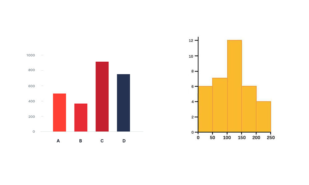
Understanding Bar Charts
Chart created with wpDataTables
Imagine you walk into a cafe and see a selection of different cakes on display. Each cake is unique—some are towering with layers, others are flat and wide.
A bar chart is somewhat like this array of cakes, where each type of cake represents a different category, and the height or length of the cake is the amount—the components of this data dessert.
Now, bar charts have a way of simplifying complexities. They break down into columns (or bars) representing different groups lined up along axes—it’s the canvas where our data story unfolds.
This canvas can extend upward with vertical bars, lifting the data towards the sky, or stretch across with horizontal bars, a horizon of information.
Use Cases
Picture this: You’re comparing the popularity of different smartphone brands. What’s the first thing you’d reach for?
A bar chart. You’d jot down each brand on the x-axis and align a bar to the number of sales on the y-axis. Voilà! A clear snapshot of the competition.
Now, let’s say you’ve got data that unravel over time—sales from January through December, for example. Line up those months and raise the bars to match the sales.
Your bar chart now tracks the ups and downs like a story, with each month a chapter.
And if your findings are all about opinions, feelings, or preferences, you’ve again got a friend in a bar chart. Collect responses, count them up, and those bars will stand tall to visualize what folks think or feel.
Advantages
Ever tried deciphering a crowded subway map? It’s a headache. But with bar charts, simplicity reigns supreme. Each bar stands apart, a silo of clarity.
There’s beauty in the simplicity, letting data breathe and speak for itself. You can tweak these guys, play with colors, stack them, or leave some space in between—it’s like accessorizing your data; the bar chart swings both casual and formal with ease.
Limitations
Now, nobody’s perfect, right? And that goes for our friend the bar chart too. Think about trying to stuff a month’s worth of clothes into a carry-on bag. It doesn’t work.
Bar charts struggle in the same way with bulky datasets. The bars can get squished together, and suddenly, it’s hard to tell them apart.
Precision can be another party pooper. Let’s be real: bar charts can rough around the edges. They may not always give you the nitty-gritty details of your data—not without some squinting and guessing, anyway.
Design Principles
Creating a bar chart can feel like being a fashion designer. It’s all about the fit. Too skinny, and the bars look cramped; too wide, and the data feels bloated. Finding that perfect bar width is like tailoring a suit—it’s gotta be just right.
And then there’s the matter of color. Choosing hues for bar charts?
It’s no less critical than picking out a tie. You use color to guide eyes, to differentiate, to highlight. It’s not just about looking pretty; it’s about making sense of the story those bars are dying to tell.
When you’re grappling with bar chart vs histogram, you’re tapping into technique as much as art. It’s the choice between clarity and chaos, between a solid handshake and a high five lost in mid-air.
With a little practice, you know exactly when to swing in with a bar chart, painting a picture of data that’s as insightful as it is accessible.
Understanding Histograms
Chart created with wpDataTables
A histogram is like a personal diary for numbers. Within its pages, you don’t just list down what happened; you tell the frequency of each event, packed into neat little bins.
These are not just any bins—they’re a kind of numerical storytelling. Numbers cluster together in these bins like friends around a campfire, each bin a different part of the story.
The key characteristics of a histogram have much to do with their purpose, to show how things are spread out, where they bunch up, what’s common, and what’s not.
They’re the silent whisperers of trends and outliers, revealing the frequency distribution of data with their well-placed peaks and valleys.
Use Cases

Now imagine you’re knee-deep in numbers, I mean, the kind of data that never seems to end. You need to see the shape of this data beast, how often numbers roll up, how they dance together. You are looking for the rhythm in this numeric noise. So, you grab a histogram.
Whether you’re spotting displaying frequency of occurrences, like how many times your favorite song popped up in a playlist, or analyzing distribution patterns, the histogram lays it down raw and real.
And about those outliers, the oddballs that don’t quite fit in? The histogram will point them out—they’re the spikes and dips in your number narrative.
Advantages
Histograms are the roadmaps of continuous data. With them, effective for continuous data, the valley and hills make sense.
They show you the landscape, where the data rises and falls, where it’s wild and where it calms down.
Your eyes glide over the bars, and patterns emerge as if by magic. Trends start popping up, like easy identification of patterns—simply, instinctively. It’s like watching birds migrate; you start noticing their pathways, the common stops, and the rare detours.
Limitations
But, and this is a big ‘but,’ histograms need a bit of a nudge to get going. You’ve got to roll up your sleeves and get down with the numbers—Requires manual calculation of statistical measures.
This isn’t plug and play; it’s roll up the rugs and deduce the numbers.
They’re also a choosy bunch. These graph types won’t let just any data stroll into their world. If it’s not quantifiable, measurable, and numerical, it’s not coming in.
They’re exclusive like that. Their restricted to quantitative data tag sometimes means parting ways with qualitative insights.
And so, when you’re standing at the crossroads, deciding between a bar chart vs histogram, remember this: it’s about choosing the right tool for the job, the one that tells your data’s story in full color and vivid detail, leaving no number behind.
Your beautiful data deserves to be online
wpDataTables can make it that way. There’s a good reason why it’s the #1 WordPress plugin for creating responsive tables and charts.

And it’s really easy to do something like this:
- You provide the table data
- Configure and customize it
- Publish it in a post or page
And it’s not just pretty, but also practical. You can make large tables with up to millions of rows, or you can use advanced filters and search, or you can go wild and make it editable.
“Yeah, but I just like Excel too much and there’s nothing like that on websites”. Yeah, there is. You can use conditional formatting like in Excel or Google Sheets.
Did I tell you you can create charts too with your data? And that’s only a small part. There are lots of other features for you.
Comparing Bar Charts and Histograms
Visual Distinctions
Peek into the world where colors dance on graphs, and the debate of bar chart vs histogram becomes a daily architecture of designs.
Here’s the scoop: when bars hug each other, tight and cozy with no space to breathe, that’s a histogram for you. But let those bars stand alone, strutting their stuff with some space, and you’ve landed in bar chart territory.
Now let these bars tell a tale. If they’re showing off categories, different flavors of ice cream or breeds of dogs, striding side by side but never touching, you bet it’s a bar chart painting the scene.
But, if it’s about the continuous flow of numbers, an endless stream of data points getting snug as a bug in a rug, then histograms are the name of the game.
Data Representation
When it comes to the showdown of bar chart vs histogram, it gets real. Those bar charts? They love a good list of names, places, things—categorical data’s their jam.
They’re all about comparing apples with oranges and Priuses with Teslas. But flip the coin, and those histograms are in it for the long haul, the journey of number after number. They take those numerical data, those unending digits, and wrap them up in intervals like a sushi roll.
And then we’ve got to look at the details—the devil’s in the details, right? Those bar charts plot discrete, separate pieces of data.
But when things blur together, when data is all about the continuous ebb and flow, histograms step up. They craft a story of the data undivided, a tale of things whole and uncut.
Application and Usage
Here’s the drill. When figuring out this whole bar chart vs histogram thing, think about what you’re trying to share with the world. If the goal is to showcase different groups of stuff, set it up with a bar chart. It’s the perfect backdrop for who-won-what, who-likes-which, and who-went-where.
But if it’s about taking the temperature of things, feeling out the vibe of your data, histograms got your back.
They thrive on showing the rhythm, the ups and downs, and twists of your numbers—capturing the pulse of continuous data.
Design and Customization
Let’s get artsy—and a bit crafty. Bar charts are like a wardrobe; mix and match to vibe with the crowd. You can stack ’em, layer ’em, or let them fly solo.
Color them bold for drama, soft for subtleties. It’s about what clicks with your peeps, what sings to your audience.
With histograms, though, you have to fit the suit to the wearer. Bin sizes can make or break your story. Go too wide, and nuances slip through; too tight, and the picture gets muddled.
It’s a careful balancing act, making sure each number finds its home without getting lost in the crowd.
It all boils down to knowing your audience, feeling out the context. When eyes meet your graph, will they spark with understanding or glaze in confusion?
The choice isn’t just science; it’s an art. Whether it’s a bar chart or a histogram stepping into the spotlight, make sure they tell the story as genuinely as it’s meant to be told, with every hue and tint of truth on display.
FAQ On Bar Chart Vs Histogram
What’s the difference between a bar chart and a histogram?
A bar chart displays categorical data with space between the bars, ideal for comparing distinct items. A histogram groups continuous data into bins, showing frequency distribution—think of it as capturing the rhythm of your data set, showing the ebb and flow of values.
When should I use a bar chart?
Use a bar chart when you have discrete categories you want to compare side-by-side. It’s like giving each category its moment in the spotlight to shine and reveal its story. The clarity of separation makes graph interpretation a breeze, showcasing data as discrete chunks of info.
Can a histogram handle non-numerical data?
No dice. A histogram handles quantitative data—numbers that flow and vary. It’s like it dances to the beat of numerical values alone, mapping out frequencies into intervals.
So, if you’re dealing with numbers, especially categories that naturally order themselves, a histogram is your go-to.
Why do histograms have no gaps between the bars?
Ah, the no-gaps rule of histograms speaks to the nature of the beast — continuous variables. Close-knit bars weave together the tale of data frequency, indicating the intervals are part of a whole.
It’s like watching data hold hands, showing a seamless progression of information.
How do I decide the number of bins for a histogram?
It’s an art, really. Too many bins, and you’ve got a fragmented story. Too few, and it’s overly simplified. Strike a balance. There’s no one-size-fits-all, but rules of thumb like Sturges’ formula can be a starting point. The key? Consider your data set’s size and variability.
What scale is best for a bar chart?
Lean towards the categorical scale for the x-axis, where the magic of data set comparison happens. Each bar represents a category, so keep these spaced and distinct. The y-axis? That’s for your quantitative values, like frequency or mean — the lead characters in your story.
How does a histogram help in statistical analysis?
Histograms illuminate underlying patterns in statistical distributions, highlighting where data clusters or gaps lurk.
It’s not just a snapshot; it’s a graphical representation that nudges you towards insights about the shape, spread, and center of statistical data — detective work for the numbers in your hands.
Can I compare two data sets using a bar chart?
Absolutely. By placing two distinct sets of bars side by side, you establish a visual dialogue. It’s like each set throws its data hat into the ring — for a comparison that’s almost conversational, inviting viewers to spot differences or similarities in a glance.
Are there any alternatives to histograms for displaying continuous data?
For a spin on tradition, consider a box plot or a density plot. While a histogram gives you the frequency distribution breakdown, these alternatives paint a picture of your data’s range, quartiles, and spread.
They may offer perspectives that histograms don’t, like outliers and skewness.
What is the importance of axis labels in a bar chart?
Axis labels are your guides — without them, you’re wandering in the wilderness of bars without names. They anchor your data, giving meaning to what’s measured and showing the relationship between graph types.
They’re essential in turning a random arrangement of bars into a story worth reading.
Conclusion
So, we’ve journeyed through the maze—dodged the data comparison pitfalls and scaled the walls of graph interpretation. Between the trusty bar chart and the stalwart histogram, it’s clear they’ve got their own tales to tell in the grand saga of data visualization.
Bar charts? They’re the chatty neighbors, doling out the scoops on each categorical data point, with a gossip-like gap between bars for the juicy bits.
Histograms, though, they march to the beat of a different drummer, clustering continuous data into a conga line of bins, hip-to-hip, no room for secrets.
Now armed with the savvy to choose the right chart for the job, it’s time to break out the tools—knit your frequency distributions, and tailor those visual tales. The graph types are your yarn; weave that statistical data into insights that stick.
And remember, whether it’s bars or bins, it’s all about giving those numbers a voice to sing their truth.


