Column charts are indispensable for turning complex datasets into clear, digestible visuals, transforming the way businesses analyze and present data. From Microsoft Excel to Tableau, column charts offer a straightforward method for depicting data trends, enabling quick comparisons and aiding in data visualization. As we delve into the anatomy of column charts, you’ll learn how to maximize their potential for your business intelligence needs.
Modern tools like Google Sheets and Power BI simplify the process, making chart creation accessible even for non-experts. This article will guide you through the essentials, from setting up your X-axis and Y-axis to customizing your chart with data labels and chart legends. By the end, you’ll be equipped to create compelling visual aids that enhance your data analysis and decision-making processes.
By the end, expect your data visualization toolkit to brim with savvy – because yes, interactive charts and charting tools will be at your fingertips.
We’ll dissect column charts, unveil nuances in chart design principles, and even tip-toe into advanced territory with visualization techniques.
Table of Contents
- What Is A Column Chart?
- Column Chart Example
- When To Use A Column Chart
- How To Read A Column Chart
- Types Of Column Charts
- How To Make A Column Chart In WordPress
- How To Make A Column Chart In Excel
- How To Make A Column Chart In Google Sheets
Table of Contents
What Is A Column Chart?
A column chart is a type of data visualization that represents data with vertical bars, where the height of each bar corresponds to the value it represents. It’s a go-to for comparing different categories or showing variations over time within a single category.
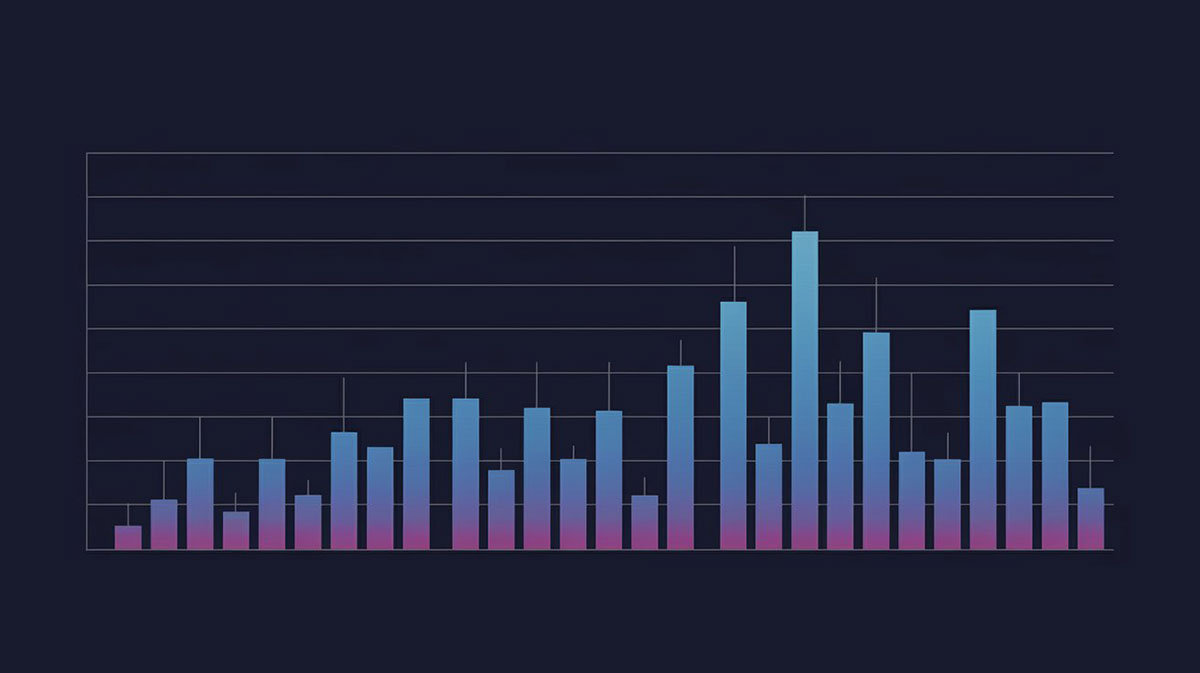
Column Chart Example
Chart created with wpDataTables
When To Use A Column Chart
Dive into the column chart when clarity calls. Category comparison? That’s the sweet spot. Think sales figures across regions or survey responses rate per item.
Time series analysis tapping on the shoulder? Chart it. Year over year, quarter by quarter; watch trends rise and fall in neat, tidy towers.
Beware the siren song of too much data, though. Crowded? Chaos. Keep it crisp, keep it clean, with just enough bars to whisper, not shout. When details abound, and you’ve got sub-categories cozying up, stacked columns or a clustered chart layout might just be your knight in shining armor.
Remember, the right chart at the right time can turn data visualization into pure storytelling.
How To Read A Column Chart
Chart created with wpDataTables
Reading a column chart? Piece of cake once you get the hang of it. Start with the X-axis—this is where your categories flex. Sales figures, survey answers, whatever you’ve got. Then, cast your eyes skyward to the towering bars—each a soldier standing for a value.
The Y-axis, that’s the next stop. It’s marked with numbers—a scale, a ruler measuring success, loss, or change. The heights of the bars, they don’t just reach for the stars; they’re telling you “this is how much” or “this many.”
And those colors, each one’s not just a pretty face. They’re a secret code. One hue per category? You got it.
Top off the chart with a title that packs a punch—one quick glance and your audience should grasp the story’s heart.
So, lock in on the axes, decode the heights and the hues, and let the data dance before your eyes. It’s storytelling with statistics and you’ve got a front-row seat.
Types Of Column Charts
The world of column charts? It’s a colorful one. Bursting at the seams with variety. First up, the classic: Single Column Chart. It’s the straightforward, no-frills go-to.
Next comes its more complex cousin, the Clustered Column Chart. Picture several single columns huddled by category side by side, playing out comparison stories like a pro.
Enter the Stacked Column Chart.
Chart created with wpDataTables
It piles different data sets on top of each other, snug within a single column’s embrace. Great for part-to-whole relationships.
And for those really into the details? The 100% Stacked Column Chart takes the stage. It gives you the lowdown on percentages, each stack proportioned to a whole, showing just how each piece fits into the bigger picture.
Let’s not forget the 3D Column Chart, strutting depth and perspective.
Chart created with wpDataTables
But beware, it’s a tricky one—it can obscure as much as it reveals, all style and swagger.
How To Make A Column Chart In WordPress
To create a column chart in WordPress using the wpDataTables plugin, follow these steps:
- Open Chart Creation Wizard:
- In your WordPress admin panel, navigate to wpDataTables -> Create a Chart.
- Name your chart for easy identification and select a rendering engine (Google Charts, Highcharts, Chart.js, or ApexCharts).
- Data Source Step:
- Choose the table that will serve as the data source for your chart using a simple select box.
- Data Range Step:
- Use the Column Range Picker to select the columns from your table that will be included in the chart. You can reorder these columns as needed.
- Select the rows for your chart using the Row Range Picker. You can choose all rows or specific ranges.
- Optionally, use the “Follow table filtering” checkbox to have the chart adapt to any filters applied to the table.
- Formatting and Preview:
- Adjust basic chart options such as chart width, height, responsive width, background color, border properties, etc.
- In the “Series” category, select the type of chart as “Basic column” (for Highcharts) or “Column” (for ApexCharts) to create a column chart.
- Customize the series options (label, color, type) and axes options (grid, labels, crosshair, direction).
- Set the main title options, tooltip settings, and legend properties.
- Configure exporting options to allow users to download the chart in various formats.
- Use the live preview on the right side of the screen to see the changes in real-time.
- Save and Use the Chart:
- Once satisfied with the chart, click “Save chart” to save it in the WordPress database.
- A shortcode will be generated, which you can copy and use to insert the chart into a WordPress post or page.
This process enables you to create a responsive and customizable column chart in WordPress, enhancing your website’s data visualization capabilities.
How To Make A Column Chart In Excel
To make a column chart in Excel, follow these steps:
- Prepare Your Data:
- Arrange your data with labels in the first column and values in the second column. This simple layout helps Excel interpret the data correctly.
- Create the Chart:
- Select the range of cells containing your data (for example, A2:B6).
- Go to the
Inserttab, clickInsert Column or Bar Chart, and chooseClustered Column. - Excel will create a basic column chart based on your data.
- Format the Chart:
- You can change the colors of the columns using the
Change Colorsbutton on the Design tab or by selecting the columns and using theShape FillandShape Outlinebuttons for more control. - Edit the chart title by clicking on it and typing your desired text.
- Adjust other elements like axes, gridlines, data series, and more through the Format tab.
- You can change the colors of the columns using the
- Customize Chart Elements:
- You can add or remove elements like gridlines and axes using the
Chart Elementsbutton. - To add data labels, choose
Data Labelsfrom the Chart Elements options and select a position likeOutside End.
- You can add or remove elements like gridlines and axes using the
- Create Charts with Multiple Data Series:
- For more complex data, select a range that includes multiple series (e.g., sales across different departments and store locations).
- Insert a clustered column chart as before, and Excel will create a chart with multiple series.
- Stacked Column Chart:
- To create a stacked column chart, use the same data range and select
Stacked Columnfrom theInsert Column or Bar Chartoptions. - This chart type is useful for comparing total values and understanding the contribution of each part to the whole.
- To create a stacked column chart, use the same data range and select
- 100% Stacked Column Chart:
- For comparing contributions more clearly, use the
100% Stacked Columnchart. This makes each column the same height, emphasizing the relative contributions of each part.
- For comparing contributions more clearly, use the
How To Make A Column Chart In Google Sheets
To make a column chart in Google Sheets, you can follow these steps:
- Select the Data Range:
- Open your Google Sheets spreadsheet and select the dataset you want to use for your column chart.
- Open the Chart Editor:
- Go to the “Insert” menu at the top of Google Sheets and click on “Chart.” This opens the Chart Editor in a sidebar on the right side of your spreadsheet.
- Create a Column Chart:
- In the Chart Editor, select “Column chart” from the list of options.
- Move the Column Chart to Its Own Sheet (Optional):
- For a clearer view and editing space, you can move the chart to a new sheet. Click on the three vertical dots at the top right corner of the chart and select “Move to own sheet.”
- Customize the Chart:
- Access the Chart Editor by clicking on “Edit chart” from the chart’s menu.
- Change the chart’s title, axis labels, and style in the “Chart & axis titles” section.
- Adjust the chart style, including background color and font, in the Chart Style section.
- Edit the series appearance in the Series section of the Customize tab.
- Share the Chart:
- Once you’re finished, you can share the chart with your team or specific people by clicking on the “Share” button. You also have the option to publish the chart or download it as an image.
FAQ About Column Charts
When Should I Use a Column Chart?
Use column charts when you need to show comparisons among discrete categories or changes over time. They’re ideal for data trends in monthly sales, survey results, or business intelligence reports. Their simplicity makes them useful in data presentation and reporting tools scenarios.
How Do I Create a Column Chart in Excel?
Creating a column chart in Microsoft Excel is straightforward. Select your data range, click on the ‘Insert’ tab, and choose the column chart icon. Customize with chart legends, data labels, and adjust the Y-axis for clarity. Tools like Tableau and Power BI offer even more customization.
What Are the Key Elements of a Column Chart?
Key elements include the X-axis (categories), Y-axis (values), data series (bars), and chart legends for identification. Additional features like gridlines and data labels can enhance readability. Proper customization ensures effective data visualization and better data interpretation.
How Can I Customize My Column Chart?
Customizing involves adjusting the chart title, axes, data markers, and colors. Software like Google Sheets and Power BI allow for extensive customization. You can format labels, add chart borders, and even integrate interactive charts to make your data more engaging.
What Are Common Problems with Column Charts?
Common issues include cluttered axes, misleading scales, and too many data series. These can confuse rather than clarify. Tools like SAS, Tableau, and D3.js offer solutions for cleaner chart formatting and better data presentation. Always review for accuracy and readability.
Can I Create 3D Column Charts?
Yes, many tools like Excel and Tableau support 3D column charts. However, 3D effects can sometimes obscure data. When using 3D, ensure the chart’s formatting highlights trends without distorting the information. Interactive charts may offer a better alternative for complex data sets.
How Do I Add Data Labels?
In Microsoft Excel, click on your chart, go to ‘Chart Elements,’ and check ‘Data Labels.’ You can customize the placement and style. Google Sheets and Power BI provide similar options. Data labels enhance your chart by showing exact values, aiding in data interpretation.
What Is the Difference Between Column and Bar Charts?
Column charts use vertical bars, while bar charts use horizontal bars. Both compare categories or values. Column charts are ideal for time series data on the X-axis. Software like Excel, Google Sheets, and Tableau supports both, each useful in different data visualization contexts.
Can I Use Column Charts for Statistical Data?
Absolutely, column charts are often used in statistics for showing frequency distributions, similar to histograms. They help in displaying data trends, grouping data points, and visualizing relationships. SAS and Power BI offer advanced features for creating accurate statistical column charts.
By addressing these common questions, you can better understand and effectively utilize column charts for enhanced data analysis and visualization techniques.
Conclusion
Column charts are indispensable tools for your data visualization needs, offering clear and concise graphical representations. Implementing them using platforms like Microsoft Excel, Tableau, or Google Sheets ensures straightforward data analysis. Utilize core elements like X-axis, Y-axis, and data labels to enhance clarity and readability.
These charts enable effective comparison across categories, aiding in business intelligence and enhancing your data presentation. Customize your chart legends, axes, and data markers to align with your specific requirements, ensuring a detailed and comprehensive visual aid.
Remember, clear and accurate representation of data trends and statistical graphs is crucial for insightful data interpretation. By integrating column charts effectively, you’ll elevate your ability to visualize complex datasets, making your analyses more accessible and actionable.
Your newfound understanding will empower you to leverage column charts for more impactful presentations and informed decisions. Continue refining your skills with these versatile tools to meet your varied data visualization needs.
If you liked this article about column charts, you should check out this article about bar charts.
There are also similar articles discussing pie charts, candlestick charts, line charts, and bubble charts.
And let’s not forget about articles on waterfall charts, stacked bar charts, area charts, and donut charts.


