Have you ever wondered how the world of data works? Think about it: every choice, every preference, and even your last online purchase is a piece of data. But not just any data – it’s categorical data.
In this article, we’re diving into the fascinating world of categorical data. Ever heard of nominal and ordinal data? Or scratched your head over frequency distributions in surveys?
We’ve got you covered. We’ll explore how this data powers everything from simple survey data analysis to complex statistical data analysis.
By the end, you’ll not only grasp what categorical data is but also see how it’s the backbone of fields like statistics and data science.
Think of this as your map through the jungle of data categorization, cross-tabulation, and even those intimidating Chi-square tests.
Table of Contents
- Types of Categorical Data
- Importance and Applications of Categorical Data
- Analyzing Categorical Data
- Visualizing Categorical Data
- Categorical Data Variables
- Discrete and Continuous Data
Table of Contents
Types of Categorical Data
Nominal Data
Let’s kick off with Nominal Data.
Picture this: you’re scrolling through your music playlist. You’ve got rock, jazz, pop… these are examples of nominal data. It’s like labeling things without any order or hierarchy.
Nominal data is all about names and labels. It’s the ‘what’ of data, not the ‘how much’ or ‘how many’.
Characteristics of Nominal Data:
- No Order: The categories have no specific order. Like different car brands, each stands alone.
- Distinct: Each category is unique. Think hair colors – black, blonde, red, each is a world of its own.
Examples of Nominal Data:
- Car Brands: Just like choosing between a sedan or a hatchback.
- Hair Color: The rainbow of choices at a hair salon.
Ordinal Data
Next up is Ordinal Data. This one’s a bit different. It’s still about categories, but now there’s a sense of order. Think about when you rate a restaurant. Is it 5-star or just average? That’s ordinal data – it ranks things.
Characteristics of Ordinal Data:
- Ranked: There’s a hierarchy or order to the categories.
- Relative: It tells us more about relationships than absolute values.
Examples of Ordinal Data:
- Likert Scale: Those survey questions asking if you strongly agree, agree, are neutral, disagree, or strongly disagree.
- Customer Satisfaction Levels: Are your customers delighted, satisfied, or frustrated?
In the realm of categorical data, these two types – nominal and ordinal – play a huge role. Whether it’s about sorting things without a pecking order (like in different types of data) or ranking them (like understanding customer satisfaction levels), knowing these categories helps in making sense of the world around us. It’s like putting a puzzle together; each piece is unique, but they all fit into a bigger picture.
Importance and Applications of Categorical Data
Role in Statistical Analysis
Ever wonder how decisions are made in big companies or governments? It’s not just guesswork; it’s all about understanding categorical data.
This data is like the secret sauce in statistical analysis. It tells stories in a way numbers alone can’t.
Significance in Various Fields:
- Social Sciences: Imagine understanding societal trends. Categorical data helps in identifying patterns in human behavior, preferences, and beliefs.
- Marketing: Marketers love this stuff. It helps them segment customers, understand preferences, and tailor campaigns. It’s like having a roadmap to what people want and how they behave.
Real-World Applications
Categorical data isn’t just for number crunchers in stuffy offices. It’s part of our everyday life, influencing decisions and shaping the world around us.
Case Studies and Industry Examples:
- Healthcare: Doctors and researchers use categorical data to categorize diseases, patient outcomes, and treatment efficacy. It’s crucial in making informed healthcare decisions.
- Finance: Banks and financial institutions use it for risk assessment and customer segmentation. It’s like having a crystal ball showing who’s likely to repay a loan and who’s not.
- Retail: Ever got a personalized offer from a store? That’s categorical data at play, sorting customers based on buying habits and preferences.
Analyzing Categorical Data
Methods and Techniques
Frequency Distribution: This is all about counting how often each category occurs. It’s like taking a headcount at a party to see how many people prefer chocolate cake over vanilla.
Cross-Tabulation: Think of this as a super useful table that compares two or more categories. It’s like setting up a chessboard to see the relationship between different pieces.
Chi-Square Tests: It helps to figure out if there’s a significant relationship between two categorical variables. Like figuring out if the type of music you like is related to your favorite food.
Challenges in Analysis
Let’s be real: analyzing categorical data isn’t always a walk in the park. There are some bumps along the way, but hey, what’s a challenge if not an opportunity to learn?
Common Limitations:
- Sometimes, this data can be too broad or vague. It’s like trying to paint a detailed picture with only a few colors.
Strategies to Overcome Challenges:
- One key strategy is to combine this data with other types, like numerical data. It’s like mixing different flavors to make a new dish.
For anyone looking to dive deeper into these methods, exploring resources like how to present data visually can offer some creative insights. And for those facing the common challenges in data analysis, learning about real-time data visualization might just be the trick to get a clearer picture of what your data is saying.
Visualizing Categorical Data
Visualization Techniques
So, you’ve got all this categorical data – now what? It’s showtime! Visualization is like turning data into a visual story, making it easier to understand and way more fun to look at.
Bar Charts:
- These are like the classic rock of data visualization. Each bar represents a category, and its height shows how common that category is. It’s straightforward and gets the message across, no frills attached.
Pie Charts:
- Think of pie charts as the dessert of data visuals. They show how a whole is divided into different categories, with each slice of the pie representing a piece of the categorical data pie. Yummy and informative!
Importance of Visualization
Now, why bother with all these charts and graphs? Because they make categorical data come alive!
Role in Data Interpretation and Presentation:
- Visualization turns complex data into something anyone can understand at a glance. It’s like translating a foreign language into your native tongue.
- It also makes presenting data way more engaging. Imagine sitting through a presentation with just numbers and text – snooze fest, right? Add some colorful charts, and suddenly, everyone’s paying attention.
Your beautiful data deserves to be online
wpDataTables can make it that way. There’s a good reason why it’s the #1 WordPress plugin for creating responsive tables and charts.
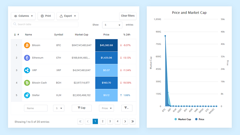
And it’s really easy to do something like this:
- You provide the table data
- Configure and customize it
- Publish it in a post or page
And it’s not just pretty, but also practical. You can make large tables with up to millions of rows, or you can use advanced filters and search, or you can go wild and make it editable.
“Yeah, but I just like Excel too much and there’s nothing like that on websites”. Yeah, there is. You can use conditional formatting like in Excel or Google Sheets.
Did I tell you you can create charts too with your data? And that’s only a small part. There are lots of other features for you.
Categorical Data Variables
Understanding Variables
Alright, let’s talk about categorical data variables. These are the characters in the story of data analysis, each playing a unique role.
Nominal and Ordinal Variables:
- Nominal Variables: These are like the basic labels with no specific order. Imagine a playlist sorted by genre – rock, jazz, pop – that’s nominal.
- Ordinal Variables: These have a bit of order or ranking to them. Think of movie ratings from one to five stars. They tell you not just what, but also how much or how little.
Tests for Different Categories
Now, how do we make sure our data is telling us the right story? By testing it!
McNemar Test: This is a special test used for nominal variables. It’s like checking if changing one variable (like a brand of coffee) affects another (like customer satisfaction).
Wilcoxon Signed-Rank Test: Used for ordinal data, this test compares two related samples. It’s like testing if people’s coffee preferences change before and after trying a new brand.
Discrete and Continuous Data
Distinction Between Discrete and Continuous Data
Discrete Data: This is all about specifics. It’s countable stuff, like the number of songs on your playlist or the number of coffee cups on your desk. Discrete data is like the steps on a staircase – each one is separate and distinct.
Continuous Data: Now, think of continuous data like a smooth ramp. It’s all about measurements and can take any value within a range. Imagine measuring your coffee’s temperature – it can be any number within a certain range, not just whole numbers.
Examples of Discrete and Continuous Data
Let’s put this into context with some real-world examples.
Examples of Discrete Data:
- Number of Children: Like counting the number of kids playing in a park.
- SAT Scores: Those scores are set numbers, not something in between.
Examples of Continuous Data:
- Weight: It can vary and doesn’t have to be a round number.
- Height: Like measuring how tall someone is, down to the very last millimeter.
FAQ on Categorical Data
What Is Categorical Data?
Categorical data is like putting names to faces. It groups information into categories, making it easier to understand and analyze. Think of it as labeling things – like different genres in a music store or types of cuisine in a food app.
How Is Categorical Data Used in Statistics?
In statistics, categorical data is the go-to for understanding groups and patterns. It’s used to classify information, which is super helpful in surveys or when studying trends. It’s like sorting your laundry – keeping the lights and darks separate makes things clearer and easier to manage.
What Are the Main Types of Categorical Data?
There are two main stars here: nominal and ordinal. Nominal data is all about labels without order, like different brands. Ordinal data adds a layer of order, like rating movies from one to five stars. It’s not just what the categories are, but also their relationship to each other.
Can Categorical Data Be Quantified?
Yes, but in its own way. It’s about counting frequencies or using percentages. Like in a survey, you might count how many people prefer tea over coffee. It’s not about measuring, it’s about categorizing and then counting within those categories.
Why Is Categorical Data Important in Research?
In research, categorical data is crucial for making sense of qualitative aspects. It helps in understanding preferences, behaviors, and patterns. It’s like having a map in a city – it guides you through the landscape of your research, showing where things are grouped and how they relate.
How Do You Visualize Categorical Data?
Visualizing categorical data is all about clarity. Bar charts and pie charts are popular choices. They turn categories into visual stories, making it easier to see patterns and relationships. It’s like turning a complex recipe into a simple, engaging cooking video.
What Are Common Challenges in Analyzing Categorical Data?
The challenges? Sometimes it’s too broad or vague. Also, finding relationships between categories can be tricky. It’s like solving a puzzle without a picture guide – you know the pieces fit, but it takes skill and patience to see the whole picture.
How Is Categorical Data Different From Numerical Data?
Categorical data is about grouping and labeling, like sorting books by genre. Numerical data deals with numbers and quantities, like counting the books in each genre. It’s the difference between asking “What type?” and “How many?”.
What Statistical Tests Are Used for Categorical Data?
Chi-square tests are popular for checking relationships between categories. Then there’s the McNemar test for paired nominal data. It’s like using different tools for different jobs – each test has its own purpose and fits certain situations better than others.
How Can Categorical Data Be Misinterpreted?
Misinterpretation often happens when the context is ignored or categories are too broad. It’s like taking a quote out of a book and trying to understand the whole story from that one line. Context and detail matter to get the true picture.
Conclusion
Wrapping up, categorical data isn’t just a bunch of labels and categories. It’s like the secret language of the world’s data, telling stories hidden in plain sight. From understanding consumer behavior in marketing to decoding complex social patterns in research, it’s everywhere.
Let’s not forget, this data isn’t just dry stats. It’s the colors we paint our world’s canvas with, turning raw numbers into vivid insights. Whether it’s through bar charts or pie charts, it brings data to life, making it relatable and understandable.
If you liked this article about categorical data examples, you should check out this article about nominal vs ordinal data.
There are also similar articles discussing discrete vs continuous data examples, descriptive statistics, different types of data, and how to present data visually.
And let’s not forget about articles on real-time data visualization, primary data vs secondary data, advantages of secondary data, and data visualization principles.
