
Imagine unearthing hidden stories in a sea of numbers. Welcome to the world of data storytelling, where raw data transforms into compelling narratives. Here, we don’t just crunch numbers; we bring them to life. This is where statistics meet stories, graphs meet guidance, and figures find their voice.
In this journey, you’ll discover how to weave facts and figures into engaging stories. You’re not just looking at data; you’re seeing the unseen, hearing the untold. It’s not about complex jargon; it’s about clear, captivating communication.
We’ll navigate through the essentials of narrative data analysis and data-driven storytelling. From understanding data visualization techniques to mastering the art of information narrative, each step is a stride towards making sense of the senseless.
By the end, you’ll not just read data; you’ll narrate it. Whether you’re a seasoned analyst or a curious newbie, you’ll learn to transform data insights communication into an art form. Ready to turn numbers into narratives?
Table of Contents
- The Components of Data Storytelling
- The Power of Narrative in Data
- Crafting a Compelling Data Story
- Data Stories vs. Data Visualizations
- The Benefits of Data Storytelling
- Practical Tips for Data Storytelling
Table of Contents
The Components of Data Storytelling
The Triad of Data Storytelling
Data: The foundation of the story
Data, oh, it’s the bedrock of data storytelling. It’s not just numbers and stats. It’s the raw material that holds the secrets, the stories waiting to be told.
You start with data, but it’s how you use it that counts. You’re like a chef – the data is your ingredients, and you’re about to cook up something amazing.
Narrative: Crafting the storyline
Now comes the narrative – the heart of data storytelling. It’s like taking your audience on a journey.
You’re the guide, leading them through the data with a story that resonates. It’s all about connecting the dots, making it relatable. Think of it as narrative data analysis.
Visualizations: Enhancing understanding through visuals
Visuals? They’re your secret weapon. This is where data visualization techniques come into play. Ever seen a graph and gone “aha!”? That’s what good visuals do.
They make complex data digestible, engaging. It’s not just about making it look pretty; it’s about making it meaningful. Here’s a cool resource about how to present data visually.
The Role of Context and Analysis
Integrating qualitative and contextual analysis
Context is king in data storytelling. It’s the background, the setting where your data lives. You need to dive deep, understand the “why” behind the “what.”
This isn’t just number crunching; it’s exploring, interpreting, getting the full picture.
The importance of domain expertise
And, of course, you need to know your stuff. Domain expertise isn’t just fancy talk; it’s essential.
It’s about knowing the field you’re working in, inside out. It’s this expertise that lets you see the stories the data is trying to tell. If you’re curious about different types of data, check this out – different types of data.
The Power of Narrative in Data
Psychological Impact of Storytelling
How stories engage the human brain
So, let’s talk about how our brains light up with stories. You know how you can lose track of time reading a good book or binge-watching a series? That’s the magic of storytelling.
When it comes to data storytelling, it’s the same deal. Data on its own can be like, “Okay, cool.” But wrap it in a story? Suddenly, it’s “Wow, tell me more!” It’s all about tapping into emotions, making those numbers stick in the mind.
The role of emotion and logic in data narratives
And it’s not just about pulling heartstrings. Data storytelling marries emotion with logic. You’ve got these solid facts and figures (hello, logic), and then you infuse them with emotion.
It’s like creating a super blend that makes people sit up and listen. Your audience is more likely to remember the data if it’s part of a story that made them feel something. Check out these impressive data storytelling examples to see what I mean.
Simplifying Complex Insights
Making data accessible to non-experts
Ever tried explaining something technical to a friend and got that glazed-over look? That’s the challenge with data.
But in data storytelling, you’re breaking it down, making it easy. It’s about taking those complex insights and turning them into bite-sized, relatable pieces.
Like, “Hey, here’s this complex data, but let me tell you a story that makes it super clear.”
The art of translating data into compelling stories
And here’s where the art comes in. It’s about finding the narrative in the numbers.
You’re not just throwing data at your audience; you’re guiding them through it with a story. Think of yourself as a translator.
You’re taking the language of data and translating it into a story that anyone can understand. Want to dive deeper into this art? Here’s a good read on visualizing large data sets.
Your beautiful data deserves to be online
wpDataTables can make it that way. There’s a good reason why it’s the #1 WordPress plugin for creating responsive tables and charts.

And it’s really easy to do something like this:
- You provide the table data
- Configure and customize it
- Publish it in a post or page
And it’s not just pretty, but also practical. You can make large tables with up to millions of rows, or you can use advanced filters and search, or you can go wild and make it editable.
“Yeah, but I just like Excel too much and there’s nothing like that on websites”. Yeah, there is. You can use conditional formatting like in Excel or Google Sheets.
Did I tell you you can create charts too with your data? And that’s only a small part. There are lots of other features for you.
Crafting a Compelling Data Story
Key Elements of a Data Narrative
Characters, setting, conflict, and resolution
Crafting a data story? It’s like writing a mini-movie script. First, who’s the star? Your data. Where’s the drama happening? That’s your setting. The conflict? It’s the problem your data is solving.
And the grand finale? Your resolution, where your data saves the day. It’s all about giving life to numbers, making them the heroes of your tale.
Using real-world examples to illustrate these elements
Now, real-world examples are like your secret sauce here. They make your data storytelling relatable. It’s like saying, “Hey, this isn’t just theory; it’s happening, and here’s the proof.”
It’s showing, not just telling. And that’s what sticks with people. Real stories, real impact. Dive into some data journalism examples to get the gist.
Structuring the Data Story
Introduction, rising action, climax, and conclusion
Every great story has a structure, right? Same goes for data storytelling. Start with your intro – set the scene.
Then, build it up – that’s your rising action. Get to the peak – your climax, where the data really shines. And wrap it up with a conclusion that leaves your audience thinking. It’s like taking them on a rollercoaster ride, but with data.
Ensuring clarity and coherence in the narrative
Clarity and coherence are your best friends in data storytelling. It’s not about fancy words; it’s about making it crystal clear.
You want your audience to follow along easily, nodding their heads, not scratching them. Keep it coherent, keep it compelling. Need some inspiration? Check out these data visualization principles for clear storytelling.
Data Stories vs. Data Visualizations
Understanding the Difference
The role of data visualizations in storytelling
So, think of data storytelling as a movie, and data visualizations? They’re like the special effects. These visuals are super crucial; they grab attention, make things clearer.
But, they’re just one part of the whole show. Data storytelling is the full package – it’s the plot, the characters, the drama, all brought to life by these visuals.
It’s like the visuals set the stage, and the story brings it to life.
How data stories go beyond mere visualizations
Now, here’s the cool part. Data storytelling goes beyond just showing pretty charts and graphs.
It’s about weaving these visuals into a narrative. You’re not just seeing a graph; you’re getting the story behind it.
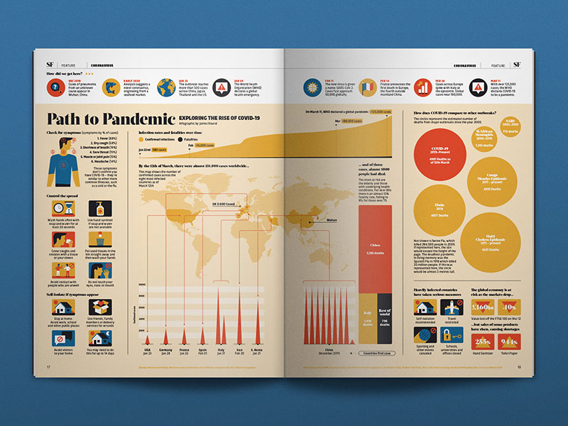
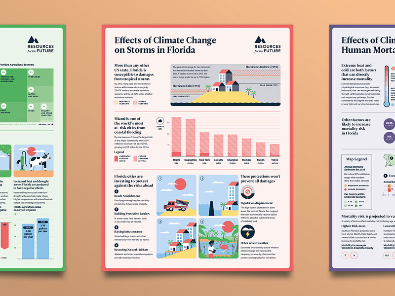
Want to see some visuals in action? Check out these infographics and data visualization.
Effective Use of Visuals
Choosing the right types of visualizations
Choosing the right visual representation types in data storytelling? It’s like picking the right outfit for an occasion. You gotta match the visual to the story you’re telling.
Is it a bar graph moment, or more of a pie chart situation? It’s all about using the right tool for the job. And remember, simplicity often wins. You want your audience to ‘get it’ at first glance.
Enhancing narrative with visual aids
Visual aids are your wingman in data storytelling. They’re there to back up your story, give it that extra punch. But it’s a balancing act.
You want your visuals to enhance the story, not overpower it. Need some tips on striking that balance? Here’s a guide on effective data visualization.
The Benefits of Data Storytelling
Business and Organizational Impact
Improved decision-making and efficiency
Here’s the deal with data storytelling: it’s like a secret weapon for businesses. Imagine making decisions based not just on numbers but on stories that those numbers tell.
It’s about getting the full picture, the context. This way, decision-making becomes smarter, faster, more efficient. It’s like having a GPS instead of an old-school map. For insights on this, peep into big data visualization.
Breaking down silos between data teams and business units
Data storytelling is also about connection – breaking down those walls between data geeks and the rest of the team.
It’s like everyone speaks different languages, but data stories are the universal translator. Suddenly, everyone’s on the same page, literally. It’s teamwork, supercharged.
Competitive Advantage
Gaining insights for strategic actions
In the world of cut-throat competition, data storytelling is your ace. It’s like having a crystal ball, giving you insights to make strategic moves.
You’re not just reading data; you’re interpreting it, predicting trends, staying ahead of the game. It’s about turning data into action, stats into strategies.
Fostering innovation and collaboration
And let’s not forget, data storytelling sparks innovation. It’s like throwing a bunch of creative minds into a room and watching the magic happen.
When everyone gets the story, they start thinking, questioning, innovating. It’s a breeding ground for fresh ideas, new solutions. For a deeper dive, here’s something about data visualization for marketers.
Practical Tips for Data Storytelling
Dos and Don’ts in Data Storytelling
Best practices for crafting data stories
Alright, diving into data storytelling, there are some must-dos. First up, know your audience. Like, who are you talking to? Tailor your story to them. Keep it simple, but not boring. Grab attention with visuals, but don’t overdo it. And hey, don’t forget the narrative. It’s like telling a friend an epic story, but with data. Also, check out these insights on data visualization best practices.
Common pitfalls to avoid
Now, for the don’ts. Avoid data dump – too much info can overwhelm. Don’t make it a snooze fest with just numbers. And watch out for misleading stats or visuals. It’s like baking a cake – too much of one ingredient can ruin it. For more on this, take a look at misleading data visualization examples.
Transforming Data into Actionable Insights
Turning metrics into concepts
In data storytelling, it’s all about transforming numbers into narratives, metrics into concepts. Think of it as giving life to data. You’re not just showing numbers; you’re telling a story that they represent. It’s like painting a picture where each data point is a brush stroke contributing to a larger image.
Conveying compelling plot lines
And then, it’s about crafting a plot that hooks your audience. It’s not just dry facts; it’s a journey you’re taking the audience on. Find the drama, the emotion in your data. It’s like being a director of a movie where data is your star actor. Want to level up your skills? Here’s something on data visualization skills that might help.
FAQ on Data Storytelling
What is Data Storytelling?
Data storytelling is an art and science of conveying data insights in a compelling narrative format.
It’s like taking raw numbers and weaving them into a story that’s both informative and engaging. It’s not just about charts; it’s about context, making data relatable and memorable to your audience.
Why is Data Storytelling Important?
It’s crucial because it makes data understandable and actionable to everyone, not just data experts.
By telling a story, you’re connecting dots in a way that sparks interest and understanding. It’s turning complex data into clear insights that can drive informed decisions and actions.
How Do You Start with Data Storytelling?
Start by knowing your audience and the message you want to convey. Then, identify the key data points that support this message.
It’s all about finding the narrative thread in your data, like looking for a story hidden in numbers. From there, craft a storyline that’s both factual and engaging.
What are the Key Elements of a Good Data Story?
A good data story needs clear data, a compelling narrative, and effective visuals.
It’s like a trio – data provides the evidence, narrative adds the context, and visuals make it accessible. Balance these elements to make your data story informative, relatable, and visually appealing.
How Do You Choose the Right Data for Your Story?
Choosing the right data involves focusing on what’s relevant to your story and audience. It’s like picking the right ingredients for a recipe.
Look for data that’s accurate, relevant, and can effectively support the narrative you want to tell. It’s not about quantity, but quality and relevance.
What Makes Data Storytelling Different from Data Presentation?
Data storytelling goes beyond mere presentation. It’s about weaving data into a narrative, not just displaying it.
Think of presentation as stating facts, while storytelling is about connecting these facts to create a cohesive, engaging narrative that resonates with the audience.
What Role Do Visuals Play in Data Storytelling?
Visuals are crucial; they’re like the bridge between data and understanding. They help simplify complex information, making it easier to digest and remember.
The right visuals enhance your narrative, making your data story not only informative but also visually compelling. It’s about using visuals to support, not overshadow, your story.
Can Data Storytelling Be Biased?
Yes, like any form of storytelling, it can be subject to bias. It’s important to be aware of this and strive for objectivity.
Be cautious about how you select and present data. It’s about telling a true story, not just a convincing one. Always check for accuracy and balance.
How to Improve Data Storytelling Skills?
Improving these skills is about practice and learning. Dive into data visualization principles and storytelling techniques.
Experiment with different ways of presenting data and narratives. Seek feedback, learn from others, and stay curious. It’s a continuous journey of learning, experimenting, and refining.
What are Common Mistakes in Data Storytelling?
Common mistakes include overwhelming the audience with too much data, lack of a clear narrative, and ineffective visuals.
It’s like telling a story without a plot or using poor illustrations. Avoid these by focusing on simplicity, clarity, and making sure your visuals complement your narrative.
Conclusion
Data storytelling isn’t just a fancy term. It’s a real game-changer. Think about it: we’ve journeyed through the art of transforming numbers and stats into narratives that don’t just inform, but inspire. It’s like giving a voice to the voiceless data, turning it into stories that stick, resonate, and drive action.
Remember, it’s not just about the data or the visuals alone. It’s the story they tell together. Whether you’re a data analyst, a marketer, or just data-curious, mastering data storytelling is like unlocking a superpower. It’s about making the complex simple and the mundane fascinating.


