Imagine unraveling the hidden stories within numbers. Box plots, those sleek graphical powerhouses, whisper secrets of data trends and outliers that might otherwise slip unnoticed. They’re not just visuals; they’re narratives of information, waiting to be told. Plumbing the depths of these statistical storybooks, we uncover narratives penciled in quartiles and scripted in interquartile ranges.
Here’s the scoop: these visuals bring to light the tale of your data’s distribution and variability. With a scan, pinpoint central tendencies and the spread of your data points, from those snugly huddled around the median to the rebellious outliers beckoning attention.
Dive in, and you’ll emerge with a knack for interpreting these insightful plots. From the nitty-gritty of data visualization tools to the keen understanding of descriptive statistics, get ready for an exploration seasoned with a dash of exploratory data analysis.
By the end of this journey, the once cryptic box plot will be your trusted informant, revealing data’s truths with clarity.
Expect to explore:
- The building blocks of box plots
- Techniques for visualizing data spread
- Crafting and analyzing your box plot masterpiece
Numbers have stories; give them voice with box plots.
Table of Contents
- What Is A Box Plot?
- Box Plot Example
- When To Use A Box Plot
- How To Read A Box Plot
- Types Of Box Plots
- How To Make A Box Plot In WordPress
- How To Make A Box Plot In Excel
- How To Make A Box Plot In Google Sheets
Table of Contents
What Is A Box Plot?
A box plot, or the more technical term “box plot,” is a graphical representation that depicts numerical data through their quartiles. It highlights the median, range, and outliers within a dataset, providing a visual summary of the distribution and variability of the data at a glance.
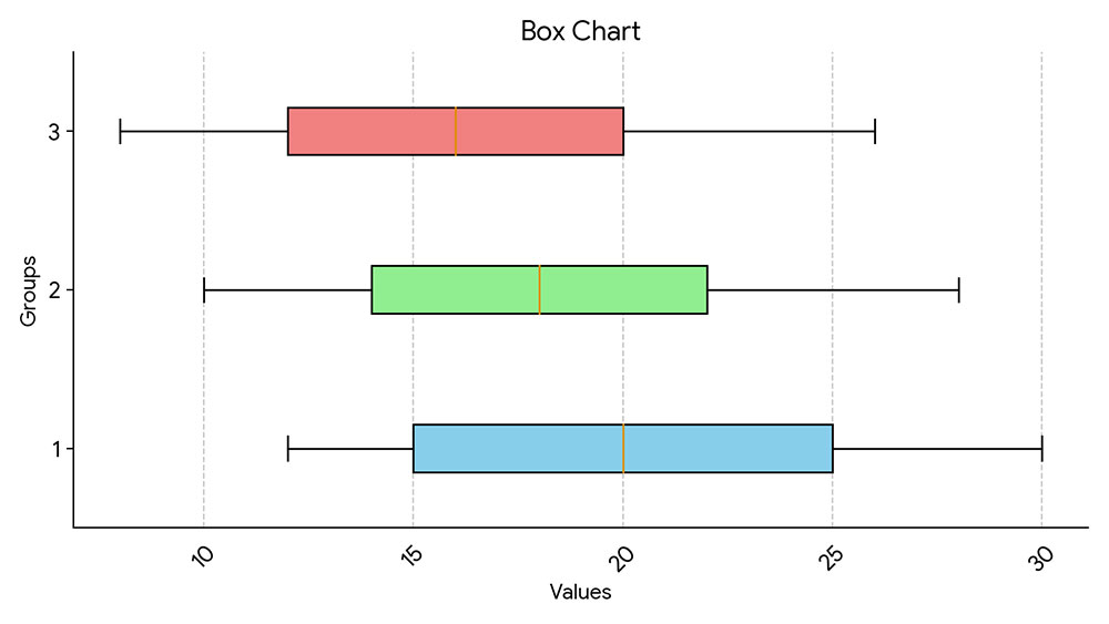
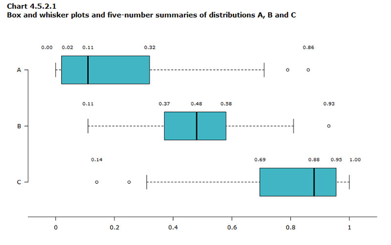
Box Plot Example
When To Use A Box Plot
Box plots? Brilliant for when the story’s in the spread.
- Got data with outliers? Box plot it.
- Compare different sets? Box plot’s a go.
- Descriptive statistics to show? Enter the box plot.
When numbers need to spill their secrets—medians, ranges, those sneaky outliers—that’s box plot territory. Analyzing survey results or test scores? Box plots lay it out. Straightforward, yet rich, they turn complex data into a visual feast anyone can dine on. Lean on them to unfold tales of your data in a language clear as day.
How To Read A Box Plot
Reading a box plot? It’s like decoding a secret. At first glance, it’s just a box and lines—yet, it’s so much more.
- Check out the median—the heart of your data, right there in the box center.
- Eye those quartiles—the box edges? They’re your data’s comfort zones.
- Then, those whiskers—they’re stretching out to the data’s high and low notes.
- Spot any points playing hooky? Those are your outliers, flirting with the edges of possibility.
Digesting this, you’re piecing together your data’s life story. Where it peaks, where it dips, and where it breaks the mold. Box plots don’t just spill the beans; they serve them up, ready for action.
Types Of Box Plots
Oh, the variety in the world of box plots is something else.
- There’s the classic, laying out the basics—median, quartiles, and whiskers. No frills, just your data barebones.
- Notched box plots, though? They dare to estimate the median’s precision, throwing in a little flair at the box’s waist.
- Then, the variable width box plots flex based on your data size. More data equals a broader box; they let the sample size strut.
Each twist offers a fresh lens. It lets you tailor that visual conversation with your data—pick one that speaks your language, whether it’s crisp detail or big-picture chat.
How To Make A Box Plot In WordPress
Here’s the approach for creating a box plot or similar types of charts with wpDataTables:
- Open the Chart Creation Wizard:
- Navigate to your WordPress admin panel, go to wpDataTables -> Create a Chart.
- Assign a name to your chart for easy identification and select a rendering engine (Google Charts, Highcharts, Chart.js, or ApexCharts might be available options, depending on the plugin’s updates).
- Define the Data Source:
- Choose the table that will serve as the data source for your new chart. This is typically done through a simple selection box within the wizard.
- Set the Data Range:
- Specify which parts of your data table you want to include in the box plot. This involves selecting the columns that contain the data points you wish to visualize.
- Formatting and Preview:
- Customize the appearance and settings of your chart. While box plots might have specific options, you generally have the ability to adjust aspects like chart titles, colors, and the range of values displayed.
- Use the live preview feature to review the chart’s appearance. If it’s not exactly as you want, you can go back and adjust the settings as needed.
- Finalize and Insert the Chart:
- Once you’re satisfied with the chart, save your work. The plugin will generate a shortcode for your new box plot.
- Use this shortcode to insert the box plot into your WordPress posts or pages.
How To Make A Box Plot In Excel
To create a box and whisker chart (box plot) in Excel, follow these steps:
- Select Your Data: Choose either a single data series or multiple data series that you want to use for the box and whisker chart.
- Insert the Chart:
- In Excel, go to the
Inserttab. - Click on
Insert Statistic Chart. - Select
Box and Whisker.
- In Excel, go to the
- Customize Your Chart:
- Use the Chart Design and Format tabs to customize the look of your chart. If these tabs are not visible, click anywhere in the box and whisker chart to add the Chart Tools to the ribbon.
- Change Box and Whisker Chart Options:
- Right-click one of the boxes in the chart and select
Format Data Series. - In the Format Data Series pane, with Series Options selected, you can make various adjustments such as:
- Gap Width: Controls the gap between categories.
- Show Inner Points: Displays data points between the lower and upper whisker lines.
- Show Outlier Points: Displays outlier points below the lower whisker line or above the upper whisker line.
- Show Mean Markers: Displays the mean marker of the selected series.
- Show Mean Line: Displays a line connecting the means of the boxes in the selected series.
- Quartile Calculation: Choose a method for median calculation (inclusive or exclusive median).
- Right-click one of the boxes in the chart and select
A box and whisker chart in Excel visually represents the distribution of data into quartiles, highlighting the mean and outliers. The “whiskers” extend from the boxes to indicate variability outside the upper and lower quartiles, and points outside those lines are considered outliers. This type of chart is useful for statistical analysis, such as comparing medical trial results or test scores.
How To Make A Box Plot In Google Sheets
To create a box plot in Google Sheets, which visually represents the five-number summary of a dataset (minimum, first quartile, median, third quartile, and maximum), follow these steps:
Step 1: Enter the Data
- Input the values of your dataset into one column in Google Sheets.
Step 2: Calculate the Five Number Summary
- Google Sheets does not have a direct box plot chart option, so you will use a candlestick chart to simulate a box plot. For this, you need to calculate the minimum, first quartile, third quartile, and maximum values of your dataset. Use the following formulas to calculate these statistics:
- Minimum:
=MIN(range) - First Quartile (Q1):
=QUARTILE(range, 1) - Median (Q2):
=MEDIAN(range) - Third Quartile (Q3):
=QUARTILE(range, 3) - Maximum:
=MAX(range)
- Minimum:
Step 3: Create the Box Plot
- Highlight the calculated values (minimum, Q1, median, Q3, maximum) in your sheet.
- Click on the
Inserttab along the top ribbon, then selectChartfrom the dropdown menu. - In the Chart Editor window that appears on the right side of the screen, click the dropdown menu for
Chart typeand selectCandlestick chart.
The candlestick chart created will serve as your box plot with the following interpretations:
- The top line extends to the maximum value of the dataset.
- The top of the box represents the third quartile (Q3) value.
- The bottom of the box represents the first quartile (Q1) value.
- The bottom line extends to the minimum value of the dataset.
Customization
- Within the
Customizesection of the Chart Editor window, you can modify the plot to include titles, adjust gridlines, and modify the axis labels to better represent your data.
By following these steps, you can effectively create a box plot in Google Sheets using a candlestick chart, allowing you to visualize the distribution of your data, identify outliers, and understand its central tendency and variability.
FAQ About Box Plots
Can You Explain What Quartiles Are in a Box Plot?
Sure thing. Quartiles are your data divvied up into four equal parts. It’s like slicing a pie—each piece reveals a different chunk of data. So, quartiles in a box plot? They show where the bulk of your numbers are hanging out. It’s about getting to know your numeric neighbors.
Why Do We Use Whiskers in Box Plots?
For starters, they’re not for twitching at smells. Whiskers on box plots stretch out from the box, reaching to the highest and lowest values, stopping short of the outliers. They’re the tell-tale signposts hinting at where most of your data lives—shedding light on the range within the safety of the interquartile expressway.
What Does the Median Tell Us in a Box Plot?
Here’s your data’s middle child, the median. Cut your sorted dataset in half, and bam! There’s your middle number, waving at you from inside the box. It tells you the midpoint, where half your data’s higher, half’s lower. No drama, just the facts of where the center of your data’s universe lies.
How Are Outliers Determined in Box Plots?
Outliers are the rebels, the ones that don’t quite fit in. They’re those points that decided to go on an adventure away from the box and whiskers. If a data point strays too far (think 1.5 times the interquartile range), it gains the coveted outlier badge. A statistical maverick, if you will.
What’s the Difference Between a Box Plot and a Histogram?
Ah, the siblings in the data vis family. A histogram’s all about frequency, how often a value appears, binned together like a neighborhood. On the other hand, the box plot is your story of spread and median, not frequency. It’s like choosing between storytelling styles—one’s quantity, the other’s quality.
How Do I Make a Box Plot in Excel?
Excel’s your canvas for painting that box plot picture. Pick your data bouquet, surf to the ‘Insert’ tab, and hit that ‘Box and Whisker’ chart type. Excel does the heavy lifting, plotting your quartiles, median, and whiskers. Customize to your heart’s content—your data, your storytelling masterpiece.
What Are the Uses of Box Plots in Data Analysis?
Picture a detective novel, where box plots are your magnifying glass for sniffing out data’s secrets. They excel in comparing distributions across groups, spotting anomalies, and getting the scoop on your data’s range. In the big-data sleuthing game, box plots are your trusty sidekick.
How Can I Interpret a Wide Box in Box Plots?
Ah-ha! A wide box gives the lowdown on data diversity. Think of it as a stage where your data points are doing the tango—a wider spread. More room means a larger interquartile range, suggesting varied data points. Your dataset is showing off its range with a grandiose flourish.
Is There a Specific Rule for the Size of Whiskers in Box Plots?
Not so hard and fast, but generally those whiskers stick to a script, about 1.5 times the interquartile stretch on either side of the box. It’s tradition, a way to earmark typical value range – but hey, the director (that’s you) can call the shots. Some whiskers might just defy convention.
Conclusion
So, we’ve danced through the details, uncorked the mysteries, and navigated the turns and dips that box plots lay bare. As vibrant as these charts are, they tell a deeper tale, one that goes beyond mere quartiles and outliers. Embrace their revelations; smart use of these data visualization tools is a power play in making informed decisions.
- Unpack complex data sets
- Showcase comparisons with ease
- Tackle exploratory data analysis like a pro
With each plot crafted, the fog of data overload lifts, revealing clarity, insight, and sometimes even a surprise or two—hello, outliers! Don’t just hear the numbers; listen to their stories. Whether in Excel, R, or any statistical software, it’s your stage, and your data analysis is the star.
Closing this chapter, think of box plots as your trusty compass through the numerical wilderness. Trust them to guide, inform, and sometimes, even to astonish.
If you liked this article about box plots, you should check out this article about line charts vs candlesticks.
There are also similar articles discussing scatter plots, funnel charts, pie charts vs bar charts, and pie charts vs donut charts.
And let’s not forget about articles on scatter charts, gauge charts, histograms, and how to choose the right chart for your data.


