Histograms are essential tools for anyone working with data visualization and statistical analysis. They allow us to quickly grasp the underlying distribution and frequency of data points, making patterns and trends immediately apparent.
I’ll guide you through everything you need to know about histograms —why they’re indispensable, how to create them in tools like Excel and Python, and best practices for interpreting them. By the end of this article, you’ll understand how to utilize histograms to their full potential, uncovering insights hidden within your data sets.
We’ll explore critical aspects such as frequency distribution, data intervals, and histographic representation, along with practical tips on comparing histograms with other visual aids.
You’ll also get hands-on tutorials to master creating and analyzing histograms, ensuring your data visualization skills are up to date. If you’re looking to elevate your data analysis game, this article has you covered.
Table of Contents
- What Is A Histogram?
- Histogram Example
- When To Use A Histogram
- How To Read A Histogram
- Types Of Histograms
- How To Make A Histogram In WordPress
- How To Make A Histogram In Excel
- How To Make A Histogram In Google Sheets
Table of Contents
What Is A Histogram?
A histogram is a graphical representation of data through bars, where each bar’s height indicates the frequency of data within a specific range, or bin. It’s used in statistics to give a visual snapshot of the distribution of numerical data, revealing patterns such as skewness and central tendency.
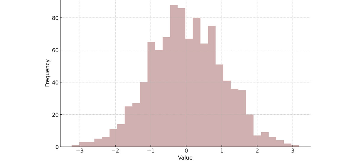
Histogram Example
Chart created with wpDataTables
When To Use A Histogram
Dive into the sea of data, and you’ll find scenarios begging for a histogram. Here’s the breakdown:
- When you’ve got a boatload of continuous numerical data and need to visualize distribution patterns. Think age ranges in a population study or time spent on a website.
- Unraveling when and where the numbers stack up, quite literally, in those towering bars or cozy valleys, offering insights into where most of your data points lay.
- Determining the skew of the tale they tell—leaning left, coasting right, or standing tall like a skyscraper at high noon.
Histograms lay it all out at a glance. Whether you’re in the throws of statistical analysis, looking to pinpoint trends, or comparing sets of continuous variables, that’s when you reach for this tool. Like a lens focusing the blur into a sharp image, it brings data into crystal clarity.
How To Read A Histogram
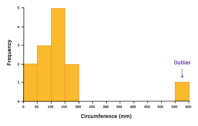
It’s like eyeing a city skyline. Each bar’s got its own story, its height a yarn spun from the number of data points within a slice of the spectrum. Width? That’s your data’s neighborhood, the range it calls home.
Scan for the peaks and valleys; they’re the chatter of your data crowds, the buzz spots and the serene streets. Is there a towering skyscraper, central and imposing? Maybe you’re looking at a bell-shaped curve.
A lean to the left or right, it’s the data doing a side-step. That’s skewness talking. It’s telling you where the tail’s at—longer tales on the side it’s leaning away from.
Soak it in, top to bottom. That’s where the meaning unfolds, in the rise and fall of those bars—a story in numbers, waiting to be read.
Types Of Histograms
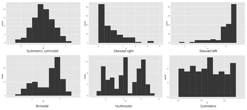
Oh, the varieties you’ll find in the histogram family!
First up, Uniform Histograms. Picture this: every bar standing at the same height, a city where each building has been planned with equal floors. Equilibrium.
Then, shimmy over to Bimodal Histograms. Two peaks, two parties in town. It’s like having twin downtowns in one cityscape.
There’s the Bell-Shaped Histogram—classic. It’s the smooth rollercoaster with a rise and fall that mirrors life’s average adventures, the Mr. Popular of data distribution.
Don’t miss the Skewed Histograms, with their lopsided grins. Could be left, could be right, but they’re the ones that tell you which way the wind blows in your dataset city.
And, if you fancy a bit of edge, we’ve got the Platykurtic ones—flat-topped, spreading the love wide across the range, no single spike to rule them all. Keep an eye out; they’re oddly grounded.
Each type, a visual story, tells a distinct tale of the numbers behind the scenes.
How To Make A Histogram In WordPress
Here’s the approach that could be applied to creating a histogram with wpDataTables:
- Open the Chart Creation Wizard:
- Navigate to your WordPress admin panel, go to wpDataTables -> Create a Chart.
- Assign a name to your chart for easy identification and select a rendering engine (Google Charts, Highcharts, Chart.js, or ApexCharts might be available options, depending on the plugin’s updates).
- Define the Data Source:
- Choose the table that will serve as the data source for your new chart. This is typically done through a simple selection box within the wizard.
- Set the Data Range:
- Specify which parts of your data table you want to include in the histogram. This involves selecting the columns that contain the data points you wish to visualize.
- Formatting and Preview:
- Customize the appearance and settings of your chart. While histograms might have specific options, you generally have the ability to adjust aspects like chart titles, colors, and the range of values displayed.
- Use the live preview feature to review the chart’s appearance. If it’s not exactly as you want, you can go back and adjust the settings as needed.
- Finalize and Insert the Chart:
- Once you’re satisfied with the chart, save your work. The plugin will generate a shortcode for your new histogram.
- Use this shortcode to insert the histogram into your WordPress posts or pages.
How To Make A Histogram In Excel
To make a histogram in Excel, you can follow these steps, which cater to different versions of Excel:
Using the Analysis ToolPak (For Older Versions of Excel)
- Prepare Bin Numbers:
- Enter the bin numbers (upper levels) in a separate column. Bins determine the intervals that your data will be grouped into.
- Access Data Analysis:
- Go to the
Datatab, find theAnalysisgroup, and clickData Analysis. If you don’t see this option, you might need to load the Analysis ToolPak add-in.
- Go to the
- Select Histogram:
- In the Data Analysis dialog, select
Histogramand clickOK.
- In the Data Analysis dialog, select
- Specify Data and Bins:
- Select your data range for the Input Range.
- Click in the
Bin Rangebox and select the range containing your bin numbers.
- Choose Output Options:
- Specify an output range if you want the histogram to be placed in a specific location on your sheet.
- Check the
Chart Outputbox to generate a histogram chart.
- Finalize and Customize:
- Click
OKto create the histogram. - You can then customize the histogram by removing the legend, adjusting bin labels, changing the gap width to 0% for no spaces between bars, and adding borders for clarity.
- Click
Using the Histogram Chart Type (Excel 2016 and Later)
- Select Data:
- Highlight the range containing your data.
- Insert Histogram:
- Go to the
Inserttab, click on theHistogramsymbol in the Charts group, and selectHistogram.
- Go to the
- Adjust Histogram Settings:
- Right-click the horizontal axis and select
Format Axisto adjust bin settings, such as bin width, number of bins, overflow bin, and underflow bin, to tailor the histogram to your data.
- Right-click the horizontal axis and select
- Customize Your Histogram:
- Further customize your histogram by adjusting the bin labels and appearance to match your preferences.
How To Make A Histogram In Google Sheets
To make a histogram in Google Sheets, follow these steps:
- Select Your Data Set: Highlight the range of data you want to analyze with a histogram.
- Insert Chart: Navigate to the “Insert” menu, then select “Chart.”
- Choose Chart Type: In the Chart editor that appears on the right side of the screen, click the drop-down menu for “Chart Type.” Scroll down to the “Other” section and select “Histogram.”
- Review Your Histogram: Once selected, Google Sheets will automatically generate the histogram based on your data. Take a moment to review the histogram to ensure it accurately represents your data.
- Edit Your Chart: For further customization, click on the three dots in the upper right corner of the chart and select “Edit chart.” Use the chart editor panel to make adjustments and customize your histogram. You can modify various aspects of the chart, including:
- Chart Style: Adjust the appearance, such as showing item dividers or changing the bucket size.
- Titles: Edit the chart title and axis titles for clarity.
- Series: Customize the series settings, possibly adjusting the color or style of the histogram bars.
- Legend: Modify the legend’s appearance or position.
- Axes: Adjust settings for both the horizontal and vertical axes, including label formatting and range.
- Gridlines: Customize the gridlines for better readability.
FAQ About Histograms
How do you create a histogram?
Creating a histogram involves selecting the right tool (like Excel, Python, or statistical software), choosing appropriate bins, and plotting the data. Software will often automate the bin width and count for you, simplifying the process of visualizing your frequency distribution.
What are bins in a histogram?
Bins are intervals or ranges that group data points in a histogram. The width of these bins significantly impacts how the data’s distribution is visualized. Properly chosen bins help reveal underlying patterns like central tendency and data intervals within the dataset.
What is the difference between a histogram and a bar chart?
While both use bars, a histogram visualizes frequency distributions for numerical data using adjacent bars, representing continuous data intervals. In contrast, a bar chart represents categorical data with separated bars, focusing more on comparative analysis rather than distribution.
How do you interpret a histogram?
Interpreting a histogram involves analyzing the shape, spread, and central tendency of the bars. Look for patterns like skewness, kurtosis, and the presence of outliers. Understanding these aspects aids in making data-driven decisions and further statistical analysis.
Why are histograms important in data analysis?
Histograms are vital for summarizing large datasets graphically. They help quickly identify the distribution, central tendency, and variability, enabling better data-driven decisions. Fields in data visualization and statistical analysis rely on histograms to uncover valuable insights.
What does skewness mean in a histogram?
Skewness refers to the asymmetry in the distribution of data within a histogram. A left-skewed (negative skew) has a longer tail on the left, while a right-skewed (positive skew) has a longer tail on the right. It indicates how data values are distributed around the mean.
How do you choose the appropriate number of bins?
Choosing the appropriate number of bins can be done through rules like Sturges’ formula or the Freedman-Diaconis rule. Too few bins can oversimplify the data, while too many bins can overcomplicate it. The goal is to achieve a balance for clear, informative visualization.
What are some common mistakes people make when creating histograms?
Common mistakes include using inappropriate bin widths, misinterpreting the axis, and not labeling the graph correctly. Incorrect bin width can misrepresent the data distribution. Ensure your axis is clear, and label your data correctly for accurate and meaningful visualization.
Can a histogram show a normal distribution?
Yes, a histogram can display a normal distribution if the data follows a bell-shaped, symmetrical pattern around the mean. This pattern indicates that most data points cluster around the central value, tapering off equally on both sides. Visualizing such distributions helps in descriptive statistics.
Conclusion
Histograms are vital for efficiently understanding data distribution and frequency. By leveraging histographic representation, we can easily spot patterns, identify central tendencies, and detect variability within datasets. Creating histograms in tools like Excel or Python streamlines data analysis, while using proper bin widths ensures accuracy.
Histograms offer more than just an overview; they help reveal underlying distributions like normal distribution and kurtosis, essential for statistical analysis. By avoiding common pitfalls and choosing appropriate bins, we ensure our data visualization is both accurate and insightful, facilitating informed decision-making.
By mastering histograms, you equip yourself with a fundamental tool in data analysis, enabling a clearer, more precise understanding of your datasets. Whether for academic, professional, or personal projects, histograms are indispensable for insightful, data-driven conclusions.
If you liked this article about histograms, you should check out this article about line charts vs candlesticks.
There are also similar articles discussing box plots, scatter plots, funnel charts, and pie charts vs bar charts.
And let’s not forget about articles on pie charts vs donut charts, scatter charts, gauge charts, and how to choose the right chart for your data.


