
Imagine this: your website’s the stage, and every visitor’s part of the audience, each at different rows of seats. Now picture funnel charts as the spotlight, guiding you smoothly from the back rows to the thrilling front row—the conversion zone.
These diagrams aren’t your run-of-the-mill data snoozefest. They’re the unsung heroes of web design that dissect the multi-layered journey a user takes, transforming confusion into clarity.
In the glimmering world of visual data, they tell you where the crowd’s thinning, which acts make your audience stick, and, oh, the pivotal twist – where you might be losing them.
Together, we’ll dive through the layers of a sales conversion funnel, surface insights hidden in the shadows, and unleash funnel analytics you didn’t realize you needed.
By the finale, you’ll wield the power to create funnel chart designs that not only look sleek but turn insights into action.
From conversion rate secrets to funnel chart best practices, I’m spilling it all. Buckle up; this isn’t just another article – it’s the gateway to mastering your user journey, one chart at a time.
Table of Contents
- What Is A Funnel Chart?
- Funnel Chart Example
- When To Use A Funnel Chart
- How To Read A Funnel Chart
- Types Of Funnel Charts
- How To Make A Funnel Chart In WordPress
- How To Make A Funnel Chart In Excel
- How To Make A Funnel Chart In Google Sheets
Table of Contents
What Is A Funnel Chart?
A funnel chart is a tool that visually depicts the progressive reduction of data through stages, resembling the shape of a funnel. It’s commonly used to represent the stages in a sales process, showing the number of potential customers at each phase, from initial contact to final sale.
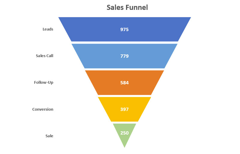
Funnel Chart Example
Chart created with wpDataTables
When To Use A Funnel Chart
Whenever you’ve got stages to sift through, and you need that oh-so-satisfying visual of things thinning down or bottlenecking, that’s when a funnel chart comes in hot.
Perfect for painting a picture of the customer journey, or mapping out those key conversion points.
They can also help track ecommerce conversion rates, identify areas for improvement, and optimize the sales funnel to increase revenue.
It’s not just for sales teams tracking leads. Think marketing campaigns, gauging click-through rates, or any scenario where steps and drop-offs need the spotlight.
Running a webinar? Plug a funnel chart to see attendee engagement drop-offs. It’s a go-to, especially when pinpointing where a little tweak can keep ’em sticking around.
How To Read A Funnel Chart
Chart created with wpDataTables
Start at the top, where everything’s wide and welcoming. That’s your potential—the whole shebang of leads or visitors. As eyes trail down, those narrowing slices? That’s where you’re losing folks—it’s the drop-off analysis in action.
But hey, don’t just mourn the lost. Each slice, each stage—be it visitors, engagers, prospects—tells a story. Where it shrinks, pause. Ponder. Why here? Is the content not gripping enough? The call-to-action too shy?
Remember, the goal ain’t just to read it; it’s to understand it. Think like Sherlock: look for clues, gather insights, and get ready to turn those conversion rate optimization gears in your head.
Types Of Funnel Charts
Right, so you’ve got your classic funnel chart, that’s your bread and butter – tracking the standard descent from prospect to loyal customer. But that’s just appetizers.
Next, the stacked funnel chart, a bit jazzier, stacking segments within sections to give extra flavor, like showing different products in a sales funnel.
Then there’s the inverted funnel chart. Think upside-down party – starts with a bang and then, well, standard stuff. It’s great for conversion rate optimization, focusing on the cause of drop-offs.
And who could forget the tornado chart? It’s a funnel chart’s cousin, comparing two data sets, side by side, ready for some head-to-head action.
Every type, it’s got its rhythm, its beat. So, pick the one that moves to the groove of your data.
How To Make A Funnel Chart In WordPress
Here’s the approach that could be applied to creating a funnel chart or similar types of charts:
- Open the Chart Creation Wizard:
- Navigate to your WordPress admin panel, go to wpDataTables -> Create a Chart.
- Assign a name to your chart for easy identification and select a rendering engine (Google Charts, Highcharts, Chart.js, or ApexCharts might be available options, depending on the plugin’s updates).
- Define the Data Source:
- Choose the table that will serve as the data source for your new chart. This is typically done through a simple selection box within the wizard.
- Set the Data Range:
- Specify which parts of your data table you want to include in the funnel chart. This involves selecting the columns that contain the data points you wish to visualize.
- Formatting and Preview:
- Customize the appearance and settings of your chart. While funnel charts might have specific options, you generally have the ability to adjust aspects like chart titles, colors, and the display of data points.
- Use the live preview feature to review the chart’s appearance. If it’s not exactly as you want, you can go back and adjust the settings as needed.
- Finalize and Insert the Chart:
- Once you’re satisfied with the chart, save your work. The plugin will generate a shortcode for your new funnel chart.
- Use this shortcode to insert the funnel chart into your WordPress posts or pages.
How To Make A Funnel Chart In Excel
Creating a funnel chart in Excel can be approached in two main ways: using the built-in funnel chart feature available in Excel 2019 and later versions, or manually creating one in earlier versions of Excel. Here’s how you can do both:
For Excel 2019 and Later Versions:
- Create a Built-in Funnel Chart:
- Highlight the data range you want to use for your funnel chart (including stages and values).
- Go to the
Inserttab. - Click on
Insert Waterfall, Funnel, Stock, Surface, or Radar Chart. - Select
Funnel.
- Recolor the Data Series:
- Enhance the visual appeal by recoloring the data series. Double-click on a bar to select it, right-click, and choose the
Filloption to select a new color.
- Enhance the visual appeal by recoloring the data series. Double-click on a bar to select it, right-click, and choose the
- Add Final Touches:
- Remove unnecessary elements like the vertical axis border by right-clicking on it and selecting
Format Axis, then choosingNo linefor the border. - Adjust the color and font of the data labels and chart title for better visibility and aesthetics.
- Remove unnecessary elements like the vertical axis border by right-clicking on it and selecting
For Excel 2007, 2010, 2013, and 2016:
- Create a Helper Column:
- Add a helper column to your data to create space for the funnel effect. Use a formula to calculate the spacer values that will center the bars.
- Set Up a Stacked Bar Chart:
- Highlight your data including the helper column and insert a stacked bar chart from the
Inserttab.
- Highlight your data including the helper column and insert a stacked bar chart from the
- Hide the Helper Data Series:
- Make the helper series transparent by selecting it, right-clicking, and choosing
Format Data Series. Set the fill toNo fill.
- Make the helper series transparent by selecting it, right-clicking, and choosing
- Reverse the Order of Axis Categories:
- Right-click on the vertical axis, select
Format Axis, and checkCategories in reverse orderto flip the chart.
- Right-click on the vertical axis, select
- Recolor the Chart:
- Customize the colors of each bar to match your desired funnel chart look.
- Adjust the Gap Width:
- Reduce the gap width between bars to make the chart resemble a funnel more closely.
- Add Data Labels:
- Add data labels for clarity on the number of items at each stage.
- Remove Redundant Chart Elements:
- Clean up the chart by removing unnecessary elements like the legend, gridlines, and axis.
- Shape the Chart as a Funnel (Optional):
- For a more funnel-like appearance, you can use shapes or SmartArt to overlay or replace parts of the chart.
- Insert the Inverted Pyramid into the Funnel Chart (Optional):
- If you’ve created an inverted pyramid shape, you can integrate it into your funnel chart for a more authentic funnel appearance.
By following these steps, you can create a visually appealing funnel chart in Excel, regardless of the version you’re using.
How To Make A Funnel Chart In Google Sheets
Creating a funnel chart in Google Sheets requires a bit of creativity since Google Sheets doesn’t offer a native funnel chart option. However, you can use workarounds to achieve a similar visual representation. Here are two methods to create a funnel chart in Google Sheets:
Method 1: Using the Native Chart Builder
- Prepare Your Data:
- Input your data into the spreadsheet. You’ll need three columns: one for the stage names, one for offsetting the chart (to be made transparent later), and one for the actual data values.
- Create the Chart:
- Select your data range and go to the
Inserttab, then click onChart.
- Select your data range and go to the
- Change the Chart Type:
- In the Chart Editor on the right, change the chart type to a “Stacked Bar Chart” from the
Chart typedropdown menu.
- In the Chart Editor on the right, change the chart type to a “Stacked Bar Chart” from the
- Adjust the Chart to Look Like a Funnel:
- Click on the series that represents the offset (the part of the chart you’ll make transparent) to select it. In the Chart Editor, set the
Fill opacityandLine opacityto 0% to make these bars transparent, leaving you with a funnel-like appearance.
- Click on the series that represents the offset (the part of the chart you’ll make transparent) to select it. In the Chart Editor, set the
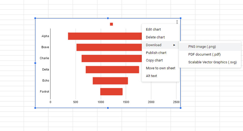
- Export the Chart (Optional):
- If you need to use the chart outside of Google Sheets, you can download it as an image by clicking on the three dots in the upper right corner of the chart and selecting “Download”.
Method 2: Using an Add-on (e.g., ChartExpo)
- Install the Add-on:
- Go to
Extensions > Add-ons > Get add-ons, search for “ChartExpo”, and install it.
- Go to
- Create the Chart:
- Open ChartExpo from the
Extensionsmenu, selectCreate new chart, and choose “Funnel Chart” from the options.
- Open ChartExpo from the
- Select Data and Customize:
- Choose the sheet and columns for your chart. Customize the appearance as needed using the options provided by ChartExpo.
- Export the Chart (Optional):
- Similar to the native method, you can export the chart for use outside of Google Sheets.
FAQ About Funnel Charts
How do you interpret a funnel chart effectively?
Lock your eyes on those bars. They represent phases—usually in sales or marketing. If one’s way shorter? That’s where folks are bailing. The idea’s to track the crowd. See where they linger, where they bolt. It’s like reading a story where you get to nudge the characters along.
What’s the typical use of a funnel chart?
Typically, it’s all about tracking sales or leads. But hey, it’s more than just dollar signs. It’s perfect for any multiphase process where you need to pinpoint where potential customers are saying “nah” and ducking out. So anywhere you need to amplify efficiency, really.
Can you make a funnel chart in Excel?
Absolutely. Excel’s got your back here. It’s got a nifty funnel chart option. Dive into “Insert” and select “Funnel Chart.” Plop in your data, and watch that magic happen. Just remember: Excel’s simpler than some other tools, so don’t expect it to do backflips.
What is a conversion rate in the context of a funnel chart?
Conversion rate’s that golden number showing you the percentage of peeps who cruise from one stage of your funnel to the coveted end goal.
Why do my funnel’s conversion rates matter?
Think of conversion rates as your company’s pulse rate. They tell you how healthy your sales process is. Solid rates mean your funnel’s fit as a fiddle. Dismal ones? Time for a check-up. Boost them, and your revenue’s gonna thank you—big time.
What software can I use to create advanced funnel charts?
Beyond Excel, there’s a bunch of software out there flexing more muscle. Tableau and ClickFunnels kick butt for in-depth, customizable charts. Also, Google Analytics can whip up a funnel visualization that’ll knock your socks off when tracking web user behavior.
Can funnel charts help optimize my website’s user experience?
You bet. Funnel charts uncover the potholes in your user experience. They’re like a flashlight shining right where users are tripping up. Spot those snags, smooth ’em out, and watch users gliding through your site like it’s greased lightning.
What is the significance of the funnel stages’ order?
Getting the order right is like mastering the steps to a dance. Mess it up, and you’re stepping on toes. The order should mirror your customer’s journey—no shortcuts, no detours. Get it right, and it’s a smooth salsa from interest to sale.
How do I improve the effectiveness of a funnel chart?
Polish that funnel till it shines. Tailor it with pinpoint accuracy to reflect your customer’s trip. Play detective on drop-off points. Then strategize—test changes, track results, fine-tune. Make your funnel so good it’s practically handing you conversions on a silver platter.
Conclusion
Wrapping it up, you read about the ins and outs of funnel charts—those sleek graphical ninjas breaking down every stage from viewer to doer. Harnessing these charts, you’ve now got a crystal-clear view of where your leads warm up or go cold.
Alright, let’s be real; illumination doesn’t come from just staring at a pretty graph. It’s about action. Use these insights, shake up your strategies. Test. Tweak. Triumph. Whether it’s optimizing your sales process diagrams or finessing your customer journey map, it’s all in your hands now.
Dive into those conversion funnel visualizations. Put them to work. You’re now clued in on the power of funnel analytics and the must-knows for funnel chart designs. Your playbook’s thicker, your plans—sharper.
If you liked this article about funnel charts, you should check out this article about line charts vs candlesticks.
There are also similar articles discussing box plots, scatter plots, pie charts vs bar charts, and pie charts vs donut charts.
And let’s not forget about articles on scatter charts, gauge charts, histograms, and how to choose the right chart for your data.


