
Imagine your data wearing the wrong outfit. Yeah, that’s a weird image, right? But stick with me.
Data, like us, needs the right style to shine. We wouldn’t rock up to a beach party in a tux, just as our figures shouldn’t strut in a pie chart when a bar graph fits better. So, how to choose the right chart for your data?
You see, web design taught me something invaluable. Just as design decisions impact user experience, chart choices directly influence data interpretation.
Miss that? Data could be misunderstood or, worse, ignored.
By the time we’re done here, you’ll know:
- The essence of different chart types
- When and why to use them
- The common pitfalls to avoid
Let’s make your data not just heard, but understood. Ready to pick the perfect ensemble for your numbers?
Table of Contents
The Basics of Data Types and Their Characteristics
Quantitative Data
So, you’ve got numbers, huh? Quantitative data is all about digits and math. It’s data you can measure, you know?
Continuous Data
Imagine measuring your dog’s weight. 32.7 pounds? Or was it 32.75?
Point is, it could be any value within a range. That’s continuous data for ya. Good for line graphs where the data smoothly changes.
If you’re asking how to choose the right chart for your data and you’ve got continuous stuff, line charts are often your friend.
Discrete Data
Now, consider the number of pets you have. 2 dogs, 1 cat, maybe a hamster. You can’t have 2.5 dogs unless you’re in a science fiction story.
So, this is what we call discrete data. Bar charts love discrete data. They’re like PB&J—a classic combo that almost never fails.
Qualitative Data
Hey, not everything’s a number. Sometimes it’s just, well, different kinds of stuff. And that’s qualitative data.
Nominal Data
Take your favorite brands of sneakers for instance—Nike, Adidas, Puma. No natural order, just names. That’s nominal data.
Pie charts or even a simple bar chart can handle this kinda data well. Just remember, the simpler, the better, especially when figuring out how to choose the right chart for your data.
Ordinal Data
Okay, but what if you’re ranking those brands? Like, ‘good, better, best.’ Now there’s some kind of order, right? This is ordinal data.
In these cases, a bar chart can still work, but it’s gonna need some tweaks to show the ranking properly.
Understanding the Objective of Your Data Visualization
To Compare Values
When you’ve got something you wanna compare, let’s say your monthly spend on coffee, you’ve got options.
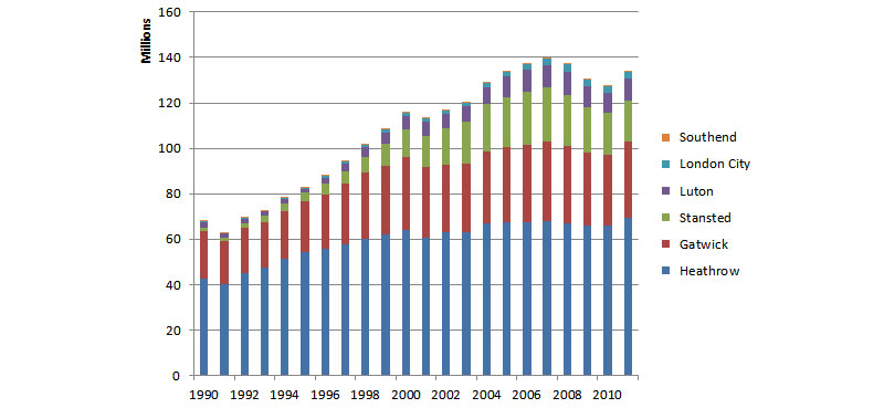
Comparing Over Time
So, maybe you’re looking at your caffeine love affair month by month. Last July, you were all about that iced latte life.
Come November, it’s pumpkin spice heaven. A line chart’s perfect for capturing that vibe. You see the ups and downs, right?
Comparing Categories
But what if it’s like, “Hey, how much am I spending on coffee vs. eating out vs. gym?” You’re not lining these up over time; you’re just looking at them side by side.
Bar chart, folks. Maybe even make it horizontal for that edgy feel. How to choose the right chart for your data? Think about what you’re stacking up against what.
To Show Composition
Ever looked inside a smoothie and wondered what’s making it that weird shade of green? You can do the same with data.
Parts of a Whole
Like, if you’re wondering where all your paycheck goes each month. Rent’s this big chunk, then there’s food, maybe a slice for entertainment.
Pie chart works for a quick snapshot. But, be real. Keep it simple. Too many slices and it looks like a psychedelic pizza.
Multiple Components Over Time
Or you could be tracking those same expenses over the year. Rent’s still the big one, but maybe you splurged on a vacation or bought a new laptop.
A stacked area chart can show this evolution over time. How to choose the right chart for your data suddenly gets more interesting, right?
To Show Relationship
You ever looked at a group of people and just knew who was tight with who? Data has those friendships and frenemies too.
Correlation
Got two things that seem like they’re acting in sync? One goes up, the other goes up? Scatter plot. You can literally see the dots forming a pattern.
But if it looks like abstract art, then maybe there’s no link.
Distribution
Ever heard of a histogram? It’s like a bar chart that went to grad school. It tells you how many times something falls into certain ranges.
Like, if you measured the height of all your friends, you’d see how many are shorties, average, or could legit play in the NBA.
To Show Geographic Distribution
Last but not least, sometimes it’s all about location, location, location.
Maps
Say you’re running a little online shop. Orders start coming in and you wanna know, “Where are my peeps at?” A map can highlight regions or even specific cities.
Heatmaps
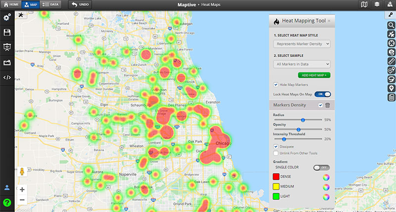
Or maybe it’s more about hotspots. Like, where in the city do people dig your stuff the most?
Heatmaps show density, like high-traffic zones, making them the cool kid in the chart world.
Audience Considerations
Okay, get this. You could create the Mona Lisa of all charts, but if it’s not vibing with the people who are supposed to look at it, you’re kinda just talking to yourself, aren’t you?
Technical vs. Non-technical Audience
When you’re in a room and someone starts talking calculus and your brain turns to mashed potatoes.
Yeah, don’t be that guy with your charts.
Level of Complexity
Got a team of data scientists? Cool, go ham with that 3D scatter plot. It’s like the Marvel Cinematic Universe but for nerds.
But let’s say you’re presenting to people who still struggle with setting up their email. Keep it basic, like really basic. A simple line or bar chart will do.
Information Density
Ever had a chat with someone who’s so detailed, you lose track of what they’re saying halfway through?
When you’re thinking about how to choose the right chart for your data, think about how much your audience can actually digest. A super-dense heat map might look pretty, but it could overwhelm. Remember, not everyone loves a mind-bender.
Presentation Medium
Okay, so where’s this masterpiece going? On a 4K Ultra HD monitor, or printed on paper that’s gonna be passed around like last year’s gossip?
Digital Displays
If it’s on a screen, you can afford to get a bit fancier. Interactivity is your playground. Hover-over details, clickable legends—make it an experience, you know?
For that, I recommend using wpDataTables.
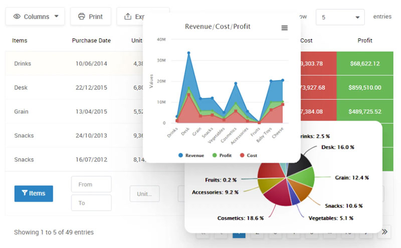
Ever felt like you’re drowning in spreadsheets? Or maybe you’ve spent hours trying to make sense of rows and columns? I get it. Data can be overwhelming. But what if I told you there’s a way to make it all effortless?
Meet wpDataTables, your new best friend for creating dynamic and interactive tables and charts. This isn’t just another WordPress plugin; it’s a lifesaver.
Why wpDataTables?
- Easy-Peasy: Just upload your file, tweak a few settings, and voila! Your table is ready to go live.
- Customizable AF: Want your table to be responsive? Editable? Have conditional formatting? You got it!
- Real-Time Charts: Turn your tables into stunning charts that update in real-time. How cool is that?
But Wait, There’s More!
- Power Filters: Narrow down your data like a pro.
- Huge Data Sets? No Problem: Handles millions of rows like a champ.
- Professional Support: Got questions? They’ve got answers.
So, what are you waiting for? Level up your data game and make your life a whole lot easier.
Print Media
But if it’s going on dead trees, you gotta stick to the basics. No interactive bells and whistles here. Plus, you need to think about black and white prints.
Yeah, your gradient might look cool in color, but how’s it gonna translate to grayscale?
Common Chart Types and When to Use Them
So, we’ve talked about the data, we’ve talked about your audience, but what about the stars of this show—the charts themselves?
It’s like picking your favorite movie genre. There’s something for everyone, but not every flick is a hit with every crowd. Knowing how to choose the right chart for your data is kinda the same.
Bar and Column Charts
Chart created with wpDataTables
Benefits
Bar charts are like the jeans and t-shirt of the data world. Super casual but get the job done.
If you’re showing, say, monthly sales or who scored what in a game, this is your go-to. Super readable, even your grandma would get it.
Limitations
But they’re not great for everything. Imagine trying to show temperature changes over a year with a bar chart.
A bit weird, right? There are better options for that. Keep it simple, not simplistic.
Line and Area Charts
Chart created with wpDataTables
Benefits
Now, if you’re tracking stuff over time, line charts are your jam. It’s like following the storyline of your fave binge-worthy show.
You see the ups, the downs, and those cliffhangers. Area charts are its edgier cousin—they fill in below the line. Great if you want to show something accumulating, like saving up for that trip to Ibiza.
Limitations
The catch? Don’t cram in too many lines. It’s like trying to follow a movie with too many characters. You get lost and stop caring.
Also, you can’t just throw in random categories. Stick to a timeline.
Pie and Donut Charts
Benefits
Want to break down a whole into pieces? This is where pie and donut charts roll in.
Like, if you wanna show how much time you spend sleeping, eating, and, um, Netflix-ing.
Limitations
But easy there, cowboy. Too many slices and it’s chaos. Like going to a party where everyone’s talking at once.
You can’t make sense of it. So, limit those slices.
Scatter Plots and Bubble Charts
Chart created with wpDataTables
Benefits
Feeling like Sherlock? Want to investigate if two things are connected? That’s where scatter plots and bubble charts enter.
Like, do people buy more ice cream when it’s hot? Plot temperature against ice cream sales and you’ll see.
Limitations
But these aren’t great for comparing who’s winning or losing. It’s not a scoreboard; it’s more like a treasure map.
Heat Maps and Tree Maps
Benefits
Ever wanted to know the hotspot of something? These bad boys are like the social media influencers of charts.
They show you what’s trending, where and when. Epic for showing stuff like website clicks.
Limitations
But it’s not the best for showing tiny details. It’s more of an “overview” kinda thing.
Sometimes it’s too much sauce and not enough pasta, ya know?
Specialized Charts
Radar Charts
Chart created with wpDataTables
This is like the indie film of charts. Not everyone gets it, but it has its place. Use it to show multivariable info.
Say you’re comparing smartphones. Screen size, battery life, camera quality—all on one chart.
Waterfall Charts
Waterfall charts are dramatic! They show you a starting point, the ups and downs, and where you end up.
Super cool for stuff like tracking a project’s progress.
Practical Tips and Best Practices
Here’s a guide to maxing out your chart game. We’re diving deep into how to choose the right chart for your data, but with a twist—how to actually make it killer.
Color Choice and Accessibility
Color Theory
Let’s be real, color makes everything better. Imagine watching your fave movie in black and white. Meh.
So, you wanna pick colors that don’t just look good but also make sense. Cool tones like blues and greens for chill vibes, hot reds and oranges for urgency, that sort of thing. And never underestimate the power of contrast!
Color Blindness Considerations
But hold up! Not everyone sees color the same way. Around 8% of men and 0.5% of women have some form of color blindness.
So, maybe skip the red-green combos, okay? There are tools out there to help you pick colors that everyone can see. It’s like adding subtitles to your movie; you make it accessible to everyone.
Readability and Clarity
Text Labels
Ever read a chart and felt like you needed a translator? Nah, we don’t want that. Make sure your labels are simple, clear, and to the point.
No jargon, no complicated words. You want people to get it the first time around.
Data-to-ink Ratio
Sounds fancy, but it’s really not. Basically, you want as much data as possible with as little “ink” (or pixels, if we’re being 21st-century about it) as possible.
Trim the fat. Get rid of anything that’s not helping. More isn’t always better.
Legends and Annotations
Positioning
Where you put your legend matters. It’s like when you’re at a concert; you don’t wanna be stuck behind a pillar.
Keep it close but not too close. Make sure it’s easy to link the legend to the data it represents.
Consistency
Be consistent with how you do things. If you’ve decided your text is gonna be a certain font and size, stick with it.
Changing things up is confusing. Imagine switching between five different narrators in one audiobook.
FAQ On How To Choose The Right Chart For Your Data
What factors should I consider when picking a chart?
Well, think about the kind of data you have first. Categorical, continuous, or sequential?
Next, ponder on the message you want to convey. Are you showing a comparison, relationship, distribution, or composition? The clearer your message, the easier it’ll be to pick the right chart.
How do bar charts and column charts differ?
Bar charts go horizontal, while column charts stand tall and vertical. Think about the data you’re dealing with.
Got a few categories with longer labels? Go with a bar chart. On the other hand, time series data loves hanging out with column charts.
Why would I use a pie chart?
Pie charts are like the dessert of data visualization! They’re great for showing parts of a whole.
But be cautious: if you’ve got too many slices or the differences between slices are subtle, your message might get lost. Keep it simple, and don’t overstuff that pie.
Are stacked charts useful?
Absolutely! Stacked charts let you peek into different data segments within a single bar or column.
They’re kinda like a multi-story building, showing how much each segment contributes to the total. But keep an eye out: too many segments can make it confusing.
When should I lean towards a line chart?
Line charts are the storytellers. They’re fantastic for showing trends over time, especially when you want to highlight ups and downs.
If you’ve got time series data or values changing over a period, line charts will be your best bud.
Scatter plots – what are they good for?
Ah, scatter plots! They’re like a dance of dots, showcasing relationships between two variables.
If you want to see if two things are correlated, or just get a feel for data clusters, scatter away!
Can I use multiple chart types together?
Of course! Sometimes, one chart type just doesn’t cut it. Combining multiple charts can help convey a richer story.
But be careful – it’s like mixing drinks. Do it thoughtfully, or it might get messy.
What’s the deal with heatmaps?
Heatmaps are the chameleons of the chart world. They use colors to represent data values in a matrix.
Looking to show concentrations or patterns, especially in large datasets? Heatmaps can be a neat choice. They’re especially cool for correlation matrices or website activity.
Do I always need a legend?
Legends are like tour guides for your chart. They provide context. If your chart has multiple data series or colors representing different values, a legend is your friend.
But if your chart is simple and self-explanatory, you might be able to skip it.
Are 3D charts a good choice?
3D charts might look flashy, but they can distort data perception. Unless there’s a very specific reason to go 3D, it’s often better to stick with 2D.
Remember, clarity is king. Don’t let the bells and whistles overshadow your data’s message.
Conclusion On The Right Chart For Your Data
Dude, seriously, charts? It’s like trying to pick the perfect outfit for a date. You’ve got to match the vibe.
- Line charts? They’re the classic jeans and tee combo. Good for showing trends over time.
- Bar graphs? Think snazzy blazer. Perfect to compare different items side-by-side.
- Pie charts? That’s the quirky tie you rock for a fun twist, showing pieces of a whole.
It ain’t just about looking good. It’s about the message: what do you really want to say? Don’t just slap on any chart like it’s a mismatched sock.
If you liked this article about choosing the right chart for your data, you should check out this article about line charts vs candlesticks.
There are also similar articles discussing box plots, scatter plots, funnel charts, and pie charts vs bar charts.
And let’s not forget about articles on pie charts vs donut charts, scatter charts, gauge charts, and histograms.


