Your pricing table is doing more selling than your homepage.
Think about who lands on a pricing page. They’re already interested, that decision’s behind them. What they need now is to see the plans laid out clearly, to understand why one tier beats another for their situation, and to hit a CTA that actually matches where their head is at.
Most pricing table roundups online just show you what a table looks like. That’s the easy part. The harder question, and the one that decides whether someone buys or bails at the final step, is what makes a pricing table actually convert.
So that’s where this goes: real designs across SaaS, ecommerce, agencies, and service businesses, the layout patterns that move people, how the billing toggle should behave, and the testing that tells you whether any of it worked.
Table of Contents
What Is a Pricing Table?
A pricing table is a structured UI component that displays product or service tiers side by side so users can compare options and make a purchase decision without leaving the page.
It is distinct from a pricing page. The pricing page is the full page. The pricing table is the specific component within it that handles plan comparison.
Every pricing table has the same core job: reduce the mental work of choosing. The fewer decisions a visitor has to make on their own, the faster they convert.
What does a pricing table contain?
A standard pricing table has 5 core elements.
- Tier name – Free, Pro, Business, Enterprise
- Price – with billing cycle clearly labeled (per month, per year)
- Feature list – what is included in each plan
- CTA button – one action per tier, no exceptions
- Plan highlight – a badge or visual treatment marking the recommended plan
Miss any of these and users fill the gap with doubt. Doubt kills conversions.
Where pricing tables appear
SaaS products use them to separate free, paid, and enterprise access.
Ecommerce platforms use them to show transaction fees and feature differences across plans.
Agencies use them for package-based service tiers with defined deliverables.
Subscription products use them to display quantity or frequency options side by side.
According to a 2024 Pricing Strategy Report, 57% of SaaS visitors check the pricing page before reading the product description (InfluenceFlow, 2024). That makes the pricing table one of the most visited components on any SaaS site.
What Makes a Pricing Table Effective?
An effective pricing table reduces decision time, not just displays prices. The difference between a table that converts and one that confuses usually comes down to 5 specific decisions. A well-executed pricing strategy relies on presenting those decisions clearly and consistently.
What features should a pricing table always include?
These are the non-negotiables.
| Element | Purpose | Common mistake |
|---|---|---|
| Clear tier hierarchy | Shows the progression from low to high value | Using vague names like “Standard” and “Premium” |
| Highlighted recommended plan | Reduces paralysis by guiding the decision | Making all plans look equal |
| Plain feature language | Users understand what they get without guessing | Internal jargon like “Advanced tools” |
| Specific CTA copy per tier | Matches the user’s intent at each plan level | Using “Sign up” for every column |
| Mobile-responsive layout | Table stacks or scrolls on small screens | Fixed-width columns that break on mobile |
The mobile point matters more than most teams realize. A table that isn’t responsive forces users to pinch and zoom to compare plans. Most don’t bother.
How does plan highlighting affect conversions?
Researchers at Duke University (2023) found that adding a visually distinct recommended plan increases sales of the premium tier by 35% to 50%.
The mechanism is contrast. When one plan looks different from the others, it becomes the default reference point. Users stop comparing all options equally and start evaluating everything relative to the highlighted plan.
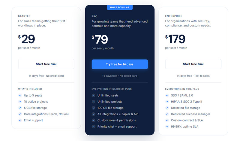
Notion, Linear, and Figma all use this pattern. The highlighted column gets a colored border or filled background. The CTA button inside it uses a stronger color than the others. The “Most Popular” badge sits at the top.
This is not a design preference. It is a decision architecture choice that directly affects which plan users select.
What Are the Main Types of Pricing Tables?
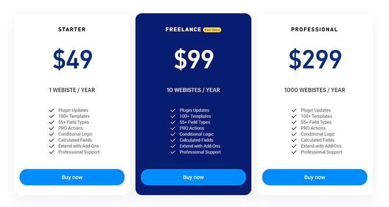
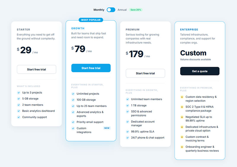
There are 5 structural formats pricing tables take. Each fits a different product type and user intent. Choosing the wrong one for your product creates friction even before the user reads a single feature.
Tiered pricing tables
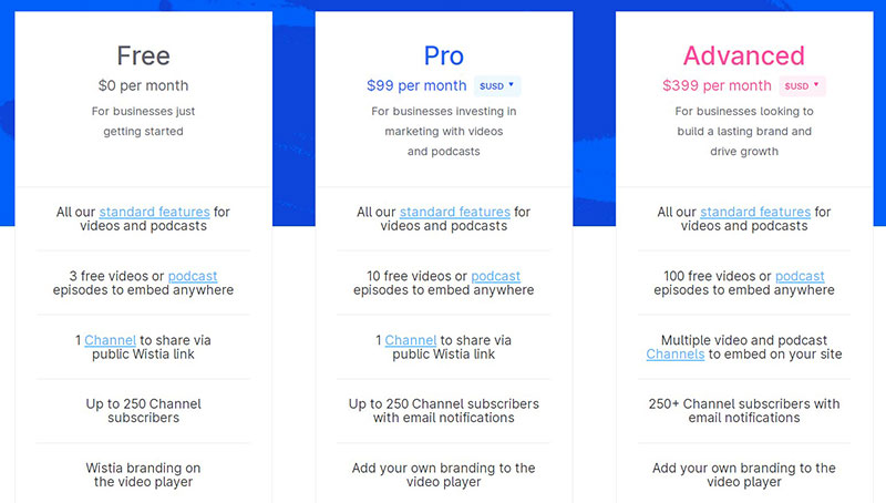
The most common format in SaaS. Plans are arranged in columns from left to right, typically Free, Pro, Business, and Enterprise.
Each column contains a fixed set of features. Users scan horizontally to compare what they get at each price point. The visual hierarchy does the persuasion work.
Notion, Slack, and Linear all use tiered tables. The structure works because it maps to how buyers think: “What do I need, and what is the minimum plan that gives it to me?”
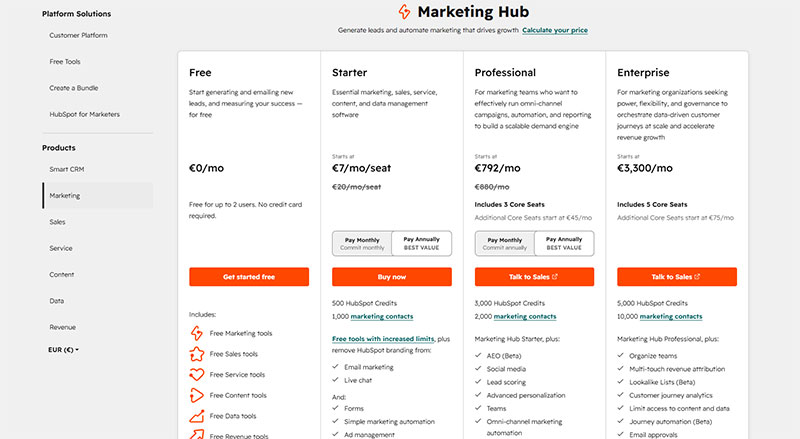
Feature comparison tables
Rows list features. Columns represent plans. Checkmarks and X marks fill the grid.
This format answers a specific question: “Does the plan I want include the feature I need?” It works for products with a long, complex feature set where users already know what they are looking for.
Best for: enterprise buyers doing a detailed evaluation before purchase
Risky when: the feature list exceeds 20 rows, at which point the table becomes harder to scan than a simple paragraph
HubSpot uses a long feature comparison table below its main pricing cards. The top section handles the quick decision. The table handles deep evaluation. Both on the same page.
Usage-based and slider pricing tables
OpenView’s research shows 61% of SaaS companies had adopted some form of usage-based pricing by 2023, up from 45% in 2021 (OpenView Partners, 2023).
Slider tables handle this model. The user moves a slider to set their usage level, and the price updates in real time. No fixed columns. No tier names. Just a number they control.
Mailchimp and Intercom use this for contact-count and seat-based pricing. Twilio uses it for API call volume. The slider removes the guesswork of estimating which fixed tier covers their actual usage. This flexibility makes usage-based models one of the more effective pricing strategies for products with highly variable customer needs.
The tradeoff is complexity. Slider tables require JavaScript and careful UX work to avoid confusion. They also make it harder to anchor users to a specific plan since there is no “most popular” column to highlight.
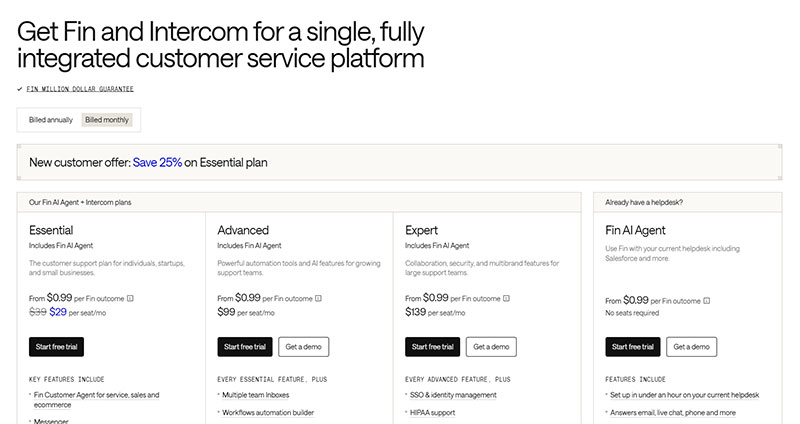
What Are the Best SaaS Pricing Table Examples?
The following 5 SaaS pricing tables are worth studying not because they look good, but because each solves a specific problem in plan comparison that most tables get wrong.
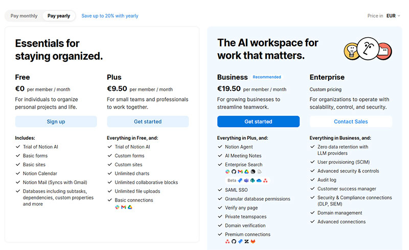
Notion
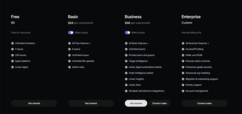
Linear
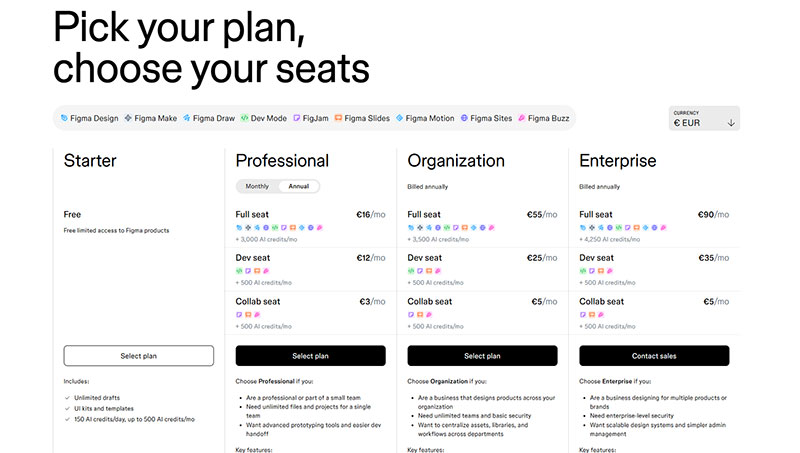
Figma
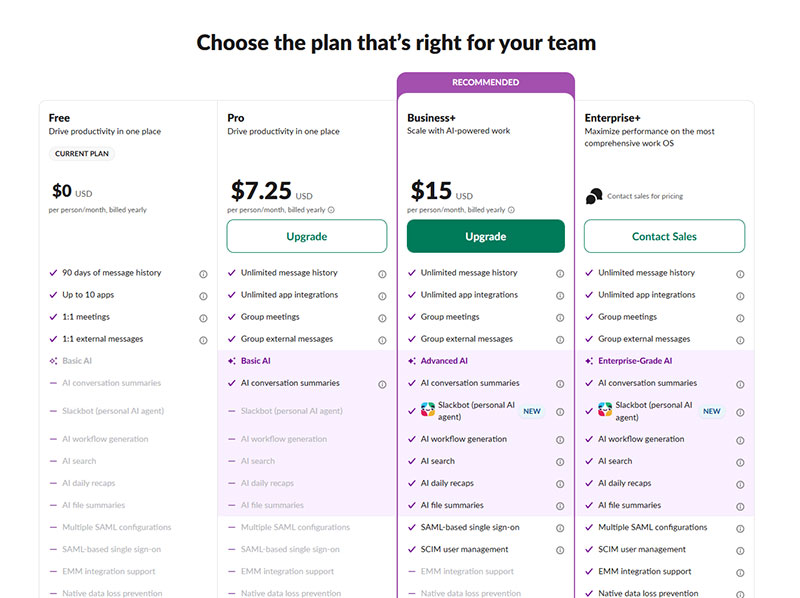
Slack
Intercom
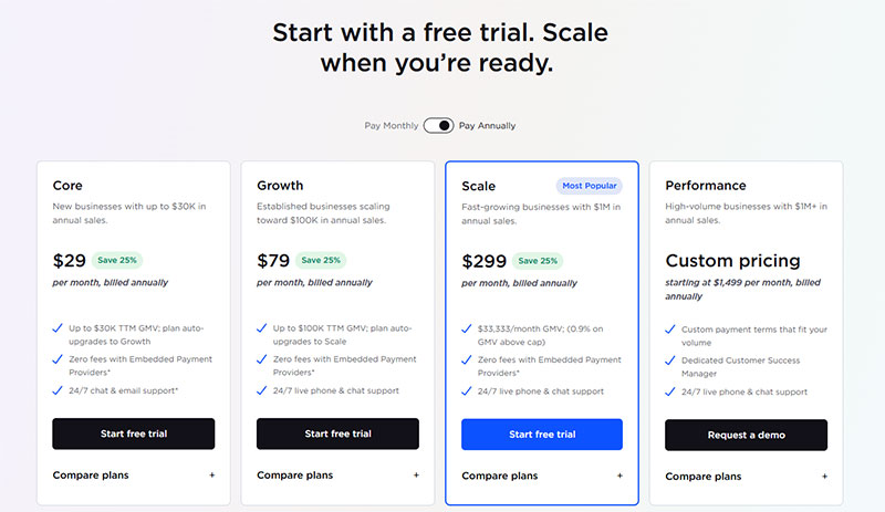
What Are the Best Ecommerce Pricing Table Examples?
Ecommerce pricing tables differ from SaaS tables in one key way: transaction fees. For most ecommerce platforms, the fee structure is the primary differentiator between plans, not features. A buyer upgrading from Shopify Basic to Shopify Grow does it primarily to lower their transaction fee, not to unlock a feature list.
Shopify
Shopify’s table displays 4 plans. Each column leads with the monthly price, then immediately shows the credit card rates and transaction fees for that plan.
The transaction fee row is visible That is deliberate. For an ecommerce merchant, fees directly affect margin. Shopify knows this is the first calculation buyers make.
A merchant processing $50,000 per month saves more by upgrading plans than by any feature unlock. Shopify’s table makes that math visible before the user has to ask.
BigCommerce
BigCommerce targets B2B buyers, and the table reflects this. Feature rows cover things like B2B quote management, price lists, customer group segmentation, multi-storefront support, and features commonly required by B2B portals. These are not features casual shoppers care about.
The table also includes an annual sales volume cap per plan. If a store exceeds the cap on the Standard plan, it moves up automatically. Showing this threshold in the table removes a surprise that would otherwise appear in the billing email.
Squarespace
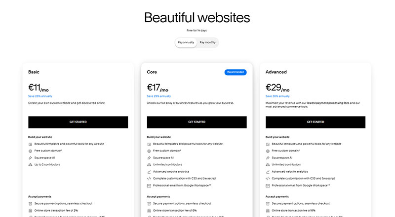
Squarespace’s table is the most design-forward of the three. The visual difference between plans communicates hierarchy before the user reads a word.
The feature rows focus on ecommerce-specific items: transaction fee percentages, abandoned cart recovery, gift card support, and advanced discounting. Squarespace knows its buyer is a small business owner who wants to understand what they are paying for, not a developer evaluating an API.
Subscription box pricing tables
Subscription box brands use a quantity-based table format instead of a tier-based one. The columns are not Free/Pro/Enterprise. They are 1 box, 3 boxes, and 6 boxes.
The price per box drops as quantity increases. The table makes this visible at a glance. Users see the saving without calculating it themselves.
This format works for any business where volume commitment is the primary variable: meal kit subscriptions, beauty boxes, and supplement brands all use it. The comparison table structure maps directly onto “how much do I want to commit?”
What Are Good Pricing Table Examples for Agencies and Service Businesses?
Agency and service pricing tables face a different challenge than SaaS tables. The product is not software. It is time, output, and expertise. Quantifying that in a column layout requires a different approach to feature rows.
Package-based tables
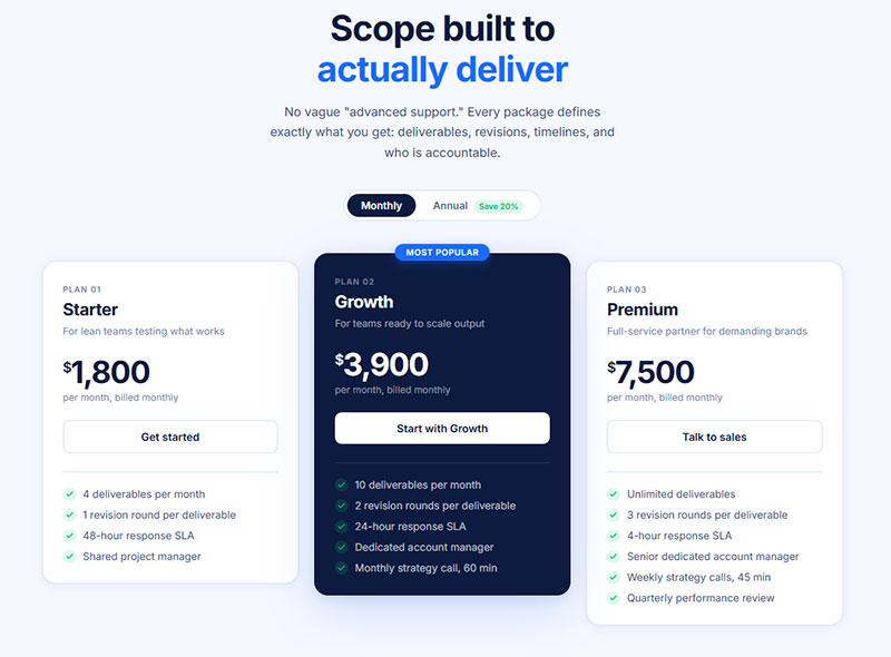
Most agencies structure tables around 3 packages: Starter, Growth, and Premium. Each package defines the scope of work, not just the features included.
Feature rows in an agency table look like this:
- Number of deliverables per month
- Included revision rounds
- Response time SLA
- Dedicated account manager (yes/no)
- Monthly strategy call (yes/no, or frequency)
These are concrete and verifiable. A client knows exactly what “2 revision rounds” means. “Advanced support” means nothing. The same principle applies to business documents, such as a contractor invoices receipt template, where clear deliverables and pricing build trust with clients.
The custom quote column
Most agency tables include a 4th column for custom engagements. The price cell says “Custom” and the CTA button says “Contact us” or “Get a quote.”
This column handles clients whose scope does not fit the 3 predefined packages. Without it, oversized prospects either force themselves into the largest package or leave entirely.
One rule: the custom column needs at least 3 feature rows filled in, even if they say “Everything in Premium, plus…” without specific prices. An empty column signals that the agency has nothing to offer at that tier.
Webflow’s own pricing table as a product demo
Webflow’s pricing page is worth studying separately. Webflow builds websites, and its pricing table is itself built in Webflow, using the same visual tools their customers use.
The table demonstrates product capability at the same time it sells the product. A prospect sees what Webflow can build while deciding whether to pay for it. That is a self-reinforcing loop that most service businesses never think to use.
If you build HTML table designs or custom web components professionally, showing your pricing table as a live example of your work does the same job for your potential clients. Many modern web design experts use their own pricing pages as portfolio pieces because they demonstrate both design quality and UX thinking.
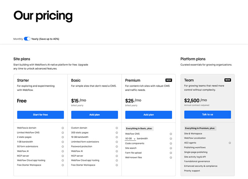
How Do Free vs. Paid Plan Structures Work in Pricing Tables?
The free plan column is one of the most consequential design decisions in a pricing table. Get it wrong and it either cannibalizes paid conversions or drives users away before they see the value of upgrading.
ChartMogul’s SaaS Conversion Report found that a good freemium-to-paid conversion rate sits between 3% and 5%, with top performers reaching 8% to 12% (ChartMogul, 2024). That means the average freemium product retains 95% of its free users as free users permanently.
Freemium model: free plan as the first column
The freemium table places the free tier as the leftmost column. Feature rows show what is included at zero cost, with clear markers for what is gated behind paid plans.
The free column should do 2 things simultaneously:
- Give users enough value to stay engaged and build a habit
- Show visible gaps that create a reason to upgrade
Canva does this well. Free users access thousands of templates but hit a lock icon on premium ones constantly. The frequency of that friction is calibrated carefully. Canva converts around 6% of free users, above the industry average, largely because premium features appear inside the free experience rather than being hidden behind a paywall (Pathmonk, 2024).
Free trial model: no permanent free column
No free tier in the table. Instead, each paid plan CTA reads “Start free trial” or “Try free for 14 days.”
ChartMogul data shows free trial products convert at 4% to 6% (good) and 10% to 15% (great), outperforming freemium conversion benchmarks at every tier (ChartMogul, 2024).
The tradeoff is volume. Free trials attract fewer sign-ups than freemium because there is no permanent free option. But the users who do sign up are more likely to be evaluating a purchase, not just exploring.
Feature gating in the table
Feature gating is how a free column creates upgrade pressure without removing value entirely.
3 common gating patterns:
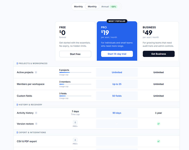
- Usage cap: Free plan includes 5 projects. Pro includes unlimited.
- Time cap: Free history goes back 7 days. Business goes back 90 days.
- Feature lock: Export, API access, or advanced analytics only available on paid plans.
The best feature gating hits users at the moment of highest engagement, not upfront. Notion’s page history limit only matters once you need to recover an older version. That moment of friction, arriving when the user already sees the product as valuable, converts better than a wall of locked icons shown before first use.
For teams building these tables with custom data structures, converting JSON to an HTML table gives a clean way to manage feature rows dynamically across tiers without hardcoding every cell.
How Does Monthly vs. Annual Billing Toggle Work in Pricing Tables?
See the Pen
Pricing Table with Monthly / Annual Billing Toggle by Bogdan Sandu (@bogdansandu)
on CodePen.
The billing toggle is a JavaScript switch that swaps displayed prices between monthly and annual billing cycles without reloading the page.
Most teams treat it as a minor UI detail. It is not. Which state the toggle defaults to directly determines what price a visitor sees first, and first prices anchor every comparison that follows.
Toggle mechanics and default state
Annual-first is the winning default.
High-converting toggle designs set annual billing as the default selected state, not monthly. Annual pricing shows a lower effective monthly cost, which anchors the visitor to a more favorable number from the moment they land (Broworks, 2024).
A 2024 pricing test found that defaulting to annual billing increases annual plan adoption by 19% compared to defaulting to monthly (InfluenceFlow, 2024).
Calendly, HubSpot, and Notion all default to annual. Monthly is available but requires the user to actively switch away from the better deal.
How to display the annual discount
Framing matters more than percentage size.
An Athenic experiment from 2024 found that framing a 20% annual discount as “2 months free” instead of “20% off” produced a 342% increase in annual plan signups (Artisan Growth Strategies, 2024).
The discount label should sit directly adjacent to the toggle, not in fine print below the price columns. Users who miss it feel misled when their first billing cycle arrives.
The UX risk most teams ignore
A toggle that defaults to monthly creates a specific problem: visitors see a higher price, calculate their annual cost mentally, and often leave before realizing a cheaper annual option exists.
The fix is not hiding monthly pricing. It is making the annual saving obvious at a glance.
- Show the savings percentage next to the toggle label
- Strike through the monthly price when annual is active
- Display “Billed annually” in small text below the per-month figure
Figma’s billing toggle confusion is a documented real-world example. A user forum post from 2023 showed a prospect who nearly abandoned the upgrade flow because the displayed savings percentages (40% in one place, 20% in another) did not align clearly. That kind of ambiguity directly costs conversions.
What Design Patterns Do High-Converting Pricing Tables Use?
Design decisions on a pricing table are not aesthetic choices. They are conversion decisions. Each visual element either reduces friction or adds it.
Well-optimized SaaS pricing pages convert at 8% to 12%, compared to the 3.8% industry median (DesignRevision, 2024). The gap between median and top-performer performance comes largely from the design patterns covered below.
How to highlight a recommended plan
3 techniques work reliably:
- Filled background color on the recommended column (while others stay white or gray)
- A “Most Popular” or “Recommended” badge at the top of the column
- A colored or elevated border that visually lifts the column above its neighbors
Center-stage positioning on a 3-tier layout increases selection of the middle option by 38% (DesignRevision, 2024).
One rule: do not use color alone as the only differentiator. Users with color vision deficiencies rely on shape, size, and label differences. A badge combined with a border handles both groups.
CTA button design in pricing tables
Each tier needs a distinct CTA. Not the same button with different colors. Genuinely different copy that matches the expected action at each plan level.
| Plan type | CTA copy that works | CTA copy to avoid |
|---|---|---|
| Free plan | “Get started for free” | “Sign up” |
| Mid-tier paid | “Start your free trial” | “Buy now” |
| Top paid plan | “Start with Pro” | “Sign up” |
| Enterprise | “Talk to sales” | “Contact us” |
HubSpot’s 2024 pricing page analysis found that pages leading with outcomes convert 34% better than pages leading with features (InfluenceFlow, 2024). CTA copy is the final point where outcome framing either lands or fails.
Typography hierarchy in plan comparison
The price number should be the largest text on the card. Not the plan name. Not the feature list header.
Users scan pricing tables in a Z-pattern: top-left to top-right, then diagonally down. Plan name and price sit in the top zone. Feature rows sit below. CTA button anchors the bottom.
Type scale that works: plan name at 14-16px, price at 36-48px, billing cycle label at 12px, feature list at 14px. Any deviation from this hierarchy makes the user work harder to extract the one number they came to find.
Whitespace and density tradeoffs
Dense feature rows signal comprehensiveness. Too much density signals complexity.
Airbnb’s pricing card design keeps each tier to 5-7 feature bullet points maximum. Additional features are revealed via a “Show more” toggle. The initial view stays clean while the full feature set remains accessible.
For tables that need to display many rows without sacrificing scannability, an HTML table with a fixed header and scrollable body keeps plan names and prices visible as users scroll through the feature list below.
What Are Common Pricing Table Mistakes?
Most pricing table mistakes are not design problems. They are information architecture problems disguised as design problems.
Columbia University research found that excessive choices reduce purchase likelihood by up to 40%. The biggest SaaS companies average 3.5 pricing packages on their pricing pages, not 6 or 8 (Cobloom).
Too many tiers
Anything above 4 tiers creates decision fatigue. Artisan Growth Strategies documented a real case where adding a 4th tier caused Professional plan signups to drop by 56% and average revenue per signup to fall by 6% (2024). The new tier cannibalized the higher-value plan and created paralysis.
If you need pricing granularity beyond 4 tiers, use add-ons rather than additional columns.
Vague feature row names
“Advanced tools” tells a user nothing. “Unlimited API calls” tells them exactly what they get.
Every feature row should pass this test: can a user who has never seen your product understand what this feature does in 4 seconds? If no, rewrite the label.
HubSpot’s pricing table names features after outcomes (“Remove HubSpot branding,” “Custom reporting dashboards”) rather than product categories. Users know immediately what changes when they upgrade.
Missing social proof near the table
A pricing table without surrounding social proof asks users to trust pricing before they trust the product.
Review counts, customer logos, or a short testimonial placed directly above or below the pricing columns reduce the perceived risk of committing. Trust signals placed near CTAs lift conversions by 10% to 20% (DesignRevision, 2024).
No clear differentiation between adjacent plans
When the Pro plan and the Business plan look nearly identical in their feature rows, users pick the cheaper one. Always.
Each tier needs at least 2 to 3 features that are meaningfully different from the tier below it, not just higher limits on the same features. “5 users” vs “25 users” is a quantity difference. “Team collaboration features” added to a plan is a capability difference. Capability differences convert better.
For teams displaying examples of data tables or complex feature comparisons, consistent column alignment and clear checkmark vs. X iconography prevent the visual confusion that causes users to default to the cheapest option.
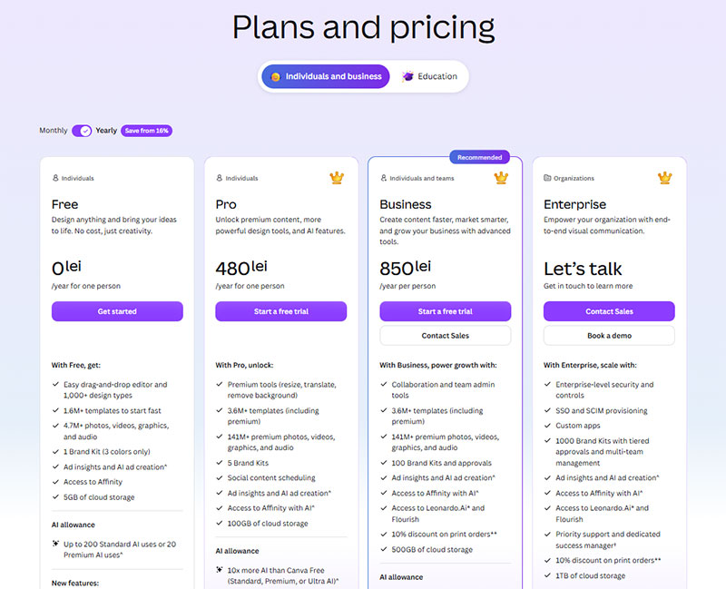
How Do Pricing Tables Handle Enterprise or Custom Pricing?
Enterprise pricing columns present a specific challenge: the product is the same as lower tiers, but the deal terms, support level, and integration requirements vary too much for a fixed price.
A 2024 B2B pricing analysis found that clear enterprise CTAs increase demo requests by 34% (InfluenceFlow, 2024). The column needs to exist and be prominent. Hiding enterprise pricing in a footer link is not a strategy.
The “Contact Sales” column structure
The enterprise column follows a predictable and effective format.
- Price cell: “Custom” or “Let’s talk” with no dollar amount
- Feature rows: “Everything in Business, plus…” followed by 3 to 5 enterprise-specific items
- CTA button: “Talk to sales” or “Request a demo,” not “Buy now”
- Supporting text: SLA guarantees, security certifications, dedicated support
An empty enterprise column, with price cells left blank and no feature rows filled in, signals that the company has not thought through its enterprise offering. That is worse than not having the column.
How Salesforce, HubSpot, and Zendesk handle enterprise columns
Salesforce shows starting prices for most plans but replaces the enterprise price with a “Contact us” CTA backed by a short list of enterprise-specific features: unlimited customization, dedicated implementation support, and enhanced security controls.
HubSpot takes a different approach. The Enterprise column shows a price anchor (“Starting at $800/month”) alongside a “Get a demo” CTA. The price anchor qualifies leads before the sales conversation begins.
Zendesk hides the enterprise price entirely but populates the feature rows completely. Users know exactly what they get even without a price number. This reduces the “I don’t even know if I can afford this” abandonment that empty columns cause.
Price anchoring vs. full opacity
Price anchor visible: “Starting at $X/month” qualifies prospects before they contact sales. Leads who reach the sales team already know the floor price. Shorter qualification calls, fewer wasted conversations.
Full opacity: No price shown. Generates more demo requests from a wider range of prospect sizes. Sales team qualifies on the call. More volume, more filtering required.
Neither approach is universally better. HubSpot tests both regularly. The right choice depends on average deal size and whether your sales team has capacity to qualify unfiltered inbound volume.
How Are Pricing Tables Built Technically?
Most modern pricing tables are not built with HTML <table> elements. They are CSS flexbox or grid card layouts styled to look like a table.
The distinction matters. A card layout gives more control over responsive behavior on mobile. A traditional HTML table structure is semantically cleaner for screen readers but requires more CSS work to stack properly on small screens.
CSS and HTML pricing table structure
Card-based layouts use a flex container with 3 to 4 child divs, one per plan. Each card contains the plan name, price, feature list as a <ul>, and a CTA button.
Key CSS decisions:
- Set
flex-wrap: wrapso cards stack vertically on mobile without a media query override - Use
align-items: stretchto keep all cards the same height regardless of feature list length - Apply
borderorbox-shadowto the recommended plan card only, not all cards
Teams working with HTML table design principles should note that pricing cards inherit the same readability rules as data tables: consistent row alignment, adequate cell padding, and clear visual separation between columns.
The table background color of the highlighted plan column is one of the highest-leverage visual decisions in the entire layout. One filled background cell changes the perceived weight of the entire column without adding a single word of copy.
Stripe’s embeddable pricing table component
Stripe offers a no-code pricing table that embeds directly into any HTML page via a <script> tag and a <stripe-pricing-table> web component.
What it handles automatically:
- Syncs with your Stripe product and price catalog in real time
- Supports flat-rate, per-seat, tiered, and free trial pricing models
- Connects directly to Stripe Checkout for purchase completion
- Updates visually from the Stripe Dashboard without touching code
The limitation is styling control. Stripe’s component supports color and font customization but does not expose full CSS overrides. For teams that need precise design control or want the pricing table to blend with the design of the rest of the website, a custom-built card layout is the better choice. Stripe’s component is best for fast deployment or teams without a dedicated front-end developer.
WordPress users can pair the Stripe component with a WordPress table generator for data-heavy feature comparison rows that sit below the embedded pricing cards.
Webflow, Framer, and Elementor pricing components
All 3 platforms offer built-in pricing table components. They differ in one important way.
| Platform | Pricing component type | Custom billing toggle |
|---|---|---|
| Webflow | Custom-built with Webflow CMS or Interactions | Yes, via Interactions |
| Framer | Pre-built component from Framer Market | Yes, built-in |
| Elementor | Pricing Table widget (Pro plan required) | No native toggle |
Webflow’s approach gives the most design flexibility. Framer’s pre-built components are the fastest to deploy. Elementor covers the basics but requires a third-party plugin for monthly/annual toggle functionality.
Accessibility considerations for pricing tables
A 2024 scan of nearly 2 million web pages found that only 3% of the web is considered accessible, with an average of 37 WCAG failures per page (Parallelhq, 2024).
Pricing tables have 3 specific accessibility requirements that most implementations miss.
- Screen reader compatibility: feature row checkmarks need
aria-label="included"oraria-label="not included", not just visual icons - Keyboard navigation: the billing toggle and CTA buttons must be reachable and activatable via keyboard alone
- Color contrast: plan name text, price numbers, and feature list text all require a minimum 4.5:1 contrast ratio against their backgrounds (WCAG 2.2 Level AA)
For teams building tables that need to meet WCAG standards, the principles that govern accessible tables apply directly to pricing table HTML structure, particularly the use of scope attributes on header cells and proper role attributes on interactive elements.
How Do You Test and Optimize a Pricing Table?
Structured A/B testing programs lift conversions by an average of 18% within 6 months (HubSpot, 2024). For a pricing table that handles the highest-intent traffic on your site, that number is not a ceiling. It is a starting point.
What to A/B test on a pricing table
Highest-impact variables, ranked:
- Billing toggle default (monthly vs. annual): directly affects perceived price and annual plan adoption
- Recommended plan selection: which plan gets the badge changes revenue per visitor, not just conversion rate
- CTA button copy: “Start free trial” vs. “Get started” produces measurable differences even when the underlying action is identical
- Feature row count: 5 rows vs. 10 rows per column affects perceived complexity
- Plan order: ascending price (cheapest left) vs. descending price (most expensive left) anchors differently
Businesses running 10 or more tests per month grow revenue 2.1x faster than those running fewer than 2 (Optimizely, 2023). Most SaaS teams run fewer than 2.
Heatmap and session recording analysis
Hotjar and Microsoft Clarity both provide the behavioral data needed to diagnose pricing table problems before running an A/B test.
Scroll maps show where users stop reading. If fewer than 60% of visitors reach your CTA buttons, the table is too long or the information architecture is wrong.
Click maps show which plan columns get the most interaction. A column with 80% of clicks but low checkout completion signals a pricing or feature mismatch, not a design problem.
Session recordings show real decision moments. Watch sessions from users who visited the pricing page, did not convert, and left. Where did they pause? Which column did they hover on longest before leaving?
Conversion rate benchmarks to target
Context matters here.
| Pricing table type | Good CVR | Great CVR |
|---|---|---|
| SaaS with free trial | 4-6% | 10-15% |
| SaaS freemium to paid | 3-5% | 8-12% |
| Ecommerce plan comparison | 2-4% | 5-8% |
| Agency service packages | 1-3% | 4-6% |
B2B SaaS sits at the bottom of conversion rate benchmarks across all industries, at around 1.1% to 1.2% for visitor-to-customer (Electroiq, 2024). Pricing page CVR is a separate metric and runs higher because this traffic has already self-selected as interested.
Testing annual vs. monthly as the toggle default
This is the single highest-leverage test on most pricing tables. It costs nothing to implement and affects every visitor.
The test is straightforward: run 50% of visitors to annual-default toggle, 50% to monthly-default. Measure annual plan adoption rate, total revenue per visitor, and checkout abandonment rate across both groups.
Most teams that run this test do not run it back. Annual default wins and stays. The median landing page conversion rate sits around 6.6% across 41,000 pages (Unbounce, 2024). Pricing pages with optimized billing defaults consistently beat that number.
For teams managing large data-driven tables as part of their optimization workflow, JavaScript sorting tables and filtering tables with JavaScript add interactivity that helps users find the plan features most relevant to them, reducing the cognitive load that kills conversions before the user reaches the CTA.
FAQ on Pricing Tables
What is a pricing table?
A pricing table is a UI component that displays subscription tiers or service packages side by side. It shows plan names, prices, feature lists, and CTA buttons so visitors can compare options and make a purchase decision without leaving the page.
How many pricing tiers should a table show?
Three tiers is the proven standard. Research shows the biggest SaaS companies average 3.5 packages. More than 4 tiers creates decision paralysis and reduces conversions. Use add-ons for extra granularity instead of adding columns.
What makes a pricing table convert well?
A highlighted recommended plan, specific CTA copy per tier, plain feature language, and a visible annual discount. Mobile responsiveness matters too. Tables that break on small screens lose buyers before they reach the CTA button.
Should I show enterprise pricing or hide it?
Show a price anchor if possible. “Starting at $X/month” qualifies leads before the sales call. A 2024 B2B analysis found clear enterprise CTAs increase demo requests by 34%. Hiding pricing entirely generates more volume but lower-quality leads.
What is a billing toggle in a pricing table?
A billing toggle is a JavaScript switch that swaps displayed prices between monthly and annual cycles. Defaulting to annual shows a lower per-month cost and increases annual plan adoption. Annual-default toggles outperform monthly-default by roughly 19% in plan adoption.
How do freemium pricing tables differ from free trial tables?
Freemium tables include a permanent free column with visible feature limitations. Free trial tables replace the free column with a “Try free for 14 days” CTA on paid plans. Trial models convert at 4% to 15%. Freemium models convert at 3% to 12%.
What is the best way to build a pricing table in HTML?
Use CSS flexbox card layouts rather than native <table> elements for better responsive control. Each card holds plan name, price, a feature <ul>, and a CTA button. Apply box-shadow or border only to the recommended plan card.
Can I embed a Stripe pricing table on my website?
Yes. Stripe provides a no-code embeddable component via a <stripe-pricing-table> web element. It syncs with your Stripe product catalog, supports flat-rate, per-seat, and tiered models, and connects directly to Stripe Checkout. No custom code required.
How do I test and optimize a pricing table?
A/B test the billing toggle default, recommended plan selection, and CTA copy first. Use Hotjar scroll maps to find where users drop off. Use session recordings to watch real decision moments. Structured testing programs lift conversions by an average of 18% within 6 months.
What are the most common pricing table mistakes?
Too many tiers, vague feature row names, no social proof near the table, and identical-looking adjacent plans. Feature row overload is the most common. More than 20 rows per column makes comparison impossible and pushes users toward the cheapest option by default.
Conclusion
This conclusion is for an article presenting pricing table examples across SaaS, ecommerce, agency, and service-based products.
A well-built subscription tier layout does one job: turn high-intent visitors into paying customers with as little friction as possible.
Get the plan comparison structure right. Use specific feature row names, not vague labels. Default your billing toggle to annual. Highlight one recommended plan clearly.
Test the CTA button copy, the tier count, and the social proof placement. Use Hotjar scroll maps and session recordings to find where users drop off before they convert.
Pricing page conversion is not a one-time design decision. It is an ongoing process. The teams that treat it that way are the ones hitting 8% to 12% conversion rates while the industry median sits at 3.8%.