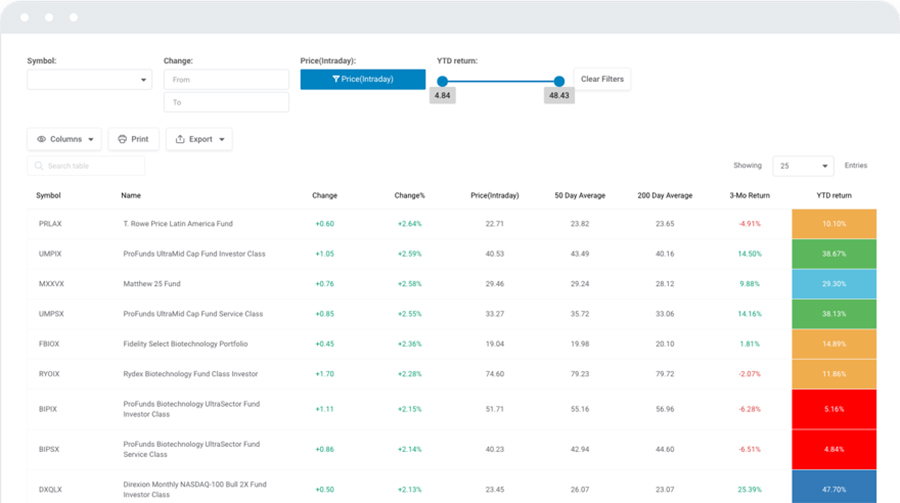
Ever felt like your data deserves more than just plain text? You’re not alone. In today’s digital age, presenting data effectively on your WordPress site can make or break the user experience. Embedding statistical tables, visualizing key figures, and ensuring responsive design is crucial for data accuracy and user engagement.
Here, I’ll walk you through how to create statistical tables in WordPress using tools like wpDataTables, making data presentation straightforward and visually appealing. By harnessing the power of these plugins, you can transform raw data into interactive tables, boosting not only your site’s aesthetics but also its SEO performance.
By the end of this guide, you’ll grasp how to seamlessly integrate charts, utilize custom CSS, and insert responsive data tables. We’ll explore importing/exporting data using formats like CSV and JSON, and touch on enhancing your tables with custom HTML and shortcodes.
Table of Contents
How to create a statistical table
If you need to create a table from scratch we recommend creating a table manually. This is one of the most common uses of wpDataTables: to create tables, and fill them with data taken from the WordPress admin panel, without accessing or having any pre-existing data source available (Excel, CSV, Google Spreadsheet, JSON, XML, MySQL DB, etc.).
If, however, you want to create a table from a certain data source, these guides might help you to get started with wpDataTables:
- How to create a MySQL based table with wpDataTables
- Creating Tables in WordPress from Google Spreadsheets
- Creating Tables in WordPress from Excel
- How to create a table from CSV data
- Creating tables in WordPress from JSON input
- How to create tables in WordPress with XML input
- Creating Tables in WordPress based on serialized PHP arrays
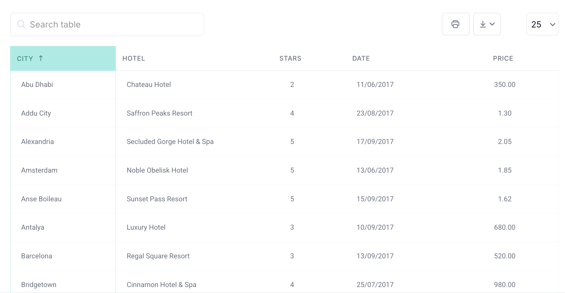
Now let’s move forward and say you have a lot of columns on the statistical table that you want to present on your website. Obviously, this will make it look a bit crowded. One solution that you can use is to hide some columns so that it looks good on the page.
For that, you can use the Master-detail tables, an add-on that allows you to show hidden columns with one click so that it will improve your page’s user experience.
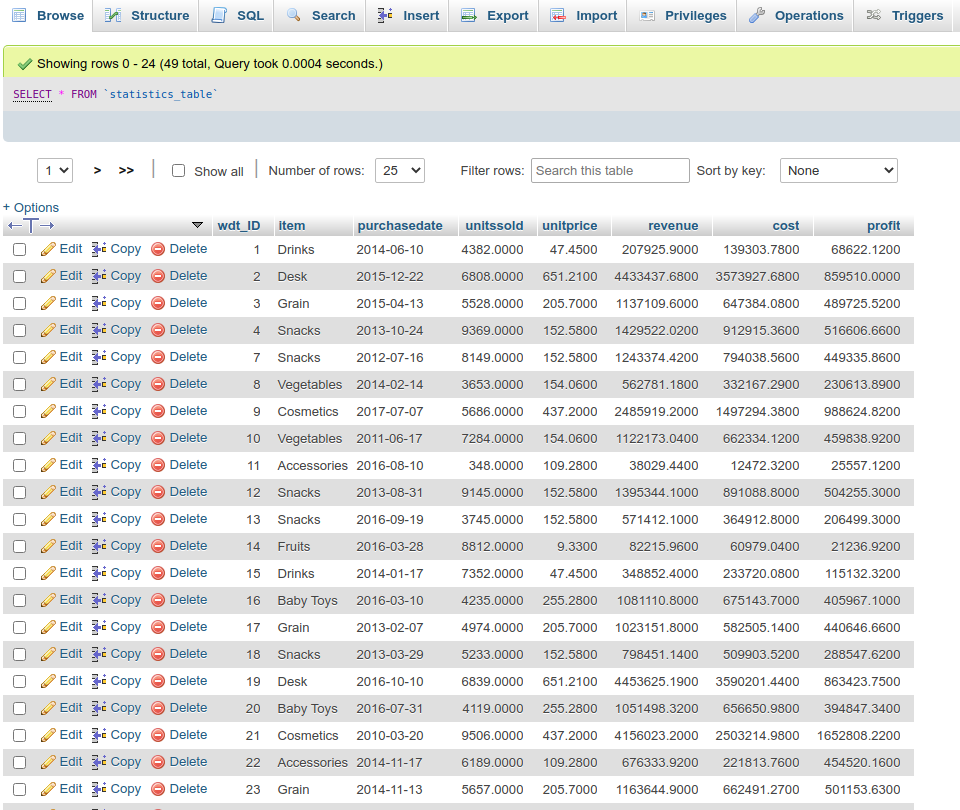
In the example that we’ll show you, we’ll create a statistical table from the data that we have in a MySQL database table. We’re going to check our table beforehand in phpMyAdmin and it looks like this:
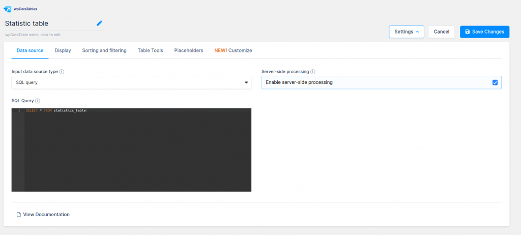
Now, in wpDataTables, we’ll use the second option of the table wizard (Create a data table linked to an existing data source) and we’ll choose “SQL query” as the data source.
In the SQL editor, we’ll insert a query to show all the columns from this table:
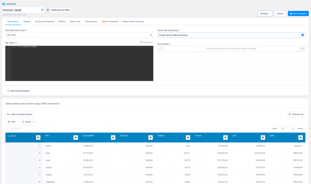
SELECT * FROM statistics_table
Then, we’ll click on the “Save Changes” button and the table is created.
You have detailed instructions about this process in our docs for Creating MySQL-based wpDataTables.
As a side note, if you don’t have access to your database through phpMyAdmin or something similar, or you’re just not familiar with creating queries, you can use the wpDataTables built-in WPDB query constructor.
It has a graphical user interface that allows you to pick tables and columns that you need and generates a query and a preview. You can modify the query as needed, and create a wpDataTable based on the modified query.
You can find in our docs detailed instructions on this: Create a MySQL-query-based table by querying a database.
Alright, let’s move forward with the guidelines for creating statistical tables.
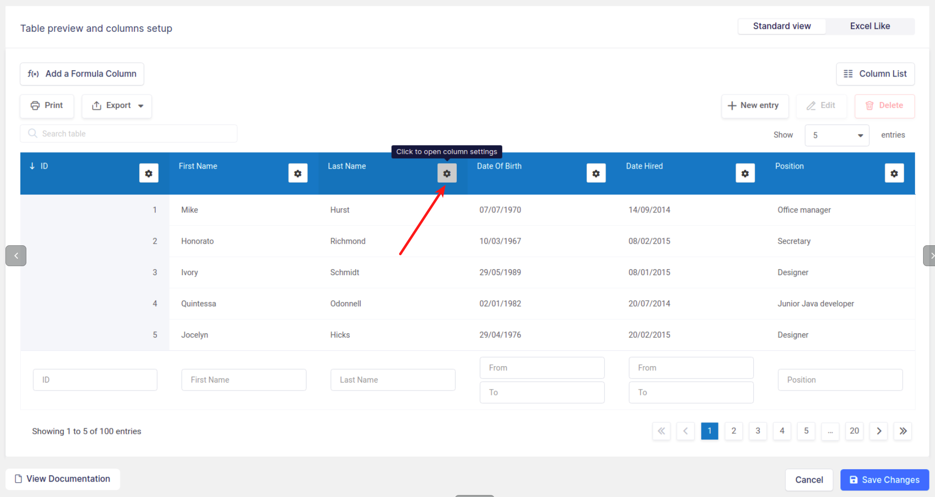
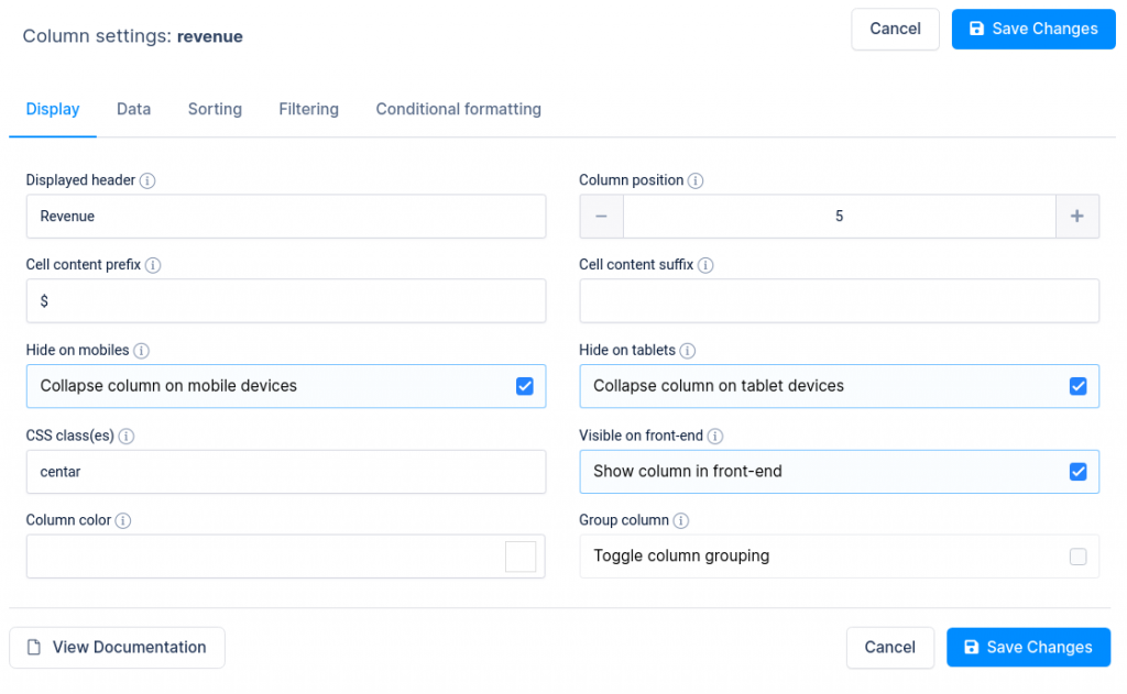
Now we’ll need to do some table customization like hiding the column wdt_ID, turning on the responsiveness option, and setting all columns to be hidden on Mobile and Tablet devices, except the Item and the Profit column.
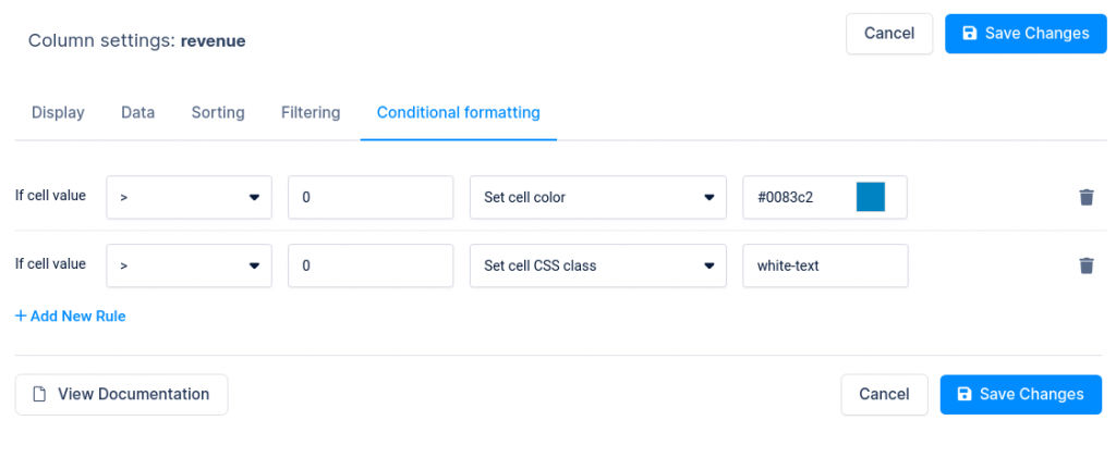
For the Revenue, Cost, and Profit columns, you can use some cell color customization with conditional formatting.
For the Revenue column we’ll set two conditions:
1) if the cell values are higher than zero then Set cell color to #0083c2
2) if the cell values are higher than zero then Set cell CSS class to white-text.
Then we’ll create those classes on the “Custom CSS” field on the “Customize” tab in table settings like this:
.wpdt-c .wpDataTablesWrapper .wpDataTable-1 td.white-text{ color: #FFFFFF !important;}
Where number 1 in .wpDataTable-1 is the ID of your table so you will need to change it for your table.
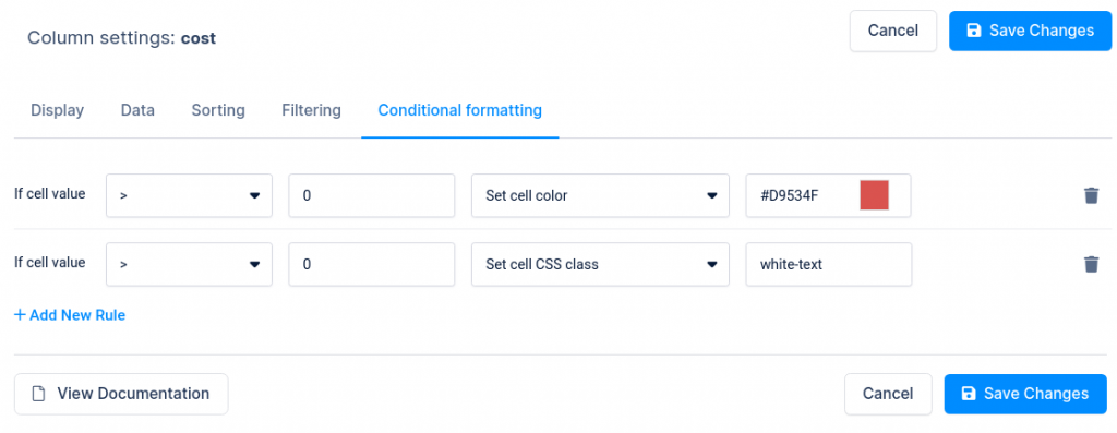
We do the same for the Cost column except we’ll set the color in the condition value to red (#D9534F)
And also for the Profit column, except for the fact that we’ll set the color in condition value to green (#5CB85C)
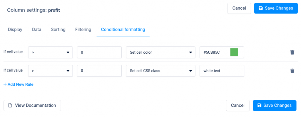
In all three columns (Revenue, Cost, and Profit) the cell prefix that we have is set to currency $ with the option “Cell content prefix” on the Display tab in the Columns settings for each column.
If you’d like to know more about this, check out our docs about currency, percentage, and other columns.
And that’s it!
Yep, it’s that easy.
The table is ready for publishing on your post or pages. Now what you need to do is for it to show up on your pages in the front-end. As with any other plugin, we use shortcodes for showing tables on users’ pages or posts.
Adding shortcodes is easy, especially if you are using popular page builders like Elementor, WP Bakery, or Gutenberg.
By the way, if you need more features for your statistical tables, you can check the following guides that will help:
- Calculating totals, minimum, maximum, and average values in WordPress Tables
- Create Formula (calculated) columns
- More table customization
- Setting Advanced filtering
You can customize your statistical tables easily with wpDataTables.
How to create a statistics chart
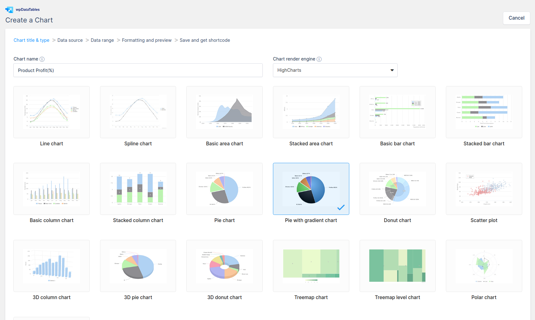
Alright, now what we need to do is to show the data that we have as diagrams.
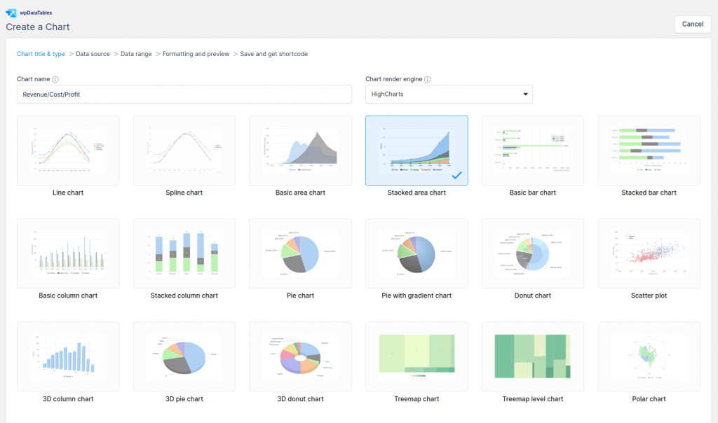
We’re going to create a pie chart. For this one, we’ll use the Highcharts library. There are also two other options, depending on your preferences: Google Charts and Chartjs.
After doing a simple chart setup, you’ll end up with beautiful charts from your statistical data.
You’ll see that when you do this, wpDataTables will show a list of possible chart types, the list depending on the chart engine that you’re using.
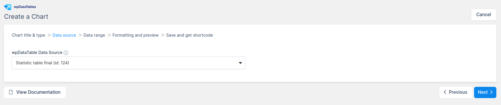
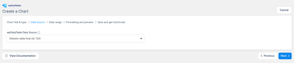
When we reach the “Data source” step, we have to define the statistical table that we already created to be used as the data source for this chart.
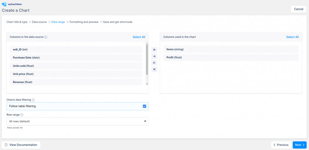
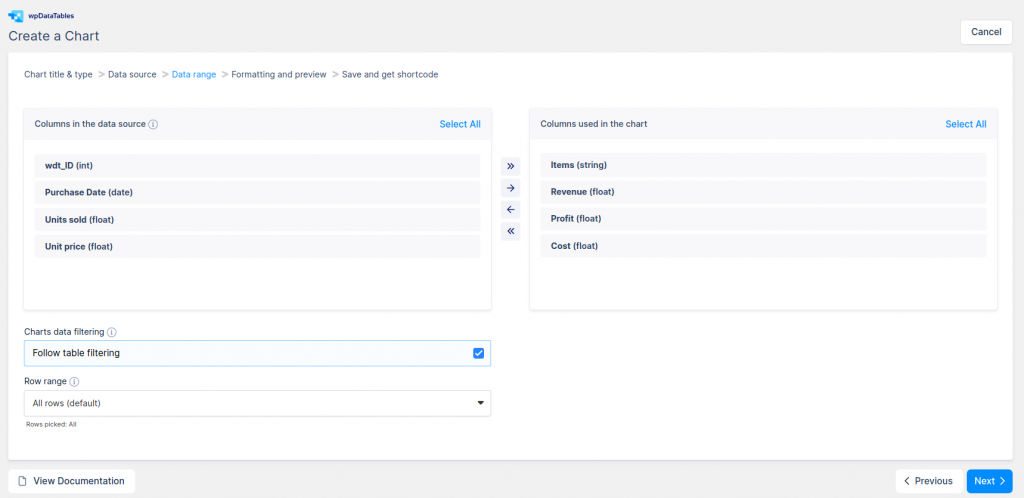
Now that we’re on the “Data range” step, we will need to provide the data range for the chart.
To do that, we’ll simply drag and drop the columns that we need or just use the arrow buttons. We chose the Items and Revenue columns. In this step, we also set the Follow table filtering option so that we’ll have dynamic charts after table sorting and filtering.
A thing to be aware of is that in wpDataCharts you can only use one string type column(string, date, email) while all others have to be integers or floats.
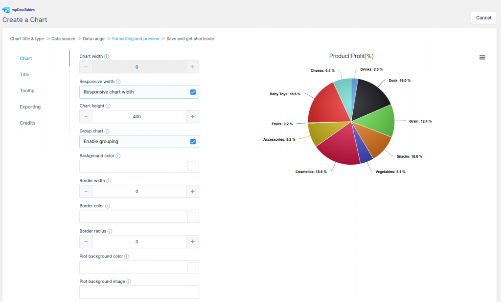
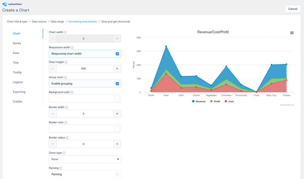
The next step that we need to take is the “Formatting and preview“ one. Changes that are made are instantly visible on the chart that is rendered on the right side of the screen.
The formatting step is divided into categories representing different chart elements.
Here we can customize the charts as we need. We can set a responsive width, grouping, different customize options for layout, tooltips, export, and more. When we finish, click on the “Save chart” button.
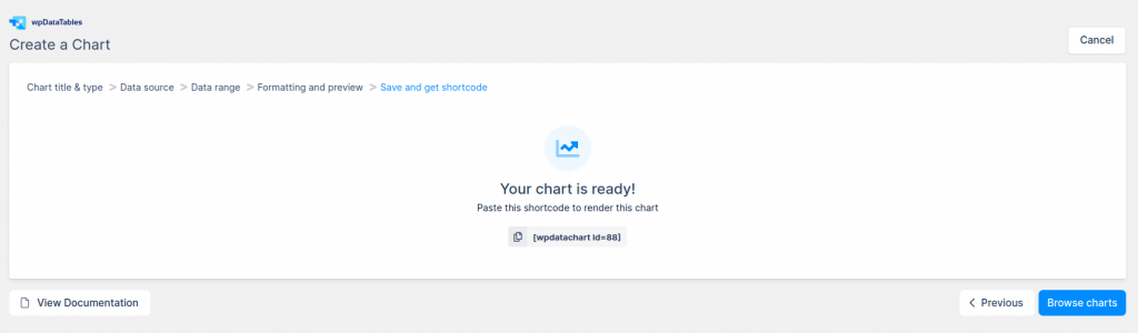
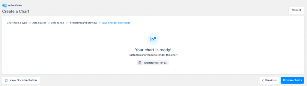
The last step is the “Save and get shortcode” one where your chart is ready. All you need to do is copy that shortcode and insert it on the same page or post where you inserted the statistical table.
We’re going to create a second chart again with the Highchart library. This time, we’ll choose the Stacked area chart type.
On the “Data source” step we define a statistics table the same as for a Pie chart.
On the “Data range” step, we’ll choose the Items, Revenue, Cost and Profit columns.
The “Follow table filtering” option is turned on as well.
On the “Formatting and preview“ step we’ll set options like responsive width, Grouping chart, Colors for series, but you can set it differently for your needs.
On the last step, “Save and get shortcode”, we’ll copy the shortcode the same as for the pie chart and then insert it on the same page where we inserted the Statistic table.
And that’s about it. That’s all there is to statistical tables and the charts that come along with them.
Even though creating statistical tables can be an overwhelming task, creating them with wpDataTables is quite easy, as you’ve seen in this article.
If you’ll follow the steps shown in this article, you’ll end up creating responsive statistical tables and charts on your page or post that are connected. What this means is that when your users filter or sort your tables, the charts will be updated as well.
FAQ on statistical tables
What plugins are best for creating statistical tables in WordPress?
wpDataTables offers robust features for data import, responsive design, and customization with CSS. They integrate well with Google Sheets and Excel, making it easy to import/export data in formats like CSV and JSON.
How can I make my tables responsive?
Enable the responsive design option within your table plugin settings. wpDataTables provides built-in responsiveness. Custom CSS tweaks can further enhance how tables adapt to different screen sizes, ensuring user-friendly data presentation across devices.
Is it possible to import data from Excel?
Absolutely. Most table plugins allow Excel data import. Use plugins like wpDataTables. Simply save your Excel file as CSV, then import it into WordPress via the plugin’s interface. This offers seamless data management and representation.
How do I style tables with custom CSS?
Add custom CSS in your WordPress theme’s customizer or directly within the table plugin’s settings. Use classes like .table, .thead, and .tbody to target and style different parts of the table. This ensures your tables align with the rest of your site’s design.
Can I use shortcodes to insert tables?
Yes, shortcodes are a convenient way to insert tables. Plugins like wpDataTables provide unique shortcodes for each table. Simply copy the shortcode and paste it into your WordPress post or page editor. This method is efficient for embedding tables without hassle.
How do I create interactive tables?
Enhance interactivity using plugins like Ninja Tables. Enable features like sorting, filtering, and pagination. Use JavaScript options within the plugin for advanced interactivity. Interactive tables provide better user engagement and make data more accessible and manageable.
Are there Gutenberg-compatible table options?
Yes, many plugins are Gutenberg-compatible. Plugins like TablePress have blocks specifically for Gutenberg. This allows you to easily add and manage tables directly within the block editor, making the process intuitive and streamlined for modern content creation.
How do I manage large datasets?
Plugins like wpDataTables excel in handling large datasets. Use pagination to break data into manageable chunks. Employ efficient data management practices like indexing and optimizing your database to ensure quick loading times and a seamless user experience.
What are my options for visualizing data besides tables?
Besides tables, consider using charts and graphs for data visualization. Plugins like wpDataTables allow integration with visualization libraries like Chart.js. This provides a dynamic way to present data, making complex information more digestible for your audience.
Can I integrate my tables with web analytics?
Yes, integrating tables with web analytics like Google Analytics is possible. Use plugins and tools to track interactions with your tables. This data can inform site improvements, tailored content strategies, and better performance tracking to meet your user needs.
Conclusion
Mastering how to create statistical tables in WordPress can seamlessly transform your site’s user experience. Using powerful plugins like TablePress, Ninja Tables, and WP Table Manager, you can effortlessly embed responsive, interactive tables full of data visualization charm.
Why it matters:
- Enhanced Data Representation: Convey complex statistics clearly.
- User Engagement: Interactive tables attract and retain attention.
- SEO Optimization: Rich content improves search engine rankings.
By leveraging shortcodes, custom CSS, and even HTML tables, your data presentation becomes both elegant and functional. Import data from Excel, integrate Google Sheets, and achieve seamless data management.
Incorporating structured data and ensuring responsive design, aligns with how modern users consume content. Gutenberg compatibility makes the creation process intuitive, while tracker integration like Google Analytics fine-tunes your strategy.
Follow these steps, and you’ll elevate your WordPress site, providing a professional display of your statistical information. Robust, user-friendly, and optimized, your tables will be nothing short of impressive.
If you liked this article about statistical tables, you should check out this article about how to publish an Excel spreadsheet on the web.
There are also similar articles discussing examples of data tables, how to make a data table, pricing table examples, and weather tables.
And let’s not forget about articles on comparison tables, product comparisons, table UI design, and WordPress Excel spreadsheet plugin.