Imagine a world drenched in numbers. Everywhere you turn, data sings the story of our lives, trickling like a stream or cascading with the furious might of a waterfall. But not all numbers narrate the same tale. Welcome to the realm where discrete vs continuous data tango, crafting the rhythm of understanding that underpins our universe.
In the next few scrolls, embark on a journey through the mosaic of data sets, where the categorical beats of discrete data waltz with the infinite twirls of continuous data.
We’ll unearth the secrets hidden within histograms and probability distributions, pulling back the curtain on the interplay of countable and uncountable treasures.
You won’t just absorb it; you’ll grasp it, wield it. By the finale, clarity will be your newfound companion in the realms of quantitative data and statistical analysis. Now, let’s unravel these numerical mysteries together.
Table of Contents
- Understanding Discrete Data
- Exploring Continuous Data
- Comparing Discrete and Continuous Data
- Practical Applications in Business
- Data Visualization Techniques
- Significance of Data Types in Organizational Context
- Choosing Between Discrete and Continuous Data
Table of Contents
Understanding Discrete Data
What is Discrete Data
Imagine you’re counting something – like the number of coffees you’ve chugged today (hopefully not too many!). Discrete data is like that. It’s the kind of data you can count on your fingers. You can’t have half a coffee, right?
Well, technically you can, but let’s not get into that! Discrete data is all about whole, countable numbers. Stuff like the number of people in a room, or how many likes your latest Instagram post got.
Characteristics of Discrete Data
Now, when we chat about the characteristics of discrete data, think countability and having a finite number of values. It’s like having a bag of M&Ms; you can count each M&M, and there’s only so many in the bag.
This is super different from measuring things like temperature or time, where the values can slide up and down a continuous scale.
When we talk about discrete vs continuous data, it’s like comparing apples and oranges – both fruits, but totally different. Discrete data is chunky and distinct. It’s integers.
Whole numbers, no fractions or decimals. We’re talking about things like the number of employees in a company or how many products you sold last month.
Countability and Finite Values
Alright, let’s break this down a bit more. Discrete data is all about things you can count. Plain and simple.
No breaking things into smaller parts. It’s a bit like the episodes in your favorite Netflix series – you can count each one, and there’s a limited number of them.
In the grand scheme of discrete vs continuous data, discrete is the straightforward, no-nonsense cousin.
It’s data that you can list out, like the number of apps on your phone or the types of donuts at your local bakery. You can also group this stuff into categories. Like, how many action movies vs. rom-coms you have in your DVD collection.
Examples of Discrete Data
Number of Employees
For instance, consider the number of employees in a business. Each employee is a distinct unit, countable and clear – just like the entries in an organizational chart.
Sales and Ticket Sales
Or think about ticket sales for a concert. Each ticket is one discrete unit. This kind of data can be beautifully illustrated in a bar graph, showing the number of tickets sold per day.
Product Reviews and Defects
Product reviews and defects are another example. Each review is a single entity. This type of data can be effectively analyzed using descriptive statistics to understand customer satisfaction levels.
Exploring Continuous Data
Definition of Continuous Data
Okay, so we’ve chatted about discrete data, right? Now, let’s flip the script and talk continuous data. This is the smooth jazz of data – it flows, it slides, it doesn’t stick to whole numbers like discrete data does.
Imagine measuring your morning coffee temperature. You don’t say it’s exactly 70 or 80 degrees; it could be 73.6 or 77.8, right? That’s continuous data for you – it can be any value within a range.
Continuous data is more about the spectrum. Like shades of color on a massive canvas, it’s all about the gradients and the slides from one value to another.
It’s not like discrete vs continuous data is a battle or anything, but they’re definitely different beasts.
Characteristics of Continuous Data
When we dive into the characteristics of continuous data, think about things like weight, height, or time.
You know, measurements that can have super precise values, even down to crazy decimal places.
In the world of discrete vs continuous data, if discrete is like counting apples, continuous is like measuring the smoothness of peanut butter.
It’s all about the flow and range. You’re not limited to whole numbers; you can have fractions, decimals, and even numbers that go on forever after the decimal point.
Measurability and Range of Values
Now, let’s get a bit more into this. Measuring continuous data is like using a super fine ruler that can go down to the tiniest unit you can think of. It’s not just about ‘how many,’ but ‘how much’ or ‘how long.’ The possibilities are endless.
In the grand landscape of discrete vs continuous data, continuous data is the ocean – vast, deep, and flowing. You’re not just looking at drops; you’re looking at waves and currents, measuring every little ripple and wave.
Examples of Continuous Data
Weight and Temperature Measurements
Take weight and temperature measurements, for instance. Your weight isn’t just 60 or 65 kg; it could be 60.53 kg. And the temperature outside isn’t just 20 or 25 degrees; it could be 22.37 degrees. Continuous data lets us get that precise.
Weight and temperature are prime examples, where precision is key, much like the detail needed in scientific data visualization.
Time to Complete Projects
Or, think about the time it takes to complete a project. It’s not just 2 or 3 hours; it might be 2 hours, 34 minutes, and 12 seconds. Continuous data captures all those in-between moments.
Time to complete projects is another aspect where continuous data plays a role, often represented in dynamic data visualizations.
Sales Figures Over Time
And then there’s tracking sales figures over time. It’s a journey, not just stepping stones. You’re looking at trends, patterns, and fluctuations – all part of the flowing river of continuous data.
Comparing Discrete and Continuous Data
Key Differences
So, we’ve talked about discrete data and continuous data, right? Let’s put them side by side and see what’s up. First off, when we’re looking at discrete vs continuous data, think about the nature of their values. Discrete data is like the steps on a staircase – each step is a separate, whole number. You don’t find half-steps in most staircases!
Now, swing over to continuous data. It’s like a ramp – smooth, no distinct steps, just a continuous slope. You can stop at any point, not just at whole numbers.
So, if discrete data is counting apples, continuous data is measuring the smoothness of honey. One is countable and distinct; the other is all about ranges and measurements.
Nature of Values
Discrete data is like a collection of distinct stars in the sky – each one is separate and countable. Continuous data, on the other hand, is like the night sky itself – vast, unbroken, and full of gradients.
Discrete data is about exact figures, represented in things like frequency tables, while continuous data covers ranges, depicted in fluid forms like line graphs.
Types of Data
Now, let’s talk types. Discrete data hangs out with integers – whole numbers, no fractions. Continuous data is more about decimals and fractions. It’s like the difference between counting marbles and measuring water in a jug.
Methods of Representation
Graphical Representations
When you’re showing off this data, your tools matter. For discrete data, bar graphs are your best friend. They’re like digital high-fives – clear, distinct, and to the point.
Switching over to continuous data, histograms are where it’s at. They’re like painting a landscape – it’s all about the flow and the range of values.
Frequency Distribution
Here’s where it gets a bit nerdy. Discrete data uses ungrouped frequency distribution. Think of it like listing all the different types of cookies in your jar – each one gets its own mention.
Continuous data, though, uses grouped frequency distribution. It’s more like categorizing those cookies by flavor or color – you’re grouping similar types together.
Your beautiful data deserves to be online
wpDataTables can make it that way. There’s a good reason why it’s the #1 WordPress plugin for creating responsive tables and charts.
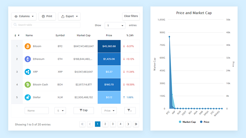
And it’s really easy to do something like this:
- You provide the table data
- Configure and customize it
- Publish it in a post or page
And it’s not just pretty, but also practical. You can make large tables with up to millions of rows, or you can use advanced filters and search, or you can go wild and make it editable.
“Yeah, but I just like Excel too much and there’s nothing like that on websites”. Yeah, there is. You can use conditional formatting like in Excel or Google Sheets.
Did I tell you you can create charts too with your data? And that’s only a small part. There are lots of other features for you.
Practical Applications in Business
Use of Discrete Data in Business
Discrete data helps in areas like tracking primary data in a business setting.
Imagine you’re counting the number of sales you made this week or tracking the number of new followers on your business’s social media.
That’s discrete data in action. It’s concrete, countable stuff. You’re dealing with exact numbers, like the number of products sold or the count of customer reviews.
Tracking and Monitoring Performance
Businesses use discrete data to keep an eye on things. It’s like having a scoreboard. You can see, for example, the number of products with defects or the number of tickets sold for an event. It’s all about those countable, tangible metrics.
Decision-Making Based on Countable Metrics
When it comes to making decisions, discrete data is like your trusty sidekick. You can rely on it to give you the clear facts. Say you’re deciding how many new laptops to order for your office. You’ll look at the exact number of employees – that’s discrete data helping you out.
Use of Continuous Data in Business
Now, let’s switch gears to continuous data. This is where things get a bit more fluid and, dare I say, a bit more exciting. Continuous data is all about the flow and trends.
Think about monitoring the temperature in your office to make sure it’s always comfy. Or tracking the time it takes to complete a project. That’s continuous data weaving its magic.
Analyzing Performance and Identifying Trends
Continuous data is like having a crystal ball. It helps businesses look at performance over time and spot trends. Say you’re tracking your website’s daily traffic.
The number of visitors at any given moment is continuous data, and it helps you see patterns and peaks.
Making Predictions and Strategic Planning
And when it comes to the big picture – like planning for the future – continuous data is your go-to. It’s like looking at a river and predicting where the current will take you.
Businesses use this data to forecast sales, plan budgets, and even decide when to launch new products.
Data Visualization Techniques
Visualizing Discrete Data
For discrete data, techniques like infographics can be highly effective.
Bar Graphs and Frequency Tables
Picture this: You’ve got a bunch of data points, like the number of coffees sold each day at your cafe. A bar graph turns this into a visual feast. Each bar stands tall, representing the sales for each day. It’s clear, it’s sharp, and it tells a story at a glance.
Frequency tables are another cool tool. They’re like organized lists, breaking down how often each value pops up in your data. It’s neat, tidy, and super handy for spotting trends in things like customer feedback scores.
Visualizing Continuous Data
Now, let’s slide over to continuous data. This is the fluid, ever-changing kind of data. It’s about ranges and scales, and it needs a different kind of visual magic.
Histograms and Plotted Points Graphs
Histograms are the go-to here. Imagine you’re measuring the time customers spend in your store. A histogram shows this as a smooth flow, with bars that blend into each other, giving you the full picture of how long people hang around. Customer Success Software can provide real-time updates to these histograms, allowing managers to make informed decisions on the fly. You can even develop your own software by outsourcing that process to nearshore software development companies.
Plotted points graphs, or scatter plots, are another ace up the sleeve. They’re perfect for showing relationships in continuous data. Think of plotting daily temperatures against ice cream sales. Each point on the graph is a day, showing you how the two variables dance together over time.
Significance of Data Types in Organizational Context
Importance of Discrete Data
Diving into the world of data, especially discrete vs continuous data, it’s like exploring two different planets. Let’s start with discrete data.
In an organizational setting, this stuff is gold. It’s the countable, the definite.
Think about tracking the number of customer calls in a call center, understanding call center abbreviations, exploring call center features, or counting the inventory in a warehouse.
Discrete data gives you the hard facts, the exact numbers. It’s like having a map with clear landmarks. You know exactly where you stand.
In this realm, discrete data is crucial for quantifying things. It’s the backbone for making decisions that are based on solid, countable facts.
Need to allocate resources or set targets? Discrete data is your go-to.
Importance of Continuous Data
Now, let’s glide over to continuous data. It’s a whole different vibe. Continuous data is about the flow, the range, the spectrum.
It’s like painting a landscape, while discrete data is like drawing a dot-to-dot picture.
In an organization, continuous data offers a deeper insight. It’s about understanding trends, patterns, and behaviors over a range.
Think about monitoring the performance of your website – the time visitors spend, the pages they browse. It’s not just about how many; it’s about how long, how much.
Continuous data provides the nuances, the subtleties. It’s like having a thermometer instead of a simple hot-or-cold gauge.
It gives you the detailed insights that can drive strategic decisions, like market analysis or financial forecasting.
Comparing Discrete and Continuous Data
In the grand scheme of things, discrete vs continuous data each play a unique role. It’s like having both a hammer and a screwdriver in your toolbox. You need both for different tasks.
In an organization, understanding when to use discrete data and when to rely on continuous data is key. It’s about choosing the right tool for the task at hand.
Whether it’s setting clear targets or understanding subtle trends, each type of data brings its own strengths to the table.
Choosing Between Discrete and Continuous Data
Hey there! So, we’ve been chatting about discrete vs continuous data, right? Now, let’s talk about how you pick between the two. It’s like choosing between sneakers or dress shoes – it all depends on where you’re going and what you’re doing.
Context-Dependent Nature of Data Choice
First things first, context is king. Think about what you’re trying to achieve. If you’re counting things, like the number of people in a meeting, discrete data is your buddy. But if you’re measuring something, like how long the meeting lasts, that’s continuous data territory.
It’s all about fitting the data type to the situation. Like, are you tracking the number of sales (discrete) or analyzing sales trends over time (continuous)? Each type of data brings its own flavor to the table.
Strengths and Weaknesses of Each Data Type
Now, let’s break down the strengths and weaknesses. Discrete data is straightforward. It’s clear-cut, easy to handle. Think about a checklist – it’s simple, right? But, it might not give you the full picture, especially if you’re looking at something that changes smoothly over time.
Continuous data, on the other hand, is like a sliding scale. It’s great for detailed analysis and spotting trends.
But it can get complex, especially when you’re dealing with lots of decimal points and precise measurements.
Suitability Based on Organizational Needs
Choosing between discrete vs continuous data is also about what your organization needs. If you’re running a store, counting inventory (discrete data) is crucial.
But if you’re tracking the temperature of your storage room, that’s continuous data territory.
In some cases, you might even need both. Like, if you’re looking at customer feedback – count the responses (discrete) and analyze the sentiment (continuous). It’s like having a toolbox – sometimes you need a hammer, sometimes a screwdriver, and sometimes both.
FAQ on Discrete vs Continuous Data
What’s the difference between discrete and continuous data?
Discrete data is countable, think whole numbers-only, like the number of apps on your phone.
Continuous data, that’s a smooth sail, allowing for fractions and decimals – like your sleek screen’s brightness level.
Can you give me some examples of discrete data in daily life?
Absolutely. Picture your daily coffee habit. Cups of coffee you down? That’s discrete. Four, five, definitely countable.
Other things? How about the books neatly lined up on your shelf or the sneakers in your closet.
And what about continuous data examples from real life?
Continuous data is more like the temperature on a sunny day or the time it takes for your morning jog. You’re not pinning it down to exact numbers.
It’s like measuring out the perfect length for your tie, or tuning into your favorite podcast’s volume.
How do we choose graphs for discrete and continuous data?
You’ve got your bar graphs for discrete data, making it easy to count instances.
For continuous, it’s the smooth lines of histograms and line graphs that let the values flow, capturing the seamless nature of data like height or weight.
What are the limitations of discrete and continuous data?
Discrete data’s got boundaries, you can’t go between the numbers. But with continuous, the challenge is precision – capturing exact measurements can be tricky, especially when tackling things as vast as the ocean’s depth.
Why does data type matter in statistical analysis?
Data type sets the stage for the play of numbers. In statistical analysis, it’s critical. It’s what decides whether you’re taking out the pie chart or the scatter plot.
It’s like choosing between a hammer or a screwdriver – it’s got to match the job.
Do discrete data always have to be whole numbers?
Typically, yes. It’s the integers that usually define discrete data – clear-cut, distinct, no room for maybe’s.
Like tallying the cupcakes left in the bakery display or counting the steps on your health app.
How can real-world continuous data be collected?
Now, this is the realm of sensors and precise instruments. Think speedometers for your road trip or the meticulously measuring tools in labs.
These nifty gadgets and techniques capture the essence of the ever-flowing continuous data pool.
What role does data granularity play?
Granularity? It’s the detail level we’re peeping at our data with. High granularity zooms in close – you’ve got specifics.
With low? You’re taking a step back, catching the broader picture. It’s like comparing pixel count in digital artwork, the more, the finer the detail.
When would we convert continuous to discrete data?
Sometimes, it’s about simplifying the complex. Chunking down continuous data into intervals can save brain strain during analysis.
Picture strategizing for marketing data: Age ranges versus every single age. It streamlines the info, making it digestible.
Conclusion
We’ve danced along the delicate line that separates discrete vs continuous data examples, weaving through the detailed fabric of quantitative data and the artful elegance of statistical analysis.
In this digital symphony, numbers aren’t just numbers; they’re the storytellers, each with a unique voice, from the crisp clarity of a countable collection to the boundless depths of measurements fathoming our reality.
Now, you’ve got the power, the insight to distinguish a set of discrete gems from the graceful continuity of data that flows without pause.
Whether you’re charting stars in the night sky or clocking the exact moment the sun kisses the horizon, your newfound understanding stands tall, like a lighthouse guiding curious minds through the sea of information.
Remember, every bar graph, every curve on a line plot carries the weight of context, with purpose rooted in its type of data.
As you step back into the world, let these examples light up the canvas of your daily life, each point and each fluid stream a testament to the dual nature of data’s endless song.
If you liked this article about discrete vs continuous data examples, you should check out this article about categorical data examples.
There are also similar articles discussing nominal vs ordinal data, descriptive statistics, different types of data, and how to present data visually.
And let’s not forget about articles on real-time data visualization, primary data vs secondary data, advantages of secondary data, and data visualization principles.
