Unlocking data’s visual potential can redefine how we perceive information. Enter Google Charts, a game-changer in the realm of data visualization.
With its ability to transform complex datasets into interactive charts and graphs, it offers a dynamic way to convey information.
In a world where real-time data drives decisions, mastering Google Charts becomes essential.
This article dives into its functionality, guiding you through creating customized charts, integrating with Google Sheets, and utilizing its expansive visualization libraries to enhance your projects.
By the end, you’ll grasp the crucial chart customization features necessary for professional data analytics and insight generation.
Explore the art of visual data representation, as we uncover tips and techniques for harnessing the full power of this cloud-based tool. Prepare to revolutionize your approach to data storytelling with compelling, visually-rich reports and dashboards.
Table of Contents
How to Install Google Charts on a Website
To install Google Charts on your website, follow these steps:
Step 1: Include the Google Charts Loader
Add the following script tag in the <head> section of your HTML document to load the Google Charts library:
<script src="https://www.gstatic.com/charts/loader.js"></script>
Step 2: Load the Required Chart Packages
After including the loader, you need to specify which chart packages you want to use. This can also be done in a <script> tag, either in the <head> or just before the closing </body> tag. Here’s an example of loading the core chart package:
<script>
google.charts.load('current', {'packages':['corechart']});
google.charts.setOnLoadCallback(drawChart);
</script>
Step 3: Create a JavaScript Function to Draw the Chart
Define a function that will create and draw your chart. This function should be called after the chart packages have been loaded. Here’s an example of a simple pie chart:
<script>
function drawChart() {
var data = google.visualization.arrayToDataTable([
['Element', 'Percentage'],
['Nitrogen', 0.78],
['Oxygen', 0.21],
['Other', 0.01]
]);

var options = {
title: 'Composition of Earth\'s Atmosphere',
width: 550,
height: 400
};

var chart = new google.visualization.PieChart(document.getElementById('myPieChart'));
chart.draw(data, options);
}
</script>
Step 4: Add a Container for the Chart
In your HTML body, create a <div> element where the chart will be rendered. Make sure to give it an id that matches the one used in your JavaScript function:
<div id="myPieChart"></div>
Complete Example
Here’s how everything comes together in a simple HTML document:
<!DOCTYPE html>
<html>
<head>
<script src="https://www.gstatic.com/charts/loader.js"></script>
<script>
google.charts.load('current', {'packages':['corechart']});
google.charts.setOnLoadCallback(drawChart);

function drawChart() {
var data = google.visualization.arrayToDataTable([
['Element', 'Percentage'],
['Nitrogen', 0.78],
['Oxygen', 0.21],
['Other', 0.01]
]);

var options = {
title: 'Composition of Earth\'s Atmosphere',
width: 550,
height: 400
};

var chart = new google.visualization.PieChart(document.getElementById('myPieChart'));
chart.draw(data, options);
}
</script>
</head>
<body>
<h1>My Pie Chart</h1>
<div id="myPieChart"></div>
</body>
</html>
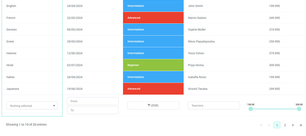
Your beautiful data deserves to be online
wpDataTables can make it that way. There’s a good reason why it’s the #1 WordPress plugin for creating responsive tables and charts.

And it’s really easy to do something like this:
- You provide the table data
- Configure and customize it
- Publish it in a post or page
But it’s not just about looks—it’s highly functional too. Whether you need to create large tables with up to millions of rows, utilize advanced filters and search, or even make your tables editable, wpDataTables has you covered.
And for those who love working with data visualization, wpDataTables supports the powerful Google Charts library. You don’t need to know a single line of code to add Google Charts to your website. Just use the intuitive wpDataTables interface to create and customize your charts.
Understanding Google Charts Types
Basic Chart Types
Line Charts
Google chart created with wpDataTables
Picture this: a simple line, whispering tales of trends over time. A line chart is often the lifeline of data visualization—a tale told in linear elegance.
Connect the dots of a timeline, track the heartbeat of your data, as it rises and falls, a graph elegantly curving like a dancer’s spine.
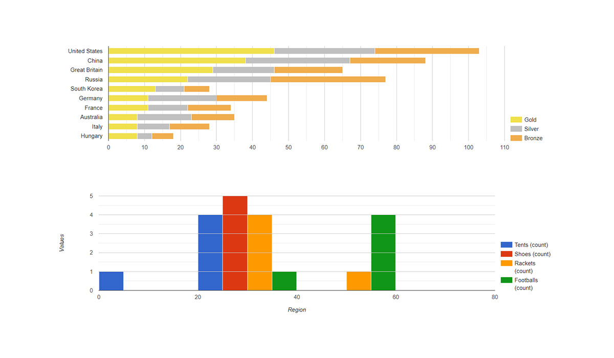
Bar Charts
Google chart created with wpDataTables
Need a punchy visual? Enter the bar chart. Stalwart and robust, it stacks data side by side, each bar a soldier in the army of data analytics.
Whether horizontal or vertical, these bars parade differentials with flair, making all comparisons crisp, clear, and compelling.
Pie Charts
Google chart created with wpDataTables
Think of a pie chart as a delectable pie, every slice holding a taste of the whole. It’s playful yet powerful, perfect for data stories involving proportions.
Wheel of fortune or a picnicker’s delight, it showcases part-to-whole relationship in servings that give instant clarity.
Advanced Chart Types
Scatter Charts
Google chart created with wpDataTables
A scatter chart is the Jackson Pollock of data visualization. It splashes data points across the canvas, each telling a separate story yet weaving a tapestry of relationships.
It’s where correlation meets individuality, mapping the dance between variables in a scattered yet systematic ensemble.
Area Charts
Google chart created with wpDataTables
Take a line chart, fill beneath its curve, and watch a drama unfold. Area charts paint the volume beneath, casting a visualization of cumulation or distribution over time.
This isn’t just a chart; it’s a fillable form of data presentation, capturing the space data occupies in your imagination.
Combo Charts
Why settle for one when you can mix it up? Combo charts blend various chart types into a single entity. Marry line and bar charts, weave in multiple datasets.
Here, chart customization meets orchestration, each element harmonizing yet standing distinct. It’s the intersection of aesthetics and complexity.
Specialized Chart Types
Geo Charts
Google chart created with wpDataTables
Globetrotting data? Geo charts pin it all down to terra firma. Showcase data tied to geographic locations, with regions colored to display statistics at a glance.
From continent to country, city to province—these charts transform satellite views into insightful stories.
TreeMap Charts
Data takes root and branches out with treemap charts. Imagine hierarchical data as a forest, with each branch expanding into leaves representing proportions.
It’s data storytelling in a grid, the structured beauty of trunks and leaves—a mathematical arboretum.
Gauge Charts
Google chart created with wpDataTables
A gauge chart ticks like a heartbeat, a dashboard gauge revving data in automotive gloss. It swings to the tune of performance metrics, perfect for showcasing progress toward targets.
It’s not just a chart; it’s the cockpit of a business intelligence race car, spinning numbers into speed dials.]
Customizing Google Charts
Appearance Customization
Changing Colors and Themes
In the realm of visual storytelling, color is king. Picture Google Charts as a painter’s palette, offering chart customization to match your canvas’s mood.
Are you in the mood for vibrant reds or tranquil blues?
Simply tweak the color codes in your script. With predefined themes or custom palettes, chart aesthetics transform, whispering soft tales or shouting bold headlines.
Adjusting Chart Size and Dimensions
Size matters. Whether you’re drawing a massive wall-sized mural or crafting an intimate postcard, your charts must scale to fit.
Adjust the width and height attributes in your HTML or JavaScript visualization platform—let your data breathe or compress. It’s almost like fitting a bespoke suit; snug or loose, always just right.
Modifying Fonts and Labels
Words matter. Choose a font that sings or speaks. That elegant Arial or that bold Verdana? Labels, titles, and legends need to align not just with each other but with your data’s voice.
A subtle font or a loud typeface can turn numbers into a narrative that dances across the dashboard tools of data visualization.
Data Interaction
Adding Tooltips
Hover, pause, and reveal. Tooltips are the secret whispers of your charts, offering deep insights with a mere touch.
Hover over data points and watch as tooltips emerge, tiny windows of enlightenment, ready to reveal secrets in their dynamic charts.
They are the pop-up books of data visualization, inviting interaction with every pointer pause.
Enabling Legend Interaction
Imagine a dance floor where clicking elements changes the rhythm. Enable legend interaction within your charts; let users toggle and twirl datasets in and out of view.
This isn’t just a chart library; it’s a stage for interactive experience, where users become conductors of their data symphony.
Implementing Zoom and Scroll
Sometimes, seeing the big picture isn’t enough; we need to zoom into the heart of the story.
Implement zoom and scroll capabilities—allow users to glide through data, magnifying sections with a flick of the finger or a scroll of the mouse.
Responsive designs invite exploration, allowing stories to stretch and contract with ease.
Responsive Design
Making Charts Responsive
In a world where screens shrink and stretch, charts must be nimble. Create responsive design so charts transition elegantly from desktop vistas to pocket-sized frames.
Web-based visualization demands elasticity, stretching to greet any device as gracefully as a cat stretches into sunbeams.
Handling Different Screen Sizes
The web doesn’t sit still; it hops from laptop to tablet to phone. Design your charts with media queries, letting them metamorphose as seamlessly as seasons shift.
Your data’s beauty should remain intact whether viewed through a panoramic lens or a peephole.
Mobile-Friendly Chart Designs
In a fast-paced, fingertip-driven world, mobile-friendly charts are more than a luxury—they’re a necessity. Simplify interactions without sacrificing depth, ensuring tap targets are just right.
Let your charts become business intelligence tools, agile and informative, offering insights as crisp on mobile as on any grand screen.
Integrating Google Charts with Web Applications
Using Google Charts with JavaScript Frameworks
Integration with React
To integrate Google Charts with React, follow these steps:
Install the required packages:
npm install react-google-charts
This will install the react-google-charts package, which is a thin, typed wrapper for Google Charts that makes it easy to use in React applications.
Import the necessary components:
import { Chart } from "react-google-charts";
The Chart component from react-google-charts is used to render the charts in your React components.
Prepare your chart data:
export const data = [
["Task", "Hours per Day"],
["Work", 11],
["Eat", 2],
["Commute", 2],
["Watch TV", 2],
["Sleep", 7],
];

export const options = {
title: "My Daily Activities",
};
The data array represents the data to be displayed in the chart, and the options object contains the chart configuration options.
Render the chart in your component:
const MyChart = () => {
return (
<Chart
chartType="PieChart"
data={data}
options={options}
width={"100%"}
height={"400px"}
/>
);
};
The Chart component accepts several props, such as chartType, data, options, width, and height, to customize the chart’s appearance and behavior.
Using Google Charts with Hooks
You can use Google Charts with React Hooks by following these steps:
Create a custom hook to handle the Google Charts initialization:
import { useEffect, useState } from "react";

const useGoogleCharts = () => {
const [google, setGoogle] = useState(null);

useEffect(() => {
const script = document.createElement("script");
script.src = "https://www.gstatic.com/charts/loader.js";
script.onload = () => {
google.charts.load("current", { packages: ["corechart"] });
google.charts.setOnLoadCallback(() => setGoogle(google.charts));
};
document.body.appendChild(script);
}, []);

return google;
};
This hook loads the Google Charts library and sets the google state when the library is ready.
Use the custom hook in your component:
import { useGoogleCharts } from "./useGoogleCharts";

const MyChart = () => {
const google = useGoogleCharts();

return (
<>
{google && (
<Chart
chartType="PieChart"
data={data}
options={options}
width={"100%"}
height={"400px"}
google={google}
/>
)}
</>
);
};
The Chart component now receives the google prop, which is passed down from the custom hook.
Handling Dynamic Data
To update the chart with dynamic data, you can use the useEffect hook to monitor changes in the data and re-render the chart accordingly:
import { useEffect } from "react";

const MyChart = ({ data }) => {
const google = useGoogleCharts();

useEffect(() => {
if (google && chartRef.current) {
const chart = new google.visualization.PieChart(chartRef.current);
chart.draw(google.visualization.arrayToDataTable(data), options);
}
}, [google, data]);

const chartRef = useRef(null);

return (
<div ref={chartRef}>
{google && (
<Chart
chartType="PieChart"
data={data}
options={options}
width={"100%"}
height={"400px"}
google={google}
/>
)}
</div>
);
};
In this example, the useEffect hook is used to draw the chart whenever the data or google prop changes. The chartRef is used to reference the chart container element.
Integration with Angular
To integrate Google Charts with Angular, you can use the angular-google-charts library, which serves as a wrapper for the Google Charts library. Here are the steps to set it up in your Angular application:
Step 1: Install the Library
First, install the angular-google-charts package using npm:
npm install angular-google-charts
Step 2: Import the Module
Next, import the GoogleChartsModule in your application’s main module file, typically app.module.ts:
import { NgModule } from '@angular/core';
import { BrowserModule } from '@angular/platform-browser';
import { GoogleChartsModule } from 'angular-google-charts';
import { AppComponent } from './app.component';

@NgModule({
declarations: [
AppComponent
],
imports: [
BrowserModule,
GoogleChartsModule
],
providers: [],
bootstrap: [AppComponent]
})
export class AppModule { }
Step 3: Create a Chart Component
In your component (e.g., app.component.ts), define the chart’s data, type, and options:
import { Component } from '@angular/core';

@Component({
selector: 'app-root',
templateUrl: './app.component.html',
styleUrls: ['./app.component.css']
})
export class AppComponent {
title = 'Google Chart Example';
type = 'PieChart'; // Specify the chart type
data = [
['Task', 'Hours per Day'],
['Work', 11],
['Eat', 2],
['Commute', 2],
['Watch TV', 2],
['Sleep', 7]
];
columnNames = ['Task', 'Hours per Day'];
options = {
title: 'My Daily Activities',
pieHole: 0.4,
};
}
Step 4: Add Chart to Template
In your component’s HTML file (e.g., app.component.html), add the Google Chart component:
<google-chart
[title]="title"
[type]="type"
[data]="data"
[columnNames]="columnNames"
[options]="options"
[width]="400"
[height]="300">
</google-chart>
Additional Configuration
You can customize your charts further by modifying the options object, which allows you to set various properties such as colors, tooltips, and chart titles.
The library supports a variety of chart types, including bar charts, line charts, and more, which you can specify by changing the type property in your component.
Integration with Vue.js
Here’s how to integrate Google Charts with Vue.js:
Install the vue-google-charts package
First, install the vue-google-charts package in your Vue.js project:
npm install vue-google-charts
This package provides a reactive wrapper for the Google Charts library, allowing you to easily use charts in your Vue components without having to load the Google Charts library manually.
Import and register the GChart component
In your Vue component, import the GChart component from vue-google-charts:
<script>
import { GChart } from 'vue-google-charts'

export default {
components: {
GChart
},
// ...
}
</script>
You can either register it locally in your component or globally as a plugin.
Use the GChart component in your template
In your component’s template, use the <GChart> component to render a chart. Specify the chart type using the type prop, the data using data, and any options using options:
<template>
<div>
<GChart
type="ColumnChart"
:data="chartData"
:options="chartOptions"
/>
</div>
</template>
The chartData and chartOptions are defined in your component’s data:
export default {
data() {
return {
chartData: [
['Year', 'Sales', 'Expenses', 'Profit'],
['2014', 1000, 400, 200],
['2015', 1170, 460, 250],
['2016', 660, 1120, 300],
['2017', 1030, 540, 350]
],
chartOptions: {
chart: {
title: 'Company Performance',
subtitle: 'Sales, Expenses, and Profit: 2014-2017'
}
}
}
}
}
The chartData is automatically processed using google.visualization.arrayToDataTable.
Load additional packages (optional)
If you need to use additional Google Charts packages, you can specify them using the settings prop:
<GChart
:settings="{ packages: ['corechart', 'table', 'map'] }"
type="Map"
:data="chartData"
:options="chartOptions"
/>
corechart, table, and map packages.Connecting to Live Data Sources
Fetching Data from APIs
APIs, the veins through which live data courses. Call upon them, fetch dynamic data with the swiftness of a falcon.
Populate your charts with up-to-the-minute stats, as fresh as a morning breeze.
Google Charts embraced APIs, transforming raw JSON into web-based visualization—a colorful tale of data told in real-time.
Using WebSockets for Real-Time Data Updates
Enter WebSockets, the harbinger of real-time magic. Keep streams open, bid adieu to fetching delays.
Watch as your charts sway to the rhythm of live updates, each data point a heartbeat along the pulse of information, a never-ending ballet of movement.
Handling Large Datasets
Handling large data sets? Break it down into bite-sized pieces. Use pagination, virtual scrolling, and smart rendering to ensure quick loading times.
Your charts should glide through data like a skilled surfer on a wave, ensuring efficient data handling without crashing under the weight of sheer volume.
Creating Interactive Dashboards
Combining Multiple Charts in a Dashboard
Dashboards, the art gallery of digital data—multiple masterpieces coalesce into one coherent view.
Combine line, bar, and scatter charts into a single tableau. Allow your users to dance between datasets with a simple click, painting a comprehensive picture from a mélange of data brushes.
Adding Controls and Filters
Behold the power of interaction. Add buttons, dropdowns, or sliders—let users toggle visibility, filter datasets, or drill down into specifics.
Interactive dashboards are like choose-your-own-adventure novels, offering a personalized journey through the data landscape, where the path is as exciting as the destination.
Synchronizing Data Between Charts
Stand one up, watch the others follow. Synchronize datasets across charts, draw connections in real-time. When one chart changes, others echo its transformations.
Data integration in harmony, like an orchestra where each instrument knows its cue, and synchronization weaves through the symphony, creating seamless unity.
Best Practices for Using Google Charts
Optimizing Performance
Reducing Load Times for Charts
Time is ticking, and no one likes to wait. Swift chart rendering is crucial.
Minimize the load by compressing scripts, deferring non-essential code, and trimming excess data. Speed is the name of the game, the elusive butterfly we all chase in web application tuning.
Efficient Data Handling Techniques
Data, vast and unyielding, must be tamed. Chunk it, paginate it, slice it into manageable bites. Efficient algorithms and lazy evaluation can become your trusty companions.
The goal is to navigate through large datasets like a sailor through calm waters, ensuring swift passage without overload.
Lazy Loading Charts
Why burden users from the start? Lazy loading is a kind smile to both server and client. Load what you need, when you need it.
Unfold charts as users scroll, reveal data with deliberate grace. It’s all about resource conservation, like a squirrel hoarding acorns for the winter.
Ensuring Accessibility
Implementing ARIA Labels and Roles
In the mosaic of web design, accessibility is non-negotiable. ARIA roles and labels transform mere charts into inclusive canvases.
These additions guide assistive technologies—charts speak, insights listen—ensuring everyone can join the dance of data visualization.
Enhancing Keyboard Navigation
Tap into the rhythm of keys. Enhance navigation to flow seamlessly from point to point.
Tab, shift-tab, arrows—they’re the instruments of digital exploration. In charts, ensure controls are not only visible but tactile, inviting keyboard explorers into the heart of data.
Providing Accessible Data Descriptions
A chart is worth a thousand words, but only if everyone can hear them. Provide comprehensive descriptions; tell the whole story. It’s more than numbers—describe relationships, trends, insights. Turn static graphs into data storytelling for all.
Maintaining Compatibility
Cross-Browser Support
Navigate the sprawling landscape of browsers—each chart a traveler on a universal road. Test in Chrome, Firefox, Safari, Edge.
Each needs love and care, ensuring the harmony of cross-browser support where every user, no matter their choice, sees the vibrant data canvas you crafted.
Ensuring Backward Compatibility
As we stride into the future, the past follows. Maintain compatibility with older setups. Code smart—anticipate, adapt, promise tomorrow’s features today without leaving yesterday behind.
Avoiding Common Pitfalls
Ah, the unseen traps. Be wary of overcomplication, data overload, performance lags. Guard against these with vigilant testing, optimization, forethought.
The technical support guidelines are clear; avoid the snares and smooth paths beckon. In data visualization, the journey is just as vital as the destination.
FAQ On Google Charts
How do I start using Google Charts?
Getting started with Google Charts is straightforward. First, visit the Google Developers site to access the comprehensive documentation and API references you need.
Include the Google Charts library in your HTML by linking it through a simple script tag. Then, initiate chart creation with basic HTML and JavaScript.
What types of charts can I create with Google Charts?
Google Charts offers a rich variety of chart types, from basic pie charts and bar graphs to complex scatter plots and interactive charts.
For specific needs, delve into the options like real-time data visualizations or specialized formats tailored for business report generation and analytical insights.
How do I integrate Google Charts with Google Sheets?
Integrating with Google Sheets streamlines your data workflow. Access data using Google Charts’ Visualization API; it links directly with your spreadsheet charts, enabling dynamic updates and data plotting.
This setup enhances data visualization projects, offering seamless access to cloud-stored data for efficient data-driven decisions.
Can I customize the appearance of my charts?
Absolutely. Chart customization features in Google Charts let you modify aspects from color schemes to user-friendly interfaces.
Tweak fonts, axis labels, and more with simple adjustments in your chart options. Tailor the visuals to fit your brand’s look or to enhance clarity for your audience.
How does Google Charts handle real-time data?
Google Charts excels in handling real-time data through its JavaScript integration. By harnessing the API efficiently, feed live updates into your charts.
This dynamic capability suits interactive user interface needs, especially valuable for industries requiring instantaneous data analytics and monitoring on-the-fly.
What makes Google Charts suitable for business intelligence?
Its integration capabilities and extensive visualization libraries make it ideal for business intelligence tools.
The ability to craft analytics dashboards from diverse data sources positions Google Charts as indispensable for enterprises seeking to make profound data storytelling and visual data representation part of their strategy.
Is Google Charts free to use?
Yes, Google Charts is entirely free. Hosted on the robust Google Cloud Platform, access its full suite of visualization techniques and features without any associated costs.
It’s a valuable resource for businesses and developers alike, enhancing projects without budget concerns, effective for scalable implementations.
How does Google Charts compare with other charting tools?
While direct comparisons can’t be provided, Google Charts stands out with its cloud-based tools, integration with Google Sheets, and diverse charting abilities.
Enjoy a wide array of web-based charts and data integration functionalities, aligning with modern requirements for interactive data displays and seamless user experiences.
Can developers add Google Charts to any website?
Absolutely, integrating Google Charts into any website is straightforward. Use the Visualization API to pull data directly from cloud services or existing databases.
Comprehensive documentation guides developers through embedding into online charts, rendering professional-grade graphics on any web presence with minimal setup fuss.
Are there support and resources available for learning Google Charts?
The ecosystem of Google Charts includes extensive resources. Google Developers provides tutorials, sample codes, and a community forum.
Whether you’re tackling chart design or needing help with HTML5 charts, ample guidance is available to maximize this powerful visualization software to its fullest potential.
Conclusion
In our journey through Google Charts, we’ve unlocked a versatile toolkit for data visualization, empowering projects with clear, informative, and interactive chart types. Through the robust capabilities of the Google API and seamless visualization libraries, complex data transforms into dynamic interactive user interfaces.
From the elegance of a pie chart to the practicality of real-time data analysis, these tools revolutionize how data narratives unfold. Businesses leveraging Google Sheets integration gain the strategic advantage of instant data updates, enhancing business intelligence tools and real-time decisions.
With limitless potential for chart customization, designers and developers can craft intricate visual stories that captivate and inform.
The future of data articulation lies in this cloud-based tool‘s adaptability and user-friendly interfaces. As we conclude, remember that every dataset is an untapped story waiting to be told. Embrace Google Charts to elevate your narratives into visual masterpieces.