
Donut charts are an indispensable tool for anyone serious about data visualization. These charts, an offshoot of pie charts, offer a clear graphical representation of data distribution while maintaining a sleek design that resonates with both business analytics and casual presentations. As you navigate through this article, you’ll discover how to leverage donut charts for various data sets, optimizing your dashboards and analytical reports for more effective communication.
We’ll explore the vital aspects, from selecting the right visualization software—like wpDataTables, Microsoft Excel, Google Sheets, or Tableau—to understanding the importance of chart legends, data segments, and color coding. You’ll learn to create visually appealing, user-friendly charts that enhance the narrative of your business metrics and data insights.
By the end of this article, you will have the knowledge to craft impactful donut charts that not only highlight critical business intelligence but also engage your audience with interactive features. Ready to elevate your data analysis game? Let’s dive in.
Table of Contents
What Is A Donut Chart?
A donut chart is a circular graph that’s hollow in the center, used to display categorical data in a series of segments, each representing a proportion of the whole. Like a pie chart with a twist, it effectively visualizes percentages and comparative data in an easily digestible format.
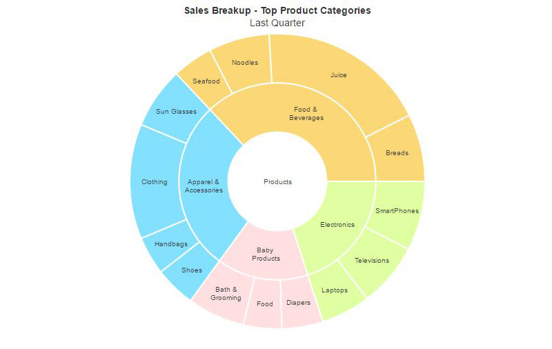
Donut Chart Example
Chart created with wpDataTables
When To Use A Donut Chart
A donut chart? It’s the go-to when simplicity needs to dance with data. Say there’s a bunch of proportional relationships, right? You want them to speak volumes, yet with a minimalist touch. That’s when this sleek wheel of stats shines.
If there’s a dynamic dashboard, humming with life—pop in a donut chart. It becomes the visual pause, the clear beacon in a sea of interactive charts. And it’s not just the eye-candy lure; this graphical tool slices through percentages, serving them on a silver data platter.
So, whenever the tale of parts to a whole begs to be told—reach for the donut chart. Just a few categories? Perfect. You’ll own the narrative and hold the audience spellbound without a word. That’s the sweet spot for this data storyteller.
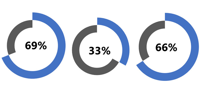
How To Read A Donut Chart
Chart created with wpDataTables
You’re scanning a donut chart, the colors, the arcs—each segment tells a story. Start at the top, where the midnight meets noon. That slice? It’s your biggest player. Trace the arc, eye the legend, it meets its match in data points.
Now, orbit the chart: each slice’s size? We’re talking proportions. Larger the arcs, the heftier their command on the whole.
Colors aren’t just for show; they’re the silence between the notes, dividing data segments for swift comprehension. And the donut hole isn’t just a quirky feature; it’s a focal point that resets your view, beckons your focus.
It’s more than just a tool for percent visualization; it’s a zen garden of statistics, where each pebble of data finds its place. Want to grasp the essence of your chart? Look for the color keys, follow the arcs, and let the segments whisper their quantitative tales.
Types Of Donut Charts
Exploring the realm of donut charts, several varieties unfold before the eyes.
Begin with the Standard Donut Chart, a singular, elegant loop delineating data with understated grace.
Enter the Multi-Level Donut, a more complex cousin, layering rings like an onion, each one representing a deeper dive into data subdivisions. It’s advanced, revealing patterns within patterns.
And then, the magic of Interactive Donut Charts. These beauties come alive with a click or hover, offering details on demand—a conversation of sorts between user and data.
Ever met a Progress Tracker Donut? It’s goal-oriented, a visual motivator tracking milestones as they inch from start to triumphant finish.
Every type, from simple to intricate, serves a unique purpose in the dance of data visualization. It’s about picking the right partner for the data narrative you’re eager to spin.
How To Make A Donut Chart In WordPress
To create a donut chart in WordPress using the wpDataTables plugin, you can follow these steps:
- Open Chart Creation Wizard:
- In your WordPress admin panel, go to wpDataTables -> Create a Chart.
- Name your chart for easy identification and choose a rendering engine (Google Charts, Highcharts, Chart.js, or ApexCharts).
- Define Data Source:
- Select the table that will be used as the data source for your chart using a simple select box.
- Set Data Range:
- Choose the columns and rows from your table that you want to include in the chart. You can use the Column Range Picker and Row Range Picker for this purpose.
- If you want the chart to adapt to table filters, use the “Follow table filtering” checkbox.
- Formatting and Preview:
- Adjust basic chart options such as chart width, height, responsive width, background color, border properties, etc.
- In the “Series” category, select the type of chart as “Doughnut” or a similar option depending on the rendering engine you chose.
- Customize the series options (label, color, type) and axes options (grid, labels, crosshair, direction).
- Set the main title options, tooltip settings, and legend properties.
- Configure exporting options to allow users to download the chart in various formats.
- Use the live preview on the right side of the screen to see the changes in real-time.
- Save and Use the Chart:
- Once satisfied with the chart, click “Save chart” to save it in the WordPress database.
- A shortcode will be generated, which you can copy and use to insert the chart into a WordPress post or page.
This process enables you to create a responsive and customizable donut chart in WordPress, enhancing your website’s data visualization capabilities.
How To Make A Donut Chart In Excel
To make a donut chart in Excel, follow these steps:
- Input Data into the Worksheet:
- Open a new worksheet in Excel and input your data. For example, you can input data about companies and their market shares in different years.
- Create Your Donut Chart:
- Select the dataset you want to use for the chart (e.g., cells A2: B7).
- Go to the
Inserttab, find theChartsgroup on the ribbon, and click the pie icon to open the drop-down menu. Choose the desired donut chart. - Alternatively, click
Recommended Chartson theInserttab, then select the donut chart icon and see the pre-made template.
- Adjust Your Donut Chart:
- To add another rim to the chart and compare data in different years, right-click on the chart area and choose
Select Data. You can also click theSelect Databutton on theDesigntab. - In the
Select Data Sourcewindow, clickAddunderLegend Entries (Series)to open theEdit Seriesdialog box. Select the second data range and enter the series name. - Modify the series name if needed.
- To add another rim to the chart and compare data in different years, right-click on the chart area and choose
- Customize Your Donut Chart:
- Double-click on the chart title to change it.
- Right-click on one of the rims and choose
Format Data Seriesto adjust the size of the hole in the donut chart. The smaller the percentage, the bigger the hole.
- Move Your Donut Chart:
- To move the chart, select it and click
Move Charton theDesigntab or the contextual menu. Choose where to place your chart, either in a new sheet or in an existing worksheet.
- To move the chart, select it and click
- Change Chart Type (Optional):
- If you want to change the chart type, find the
Change Chart Typebutton on theDesigntab or the contextual menu. Choose a different type of chart if needed.
- If you want to change the chart type, find the
How To Make A Donut Chart In Google Sheets
To create a donut chart in Google Sheets, follow these steps:
- Prepare Your Data:
- Ensure your data is displayed in a clean and organized manner. This will facilitate the creation of the donut chart.
- Select the Data:
- Select the entire data cell range that you want to use for the donut chart.
- Insert the Chart:
- Choose
Insertfrom the menu, then selectChart.
- Choose
- Create a Pie Chart (Intermediate Step):
- By default, Google Sheets will generate a pie chart using the selected data. This pie chart is the basis for creating your donut chart.
- Customize the Chart:
- Change the chart title to something relevant, like ‘Survey Result’. You can also adjust the text color, make it bold, and align it to the center for better emphasis.
- Create the Donut Effect:
- To transform the pie chart into a donut chart, select the desired percentage for the hole size in the middle of the chart.
- Finalize and Review:
- After customizing your chart, you will have a donut chart representing your data.
Donut charts are effective for displaying data with a few categories (typically 2-5) and are used to illustrate a “part-to-whole” relationship where each component represents a portion of the whole.
FAQ About Donut Charts
How is a donut chart different from a pie chart?
While both are circular charts used for data visualization, a donut chart features a blank center, which can be leveraged for additional data labels or comparative information. This hole enhances visual storytelling by allowing users to focus more on the data segments surrounding it.
When should I use a donut chart?
Donut charts are ideal for presentations where you need to emphasize part-to-whole relationships among data sets. They excel in dashboard reporting and are perfect for showcasing key performance indicators in business intelligence.
How do I create a donut chart in Excel?
To create a donut chart in Microsoft Excel, input your data sets and select the “Donut Chart” option from the Charts menu. Customize your chart by adjusting color coding, labels, and chart legends to match your analytical reports and aesthetic preferences.
What kind of data is best for a donut chart?
Donut charts are well-suited for categorical data that sums up to a whole. Whether analyzing business metrics, marketing presentations, or data insights, using donut charts helps in clearly illustrating the proportions of different categories.
Can donut charts show more than one data series?
Yes. Effective use of visualization software and tools like Tableau or Google Sheets enables you to layer multiple donut charts together, each representing a distinct data series. This multi-layered approach aids in comparative data analysis.
What are common mistakes to avoid with donut charts?
Avoid clutter by not overloading the chart with too many slices or colors. Ensure your data segments are distinct and easy to differentiate. Properly label and use a clear chart legend to ensure the chart remains user-friendly and informative.
How do I make donut charts interactive?
Leveraging interactive features such as clickable elements or hover effects can enhance reader engagement. Tools like Power BI and Chart.js allow for the creation of dynamic donut charts, which can be embedded within your data dashboards for a richer user experience.
What are the advantages of using donut charts?
Donut charts offer visual summarization of data, making it easier to interpret at a glance. Their design provides an effective method for breaking down categorical data while keeping the information visually appealing and digestible, especially when used in infographics and presentation slides.
Are there any limitations to donut charts?
While versatile, donut charts aren’t great for displaying large data sets with many categories. The effectiveness diminishes as more slices are added, making it difficult to compare small segments. For detailed statistical analysis, consider other chart types for more granular insights.
Conclusion
Donut charts enhance your presentations by providing a visually appealing way to showcase data distribution and percentages. The central hole offers space for additional data labels, making business analytics more intuitive. Visualization tools like wpDataTables, Tableau, Google Sheets, and Microsoft Excel make creating these charts straightforward and customizable.
Effective use of color coding and clear chart legends helps in breaking down complex data sets into easily digestible parts. Leveraging donut charts for business metrics and data insights on your data dashboards can significantly improve how information is communicated to your audience.
Be mindful of common pitfalls such as overcrowding your donuts and ensure your slices are distinct and clearly labeled. Experiment with interactive features for a more engaging user experience.
Armed with this knowledge, you’re now ready to use donut charts to elevate your analytical reports and presentations, making your data both impactful and easy to understand.
If you liked this article about donut charts, you should check out this article about bar charts.
There are also similar articles discussing pie charts, candlestick charts, line charts, and bubble charts.
And let’s not forget about articles on waterfall charts, stacked bar charts, area charts, and column charts.


