Stacked bar charts offer a powerful way to visualize data, especially when comparing parts of a whole across different categories. Aimed at simplifying complex data sets, these charts are essential tools for data analysts, business professionals, and anyone keen on crystal-clear data presentation.
We’ll delve into the specifics of why stacked bar charts are invaluable for your data visualization needs. You’ll learn how to create and format these charts using popular tools like Excel, Tableau, and Google Sheets. We’ll also cover the key elements such as color-coded bars, chart legends, and data segments that make your charts not only informative but also visually appealing.
By the end of this article, you’ll be equipped with the knowledge to create comprehensive, interactive, and insightful stacked bar charts. We’ll also integrate tips on leveraging related visualization tools and techniques to enhance your data storytelling.
Read on to master stacked bar charts, elevate your data presentation, and gain deeper insights with clear, concise visual analytics.
Table of Contents
- What Is A Stacked Bar Chart?
- Stacked Bar Chart Example
- When To Use A Stacked Bar Chart
- How To Read A Stacked Bar Chart
- Types Of Stacked Bar Charts
- How To Make A Stacked Bar Chart In WordPress
- How To Make A Stacked Bar Chart In Excel
- How To Make A Stacked Bar Chart In Google Sheets
Table of Contents
What Is A Stacked Bar Chart?
A stacked bar chart is a graphical representation where multiple data series are stacked on top of one another in either vertical or horizontal bars. It’s used to visualize the total of grouped data points while also showing the comparative sizes of each data point’s component parts.
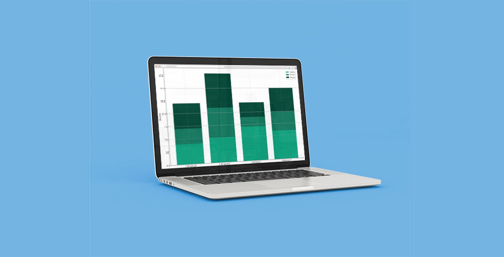
Stacked Bar Chart Example
Chart created with wpDataTables
When To Use A Stacked Bar Chart
You’ve got categories—chunks of data—and beneath each, there’s a story. Individual parts that, together, spin a yarn of totals. That’s your cue: stacked bar chart time.
Think:
- When the goal’s to show a part-to-whole relationship across different segments.
- For visualizing trends in data series without losing sight of the granular deets.
- Whenever it’s vital to highlight individual contributions within larger categories, it shines.
It’s a tad like a troupe on stage, each actor playing their part in one grand scene. Use it when those individual roles deserve a spot in the limelight, yet you still need that collective bow at the end.
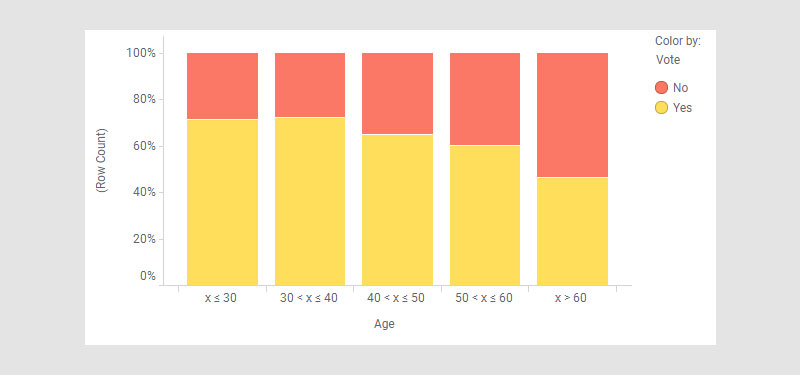
How To Read A Stacked Bar Chart
Chart created with wpDataTables
Dive into that stacked bar chart like it’s the last piece of cake—eager, ready, and strategic.
Start at the base. Each layer, a data slice, comfortably nestled above the next. Colors aren’t just for show; they’re the key to unlocking what’s what. Match ’em with the legend—yep, that’s the map to this treasure.
Scan along the axis—the one that’s tagged with numbers. It’s dishing out the totals, height or length-wise.
Now, here’s the kicker: don’t breeze through looking at just the top or bottom. Every segment has a voice, a stake in this tasty data pie—or bar, rather.
They stack up, these colorful bits, telling a story of trends, comparisons, and sheer numeric ballet. And if percentages are splashed across, you’re eyeballing a “100% stacked” special—each part’s role in the grand total, no calculator needed.
Types Of Stacked Bar Charts
Navigating the world of stacked bar charts, you’ll stumble upon a funky ensemble.
First, there’s the classic stacked bar. It’s your bread and butter, neatly piling those data segments skywards or lengthwise.
Then, hello 100% stacked bar chart.
Drama? None. It’s about proportion, every bar maxed to full capacity, breaking down the share of each category.
Got an eye for details? Segmented bar diagram, a cousin, shows up, ready to depict nuances without muddling the waters.
Now, the twist — a layered bar graph. It’s a bit of a maverick, letting segments overlap, playing with transparency for a touch of flair.
And for the code-savvy out there, popping some interactivity adds a bit of oomph. Hover effects? Clickable legends? Why not. It’s about giving those data layers life beyond the static.
How To Make A Stacked Bar Chart In WordPress
To make a stacked bar chart in WordPress using wpDataTables, follow these steps:
- Open the wpDataTables plugin in your WordPress admin panel.
- Navigate to “Create a Chart” and choose your chart type (e.g., stacked bar chart) and rendering engine.
- Select a data source, usually a wpDataTable that you’ve already created.
- Define the data range by selecting the relevant columns and rows from your table.
- Customize your chart’s appearance, including dimensions, formatting, and style.
- Once satisfied with the settings and preview, save the chart. This will generate a shortcode.
- Use the shortcode to insert the chart into a WordPress post or page.
How To Make A Stacked Bar Chart In Excel
To create a stacked bar chart in Excel, follow these steps:
Step One: Line up your data side by side in a neat table, each column flexing its own unique category muscles.
Step Two: With the click and sweep of your trusty mouse, highlight the cells brimming with your choicest data. Facing a mighty sea of numbers? “Ctrl” (or “Cmd” for the Apple crowd) is your lifesaver to select vast expanses of data.
Step Three: Launch into the “Insert” escape pod and lock in on “Stacked Bar Chart” smack dab in the middle of the chart galaxy. Got a taste for something fancier? A 3D effect or a full-on percentage stack might just be the ticket.
Step Four: Brand that beauty with a title and break down those colors with a legend, courtesy of the “Chart Design” toolkit. Get that title speaking loud and clear about your chart’s tale, with a legend as your trusty sidekick for decoding.
Step Five: Spruce it up – splash a fresh color coat, tweak those titles, axis labels, and legends. Mold the style to your vibe using the “Chart Design” and “Format” paintbrushes.
Step Six: Now, take a step back. What’s your chart whispering about trends, peaks, and valleys? Let it guide your crowd on a journey through the heart of your data.
Keep this etched in your mind: when the totals dance in a close line-up, stacked bars are your jam. But when the rhythm of individual beats needs to shine solo, perhaps a clustered column tune or the smooth jazz of a line chart could better play the song of your data.
How To Make A Stacked Bar Chart In Google Sheets
To create a stacked bar chart in Google Sheets, you can follow these steps:
- Prepare Your Data:
- Label the Headers: Identify what each column represents in the first row of your dataset.
- Add Your Data: Populate the data in the subsequent rows.
- Verify Data Format: Ensure each column’s data type (text, number, currency) is correct and make adjustments if necessary.
- Select the Data for Your Stacked Bar Chart: Click and drag your mouse to select the entire dataset you want to visualize.
- Choose and Insert a Chart:
- Insert a Chart: Go to “Insert” in the top menu bar and select “Chart.”
- Choose the Chart Type: In the chart editor, under the “Setup” tab, select “Stacked column chart” from the “Chart type” dropdown menu.
- Adjust the Position of Your Chart: Click and drag the chart to your desired location.
- Customize Your Chart:
- Open the Chart Editor: Double-click on the chart if the editor isn’t open.
- Navigate to the Customization Tab: Use the “Customize” tab for various customization options.
- Customize Chart and Axis Titles: Add titles, change fonts, sizes, and colors.
- Customize Legend: Adjust the legend’s position, font, color, and format.
- Customize the Color of Each Series: Select each series and choose your desired colors.
- Finalize Your Stacked Bar Chart: Review your chart to ensure it accurately represents your data.
FAQ About Stacked Bar Charts
How do you create a stacked bar chart in Excel?
To create a stacked bar chart in Excel, select your data range, go to the “Insert” tab, choose “Bar Chart,” and select the “Stacked Bar” option. Customize by adding data labels, chart legends, and adjusting the color-coded bars to make your chart more informative and visually appealing.
When should you use a stacked bar chart?
Use a stacked bar chart when you need to compare categories across more than one data series. They’re ideal for showing the relative size of components within a category, giving a clear visual of proportional distribution as well as total sum, making them invaluable in analytical tools.
What’s the difference between a stacked bar chart and a clustered bar chart?
A stacked bar chart layers data series on top of each other within single bars, while a clustered bar chart places them side by side. Stacked versions are better for showing part-to-whole relationships; clustered charts excel at direct comparisons between individual data points.
How do you interpret a stacked bar chart?
Interpret a stacked bar chart by examining the height of each segment within the bars. The entire bar height shows the cumulative total, while individual segments highlight the contribution of each category. Use chart legends to identify data series and focus on proportional display for detailed insights.
What tools can you use to create stacked bar charts?
Tools for creating stacked bar charts include Excel, Google Sheets, and Tableau. These tools offer robust charting software capabilities, allowing you to customize colors, add data labels, and integrate chart legends to make your visual analytics straightforward and compelling.
How can you customize a stacked bar chart?
Customize a stacked bar chart by adding data labels, adjusting color-coded bars for better differentiation, and including chart legends. You can also manipulate axis scales, titles, and gridlines in tools like Excel, making your data presentation more accurate and visually appealing.
What are the advantages of using a stacked bar chart?
Stacked bar charts offer the advantage of displaying part-to-whole relationships within each category, making it easy to see both absolute and proportional data. They provide clear visuals for multi-series data, enhancing data presentation and simplifying comparative analysis.
Are there any limitations to stacked bar charts?
Limitations of stacked bar charts include difficulty in interpreting segments for categories with many data points and potential clutter. They may become less effective for detailed comparisons but excel when displaying a general overview or when data sets are manageable.
How do stacked bar charts handle negative values?
Stacked bar charts can handle negative values by extending bars in opposite directions from a zero baseline. Positive values stack upwards, while negative values stack downwards. This allows for easy visualization of net effects and detailed trend analysis in your data.
Conclusion
Stacked bar charts are indispensable tools for data visualization, providing a clear way to compare multiple data sets within single categories. By layering data series, these charts enhance both cumulative and proportional analysis, catering to a variety of analytical needs from business reporting to academic research.
Creating and customizing these charts with tools like wpDataTables, Excel, Google Sheets, and Tableau allows for robust data presentation. Customize with color-coded bars, data labels, and chart legends to ensure clarity and effectiveness.
While there are limitations, such as handling numerous data points, the strengths lie in their ability to present intricate data in an accessible format. Use stacked bar charts to simplify complex data sets, ensure effective data storytelling, and present clear insights.
By mastering stacked bar charts, you elevate your data presentation skills, making your insights more compelling and accessible to your audience. Incorporate these visual tools in your workflow for more effective data analysis and communication.
If you liked this article about stacked bar charts, you should check out this article about bar charts.
There are also similar articles discussing pie charts, candlestick charts, line charts, and bubble charts.
And let’s not forget about articles on waterfall charts, area charts, column charts, and donut charts.


