Waterfall charts are indispensable tools in financial analysis and data visualization.
They can demystify complex data sets, clearly represent financial statements, and track increments like profit and loss over time. This article will dive deep into the mechanics of waterfall charts, providing you with a step-by-step guide to creating them in Excel, along with tips for using them in business analytics and financial modeling.
You’ll learn how to utilize these dynamic charts to present financial trends, cost analysis, and revenue tracking efficiently.
The focus will be on practical applications, from breaking down income statements to expense tracking and generating interactive charts for comprehensive business intelligence.
By the end of this article, you’ll know how to implement waterfall charts using various visualization tools and customize them to fit your specific needs. We will discuss the nuances of chart customization, structured data utilization, and techniques to enhance your analytical insights.
Table of Contents
- What Is A Waterfall Chart?
- Waterfall Chart Example
- When To Use A Waterfall Chart
- How To Read A Waterfall Chart
- Types Of Waterfall Charts
- How To Make A Waterfall Chart In WordPress
- How To Make A Waterfall Chart In Excel
- How To Make A Waterfall Chart In Google Sheets
Table of Contents
What Is A Waterfall Chart?
A waterfall chart is a data visualization tool that displays sequential changes in values over time. It’s like a visual step-by-step journey, starting with an initial value and showing the cumulative effect of positive or negative data points, leading to a final result. Perfect for financial analysis and insightful storytelling.
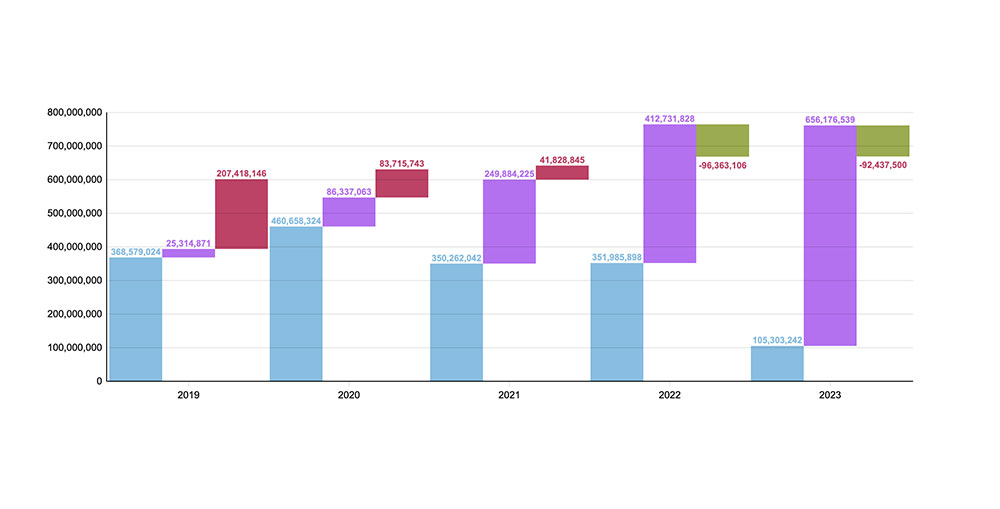
Waterfall Chart Example
Chart created with wpDataTables
When To Use A Waterfall Chart
When the tale you’re spinning is all about the financial journey, that’s when you let a waterfall chart take the stage.
Imagine breaking down that annual revenue report, laying out each increment and drop along the fiscal year’s roller coaster. Or, say there’s a story behind a profit and loss statement needing to unfold—this is your go-to chart.
It’s about connecting dots that show how you’ve climbed or dipped, translating complex data analysis into a powerful narrative. Use it when illustrating budgets, forecasting, or any scenario where the path from A to B craves a clear, visual tale.
How To Read A Waterfall Chart
Okay, so, you’ve got this waterfall chart in front of you, right? Each bar, it’s like a chapter in a book. Some shoot up, show you the gains; others, they drop—revealing costs or losses.
Start on the left. That’s your baseline. Now, stroll through the bars. Green ones? They’re like little victories, adding to your story. Red bars? Plot twists, where things took a hit. Finally, you land on that last bar. That’s your climax—the ending balance.
And throughout, keep those eyes peeled for those subtle shifts. They’re like whispers, nudging the plot along. Whether it’s a cumulative flow, revenue shifts, or an epic cost-benefit analysis, by the end, you’re not just reading numbers. You’re reading a story, with all its ebbs and flows.
Types Of Waterfall Charts
Dive into the world where waterfall charts come in a few different flavors, each with a story to tell. Let’s break it down:
- There’s the classic revenue waterfall, a champ at sifting through monthly sales figures.
- Then, cumulative flow diagrams step up to the plate, brilliant at displaying ongoing totals.
- Ever heard of the inventory movement chart? That’s for the stock managers, tracking ins and outs like a hawk.
- And hey, for the money maestros, earnings charts work like financial fortune tellers, mapping out the fiscal magic.
Each type, it’s got its own stage, its own audience. Choose the chart that tells your story best whether it’s in the boardroom, the backroom, or the stockroom.
That’s the beauty of data design; picking the perfect visual to spotlight the story behind the stats.
How To Make A Waterfall Chart In WordPress
Creating a waterfall chart in WordPress using the wpDataChart Wizard from the wpDataTables plugin involves several steps. Here’s a summary of the process:
- Access Chart Creation Wizard: In your WordPress admin panel, go to wpDataTables -> Create a Chart. Here, you’ll define a chart name for easy identification later and choose a render engine (Google Charts, Highcharts, Chart.js, or ApexCharts).
- Select Data Source: Choose the table that will serve as the data source for your chart using a simple select box.
- Define Data Range:
- Column Range Picker: Select the table columns to be used in the chart. You can reorder these columns as needed.
- Row Range Picker: Select specific rows or ranges for the chart. You can choose all rows or select individual rows or row ranges.
- Follow Table Filtering: This option is available if you choose “All rows” in the Row Range. It allows the chart to reflect any filtering applied to the table.
- Formatting and Preview:
- Adjust basic chart options like width, height, background color, border properties, and more.
- Customize series options, including label, color, and type.
- Configure axes options, including grid, labels, and crosshairs.
- Set main title options and tooltip settings.
- Adjust legend settings, including enabling/disabling, background color, layout, and position.
- Define exporting options for users to download the chart in various formats.
- Experiment with settings and see a live preview of the chart.
- Save and Use the Chart: Once satisfied with the preview, save the chart. A shortcode will be generated, which you can copy and use to insert the chart into a WordPress post or page.
The wpDataTables plugin provides a user-friendly interface to create responsive and interactive charts, including waterfall charts, for WordPress websites. The step-by-step wizard makes it easy to customize the chart according to your data visualization needs.
How To Make A Waterfall Chart In Excel
To whip up a waterfall chart using Excel, here’s the rundown:
- Handpick Your Data: You’ve got numbers that need storytelling. Grab the cells that contain the saga’s digits. Playing with non-neighbors? No sweat. Ctrl (Cmd for the cool Mac folks) is your trusty sidekick here.
- Summon the Waterfall Chart: Hit up the Insert tab, find that Waterfall chart lurking under the Charts section, and let it make its grand entrance.
- Tweak the Masterpiece: Deployed the chart? Solid. Now roll up your sleeves—it’s time to refine. Tag your data labels, crown your totals or lesser nobles, craft that compelling title, and size it right.
- Data Labels, You Say?: Is your chart turning into a mosh pit of labels? Clear the dance floor by hitting the Chart Elements (+), and give Data Labels the boot. Or just smack Delete after clicking one that’s crashing the party.
- Coronate Your Totals/Subtotals: Got a data pillar that’s reaching for the stars? Anoint it as your total or sub with a couple of clicks and a tick in the “Set as total” coronation box.
- Chart Title Makeover: Click that title area and key in a marquee that grabs eyeballs. Or double-tap an old one to spruce it up.
- Stretch or Squash the View: Play with those handles! You’ve got eight; drag ‘em to scale your chart’s horizon or craft its silhouette.
- Axis Titles – Yea or Nay: Toss in axis titles with a click on that Chart Elements (+), finding your way to the Axis Titles option. Typing your titles is as easy as a double-click.
- Stylin’ and Profilin’: Now for the grand finale. Let the Design and Format tabs unleash your inner artist. Or dip into the Quick Layout for some snazzy prefab combos.
Excel’s waterfall charts are your trusty sidekicks for making those numbers sing, whether it’s cash flow, moving inventory, or tracking those sales highs and lows.
How To Make A Waterfall Chart In Google Sheets
To create a waterfall chart in Google Sheets, you can follow these steps:
Simple Waterfall Chart
- Prepare the Data: Initially, set up your data in a simple format.
- Shape the Data: Create a new table adjacent to the original data with columns for Base, Endpoints, Positive, and Negative.
- Apply Formulas: Use specific formulas for different parts of the table to calculate the values for each column.
- Create a Stacked Column Chart: Highlight the new table and insert a chart, selecting the stacked column chart type.
- Make the Base Transparent: Adjust the Base column color to none.
- Format the Chart: Choose suitable colors for the series, format axes and titles, and remove the legend.
FAQ About Waterfall Charts
What is a waterfall chart?
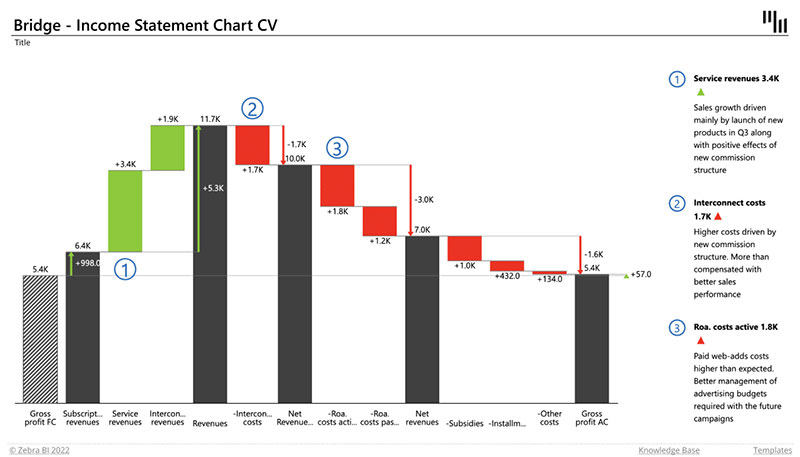
A waterfall chart is a type of data visualization that helps you understand how an initial value is affected by a series of intermediate positive or negative values. Popular in financial analysis and business analytics, it’s perfect for visualizing income statements, cash flows, and other sequential financial data.
How do you create a waterfall chart in Excel?
To create a waterfall chart in Excel, start by listing your data in sequential order. Use Excel’s built-in Waterfall Chart function under the Insert tab. Customize it through chart elements to add titles, data labels, and colors to represent increases and decreases.
What are the key components of a waterfall chart?
The primary components include a starting value, a series of positive and negative increments, and a final resultant value. These are typically visualized using floating columns or bars in different colors, aiding in easy interpretation of financial trends and data presentation.
Why are waterfall charts useful in financial modeling?
Waterfall charts excel in financial modeling due to their ability to clearly display financial statements. They allow for easy tracking of revenue, costs, and profit margin, helping analysts to quickly identify areas of gain or loss and make informed business decisions.
Can waterfall charts handle negative values?
Yes, waterfall charts can handle negative values effectively. Negative increments are usually displayed in a different color to distinguish them from positive values, enabling a clear visual representation of losses and aiding cost analysis and financial reports.
How can I customize waterfall charts for better visual representation?
Customize your waterfall chart by altering the colors of the bars, adding data labels for clarity, and adjusting axis limits for better scale. Use Excel’s formatting options to enhance the chart customization and ensure the visual is aligned with your visualization tools.
What are some common applications of waterfall charts in business?
Waterfall charts find widespread use in business intelligence for analyzing financial statements, tracking expense and revenue flows, planning budget, and performing cost analysis. They are also used for presenting strategic planning, investment analysis, and performance evaluation data. For example, finance teams often use waterfall charts to visualize how spending on business credit cards affects monthly cash flow—breaking down interest charges, rewards earned, and categorized expenses to manage working capital better and optimize card usage policies.
How do waterfall charts improve data storytelling in presentations?
Waterfall charts enhance data storytelling by sequentially showing how individual components contribute to the overall total. This transparent breakdown aids in better data interpretation, making complex data sets easier to understand for decision-makers and stakeholders in presentations.
Are there any limitations to using waterfall charts?
While useful, waterfall charts can become cluttered with too many data points. They also primarily focus on sequential, single-category data, making them less effective for multi-category analysis. Careful data organization is essential to avoid misinterpretation.
How do I integrate waterfall charts into a financial dashboard?
Integrate waterfall charts into a financial dashboard by ensuring they complement other financial reports and visualizations. Use a combination of dynamic charts, tables, and interactive elements to provide a comprehensive overview. Ensure consistency in design for a seamless user experience.
What’s the difference between a waterfall chart and a stacked bar chart?
Think of it as order versus chaos. Waterfall charts guide you through a story, step by analytic step.
Stacked bars?
More like a static snapshot of categorically lumped data. Waterfall charts are the narrators of change, while stacked bars are categorical librarians, shelving info without the drama.
Conclusion
By now, you should have a clear understanding of how waterfall charts can significantly enhance your data visualization efforts.
These charts are indispensable for financial analysis, providing a transparent view of revenue, cost analysis, and other crucial financial statements. Utilizing tools like Excel can simplify the process of creating and customizing these charts.
Incorporating waterfall charts into your business intelligence strategy will allow you to clearly track financial performance, aiding in strategic planning and informed decision-making.
Whether you’re presenting to stakeholders or analyzing internal metrics, the clear, incremental breakdown provided by a waterfall chart is invaluable.
Focus on the key components: initial values, positive and negative increments, and the final result. Customize your charts for better readability and ensure they fit within your overall financial dashboard.
This will provide a comprehensive view, making your data presentation more impactful and insightful.
If you liked this article about waterfall charts, you should check out this article about bar charts.
There are also similar articles discussing pie charts, candlestick charts, line charts, and bubble charts.
And let’s not forget about articles on stacked bar charts, area charts, column charts, and donut charts.


