A well-crafted pricing table can be the linchpin of your website’s success, converting curious visitors into loyal customers.
As you navigate the complexities of pricing strategies and subscription plans, finding the right design for your pricing table is crucial. Whether you’re structuring your pricing models for a SaaS product, e-commerce site, or service-based business, understanding the various examples available can save you time and enhance your value proposition.
In this article, you’ll discover diverse pricing table examples that balance aesthetic appeal, functionality, and clarity.
We’ll delve into the nuances of pricing grids, explore innovative pricing templates, and provide insights into optimizing your feature comparison to maximize cost efficiency.
By the end, you’ll be equipped with the knowledge to craft pricing tables that not only look great but also drive conversions.
Ready to transform your pricing page? Let’s dive into the best practices and examples to elevate your pricing structure.
Table of Contents
Best Practices and Guidelines for Pricing Tables
Under this subheading are suggestions and tips on structuring a pricing table. The design has a big impact on the clients’ decision-making and can greatly influence your pricing strategies.
A good one can convince clients to buy a product or service. Tables must be clear and easy to read.
When preparing a price list, consider the following reminders:
Give the Right Amount of Information
When looking at a pricing table, a customer should get the right information at a glance. List the most relevant and unique features of the service or product.
As well, list related information about different parts of the website. Find the right balance between completeness and clarity.
If the list features similar items, make the differences between them clear. Do not give irrelevant information but do include what interests the customer.
Transmit Features and Benefits in a Concise Manner
It is a challenge to present the most important features in clear and concise wording.
It needs to contain enough information that is easy for the reader to understand. A confused customer will likely not buy anything.
What is the best way to be concise and clear? Take care not to make an endless pricing table with many pages and columns.
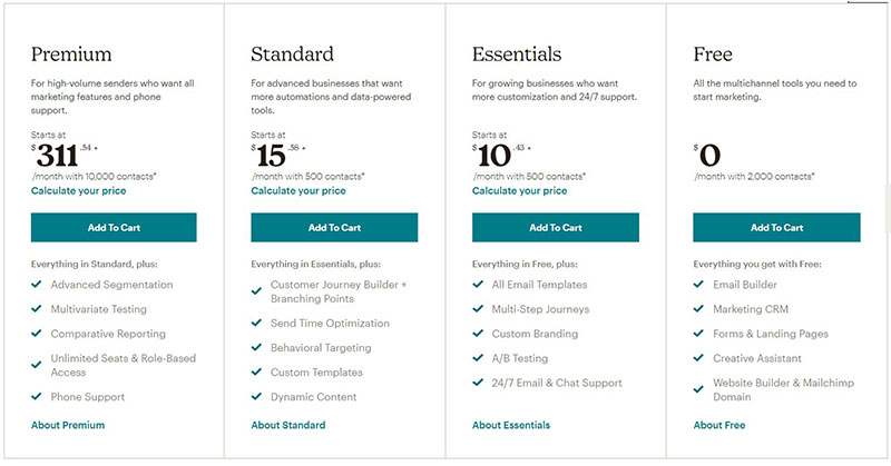
It is better to start listing the most basic options. Then expand on them through extended offers that clearly show the differences.
Do this by including phrases like “same as above, plus…”. Using phrases like these avoids endless repetitions of items and features.
Place the most special items at the top of the pricing table and the more common ones at the bottom.
Put the Focus on Popular Choices
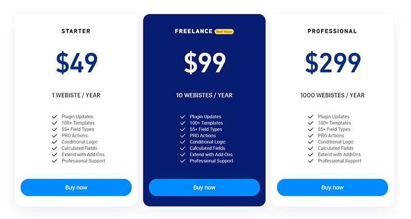
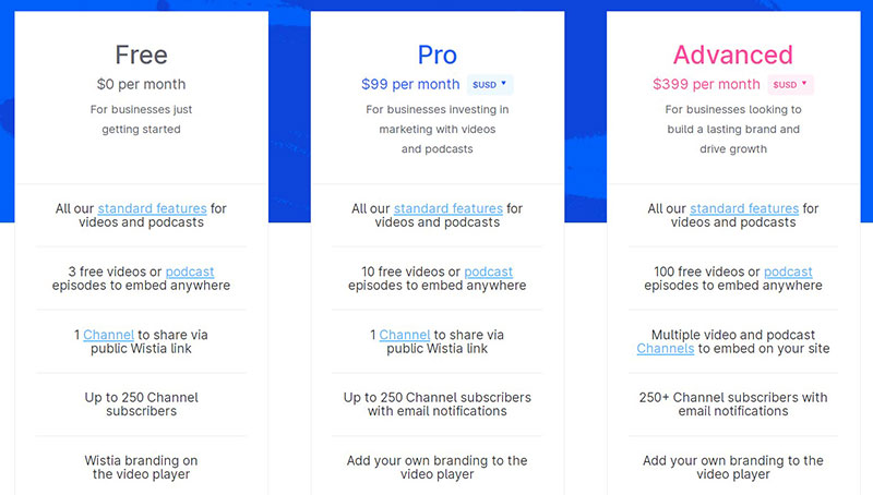
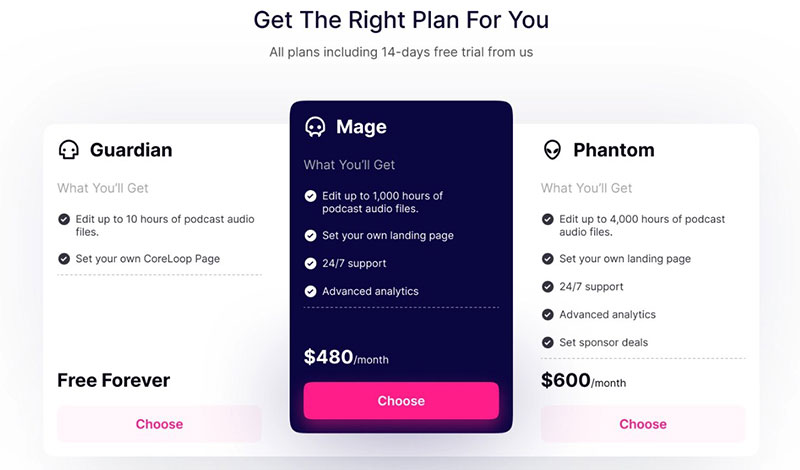
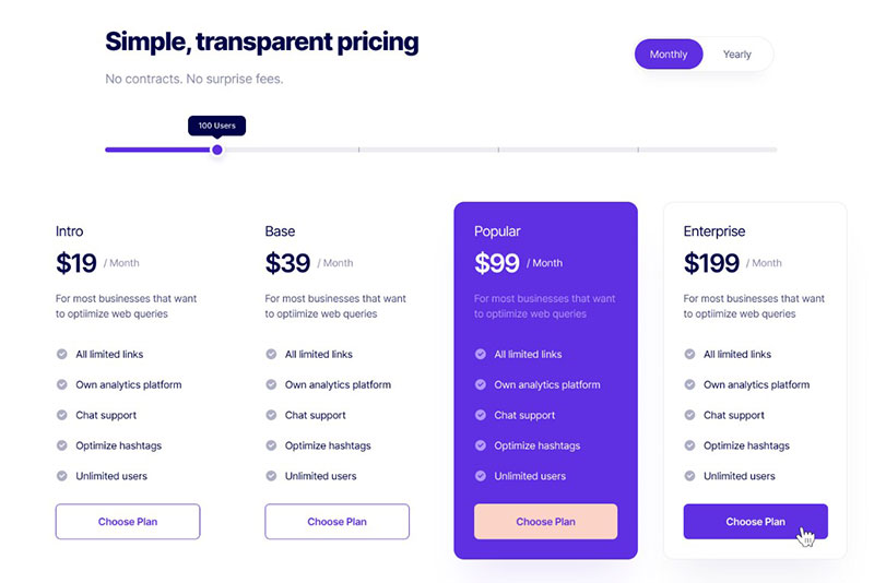
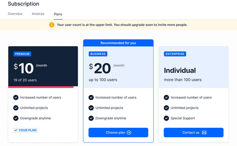
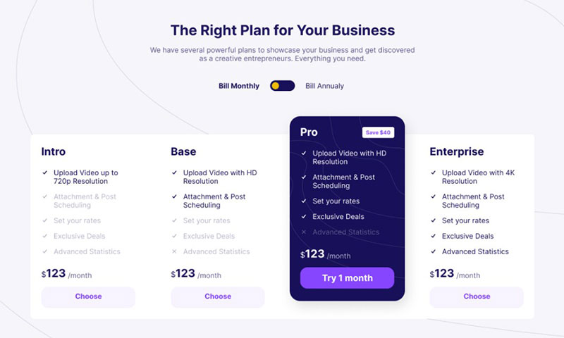
Highlight suggested choices with words like “Most Popular” or “Best Seller“. The most popular options on the pricing table are usually the mid-price choice.
If the most popular choice is the more expensive choice, do not hesitate to promote that one. Highlight this choice by supersizing it, adding a frame, or some other eyecatcher.
Make choosing that option easy for the customer. By drawing attention to this option, a customer is more likely to pick it and in less time.
The goal is not necessarily to make customers select that option. But it is very likely that many will.
That is good because it will increase income. By highlighting the most popular choice, some will choose a higher-level option.
It makes the more expensive products or services seem more affordable.
Do Not Just Delete Items That Are Not Included
It is a good idea to show the customer what each plan includes. In this way, they will know what they are getting.
However, they are also interested in the things that are not included. That is even more important in increasing sales.
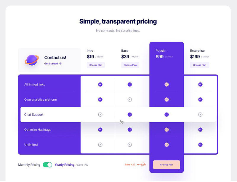
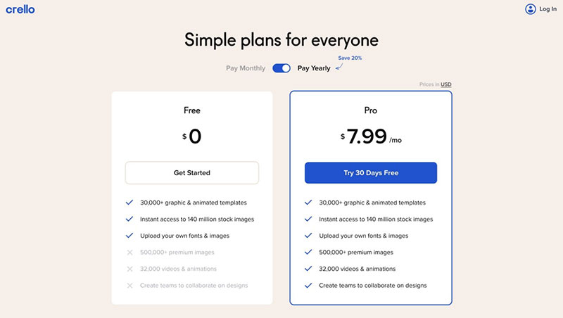
The use of strike-through is a smart way of indicating what feature is not included in a plan. That shows the customer exactly what the difference is between each plan.
This gives many clients a reason to choose a higher level of service, with a bigger price tag.
Make the Price Stand Out
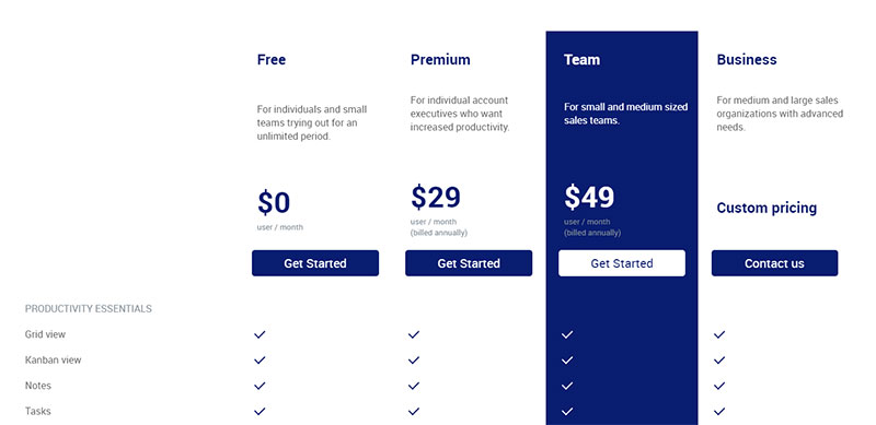
Without a doubt, the price is what most customers look at first when they go over a pricing table. Strangely, leaving out prices is the most common mistake on B2B and B2C websites. While some B2B companies can use B2B portals to interact with potential business partners and share the pricing strategy, it’s hard for B2C brands to access such an option.
Take care not to make the same mistake. Make it clear to the customer what the cost of each item is.
Font selection is an important element of pricing table design. Tools like a Contractor Invoices Receipt Template can ensure invoice designs align with the presentation of pricing tables. The choice of font depends on the kind of product or service.
Of course, it should also blend with the design. The headlines, titles, and prices should stand out on a table, so they are normally in bold.
Still, the overall visual and semantic weight of the pricing should be taken into account.
Do Not Use Too Many Visuals
Images and other design elements can make a pricing table more appealing. But do not go overboard with them.
Small touches of visuals have a much bigger impact, making the important things stand out. Use images with caution and avoid visual overcrowding.
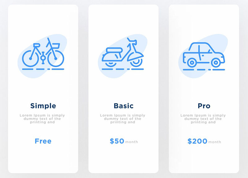
Icons are a different matter. They help the reader understand the information that they are reading.
Still, take care to also use the icons in a meaningful way. A green checkmark next to “Unlimited” says nothing.
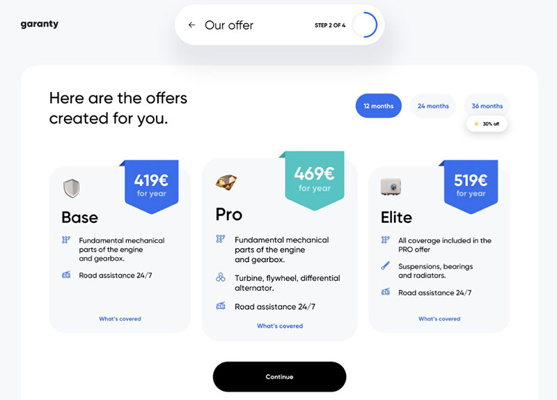
Thumbnails, or small images of the products, are also helpful. Comparative pricing tables are more informative if they show thumbnails of the products.
Place Them in Descending Order
For a reader, it is more pleasant to go down the prices on a pricing table than to go up one. So, it is best to start with the higher-priced items.
In this way, the customer cannot ignore those products or services. Those are the ones that will bring in more money.
Otherwise, they might only see the less expensive items and ignore the rest.
Use the same principle going from left to right on the pricing page. List the more expensive ones on the left-hand side and the cheaper ones on the right.
Again, this exposes the eyes of the client first to the higher-end options, without a price bias.
Illustrate the Difference
The human brain processes images and symbols faster than text. Use this fact to your advantage.
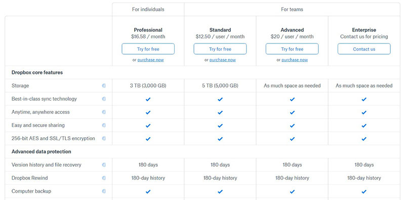
Instead of writing “yes” or “no” at every option, use a symbol. This helps the reader to take in the information.
It also improves the aesthetics by removing the clutter of unnecessary text.
A word of caution here. It has been found that a checkmark and an X have a similar appearance so are easy to confuse.
Also, their meaning is rather ambiguous. So, readers can interpret them to mean different things.
Leave Room for Customization
Leave some room for flexibility. A table is the most common way of presenting pricing information.
Sometimes, though, it’s good to show prices in a way that goes beyond the simple organization in columns and rows.
So when designing a pricing page, leave customization options in the web design. This can be used immediately or at some point in the future.
Flexibility allows customers to feel they are in control of their purchasing decisions.
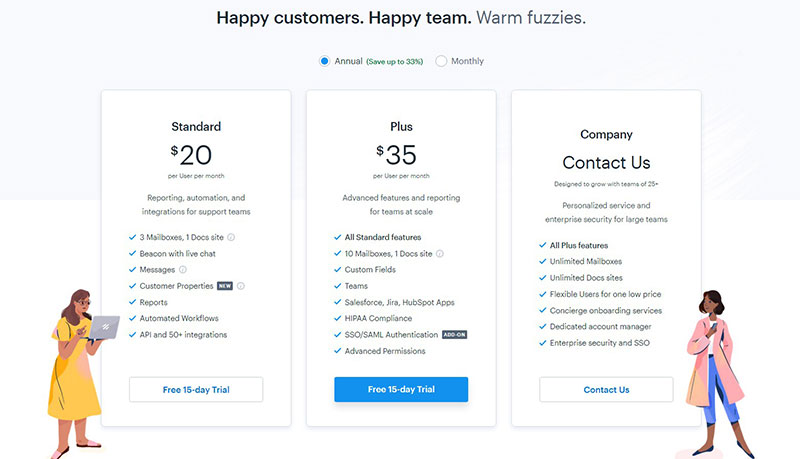
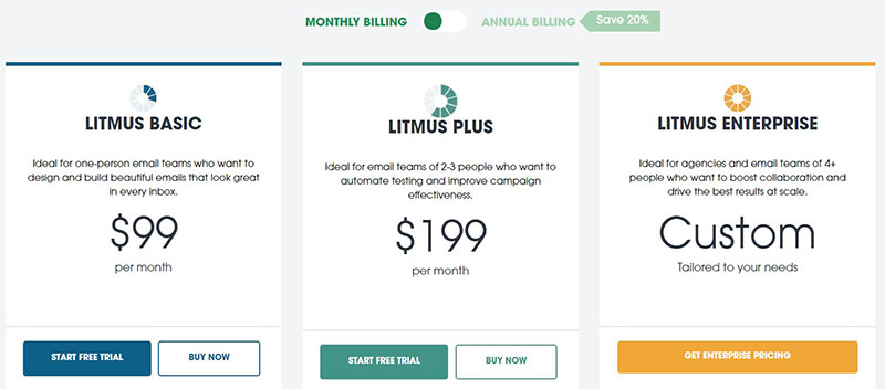
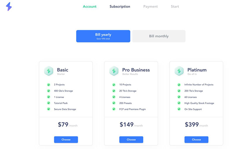
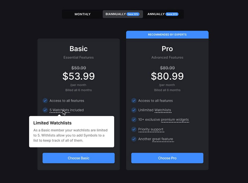
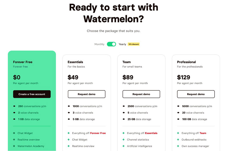
One idea could be to include the option of toggling between monthly or annual billing. This allows the clients to compare the two billing options.
Pricing table examples
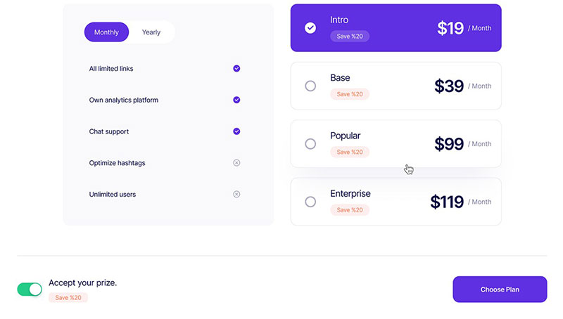
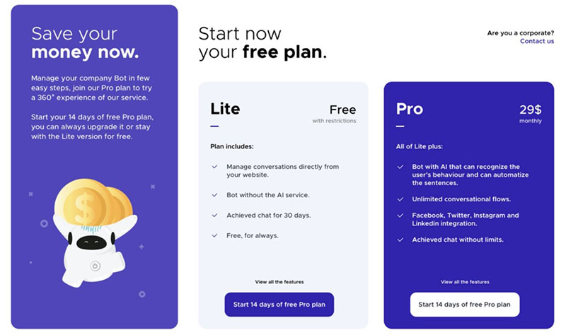
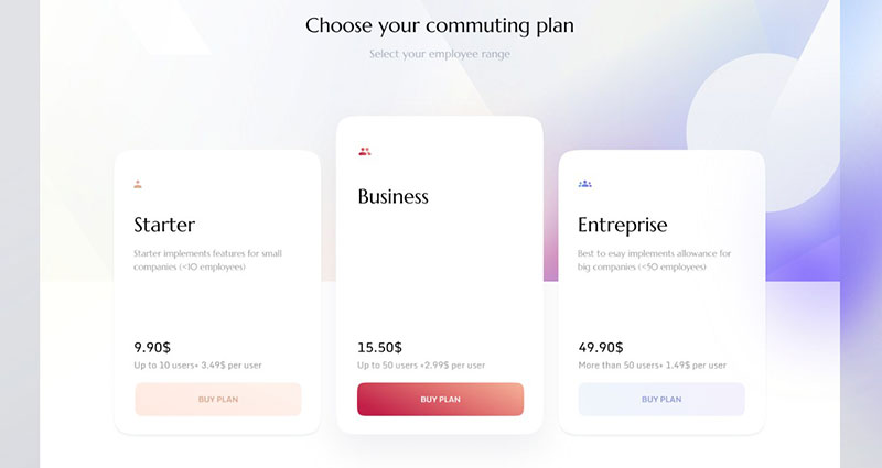
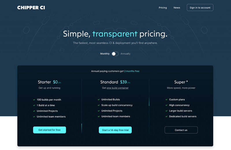
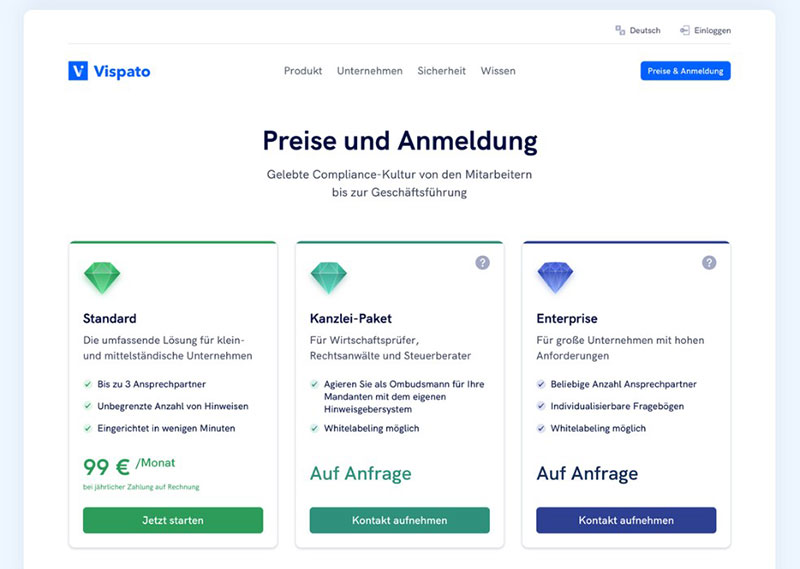
Those were some pointers and reminders for making a pricing table. But to get some inspiration, here are some examples of pricing tables.
These are some of the best. Have a look at them to learn how to design and present a pricing table
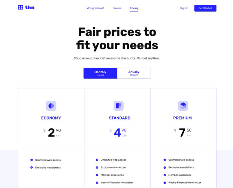
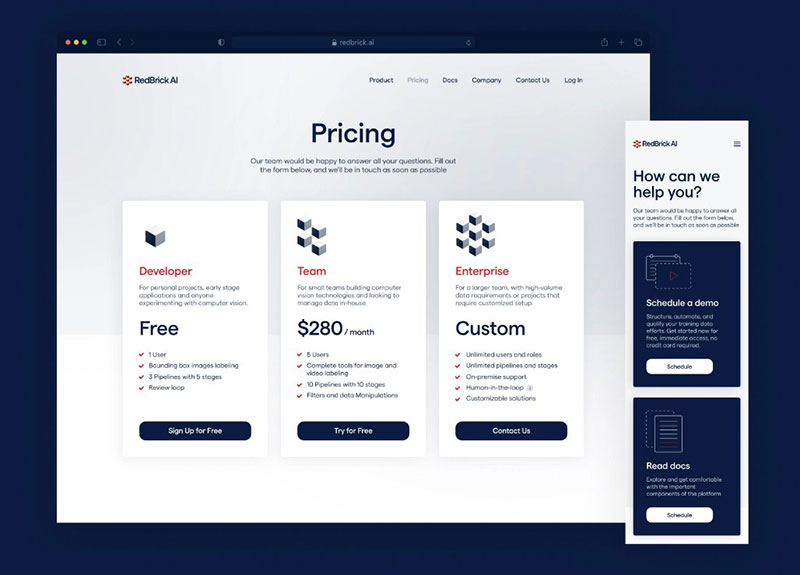
Pricing Section 02
Pricing Page Web
Pricing Section 03
Pricing Page — Choose Plan
Pricing Tables UI Component (Free Download)
Pricing Page – Watermelon
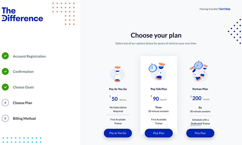
TheDifference Onboarding Pricing
Pricing Exploration
Pricing Plans
Pricing Section 01
Pricing and Plans Overview
Pricing Page Exploration
Insurance Car Pricing Web
Stocklabs – Pricing Cards
Pricing Plans
Roadmap’s new pricing model
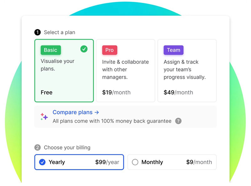
Pricing Page
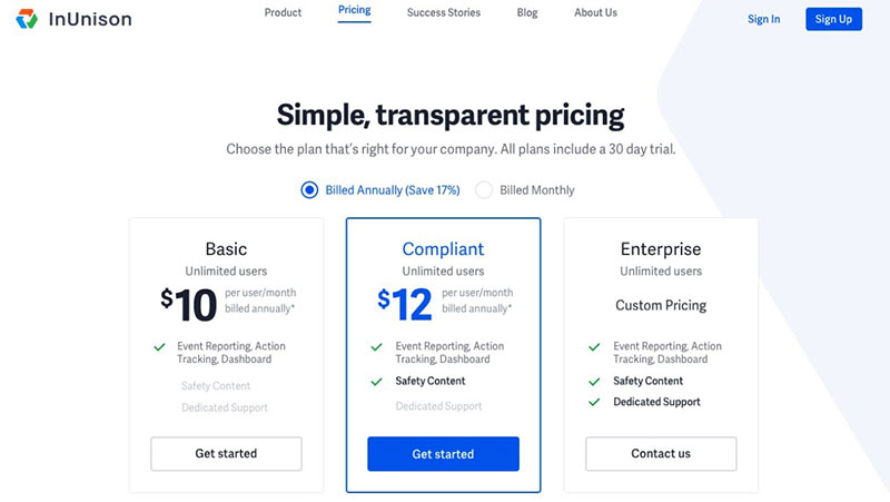
InUnison Pricing
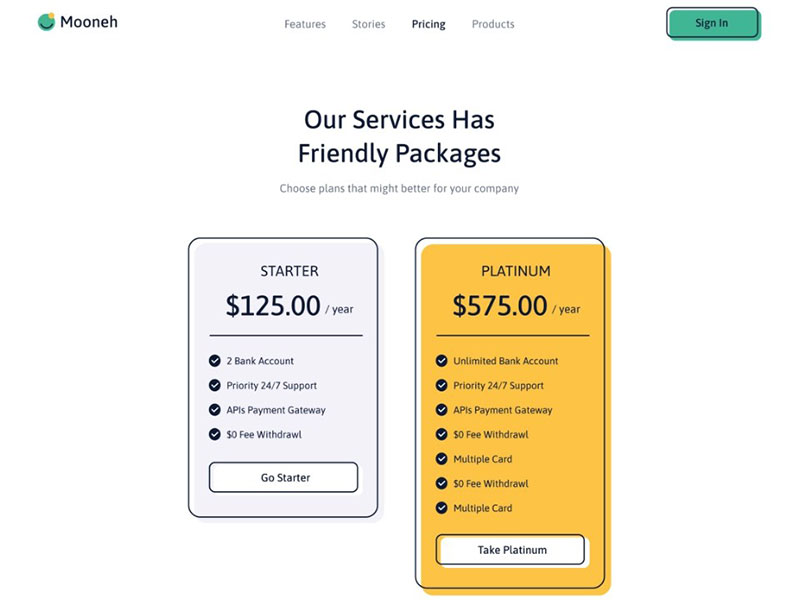
Mooneh Pricing Page
Pricing Page
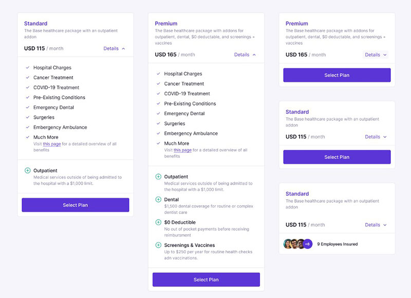
Private Healthcare Plans
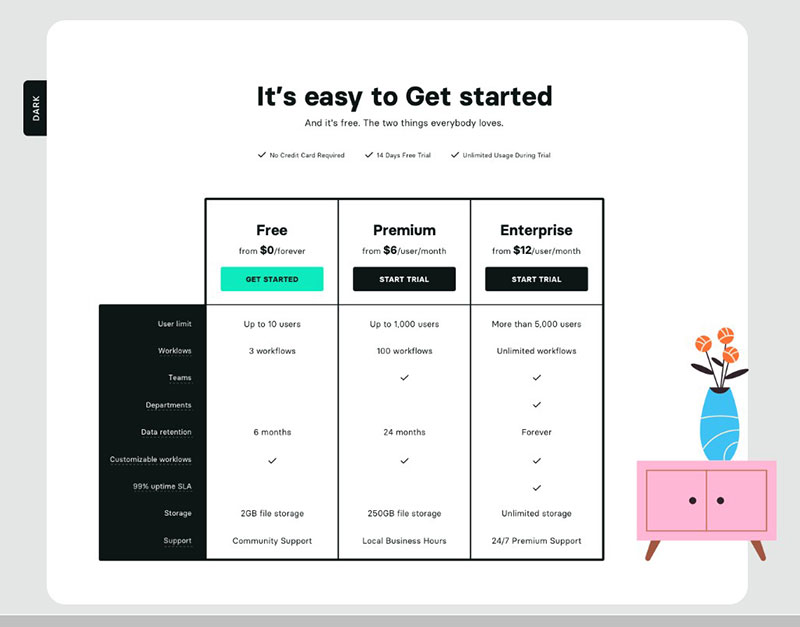
Pricing – Light and Dark mode
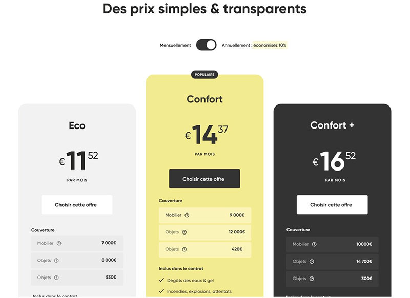
Pricing – Insurtech
Pricing Desktop Exploration (Free Figma Files)
Pricing
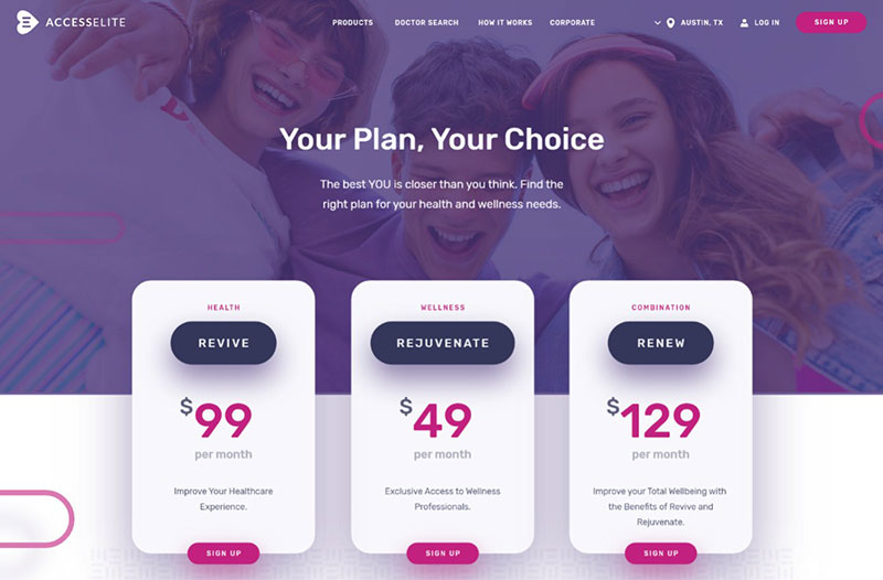
Accesselite Pricing page
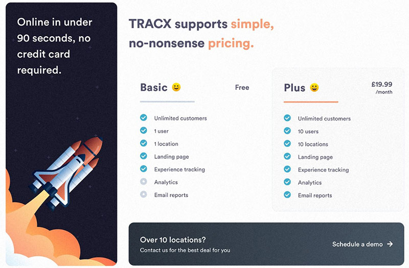
TRACX Pricing Page
Pricing Page
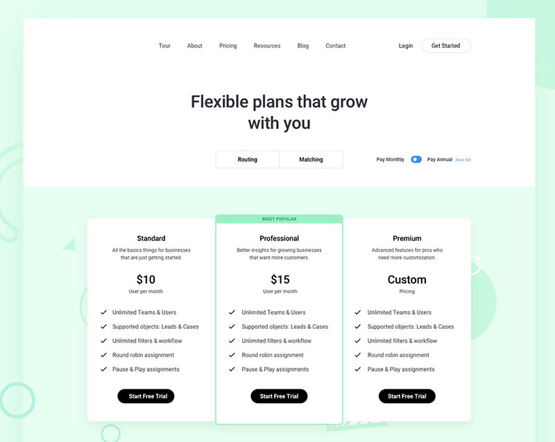
Flexible Plans
FAQ on pricing tables
What is a pricing table?
A pricing table is a visual tool on a website that displays various subscription plans, package pricing, or service options side by side. It helps potential customers compare features, pricing models, and payment options, making it easier to choose the plan that best fits their needs.
Why are pricing tables important?
Pricing tables are crucial for clear communication of your pricing structure and value proposition. They enhance user experience by simplifying complex information, helping customers understand the benefits and costs of each option, and ultimately guiding them toward a purchasing decision.
How do I design an effective pricing table?
Designing an effective pricing table involves clarity, simplicity, and highlighting the differences between your plans. Use a clean layout, distinguish key features with contrasting colors, and include a clear call-to-action. Ensuring your pricing table is mobile-friendly is also essential for a good user experience.
What elements should be included in a pricing table?
Key elements of a pricing table include plan names, pricing, a list of features, payment options, and a call-to-action button. Additional details like discount offers, a price breakdown, and billing cycles can further enhance clarity and attractiveness to potential customers.
How can I use pricing tables to increase conversions?
To increase conversions, highlight the most popular or recommended plan, use persuasive language for the benefits, and ensure the pricing table is easy to navigate. Including customer testimonials and clearly stating the value proposition for each plan can also help in converting visitors into customers.
What are common mistakes to avoid in pricing tables?
Common mistakes include overcrowding the table with too much information, using confusing or inconsistent layouts, and not clearly differentiating between plans. Avoid technical jargon that might confuse potential customers and ensure your pricing page loads quickly and is easy to navigate.
Can I use pricing tables for services and products?
Yes, pricing tables are versatile and can be used for both services and products. Whether you’re offering SaaS, e-commerce products, or any service-based business, a well-structured pricing table can effectively communicate the value and options available to your customers.
How do I choose the right pricing model for my pricing table?
Choosing the right pricing model involves understanding your target audience and their needs. Consider factors like market pricing, your cost structure, and competitors. Options include tiered pricing, dynamic pricing, and subscription models, each with its benefits depending on your business strategy.
How often should I update my pricing table?
Regular updates to your pricing table are necessary to reflect changes in costs, features, and market conditions. Monitor customer feedback and conversion rates to make data-driven adjustments. Keeping your pricing table current ensures that customers always have accurate information to make informed decisions.
What tools can I use to create pricing tables?
Various tools can help you create effective pricing tables, including website builders with built-in pricing table templates, plugins for platforms like WordPress, and custom design solutions. Tools like SEMrush and Ahrefs can help identify competitive pricing strategies, enhancing the effectiveness of your pricing table.
Conclusion
Crafting pricing table examples that resonate with your audience can transform your website from ordinary to extraordinary.
By utilizing pricing templates, subscription plans, and clear pricing structures, you cater directly to user needs, boosting both engagement and conversion rates.
As we explored, incorporating essential elements like rate plans, pricing models, and a compelling feature comparison ensures that your offerings stand out.
Effective pricing tables aren’t just about listing prices; they’re about communicating value, optimizing user experience, and driving decision-making.
Remember, the right pricing grid can simplify complex information, making it accessible and attractive.
Use dynamic pricing techniques and stay current with your updates to reflect real-time market changes. By doing so, you leverage cost efficiency and enhance your value proposition.
In conclusion, masterfully designed pricing tables are a powerful tool in your web design arsenal. Implement these strategies to elevate your site and achieve higher user satisfaction and business growth.
If you liked this article about pricing table examples, you should check out this article about how to publish an Excel spreadsheet on the web.
There are also similar articles discussing examples of data tables, how to make a data table, statistical tables, and weather tables.
And let’s not forget about articles on comparison tables, product comparisons, table UI design, and WordPress Excel spreadsheet plugin.
