
Imagine the elegance of a perfectly centered table on your website—it’s like finding the sweet spot in a symphony where harmony reigns supreme. That’s where the wizardry of CSS swoops in, transforming a chaotic alignment into pixel-perfect order. If you’ve grappled with tables that seem to have a mind of their own, sprawling awkwardly to the left or clinging to the right, you’re in the right place.
Centering a table with CSS is a rite of passage for front-end developers; it’s where form meets function in the digital world. This article empowers you with centering techniques that ensure your tables sit poised at the very heart of your design, on every device and every browser.
By the end, you’ll be armed with the skills to wield CSS properties like a conductor’s baton, orchestrating a responsive, aesthetically pleasing, and cross-browser compatible table display. From the intricacies of the flexbox to the robustness of the grid layout, we’ll ensure your tables never dance out of line again.
Table of Contents
How can I use CSS to center a table?
CSS sets the look of the page, enabling you to control the appearance and positioning of every element, including the table element and all its sub-elements such as th, tr, and td.
First things first, let’s go over the ‘right’ way of centering a table with CSS. If your right and left margins are of equal value, modern browsers should show the table centered. An easy way to achieve this is having both margins set to auto.
An example of how to write this in CSS is below:
table {
margin-right: auto;margin-left: auto; }
Note that you cannot just center the table the same as you would with text — .e.g. by using “text-align: center”.This is because the table element is a block-level element, as opposed to an inline element. “text-align: center” will only center inline content, such as the text within the table, rather than the table itself.
However, for older versions of Internet Explorer, there is a bug in which block-level elements are treated as inline elements. Thus, the only way to center a table to work with some versions of IE is to explicitly set “text-align: center” on the parent element of the table (e.g. the body element as shown below):
body { text-align: center;}
You can test how different browsers will behave with different styles, either by using “margin-left: auto; margin-right: auto” or “text-align: center”.
We’ll go over how to center a table in both modern and older browsers so that it looks right.
Examples will have the following general format:
<div>

<table>

</table>

</div>
Styles get applied to either <div>, <table> or sometimes both.
The style sheet section that we’ll play around with to set the margins is:
.center1{
margin-right: auto;
margin-left: auto;
}
.center2 { text-align: center;}
This example will work well on newer browsers. It will also work on most older browsers. Once you’ve used this method, open it in different browsers to check how it looks.
CSS for older browsers and newer browsers together:
.centertbl{text-align: center;}
.centertbl table{margin-left: auto;
margin-right: auto;
text-align: left;
}
How does it work?The first part gets put into the <div> containing the <table>. This will center a table in Internet Explorer 5 and Netscape 4. The second part gets applied to the<table> within a <div>.
The settings for the margins will let you center a table in browsers that work well with CSS. Then, the inline text will be put back to the default left alignment, overriding the initial “text-align: center” for older browser support.
How to center with a margin
One of the most common ways to center a table is to set both the bottom and top margins to 0, and the left and right margins to auto.
Here’s a commonly used method:
table { margin: 0 auto;}
Or you can do it this way:
table {
margin-left: auto;
margin-right: auto;
}
If you’re after a table that’s an exact width, you may do this as you usually would and the automatic margin will divide the space left over.
table {
width: 500px;
margin: 0 auto;
}
Another way to do it is to use percentages to define the width:
table {
width: 50%;
margin: 0 auto; /* same as margin: 0 25%; */
}
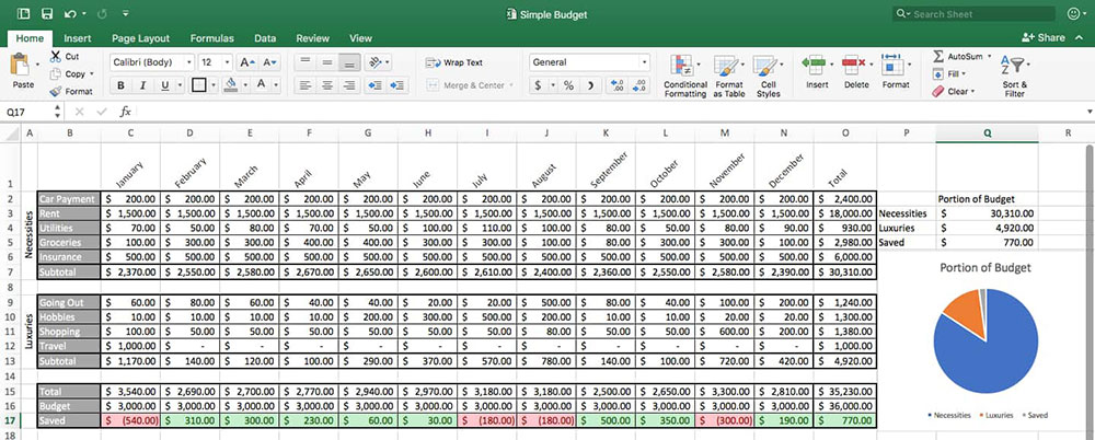
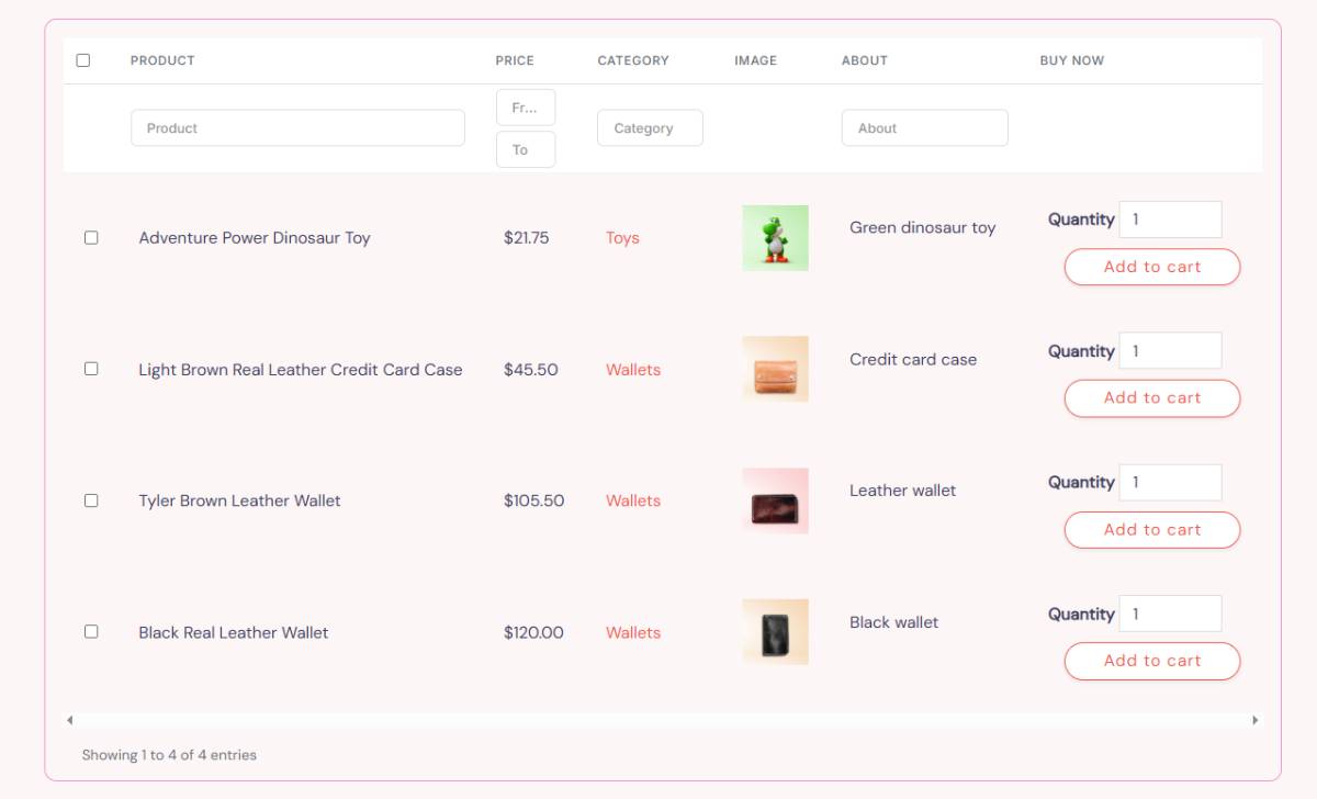
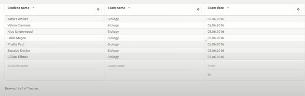
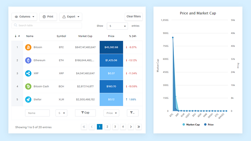
Your beautiful data deserves to be online
wpDataTables can make it that way. There’s a good reason why it’s the #1 WordPress plugin for creating responsive tables and charts.
And it’s really easy to do something like this:
- You provide the table data
- Configure and customize it
- Publish it in a post or page
And it’s not just pretty, but also practical. You can make large tables with up to millions of rows, or you can use advanced filters and search, or you can go wild and make it editable.
“Yeah, but I just like Excel too much and there’s nothing like that on websites”. Yeah, there is. You can use conditional formatting like in Excel or Google Sheets.
Did I tell you you can create charts too with your data? And that’s only a small part. There are lots of other features for you.
Cell alignment: text-align vs. vertical-align
If you want to know how to center text in CSS, there are two parts to aligning text in a cell; horizontally and vertically. Horizontally is whether the text will align center, left, or right of that cell. This is controlled by the text-align property.
Vertically is whether it’s in the middle, top, or bottom of the cell. This is controlled by the vertical-align property.
You apply the below properties to the TH or TD element to have your text vertically and horizontally align however you desire. For example:
td { text-align: center; vertical-align: top; }
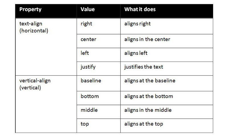
Justifying the text refers to adding spaces between all the words until they perfectly fit the space available on the line. The final line does not justify.
Table styling tips
Before concluding, we thought it may be useful to have a list of quick tips for your reference. These will help when you make a table in CSS.
- Line up your <td> and <th> text by using text-align. This will make it look tidier and easier to read.
- To break your table into parts that make sense, you can use <tfoot>, <tbody>, and <thead>. This also gives you more parts where you can apply CSS. This makes it simpler to layer multiple styles.
- Using table-layout enables you to set your column widths more easily. When you set the heading width, the column width will be the same.
- Use alternating colors to make the table simpler to read. At a quick scan, you can see what information is in the same row.
- Keep your table simple. You can use percentages, so you don’t have to change the size every time.
- You can utilize border-collapse to make a cleaner and neater looking table.
FAQ on centering a table
Why doesn’t my CSS code center the table on the page?
CSS can be finicky; ensure that you’ve set both the table’s left and right margins to auto and that its display property is not mistakenly set to default inline, which resists centering. Use display: block or display: table for better results.
What’s the difference between text-align and margin for centering a table?
Text-align controls the alignment of inline content within a block, while margin: auto actually manipulates the space around block-level elements. To center the table itself, go with margin; for text inside cells, text-align is your friend.
Can flexbox be used to center a table?
Absolutely, flexbox shines in centering tasks. Wrap your table in a container div, apply display: flex with justify-content: center and align-items: center to it, and watch your table sit pretty, bang in the middle.
Is it possible to center a table with CSS both horizontally and vertically?
Indeed, vertical centering calls for a combo move. With flexbox, for instance, setting both justify-content and align-items to center on the container will score you that sweet center spot in both dimensions.
How do I center a table with CSS on mobile devices?
Buckle up for responsive web design. Employ media queries to ensure that your centering logic, perhaps involving a nifty flexbox or grid layout, adapts as the screen size shrinks. Consistency is key across all devices.
Why is my table not centered in Internet Explorer, but it’s fine in other browsers?
Ah, the quirks of cross-browser compatibility. Internet Explorer has a notorious streak of playing by its own rules. Double-check your syntax and consider using text-align: center on the parent container, which is often more effective in IE.
Can CSS Grid Layout also be used to center a table?
Sure can! CSS Grid Layout is another ace up the sleeve. Designate your container as a grid with display: grid and then use place-items: center or a combination of justify-items and align-items to beam that table to the center grid square.
How does padding affect the centering of a table in CSS?
Padding can add a twist to the tale. It increases the content’s area within each cell, demanding more space, which can throw off your centering harmony. Keep an eye on it when calibrating your centering masterpiece.
If I use margin: 0 auto;, why isn’t my table centering?
Check your table’s display property; margin: 0 auto; is a trusty bard for blocks, not inline elements. Switching your table’s display to block or table should see your table waltz to the center stage gracefully.
How do web standards and W3C recommendations impact table centering with CSS?
Web standards are the compass guiding our voyage through the turbulent seas of web design. Aligning your CSS with W3C guidelines ensures that your centering method is built on a foundation respected across the digital cartography, ensuring a harmonious display in the vast web browserscape.
Conclusion
Endings are as crucial as the grand entrance of a table perfectly centered; it’s a testament to the skillful harmony you’ve orchestrated with mere lines of CSS code. Now, when the question of how to center a table with CSS arises, it’s met with confidence—a product of the wisdom shared.
Acknowledge the design quest tackled, from the deceptive simplicity of horizontal centering to the meticulous demands of vertical alignment. Armed with the prolific powers of margin, the flexibility of flexbox, and the structural might of grid layout, the crusade against off-center tables is one for the storybooks.
Marvel at the responsive prowess that ensures your centered table remains the star across devices, and bask in the victory over cross-browser antics—an odyssey through compatibility that cements your feats in web design.
Farewell then, creator of centered tables; may your designs forever hit that sweet symphony of balance. Remember, in the realm of pixels, you hold the wand that conjures harmony.
If you enjoyed reading this article on How to center a table with CSS, you should check out this one about Bootstrap tables.
We also wrote about a few related subjects like table background color, HTML tables, responsive tables with CSS, CSS tables and jQuery table plugins.