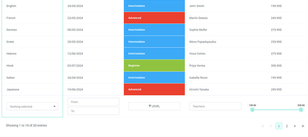
Raw data in spreadsheets is overwhelming and difficult to interpret, especially by people who aren’t data-savvy. This is where sales data visualization comes in – transforming numbers into clear, insightful charts that allow you to easily track performance, identify trends, and optimize your sales strategies.
That’s why we’ll explore how wpDataTables simplifies sales data visualization, provides real-time insights, and enables you to make data-driven decisions that ultimately boost their bottom line. Whether you’re looking to track monthly revenue trends, analyze sales by product categories, or create interactive sales dashboards, wpDataTables offers the perfect solution to bring your sales data to life.
Table of Contents
How Sales Data Visualization Influences Your Bottom Line
By transforming raw sales data into insightful visuals, you will make smarter, faster decisions that lead to better financial performance. But what can you expect in terms of measurable results of sales data visualization?
Better sales forecasting and planning
Visualizing historical sales data allows you to spot trends and predict future sales more accurately. Whether you’re tracking seasonal peaks or long-term growth, sales data visualization provides a clear, visual representation of what to expect. This leads to more precise forecasting, enabling you to allocate resources efficiently, manage inventory, and prepare for demand shifts – all of which directly improve profit margins.
Identify sales gaps and opportunities faster
Sales data visualization helps you quickly identify underperforming products or services, as well as areas that are exceeding expectations. For example, a bar chart comparing regional sales might reveal that certain territories consistently outperform others. With this insight, you can allocate more resources to high-performing areas and address gaps in weaker ones, maximizing revenue potential across the board.
Improved sales team performance
Dashboards and visual KPIs allow your sales team to track their performance in real time. By making individual and team goals visible, sales data visualization fosters accountability and drives motivation. For instance, sales reps can monitor their progress toward targets, helping them stay focused and engaged.
A more motivated and aligned sales team naturally boosts productivity, leading to higher sales and increased revenue. To further maximize this output, many companies are asking, “What Is AI SDR?” and using autonomous agents to handle the high-volume outreach tasks identified by their data, allowing human reps to focus strictly on closing the high-value opportunities highlighted in their dashboards.
Increased customer retention and upselling
By analyzing visualized sales data, businesses can better understand customer buying patterns and behaviors. This allows for more personalized upselling and cross-selling strategies. Visualizing repeat purchase rates or customer lifetime value, for example, can uncover high-value customers and prompt targeted marketing efforts. Retaining existing customers is often more cost-effective than acquiring new ones, and visual insights drive these profitable retention strategies.
Aligned decision-making process
When you visualize sales data, it eliminates guesswork and ensures that every decision is based on accurate insights. Instead of spending time deciphering spreadsheets, executives can immediately see the big picture – whether it’s product performance, sales trends, or customer behavior. Quick, data-backed decisions lead to faster responses to market changes, helping businesses stay competitive and capitalize on opportunities that boost their bottom line.
Optimized pricing and inventory management
Visual sales data can reveal patterns that directly influence pricing strategies and inventory management. For instance, visualizing sales volume over time can show when demand is highest, allowing you to adjust pricing dynamically for maximum profit. It can also help ensure that inventory is aligned with customer demand, minimizing excess stock and associated costs, thereby improving profitability.
And now, let’s see the tool that makes all these benefits a reality:
Overview of wpDataTables’ Charting Tools
wpDataTables is a powerful and versatile sales data visualization plugin for WordPress that enables users to create dynamic, interactive tables and charts. It’s particularly useful for visualizing complex datasets, including sales data, in a way that’s easy to understand and actionable.
One of the standout features of wpDataTables is its wide selection of chart types, allowing you to choose the most suitable visual representation for your data. Some of the available chart options include:
- Bar charts: Ideal for comparing sales performance across different products, regions, or time periods. For example, a bar chart can easily display monthly sales by product category, helping businesses identify their top performers at a glance.
- Line charts: Perfect for tracking sales trends over time, such as visualizing the growth of monthly revenue or customer acquisition. Line charts make it easy to spot upward or downward trends.
- Pie charts: Useful for showing the proportion of sales attributed to various categories, such as product lines or customer segments. This can help businesses understand which areas are contributing most to their total sales.
- Scatter plots: Great for identifying correlations between two variables, such as customer size and revenue, or price and quantity sold.
- Area charts: Excellent for showing cumulative sales figures over time, giving a visual sense of growth and scale.
Each chart type comes with customization options, allowing you to modify colors, labels, and other chart elements to match your brand or reporting needs.
A key advantage of wpDataTables is its ability to integrate with various data sources, making it easy to import and visualize sales data from multiple platforms. The charts plugin supports popular formats such as:
- Google Sheets: Automatically sync your sales data from Google Sheets, ensuring that your charts and tables always display the most up-to-date information. This is especially useful for teams that collaborate using shared documents.
- Excel Files: If your sales data is stored in Excel, wpDataTables allows you to import and visualize it effortlessly, helping you transform raw numbers into engaging visuals with just a few clicks.
- SQL Databases: For more advanced users, wpDataTables can directly connect to SQL databases, pulling in real-time sales data for visualizations. This is particularly useful for businesses dealing with large datasets or using custom CRM software that rely on databases.
In addition to these sources, wpDataTables also integrates with other file types such as CSV, XML, and JSON, providing flexibility no matter where your sales data resides. The plugin’s intuitive interface makes it easy for users of all skill levels to create professional-looking charts without any coding knowledge.
How to Visualize Sales Data with wpDataTables
Visualizing sales data with wpDataTables is a straightforward process that can turn raw numbers into insightful charts in just a few steps. This guide will walk you through the process of creating a sales data chart—from importing your data to customizing the visual elements of the chart.
Step 1: Importing sales data
The first step to creating a sales data chart in wpDataTables is to import your sales data into the plugin. You can do this by uploading a file or connecting to an external data source.
- File upload: If you have your sales data in an Excel, CSV, or Google Sheets format, you can upload it directly into wpDataTables. To do this, simply navigate to the wpDataTables plugin dashboard, click on Create a Table, and select the appropriate option to upload your file.
- Connect to External Data Sources: If your sales data is stored in a live source such as Google Sheets or an SQL database, wpDataTables allows you to connect directly to these sources. This ensures that your charts always display the latest sales figures without needing to manually update the data.
Once the data is imported, wpDataTables will automatically generate a table preview, allowing you to verify that your sales data is correct before proceeding.
Step 2: Choosing the right chart type
After your data is uploaded, the next step is to choose the most suitable chart type to represent your sales data. wpDataTables offers various chart types, including bar charts, line charts, pie charts, and more, each ideal for specific purposes.
For example:
- Bar Charts are great for comparing sales across different products or regions.
- Line Charts are ideal for visualizing sales trends over time.
- Pie Charts work well for showing the proportion of sales attributed to different categories.
In this case, let’s assume we want to create a Sales Revenue Trend Line Chart to visualize monthly sales performance over the past year. Select the Line Chart option from the available chart types.
Step 3: Customizing chart elements
Once you’ve chosen your chart type, wpDataTables allows you to customize the visual elements to make the chart more informative and visually appealing. Some key customizations include:
- Chart Title: Add a descriptive title, such as “Monthly Sales Revenue – 2024”, to provide context for the data being displayed.
- Colors: Customize the chart’s color scheme to match your branding or highlight specific data points (e.g., use green for months where sales exceeded targets).
- Axes and Labels: Ensure that the axes are labeled clearly. For a sales revenue trend chart, the X-axis might represent time (e.g., months), while the Y-axis represents revenue.
- Gridlines and Data Points: Enable gridlines or display individual data points on the line for easier interpretation of the trends.
wpDataTables also allows you to enable tooltips and interactive elements, so users can hover over data points to see exact sales figures.
Key Benefits of Using wpDataTables for Sales Data Visualization
When it comes to visualizing sales data, wpDataTables offers numerous benefits that make it a go-to tool for businesses looking to turn their sales data into actionable insights.
1. Real-time data updates
One of the standout features of wpDataTables is its ability to display real-time data and dynamically adjust charts as your data changes. This is particularly useful for businesses that rely on up-to-the-minute sales data to make decisions.
Whether your sales data is stored in Google Sheets, Excel, or an SQL database, wpDataTables can sync with these sources to pull in the most current information. This ensures that your charts are always up to date without the need for manual refreshes.
As your sales data changes, wpDataTables automatically updates your charts in real-time. For instance, if new sales figures come in, or if there are shifts in product performance, the visualizations will adjust to reflect the new data. This makes it easy to monitor performance continuously, helping you respond quickly to sales trends and opportunities.
2. Responsive charts for viewing on any device
Being able to access and view data on any device is crucial. wpDataTables excels in providing fully responsive charts that adapt to different screen sizes, ensuring that your sales data is accessible from desktops, tablets, and smartphones.
- Cross-device compatibility: Whether you’re in the office or on the go, wpDataTables ensures that your sales charts look great on any device. Responsive design means that the visual elements, labels, and data points adjust automatically to fit smaller screens without sacrificing readability or usability.
- User-friendly interface: The responsive nature of wpDataTables charts allows business owners, managers, and sales teams to view critical data from their phones or tablets, making it easier to stay informed and make quick decisions, regardless of where they are.
This mobile-friendly design is particularly useful for remote teams or executives who need access to real-time sales data while traveling or attending meetings.
3. Integration with other tools for better sales reporting
wpDataTables seamlessly integrates with various tools and platforms that businesses commonly use for sales tracking and reporting. This allows you to create a more comprehensive sales analysis by pulling in data from multiple sources, offering a holistic view of your business performance.
In addition to Google Sheets, Excel, and SQL databases, wpDataTables can integrate with other data sources such as CSV files, XML, and JSON. This flexibility allows you to visualize data from virtually any source, enhancing your ability to analyze sales performance across various systems.
Try Before You Buy
If you’re ready to transform the way you analyze your sales data, wpDataTables is the perfect choice.
You’ll get the ability to create stunning, interactive charts that automatically update as your sales figures change, all without needing advanced technical skills.
With wpDataTables, you can take full control of your data, turning complex spreadsheets into visually engaging reports that provide clarity and drive better business decisions. Stop relying on outdated, time-consuming methods and empower your team with a tool designed for modern businesses.
The best news is – you can try wpDataTables immediately for free and see firsthand how powerful it can be for sales data visualization.
And when you do, you’ll immediately try wpDataTables immediately for free and choose a plan that fits your sales needs.


