Table of Contents
Video tutorial
See the steps needed to create a responsive chart in WordPress using Chart Creation Wizard of the wpDataTables plugin, a very easy step-by-step generator.
Charts in wpDataTables

Charts in wpDataTables can be created with a step-by-step chart creation wizard in WordPress admin. On each step you can go back to change the settings. In the “Formatting and preview” step, you can see a live chart preview, so you can check if you’re satisfied with the look of the chart before saving it and inserting it to a WordPress post or page. You can see the current step in the upper part of the screen in the breadcrumbs.
Chart title & type
To open the Chart Creation Wizard, open your WordPress admin panel and go to wpDataTables -> Create a Chart, where you will define a chart name that will help you to identify it later, and choose one of the render engines – Google Charts, Highcharts, Chart.js or NEW ApexCharts.

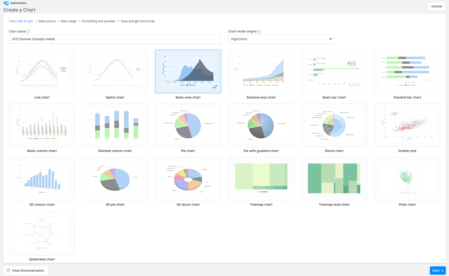
When you choose the rendering engine, wpDataTables will show a list of possible chart types, the list varies depending on the engine. You can find a full list of chart types with details for Google Charts in this documentation section, for Highcharts in this documentation section, for ApexCharts in this documentation section, and for Chart.js in this documentation section.
For this example, we will use the Highcharts area chart. After you choose the chart, click Next to go to the next step.
Data source selection for the chart
On the “Data source” step you will need to define the table that will be used as the data source for the new chart. This is done with a simple selectbox.

Data range
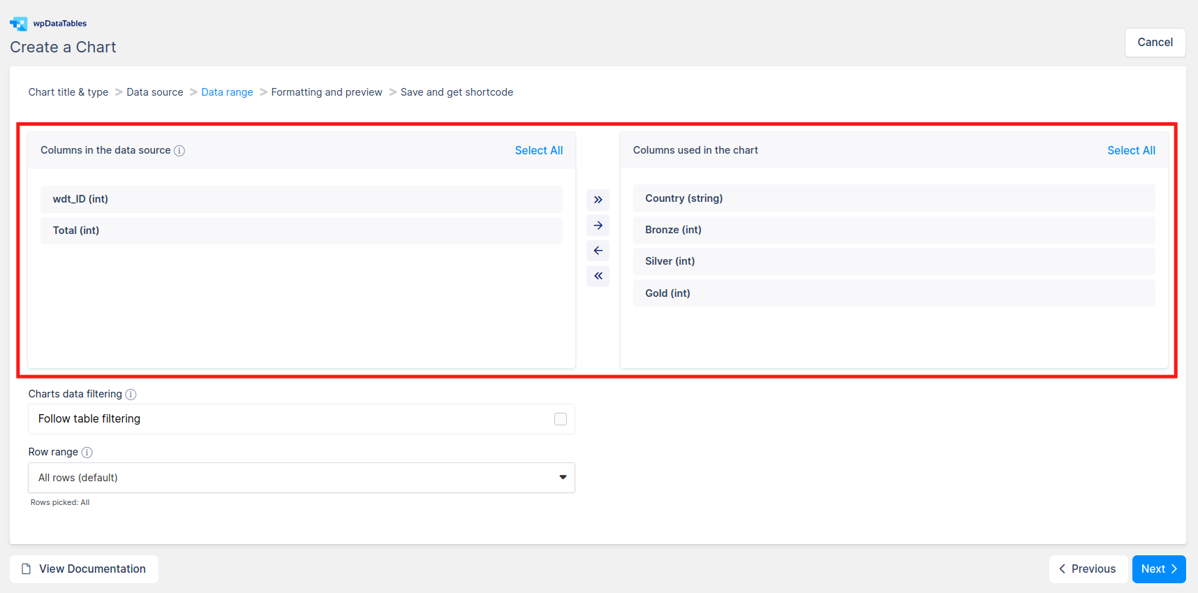
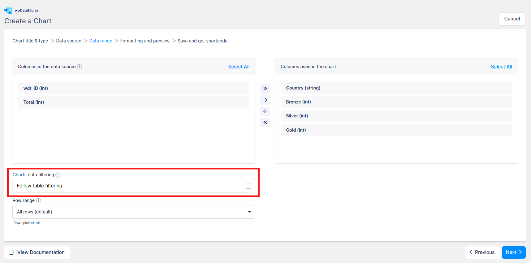
On the “Data range” step, you will need to provide the data range for the future chart. This consists of several blocks. The first block is the Column range picker.
In the column range picker, you can select the table columns that will be used in the future chart. In the left container you can see a list of all the columns that the table has, with their names and data types. The items of this list can be clicked to be selected; also, there are “Select all” and “Deselect all” shortcuts above them. The right container represents the list of columns that will be used in the chart. The items in this list can be drag&dropped for reordering. Add all, Add selected, Remove selected, Remove all buttons are between the two containers. These allow adding columns to the chart or removing them. The right container also displays hints if an incorrect amount or incorrect type of columns for the chosen chart type was selected (e.g., it shows that there are not enough columns added for the selected chart type).
Next block is the Row range picker block:
wpDataTables allows you to choose not only the columns that will be used in the chart in the WordPress front-end, but also the rows. By default, it is set to “All rows“, but you can choose individual rows or row ranges as well. For this, choose “Pick range” in the dropdown, and click on the “Range picker…” button that appears.
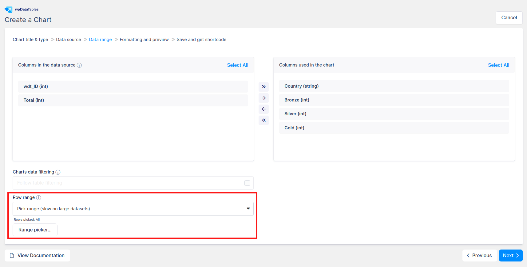
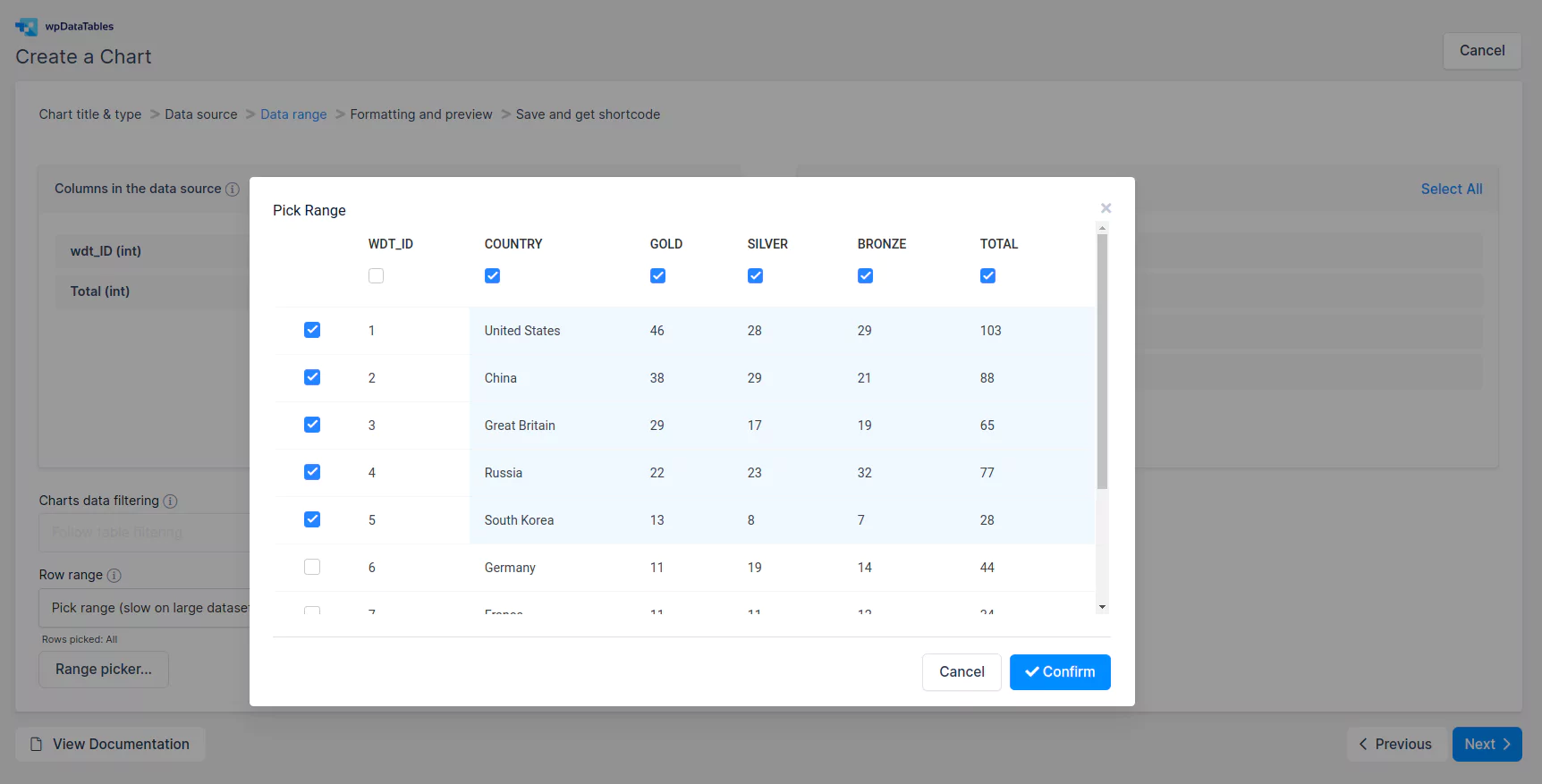
When you click on the “Range picker…” button, the row range picker popup will appear.
Range picker shows the data of your table, and you can select the cells that you would like to use in the chart there.
There are 2 options to pick a range:
- Click&drag (Excel-like): click on a cell that you want to set as a range start, and move your mouse (e.g., diagonally) to the cell that you want to set as the range end. It will also override the columns you chose in the column range picker if the column set will be different.
- Use checkboxes above the columns and to the left of rows. All rows and columns that have checkboxes checked are for the range. Column range can be overridden with this option as well.
When you’re done, click “OK“, and the range will be saved (see the hint below the dropdown which will show the number of selected rows).
The last option on this step is the “Follow table filtering” checkbox. It is available only if you choose to use “All rows” in the “Row range” selectbox. It is explained in a separate documentation section you can see here.
Formatting and preview
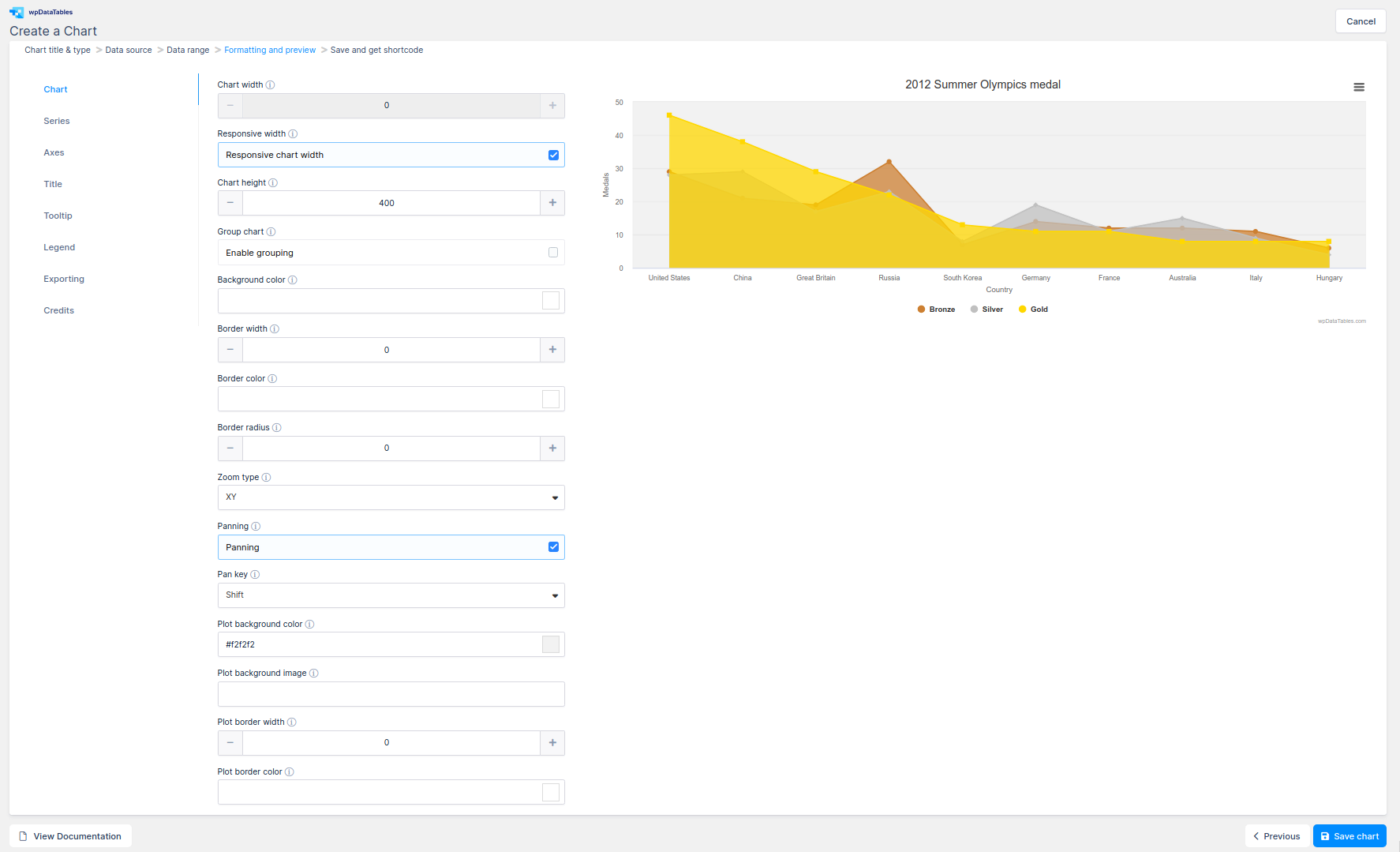
When the data range is chosen, you can click Next to proceed. The next step is “Formatting and preview“. Changes that are made on the chart are instantly visible on the chart that is rendered on the right side of the screen. The formatting step is divided into categories representing different chart elements.
In the first category you can change basic chart options like:
- Chart width – The width of the chart
- Chart height – The height of the chart.
- Responsive width – If you tick this, chart width will always adjust to 100% of the width of the container
- Group chart – If you tick this checkbox, the values of the rows with the same label will be summed up and rendered as a single series. If you leave it unticked, all the rows will be rendered as a separate series. This is explained in a separate documentation section; you can see it here
- Background color – The background color for the tooltip.
- Border width – The pixel width of the outer chart border.
- Border color – The color of the outer chart border.
- Border radius – The corner radius of the outer chart border.
- Zoom type (Highcharts and ApexCharts only) – This decides in which dimensions the user can zoom by dragging the mouse.
- Panning (Highcharts only) – Allows panning in a chart. This is best used with Pan key to combine zooming and panning.
- Pan key (Highcharts only) – Allows setting a key to switch between zooming and panning.
- Plot background color – The background color or gradient for the plot area
- Plot background image (Highcharts and ApexCharts only) – The URL for an image to use as the plot background.
- Plot border width – The pixel width of the plot area border.
- Plot border color – The color of the inner chart or plot area border.
- Chart area/line image (ApexCharts only) – The URL for an image to use as the background image of the chart area or line. If you have multiple series, this image is applied to all of them. If you want each series to have a different image property, leave this blank.
- Font size (Chart.js and Google Charts only) – The default font size, in pixels, of all text in the chart.
- Font name (Chart.js and Google Charts only)- The default font face for all text in the chart.
- Monochrome (ApexCharts Pie only) – A single color will be used as a base and shades for the chart will be generated from that color. Leave this unchecked if you want to use the Color pallete.
- Color palette (ApexCharts Pie only) – When enabled, you can pick a predefined color palette for your chart. Leave this unchecked if you want to use the Monochrome design.
- Marker size (ApexCharts only) – Sets the size of the marker point. For larger amounts of data points, it is recommended to set this to 0 to optimize performance.
- Data labels (ApexCharts only) – If you leave this checked, data labels will be shown on the chart. For larger amounts of data, it is recommended to keep this option turned off for optimal performance.
- Drop shadow (ApexCharts only) – Add Shadow on each series. When is turn on, it will be be shown aditional settings: Dropshadow blur, Dropshadow opacity, Dropshadow color, Top and Left position.
- Start angle (ApexCharts Radial Bar only) – Set the starting angle of the radial bar.
- End angle (ApexCharts Radial Bar only) – Set the ending angle of the radial bar.
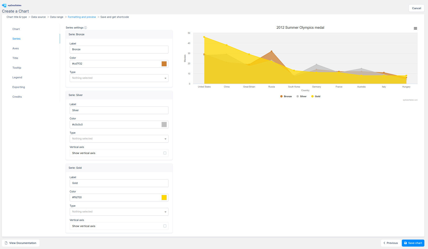
In the “Series” category you can customize actual series options for series that are used in the chart:
- Label
- Color
- Type (Only Line, Spline, Basic area, Basic bar and Basic column Highcharts and Line, Spline, Stepline, Area, Column Apexcharts) – To combine several chart types in one chart.
- Vertical axis (Only Line, Spline, Basic area, Basic bar and Basic column Highcharts) – Multiple y axis in order to show different units on the same chart.
- Curve type (Google Line Chart only, Chart.js Line and Area)
- Chart line/area image (ApexCharts only) – The URL for an image to use as the background image of the chart area or line.
- 3D (Google Pie Chart only) – If true, a three-dimensional chart is displayed.
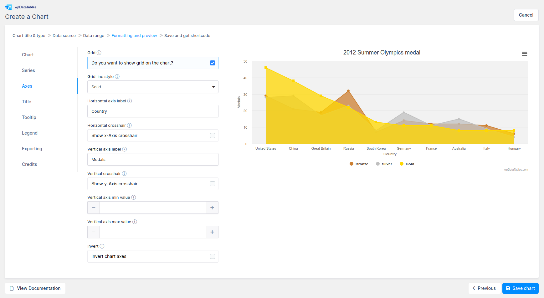
The “Axes” section describes chart axes options; the X(H) axis or category axis and the Y(V) axis or value axis. Options that are available for axes are:
- Grid
- Grid line color (ApexCharts only) – Color of grid borders / lines
- Grid stroke dash (ApexCharts only) – Creates dashes in the grid. Higher number creates more space between dashes in the border.
- Grid position (ApexCharts only) – Whether to place grid behind chart paths or in front.
- Axes lines to show (ApexCharts only) – Choose which axis to show
- Stroke width (ApexCharts only) – Sets the width of border for SVG path. Smaller values correspond to smaller line thickness.
- Tick amount (ApexCharts only) – Number of tick intervals to show on the y-axis.
- Grid line style (Highcharts only) – The dash or dot style of the grid lines
- Horizontal axis label – Name of the horizontal axis
- Horizontal crosshair (Highcharts and Google Charts only)- Configures a horizontal crosshair that follows either the mouse pointer or the hovered point lines
- Horizontal axis direction (Google Charts only)
– The direction in which the values along the horizontal axis increase. Specify -1 to reverse the value order - Vertical axis label – Name of the vertical axis
- Vertical crosshair – Configures a vertical crosshair that follows either the mouse pointer or the hovered point lines
- Vertical axis direction (Google Charts only) – The direction in which the values along the vertical axis increase. Specify -1 to reverse the order of the values
- Vertical axis min value – The minimum value of the axis
- Vertical axis max value – The maximum value of the axis
- Invert – Enables inverting the axes, so that the x axis is vertical, and the y axis is horizontal
The chart’s main title options:
- Show/Hide Chart title
- Title floating (Highcharts, ApexCharts and Google Charts only)- When the title is floating, the plot area will not move to make space for it
- Title align (Highcharts and ApexCharts only) – The horizontal alignment of the title
- Subtitle (Highcharts and ApexCharts only) – The chart’s subtitle
- Subtitle align (Highcharts and ApexCharts only) – The horizontal alignment of the subtitle
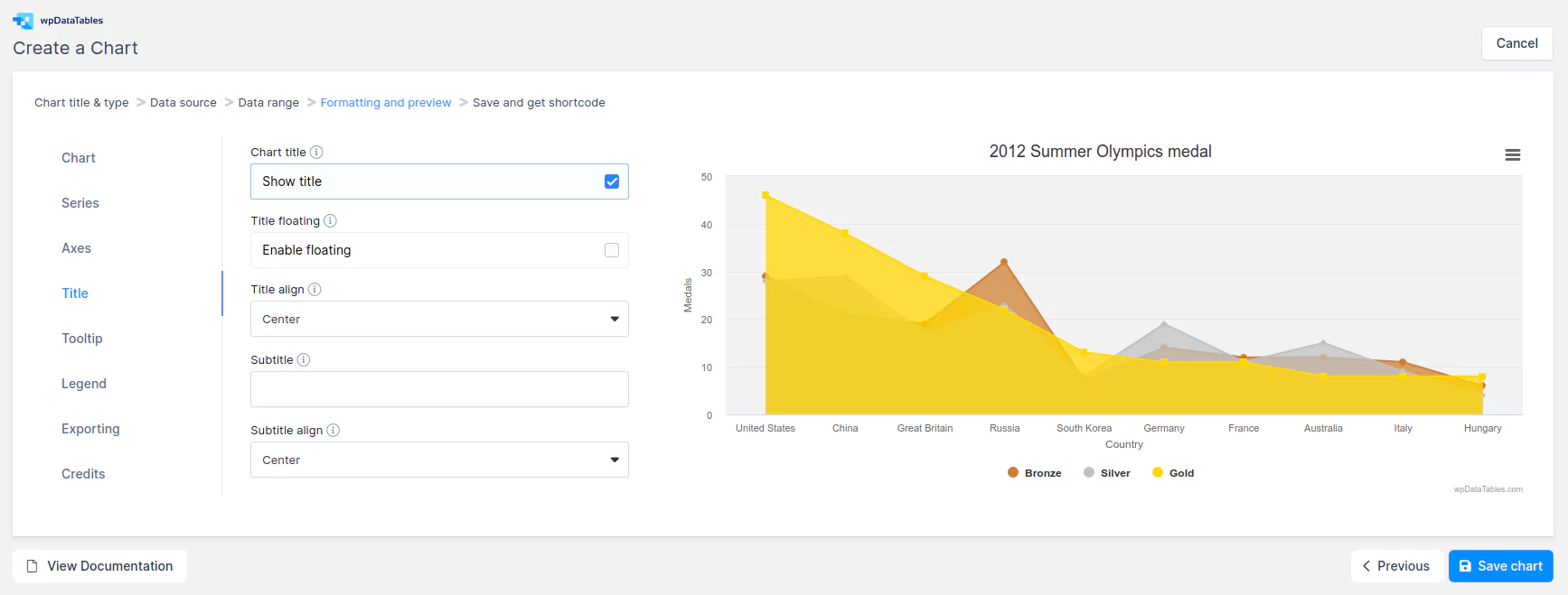
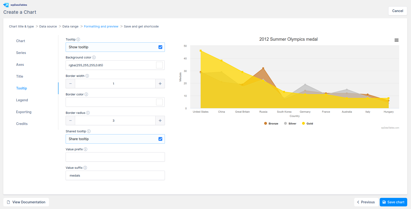
Options for the tooltip that appears when the user hovers over a series or point:
- Enable/Disable Tooltip
- Background color (Highcharts and Chart.js only) – The background color for the tooltip
- Border width (Highcharts only) – The pixel width of the tooltip border
- Border color (Highcharts only) – The color of the tooltip border
- Border radius (Highcharts and Chart.js only) – The radius of the rounded border corners
- Shared tooltip (Highcharts and Chart.js only) – When the tooltip is shared, the entire plot area will capture mouse movement or touch events
- Value prefix (Highcharts only) – A string to prepend to each series’ y value
- Value suffix (Highcharts only) – A string to append to each series’ y value
- Follow cursor (ApexCharts only) – Follow the cursor position instead of putting tooltip on actual data points
- Fill with series color (ApexCharts only) – If you leave this checked, the tooltip background will be filled with the corresponding series color
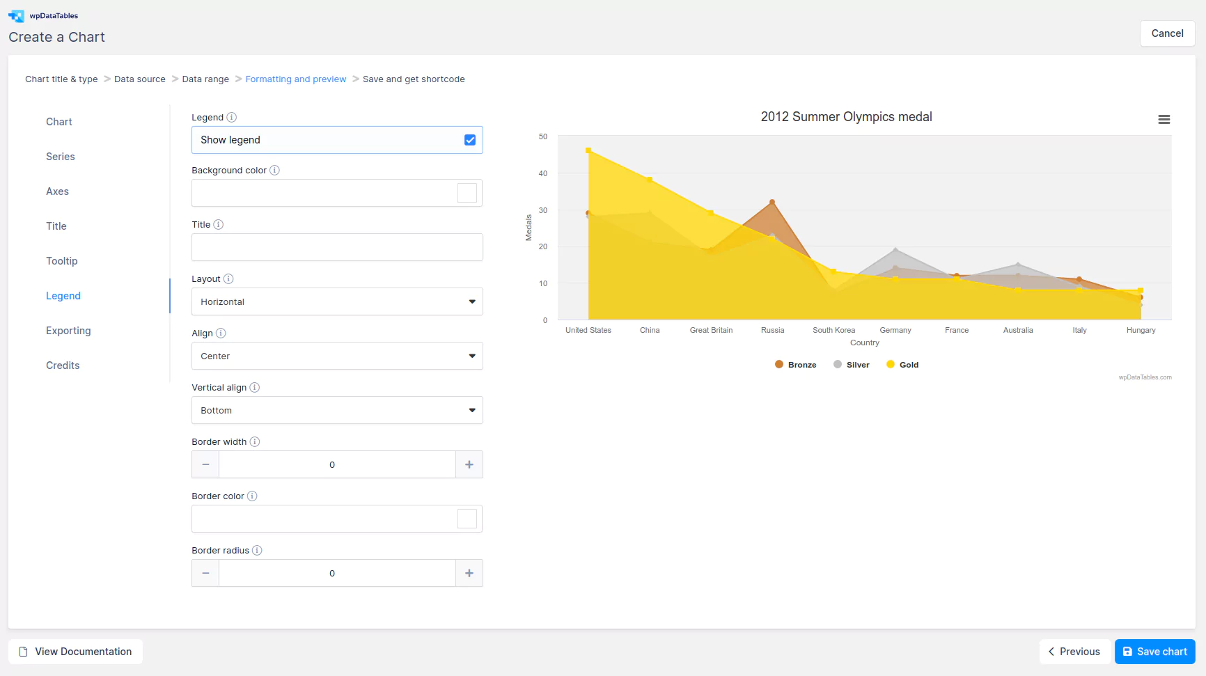
The legend is a box containing a symbol and name for each series item or point item in the chart:
- Enable/Disable Legend (Highcharts and Chart.js only)
- Background color (Highcharts only) – The background color of the legend
- Title (Highcharts only) – A title to be added on top of the legend
- Layout (Highcharts only) – The layout of the legend items
- Align – The horizontal alignment of the legend box within the chart area
- Vertical align – The vertical alignment of the legend box
- Border width (Highcharts only) – The width of the drawn border around the legend
- Border color (Highcharts only) – The color of the drawn border around the legend
- Border radius (Highcharts only) – The border corner radius of the legend
- Legend position – The position of the legend. Possible values are ‘top’, ‘left’, ‘bottom’ and ‘right’
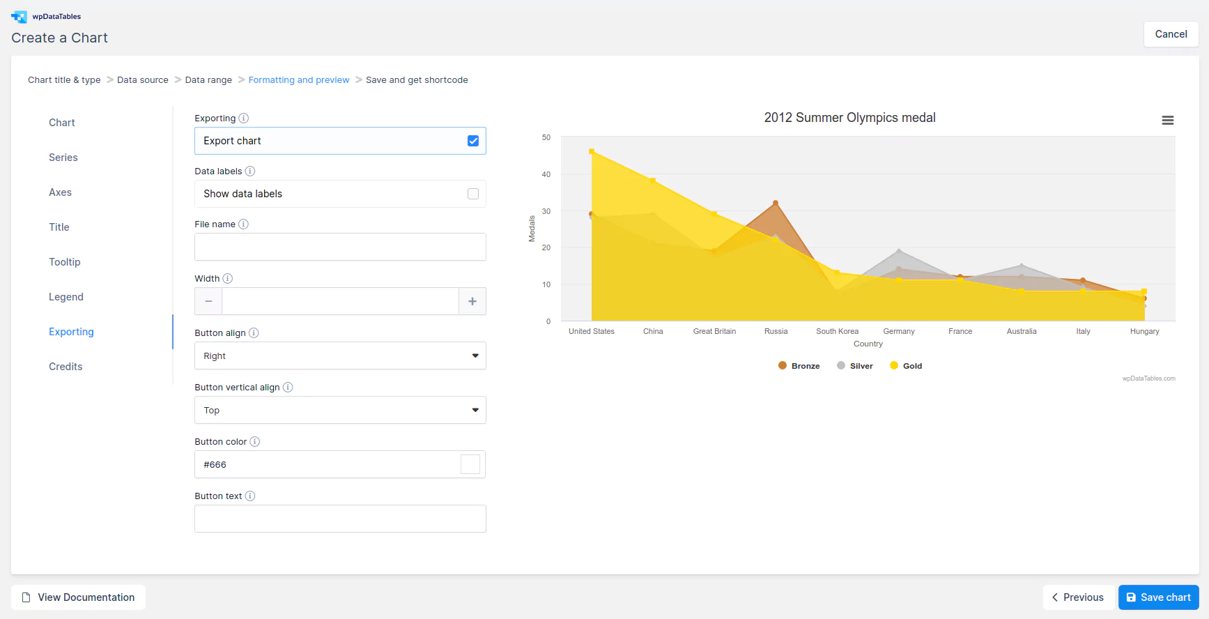
The “Exporting” category defines the exporting module that allows your users to download the chart as CSV, XLS, PDF, PNG, JPG, or SVG vector images. The chart also offers the option to View the data table in HTML below the chart (Highcharts only):
- Enable/Disable Exporting
- Data labels – Add data labels to improve the readability of the exported chart
- Filename – The filename, without extension, to use for the exported chart
- Width – The width of the original chart when exported
- Button align – Alignment for the export button
- Button vertical-align – The vertical alignment of the export button
- Button color – The color of the symbol’s stroke or line
- Button text – A text string to add to the individual button
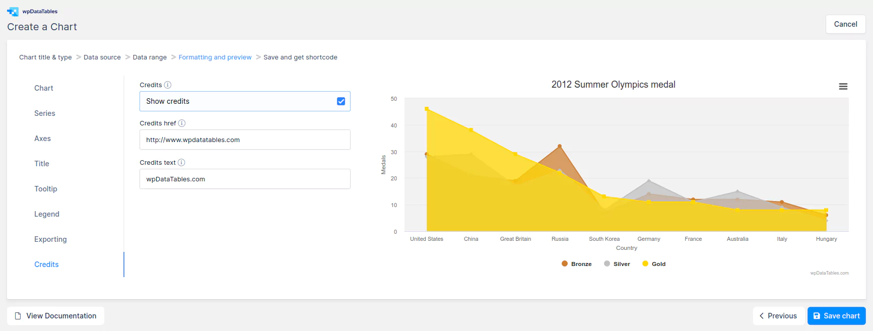
Credits label in the lower right corner of the chart
- Enable/Disable Credits
- Credits href – The URL for the credits label
- Credits text – The text for the credits label
You can experiment with the settings and click Next to see the chart preview. If you’re not satisfied, you can always go back and change these settings:
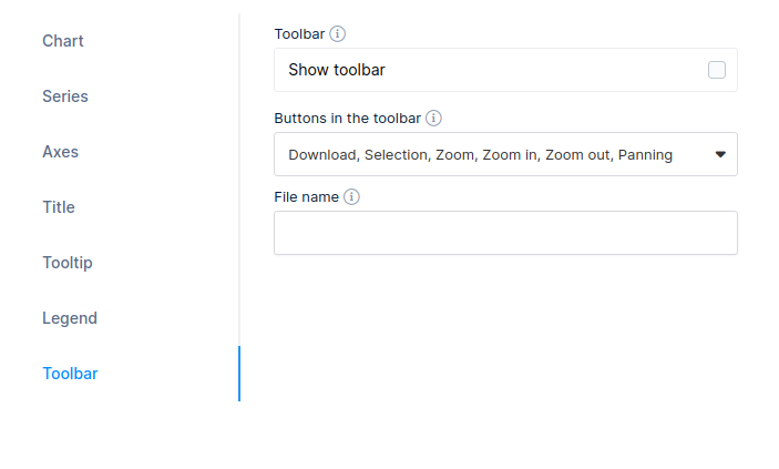
The “Toolbar“(ApexCharts only) category defines the exporting module that allows your users to download the chart as CSV, PNG, or SVG vector images. The option also offers Selection, Zoom, Zoom in, Zoom out, and Panning:
- Enable/Disable Toolbar
- Buttons in the toolbar – Choose which button to show in toolbar.
- File name – The filename, without extension, to use for the exported chart.
Save and get shortcode

When you’re satisfied with the preview, click Save chart so your chart will be saved in the WordPress database, and a shortcode will be generated for you. Click on the Copy icon button, and the shortcode will be directly saved to your clipboard.
Inserting the wpDataChart into a page or post for front-end use
To insert the chart in a WordPress post or page please check out the section for Adding wpDataTables shortcodes on the page.

You can see the chart we created in this live tutorial:
