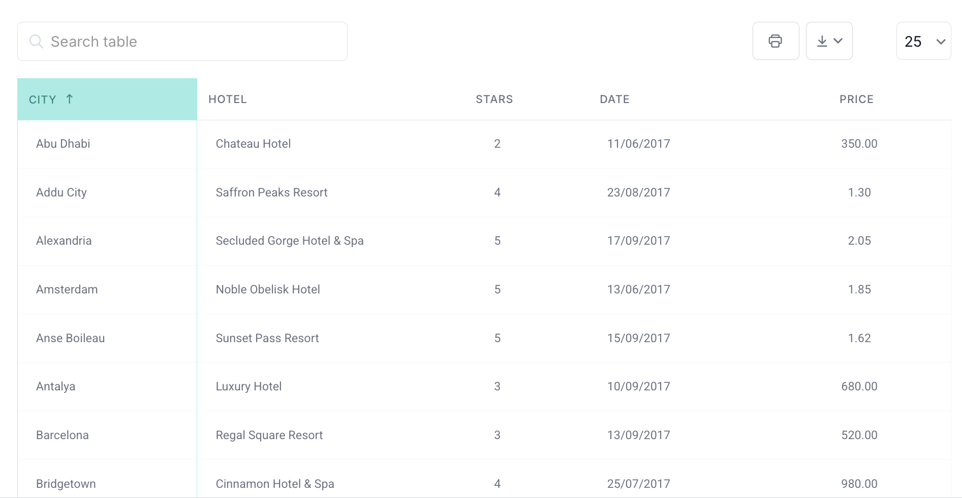
The wrong font in a data table doesn’t just look off. It makes numbers harder to compare, characters harder to distinguish, and the whole table harder to trust.
Choosing the best fonts for tables is a different decision from picking a body font or a display typeface. Tables have specific demands: tight spacing, small sizes, numeric column alignment, and mixed content that has to stay legible under pressure.
This guide covers what actually makes a font work in a table, which typefaces hold up best for data, text-heavy content, and technical use, and which ones to avoid entirely. You will also find a practical process for testing any font before committing to it.
Table of Contents
What Makes a Font Work in a Table
Tables are not body copy. The rules that apply to paragraphs and headlines don’t fully carry over once you’re dealing with rows, columns, and cells packed with numbers or short phrases.
A font that looks clean on a landing page can completely fall apart inside a data grid. Misaligned numbers, tight letter spacing at small sizes, or poor rendering at 12px – these are all font problems, not layout problems.
The criteria that matter for table UI design are specific: tabular figures, x-height, rendering quality, and how well the font handles tight spacing without losing clarity.
Tabular Figures vs. Proportional Figures
This is the biggest thing most people miss. Proportional figures give each digit a width based on its shape. The “1” is narrower than the “8.” That’s fine for running text. In a column of numbers, it’s a problem.
Tabular figures (also called monospaced numerals) give every digit the same horizontal space so columns align vertically. Ilene Strizver puts it plainly: proportional figures work in text, tabular figures belong in columns.
According to the 2024 Web Almanac by HTTP Archive, only 16% of web fonts support tabular and proportional number variants – which means most fonts on the web aren’t actually built for table use.
You can activate tabular figures in CSS with font-variant-numeric: tabular-nums. Works across most modern system fonts and many web fonts. Worth checking before committing to a typeface for a data-heavy project.
X-Height, Letter Spacing, and Rendering
Small x-height at 12–13px means characters start blending together. Tight letter spacing in a dense table makes it even worse.
Research published in the International Journal of Research and Innovation in Social Science found that optimizing inter-letter spacing can improve legibility of smaller characters by up to 20% compared to default settings.
- High x-height holds up at small sizes without losing distinction between characters
- Open counters (the enclosed space in letters like “a,” “e,” “g”) prevent visual crowding in dense rows
- Good hinting matters more on Windows where ClearType rendering is active
Font rendering also varies across Chrome, Firefox, and Safari. A font that looks crisp on macOS can appear slightly blurry on a Windows machine with subpixel rendering. Test early if your table audience is mixed.
Proportional vs. Monospaced Spacing
Monospaced: every character, letter or number, gets the same width. Good for code. Slightly awkward for mixed text-and-number tables because words end up with unnatural spacing.
Proportional with tabular nums: letters keep natural proportions, but numbers align in columns. This is the right call for most data tables – you get readable text cells and aligned numeric columns at the same time.
The US Web Design System recommends smaller font sizes specifically for data tables and specialized UI elements, noting that a base body size of 16px is reserved for longer reading, while tables often run at 13–14px where font quality becomes more critical.
The Best Fonts For Tables
| Font Name | Font Type | Best Used For | Readability | Recommended Size | Style | Example Use Case |
|---|---|---|---|---|---|---|
| Arial | Sans-serif | General-purpose tables | High | 10 – 12 pt | Clean, Versatile | Business reports |
| Helvetica | Sans-serif | Professional documents | Very High | 10 – 12 pt | Modern, Elegant | Financial statements |
| Verdana | Sans-serif | Screen readability | Very High | 9 – 11 pt | Clear, Legible | Web tables, Dashboards |
| Times New Roman | Serif | Print documents | High | 10 – 12 pt | Traditional | Printed reports |
| Calibri | Sans-serif | Digital presentations | High | 10 – 12 pt | Modern | PowerPoint tables |
| Tahoma | Sans-serif | Technical data | High | 10 – 11 pt | Practical, Clear | Excel spreadsheets |
| Open Sans | Sans-serif | Web tables, digital media | Very High | 10 – 12 pt | Friendly, Legible | Websites, Web apps |
| Roboto | Sans-serif | Digital use, mobile apps | Very High | 10 – 12 pt | Modern, Clean | Mobile app tables |
| Montserrat | Sans-serif | Modern designs | High | 10 – 12 pt | Stylish, Bold | Infographics, Reports |
| Raleway | Sans-serif | Design-focused documents | High | 10 – 12 pt | Elegant, Thin | Marketing materials |
Roboto
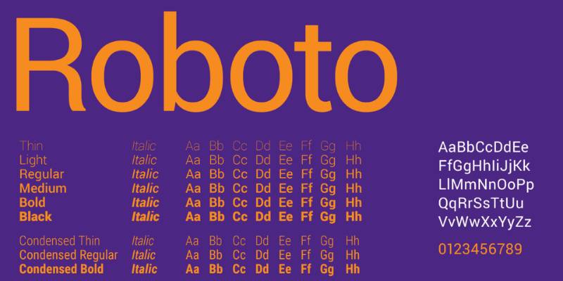
Well, Roboto is a no-brainer, really. It’s a font that breathes simplicity and clarity. For tables, it’s a dream, providing crisp lines and easy readability. The font has its roots in geometric forms, ensuring balance and harmony. A table set in Roboto is like a well-organized kitchen; everything’s in its right place.
Lato
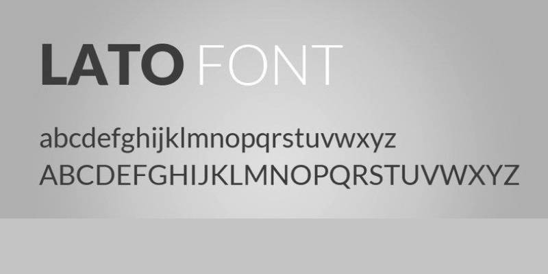
Turning to Lato, we find a font that’s both sleek and warm. Lato’s beauty lies in its semi-rounded details, which give tables a friendly vibe. Despite this warmness, Lato retains a sense of professionalism. It’s like the office’s cool guy who knows how to get the job done.
Open Sans
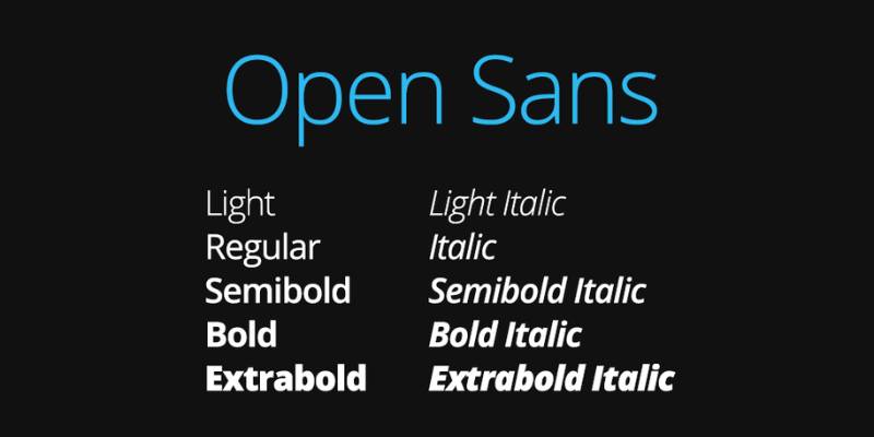
Open Sans is like that pair of reliable jeans you always turn to. Optimized for print, web, and mobile interfaces, this font is as versatile as it gets. For tables, Open Sans is a match made in heaven. It guarantees easy readability and a clean look that doesn’t get old.
Source Sans Pro
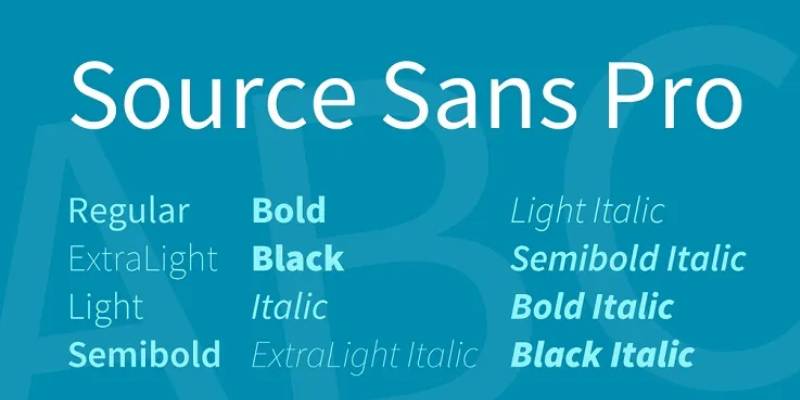
Onward to Source Sans Pro. Here’s a font that was born for digital spaces. Its legibility and variety of weights make it a fantastic choice for tables. Think of Source Sans Pro as a Swiss Army knife, ready to adapt and make your data shine.
Noto Sans
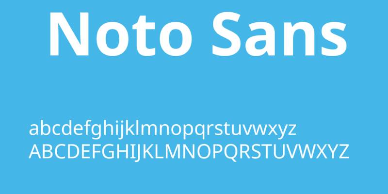
Say hello to Noto Sans. Designed with a goal to support all languages with a harmonious look and feel, it’s a font that screams inclusivity. Tables dressed in Noto Sans are easy on the eye and rich in character. It’s like a melting pot of cultures, but for fonts.
Verdana
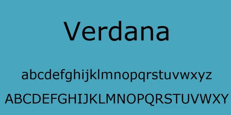
Ah, Verdana. An oldie but a goldie. It’s known for its wide letters and high legibility even at small sizes. If you’re designing tables that require small text, Verdana’s your best bet. It’s the veteran player in the team, always delivering when it matters most.
Georgia
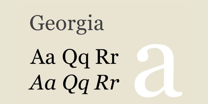
Next up, Georgia. A serif font that’s perfect for those seeking a classical vibe. Its readability is excellent, and the small decorative strokes add a touch of elegance to your tables. Georgia’s like a grand library, sophisticated yet accessible.
Tahoma
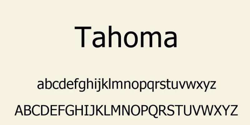
Introducing Tahoma. Here’s a font that balances tight letter spacing with high legibility, creating a fresh and clean look. In table form, Tahoma provides a sharp aesthetic that’s pure pleasure for the eyes. Think of it as the minty fresh breath of the font world.
Myriad Pro
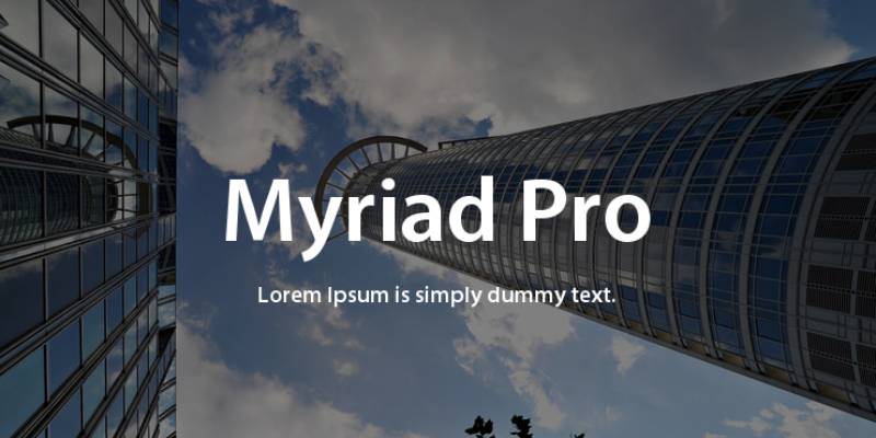
Myriad Pro enters the scene with its friendly and open look. Its professional tone, coupled with a dash of warmth, makes it perfect for table design. Myriad Pro’s like that bubbly friend who also has their life together.
Bell Gothic
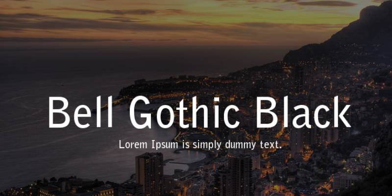
Bell Gothic is quite the trendsetter. Originally designed for phone books, it’s excellent for any table that needs to display information concisely. Bell Gothic’s the fashion-forward icon of the font world, always staying one step ahead.
Helvetica

No font list would be complete without Helvetica. It’s simple, clean, and super versatile. It’s the little black dress of fonts, looking great in any situation, including your tables.
Arial
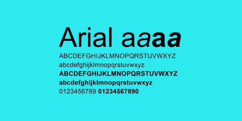
Meet Arial, Helvetica’s cousin. It’s a popular choice for a reason: it’s familiar, friendly, and makes for easy reading. With Arial, your tables are in safe hands. It’s the comfort food of the font family.
PT Sans
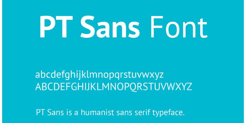
Say hi to PT Sans. It’s a font that feels modern yet rooted in tradition, with its humanist and grotesque styles. PT Sans brings an exciting twist to tables, like a spice that adds a new flavor.
Exo

Here comes Exo. This font takes the future into its own hands, with a techno vibe that feels fresh and innovative. Tables styled with Exo look like they’re from a futuristic sci-fi movie. Buckle up, it’s a font that takes you on a ride.
Exo 2
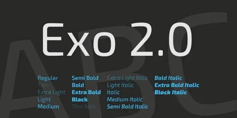
We continue with Exo 2. It’s like Exo’s younger sibling, maintaining the futuristic look but with a more simplified form. For tables, Exo 2 offers a refined and contemporary touch. It’s the kind of font that knows the latest trends.
Ubuntu

And finally, Ubuntu. This font embodies the spirit of its namesake, an African philosophy of interconnectedness. Ubuntu’s rounded letters give tables a harmonious, human touch. It’s the community spirit in font form.
Your beautiful data deserves to be online
wpDataTables can make it that way. There’s a good reason why it’s the #1 WordPress plugin for creating responsive tables and charts.

And it’s really easy to do something like this:
- You provide the table data
- Configure and customize it
- Publish it in a post or page
And it’s not just pretty, but also practical. You can make large tables with up to millions of rows, or you can use advanced filters and search, or you can go wild and make it editable.
“Yeah, but I just like Excel too much and there’s nothing like that on websites”. Yeah, there is. You can use conditional formatting like in Excel or Google Sheets.
Did I tell you you can create charts too with your data? And that’s only a small part. There are lots of other features for you.
Best Fonts for Text-Heavy Tables
Not all tables are full of numbers. Comparison tables, feature lists, content audits, editorial tables – these are dominated by phrases, sentences, and sometimes whole paragraphs inside cells.
The readability requirements shift. What matters here is how the font performs during sustained reading, not how it handles numeric column alignment.
When Serif Fonts Work in Tables
Serifs in tables get dismissed a lot. That’s partly fair – most dashboard fonts are sans-serif for good reason. But for text-heavy tables in editorial or print-style contexts, a well-chosen serif can actually improve readability.
A 2024 study published in Education Sciences found that font choice had a measurable effect on reading speed, with participants showing individual performance differences between their best and worst fitting font that were statistically significant. The implication: font-reading context pairing matters.
- Georgia: designed specifically for screen readability, holds up well in cells with 2–3 lines of text
- Merriweather: tall x-height keeps it readable at smaller sizes, designed for on-screen reading
- Lora: works for tables that lean more editorial, slightly more personality than Merriweather
The US Web Design System describes Merriweather as having “a tall x-height but remaining relatively small, making for excellent readability across screen sizes while not occupying extra horizontal space.” That’s a direct table use case.
Sans-Serif Options for Mixed Content Tables
Noto Sans handles mixed content well. Open Sans is another solid choice – it was the most-used Google Font on legal websites (14,074 sites, per Toner Buzz analysis), which tells you something about its reputation for clarity in dense professional content.
The honest answer: for cells with more than two lines of text, increase line height slightly. Most fonts need 1.4–1.5 line height in table cells to stay comfortable. The default browser table line height is usually too tight.
Monospaced Fonts for Technical Tables
There’s a specific class of table where a monospaced font is actually the right call: code comparison tables, API reference docs, terminal command listings, and anything where character-level alignment is part of the meaning.
These are developer-facing tables. The expectations are different. Readers scanning a monospaced column of command strings are looking for exact character patterns, not comfortable prose reading.
Top Picks for Technical Table Typography
JetBrains Mono is probably the best-known option right now. It was designed specifically to reduce eye strain during long coding sessions, with wider letterforms and increased character height to help distinguish similar glyphs – useful in tables with mixed alphanumeric content.
Fira Mono is a solid alternative with strong legibility at smaller sizes. Roboto Mono is the most-matched option if you’re already using Roboto for the rest of your interface.
| Font | Character Width | Best Use Case |
|---|---|---|
| JetBrains Mono | Fixed | Code tables, API documentation |
| Fira Mono | Fixed | Technical reference tables |
| Roboto Mono | Fixed | Mixed interfaces using Roboto |
| Courier New | Fixed | Legacy systems, print output |
When to Stay Proportional
Monospaced fonts are overkill for most numeric tables. If you just need numbers to align in columns, font-variant-numeric: tabular-nums on a proportional font gives you column alignment with better readability than full monospacing.
Use monospaced when: the table contains code, command strings, file paths, or any content where character-by-character alignment has meaning.
Stay proportional when: the table is a data grid, pricing table, or report with numbers and short text labels. Proportional fonts with tabular nums look more polished and read faster.
System Fonts vs. Web Fonts for Tables
This is a practical decision as much as a design one. System fonts are already on the user’s device – no network request, no render delay. Web fonts give you more control over how the table looks across different machines.
For most data tables embedded in web apps or WordPress sites, the performance trade-off is worth thinking about. Loading a 200kb+ font file just for a table is a real cost, especially on slower connections.
System Font Stacks Worth Using
The standard system font stack – -apple-system, BlinkMacSystemFont, "Segoe UI", Roboto, sans-serif – pulls San Francisco on Mac and iOS, Segoe UI on Windows, and Roboto on Android. All three have solid numeric rendering and are screen-optimized.
According to Toner Buzz’s font statistics analysis, 85% of websites prefer sans-serif fonts for web use. System font stacks are almost entirely sans-serif, which aligns with what actually works for tables.
The catch: system fonts look slightly different across platforms. If consistent visual branding matters more than performance, a web font gives you predictable rendering everywhere.
Web Font Loading for Tables
If you’re loading a web font for table use, subset it. You don’t need the full character set – just the characters your table will actually display. Tools like Fontdrop and Wakamai Fondue let you inspect exactly what OpenType features a font supports before downloading.
- Subset to Latin + numerals for most English-language tables
- Use
font-display: swapto prevent invisible text during load - Load only the weights you actually need (Regular + SemiBold covers most table hierarchies)
Google Fonts is active on nearly 12 million websites, making it the dominant delivery method for web fonts. For tables specifically, the tradeoff is real: you get great fonts like Inter or IBM Plex Sans for free, but you’re adding a render dependency to your page.
Font Size and Weight for Tables
Font family gets all the attention. Size and weight are just as important.
A well-chosen font at the wrong size – or the wrong weight – makes the table harder to scan, not easier. There are practical ranges that work, and most people set them too large or use weights that create visual noise.
Size Ranges That Actually Work
The US Web Design System explicitly calls out data tables as a context where smaller font sizes are appropriate, separate from the 16px recommendation for body copy.
Most well-designed data tables run at 12–14px for body rows and 13–15px for headers. Going smaller than 12px is tricky – it works at retina resolution on a Mac but looks rough on a standard-density Windows display.
- 12–13px: dense analytics tables, spreadsheet-style grids
- 13–14px: standard data tables, report tables
- 14–15px: comparison tables, content tables with longer text
- Table captions and footnotes: 11–12px
Font Weight for Headers and Body Rows
The gap between header weight and body row weight should be noticeable but not dramatic. A common mistake: using Bold (700) for headers when Medium (500) or SemiBold (600) would create clearer hierarchy with less visual noise.
Toner Buzz’s analysis of designer preferences found that 76% of designers combine larger sizes and heavier weights for emphasis rather than relying on one or the other alone. In tables, that principle applies to headers: bump both size and weight slightly, not just one.
Practical rule: if your body row is Regular at 13px, set your header at Medium or SemiBold at 13–14px. That’s usually enough. Bold headers at the same size tend to overpower the data below them.
Fonts to Avoid in Tables
Some fonts just don’t belong in a table. Not because they’re bad fonts – some are excellent in other contexts – but because table typography has specific demands that certain typefaces fundamentally can’t meet.
DigitalA11Y accessibility research identifies fonts with ambiguous character shapes as a specific hazard: when uppercase “I,” lowercase “l,” and the number “1” look nearly identical, data tables become unreliable. That’s not a stylistic complaint. That’s a functional failure.
Display and Decorative Fonts
Wrong tool for the job. Full stop.
Display fonts are built to attract attention at large sizes. Pacifico, Lobster, Playfair Display at small sizes – the letterforms that make them distinctive at 48px become visual noise at 13px inside a table cell.
- Ornate stroke contrast falls apart at small sizes
- Tight counters close up at 12–14px, merging characters
- Script fonts actively harm readability for dyslexic users (DigitalA11Y, 2025)
Datawrapper’s typography guidelines for data visualization explicitly recommend against decorative typefaces in tables and charts, noting that oldstyle figures common in serif display fonts are “hard to read in a table, tooltip, or as an axis tick.”
Fonts Without Tabular Figure Support
Proportional figures in a number column look wrong. The columns don’t align, and readers intuitively sense something is off even if they can’t articulate why.
Montserrat is a good example of a popular font that uses proportional figures by default. Beautiful in marketing contexts. The Flerlage Twins’ 2024 Tableau font analysis specifically calls it out as a font to avoid for charts and tables because the proportional figure widths cause column misalignment that misleads readers when scanning numeric data.
Same applies to Raleway, Oswald, and Poppins – all visually strong, all proportional figures, all tricky for numeric columns.
Condensed Fonts in Multi-Column Layouts
Condensed fonts can work in tables with very wide column counts, but there’s a real cost. Richard Rutter’s “Web Typography” notes that narrow typefaces in tables “quickly look like a slightly retro, cramped compromise” – and that regular-width text at a smaller size is often more readable than a condensed font at a larger size.
The actual failure point: condensed fonts reduce the visual difference between similar characters. In a multi-column table, “m” and “rn” already look similar in standard-width fonts. In condensed, they become nearly identical.
If column space is tight, reduce padding and font size slightly before switching to a condensed variant.
Thin Weight Variants at Small Sizes
Thin (100) and Extra-Light (200) font weights disappear at 12–13px on anything other than a high-DPI display. On Windows with standard ClearType rendering, thin strokes become broken and uneven.
Avoid: Helvetica Neue Ultralight, any font weight below 300 in table cells.
Use instead: Regular (400) as the minimum for table body rows. Medium (500) or SemiBold (600) for headers.
| Font | Character Width | Best Use Case |
|---|---|---|
| JetBrains Mono | Fixed | Code tables, API documentation |
| Fira Mono | Fixed | Technical reference tables |
| Roboto Mono | Fixed | Mixed interfaces using Roboto |
| Courier New | Fixed | Legacy systems, print output |
How to Test a Font for Table Use
Testing a font before committing to it saves time. It also catches problems that are invisible in specimen previews but obvious the moment real data goes into the cells.
Google Fonts specimen pages and Adobe Fonts previews show fonts at large display sizes with curated letter combinations. That tells you almost nothing about how the font will perform at 13px in a column of invoice numbers or a table of product names.
Build a Test String
The test string matters more than the tool. Use something like this:
Il1O0 | 1,234.56 | $9,999.99 | rn vs m | 2024-01-01
That single line tests character disambiguation (I/l/1, O/0), numeric column alignment, currency formatting, the classic “rn vs m” confusion, and date formatting all at once.
Set it at 12px, 13px, and 14px. On both a Mac (Retina) and a Windows machine if you can. The difference can be significant – fonts with poor hinting render sharply on macOS and blur noticeably on Windows ClearType.
Check OpenType Feature Support
Wakamai Fondue (wakamaifondue.com) is the most useful free tool for this. Drop a font file in and it immediately shows which OpenType features are present, including whether tabular figures (“tnum”) and lining figures (“lnum”) are supported.
Fontdrop (fontdrop.info) is an alternative that shows features alongside variable font axes and a live text tester. Both process fonts locally in the browser, so no font license issues.
- Look for “tnum” in the OpenType features list
- Check for “lnum” (lining figures) if you need numbers at cap height
- Variable font support is a bonus for responsive tables that scale
Cross-Browser and Cross-Platform Rendering
Font rendering varies across browsers and operating systems more than most designers expect. Chrome on Windows uses DirectWrite. Safari on macOS uses Core Text. Firefox has its own rendering stack. The same font can look meaningfully different across all three.
Minimum test matrix:
- Chrome on Windows (standard DPI) – catches hinting issues
- Safari on macOS – catches kerning and spacing differences
- Firefox on either platform – catches subpixel rendering edge cases
For accessible tables, WCAG 2.2 (published October 2023 by W3C) requires a minimum contrast ratio of 4.5:1 for normal text and 3:1 for large text. Test your font color against your table background color, not just your body text. Table cell backgrounds (striped rows, header fills) change the effective contrast ratio and can push a passing font-color combo into a failing one.
The US Department of Justice’s April 2024 ADA final rule now requires state and local government web content to meet WCAG 2.1 Level AA within two to three years of publication. For teams building public-sector data tables, that’s a compliance deadline, not a suggestion.
Test with Real Data
Specimen previews use cherry-picked text. Real tables have edge cases: very long strings, empty cells, numbers with many decimal places, mixed-language content.
Pull a sample of your actual data – 20 to 30 rows – and run it through the font before finalizing. Issues like overflow, word-break behavior, and numeric alignment only surface with real content.
One practical shortcut: the Google Fonts website lets you type custom text in the specimen preview. Paste your test string directly into the preview field to see how the font handles your actual characters at different weights. Not as thorough as a full browser test, but fast for early-stage evaluation.
FAQ on Best Fonts For Tables
What is the best font for data tables?
Inter is the top choice for most data tables. It has tabular figures by default, excellent character distinction at small sizes, and renders consistently across browsers. IBM Plex Sans and Source Sans Pro are strong alternatives for enterprise or report contexts.
What makes a font suitable for use in a table?
Three things matter most: tabular figure support for column alignment, a high x-height for legibility at 12-14px, and clear distinction between similar characters like 1, l, and I. Font rendering quality across operating systems matters too.
Should I use a serif or sans-serif font in a table?
Sans-serif fonts work better for most data tables. Serifs like Georgia or Merriweather are fine in text-heavy comparison tables. For numeric data, stick with sans-serif. Datawrapper recommends sans-serif as the default for all data visualization contexts.
What are tabular figures and why do they matter?
Tabular figures give every digit the same horizontal width so numbers align vertically in columns. Without them, a column of prices or percentages looks visually uneven. You can enable them in CSS with font-variant-numeric: tabular-nums.
Can I use Google Fonts for tables?
Yes. Inter, IBM Plex Sans, Source Sans Pro, Noto Sans, and Lato are all available on Google Fonts and support tabular figures. Check each font’s OpenType features before committing. Not every Google Font is built for numeric column alignment.
What font size should I use in a table?
Most well-designed data tables run at 12-14px for body rows and slightly larger for headers. Below 12px gets risky on standard-density Windows displays. The US Web Design System notes that data tables are a valid context for smaller sizes than body copy.
Are monospaced fonts good for tables?
Only for technical tables with code, command strings, or file paths. For standard data tables, a proportional font with tabular numerals is more readable and looks more polished. JetBrains Mono and Fira Mono are the best picks when monospaced is genuinely needed.
Which fonts should I avoid in tables?
Avoid decorative fonts like Pacifico and Lobster, and proportional-only fonts like Montserrat and Raleway for numeric columns. Thin weight variants below 300 disappear at small sizes. Display fonts built for large headings consistently fail inside table cells.
How do I test a font for table use?
Use a test string like Il1O0 | 1,234.56 | rn vs m at 12-14px across Chrome and Safari. Drop the font file into Wakamai Fondue to check tabular figure support. Always test with real data, not specimen previews.
Does font choice affect table accessibility?
Yes. Fonts with ambiguous character shapes fail users with low vision or dyslexia. WCAG 2.2 requires a minimum 4.5:1 contrast ratio for normal text. Fonts like IBM Plex Sans were specifically designed with clear glyph distinction for interface and data accuracy contexts.
Conclusion
Font selection for tables comes down to function over aesthetics. Inter, IBM Plex Sans, Source Sans Pro, and Noto Sans consistently deliver on the things that matter: tabular figure support, clear glyph distinction, and solid rendering at small sizes.
Serif options like Georgia and Merriweather earn their place in text-heavy layouts. Monospaced fonts like JetBrains Mono belong in technical and code-oriented grids. Everything else should earn its spot through testing, not assumption.
Check OpenType features before committing. Run real data through the font at 12-14px. Test across browsers.
Good table typography is invisible when it works. Readers scan the data, not the typeface. That’s exactly the goal.