Tables, the silent heroes of web design, carry the weight of information with grace and precision. Yet, a poorly crafted table is like a riddle with no solution—cluttered, confusing, and far from welcoming. As a seasoned weaver of the web’s fabric, I’ve seen my share of table travesties and triumphs.
Diving into table design, we’re not just talking lines and cells, but a narrative of clarity and craftsmanship entwined in rows and columns.
Elegant tables don’t shout; they whisper data like a well-versed tale, engaging the user in a conversation that feels effortless.
By the end of our journey, you’ll master the art of responsive table design, balancing form and function with user-friendly table layouts.
We’ll navigate through the realms of HTML table elements and CSS table styles, conquering the peaks of accessibility standards, and delving into the subtleties of data presentation.
Armed with HTML5 prowess and CSS3 elegance, you’ll breathe life into static data, crafting web tables that respond, interact, and adapt seamlessly, whether on a desktop canvas or the compact stage of mobile screens.
Table of Contents
Designing Data Tables the Right Way
When planning a table design, there are two things to work on: the table style and the table functionality.
Table Style
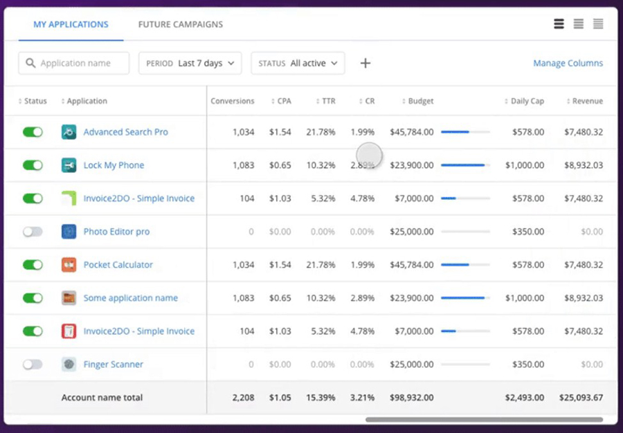
Aligning table data
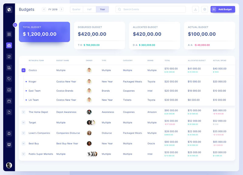
To differentiate text from numerical data, align the text to the left and numbers to the right. Such alignment makes it easier to compare two different data.
Table headers should also align with their column data for a structured table design.
Some table cells may have multiple lines of text, such as descriptions. The vertical alignment for such content should be at the top.
Otherwise, the column data will not be aligned with each other.
Adding featured section
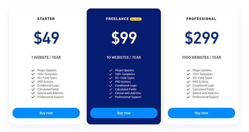
A featured section is a table column, row, or a cell that the author wants to emphasize. It is usually applied to pricing tables or when comparing subscription plans.
Use a featured section to highlight important information in the table. This could be the best value plan or a popular element among a list for example.
To create a featured section, change the formatting of the cells. For example, modify the fill color of the cell or the font size of the text to make it stand out.
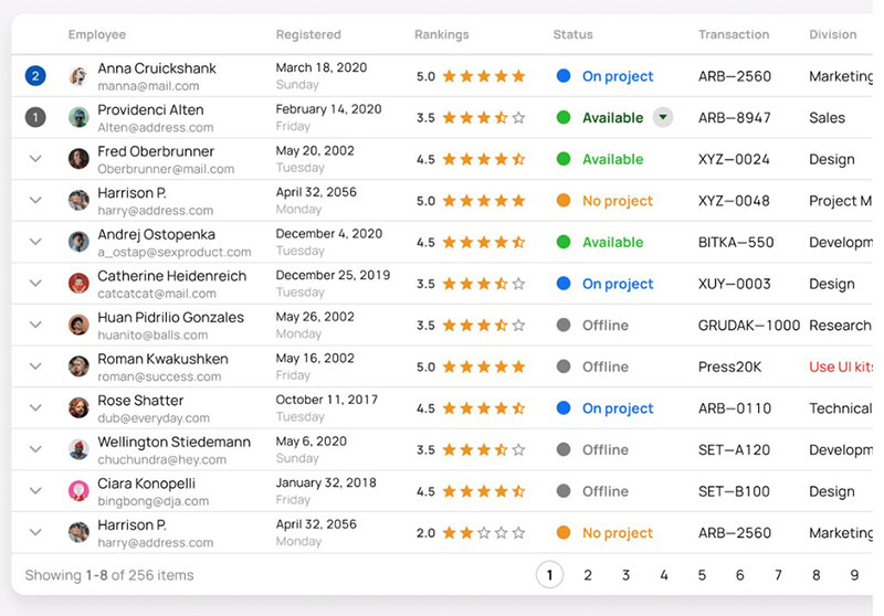
Applying colors
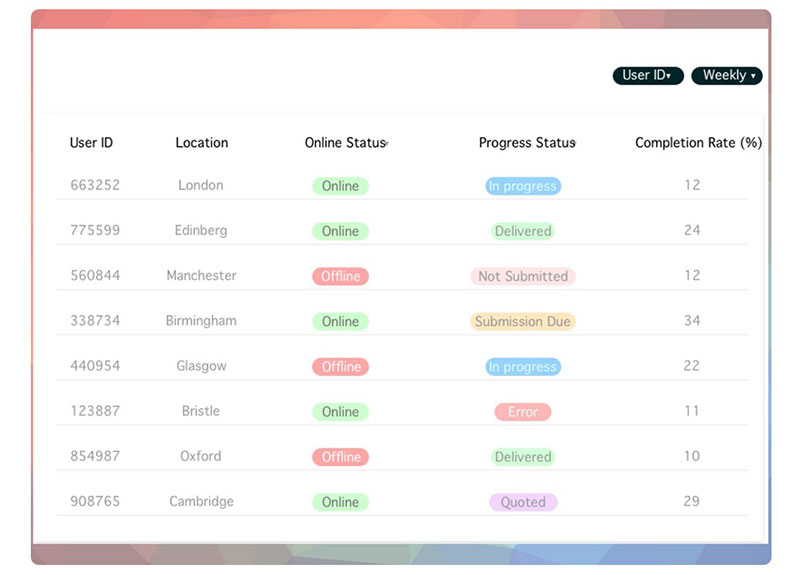
A data table should not have too many colors. Use them only for table headers, negative and positive trends, and featured sections.
Adding too many colors creates visual noise. This makes it hard to distinguish elements that need to be highlighted.
Use darker shades of gray for font color, and lighter shades of gray for border color instead of the regular black color. Using softer shades of black makes it less intense, reducing eye strain.
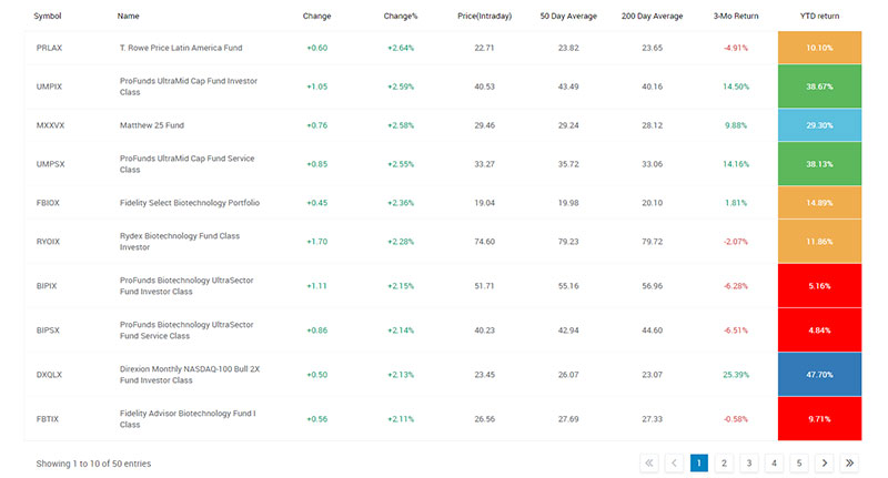
Apply varying colors when differentiating categories or when emphasizing highest and lowest values. To emphasize certain sections in the table, use brighter or bolder fill colors to make them stand out.
Alternating row colors
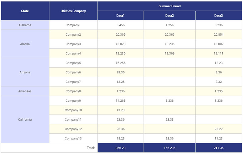
Alternating row colors improves readability. It sets visual cues, helping people follow a list of information and connect data.
This is especially useful when creating a large database. It also works well for small data tables.
Create a ‘zebra stripes’ effect by alternating white fill color with a darker color such as light gray. If using other colors, use a light fill color and alternate it with a slightly darker shade.
Using monospaced font
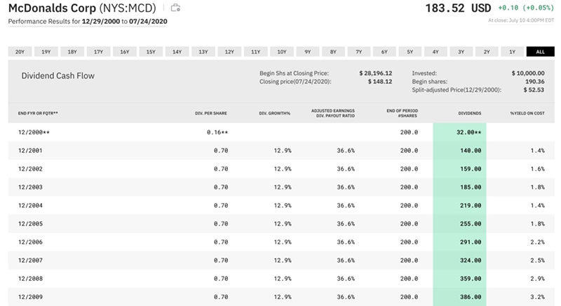
For a more structured table design, use a monospaced font style for numerical data.
Tabular, or monospaced font, has a fixed width and spacing for every character. This improves typography and readability.
Examples of monospaced fonts include Courier, Courier New, Lucida Console, and Monaco.
To further improve symmetry, make sure to format digits in the same length, like dates for example. Instead of writing 15/3/2019, format the date as 15/03/2019.
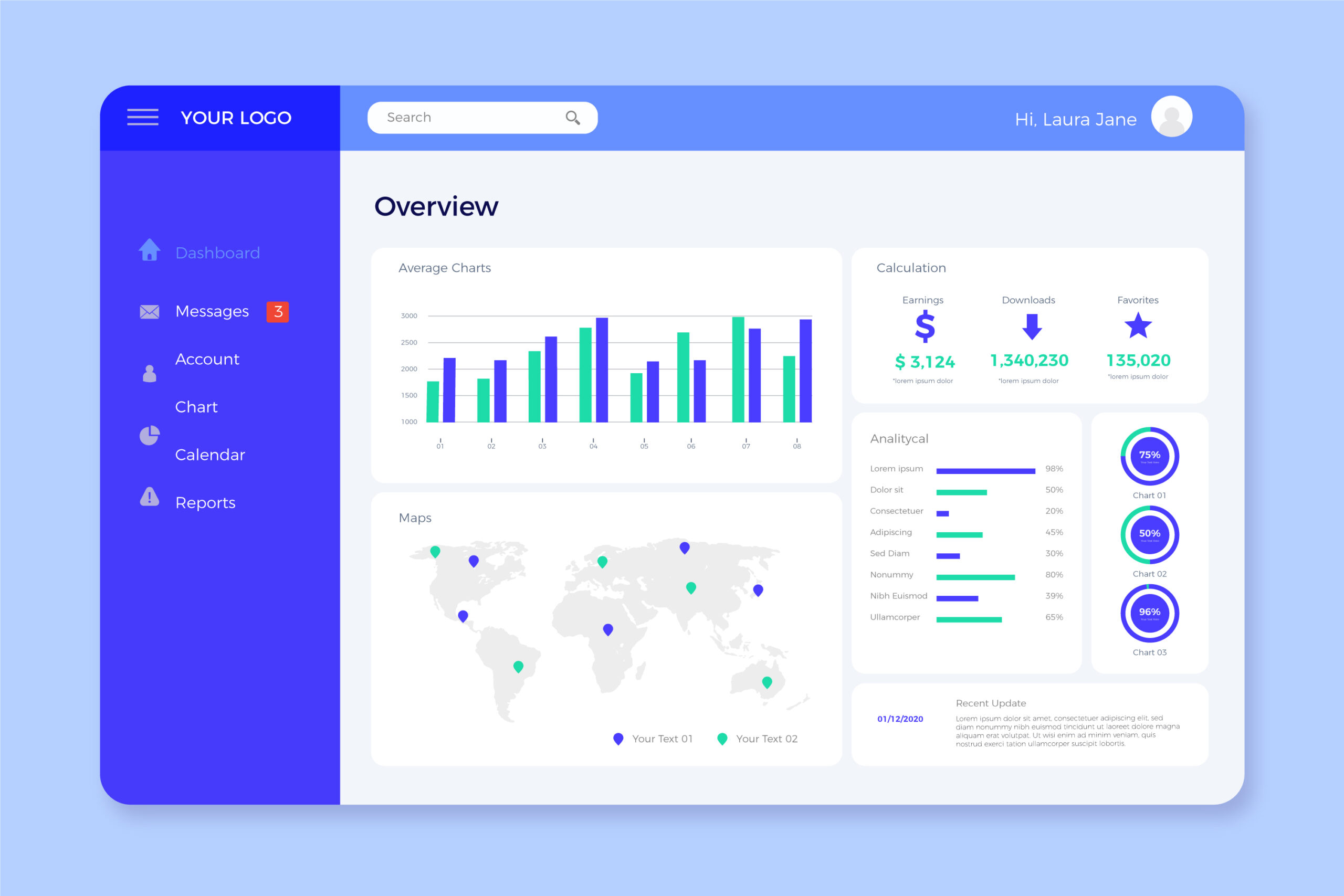
Visualizing table data
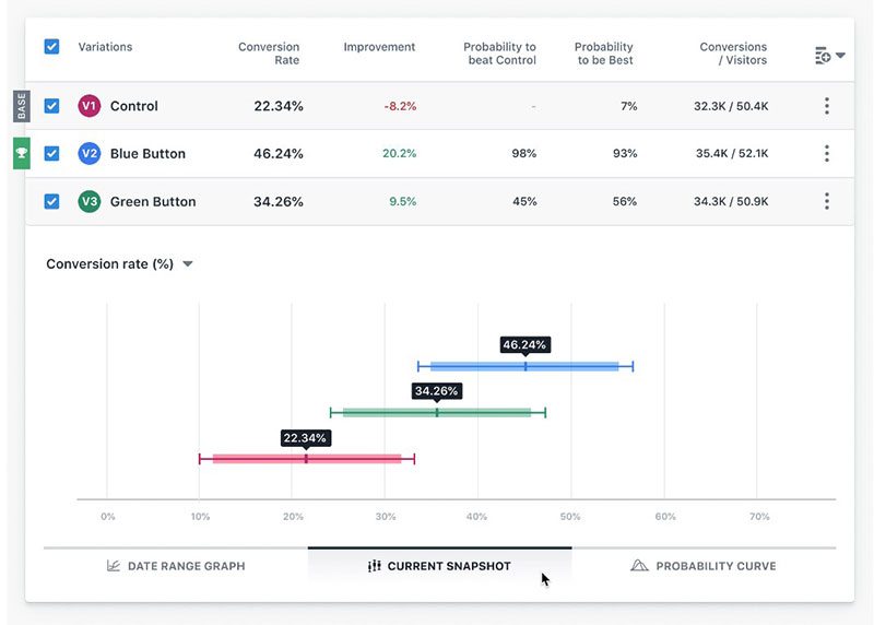
Turn column data into horizontal bar charts. This helps to visualize data and generate an overview.
Horizontal bar charts allow users to compare data sets and interpret them with ease. Each bar sits in a column next to the data it represents, vertically aligned, and divided into rows.
Inserting a bar chart oftentimes expands the column too much. Thus, consider showing bars only for visualizing important values.
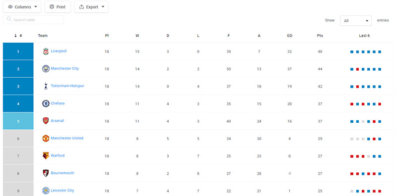
Another method to visualize table data is to use heatmaps.
Heatmaps adjust the color shade of the cell background or fill color based on the numerical value on the cell, creating a one color gradient. The higher the numerical value, the darker the fill color becomes.
Table Functionality
Make it responsive
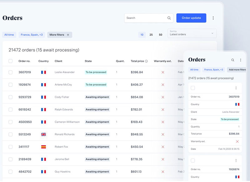
An effective data table works well on different devices. It must display data in a readable manner when opened on smartphones, tablets, and laptops.
Viewing tables on smaller screens requires a lot of changes in table design. A table design built on large desktops might not work on smaller devices.
Test out the table on mobile devices. Make sure that users can scan through information without having to scroll endlessly.
Beware of shrunk columns and hidden texts as these result in poor user experience.
Remember, on smaller screens, narrow columns are better. There are different ways to make the columns thinner.
This includes using icons, abbreviations, shorter number format, and rounded-off numerical data. So 2.5m rather than 2,500,000 and 0.3 rather than 0.3241.
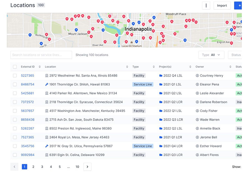
Enable reordering of columns
Large data tables are sometimes hard to read due to their size and the amount of information they hold. Enabling users to reorder columns allows them to focus on the columns they need to read.
It also means they can do this without scrolling back and forth. This helps users minimize clutter, digest small pieces of information, and arrange the columns according to their needs.
Consider having a fixed row height
If the data table contains many columns, anchor the first few columns. This will keep the context while users scroll through the rest of the table.
Having customizable columns is highly recommended. But table rows must have a fixed height to maintain symmetry and avoid confusing the readers.
Regardless of the data, fixed row height improves table UI design and visuals.
Using pagination for long data tables
There is an unwritten rule that data tables should not be longer than a desktop screen. However, this is not possible if a data table is long.
Prevent long data tables from occupying a large portion of a web page and maximize white space. Do this by enabling the pagination feature.
This also serves to guide readers through the table and help them navigate.
When using pagination, include the page number to show how many pages there are and what page the readers are on. Moreover, to provide users with more control, allow them to customize how many rows to view per page.
Include table sort feature
Allowing users to have more control over the data table enhances table UI design. If the table contains a lot of information, one way to help readers locate the data they need is to add a sort feature.
Sorting enables users to arrange the data according to specific logical orders.
This can be alphabetical, date and time modified, ascending, descending, and more. The more options, the better.
Another way to sort data is to include a search field. This allows readers to search for specific data such as the name of a company, location, products, and more.
Filtering data
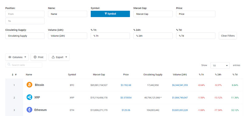
Filtering data is another way of increasing the functionality of a data table. Users can digest large amounts of data, understand trends, and create comparisons.
They can also locate certain information and analyze complex data. This is especially so for numerical data tables.
Make sure users can customize parameters or filter sets for certain columns. Also, include an advanced filtering option to save the filter set they created for future use.
Maintain context, use fixed headers and frozen columns
Reading through a large data table requires lots of vertical and horizontal scrolling. To maintain context, anchor column headers as well as the first column or first few columns.
Microsoft Excel and Google Sheets refer to anchored columns as “frozen”.
For easier table navigation, add a full row selection. This allows users to mark important rows as they scroll horizontally.
This can be tricky if the table has expandable rows and might result in a different effect.
FAQ on designing a table
What’s the best way to start designing a table for a website?
Start with a clear goal. Think about the data visualization you need. Sketch a wireframe to outline your table grids and consider the user experience for your web content structure. A solid blueprint matters just like a foundation for any front-end design project.
How do I make my table responsive on all devices?
Embrace CSS magic. Use flexible units and media queries to ensure your CSS table styles adapt. Remember, mobile-friendly tables aren’t a luxury; they’re a necessity. Think about users who will access your table on-the-go. Make sure your table sings on any screen, big or small.
What are the best practices for HTML table design?
Stick to clean, semantic HTML5 table tags. Be minimalistic yet descriptive; use <th> for headers, <tr> for rows, and <td> for data cells. Ensure that your markup is neat—search engines love that. Plus, keep accessibility in table design central from this early stage.
Can CSS make my tables look more attractive?
Absolutely. CSS3 properties for tables are your allies in this quest. Experiment with border styles, background colors, and even table captioning for flair. Your tables will not only hold data but also capture attention and elevate the visual hierarchy in your web interface.
Is it important to consider web accessibility when designing a table?
Prioritizing Web Content Accessibility Guidelines (WCAG) isn’t just kind—it’s essential. Use scope attributes, proper contrast, and descriptive labeling. This way, everyone, including users with disabilities, can interact with your data presentation in tables.
How do I sort table data dynamically?
JavaScript table interactions to the rescue. Implementing sorting functionalities can be as straightforward as attaching a JS library. Or, for the coder who loves a challenge, crafting a custom script might just be up your alley.
What should I know about pagination in web tables?
Long data sets can overwhelm. Splitting them into digestible bites with pagination is key. It aids in user-friendly table layouts and isn’t as daunting as it sounds; many content management systems (CMS) offer plugins or modules to make this a breeze.
How do I maintain consistent spacing in my tables?
Consistency is king. Define spacing in your CSS stylesheet, and remember the paddings and margins. Keep an eye on that row and column spacing for a clean look that’s easy on the eyes. Front-end design thrives on such details.
How can table design affect my site’s SEO performance?
Well-structured tables with clear headings and structured data can enhance your site’s comprehension by search engines. Adding microdata can also serve up a feast of context, making the content within your table more indexable and, thus, more likely to rank.
How to ensure that my table is interactive for users?
Sprinkle a dash of JavaScript or embrace frameworks that specialize in interactivity, like Bootstrap Table Component or Vue.js. Adding filtering, search bars, and clickable events makes for an engaging experience. Remember, interaction is more than a feature; it’s an invitation to engage.
Conclusion
Stepping back, behold the creation—a harmonious blend where data and design meet. We’ve journeyed together through the alchemy of how to design a table, transforming basic cells into an engaging, informative tableau that speaks volumes without uttering a word.
- It’s been a delve into HTML familiarity, painting structure with
<table>,<tr>, and<td>. - A dance with CSS wizardry, dressing up stark data in captivating table formatting.
- And a strategic play with JavaScript, breathing interactivity into every row.
But above all, designing for accessibility and responsiveness means these tables champion inclusivity and adaptability across the vast digital landscape.
Think of it not as the end but the launchpad—for every table designed sparks a spectrum of possibilities, each an opportunity to enhance, enlighten, and enrich the digital narrative. Now, the baton is yours: craft, refine, and revolutionize the way we consume data, one table at a time.
If you liked this article about how to design a table, you should check out this article about the best fonts for tables.
There are also similar articles discussing how to make a table responsive, WooCommerce product tables, heatmap tables, and how to merge cells in HTML.
And let’s not forget about articles on WordPress pricing table plugins, JavaScript data table, table UI design, and examples of data tables.