A table that looks perfect on your desktop might fall apart the second you open it on a phone. That is not a responsive table.
Mobile is now over 64% of global web traffic (StatCounter, 2025). So when a data table spills past the viewport or crushes its columns into unreadable slivers, you’re not annoying a few stragglers, you’re failing most of the people who land on the page.
Getting this right isn’t a nice-to-have anymore. It feeds straight into usability, accessibility, and your Core Web Vitals scores, and there’s no single trick that covers every table. What works for a dense ten-column comparison grid is the wrong call for a three-column summary, and most of what follows is about matching the method to the table.
Table of Contents
What Is a Responsive Table?
A responsive table is an HTML table that reshapes itself to fit different screen widths, without forcing horizontal scroll or dropping data along the way.
Plain HTML tables don’t do any of that on their own. Fixed column widths, rigid cell structures, no default wrapping, so they break on small screens. The table either overflows past the viewport or gets squeezed into an unreadable heap of collapsed text.
Mobile sits at 64.35% of global web traffic as of mid-2025, per StatCounter. A table that only holds together on a 1440px desktop is broken for most of the people visiting.
Two things define a table that isn’t responsive:
- Overflow, where the table runs past the viewport width and drops a horizontal scrollbar onto the page itself
- Readability loss, where cells compress down to single characters or stack in ways that sever the link between headers and data
The baseline fix is wrapping the table in a div with overflow-x: auto. That stops the page from breaking, but it doesn’t make the table usable on a phone. A real responsive solution changes how the data is presented, not just where it overflows.
Good HTML table design starts with being honest about what the table needs to do on a small screen. Dense comparison data calls for a different approach than a three-column summary, and no single method covers both.
What Makes a Table “Broken” on Mobile vs. Just “Scrollable”
A scrollable table fits inside a contained area, and the user swipes horizontally to reach the rest of the columns. The data relationships hold, nothing vanishes.
A broken table overflows the whole page, shoves other content out of place, or collapses cells until the header context is gone completely.
Scrollable is fine for dense data tables where the column relationships carry the meaning. Broken is never fine. The reason this distinction matters is that developers keep mistaking “overflow hidden” for “responsive,” and those are not the same thing at all.
The Core Difference Between Fitting and Being Readable
A table can technically fit on a 375px screen and still be useless. Fitting just means no horizontal overflow. Readable means a user can scan a row, work out what each value refers to, and make a decision off it.
Mobile users are 5 times more likely to abandon a task when a site element isn’t properly optimized for their device, going by research DesignRush compiled in 2026. With tables, that abandonment happens the instant someone has to turn their phone sideways to read a pricing grid or a product comparison.
Readability depends on column headers staying tied to their data cells at every breakpoint. That’s the actual definition of a responsive table. Everything else is just layout adjustment.
What Are the Main Methods for Making a Table Responsive?
Five techniques cover almost everything, and which one fits comes down to your column count, how dense the data is, and the context the user is in.
If you’re building a table from scratch, a Table Generator can help you create the initial rows and columns. From there, you can apply the responsive technique that best fits the data, whether that’s horizontal scrolling, stacked cards, or a sticky first column.
| Method | Approach | Best for | Dependency |
|---|---|---|---|
| Overflow scroll wrapper | Horizontal scroll inside a container | Dense data, many columns | CSS only |
| Stacked card layout | Rows reformat into vertical blocks | 3–6 columns, short cell content | CSS only |
| Fixed first column | Identifier column stays sticky | Comparison and pricing tables | CSS only |
| Column priority hiding | Low-priority columns hide at breakpoints | Tables with optional secondary data | CSS or JS |
| JavaScript reflow | Library handles full restructure | Complex interactive data grids | JS required |
The CSS-only approaches barely touch Cumulative Layout Shift. The JavaScript-dependent ones introduce CLS risk whenever the reflow fires after the initial paint. For most mobile-friendly tables, a CSS method is plenty.
None of these are mutually exclusive, either. You can run a scroll wrapper at the container level and a sticky first column with position: sticky at the same time. The call really comes down to what the user always needs in view versus what they can scroll to find.
CSS-Only vs. JavaScript-Dependent: Key Trade-offs
CSS-only buys you zero render-blocking risk, no dependency weight, and a layout that’s right at paint time, in exchange for limited interactivity.
JavaScript-dependent gets you sorting, filtering, child row expansion, and full column reflow, but you’re paying for it with script load weight and possible CLS if the table renders before the JS runs.
Responsive design adoption reached 88% across surveyed sites in Google’s 2023 Core Web Vitals report (Gitnux, 2026), though most of those implementations lean on basic overflow containment rather than genuine layout adaptation. Whichever method you pick feeds straight into that Core Web Vitals score.
How Does the CSS Overflow Scroll Method Work?
See the Pen
CSS Overflow Scroll On A Table – Interactive Viewport Demo by Bogdan Sandu (@bogdansandu)
on CodePen.
You wrap the <table> in a div set to overflow-x: auto and width: 100%. The table keeps its full structure and every column relationship, and on a narrow viewport a horizontal scrollbar shows up inside the container instead of on the page.
<div style="overflow-x: auto; width: 100%;">
  <table>
    ...
  </table>
</div>
This is the fastest thing to ship. No JavaScript, no media queries, and the data integrity stays completely intact. Every value stays in its column, every header stays tied to its data.
Why the Wrapper Div Matters (and Why You Can’t Skip It)
A frequent mistake is putting overflow-x: auto on the <table> element directly instead of a wrapper div. That breaks in Safari, which doesn’t support overflow on table elements the way Chrome and Firefox do. The scrollbar simply never appears, and the table overflows the page anyway.
The wrapper div is the scroll container. The table inside can be as wide as it needs to be, and the div clips and scrolls it.
Set an explicit background-color on the wrapper while you’re at it. Without one, content behind the table can bleed through as the user scrolls, and it’s especially noticeable on iOS Safari with momentum scrolling.
When Overflow Scroll Is Acceptable and When It Is Not
Horizontal scrolling is genuinely rough UX on touch devices. People don’t expect to swipe sideways through content, and it fights the natural navigation gestures on mobile browsers.
It’s a reasonable choice in a few narrow cases. Admin dashboards, where users are on desktop or tablet and the data’s too complex to reformat. Developer tool output, where the column relationships can’t be touched. Financial or statistical tables, where every column carries equal weight and hiding any of them strips out meaning.
For a public-facing product comparison or pricing table, though, overflow scroll isn’t enough. Those want the fixed first column method or a full stacked layout. Google Sheets is a decent illustration here: it uses a horizontal scroll container for its web export tables, which works because spreadsheet users expect that behavior, but the same pattern would flop on a standard marketing landing page.
How Does the CSS Stacked Card Method Work?
See the Pen
Responsive HTML Table – Card Layout Transformation by Bogdan Sandu (@bogdansandu)
on CodePen.
At a chosen breakpoint, CSS flips every <tr>, <td>, and <thead> from table display to block display. Each row turns into a self-contained vertical card, and each cell inside it stacks top to bottom.
The column headers get hidden. In their place, a data-label attribute on each <td> pairs with a CSS ::before pseudo-element to inject the column name into the cell as visible text. So every value shows up next to its own label, even though there’s no visible <thead> anymore.
@media (max-width: 768px) {
  thead { display: none; }
  tr { display: block; margin-bottom: 1rem; }
  td { display: block; }
  td::before { content: attr(data-label); font-weight: bold; }
}
What Breakpoint Should Trigger the Stack Layout?
768px is the standard breakpoint. It lines up with the handoff between most tablets in landscape and phones in portrait.
Column count and cell length push that number around, though. A table with six columns of short text might want to stack at 960px. One with three columns of long text might not need to stack until 480px. Test at 320px, 375px, 414px, and 768px in the Chrome DevTools device toolbar before you commit to a breakpoint.
The stacked layout shines on tables with three to six columns and short cell values. Once you’re past eight columns, each stacked card turns into a long vertical list that’s harder to read than the original horizontal table was. At that point the fixed first column or column-hiding method serves you better.
The data-label Technique in Full
Each <td> in the HTML needs a data-label attribute that matches its column header.
<td data-label="Product Name">Widget Pro</td>
<td data-label="Price">$49</td>
<td data-label="Stock">In Stock</td>
The CSS ::before pseudo-element reads that attribute and renders it ahead of the cell value. No JavaScript, and no duplicating the header text in the markup.
The catch is that the HTML has to be maintained with some care. Add or rename a column and every data-label in it needs updating. That cost is worth paying for static tables. For dynamically generated ones pulling from a database or a JSON to HTML table conversion, the data-label attribute should be injected programmatically at render time.
How Does the Fixed First Column Method Work?
See the Pen
CSS Sticky First Column In A Table – Toggle On/Off Demo by Bogdan Sandu (@bogdansandu)
on CodePen.
The first column stays put while the rest scroll horizontally. CSS pulls this off with position: sticky, left: 0, and a defined z-index on the first <td> and <th> in each row.
.table-wrapper { overflow-x: auto; }

.table-wrapper td:first-child,
.table-wrapper th:first-child {
  position: sticky;
  left: 0;
  z-index: 1;
  background-color: #fff;
}
This earns its place on comparison tables, pricing tables, and sports statistics tables, anywhere the row identifier (a product name, a team, a player) has to stay in view while the user scrolls right through the metric columns.
Why z-index and Background Color Are Both Required
As the user scrolls right, the body of the table slides behind the sticky first column. Leave out a z-index and that sticky cell sits at the same stacking level as the scrolling cells, so content bleeds straight through it.
And without an explicit background-color, the sticky cell is transparent, so the scrolling content shows through and it reads like a visual glitch. Put a solid background on the sticky cell that matches the row’s background color.
If the table uses zebra striping, the sticky cell’s background has to match per row, which CSS :nth-child selectors handle.
Browser Support and the IE11 Edge Case
position: sticky works in every modern browser, Chrome, Firefox, Safari, and Edge included. Internet Explorer 11 doesn’t support it at all.
If you somehow still need IE11 support (rare in 2025, but it lingers in some enterprise environments), a JavaScript fallback using scroll event listeners can fake the sticky behavior. The JS listens to the scroll event on the wrapper div, reads the scroll position, and applies a class that switches the first column to position: absolute with a calculated left offset.
One conflict to watch for: if any parent of the table wrapper has overflow: hidden set, position: sticky won’t work. The sticky element needs a scrollable ancestor to stick against, so check the parent containers if the sticky behavior seems to be breaking for no reason.
For tables that want both a sticky first column and a fixed header and scrollable body, Chrome 148 added experimental support for per-axis sticky positioning, which makes that combination possible in pure CSS without the JavaScript scroll-sync hacks.
How Does Column Priority Hiding Work for Responsive Tables?
See the Pen
Responsive Table – Priority Columns at Breakpoints by Bogdan Sandu (@bogdansandu)
on CodePen.
Each column gets a priority class. The high-priority ones, the data a user needs most, stay visible at every width. The lower-priority ones drop out at specific breakpoints through CSS media queries.
Priority 1 stays visible at all screen widths. Priority 2 hides below 768px. Priority 3 hides below 960px.
@media (max-width: 768px) {
  .priority-2 { display: none; }
}
@media (max-width: 960px) {
  .priority-3 { display: none; }
}
How to Decide Which Columns Are Low Priority
The question to sit with: if a user is on a phone and can only see two or three columns, which ones actually change their decision?
In an e-commerce product table, the name and price are priority 1. SKU codes, weight dimensions, warehouse location, all priority 3. Nobody’s filtering products by SKU on their phone.
In a sports statistics table, player name and total points are priority 1. The advanced metrics, true shooting percentage or usage rate, are priority 3.
The danger with this method is hiding something a particular user genuinely needs. A “show more” toggle, a small button that reveals the hidden columns on demand, takes the edge off that. It keeps the mobile view clean while still giving the power users the full dataset.
FooTable: a Ready-Built Priority Hiding Implementation
FooTable is a jQuery table plugin that does priority-based column hiding out of the box. It reads data-breakpoints attributes on the column headers and hides columns automatically at the defined breakpoints, while the hidden data stays reachable through expandable row toggles, so nothing’s permanently lost.
It’s lightweight and needs jQuery. On projects already running jQuery, it’s quick to drop in. For modern vanilla JavaScript or framework-based projects, Tabulator handles priority column collapsing without jQuery and with a more configurable responsive API.
Here’s the improved section:
A Better Way to Create Responsive Tables
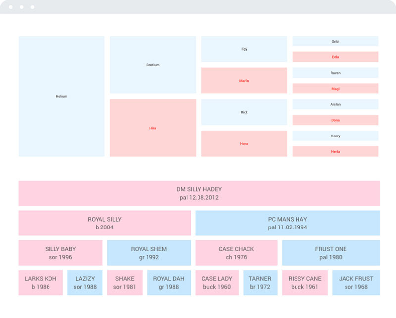
Manually adding responsive code snippets works fine if you’re only embedding a table once. But if tables are a regular part of your site, that approach gets old fast.
wpDataTables is a WordPress plugin built specifically for creating and managing tables and charts without touching a single line of code. Over 80,000 users trust it, and it’s been on the market for 10+ years. That kind of track record says something.
Tables are responsive by default. No extra setup, no breakpoint tweaking. Whatever device your visitor is on, the table just works.
You also get full control over column visibility on mobile. Hide columns that clutter smaller screens, and make that hidden data available through expandable, drop-down blocks. Clean and practical.
Getting started comes down to three steps:
- Install the plugin
- Create a table
- Insert the shortcode into any post or page
Create the Data Table
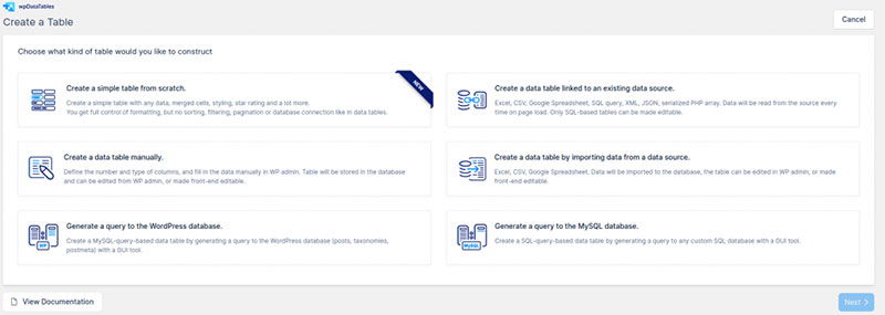
After installing and activating the plugin, a wpDataTables menu item appears in your WordPress dashboard. Click it, then hit Add New to start.
You’ll pick a table type from several options:
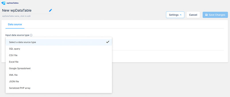
- Link to an existing data source (Excel, Google Sheets, MySQL, JSON, and more)
- Create a table manually
- Import data from another source
Upload your data source, give the table a name, then adjust the data attributes and column settings to match what you need.
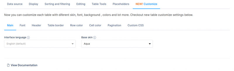
Styling is handled through built-in settings. Change colors and font styles directly in the interface, or drop in custom CSS if you prefer more control.
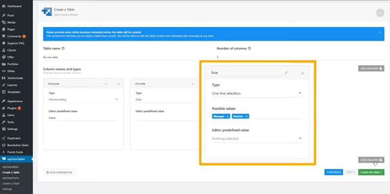
Hit the green button to save. Once you’re happy with how everything looks, copy the shortcode from the top of the screen.
Insert the Table into a Post or Page

Go to any post or page and paste the shortcode. The live preview shows you exactly how the table renders. Responsive behavior is on by default.
From there, you can add filtering options so visitors can sort through data faster. wpDataTables handles large datasets without issues, including tables with thousands of rows and columns. It also supports fixed headers and fixed columns, so key data stays visible while scrolling. Useful when you’re working with wide or tall tables and need to keep context on screen.
How Do JavaScript Libraries Handle Responsive Tables?
JavaScript table libraries reach past what CSS can do. Sorting, filtering, pagination, child row expansion, and dynamic column reflow that CSS alone can’t pull off.
| Library | Responsive Feature | jQuery Dependency | Best For |
|---|---|---|---|
| DataTables.js | Responsive extension, child row expansion | Yes | Existing jQuery projects |
| Tabulator | Column collapse, row grouping, breakpoints | No | Modern framework projects |
| FooTable | Priority column hiding, expandable rows | Yes | Bootstrap-based projects |
| Grid.js | Framework-agnostic, lightweight reflow | No | Minimal dependency projects |
DataTables.js Responsive Extension
DataTables.js ships a dedicated Responsive extension that collapses columns by defined priority levels and folds the hidden data into child rows. The user taps a control icon on a row to reveal those hidden columns as a nested list underneath.
It plugs straight into the DataTables API, so sorting, filtering, and table pagination all keep working on the responsive layout with no extra configuration.
DataTables needs jQuery. Where that’s already a dependency, it’s a natural fit. On vanilla JavaScript or React and Vue projects, the jQuery requirement is overhead worth dodging.
Tabulator: No-jQuery, Fully Configurable
Tabulator is a zero-jQuery data grid that handles responsive column collapse, row grouping, and custom breakpoints through its own configuration API. It runs on plain JavaScript and slots cleanly into React, Vue, and Angular.
Its responsive layout moves the hidden column data into sub-rows, and it also does column resizing, inline cell editing, and a full row grouping system that pure CSS can’t touch.
The cost is bundle size. Tabulator’s full build is heavier than a small CSS solution, so for a simple four-column table it’s overkill. For a JavaScript data table that needs sorting, filtering, and responsive behavior together, it’s exactly the right tool.
When a JS Library Is Worth the Dependency
A JavaScript library earns its keep when at least two of these three things are true. The table needs interactive features (sorting, filtering, search) on top of responsive layout. The data is dynamic, loaded from an API or database. Or the column count is past eight and pure CSS stacking would produce an unusable vertical list.
If none of those land, a CSS-only method costs nothing in performance and carries no render-blocking risk. The JS library overhead, script parsing, execution time, the potential CLS from a late reflow, is only justified when the interactive features actually serve the user.
57% of users won’t recommend a site with a poor mobile experience, per DesignRush (2026). A sluggish JS-heavy table on a mid-range Android phone is a poor mobile experience, no matter how many features it carries.
How Do CSS Frameworks Handle Responsive Tables?
Bootstrap, Tailwind CSS, and Foundation each take a different swing at responsive tables, and none of them solves the whole thing. They mostly handle scroll containment rather than real layout adaptation.
| Framework | Responsive Table Feature | Approach | Limitation |
|---|---|---|---|
| Bootstrap | .table-responsive class |
Overflow scroll wrapper | No column reflow |
| Tailwind CSS | No built-in table component | overflow-x-auto utility on wrapper |
Manual implementation required |
| Foundation | scrolling table class |
Overflow scroll wrapper | No column reflow |
The State of CSS 2024 survey puts Tailwind at 62% developer usage and 81% satisfaction, against Bootstrap at 28% usage and 55% satisfaction (DesignRevision, 2026). That shift shapes how you approach table styling.
Bootstrap: The .table-responsive Wrapper
See the Pen
Bootstrap 5 Table Classes by Bogdan Sandu (@bogdansandu)
on CodePen.
Bootstrap wraps a .table inside a div carrying the .table-responsive class, which applies overflow-x: auto to the container. The table scrolls horizontally on a narrow viewport, and nothing about the column structure changes.
Bootstrap 5 also gives you breakpoint-specific variants, .table-responsive-sm, .table-responsive-md, .table-responsive-lg, and .table-responsive-xl. Each one only applies the scroll behavior below its named breakpoint, and above that the table renders normally with no scroll container.
Bootstrap powers 17.5% of all websites globally as of August 2025 (W3Techs). For teams already on Bootstrap tables, the .table-responsive class is the quickest route to a contained overflow on mobile.
Tailwind CSS: No Built-In Table Component
See the Pen
Tailwind CSS Table by Bogdan Sandu (@bogdansandu)
on CodePen.
Tailwind has no table component, and that’s deliberate. The framework hands you utility classes and leaves the composition to you.
The standard Tailwind setup for a responsive table wrapper:
<div class="overflow-x-auto w-full">
  <table class="min-w-full">...</table>
</div>
overflow-x-auto maps to overflow-x: auto. w-full sets width: 100% on the wrapper. min-w-full on the table keeps it from collapsing below the wrapper’s width.
For hiding columns at breakpoints, Tailwind’s responsive prefixes handle it neatly. hidden md:table-cell hides a column below the md breakpoint (768px) and shows it above, with no custom media queries to write.
When Framework Utilities Are Not Enough
All three framework approaches are variations on the overflow scroll method. None of them produces a stacked card layout, a fixed first column, or priority-based column hiding on their own.
For those patterns you still need custom CSS or a JavaScript library, even inside a framework. The framework utility is a starting point, not the whole answer. CSS tables styled with Tailwind utilities, for instance, still need a custom @media query block and data-label attributes to produce a genuine stacked card layout on mobile.
How Do Responsive Tables Affect Accessibility?
See the Pen
Table Accessibility – Simulated Screen Reader Demo by Bogdan Sandu (@bogdansandu)
on CodePen.
Responsive techniques bring accessibility risks that a standard table doesn’t carry: broken header association, hidden content a screen reader can’t find, and reading-order disruption in stacked layouts.
96.3% of the top one million home pages failed WCAG 2.0 Level AA criteria in the 2023 WebAIM Million analysis, and tables show up again and again as a source of those failures.
The scope Attribute and Why It Matters
65.6% of screen reader users run NVDA as their primary screen reader, according to WebAIM’s 2024 survey. NVDA moves through tables with keyboard shortcuts that read a cell value along with its associated header.
Leave the scope attribute off your <th> elements and NVDA can’t tell whether a header belongs to a column or a row. The user hears the value with no context attached.
<th scope="col">Product</th>
<th scope="col">Price</th>
<th scope="row">Widget Pro</th>
scope="col" marks a column header, scope="row" marks a row header. axe DevTools checks for this through its scope-attr-valid rule, and if the attribute’s missing or wrong, it flags a serious violation.
Why Hiding thead with display: none Breaks Screen Readers
The stacked card method hides <thead> with display: none at mobile breakpoints, and that’s the trap. Screen readers treat display: none as “this content doesn’t exist,” so NVDA skips it entirely.
The data-label and ::before technique injects visible text into the rendered layout, but that text isn’t part of the table’s semantic structure. Whether a screen reader reads it depends on how the browser’s accessibility tree handles pseudo-element content, which varies.
The safer route is hiding the <thead> with visibility: hidden plus position: absolute and zero dimensions, so it disappears visually but stays in the accessibility tree. Or put aria-label attributes on each <td> to carry the column header as accessible text, rather than leaning on ::before content alone.
WCAG 1.3.1 and the data-label Technique
WCAG 1.3.1 (Info and Relationships) requires that anything conveyed visually is also available programmatically. The data-label technique only satisfies this partway.
What it gets right is injecting the column header as visible rendered text inside each cell on mobile. What it misses is that the text from ::before pseudo-elements isn’t always exposed to the accessibility tree across every browser and screen reader combination.
So you have to test with both axe DevTools and NVDA directly. axe DevTools catches up to 57% of common barrier types automatically (Moldstud, 2025), and the rest needs hands-on screen reader testing. VoiceOver on iOS Safari and NVDA on Chrome both belong in the test matrix for any responsive table.
For a fuller picture of accessible tables, the practical guidance runs well past header association alone.
How Do Responsive Tables Affect Core Web Vitals?
Responsive tables bring CLS and LCP risk. CSS-only solutions add close to nothing on either metric. JavaScript reflow solutions can fail both, depending on when the script runs relative to the initial paint.
Per the 2025 Web Almanac, 72% of websites hit good CLS scores globally, but 11% are stuck in the poor range, and tables with late-executing JS reflow feed directly into those poor scores.
CLS Risk from JavaScript Table Reflow
CLS measures unexpected layout shift, and a JavaScript table library that restructures columns or collapses rows after the initial render causes exactly that.
The sequence that triggers it goes like this. The browser renders the full table in its default HTML structure. The JavaScript loads and runs, collapsing or hiding columns. The table shifts position, changes height, or reflows around the content near it. And the CLS score climbs by the impact fraction multiplied by the distance fraction.
A good CLS score sits below 0.1, per Google’s Core Web Vitals thresholds (web.dev). A late-reflow table on a page where the table is the main content element can shove that past 0.25, which is the poor threshold.
LCP Risk from Deferred JS Rendering
Largest Contentful Paint measures when the largest visible element in the viewport finishes rendering. If a data table sits above the fold and its responsive layout hangs on a JavaScript library, LCP is held up until that script runs.
Two things make it worse. Render-blocking scripts come first: load the table library in <head> without defer or async and it blocks HTML parsing outright. Then there’s bundle size: Tabulator’s full build, or DataTables with its Responsive extension, both add parse and execution time before the table can render its responsive state.
The fix for both is the same. Load the table library with defer, and set explicit column widths so the layout doesn’t shift when the script fires. Explicit widths stop the browser from recalculating column distribution after the JS runs.
Measuring Table-Related CLS with PageSpeed Insights
PageSpeed Insights pulls real Chrome User Experience Report (CrUX) data for its field metrics and identifies layout shift contributors by element.
To diagnose table CLS, run the page URL through PageSpeed Insights first. Then open the Chrome DevTools Performance panel and record a page load. Look for Layout Shift entries in the timeline, and expand each one to see which elements shifted and by how much.
If the table shows up in those shift entries, the root cause is one of three things: unsized columns, late JS execution, or dynamic content getting inserted into the table after the initial render, like server-fetched row data.
How Do You Test a Responsive Table Across Devices?
Real testing needs both emulation and physical hardware. Chrome DevTools is fast for iterating. BrowserStack is what catches the hardware-specific rendering issues an emulator quietly misses.
Chrome DevTools Device Emulation
Test at four breakpoints minimum: 320px for older small phones, 375px for the iPhone SE and standard minimum, 414px for larger Android phones, and 768px for tablet portrait.
Open DevTools, hit the Toggle Device Toolbar, switch to Responsive mode, and drag the viewport to each width by hand. Watch for horizontal overflow on the page itself, not just inside the table wrapper, check that the stacked layout fires at the right breakpoint, and confirm the data-label content renders correctly in each cell.
Chrome DevTools is free and good enough for most layout issues. What it won’t do is accurately reproduce touch event behavior, iOS Safari rendering quirks, or hardware-specific performance limits.
Real Device Testing with BrowserStack
BrowserStack gives you real physical devices with native browsers and operating systems. It’s especially worth it for two table-specific situations.
The first is iOS Safari overflow behavior. Safari handles overflow-x: auto on table elements differently from Chrome, and testing in BrowserStack’s real iPhone environment catches the issues Chrome DevTools emulation lets slip.
The second is Android Chrome momentum scrolling. The horizontal scroll behavior on Android Chrome, the momentum and snap inside a scroll container specifically, needs real touch interaction to verify properly.
BrowserStack starts at $39/month for team plans. For production tables on public-facing sites, that’s money well spent. A layout that breaks on iOS Safari hits a meaningful slice of users, since Safari holds 23% of the mobile browser market globally (StatCounter, 2025).
Accessibility Testing with axe DevTools
Install the axe DevTools browser extension and run a scan after the table is rendering in its mobile state (use DevTools to set a narrow viewport first).
axe will flag the missing scope attributes, the incorrect aria-label placement, and the th elements without proper header associations. Fix every flagged issue before you move on to manual testing with NVDA on Windows or VoiceOver on iOS.
Manual screen reader testing catches what the automated tools don’t. Navigate the table using only NVDA’s keyboard shortcuts (Ctrl+Alt+Arrow keys to move between cells) and confirm each value gets announced with its correct column header. If it reads the value alone with no context, the scope attribute or header association is broken.
What Are Common Mistakes When Making Tables Responsive?
Most responsive table bugs trace back to a handful of causes, and every one of them is avoidable.
Applying overflow-x: auto to the Table Element Directly
This is the single most common one. It looks right, works in Chrome, and fails silently in Safari.
The CSS spec doesn’t define overflow behavior on table elements reliably across browsers. Safari treats overflow on a <table> as visible no matter what you set, so the table overflows the page rather than creating a scroll container.
Always apply overflow-x: auto to a div wrapper around the table, never to the table element itself.
Hiding thead Without Providing Alternative Header Context
The wrong move is hiding <thead> with display: none in the stacked layout and relying entirely on ::before pseudo-element text for the header labels.
Screen readers skip display: none content, so the table turns into a column-free list of values with no context. For accessible tables using the stacked card pattern, the <thead> should be hidden visually but kept in the accessibility tree with a visually-hidden CSS class rather than display: none.
Using Stacked Layout for Tables with Too Many Columns
The stacked card method works well from three to six columns. Past eight, each stacked row becomes a long vertical run of label-value pairs, and a user on a phone has to scroll through eight or more items just to read one row.
For high-column-count tables, use the fixed first column method with overflow scroll, or set up column priority hiding so only the most relevant columns show on small screens. The examples of data tables that hold up on mobile almost always keep the visible column count under four on phones.
Forgetting Background Color on Sticky Cells
A sticky first column with no explicit background-color is transparent. When the table body scrolls behind it, the content of the other cells bleeds straight through.
It looks fine in Chrome DevTools emulation because there’s no real scroll inertia, then becomes obvious on an actual device the moment someone swipes through the table. Set a matching background-color on every td:first-child and th:first-child that uses position: sticky.
Skipping Real-Device Testing After Emulator Passes
Chrome DevTools device mode simulates viewport dimensions. It doesn’t simulate iOS Safari’s rendering engine, Safari’s handling of overflow on table elements, momentum scrolling, or the touch event quirks specific to certain Android Chrome versions.
A table that clears every Chrome DevTools breakpoint check can still break on a real iPhone 13 running Safari. BrowserStack or a physical device test is the only way to confirm the implementation works where users actually are. Skipping it is the most expensive mistake on this list, because it means your users find the bug instead of you.
FAQ on How To Make A Table Responsive
What is the simplest way to make an HTML table responsive?
Wrap the <table> in a div with overflow-x: auto and width: 100%. That creates a horizontal scroll container without changing the table structure. Three lines of CSS, and it works in all modern browsers.
Why does overflow-x: auto not work when applied directly to the table element?
Safari doesn’t support overflow on <table> elements. The property gets ignored and the table overflows the page instead. Always apply overflow-x: auto to a wrapper div, never to the table itself.
What is the CSS stacked card method for responsive tables?
At a defined breakpoint, CSS switches <tr> and <td> to display: block, so each row becomes a vertical card. The data-label attribute paired with a ::before pseudo-element injects the column headers into each cell.
What breakpoint should trigger a responsive table layout on mobile?
768px is the standard starting point, targeting the tablet-to-phone transition. Adjust it based on column count and cell content length. A table with eight columns may need to stack at 960px to stay readable.
Can I make a responsive table without JavaScript?
Yes. The overflow scroll wrapper, stacked card layout, fixed first column using position: sticky, and CSS column priority hiding all work without JavaScript. Pure CSS solutions also carry zero Cumulative Layout Shift risk.
How does position: sticky work for a fixed first column in a responsive table?
Apply position: sticky, left: 0, z-index: 1, and a solid background-color to td:first-child and th:first-child. The column stays visible while the others scroll. No parent element should have overflow: hidden set.
How do Bootstrap and Tailwind CSS handle responsive tables?
Bootstrap uses the .table-responsive class, which applies an overflow scroll wrapper. Tailwind has no built-in table component, so the standard approach is overflow-x-auto on a wrapper div. Neither one produces a stacked card layout automatically, making responsive tables one of the website elements developers often customize with additional CSS for better mobile usability..
How do responsive tables affect Core Web Vitals?
CSS-only responsive tables add near-zero CLS impact. JavaScript libraries that reflow the table after the initial paint raise Cumulative Layout Shift scores. Load table scripts with defer and set explicit column widths to cut CLS risk.
What accessibility issues do responsive tables introduce?
Hiding <thead> with display: none strips header context from screen readers. Always include the scope attribute on <th> elements, and test with axe DevTools and NVDA to confirm cell values are announced with their correct column headers.
What is the best way to test a responsive table across devices?
Use Chrome DevTools at 320px, 375px, 414px, and 768px for fast iteration. Follow up with BrowserStack for real-device testing on iOS Safari and Android Chrome. Run axe DevTools for accessibility validation before any production deployment.
Conclusion
This conclusion is for an article presenting every practical method for making a table responsive, from CSS-only techniques to JavaScript libraries and framework utilities.
The right approach depends on your column count, data density, and user context. A simple overflow scroll wrapper solves the layout problem in minutes. A stacked card layout with data-label attributes gives mobile users a genuinely readable experience.
For complex data grids, Tabulator and DataTables.js handle column reflow, sorting, and pagination together.
Whatever method you choose, always validate the scope attribute on header cells, test at multiple breakpoints, and confirm behavior on real devices through BrowserStack.
Accessible, fluid table design is not a finishing touch. It is part of building something that actually works for the people using it.