You’re staring at an ocean of data, a potential gold mine of insights, yet it’s as if a fog rolls in, obscuring the treasure beneath. Your lifesaver? Chart designs from user interfaces. They’re the beacon of clarity that slice through the mist, transforming raw numbers into intelligible stories.
In the realm of pixels and wireframes, I navigate the intricate dance of form and function. Here, a seamless dashboard layout isn’t just a pretty veneer; it’s the core of user experience (UX) optimization, ensuring that every bar graph whispers truths and each line chart sings data harmonies.
Dive into this wellspring of knowledge, and by the article’s close, you’ll be versed in the subtle art of data visualization techniques. We’ll explore the palette of visual data analysis, from the simplicity of a pie chart to the sophistication of interactive dashboards.
Ready to unlock the power of your data? Let’s embark on this visual quest where every chart becomes a storyteller, and every interface an invitation to discover.
Learn below more about this topic in this article created by our team at wpDataTables, the #1 WordPress plugin for creating tables and charts.
Table of Contents
Important Points to Keep In Mind
When designing the dashboard of an app remember that visual aids play a vital part in attracting users. A well-designed graph or diagram will help to present data in an appealing way. On the other hand, a poor design can confuse users or make them misinterpret the information.
Keep the following points in mind every time you design a chart:
- When choosing what kind of chart to use, consider the type of information you wish to present (composition, comparison, relationship, distribution, etc). The chart should not confuse viewers nor lead them to misinterpret the information.
- The easiest way to show parts of a whole is by creating pie charts, stacked bar charts, or stacked area charts.
- Single bar charts or clustered bar charts are most suitable for comparing values or showing variations over a period of time.
- Line charts are best for presenting trends or showing a correlation between variables.
- It is best to use an area chart when presenting volumes.
- The principles of design should always guide your creativity.
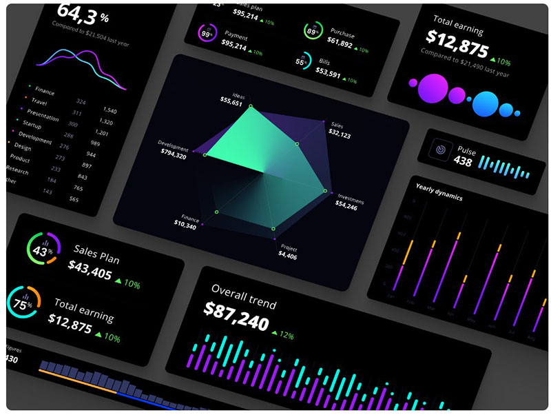
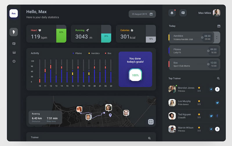
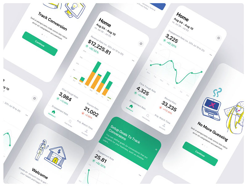
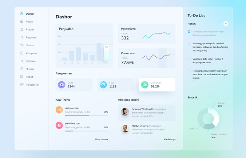
54 Most Appealing User Interface Chart Designs
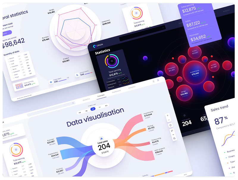
Map dataviz template
Designed by: Alien pixels for Setproduct
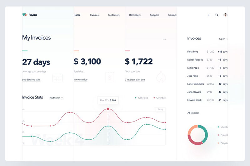
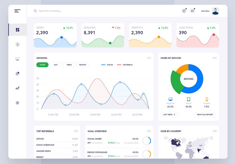
Dashboard: BlueReceipt
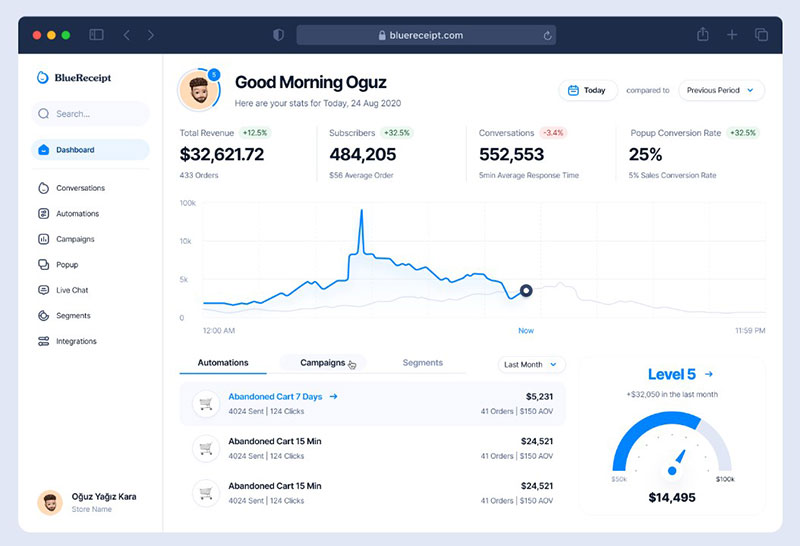
Designed by: Oğuz Yağız Kara for Blue
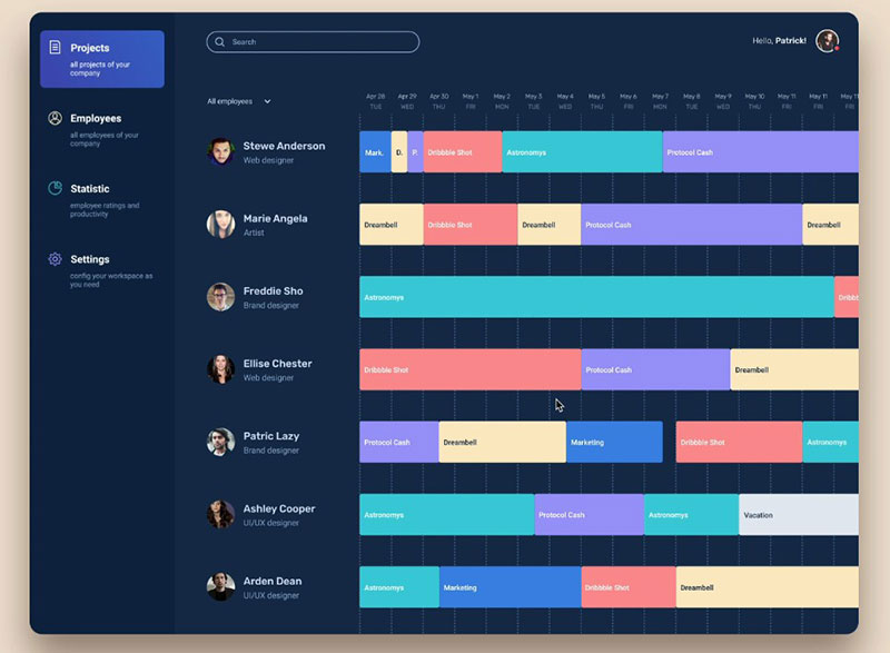
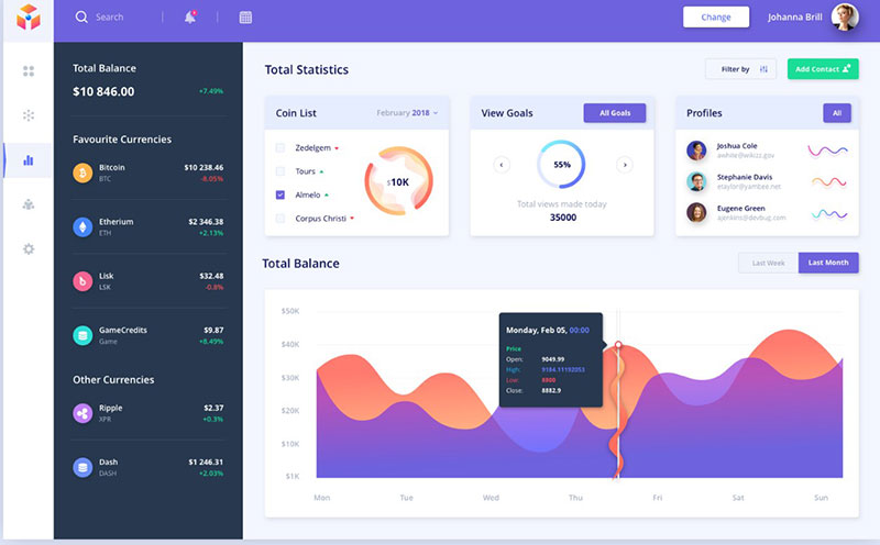
Project management Dashboard
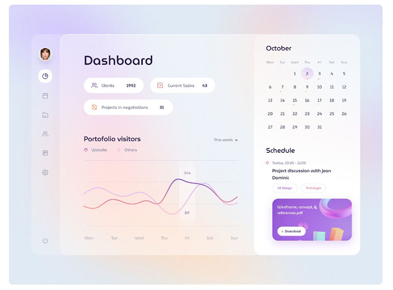 Designed by: Ghani Pradita for Paperpillar
A design with added blur effect.
Your beautiful data deserves to be online
wpDataTables can make it that way. There’s a good reason why it’s the #1 WordPress plugin for creating responsive tables and charts.

And it’s really easy to do something like this:
- You provide the table data
- Configure and customize it
- Publish it in a post or page
And it’s not just pretty, but also practical. You can make large tables with up to millions of rows, or you can use advanced filters and search, or you can go wild and make it editable.
“Yeah, but I just like Excel too much and there’s nothing like that on websites”. Yeah, there is. You can use conditional formatting like in Excel or Google Sheets.
Did I tell you you can create charts too with your data? And that’s only a small part. There are lots of other features for you.
Analytic dashboard concept
Designed by: Stoyko
Created for a scooter sharing app.
The dashboard enables you to get in-depth analytics using a variety of metrics.
Odore Charts
Designed by: Karlo for kreativa
These graphs and diagrams were employed in Odore’s case studies.
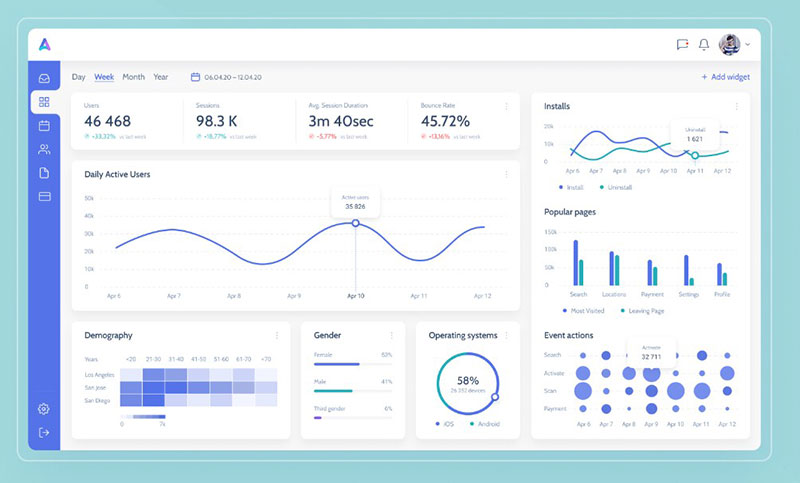
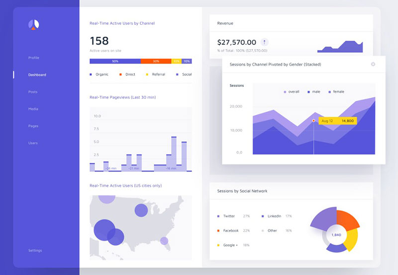
Analytics Dashboard
Designed by: Afterglow
This offers many widgets, allowing users to monitor the most important data. It provides a simultaneous overview of several metrics. In an instant, users can view the condition of their accounts or check the interrelationship between certain reports.
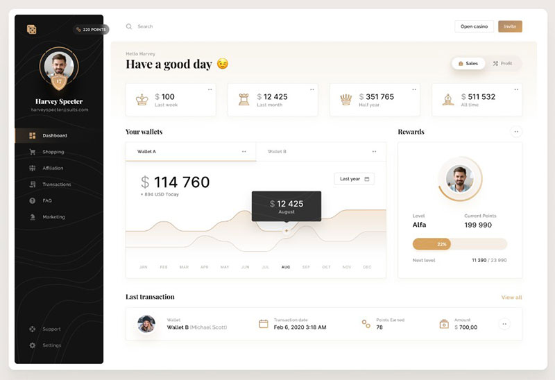
Unity Dashboard Kit – Earnings Report
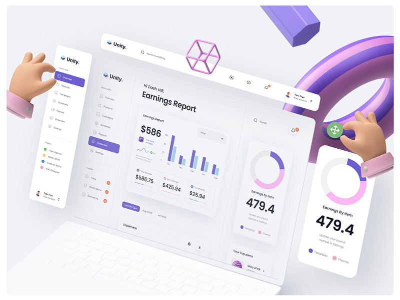 Designed by: Tran Mau Tri Tam for UI8
This is a transparent and minimalistic dashboard. It can have a great range of uses. It is both PC and mobile-friendly and comes in light and dark theme.
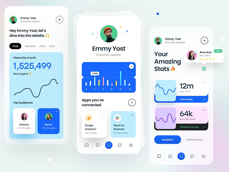
Payments App Dashboard Interface Design
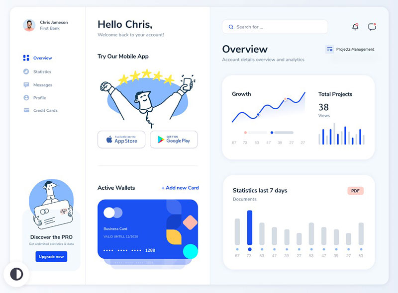 Designed by: Emy Lascan
Payments App Dashboard Interface Design
Employee Engagement Dashboard
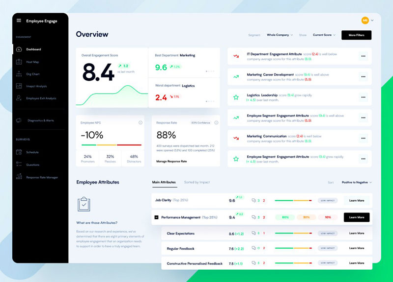 Designed by: Tom Koszyk for EL Passion
This Dashboard design is suitable for enterprise-level use. Its main idea is to present the metrics you care about the most on one screen without creating clutter.
Dashboard Mobile UI
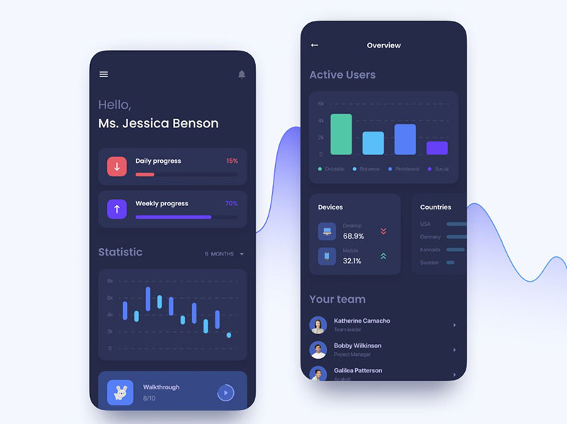 Designed by: Natalia Berdnyk for Uptech
Perfect for keeping tabs on social activities.
Dashboard charts library
 Designed by: Alien pixels for Setproduct
Orion UI kit is a Figma collection of over 25 full-width charts in light and dark modes. It includes over 180 DataViz widgets that work t on both a PC and a mobile device.
Fitness app dark
 Designed by: Alexey Savitskiy for NORT
Web Analytics Mobile App
 Designed by: YesYou Studio
A mobile analytics app allowing users to monitor their website KPIs, income, and traffic.
Commerce Dashboard
 Designed by: Ghani Pradita for Paperpillar
Comes with a glass visual effect.
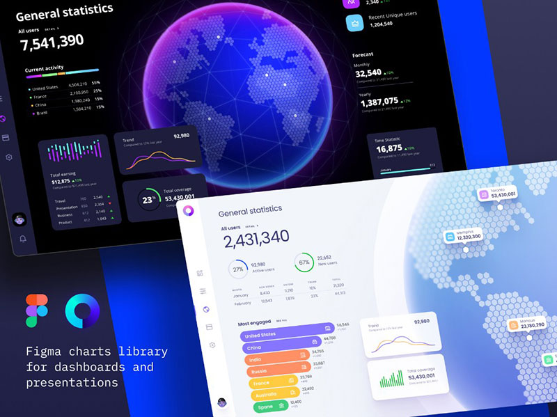
Charts templates & infographics in Figma
 Designed by: Alien pixels for Setproduct
Your earnings dashboard
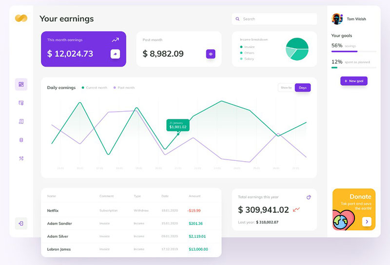 Designed by: Łukasz Wakuła for Netguru
e-Commerce & Finance Analytics – Mobile app
 Designed by: Maciej Kałaska for widelab
Banking Dashboard
 Designed by: Afterglow
Personal banking data visualizations. It provides fast access to reports, stats, and card information.
Xenium Dashboard
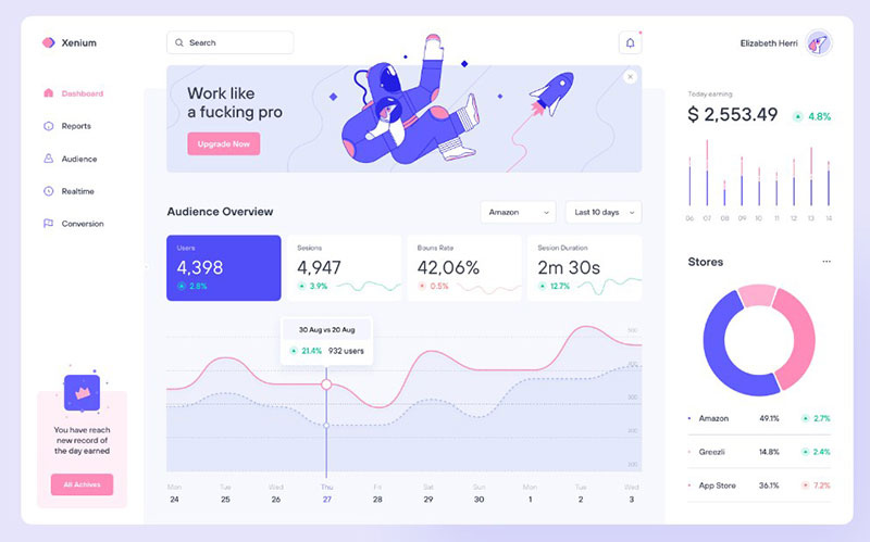 Designed by: Victor Nikitin
Klamma for business | Liquidity planning
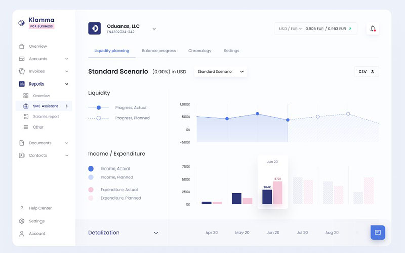 Designed by: Alexander Plyuto
Figma Community – Free Light Crypto Dashboard
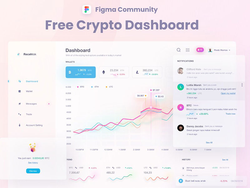 Designed by: Zazuly Aziz for Pixelz Studio
This is a cryptocurrency main panel with a fantastic glow and blur visual effect.
Social analytics: Insights
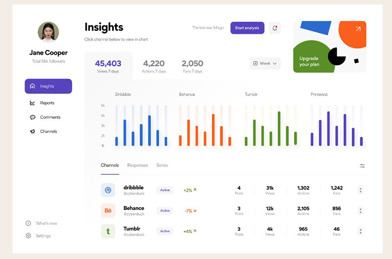 Designed by: Vladimir Gruev for heartbeat
A monitoring app for tracking and analyzing social network activity. Each graph comes in different colors, each color refers to a different social network. This allows for intuitive distinction among them.
Mobile Dashboard UI for Adelfox
 Designed by: Tran Mau Tri Tamn
Task panel
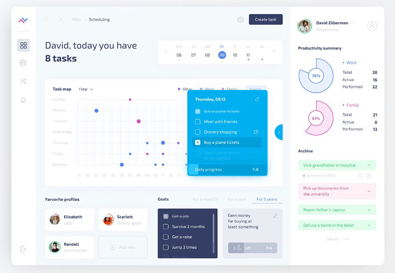 Designed by: Alexey Savitskiy for NORT
Dashboard UI Cards: Jobriver
 Designed by: Oğuz Yağız Kara
Dashboard Widgets
 Designed by: Valery Pevnev for Insoft
Sales Pipeline Sankey
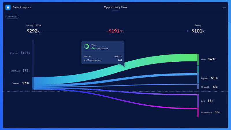 Designed by: Eddie Picot for Salesforce Design
This interpretation of the Sankey diagram is most often employed to show how opportunities move through a sales pipeline over time.
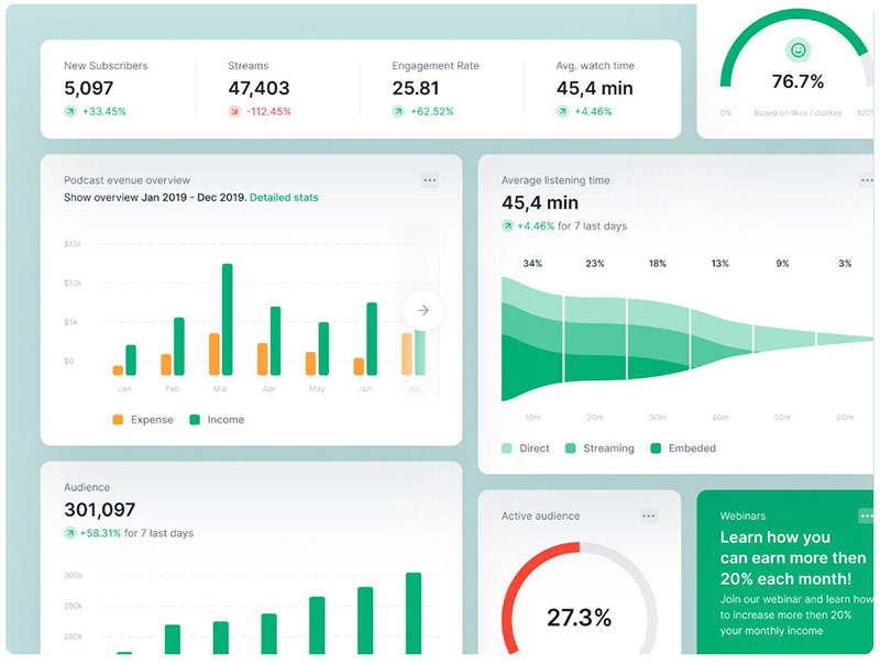
Sales Analytics & AI Predictions
 Designed by: Stan for Dtail Studio
Banking Web App Dashboard
 Designed by: Emy Lascan
Chattermill – Dashboard in Motion
 Designed by: Gregory Muryn-Mukha
A moving custom dashboard.
grinfer – authors analytics page
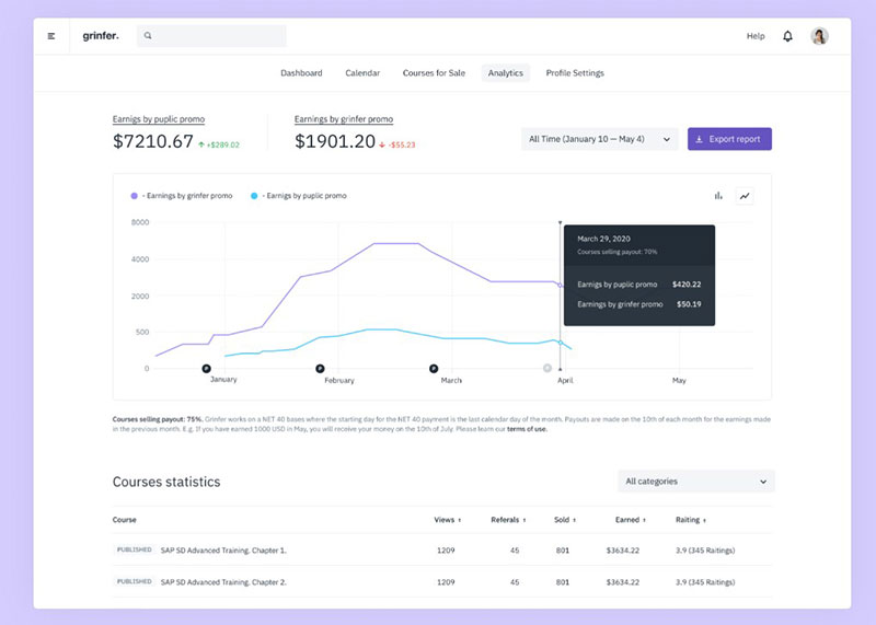 Designed by: Ilya Sivakov
Provides analytics for an e-learning platform.
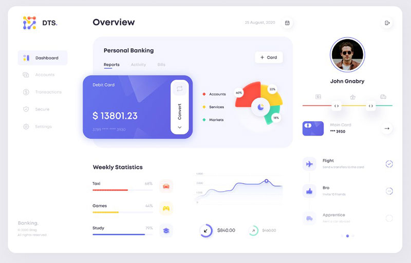
Dashboard Modules – Banking
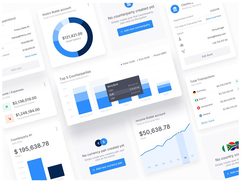 Designed by: Stefan Quernhorst for Fintory
Velocity: A dashboard UI kit
 Designed by: Robert Mayer
This app was created for a fictional self-driving car company. It can be used for saas applications or as an idea for styling a design system.
The Actin medic statistics info dashboard UI design
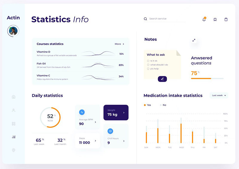 Designed by: Taras Migulko
Daily medication stats. Comes with notes.
Gantt Chart – UI UX design
 Designed by: Ramotion
UI and interaction studies for the Gantt chart interface.
Affiliate Marketing Tool
 Designed by: Maciej Kałaska for widelab
Perfect for creating, keeping track of, and expanding your affiliate marketing programs.
Heeded – Dashboard
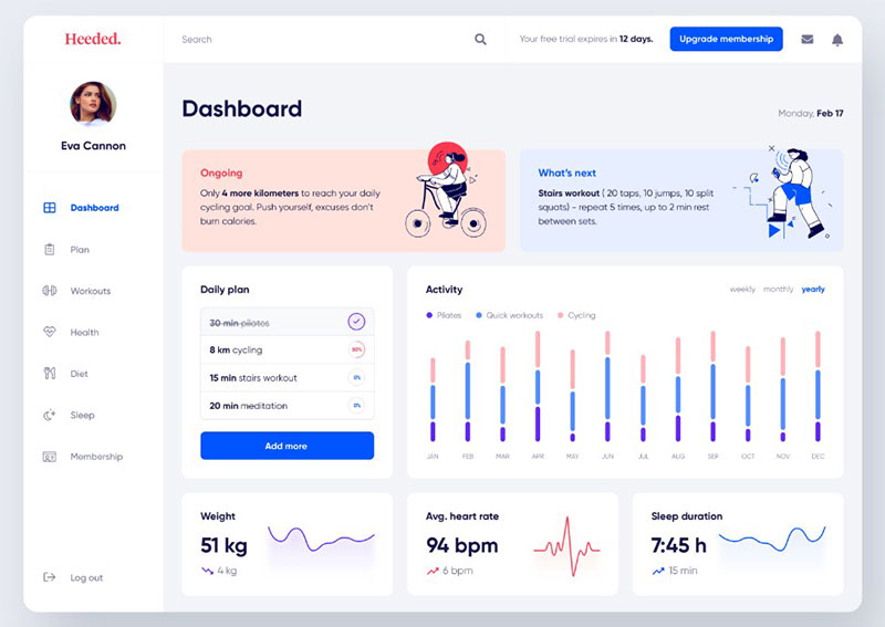 Designed by: Maya Koeva
This dashboard allows users to plan and track their workouts and monitor their health stats.
Organic – Project Management Dashboard
 Designed by: Fadhilah Rizky for One Week Wonders
Invoicing Platform
 Designed by: Den Klenkov for Fireart Studio
Analytics Dashboard
 Designed by: UGEM
This dashboard allows users to monitor the success of their business. Detailed design with all the numerical data presented on one screen.
Sales Tracking / Sales Management Dashboard
![]()
![]() Designed by: Nsky for Awsmd
Designed by: Nsky for Awsmd
This dashboard uses charts to present sales by region, total and average sales, count of sales, impressions breakdown, and average CTR.
Sleep analysis dashboard
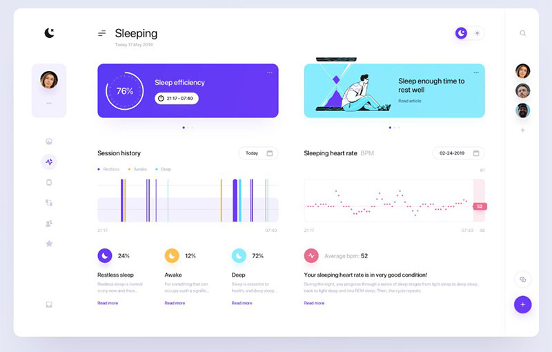 Designed by: Maciej Kałaska for widelab
E-Course dashboard
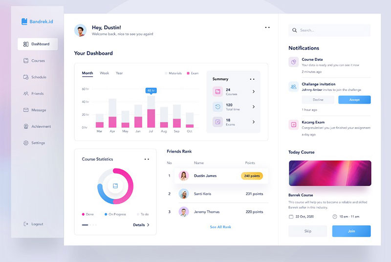 Designed by: Riko Sapto Dimo for Orely
Dashboard
 Designed by: Manoj Rajput for MindInventory
A dashboard design exploration for one project.
Orion dashboard template
 Designed by: Alien pixels
Report builder dark theme
 Designed by: Gregory Muryn-Mukha
An example of a report builder tool in a dark theme.
Robinhood Dashboard Concept
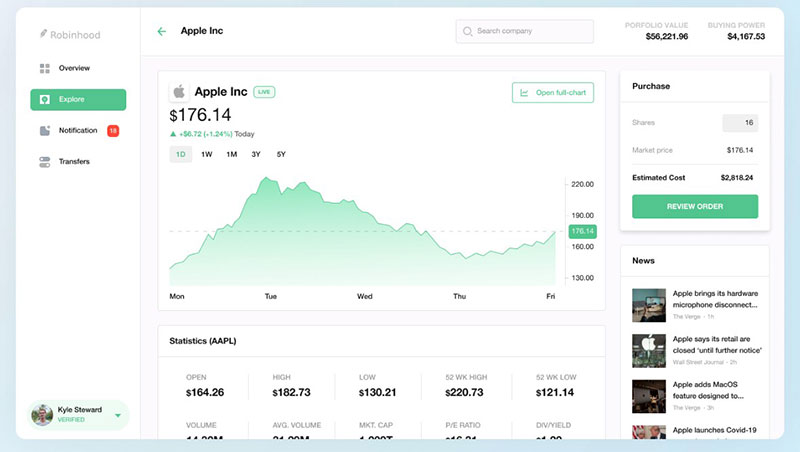 Designed by: Thang
Analityc Dashboard
 Designed by: Anna M
Sentinic – Chart
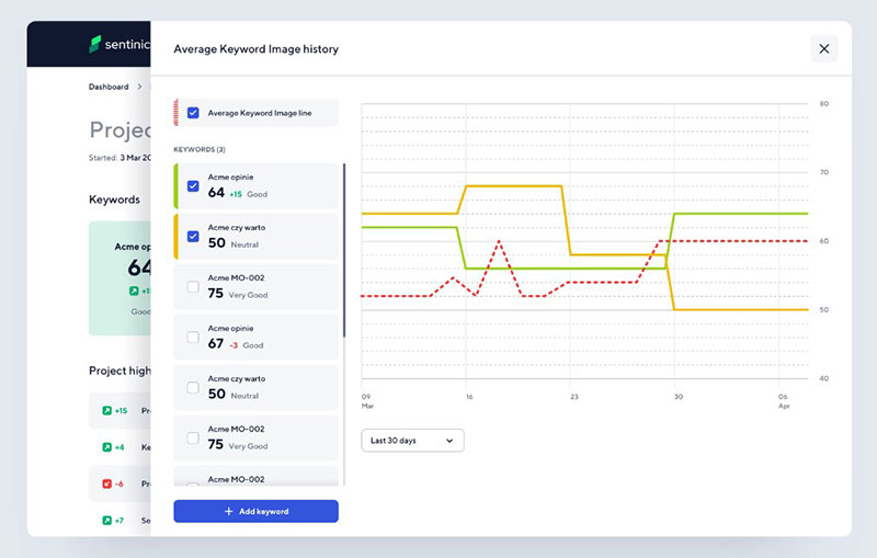 Designed by: Patryk Ilnicki for Autentika
Sentinic is a Search Engine Reputation Management tool. It enables a company to track the sentiment of Google results and find out what opinion the company, product, and services have.
Stockit – Web App
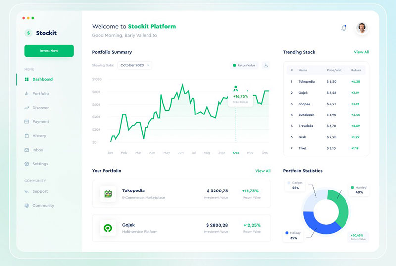 Designed by: Barly Vallendito for Dipa Inhouse
FTW | Analytics system
 Designed by: Alexander Olssen
Dashboard for engineers
 Designed by: Viacheslav Tarasov for bn digital
The goal is to present engineers with a lot of vital data in a cool yet simple way.
Survey Dashboard
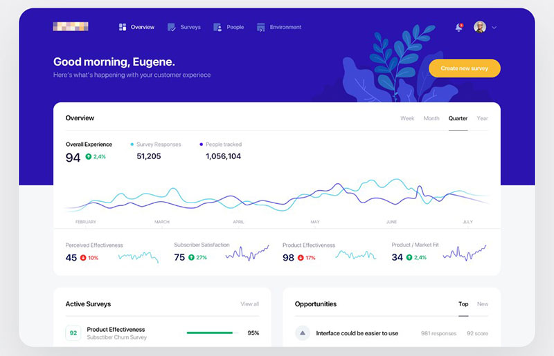 Designed by: Eugene Olefir
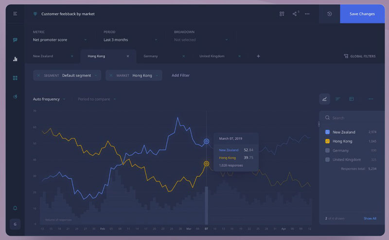
Marketing Miner – Competition
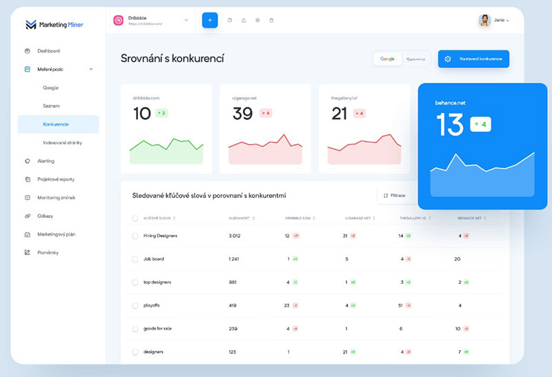 Designed by: Martin Strba
This is another concept preview for Marketing Miner.
You like well-designed chart designs, but let’s get into the practical aspect of them. If you want to create a great-looking chart in WordPress, you will need to use a WordPress plugin for that.
The best option that we would recommend is the plugin that we’ve created and for which we add new features on a regular basis. That plugin is wpDataTables.
wpDataTables is a best-selling WordPress table plugin that makes your work with tables, charts, and data management easy. Check it out and you’ll never use another chart plugin ever again.
FAQ about chart designs
What’s the big deal with chart designs in user interfaces?
They’re a game-changer; a pivot from confusion to clarity. Picture a dashboard—without intuitive chart designs, it’s gibberish. Good design prioritizes data visualization best practices, ensuring the data’s not just seen, it’s understood. It’s about creating that “aha-moment” for users, where complex information becomes graspable.
How do chart aesthetics influence user experience?
Imagine a chart as a party host. If it’s dressed up sharp—good color contrast, clear typography—it makes guests, or users, stay longer. Chart aesthetics dictate if the user feels welcome and at ease, deciphering data smoothly or squinting, lost in a maze of figures.
What’s the role of interactivity in chart design?
It’s like handing over a joystick in a video game; users want control. Interactivity in chart designs means less static, more action—think filtering, zooming, adjusting. It makes the user part of the conversation, allowing them to delve into data storytelling and tailor the narrative.
Which chart types are best suited for different data sets?
It’s about matching character to context. Dense data? A heat map might unfold the drama. Trends over time? Line graphs are your time-travel device. Choices should amplify the data, not overshadow it, like picking the right actor for a movie role—it’s got to fit.
Can color choices in charts really affect data interpretation?
Absolutely. It’s the visual seasoning—too bland, and your data’s lost. Too spicy? Overwhelm city. Color choices can guide, highlight, even manipulate. Choose wisely. The right palette underlines the story data tells, while poor choices can lead to misinterpretation or, worse, viewer disinterest.
How crucial is responsive design for chart interfaces?
Think of it as a passport, allowing your charts to travel across devices seamlessly. Responsive design ensures your graphs and charts are fluent in mobile, tablet, desktop languages alike. In today’s digital nomad world, it’s not a luxury; it’s mandatory for accessibility.
What are the common pitfalls in UI chart design?
Over-elaboration is the Achilles’ heel—like a novel with too many characters. Users can get lost. Another pitfall? Ignoring accessibility. Charts need to speak to everyone, including those with disabilities. Lastly, neglecting mobile-friendly design principles can alienate a huge chunk of the audience.
How important is it to follow data visualization trends in chart design?
Here’s the thing—trends aren’t gospel, but they’re indicators of evolving tastes and technology. Keeping abreast means staying relevant and innovative. Jumping on every bandwagon, though? Not recommended. Instead, adapt trends that resonate with your users and align with your analytics interface design goals.
What’s the best way to approach chart design for a diverse user base?
Empathy is key. You’ve got to wear different shoes—tech-savvy, total newbie, color-blind. Versatility in design caters to this diversity. Think adjustable settings, accessible data visualization, and user customization options. It’s about serving a buffet with something delicious for every dietary need.
How often should I update my user interface’s chart designs?
Not on a schedule, but with purpose. Changes should be reactive to user feedback, technological advancements, or new insights into data representation. If users are losing their way or new visualization compatibility tech appears, revamp. Freshness keeps the interface vibrant but change for the sake of change is noise.
Conclusion
Wrapping it all up, we’ve journeyed through the landscape of chart designs from user interfaces, uncovering how they are the silent narrators of data’s story. From the selection of the right chart types for your narratives to mastering the subtleties of color psychology in graph aesthetics, it’s clear:
- Each design choice whispers volumes to the user.
- Crafting an interactive dashboard isn’t just a skill—it’s an art.
- Embracing the fluidity of responsive graph design ensures no user is left behind.
Remember, it’s not about using every tool in the shed but picking the right one for the job. The balance between simplicity and informative richness is delicate but attainable. Keep the user’s journey at the heart of design, and the charts will almost start to speak, engaging and enlightening in equal measure. Though the visuals sign off here, the insights gleaned will echo each time you look at a set of data, itching to tell its tale through your next design masterpiece.
If you liked this article about chart designs, you should check out this article about embedding a chart.
There are also similar articles discussing survey graph makers, survey chart types, survey tables, and creating a Google forms results graph.
And let’s not forget about articles on Chart.js examples, types of charts, Highcharts alternatives, and WordPress charts.