Imagine transforming a sea of survey responses into stunning, insightful visuals that captivate and inform. That’s the power of survey graph maker tools at your fingertips.
In today’s data-driven world, deciphering complex datasets and presenting them effectively is crucial. You need tools that not only compile and analyze survey data but also showcase it through intuitive charts and interactive graphs.
By the end of this article, you’ll discover the essential features of top-tier graphing software and visualization platforms, learn how these tools enhance your data analysis capabilities, and see why they’re indispensable for modern survey reporting.
We’ll explore data visualization dashboards, customizable survey charts, and interactive chart tools that transform raw data into clear, actionable insights.
Whether you’re involved in questionnaire design or need to present survey results compellingly, this guide will equip you with the knowledge to make informed choices and significantly elevate your data presentation game.
Table of Contents
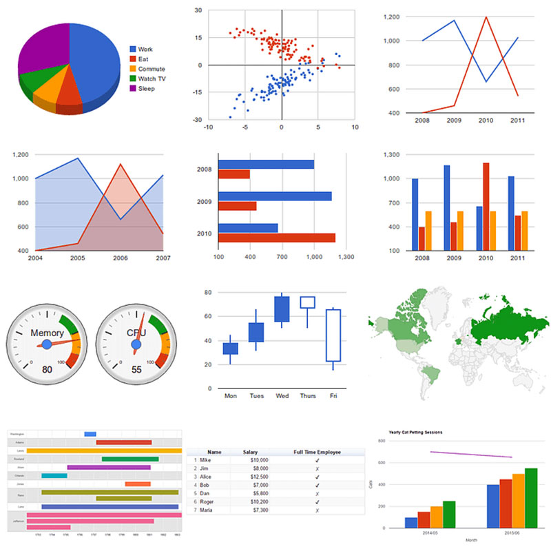
What Are Survey Results Report Tools?
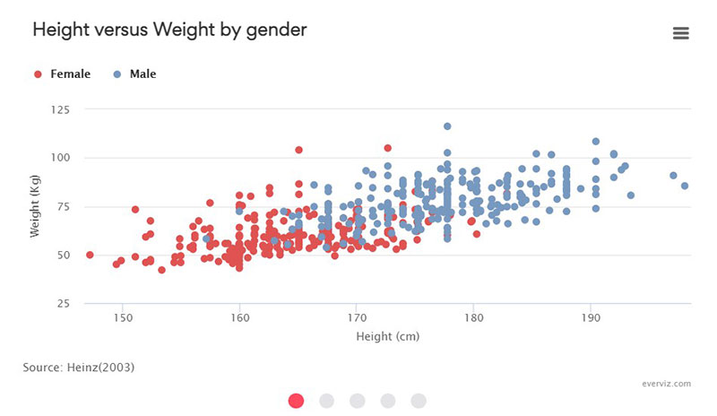
Survey results report tools convert text-based data into bar graphs or pie charts.
Visualizing survey data helps the user understand the data. It shows them how to use it to achieve a desired goal or objective.
Conducting surveys is easy. However, visualizing survey results via different chart types can be difficult.
This was once a job for graphic designers and could take days or weeks to finish.
Today, there are tools that create visual representations of customer survey responses. These survey results tools include:
- Simple website plugins for small businesses
- Complex BI software (Business Intelligence) for large corporations
These resources allow users to make faster, better decisions, based on charts and graphs. Here are some of the best means of visualizing survey results.
Resources To Present Survey Data
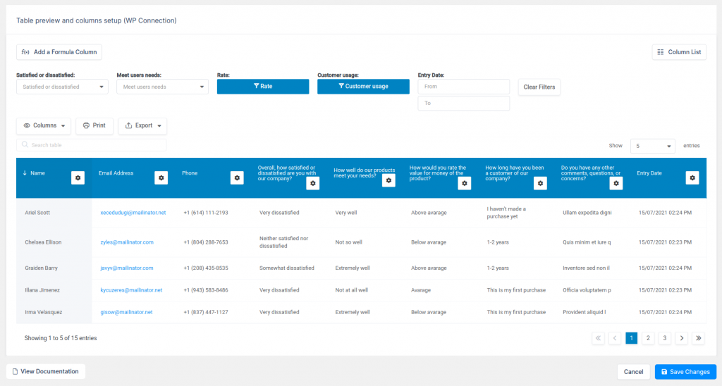
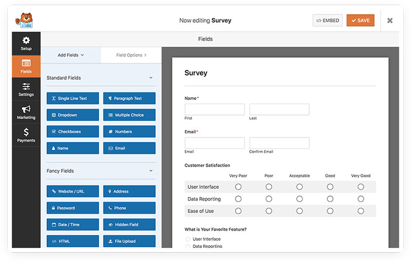
wpDataTables integration for Forminator Forms
Quite a good deal of people use wpDataTables. It helps them to display original data in an appealing and understandable format.
This add-on integrates wpDataTables with Forminator Forms, WordPress’s form builder.
This allows users to build sortable charts and tables based on their survey data. They can do this via the wpDataTables table and chart wizard.
RAW
Those wanting an interactive visualization of survey results using D3 should use RAW. This app is free and makes using the D3 JavaScript library a simple task.
The simple three-step process includes:
- Copying the survey data into the online editor
- Selecting the desired chart type
- Mapping the axis
Users can style their charts and graphs as desired using RAW’s customization options. Then, they can display the survey results report on their website using the embed code.
RAW’s only drawback is its limited graph library. But, for personal or small professional presentations RAW is still a first-class option.
Highcharts Cloud
When it comes to visualizing survey results, Highcharts Cloud creates beautiful reports. Highcharts offers this free solution and a variety of other visualization products.
It features various chart types. Users only have to input the data from, let’s say, customer satisfaction surveys, to display their survey results.
Highcharts’ only drawback is its limited customization capabilities. But, for quick and simple visualization this tool is perfect.
RafflePress
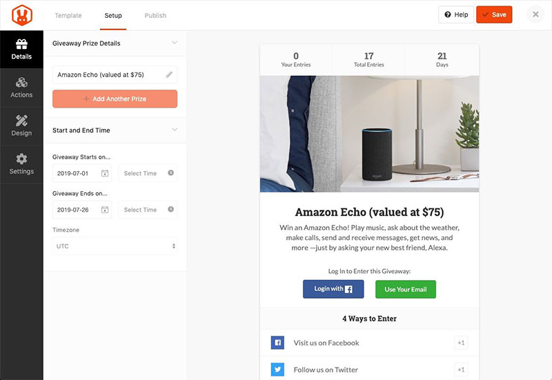
This is a simple but effective tool for conducting surveys. As such it can contribute to a company’s online growth.
The RafflePress tool enables users to host giveaways on their WordPress site. This encourages visitors to complete the poll or survey.
This tool is the perfect giveaway plugin to motivate visitors to take a survey. This, in turn, gives needed insights to boost a company’s growth.
Visualizer
Visualizer syncs well with WordPress websites. It allows users to create customizable and responsive:
- Tables
- Charts
- Line graphs
This tool allows real-time editing of each table, pie chart, and graph from one’s posts.
Users can also import data from CSV files or Google Spreadsheets. Then display these in beautiful charts and graphs.
Business Intelligence Survey Results Software For Corporations
Tableau Public
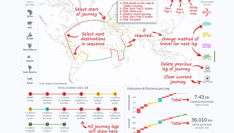
Tableau is popular among large companies.
There is a personal license version called Tableau Creator. There’s also a free version called Tableau Public.
This tool’s greatest strength is its geocoding. This converts location data into an interactive map.
Beginners who choose to skip Tableau’s tutorial may find the tool challenging to use.
Sisense
This BI survey results report tool is for displaying insightful corporate survey reports. Sisense is often used to create dashboards but its functions go beyond that.
It is especially perfect for visualizing large quantities of data. This makes Sisense ideal for large corporations within industries such as:
- Health and wellness
- Food
- Transportation
- Energy
- Manufacturing
- Mining, and so much more
It can also be used to build dashboards for tracking social media marketing data. Developers can use the Sisense API with any type of data set to create analytics applications.
Visualize Free
This tool is an online platform supported by HTML5 and Flash. It is for the advanced visualization of survey responses.
The benefits of using the Visualize Free tool include:
- Interactive pie charts and graphs that allow viewers to edit the data sets
- Access to a range of customization options
This tool can help to enhance large corporate meetings.
For example, stakeholders can watch as users run live filters of the survey results. They can request filters such as location, age, and more.
This increases the level of engagement during presentations.
SurveyMonkey
This survey results tool provides a wide variety of professional survey templates. It also allows users to set up payments via Stripe, protecting against fraud.
SurveyMonkey integrates well with CRM and analytics programs such as Salesforce and Tableau. It also offers a variety of question types, such as:
- Slider
- Matrix
- A/B testing
- Ranking questions
- Video
- Rating
- Star
Confirmit
This online survey graph maker software is for market research companies and other research workers. Confirmit allows the user to:
- Collect data
- Customize surveys
- Integrate various additional tools
- Program the study
- Export data and analyze results in tables and charts
- Prepare quick reports
- Translate links in a simple Confirmit Translator module
This tool is also useful for employee engagement and pulse survey. Its only drawback is that it lacks user interface updates.
WPForms
WPForms comes with a variety of resources and integrates well with WordPress websites.
This tool caters to users with more advanced needs. But it does make it easy to attach forms to a WordPress website.
With its drag and drop feature, there is no coding knowledge required. Users can collect payments and link their email marketing service with the survey.
Flourish
This is a survey results report tool with a variety of simple bar chart types. It features:
- Interactivity
- Extra animation on loading
- A Twitter timeline chart for events
- Beautiful survey visualization
Flourish enables one to use different data points to sort and compare survey data. This results in a visualization that is perfect for analytic purposes.
Where this tool stands out is with some of its unique charts. Users won’t find these in other spreadsheet and chart-building tools.
Whatagraph
Whatagraph displays and analyzes email marketing and social media campaigns. This tool provides visual data analytics for:
- SEO
- Social media
- Email campaigns
- PPC
It makes these visual analytics using integrations, such as Google Analytics and Twitter. Users can customize the data visualizations for their brand with white label templates.
Google Charts
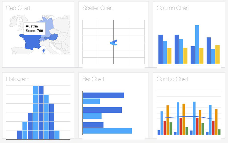
This tool enables stakeholders to access survey results data from anywhere in the world. Users can display survey results to participants in an engaging and practical way.
To customize the starting bar graph one will need basic HTML knowledge.
However, even without experience, a user can create a personalized graph. this is thanks to the tutorial included with the software.
ChartBlocks
This data visualization tool is ideal for making charts and graphs. Now integrated with the content creation tool Ceros, users have the option of:
- Accessing charts from ChartBlocks via their Ceros dashboard.
- Accessing charts straight from the ChartBlocks site.
Hosted with D3.js, ChartBlocks’s charts can be shared or viewed on any platform and device.
This tool enables one to build or insert any type of chart or graph into their Ceros projects. The chart maker is easy to customize to match any brand or project color scheme.
Zoho Survey
The Zoho Survey results report tool is easy to use. Zoho Survey allows the user to build surveys right on the platform.
This is a simple task for persons with experience in building surveys. Depending on the survey responses, charts may become quite complex with many branches.
Those with limited survey building experience can make use of Zoho’s webinars and live online training that will teach you to use a webinar. They offer free training sessions with a syllabus that covers categories such as:
- 100 responses/survey
- Social sharing
- Over 200 survey templates
- 10 questions/survey and more.
FAQ on survey graph maker tools
What are survey graph maker tools?
Survey graph maker tools are software applications designed to help you visually represent survey data. They simplify the creation of interactive graphs, enabling you to transform responses into visual data formats like charts and graphs. These tools are essential for data visualization and enhancing survey reporting.
Why are these tools important for data analysis?
These tools are vital because they turn complex data into easy-to-understand visuals. Graphing software can uncover patterns and insights you might miss in raw data. Visualization platforms help you make data-driven decisions quickly, improving both survey analysis and the presentation of results.
Can I create customizable survey charts with these tools?
Yes, most survey graph maker tools offer extensive customization options. You can tailor your charts to match your brand or highlight specific data points. Features often include color schemes, chart types, and layout options, making customizable survey charts easy to produce.
Are there any specific features to look for in survey graph maker tools?
Look for tools with features like interactive chart tools, real-time updates, and extensive data export options. Other valuable features include user-friendly interfaces, robust data import capabilities, and strong data interpretation tools to make your analysis process seamless and efficient.
How do these tools help in presenting survey data?
They allow for visual data presentation that is both engaging and informative. You can create interactive graphs that bring the data to life, making it easier for your audience to grasp key insights. This enhances the overall survey reporting experience.
Do these tools support online survey platforms?
Absolutely. Many survey graph maker tools integrate smoothly with online survey platforms. Whether you’re using tools like Google Forms or SurveyMonkey, you can easily import your data for visualization. This seamless integration streamlines the entire data collection and analysis process.
What are the benefits of using data visualization dashboards?
Data visualization dashboards provide an at-a-glance view of your key metrics and trends. They allow you to track survey results in real-time and make quick adjustments based on the data. With dashboards, you can monitor performance and generate detailed reports effortlessly.
Can I integrate other data sources with these tools?
Yes, you can. Most tools enable the integration of various data sources, enhancing your ability to create comprehensive reports. You can compile data collection tools results and additional datasets, providing richer context and more accurate insights.
How can these tools enhance my questionnaire design?
By offering templates and insights on question performance, these tools help refine questionnaire design. You can visualize which questions yield the most valuable data and adjust accordingly. This iterative process ensures you’re gathering the most actionable survey insights.
Are there free versions of these tools available?
Yes, many companies offer free versions with basic functionalities. These can be quite useful for smaller projects or for testing purposes. However, for more advanced features like interactive graphs and extensive data interpretation tools, premium versions may be required.
Conclusion
Wrapping up, survey graph maker tools stand out as indispensable assets in transforming raw data into compelling visual narratives. These graphing software solutions foster an intuitive approach to data analysis, enabling the creation of interactive graphs that convey insights succinctly.
By leveraging visualization platforms, you can elevate survey reporting with customizable survey charts and data visualization dashboards. Tools integrated with online survey platforms streamline the data collection process, ensuring comprehensive and accurate insights.
Ultimately, these tools are not just about displaying data but about making it speak. From questionnaire design to feedback analysis, the right tool amplifies your data’s impact. Engage your audience with visually rich, insightful presentations and make informed decisions backed by crystal-clear data interpretation.
In a world awash with information, the clarity provided by the right survey graph maker tools is invaluable. Equip yourself to handle and present data with unmatched precision and creativity.
If you want to have an entertaining survey with numerous advanced features on your WordPress websites, then the Survey Maker plugin is a perfect fit.
If you liked this article about survey graph makers, you should check out this article about embedding a chart.
There are also similar articles discussing survey chart types, survey tables, creating a Google forms results graph, and Chart.js examples.
And let’s not forget about articles on chart designs, types of charts, Highcharts alternatives, and WordPress charts.