There are many survey chart types that can serve to display survey responses. Choosing the right chart for a survey results report can be challenging.
This is often due to a lack of understanding of the characteristics of different chart types. As a result, many people visualize their survey report data in one of two ways.
They may pick the nicest-looking charts. Or they overload their report with the usual vertical bar and pie charts.
A pie chart, line chart, bar graph, or a stacked column chart can clearly communicate your findings. But, depending on the features and complexity of the survey results report, some charts may be more useful than others.
This is why it is important to know which survey chart types to use. Knowing when and how to use them is especially vital when working with multivariate data.
Table of Contents
Chart Types For Displaying Survey Results
| Chart Type | Best Used For | Visual Appeal | Ease of Creation | Interactivity Potential |
|---|---|---|---|---|
| Bar Chart | Comparing responses across different groups or categories | High | Easy | Low to medium (can include tooltips or click events) |
| Pie Chart | Showing simple response distribution as a part of a whole | Medium | Easy | Low (can include hover details) |
| Line Chart | Tracking changes over time or showing trends | Medium | Moderate | Medium (zooming, hover details) |
| Histogram | Displaying frequency distribution for numerical data | Medium | Moderate | Low to medium (can include hover details) |
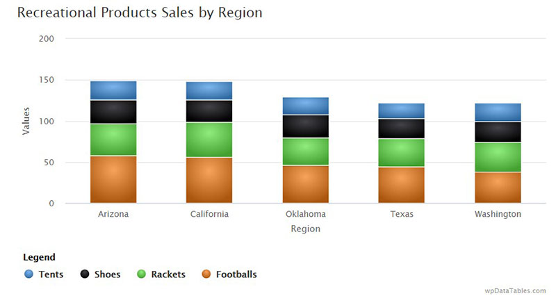
| Stacked Bar Chart | Comparing the composition of different groups | High | Moderate | Medium (can include tooltips, segmented clicks) |
Visualizing Survey Data With A Pie Chart
An Overview Of Pie Charts
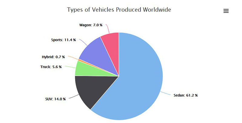
Pie charts are among the most popular chart types used for comparing survey results.
Each arc of a pie chart is outlined by creating outspread lines. These emanate from the circle’s focal point to its closures.
This results in the creation of wedge-shaped slices in the pie chart.
Uses Of Pie Charts
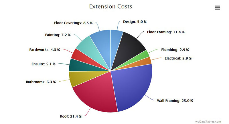
Pie charts are best used to represent groups of survey results data that contribute to a whole. In essence, a pie chart displays the different shares of nominal and ordinal data.
It is ideal for expressing individual variables to the benefit of the reader. It is also useful for assessment purposes.
Nominal data is data that can divide into categories, e.g. demographic information. Ordinal data is similar but is also on a scale or ranked.
For example, customer survey responses may rank their opinions or experience from “Very Good” to “Very Poor”. This would be ordinal data.
Guidelines For Creating Pie Charts
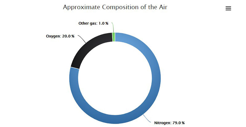
Optimize pie charts by arranging the data in a clockwise manner, largest to smallest. An exception to this guideline is when survey results have an “other” category.
This category may produce several different responses. Yet they all make up a single wedge of the pie chart.
Regardless of the size of this wedge, always place it last in the clockwise sequence.
Also, be strategic when choosing the color for each wedge of your pie chart.
Use the darkest color for the first, largest slice. Then gradually move to the lightest color for the last, smallest slice.
Displaying Your Survey Results Report Using A Line Chart
An Overview Of Line Charts
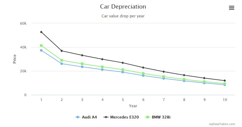
Line charts use data values that correlate to respondents’ answers. Line charts are great for running surveys repeatedly.
Uses Of Line Charts
A line chart is useful for displaying comparisons, peaks, or trends over time. It’s great for measuring the long-term movement of empirical statistics for any organization.
A line chart is also useful for comparing two different variables over a period of time. For example, a line chart could illustrate the relationship between:
- Increased governmental promotion of health and wellness and a drop in the sale of sugary products over a 5-year span.
Best Practices When Using Line Charts
Add descriptive labels to the chart to put the data in context. This ensures that the data is not lost in translation or misinterpreted by your audience.
Use these labels to show the conclusions and implications of the data in your survey chart.
Be sure to use enough data points to facilitate a proper extraction of trends. But, to ensure readability try to limit the number of data labels on the x-axis to 5.
Improve the chart’s visual appeal by increasing the height of the y-axis. It should match the highest value point in the line chart.
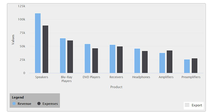
Visualizing Survey Results With Vertical Bar Charts
An Overview Of Vertical Bar Charts
It’s possible to separate each bar with a blank space. With this format, base the x-axis on a scale with mutually exclusive categories, such as:
- Multiple choice
- Check box questions
Categories based on a continuous scale are better suited for a histogram.
Uses
This type of chart is best suited for comparing between 2 to 7 different groups of percentages or means. Too many categories would increase the width of the bar graph making it hard to read or display on the screen.
Best Practices
It is best to use only a handful of categories in a vertical bar chart.
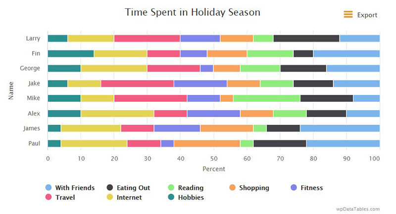
There is a less information-dense alternative. Try splitting up the bars to create a modified 100% stacked bar chart.
This will produce more space for labels, especially for “Yes” and “No” responses.
Illustrating Survey Results With Horizontal Bar Charts
An Overview Of Horizontal Bar Charts
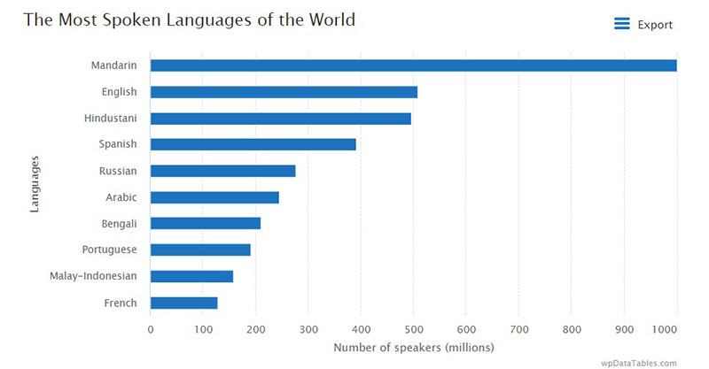
A horizontal bar chart is great for illustrating survey results with multiple categories.
The structure of the graphs improves readability. This is because the bars extend along the x-axis instead of up the y-axis.
Thus, the x-axis carries the scale. The y-axis displays the different response categories of the survey results report.
Uses Of Horizontal Bar Graphs
Horizontal bar graphs are best suited for survey report categories with long names. These are hard to fit beneath an upright bar graph.
Guidelines For Using Horizontal Bar Graphs
Display all bar labels horizontally so that viewers won’t need to tilt their heads to read them. Try not to include the answer option “Other.”
When using nominal data, try to arrange each bar category from largest to smallest. This improves the readability and visual appeal of the graph.
For ordinal data, arrange the bar categories in the proper order regardless of which was the most common answer. For example, “Very Poor,” “Poor,” “Good,” “Very Good.”
Displaying A Survey Results Report Using A Choropleth Map
Overview Of Choropleth Maps
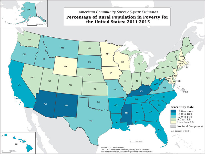
Image source: xdgov.github.io/
Creating visual representations of survey data that include demographics and other results? Do you want to visualize data from the survey results report for analytical purposes?
Using a choropleth map is a fun way to add demographics to the infographic.
Usefulness Of Choropleth Maps
Use choropleth maps to display data distribution by:
- Gender
- Different age groups
- Geographic location
- Income level
Choropleth maps do not demand any reading. That’s because each data value can be represented by a different shade of a particular color.
Therefore, this survey chart is ideal for presenting complex survey results.
Best Practices
For simpler demographic data, use an icon chart. This adds more impact to simple survey results, such as:
- Job
- Role
- A design feature
With choropleth maps, focus on the important survey results. Use reports or white papers for more in-depth summaries.
Data visualization is about simplification and presentation. So only add supporting data if it is necessary.
Using Word Clouds To Display Survey Results
Overview And Usefulness Of Word Clouds
How can you create a visual representation of survey questions that do not have preset answers?
One way is to utilize word clouds to visualize data for open-ended responses. With this chart type, group respondents’ answers using:
- Common keywords
- Sentiments
- Another connecting factor
For instance, a survey may ask why respondents rarely purchase a particular product. Depending on their answers, the word cloud may include expressions like:
- Shipping time
- Price
- Customer service
- Convenience
- Selection, etc.
Guidelines For Using Word Clouds
Frequently expressed responses should display in the largest font. Each subsequent response should carry a sequential decrease in size.
This chart type is best used to display a lot of data that is easy to understand in context.
Ensure the phrases in the word cloud visualization make sense when displayed together. If the words and phrases don’t relate to each other the word cloud will be useless.
Word clouds are ideal for audiences with little exposure to statistical analysis or data-heavy tables. Identify the most recurring keywords and plug these into the word cloud generator.
FAQ on Survey Chart Types
What’s the best chart to represent overall survey responses?
You’ll want a pie chart or a bar graph for that snapshot view. Pie charts nail it for showing percentage breakdowns, while bar graphs excel when comparing different groups. Data visualization tools like these shine when giving that instant, ‘get it at a glance’ vibe.
Can I use a line plot for survey results?
Absolutely, if you’re tracking changes over time. Line plots showcase trends beautifully—say, if you’re charting customer satisfaction levels across several quarters. Just make sure your survey has that temporal element; line plots love a time series!
Why are bar graphs so popular in survey data representation?
Bar graphs are the bread and butter here—they’re user-friendly and super versatile. Whether you’re ranking preferences or showing a demographic segmentation, bar graphs lay it out in a way that’s easy to digest. They’re like visual shorthand for “survey data trends“.
How can I visualize Likert scale data?
Likert scales and stacked bar charts or area charts go hand in hand. They align your strongly agree to strongly disagree responses neatly, making it clear where opinions cluster. It’s a perfect match that turns complex sentiment data into a clean, clear picture.
What chart type should I use for comparing multiple choice answers?
Cross-tabulation charts have a knack for this job. They let you pit multiple choice answers against each other and can really spotlight those intriguing patterns in your survey question analysis.
Is there a chart type that can display open-ended responses?
Trickier, since it’s qualitative, but word clouds or infographics play a starring role. They highlight commonly used words or themes, giving you a creative and impactful way to show what’s buzzing in the respondents’ minds.
When should I use a scatter plot for survey data?
Scatter plots are your go-to when unveiling relationships between two quantitative variables. Say you’ve got an age demographic and a product preference—scatter plots will show you how, or if, they’re related. They’re like detectives of correlation in your survey results.
How can I make sure my chart is accessible to everyone?
Stick to clear, contrasting colors and don’t skimp on labels. Keep those graph design best practices in your back pocket. Remember, not everyone sees color the same way, so patterns and textures can be a big help. Accessibility is key to visual communication.
Are there any interactive chart types for online surveys?
Interactive dashboards—where users can click, zoom, filter. They’re top-notch for online data interpretation, letting users play with the data and dig into what interests them. It’s like giving your audience the driver’s seat in exploring survey data trends.
How do polar area diagrams differ from pie charts in survey visualization?
Think of polar area diagrams as pie charts with an edge—literally. They can show more complex relationships, with angles representing categories, and radii indicating magnitude. Great for comparing cyclic trends or multifaceted survey data—they’re like pie charts that hit the gym.
Conclusion
Do you want to create attractive, informative, and understandable survey charts? Do you want to visualize a survey results report in a way that the audience will appreciate?
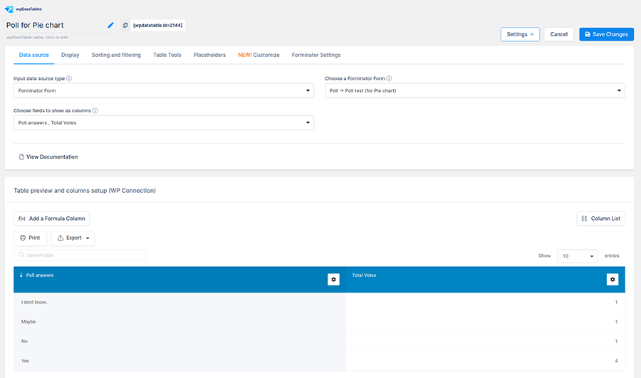
Use the wpDataTables Forminator integration to build charts for your survey results report. These work well with Forminator PRO and wpDataTables Premium and their advanced features.
To get started, go to wpDataTables and click “create a Table.” Then select “Create a table linked to an existing data source,” and tap “Next”.
Select “Forminator Form”. Then choose a quiz, poll, or form from the “Choose a Forminator Form” select-box.
When the box “Choose fields to show as columns” appears, select the quiz, form, or poll fields to use as columns.
We detailed this process further in an article that you can check out.
If you liked this article about survey chart types, you should check out this article about embedding a chart.
There are also similar articles discussing survey graph makers, survey tables, creating a Google forms results graph, and Chart.js examples.
And let’s not forget about articles on chart designs, types of charts, Highcharts alternatives, and WordPress charts.