Diving into the world of data visualization, we’re often left contemplating beyond the usual suspects. Highcharts stands tall, a titan in the realm of dynamic, interactive graphs, but whispers of change linger in the digital winds. There’s a slew of Highcharts alternatives clawing at the fringes, each promising a unique twist on painting data stories.
Here’s the deal: you’ve got data. A lot of it.
You need to make it dance, sing, and do the occasional backflip for your audience. I’m here with a toolbox brimming with fresh charting libraries and data visualization tools, revving to take your datasets on an animated joyride. Forget static bar charts in yawning boardrooms; we’re crafting narratives that latch onto viewers’ eyeballs.
By the wrap of this read, you’ll be wielding the know-how to pick a charting alchemist that transforms your rows and columns into compelling visuals.
Chart types are diverse—bar, line, pie, scatter—you name it, and I’ll showcase the crème de la crème alternatives scaling the peaks of visualization genius. Strap in; your data’s never looked this good.
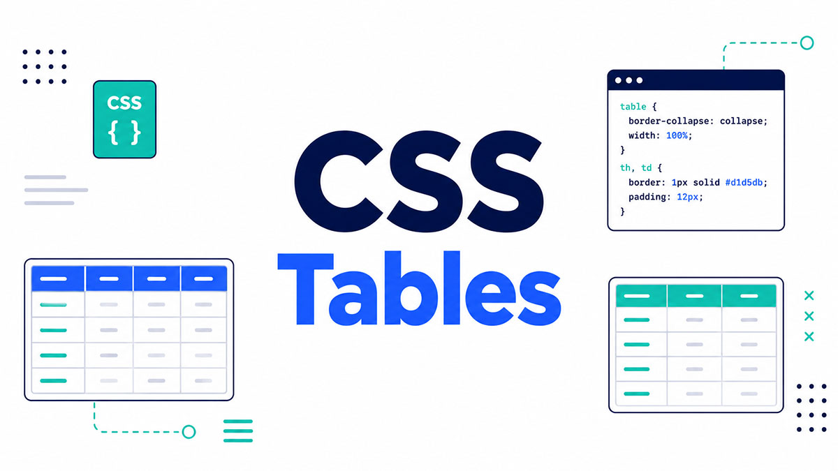
Highcharts is a popular platform used to create interactive charts without relying on plugins. It’s so popular and versatile that we’re using it for creating charts in wpDataTables.
It is not the only option, and there are many alternatives worth considering.
Here is an overview of some of the best Highcharts alternatives available and their benefits. Keep reading more and learn how to choose the best one for you.
Table of Contents
The Best Highcharts Alternatives
| Highcharts Alternatives | License Type | Chart Types | Special Features |
|---|---|---|---|
| FusionCharts | Commercial/Free | Extensive variety | Interactive, real-time charts, integrations |
| Chart.js | MIT | Basic+Advanced | Responsive, canvas based, easy to use |
| Epoch | MIT | Real-time line & area | Real-time charts, lightweight |
| JSCharting | Commercial/Free | Extensive variety | Advanced features, maps, accessibility support |
| Dygraphs | MIT | Time series | Interactive, large datasets, easy to use |
| D3.js | BSD | Highly customizable | Data-driven, powerful visualizations |
| Recharts | MIT | React-specific | Built with React, SVG based |
| Chartist.js | GNU GPL/MIT | Responsive, simple | Simple syntax, animations, responsive |
| Sigma | MIT | Network graphs | Graph drawing tailored to large networks |
| KOOLCHART | Commercial | Extensive variety | Flash/HTML5, complex chart support |
| amCharts | Commercial/Free | Extensive variety | Maps and charts, plugins, responsive |
| Google Charts | Free | Basic+Advanced | Real-time connectivity, geo charting |
| Toast UI Chart | MIT | Basic+Advanced | Easy to use, includes map charts |
| Ember Charts | MIT | Basic charts for Ember | Built for Ember.js framework |
| dc.js | Apache 2.0 | Dimensional charting | Tied with Crossfilter, SVG based |
FusionCharts
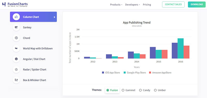
FusionCharts is like the Swiss Army knife of charting tools, loaded with an arsenal of interactive charts, maps, and widgets. It’s a powerhouse for businesses craving comprehensive dashboards and reports that look slick across devices.
Best Features
- Extensive chart variety
- Interactive & real-time data capabilities
- Intuitive dashboards
What we like about it: Its drag-and-drop feature builder stands out, turning complex data sets into visually engaging stories without breaking a sweat.
Chart.js
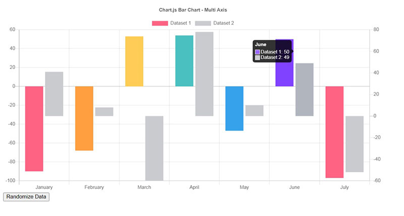
Chart.js brings a delightful blend of simplicity and performance to the canvas. It’s the lean, mean, charting machine for websites craving crisp visuals with a minimal footprint. Open-source and loving it, it hooks up with HTML5 in a breeze, making it a breeze for data visual storytelling.
Best Features
- Lightweight and fast
- Responsive design
- Open-source community support
What we like about it: The sheer simplicity is a breath of fresh air—drop in a few lines of code, and you’ve got charts that resize on the fly and look good doing it.
Epoch
Epoch is the underdog when it comes to real-time charting. Its primary focus on time-based series makes it a strong contender for applications that require a constant stream of data, like monitoring systems where now is everything.
Best Features
- Specializes in real-time charts
- Highly customizable
- Comprehensive API
What we like about it: Epoch’s real-time responsiveness is a game-changer. Seeing data flow smoothly like a river on your screen is just captivating.
JSCharting
JSCharting is a vanguard in the charting domain, offering a suite of sophisticated visual tools. From standard charts to complex maps and stock graphs, JSCharting arms developers with the ability to concoct visuals that talk the talk.
Best Features
- Advanced chart types
- Stock and finance charting
- Accessibility features
What we like about it: Accessibility—because everyone deserves to unravel the data yarn, and JSCharting paves the way for screen readers and keyboard navigation.
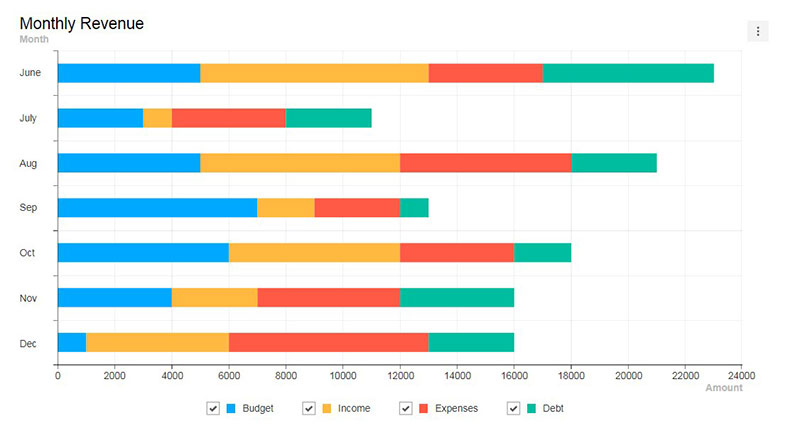
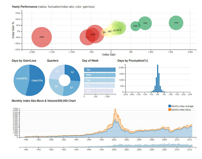
Hey, did you know data can be beautiful too?
wpDataTables can make it that way. There’s a good reason why it’s the #1 WordPress plugin for creating responsive tables and charts.

And it’s really easy to do something like this:
- You provide the table data
- Configure and customize it
- Publish it in a post or page
And it’s not just pretty, but also practical. You can make large tables with up to millions of rows, or you can use advanced filters and search, or you can go wild and make it editable.
“Yeah, but I just like Excel too much and there’s nothing like that on websites”. Yeah, there is. You can use conditional formatting like in Excel or Google Sheets.
Did I tell you you can create charts too with your data? And that’s only a small part. There are lots of other features for you.
Dygraphs
Dygraphs specializes in sinking its teeth into large, unruly data sets and not letting go until they’re tamed into smooth, zoomable charts. It’s all about line charts and timeseries, perfect for analyzing trends without the eye squints.
Best Features
- Handles large data sets
- Interactive zoom and pan
- Strong browser support
What we like about it: Zoomable data ranges make dissecting long-term trends like you have data-vision goggles—so every tiny blip on the radar gets its moment.
D3.js
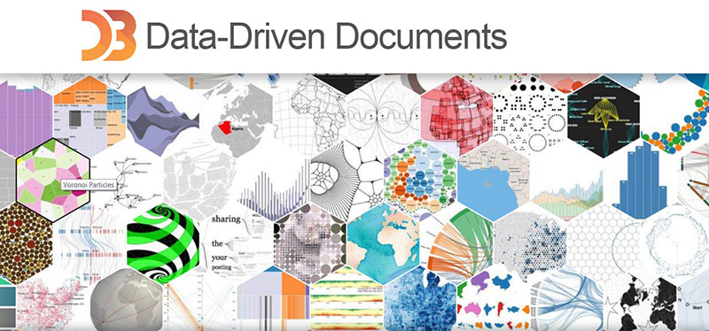
D3.js is a canvas for the creativity of coders who live for data-driven documents. It’s a library that lets you bind data to the DOM and gives you the tools to bring it to life, respecting the artistry in analytics. With a bustling community and extensive resources, D3.js equips you to turn numbers into narratives.
Best Features
- Highly customizable visualizations
- Strong community and plugin ecosystem
- Capable of complex, interactive visuals
What we like about it: Its flexibility is unmatched—like having a data paintbrush that lets you craft visual masterpieces limited only by your imagination.
Recharts
Recharts is a React-friendly library that immerses seamlessly into the React ecosystem. Crafted with SVG and fully declarative, it couples the power of React components with the beauty of charts, making it an easy pick for developers hooked on the React hook.
Best Features
- Built specifically for React
- Declarative components for chart construction
- SVG rendering for crisp visuals
What we like about it: Rechart’s use of React components means you’re in familiar territory, composing charts like you would any other UI piece, snappy and slick.
Chartist.js
Chartist.js sings a tune of simplicity and responsiveness. It’s the charting lib that prides itself on its lightweight footprint and the promise of making your responsive charting dreams come true with easily adjustable SVG magic.
Best Features
- Simple, responsive design
- Customizable SVG-based charts
- Great for creating animated charts
What we like about it: The responsiveness—it’s like a chameleon, adapting your charts to fit any screen size, making sure your visuals look just sharp everywhere.
Sigma
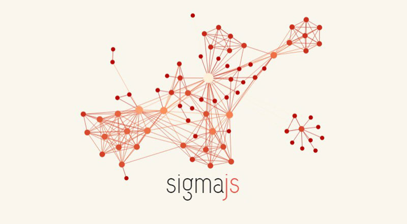
Sigma is all about throwing your data into a graph and letting the relationships form. For projects that rely on understanding the network—the links, the nodes, the complex spiderwebs—Sigma provides a canvas to map out your data points and see the bigger picture.
Best Features
- Specializes in graph networks
- Extensible plugins
- Canvas and WebGL rendering
What we like about it: The way Sigma makes network theories visible—suddenly, all those abstract relationships become a tangible map you can navigate.
KOOLCHART
KOOLCHART steps up as a robust charting solution that’s, well, cool with its rich feature set and an impressive array of chart types. It’s flashy with a suite of animations and effects that can transform drab data into a dynamic visual show.
Best Features
- Impressive visual effects and animations
- Variety of chart options
- Real-time data support
What we like about it: The animation—it takes your data for a joy ride, making the end result as engaging as it is informative.
amCharts
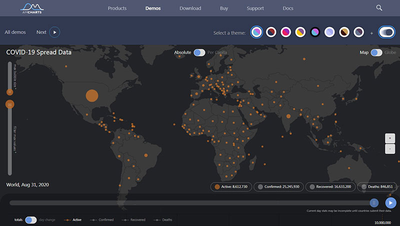
amCharts takes pride in offering both simplicity and depth, with a vast library of charts that are customizable and animated. Whether you’re plotting on a XY chart or world map, amCharts serves up rich interactive options to bring your data narrative to life.
Best Features
- Wide range of chart types
- Map chart capabilities
- Plugin system for extended functionality
What we like about it: Maps, because there’s something riveting about watching your data play out over a landscape, giving you a sense of place along with the facts.
Google Charts
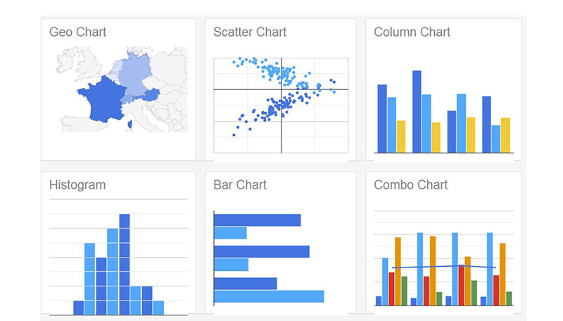
Google Charts offers a venerable toolkit for turning raw numbers into clear, Google-clean visuals. With its robust gallery of chart types and straightforward integration, harnessing the power of data visualization is as easy as tapping into the Google ecosystem.
Best Features
- Integration with Google products
- Comprehensive chart gallery
- Support for real-time data updates
What we like about it: Its integration with the Google Suite stands out—it’s grab-and-go charting with the familiar face of Google’s UI and UX.
Toast UI Chart
Toast UI Chart brings the heat with a recipe for crisp, interactive charts that blend well into any web project. Baked with ease-of-use in mind, it caters to those who want their data pretty and painless, with a side of delicious APIs.
Best Features
- Easy to implement
- Variety of chart types
- Bundled with a user-friendly interface
What we like about it: The ease of use is something to savor—like going from dough to delectable pie chart without the need for a culinary degree in coding.
Ember Charts
Ember Charts is tailor-made for the Ember.js aficionados seeking harmony between their framework and their visuals. With a focus on time-series data, it’s all about making your datasets sing within the Ember note.
Best Features
- Integration with Ember.js applications
- Emphasis on time-series data
- Customizable and extensible
What we like about it: It’s an Ember native—dropping charts into your Ember apps feels like a reunion, seamless and meant to be.
dc.js
dc.js does the heavy lifting for data fanatics eager to dice and splice multi-dimensional data. Built on the power of D3.js and crossfilter.js, it’s the gateway to explore data in depth with charts that filter, dissect, and reveal every layer of your information story.
Best Features
- Multi-dimensional charting
- Tight integration with crossfilter.js
- Powerful data filtering and manipulation
What we like about it: The multi-dimensional magic—dc.js hands you the keys to a kingdom where data slices in all directions, revealing insights at every turn.
FAQs about Highcharts alternatives
What can I use instead of Highcharts for my data visualization needs?
From the open-source aficionados to the budget-conscious, options abound. Chart.js stands out with a lightweight footprint, while D3.js takes the cake for uber-customizability and intricate datasets. Seeking enterprise-grade flair? FusionCharts or ZingChart might tickle your fancy, blending in style with a generous feature set.
Is there a free alternative that matches Highcharts functionality?
Absolutely. Chart.js is a fan favorite—sans cost and rich in features. Or dive into Apache ECharts, offering a treasure trove of chart types and interactive elements. Both pack a punch, sans the price tag, offering thrifty paths to visual finesse minus the fiscal sting.
How do Highcharts alternatives stack up in terms of performance?
Performance is a spectrum: some race, some stroll. CanvasJS gets props for speed, keeping your web workhorse galloping along. Then there’s Plotly.js, balancing grace with gusto, rendering swift without skirting on the sophistication. The premium charting champions like FusionCharts also zip thru data like a hot knife through butter.
Can I find a charting library that integrates well with React?
React devotees, rejoice. There’s Victory and Recharts, concocted with React’s DNA in mind, melding seamlessly into your components with JSX-friendly syntax. Or paint with a broader brush—Plotly.js and D3.js also play nice with the React ecosystem, keeping your interactive components snappy and in sync.
What alternatives offer the best cross-browser compatibility?
Wrestling with browser whimsy? Google Charts might be your knight in shining API. Tried and true, it parades impressive compatibility across the digital spectrum. AmCharts and CanvasJS also boast a chameleon’s talent, adapting effortlessly across browsers, keeping your charts consistently crisp.
Are there alternatives better suited for mobile devices?
Aiming for mobile stardom? Highcharts itself is nimble on the small screens, but don’t overlook Chart.js for its responsiveness and agility. Or, ZingChart and FusionCharts elbow their way in, all spruced up in mobile-friendly finery, ensuring sleek rendering on gadgets galore.
What alternative offers the most types of charts?
Variety’s the spice of life, and FusionCharts is a veritable bazaar, brimming with chart assortments. ZingChart follows suit with an extensive lineup. But the crown may well sit atop D3.js; its library, a canvas for the artistically inclined data whisperer, caters to virtually limitless charting quests.
Which alternative provides the easiest method for customizing charts?
Crave that personal touch? D3.js lets you tinker to your heart’s content—though it demands savvy script skills. Seeking a gentler slope? Chart.js moves the dial towards convenient, with a bevy of options all nestling cozily within its documentation, encouraging you to finesse with ease.
Can I find alternatives that support real-time data streaming?
In the now eludes many, but not all. Socket.io pairs with D3.js or Plotly.js for live data that hops off the screen. And for those mining the golden enterprise hills, FusionCharts and ZingChart wire up real-time displays, keeping your dashboard pulsing to the rhythm of live bytes.
Are there charting libraries that are better for enterprise solutions?
Enterprises hunt for robust, scalable bling. FusionCharts serves them on a silver platter with a host of integrations and features. Meanwhile, Highcharts itself often stays in the conversation, with its power-suited portfolio tailored for the corporate crowd, and scalable solutions alongside a suite of professional features.
Conclusion
And, here we are, wrapping this tech tapestry we’ve weaved, full of colors and patterns with a rich selection of Highcharts alternatives at your fingertips.
- Charting paths with vibrant interactive graphs?
- Setting course with open-source graphing shining like a beacon?
- Or maybe you’re crafting tales with data visualization software that stretches to horizons only you can imagine.
You’ve seen the lay of the land: the charted territories extend far and wide. From the customizable heavens of D3.js to the approachable grounds of Chart.js, where every line of code feels like home.
Whether you’re balancing on the tightrope of real-time data with Plotly or sculpting mobile masterpieces – there’s a flavor for every palette, a thread for every tapestry. The visual stories you’ll tell, they’re yours – unique, engaging, alive. So go ahead, pick the tool that resonates, and paint your data in strokes bold and true.
If you liked this article about Highcharts alternatives, you should check out this article about embedding a chart.
There are also similar articles discussing survey graph makers, survey chart types, survey tables, and creating a Google forms results graph.
And let’s not forget about articles on Chart.js examples, chart designs, types of charts, and WordPress charts.