When your data screams for a spotlight, why whisper? That’s what it’s like when you bury compelling numbers in text. Visuals are the game-changer, and that’s where wpDataTables steps in to turn the tables. How to embed a chart on a website with wpDataTables isn’t just tech talk; it’s turning your data into a headliner on the digital stage.
Here’s the scoop: you have a story, your data sets the scene — make it immersive. I’ll guide you through the narrative of embedding sharp, responsive charts that resonate with your audience’s curiosity, using a tool designed to simplify yet amplify.
By the end of this read, be ready to:
- Deploy crisp graphs with wpDataTables like it’s second nature.
- Tweak aesthetics with CSS styling for charts, etching your brand into every pixel.
- Hook your audience with interactive elements that say, “Hey, touch me, I’m alive!”
We’re not just plotting points, friend. We’re crafting a user experience that charts a memorable journey through your data, one click at a time. Let’s plot this together.
This article will show how to embed a chart on a website with the help of wpDataTables.
First things, first: let’s look at wpDataTables
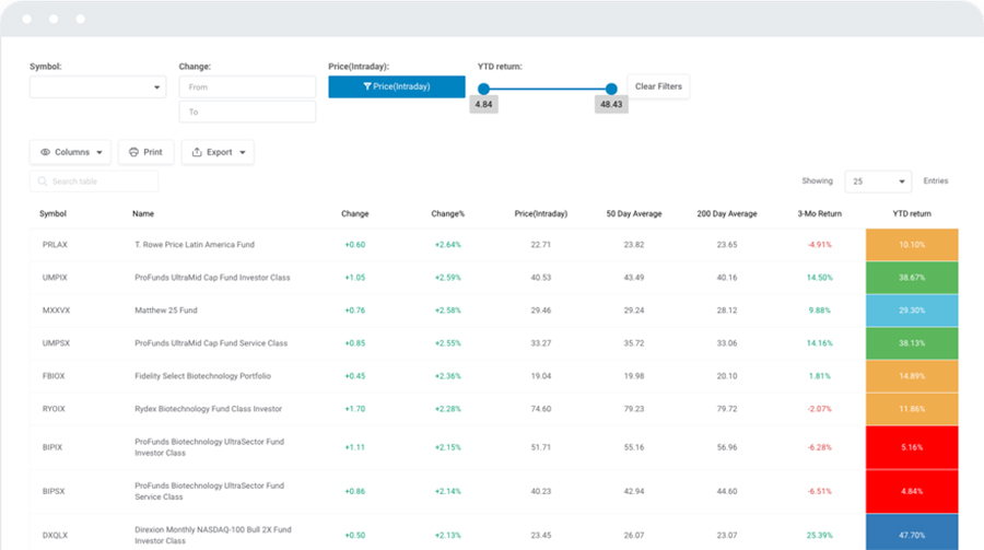
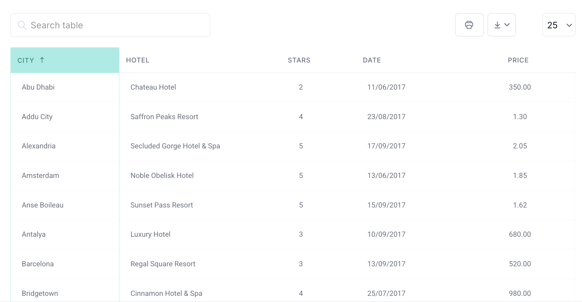
There’s a good reason why wpDataTables is the #1 WordPress plugin for creating responsive tables and charts.

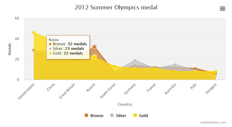
And it’s really easy to do something like this:
- You provide the table data
- Configure and customize it
- Publish it in a post or page
And it’s not just pretty, but also practical. You can make large tables with up to millions of rows, or you can use advanced filters and search, or you can go wild and make it editable.
“Yeah, but I just like Excel too much and there’s nothing like that on websites”. Yeah, there is. You can use conditional formatting like in Excel or Google Sheets.
Did I tell you you can create charts too with your data? And that’s only a small part. There are lots of other features for you.
Table of Contents
Steps for Embedding Charts and Tables
Step 1: Define the basic settings for the chart
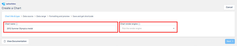
To open the wizard, go to the WordPress admin panel and click on the wpDataTables plugin. Click on Create Chart Wizard.
The Chart Creation Wizard tool only asks for necessary information. It just takes four steps to create and customize a chart and five steps to embed it.
The first step is to define the chart’s settings by naming it and choosing its type. Give the chart a unique name so that you can find it quicker among all your other charts later.
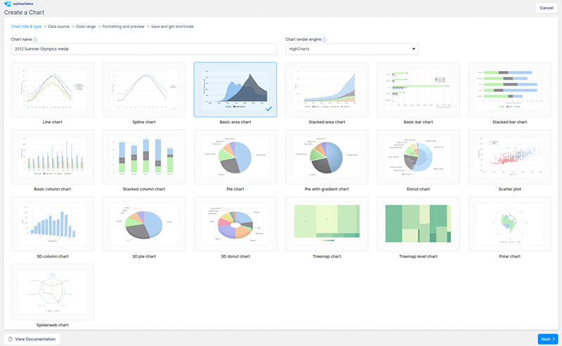
Next, select a render engine. You have a choice between three different render engines:
After you choose the render engine, select the chart type. The chart type options will be different depending on what render engine you choose.
Step 2: Choose the data source
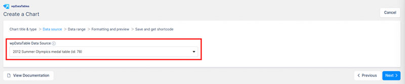
Next, users need to choose the data they want to insert into the chart. This data comes from a data table that users have already created in wpDataTables. Select an existing data source from a simple select box.
If users have already created a data table, they can use it for their chart. If not, they need to create a data table first.
Click on the add a chart menu link, import data, and create a table. Now you can choose this table as your data source.
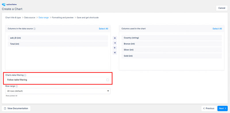
Step 3: Define the data range
After selecting the data source, the wizard takes you to the data range page. Here users can select column ranges, row ranges, and filter data if they want.
Column Range
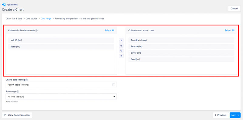
The first section allows users to define the column range—the block on the left displays the columns from the data source table.
The block on the right displays the columns to be used in the chart. It also provides helpful tips, like the minimum and the maximum number of columns you are allowed according to the chart type you chose.
On the left side block, users can click on the names of the columns. Then they can press Add to select them to appear in the chart. After adding the columns, they will appear in the right-side block.
Users can use the “all” or “none” shortcuts at the top of the box when selecting and deselecting. After selecting the columns, users can reorder them by dragging and dropping them in the right-side block.
Row Range
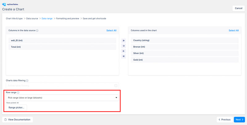
Next, users need to define the row range. The default setting shows all the rows, but users can choose individual rows and row ranges.
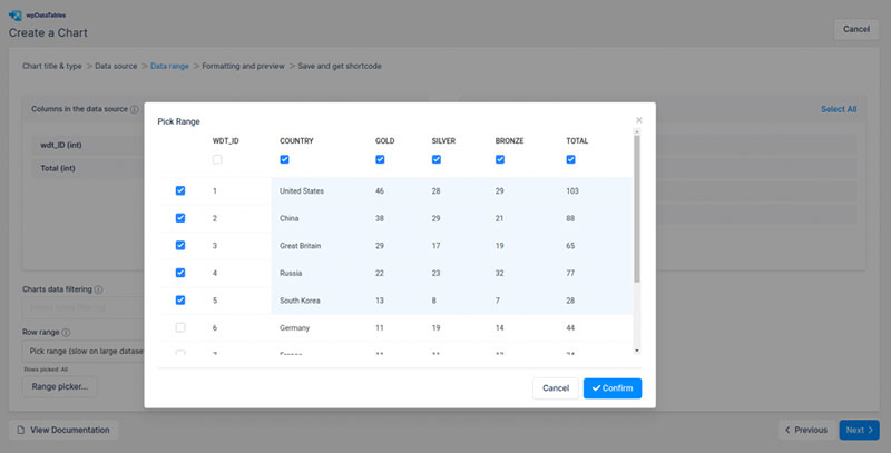
To select a row range, click on the drop-down menu. Select Pick Range, then click on the Range Picker button.
The wizard will show the table. Now users can click and drag to highlight the rows and columns they want. Or they can use the checkboxes at the beginning of each row and column to select the data range.
One last feature on this page is a Follow table filtering option. This option is only available to those who are using all the rows.
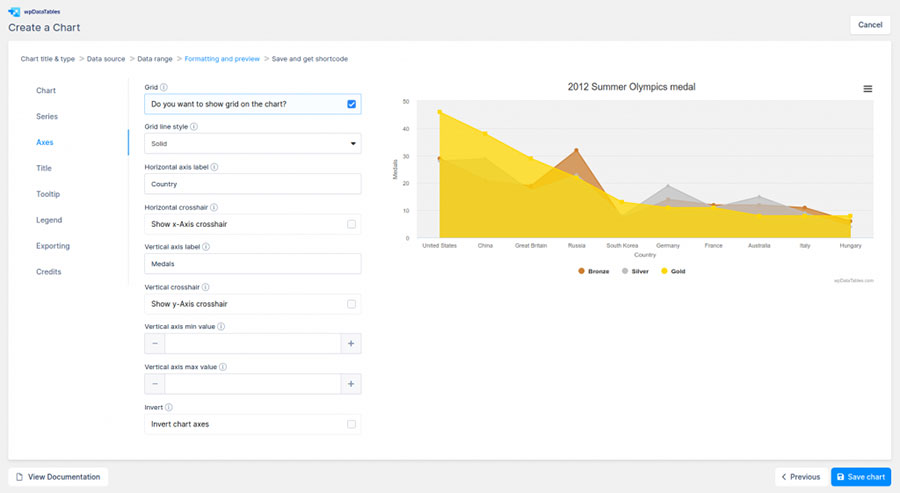
Step 4: Formatting and Previewing
Now users will be directed to the editing and previewing page. The chart is visible on the right side of the page, so users can instantly view the changes they make.
The formatting step is divided into categories according to different chart elements. Users can edit and customize everything from the font to the table size, color, and much more.
The first category allows users to change the chart’s appearance. Users can edit the width, background colors, panning, and more.
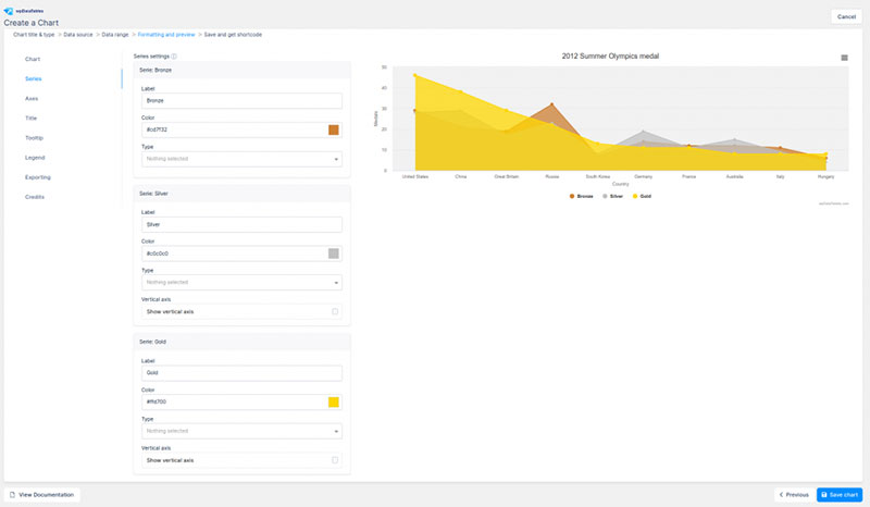
The second category is the series category, where users can change labels, the vertical axis, curve type, etc.
Next, the axes category gives options for the chart axes. You can choose the following options:

- Gridline style
- Horizontal axis label
- Horizontal crosshair
- Horizontal axis direction
- Vertical axis label
- Vertical crosshair
- Vertical axis direction
- Vertical axis min value
- Vertical axis max value
- Invert
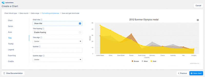
The category after that gives design options for the chart’s title. Following that are tooltip options that appear when viewers hover over a point.
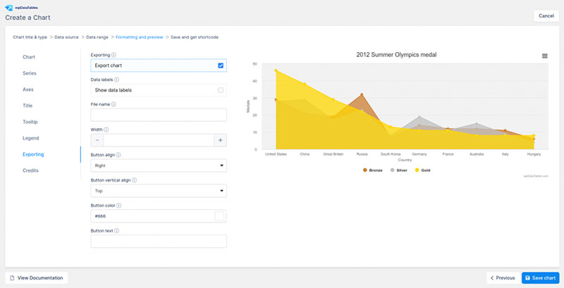
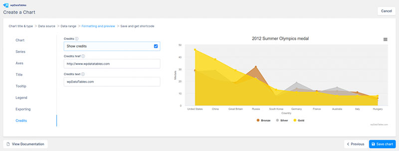
Users can also enable a legend, export the chart data, and include a credit line. There are dozens of individual settings that you can change to create a perfectly customized chart.
Step 5: Save the chart and get the shortcode
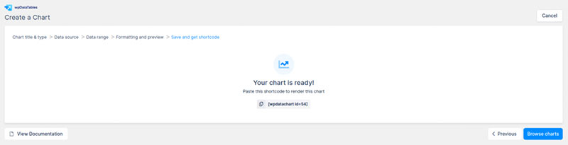
Those are the four steps it takes to create and customize a chart. The fifth step is to simply copy the shortcode and embed it into a website.

After formatting and previewing the chart, click next to save it. Highlight and copy the shortcode, and then paste it into any post or webpage.
Now you have an embedded chart.
FAQ about embedding a chart on a website
What tools do I need to embed a chart on my website?
Crack open your web toolkit; you’re going to need an editor for HTML and possibly some CSS and JavaScript if you’re getting fancy. Dabble with a JavaScript chart library like Chart.js or grab from Google Charts. Make room for diversity — data visualization techniques aren’t one-size-fits-all.
Can I display real-time data in an embedded chart?
Absolutely. The magic word? AJAX. This gem fetches your fresh data without refreshing your page — talk about smooth. Combine it with server-side scripting, and you’re broadcasting live updates like a pro. Think of stock tickers; they’re always in the now, right?
What about embedding charts from spreadsheets like Google Sheets?
Google Sheets has your back. A few clicks and you’re sharing data visuals straight from your sheet-stash. Opt for ‘Publish to the web’, choose your chart and inject that HTML iframe code into your page. Voilà, data connectivity with user-friendly flair.
How do I make my chart responsive for mobile devices?
Ah, the mobile riddle. Let’s decode. Wrap your chart in some HTML and CSS love that plays nice with percentage-based sizing. Responsive chart design means eyeballing your data pretty as a picture on any gadget. Don’t forget to test across devices — consistency is king.
Is it possible to style my chart to match my website’s design?
I say, express your style! CSS is your virtual paintbrush here. Add a touch of class to your chart elements, paint them with your color palette, and finesse with fonts. Remember, your visuals should echo your brand’s voice, and CSS is how you get there.
Can I add interactive elements to my chart?
Of course, you’re the captain of interactivity. Use a chart tool that supports hover details, clickable legends, or even drill-down functionalities. Your viewers get more than just a pretty picture; they get to play detective, unveiling layers of data with every click and hover.
What’s the best way to ensure my embedded chart is accessible to all users?
Think universal. Aim for web accessibility standards like keyboard navigability and screen reader support. Use ARIA labels for context and ensure contrast ratios that make text stand out. Everyone deserves a peek at that chart.
How can I embed a third-party chart service on my site?
It’s like ordering takeout — you get the goods without the kitchen chaos. Sign up, create your chart, and they serve you the embed code on a silver platter. Place this snippet in your HTML, and you’re showcasing top-shelf data without breaking a sweat.
Will embedding charts impact my website’s loading speed?
Truth? It might. But here’s the trick: optimize, optimize, optimize. Go for lightweight chart tools, compress data payloads, maybe even lazy-load those graphical goodies. The aim is to keep your site zippy while flaunting those snazzy charts.
Can I track user interactions with my embedded charts?
You bet. Gauging user engagement is a goldmine. Drop in some tracking tags or event listeners linked to your analytics API and monitor those clicks and hovers. Understanding how visitors interact with your data art gives you insights into what sings and what sinks.
Conclusion
So, we’ve come full circle, haven’t we? Charting a course through the jungle of how to embed a chart on a website with wpDataTables turned out to be less of an expedition and more of a walk in the park.
Wrapping this up, remember:
- Your data, once dull and inert, now sparkles — interactive and lively on your webpage.
- The styling? Your signature, unmistakably, shines through CSS styling for charts like a beacon.
- Responsiveness? Nailed it. Kiss goodbye to squinting and hello to seamless mobile experiences.
Dive into wpDataTables, an ally for both the novice and veteran web artist, and marvel as numbers transform into narratives, commanding attention.
You’re not just displaying data; you’re crafting experiences, telling stories, making every data point a pit stop on an epic journey. So, chart on, fellow traveler. Your next audience awaits, eager for the tales only your data can tell.
If you liked this article about embedding a chart, you should check out this article about survey graph makers.
There are also similar articles discussing survey chart types, survey tables, creating a Google Forms results graph, and Chart.js examples.
And let’s not forget about articles on chart designs, types of charts, Highcharts alternatives, and WordPress charts.