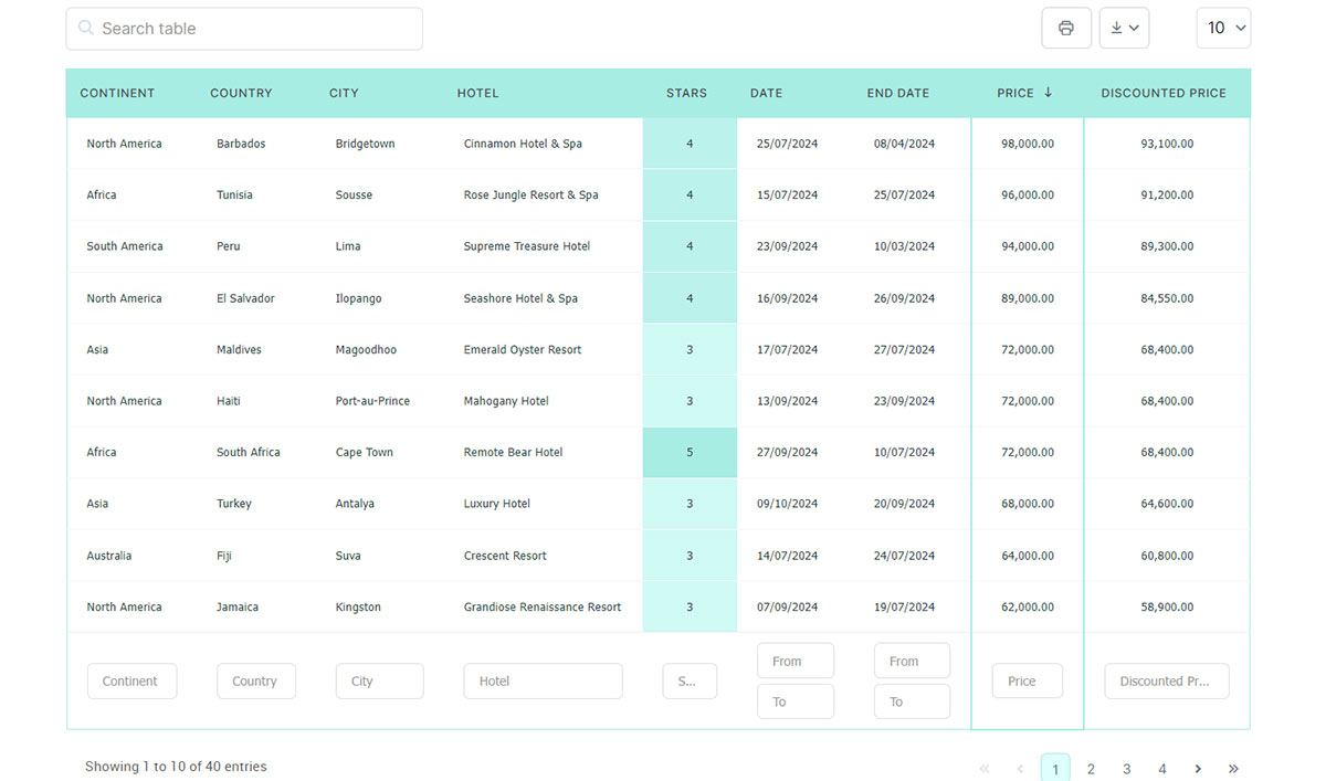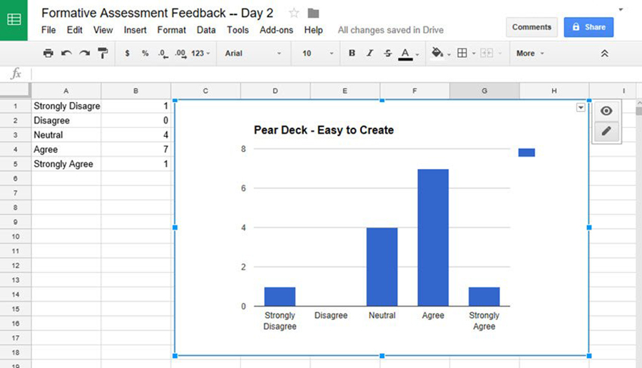
Google Forms draws a pie chart for every question the moment answers start arriving. It just refuses to let that chart leave the building. To get one onto a blog post, a landing page, or a client report, the responses have to land in a linked Google Sheet first, and the chart gets built there instead.
That detour is the whole job. Everything after it is styling.
Teachers, small business owners, anyone running a customer survey ends up in the same spreadsheet building the same chart, usually after ten minutes of hunting for an export button that does not exist.
One thing to know going in: not every question type charts well. Google’s Apps Script reference lists 14 distinct question item types in Forms (Google Developers documentation, 2026), and file uploads chart about as well as you would expect.
Table of Contents
What a Published Forms Chart Actually Is
Two different charts get confused here constantly. One is the summary Forms generates on its own inside the Responses tab. The other is the one you build from the response spreadsheet and publish somewhere public.
Only the second one can leave Google.
The built-in version updates in real time, looks decent, and is stuck. No embed code, no public url, no export past a screenshot. Fine for glancing at results in a staff meeting. Not fine for a page other people visit.
The published kind reads responses rather than collecting them, so the form still has to exist behind it. Live updating is a checkbox somebody has to tick, not a default. And pie, bar, column, and line charts all run off the same rows underneath, which makes chart type a design decision rather than a data one.
Where the Data Lives
The Responses tab holds raw answers. A linked Google Sheet holds those same answers somewhere other tools can reach. Anything you plan to publish needs the sheet.
A few ceilings worth keeping in the back of your head. A single Google Sheets workbook holds 20 million cells counted across every tab combined, which is double what it used to be.
Google raised it from 10 million cells starting September 10, 2026, so any guide still quoting the old figure is out of date (Google Workspace Updates). Individual cells cap at 50,000 characters, and that limit bites sooner than people expect once a form includes an open-ended text question. Respondents write essays in those boxes.
On the Looker Studio side, every connected query makes the tool recheck the linked sheet for changed values and new rows, according to Google’s own Looker Studio documentation.
Straight From the Responses Tab
Nothing to configure. Answers arrive, Forms draws something, you look at it.
- Auto-generated pie chart or bar graph per question
- No control over color palette, axis label, or chart title
- No public url, no embed code, no export beyond a screenshot
Through a Linked Sheet
Linking responses to a spreadsheet is what turns a stack of survey answers into something a chart tool can touch. Chart type, colors, axis labels, titles all become editable. The QUERY function and IMPORTRANGE let you filter or pull rows into a second sheet before charting, which is how you avoid plotting all 400 responses when you only wanted March. Publishing depends on it too, since a sheet-based chart is the only kind that can go to the web or feed a Looker Studio report.
From this point the spreadsheet is the source of truth. Not the form.
Picking the Tool
The native Sheets chart editor covers most of what people actually need. Google Charts and Chart.js both want JavaScript from you. Looker Studio sits in between, no code required but a real setup process on the front end. And if the destination is a WordPress site, wpDataTables is a no-code option that skips the iframe entirely.
| Tool | Setup | Coding Required | Live Update |
|---|---|---|---|
| Sheets native chart | Minutes, built into the sheet | None | Yes, via Publish to web |
| Google Charts | Needs a code editor | JavaScript, via the Google Visualization API | Yes, if data is fetched on page load |
| Chart.js | Needs a code editor | JavaScript | Yes, with a data-fetch script |
| Google Looker Studio | 15 to 20 minutes for a first report | None | Yes, refreshes on every query |
| wpDataTables | WordPress plugin, then paste a published Sheet url | None | Yes, re-reads the Sheet (up to 15 minutes of lag) |
Chart.js wins by ubiquity more than by any particular feature. It pulls close to 10 million weekly downloads through the npm registry, more than any other JavaScript charting library tracked there. When someone hand-codes an embed, that is what they reach for, often out of habit rather than a real comparison.
If you are not writing code, the choice is the Sheets editor, Looker Studio, or wpDataTables when the page lives on WordPress. All three launch fast and hand off easily to a colleague who does not touch markup. You give up precise control over how the thing looks.
The coded route buys exact colors, custom tooltips, animation, whatever the mockup demands. It also means somebody owns that HTML and JavaScript for as long as the page exists. I would not go there until the Chart Editor has genuinely failed at what the design asks for.
Building the Chart
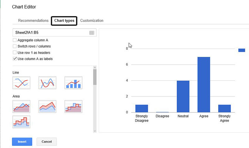
You can stay inside Forms or move to the linked sheet. Almost every chart that ends up published came from the sheet.
Inside Google Forms
- Open the form and click the Responses tab at the top
- Forms has already rendered a pie chart or bar graph per question, so there is nothing to trigger
- Click the three-dot menu above any individual chart to download it as a PNG image
That is the whole process and it stops there. Nothing in this view can be embedded or linked anywhere else.
Inside Google Sheets
- Highlight the header row plus every response row for the question you want charted
- Go to Insert, then Chart. Sheets takes a guess at the chart type
- Override that guess in the Chart Editor panel that opens on the right
- Check the data range before touching anything else
That last step. A wrong range is behind more blank and garbled charts than every other mistake put together, and it never announces itself. The chart just quietly looks wrong.
Free Chart Type Picker
Customizing Before You Publish
Everything adjustable lives in the Sheets Chart Editor, split across two tabs that are not labeled in a way anyone guesses correctly on the first try.
Chart Type and Data Range
Chart type sits in the Setup tab. Most people click Customize first and then wonder where the dropdown went.
- Switch between pie chart, bar graph, column chart, or line chart from one dropdown
- Adjust the data range without deleting and rebuilding from zero
- Toggle whether row 1 counts as a header or as data
Labels, Legend, Colors
The chart title is editable under Customize, and it doubles as the preview text if the chart ever gets shared as a bare link. Axis labels come blank by default. That is harmless inside the spreadsheet where everyone knows what the columns mean, and actively confusing once the chart sits on a page by itself.
Legends move to the side, move to the top, or vanish. Single-series charts rarely need one at all.
Then color. The Sheets defaults are that specific blue and red that match nobody’s branding, so this is usually the first thing worth changing.
Preview the embed before publishing. Not all of this styling survives the trip as cleanly as you would hope.
Publishing and Embedding on Your Site
Google Sheets generates an iframe snippet through Publish to web. You paste that snippet into an HTML block wherever the chart is going.
Getting the Embed Code
- Click the chart, then the three-dot menu, then Publish chart
- Choose Embed rather than Link so you get an iframe snippet instead of a bare url
- Pick Interactive to keep hover tooltips, or Image for a flat picture
- Tick “Automatically republish when changes are made” if the chart needs to stay live
Google’s Help Center is blunt about the lag: automatic updates to a published chart might take a few minutes to show up. Not seconds.
Adding the Code to Your Site
Paste the iframe into whatever HTML or embed block your editor provides. Wrap it in a container with a set max-width, or it overflows on narrow screens. This is the step everyone skips and then fixes two weeks later when somebody complains from a phone.
- Most page builders ship a dedicated HTML or embed block for exactly this
- A hand-coded page just needs the iframe tag dropped into the markup
- Resizing later means editing the iframe’s width and height attributes, not rebuilding the chart
The chart now has a public url like any other page on the site. Treat the link accordingly.
Where the Embed Tends to Behave
WordPress, Squarespace, Wix, and Google Sites all accept a Google Sheets embed code. Each one handles the iframe slightly differently once it is in.
WordPress is the one most readers here will already be on. It runs 40.2 percent of all websites as of September 2026, according to W3Techs data.
| Platform | Where the Code Goes | Common Snag |
|---|---|---|
| WordPress | Custom HTML block in the block editor | Some themes strip iframe tags on save |
| Squarespace | Code block, set to embed | Fixed-width sections can clip the chart edges |
| Wix | Embed a Widget, then paste the HTML iframe | Mobile view often needs a separate resize pass |
| Google Sites | Insert, then Embed, then paste the code directly | Almost none, since Sites is built by the same company |
Google Sites gives the fewest problems for the obvious reason. Same company, same iframe, nothing in between trying to sanitize it.
On WordPress, the iframe snag has a cleaner fix than fighting the theme. That is the next section.
Skipping the Iframe With wpDataTables
If the site runs on WordPress, wpDataTables reads the response sheet directly and draws the chart as part of the page. No embed code, no theme stripping tags on save, no separate resize pass for phones.
The chart inherits your theme’s look and scales with the screen. That alone removes two of the most common complaints from the iframe route.
How It Works With a Forms Response Sheet
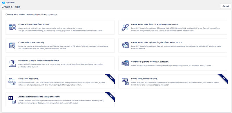
The plugin treats the linked Google Sheet as a data source. A table sits on top of it, and the chart sits on top of the table. A respondent submits the form, the row lands in the sheet, the table refreshes, the chart follows.
Not instantly, though. wpDataTables says new or edited data can take up to 15 minutes to appear in a table linked to a Google Sheet. Near-live, not live.
- In the linked response sheet, go to File, Share, then Publish to web, and publish it
- Close the dialog and copy the url from the browser’s address bar (a working link contains “2PACX”)
- In WordPress, open wpDataTables, click Create a Table, and choose the option linked to an existing data source
- Pick Google spreadsheet as the input type and paste the url
- Open Create a Chart, choose a chart engine, select the table and columns, then set the chart type
- Drop the chart into the page with its shortcode or the Gutenberg block
Forms already puts each question in row 1, which is the header row wpDataTables expects. Those question titles make clumsy column names, so rename them inside wpDataTables rather than in the sheet. The vendor recommends doing formatting changes on the plugin side.
The same table also gets sorting, search, advanced filtering, and export to PDF, Excel, CSV, and print, which a pasted iframe never offers. And charts can follow the table’s filters, so a visitor who narrows the table to March sees a March chart.
The plugin works with Elementor, Divi, WPBakery, and Avada, so it fits most page builders without extra setup. The documentation covers each one.
What Each Plan Covers
For Google Sheets and charts specifically, the differences between plans come down to private sheets and chart engines.
| Plan | Google Sheets Access | Chart Engines |
|---|---|---|
| Starter | Published (public) Google Sheets with auto-sync | Google Charts, Chart.js |
| Standard | Adds private Google Spreadsheets | Adds ApexCharts, Highcharts |
| Pro and Developer | Same as Standard | Same as Standard, plus Highcharts Stock |
That private sheet option matters for survey data. A published sheet is reachable by anyone holding the url, so if the responses contain names or emails, a private connection is the safer setup. Compare the details on the pricing page.
Limits Worth Knowing
A Google Sheet source is the fragile part of any setup like this, and wpDataTables is no exception.
- Merged cells in the source sheet are not supported
- Formulas, IMPORTRANGE, and custom formatting in the source can cause “no rows” or “no data available” errors
- Workspace (business) accounts may allow publishing but block access from outside, which shows up as an empty table
- There is no trial, but there is a 15-day money-back guarantee and a free limited version on WordPress.org
The practical fix for the second point: keep one clean tab with raw responses for the plugin, and do any QUERY or IMPORTRANGE work in a separate tab you never connect.
wpDataTables only makes sense when the destination is a WordPress site. For a Squarespace or Wix page, the iframe route above still applies.
Third-Party Charting Tools
Plenty of tools outside Google will read a Google Sheet happily. The on-ramp is identical in each case, either a live link to the response spreadsheet or a plain CSV export of it.
Datawrapper
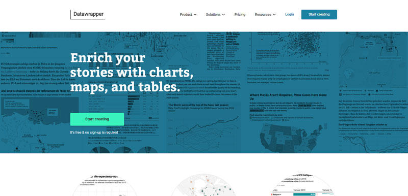
Datawrapper connects to a Google Sheet through a live link or a CSV, then hosts the chart and hands back an embed code. The output looks editorial rather than spreadsheet-default, which is most of the appeal.
Its pricing page now confirms the free plan allows unlimited charts, maps, and tables with no monthly view cap, a change from the 10,000-view ceiling it enforced for years. The free tier still stamps a small Datawrapper credit on the published chart. Fair trade, in my view.
Newsrooms including the New York Times and Reuters publish charts built this way, at a scale nothing like a typical survey project.
Flourish
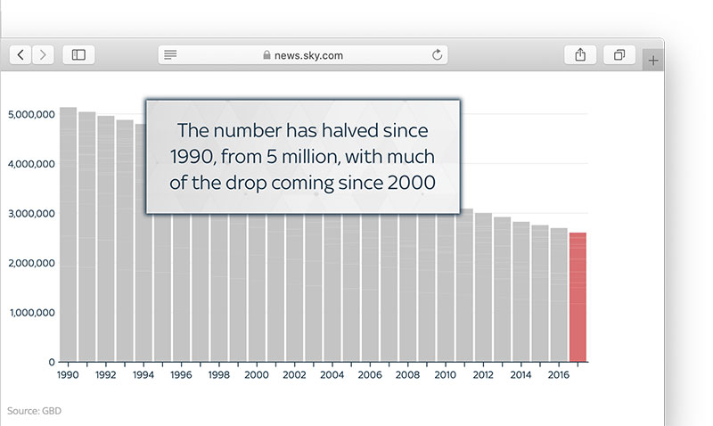
Flourish leans animated and narrative where Datawrapper stays static. It reads a connected Google Sheet the same way and republishes on whatever schedule the account owner picks.
- Built for scrollable data stories more than a single chart dropped into a page
- Templates skew toward maps, bar chart races, animated timelines
- Steeper learning curve than a plain bar graph justifies
Infogram
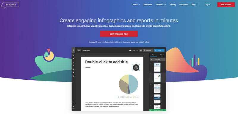
Infogram sits closer to a design tool than a charting one. It pulls a Google Sheet in as a data source, then wraps the chart inside a wider infographic or one-page report layout. The built-in templates for combining a chart with icons, text blocks, and a header are genuinely good. The setup time is longer than a single embedded bar graph is worth.
QuickChart
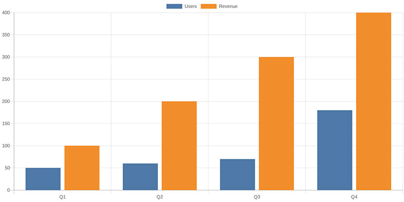
QuickChart works on a different principle entirely. It renders a chart image from a url, with the data written into the url parameters, and there is no dashboard and no account.
- Fits an email newsletter or a Slack message better than a page meant to stay current
- Updating means rewriting the url’s parameters rather than editing a saved chart
Live or Static
Whether a published chart updates itself was decided back when you built it, not by a switch you flip afterward. A Sheets native chart with automatic republishing enabled stays live. A downloaded image, a saved QuickChart picture, or an unchecked republish box stays frozen.
Live makes sense while the form is still collecting and the movement is part of the point. A running tally on a community poll, for instance.
Static covers everything else, more often than people assume. The survey closed and the numbers are final. Privacy matters more than freshness. Or the page barely gets visited, which makes a live connection to a spreadsheet a small ongoing liability for no return, especially since someone can change that sheet’s sharing settings six months from now without telling you.
Static is my default for anything public. Live is the exception you justify.
Automating Updates Instead of Clicking Republish
Both options here refresh the data connection on a schedule so nobody has to remember to do it manually.
Google Apps Script
Google’s Apps Script quotas documentation caps every script run at 6 minutes of execution time, on free and Google Workspace accounts alike. Trigger runtime is a separate budget: 90 minutes a day on a free account, against 6 hours a day on Workspace.
- An installable time-driven trigger can re-run a refresh script every few minutes, hourly, or daily
- Works well for a self-contained Sheets chart, since script and data share a file
- Fails quietly once the daily runtime cap is hit, and the chart just stops updating until quota resets
That quiet failure is the part worth flagging. Nothing errors. The numbers simply stop moving, and you find out when somebody asks why the chart says 47 responses three weeks running.
Zapier
Zapier wires a Google Sheets trigger, like a new response row, to an action somewhere else without any script. The free plan is capped at 100 tasks a month with roughly a 15-minute check interval on that tier, according to Zapier’s own pricing page.
It is better at pushing new response data somewhere, a Slack channel or a second sheet, than at refreshing the chart itself. Worth being clear about that before you build a workflow expecting otherwise.
Access and Privacy on a Published Chart
A published chart inherits whatever sharing setting the underlying Sheet or the Publish to web link already had. Nothing gets tightened automatically.
View-only link sharing lets anyone holding the url see the chart without being able to edit the response spreadsheet behind it. That is the safer of the two settings. Fully public visibility goes further, making the chart indexable and findable rather than just viewable by people you sent the link to.
The General Data Protection Regulation, in force since 2018, treats survey answers as personal data the moment they can identify a respondent, even indirectly. Fully anonymized data falls outside that, which changes what is genuinely safe to publish.
Aggregated counts and percentages carry far less risk than a chart broken out by name or email address. And a single free-text answer field, charted as-is, can expose exactly who said what without any names involved at all. Someone always writes something recognizable.
When the Published Chart Does Not Work
Failures here repeat. Almost every one traces to permissions or to the underlying Sheet rather than the chart.
If the Sheet’s link-sharing setting changes after publishing, the embedded chart goes blank with no error message at all. Some platforms and browser extensions strip iframe tags outright, so the embed code never renders. And a chart built on one sheet stops updating correctly if the form’s response destination gets reset to a different sheet, which happens more than you would think when multiple people share a form.
Scale breaks things too. Google’s Help Center confirms that the question and individual response views can stop rendering past 10,000 responses, and that Sheets sync itself degrades past 100,000 responses.
- A Workspace admin can disable external link sharing across the organization, which kills every method described here at once
- A form owner who loses edit access to the linked Sheet cannot republish a chart even while still able to view it
A blank embed is almost never the chart. It is a permission upstream that changed.
FAQ on Charting and Publishing Google Forms Results
Does Embedding a Live Chart Slow Down Page Load Speed?
A live embed adds one more request, the iframe pointed at Google’s servers. That request is small next to typical page weight, but a static image loads marginally faster when speed matters more than freshness.
Is There a Limit to How Much Data a Chart Can Display?
Storage caps rarely bite first. A pie chart with more than a dozen categories turns unreadable long before a sheet fills up, and a bar graph with hundreds of rows needs grouping or a QUERY function summary, not raw points.
Can You Track Visits or Engagement on the Page Where a Chart Is Embedded?
The embed itself carries no analytics. Tracking happens at the page level, so a tool like Google Analytics reports on the page as a whole rather than clicks or hovers inside the iframe specifically.
Can You Show Google Forms Results on a WordPress Site Without an Iframe?
Yes. wpDataTables connects to the published response sheet, builds a table from it, and turns that table into a chart you place with a shortcode or block. The data still comes from the sheet, so its sharing and publish settings still matter.
What to Get Right First
Start with the data connection. Confirm the linked Google Sheet is shared the way it needs to be, because chart type, customization, and publishing all sit on top of that one link holding.
A fixed order cuts down on rework.
- Confirm the Sheet’s sharing setting before touching chart type
- Lock the data range and chart type before customizing labels or color
- Publish and automate last, once the chart already looks right unpublished
You pay for that order in speed. A chart assembled before the connection is verified looks finished much sooner, and then usually needs rebuilding when the link turns out to be unstable.
If the chart is headed for a WordPress page, try the plugin route before wrestling with iframes. Start with the free version on WordPress.org, or compare the paid plans if you need private sheets or more chart engines.