If you want to offer information on a particular subject, using survey data is a good idea. Moreover, it helps if you present it engagingly.
People always like to hear compelling stories and to understand the world through statistics. This is why a solid narrative can help you. Nowadays, data science offers an excellent solution for journalism projects. Through interactive maps and accurate data visualization, you can help viewers reach a deeper understanding of a given matter.
Interactive elements do more than provide relevant information. They provide clarity to back up the message you are trying to convey.
These data journalism examples show you the tools that will help you engagingly present data stories. Let your viewers connect to the numbers and understand their significance.
Table of Contents
The Emergence of Data-Driven Journalism
All in all, data journalism is about understanding data. Thus, you can combine data science with interesting visualizations and interactive elements to help people find patterns. The essence of data journalism is to simplify data while giving it meaning. The viewer won’t see only numbers but how these numbers affect people’s lives.
Data journalists have created compelling narratives in recent years. Thus, simple stories became powerful investigations based on raw data. With the tools they have today, data journalists can uncover stories and achieve a deeper understanding of any set of information. Then, they can show this through impressive data visualizations.
It’s not a surprise that data journalism is on the rise. These professionals are crossing the bridge between raw data and meaningful insights. As a result, investigative journalism helps empower readers because it helps them make informed decisions.
Advanced Data Journalism Examples
The following examples show how journalists managed to organize information effectively. Check out the power of data visualization when trying to convey a message.
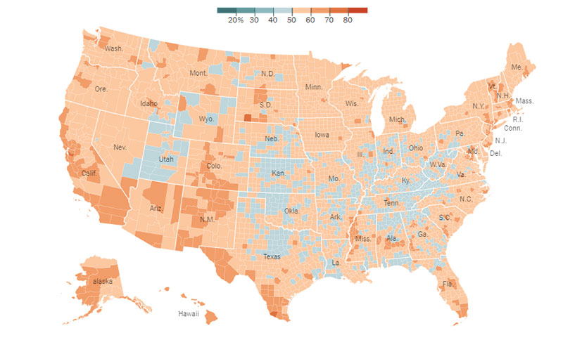
How America’s Thinking Changed Under Obama
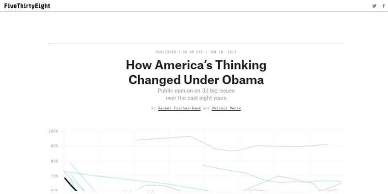
This project was launched after Obama’s second term. It analyzes America’s public perception of major issues using data from 2009 to 2016.
Some of these issues include same-sex marriage, gun laws, race relations, abortion, health care, the economy, and terrorism. They use innovative ways to show how public opinion changed during this period.
Covid-19 in Africa

This project was built with Vev. Through powerful data visualizations, it shows how Covid-19 affected Africa and how it keeps impacting the region even today.
Check out how data-driven reporting can help convey a message. While data may lose significance on simple columns and blocks, these elements help make an impact on the viewer. The audience can see through interactive maps how Covid-19 keeps affecting many people in Africa.
Uninhabitable
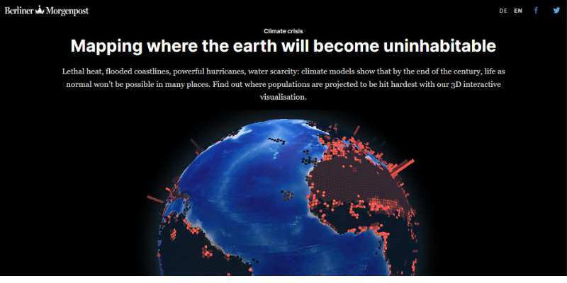
Here is a report on environmental issues that affect us all. Climate change is a serious matter, and the Berliner Morgenpost conveys that to the audience.
With this project, we can see more than an interactive map. This is a globe featuring the areas more severely impacted by climate change. Thus, the viewer can jump from one place to another and see the consequences of environmental issues in a specific country.
This is a great example of how data-driven journalism, combined with powerful data visualizations, can provide deeper insights into any topic. In this case, they based their research on data from the IPCC (Panel on Climate Change).
Mapping Australia’s Childcare Blackspots

Check out one of the most compelling data journalism examples. ABC’s team tells us a compelling story using data driven by the Mitchell Institute for Education and Health Policy. This project reveals inequality issues in Australia’s childcare.
They use plenty of elements so that readers can understand the impact of these social issues. Through an interactive map and different graphics, they show a variety of factors: language, occupation, and location.
England Water: the World’s Piggy Bank
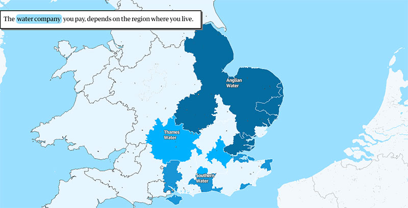
All countries should be able to control their water resources. This is vital for a nation’s social and economic well-being. This investigation by the Guardian shows that offshore investors control at least 72% of water resources in England.
In this case, a data-driven approach is better than traditional journalism because it impresses the viewer. This project reveals that water sources in England are owned by two Canadian pension funds, seven Asian companies, and two US investment funds.
Your beautiful data deserves to be online
wpDataTables can make it that way. There’s a good reason why it’s the #1 WordPress plugin for creating responsive tables and charts.

And it’s really easy to do something like this:
- You provide the table data
- Configure and customize it
- Publish it in a post or page
And it’s not just pretty, but also practical. You can make large tables with up to millions of rows, or you can use advanced filters and search, or you can go wild and make it editable.
“Yeah, but I just like Excel too much and there’s nothing like that on websites”. Yeah, there is. You can use conditional formatting like in Excel or Google Sheets.
Did I tell you you can create charts too with your data? And that’s only a small part. There are lots of other features for you.
How Americans Think About Climate Change
These interactive maps show the opinion of US residents on climate change. It also shows how much they support environmental-friendly policies. In this case, data visualizations show statistics from Yale’s Program on Climate Communication.
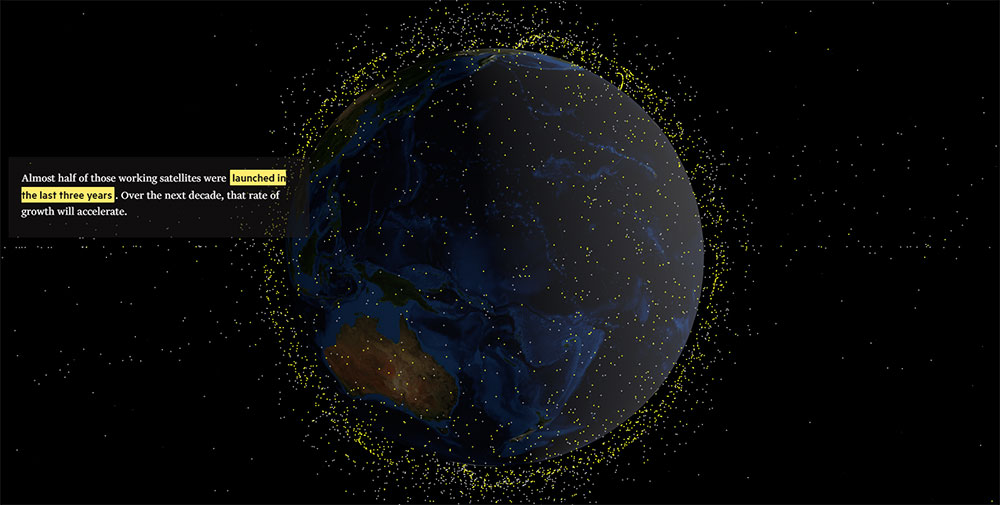
How Space Debris Threatens Modern Life

Check out how the Financial Times tells a compelling story. This research shows how much space debris is hovering over our heads and how dangerous the situation is.
Thanks to these data visualizations, readers of the Financial Times know that there’s much human-generated debris threatening modern life.
Mapping Iran’s Unrest
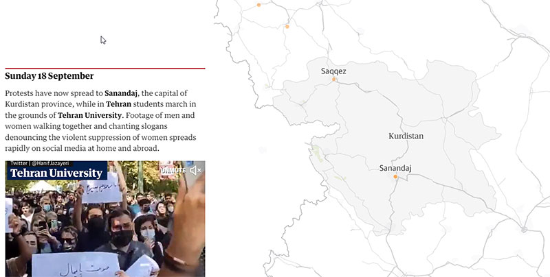
Worldwide data-driven journalism is important to solving social issues. This project by The Guardian shows the protests that arose across the country after the death of Masha Amini. She was a 22-year-old woman who was allegedly killed under arrest.
Using great visual context, the project shows videos, footage, and interactive maps. Thus, the viewer understands what’s going on at the moment and how the protests evolve.
The Green Divide

This is one of the best data journalism examples, telling the story of “leafy suburbs” and their importance. They show data from major cities in Aotearoa. “Leafy suburbs” is a term that they use to describe wealthy residential areas with plenty of trees.
Instead of simply casting a shadow, trees help cool the air. Thanks to a process called transpiration, trees release moisture and help keep a cooler atmosphere. All in all, having a tree-filled area is much better than living in the city center under the shade of buildings.
Database of Congressional Slaveholders
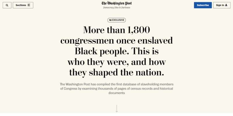
Nobody had created a database like this before. The Washington Post catalogs over 1,800 U.S. congress members who owned slaves.
Check out this fine work of data journalism. To create these data visualizations they researched journals, wills, plantation records, and historical documents.
Thus, they identified several slaveholders who were part of Congress across 40 states between 1789 and 1923.
The 500+ Conflicts of Interest of the Trumps
A project from Northwestern University examined more than 500 potential conflicts of interest regarding the Trump family. It includes an interactive graphic.
Also, the report shows a session of questions and answers with the data journalists where they explain their research and production process.
Use of Contraceptives Worldwide

Check out this article by Medicamentalia where they analyze different contraceptive practices.
You’ll find that the story develops as you scroll, and moving graphics help convey the message. This is a great example of how to show a reality that affects people’s lives across the world.
Wordle, 15 Million Tweets Later
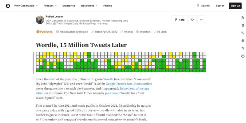
The search for the word “Wordle” has defined a trend in 2022. In fact, Google’s report confirms it was one of the most popular words in searches.
Robert Lesser conducted a thorough analysis based on large amounts of data. He used a JavaScript-based program to analyze tweet results on said word.
Aoteaora’s Vanishing Species

The RNZ prepared a report on Aotearoa’s vanishing species. With its research and clear data visualizations, the project shakes Aotearoa’s self-perception of being a lush and verdant country.
Using findings from the New Zealand Threat Classification System, the RNZ makes a clear point. Despite their simplicity, these graphics offer significant insights and great visual elements helping assess the threat that the local species are suffering.
Haiti’s Lost Billions
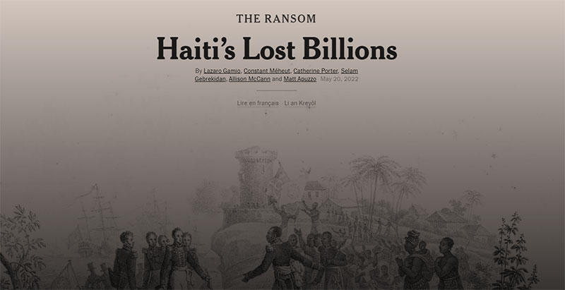
Here is outstanding historical research by the New York Times and one of the best data journalism examples. The research team studied government budgets, financial reports, and archival ledgers on how Haiti was forced to pay reparations to keep its independence.
Data journalists estimate the enormous expenses that Haiti had to face because of this debt. Also, they studied the terrible effects of these losses on the country’s economy, infrastructure, and people.
FAQ on Data Journalism
What is data journalism?
Imagine Sherlock Holmes, but instead of solving crimes, he’s hunting down stories hidden in piles of numbers and stats. That’s data journalism.
It’s all about digging into data to find, tell, and visualize stories in a clear and engaging way. Data journalists are like detectives with a knack for storytelling.
How is data journalism different from traditional journalism?
Traditional journalism mainly relies on human sources and observation. But data journalism? It dances with numbers.
It dives deep into databases and spreadsheets to uncover stories that could easily be overlooked. So, while traditional journalism might interview someone to get a story, data journalism might analyze a thousand tweets.
Why is data journalism important?
Ever heard the phrase ‘numbers don’t lie’? Well, data journalism helps make sure of that. It uses cold, hard facts to tell stories, making them more accurate and less biased.
Plus, in a world overflowing with data, it’s the best tool we have to make sense of it all.
What skills do I need for data journalism?
It’s a bit of a mix, really. You need the curiosity of a journalist, the detective skills of a researcher, and the geekiness of a data analyst.
And if you can visualize data or code, that’s a cherry on top. But most importantly, you need to be able to tell a clear, compelling story.
Can I learn data journalism online?
Absolutely, yes! There are tons of online courses that teach data journalism. Websites like Coursera, edX, and even YouTube have plenty of resources.
So whether you’re a seasoned journalist looking to brush up on your data skills or a newbie starting from scratch, the internet’s got you covered.
How is data visualization related to data journalism?
Data visualization is like the wardrobe department for data journalism. It takes the raw, often boring-looking data and dresses it up into something engaging and easy to understand.
Think of it this way, if data journalism is about finding the story in the data, data visualization is about telling that story visually.
How can I find data for my stories?
There’s data everywhere if you know where to look. Government databases, research reports, social media feeds, you name it. And the best part? A lot of it is freely available online. So go on, get your detective hat on and start digging.
What tools do data journalists use?
Data journalists have quite the toolbox. There’s data scraping tools for collecting data, like Import.io.
Analysis tools like R or Excel for making sense of it. And visualization tools like wpDataTables for bringing the data to life. It’s like being a carpenter, but for data.
Can data journalism be biased?
Here’s the thing. The data itself can’t be biased. It’s just numbers. But the people interpreting the data?
That’s a different story.
Bias can sneak in when choosing which data to include, how to analyze it, or how to present it. That’s why it’s crucial to be transparent about your methods in data journalism.
How has data journalism evolved?
In the old days, data journalism was mostly about simple charts and graphs in newspapers.
Now?
It’s interactive, it’s online, it’s dynamic. As technology has improved, so has the complexity and scope of data journalism. We’ve gone from static pie charts to immersive, interactive data stories.
And with more data being generated every day, the possibilities are only expanding.
Final Thoughts on These Data Journalism Examples
Sometimes, numbers can be dull, but they are always valuable when interpreting important stories and facts.
These data journalism examples show how to use various techniques and tools to send the right message. With data journalism, one can prepare engaging and informative reports. Moreover, the importance of this approach grows as the digital era moves forward. In our times, data science and visualizations help bring transparency to the world of statistics. Readers can access information with confidence and form their own opinions.
All in all, these examples show how data journalism can be as provocative as it is practical.
If you liked this article about data journalism examples, you should check out this article about data visualization blogs.
There are also similar articles discussing scientific data visualization, data visualization challenges, data visualization for marketers, and data storytelling examples.
And let’s not forget about articles on big data visualization, visualizing large data sets, financial data visualization tools, and data visualization trends.


