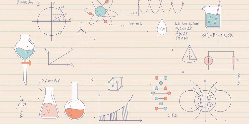
You know that feeling when you’re hit by an image so powerful it just sticks? That’s the magic of visualization, especially when we’re talking scientific data visualization.
Hold up. I can hear the cogs turning. Why should you care?
- We live in the age of data. Everywhere. Every second.
- But let’s be real – numbers alone? Snooze fest.
- Visuals? Now that’s where the party’s at. We remember them, get them, feel them.
By the end of this piece, you’ll grasp why every scientist, student, or random Joe browsing the web (yeah, you!) should know about this. We’ll explore:
- Why? The absolute need for visualization in this big data world.
- What? Dive into some jaw-dropping examples.
- How? The tools and techniques bringing this art (and science) to life.
Table of Contents
Categories of Data Visualization in Science
Data by Category
Let’s explore the various forms of data visualization in science. First on the list is categorical data, which deals with non-numerical classifications.
Bar Graphs
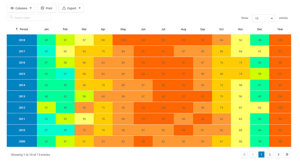
Chart created with wpDataTables
Consider bar graphs as the staple attire of data representation—basic yet indispensable. These vertical or horizontal bars illustrate the distribution of categories, such as the preference for tea over coffee.
Circular Graphs
Next, we have circular graphs, commonly known as pie charts. Imagine a dessert pie sliced into segments, each representing a category. If one half is apple and the other is cherry, you know you have an even distribution.
Numerical Data
Moving on, we have numerical data, which involves quantifiable variables. For instance, how many steps do you take daily?
Line Charts
Chart created with wpDataTables
Line charts serve as the data’s roller coaster, fluctuating based on numerical values. If you’re monitoring your daily step count, the line will indicate the variations.
Frequency Plots
Frequency plots, or histograms, are specialized bar graphs where bars are adjacent, ideal for showing numerical ranges, like the number of people taking 5,000-10,000 steps daily.
Spatial Data
Next, we delve into spatial data, focusing on geographical aspects.
Geographical Maps
In the realm of data visualization in science, geographical maps are like advanced GPS systems, displaying data for various regions, such as the density of gyms in different cities.
Thermal Maps
Thermal maps act as the Earth’s mood indicators, with colors shifting based on data. A red zone might signify a high-temperature area.
Multi-Aspect Data
Lastly, we have multi-aspect data, which is complex and multi-dimensional.
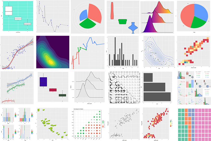
Point Plots
Point plots, or scatter plots, are like a visual fiesta. Each point signifies a data element, and its position reveals specific attributes. It’s information-rich but can be overwhelming.
Coordinate Plots
Coordinate plots, also known as parallel coordinates, resemble intricate string art. They connect multiple data points through intersecting lines, useful for comparing multiple variables simultaneously.
Principles for Effective Data Visualization in Science
Balancing Simplicity and Complexity
Let’s discuss the essence of data visualization in science: the tension between simplicity and complexity.
Reducing Mental Strain
Ever felt overwhelmed by a complex graph? That’s cognitive load. The aim is to minimize it. Think of it as curating a playlist; you wouldn’t mix disparate genres haphazardly.
Embracing Complexity
However, complexity isn’t inherently negative. It’s like seasoning a dish; a dash enhances, but an overload overwhelms.
The Role of Color
Color isn’t merely aesthetic; it’s a communicative tool in data visualization in science.
The Language of Colors
Colors convey emotions. Blue may soothe, while red demands attention. Choose colors as if you’re setting a room’s ambiance.
Inclusivity in Color
Remember, color perception varies among individuals. Design with colorblind-friendly palettes to be inclusive.
Textual Components
Textual elements are the supporting actors in data visualization in science.
Identifiers
Identifiers, or labels, serve as introductions. They clarify what each axis or element represents.
Key Guides
Key guides, or legends, act as the data’s glossary, explaining symbols or colors. They’re your go-to reference.
User Engagement
Finally, interactivity enhances user experience.
Magnification
In data visualization in science, zoom features allow for detailed examination, solving minor mysteries within the data.
Information Bubbles
Information bubbles, or tooltips, appear upon hovering over data points, offering additional insights like whispered secrets.
Tools and Software for Scientific Data Visualization
Featured Tool: wpDataTables

So, you’re into data, huh? Maybe you’re a scientist, a marketer, or just a data geek. Either way, you’ve got numbers and you need to make ’em look good. Enter wpDataTables. This isn’t just another WordPress plugin; it’s like the Swiss Army knife for your data.
- Easy-Peasy Setup: Upload your file, paste a MySQL query, or just type in the data. You choose.
- Customize Like a Pro: Want your table to be responsive? Or maybe you’re into conditional formatting. You got it.
- Publish and Boom: Once you’re happy, slap that table into a post or page.
Why It’s Great
- Data on Steroids: This isn’t just for basic tables. We’re talking financial reports, scientific data visualization, and even Amazon comparison tables.
- Filters & Searches: Got a massive table? No worries. Advanced filters help you find what you need, fast.
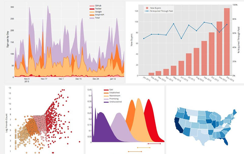
- Real-Time Charts: Yep, your data can become a live chart. How cool is that?
Add-Ons? Oh Yeah. Extend your data game with powerful add-ons. From report building to form integrations, the sky’s the limit.
Who’s Using It? Over 70,000 companies and individuals. From business to science, this plugin’s got fans.
So, if you’re looking to turn your data from “meh” to “WOW,” wpDataTables is your go-to. Trust me, your data will thank you.
Open Source Tools
So, you’re ready to dive into the world of scientific data visualization, but you’re like, “Where do I even start?” Don’t sweat it; there are tools for every vibe and budget.
Matplotlib
Matplotlib is like the Swiss Army knife for data visuals. It’s open-source, which means it’s free and customizable. You can make all kinds of charts and graphs.
ggplot2
ggplot2 is like a DIY kit for making visuals, inspired by The Grammar of Graphics.
You bring the data to the table, tell ggplot2 what elements should look like and what shapes to use, and it handles all the nitty-gritty for you.
Commercial Tools
Alright, let’s talk big leagues. If you’ve got some cash to splash, these are the Ferraris of scientific data visualization.
Tableau
Tableau is like the Photoshop for data. It’s sleek, it’s powerful, and it makes you look like a pro even if you’re just messing around.
Microsoft Power BI
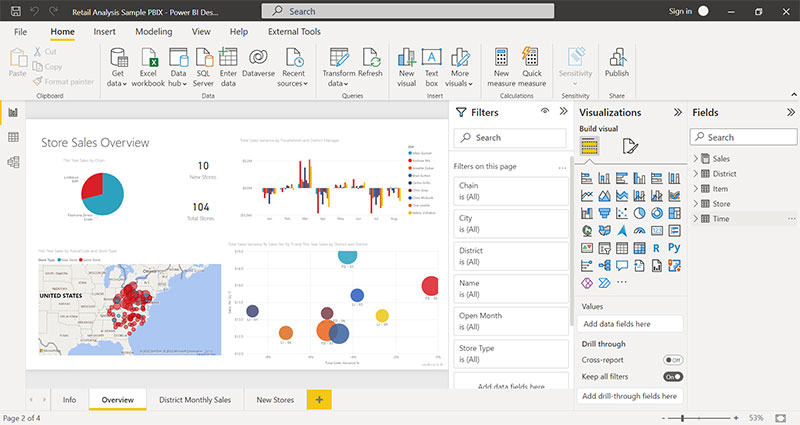
Microsoft Power BI is like the Swiss watch of data tools. It’s precise, it’s reliable, and it integrates with all the Microsoft stuff you’re probably already using.
It’s the no-brainer choice for corporate types.
Best Practices for Scientific Data Visualization
Data Preprocessing
Alright, so you’ve picked your tool, you’re all hyped up, but wait—before you dive into the deep end of scientific data visualization, you gotta prep that data. It’s like marinating chicken before you grill it; trust me, it makes all the difference.
Data Cleaning
First things first, data cleaning. Get rid of the stuff that’s not helping your story.
Data Transformation
Then comes data transformation. This is like turning that bag of candy into a gourmet dessert. Maybe you’re melting the chocolate or turning the gummies into a sauce. You’re making the data easier to work with and way more delicious.
Usability Testing
Last but definitely not least, you gotta test that visual. Because what’s the point of a killer scientific data visualization if no one gets it?
Feedback Loops
Feedback loops are your BFF here. Show your visual to a few people and see what they think. It’s like a dress rehearsal before the big show.
A/B Testing
Try some A/B testing. Show two different versions and see which one hits the mark.
FAQ On Scientific Data Visualization
What is scientific data visualization?
Scientific data visualization is like taking all those mind-boggling numbers, data sets, and research findings, and turning them into visuals.
I’m talking graphs, charts, and even 3D models. Think of it as giving your eyes a treat while making complex stuff easier to understand. It’s about telling a story with data in the most engaging way possible.
Why is it important in science?
Science is chock-full of complicated info. Visualization helps break it down. Imagine you’re trying to get your head around the human genome or climate patterns.
Reading tables? Not for everyone.
But show me a color-coded map or a dynamic graph? Now you’re talking! It makes the intangible tangible, aids in comprehension, and seriously boosts communication among scientists and to the public.
Which tools are popular for this?
Oh man, there’s a bunch. Some heavy hitters are wpDataTables, Tableau, D3.js, and Python libraries like Matplotlib.
Then there’s Paraview for the 3D enthusiasts out there. Choosing a tool? That’s like asking someone their favorite ice cream flavor. Depends on the job, your taste, and how deep you wanna dive into customization and interactivity.
How do colors impact data visualization?
Colors are everything, my friend. They can highlight trends, differentiate data sets, and set the mood.
Ever seen a heatmap?
Those reds and blues aren’t just for show. But, be careful! Poor color choices can mislead or confuse. And always remember: there are color-blind folks out there, so accessibility is key.
Can you suggest some best practices?
Absolutely! First off, keep it simple. Overloading visuals is like talking at 100mph – nobody gets it. Aim for clarity.
Consistency is your buddy, use similar visuals for similar data types. And please, oh please, always cite your data sources. And here’s a golden nugget: iterate and get feedback.
What role does interactivity play?
Interactivity is like the cherry on top. Instead of just looking at data, you’re engaging with it. Zoom in, filter, explore!
It makes data personal, relevant. It’s no longer a monologue, but a dialogue between the viewer and the data. Truly, it’s turned passive viewers into active explorers.
What’s the difference between infographic and data visualization?
Ah, a classic query! Infographics are like storytelling with design and some data. They’re structured, thematic.
Now, data visualizations are more like raw, unscripted glimpses into pure data. While infographics paint a broad picture, data visualizations deep-dive into specifics. Apples and oranges, but both delicious in their own right.
How do you handle large data sets?
Big data, big challenges, right? But, the trick is in sampling, aggregation, and, sometimes, simplification.
Think of it as making a smoothie – you blend a lot into a digestible format. Tools help, of course. The modern ones can handle tons of data points, but remember: it’s not just quantity, but the quality and relevance of the data that counts.
Any tips for beginners?
Alright, rookie, here’s the scoop. Start with a purpose, a clear question you want answered. Familiarize yourself with the basics, maybe pick up a tool and play around.
There’s a sea of online resources, tutorials, and courses. But most importantly, practice, practice, practice. And hey, don’t be scared of making mistakes – they’re the best teachers. Dive in, the data’s fine!
Conclusion On Scientific Data Visualization
Why is scientific data visualization even a big deal?
- First off, our brains? Wired for visuals.
- Those crazy complex numbers? They get way easier when drawn out.
- And let’s face it, a snazzy chart can make even the driest data pop.
Honestly, whether you’re geeking out over the latest research, trying to explain your findings to someone, or just aiming to impress at a cocktail party, these visuals matter. Dive into this world, and you’ll never see data the same way again.
If you liked this article about scientific data visualization, you should check out this article about data visualization blogs.
There are also similar articles discussing data visualization challenges, data visualization for marketers, data storytelling examples, and data journalism examples.
And let’s not forget about articles on big data visualization, visualizing large data sets, financial data visualization tools, and data visualization trends.


