Nowadays, most organizations are generating a tremendous amount of information with analysts having to contend with examining and interpreting the finer details.
But with well-designed big data visualization tools, this continuous stream of information can be unraveled in an orderly and logical way. And businesses can reveal insights that would otherwise remain cryptic.
Through this deeper understanding of complex data sets, enlightened companies are able to reach valuable and profitable decisions.
In fact, this innovative technology enables a business to tell its data story in a way that is not only straightforward but visually gripping.
This article will explore the sphere of big data visualization and how it’s altered and improved the way that data is analyzed and processed. The value of this tool in today’s data-driven world will be considered, as well as techniques to exploit its tremendous potential.
Table of Contents
Grasping the Concept of Big Data Visualization
Simply put, data visualization transforms complex data sets into a straightforward configuration that is easy to read and interpret.
Big data visualization techniques utilize tools and methods that communicate the interconnectedness between data points.
In contrast with typical visualization methods such as pie charts, histograms, and corporate graphs, big data visualization uses more intricate representations like heat maps and fever charts.
Effective computer systems are necessary for big data visualization to compile raw data, sort through it, and modify it into a visual depiction. People are then able to immediately derive an understanding from these data points.
To create meaningful visualizations, data must first be collected, cleaned, and stored in a suitable data warehouse or database. Data visualization tools can then help users explore and analyze the data visually, presenting it in a more easily understandable and actionable format.
The data pipeline supports data visualization by enabling efficient data integration and ensuring that the right data is available in the right place for visualization purposes.
Advantages of Analyzing Big Data
The process of data visualization has become standard in the business world. Despite this, many still find it a challenge to appreciate what data visualization is fully capable of accomplishing.
Any business that embraces data visualization in its everyday activities will be able to make informed decisions that will boost and sustain its performance as a whole.
In a business industry that is constantly changing, visualization enables companies to navigate through such shifting developments with flexibility.
Organizations can change raw data into essential insights and concepts, and as a result, refine their business intelligence. No doubt, the whirlwind development and progress of technology has created ample space for data visualization to make headway in the business sector. Furthermore, incorporating the Net Promoter Score into data analysis can provide businesses with a valuable metric for assessing customer satisfaction and driving data-driven decisions.
And what is more, companies that exploit data visualization are more skillful at pinpointing market opportunities.
This enables them to obtain a substantial share of the market and increase their revenue streams over time.
In addition, a business manager looking to identify pivotal information more effectively and rapidly does well to make use of visualization tools. On top of that, they gain a competitive edge in the business world.
Best Practices for Big Data Visualization
Keep in mind that the development of absorbing impactful data visualization is a challenging activity.
It demands thorough preparation, design, and implementation, as well as savvy data analysis. This article will further examine a range of great techniques to help create impressive and informative data techniques.
These points will cover:
Picking the Appropriate Visualization
A variety of charts exist, and choosing the ideal one to visualize data is a skill in itself.
A suitable chart will not only complement the simplicity of the data but also showcase it as accurately as possible. To make a suitable decision, carefully evaluate the set of information you wish to communicate and identify your target audience.
Designing with Purpose
Data scientists can take advantage of a big data visualization tool to provide answers to valuable strategic queries, add authentic value, and discover solutions to obstacles.
This tool can then be used to follow consumer habits, track efficiency, and evaluate productivity.
Outline the objectives and priorities at the beginning of the project to create more beneficial results and avoid the lost cause of creating nonessential visuals.
Guarantee Uniformity and Authenticity
Compelling big data visualizations need to be factual and consistent. To achieve this, ensure that every visualization presents uniformity and authenticity.
Design Engaging Visualizations with Tools and Technology
You might require an assortment of tools, like a QR code maker or specific data visualization software, to design and share visual data representations.
The direction of the design could be based on data type and size, required interactivity, and intended users.
Clarify and Create a Focal Point for Your Visualization
To make data visualization important and significant for a business, data science steps in and makes it easier to look into and grasp what the visualization is trying to communicate.
This is done by creating a simple visualization with a strong focal point.
Big Data Visualization Techniques and Tools
An assortment of tools for big data visualization is available based on data type, size, and intended objective, some of which are described below:
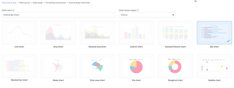
Graphs and charts: A pie chart and a line chart are two common examples of graphs and charts that visually represent statistical data.
Pie chart created with wpDataTables
These tools are simple yet powerful, and can effectively compare, contrast, or sum up data across various groupings, scale and measurements, or timeframes.
Maps and spatial analysis: To visualize big data with a geographic element (customer location and sales territory), make use of maps and spatial analysis.
Dashboards and scorecards: Dashboards and scorecards can be used to analyze data as an effective means for displaying KPIs or metrics that track the progress or condition of a business, undertaking, or operation.
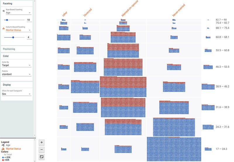
Heat maps and tree maps: Heat maps and tree maps are effective techniques for visualizing hierarchical data, allowing for the identification of patterns and connections across intricate data sets.
Augmented and virtual reality: Up-and-coming tech such as augmented and virtual reality possesses the potential to transform the visualization of large data sets, leveraging the capabilities of the human brain and its ability to process large chunks of information.
You can create big data visualizations too
You know how it can be super frustrating when you’re trying to create big data visualizations for your projects, right? I mean, we’re talking massive data sets here, and it can feel like an endless battle to find the perfect solution.
If these are some pain points that you’re facing:
- Struggling to process and display huge amounts of data
- Wasting hours configuring complex charts and tables
- Dealing with poor performance and slow page loading times
- Frustrated with limited customization options
Then wpDataTables can do a whole lot of good to your workflow.
Now, let me walk you through how wpDataTables can turn things around for you:
- Efficient Data Handling
wpDataTables handles big data sets like a boss. Importing and managing data has never been this smooth. No more lag or performance issues! - Ready-to-use Visualizations
With tons of pre-built chart types, I was able to create stunning visualizations in a snap. Talk about a time-saver! - Flexible Customization
wpDataTables offers amazing customization options. Need to match your client’s branding? No problem! It’s got you covered. - Responsive and Fast
I love that the tables and charts are fully responsive, so they look great on any device. Plus, the loading times are lightning-fast. - Ease of Integration
It’s WordPress-based, so it fits seamlessly into my workflow. Just plug it in and get to work. Easy peasy!
Don’t waste another minute wrestling with big data visualization. Embrace the power of wpDataTables and watch your productivity soar.
Want to know more? Check out all the awesome features that wpDataTables has and give your financial data the visual makeover it deserves.
Dodge the Usual Big Data Visualization Mistakes
When creating a visual representation of data, the aim should be to present the information in a way that is easily understood by the intended audience. It’s just as important to know which obstacles could stand in the way of this objective.
Topsy-Turvy Visualizations
Visualizations that contain excessive visual elements, including numerous text boxes and graphic layers, may end up confusing the audience who won’t understand how many data points are being presented.
If you’re worried about creating a visualization that resembles a labyrinth, concentrate on a focal point and simplify its presentation.
Distorting Data
One common blunder in big data visualization is distorting data. This involves falsifying or twisting data to promote a specific result.
Outcomes like inaccurate conclusions and poor decision-making emphasize the need for authentic presentation of data through techniques like bar charts.
Choosing the Wrong Visualization
Sometimes an unsuitable visualization is used to present data, such as using a line chart for categorical data or a pie chart for information with numerous categories.
This can land up in confusion and misinterpretation of the data.
Neglecting Context and Audience
Visualizing data without context can tell only half the story and mislead your audience. It’s important to design effective visualizations that keep the audience in mind and provide a complete picture so as to avoid them reaching the wrong conclusions.
Overemphasizing Aesthetics
An overemphasis on aesthetics means that the visual appeal of your data visualization becomes more important than the actual data itself. That’s when you end up with an ineffective visualization that confuses your audience.
Using appropriate chart types, like a well-designed bar chart or comprehensive line charts, can guarantee the spotlight shines on the actual communication of the data.
Conventional Applications of Data Visualization
Here are some common use cases for data visualization:
Sales and marketing
To boost their revenue, sales, and marketing teams should use big data analytics to monitor web traffic. They can then readily deliver data on the influence of their marketing efforts on traffic trends.
Pairing that with event-based marketing information (e.g., product views, sign-ups, checkout steps) makes it easier to see which actions actually lead to revenue.
Politics
Politics often use geographic maps to present the political parties that have been voted for in each state or district.
Healthcare
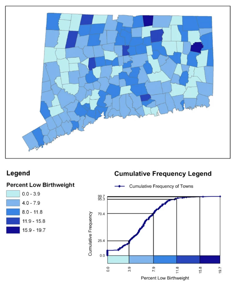
Data analysts in healthcare often use choropleth maps to visualize essential health data by displaying regions with different colors based on a numeric variable.
With choropleth maps, professionals can observe the changes in variables like heart disease mortality rates across specific territories. These maps help to quickly identify trends and patterns.
Scientists
Researchers and scientists can now extract more valuable insights from their unstructured data sources by means of scientific data visualizations. SciVis, for example, is a useful way to gain greater clarity and understanding from experimental data.
Finance
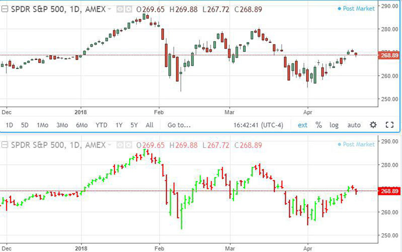
When visualizing big data, finance professionals trust candlestick charts to analyze price movements over time and monitor the performance of their investment decisions. Such effective tools can be used to display important data points such as securities, derivatives, currencies, stocks, bonds, and commodities.
Logistics
A bar graph, for example, can be used by shipping companies as a visualization tool to pinpoint the most efficient global shipping routes.
Data scientists and researchers
A data scientist creates visualizations primarily for their own use or to present information to specific audiences. They may use a visualization method and libraries within chosen programming languages and tools to represent big data.
Big Data Visualization and Business Strategy
The big data world, with its ever-increasing amount of information, makes it a challenge to keep up with. A data strategy is crucial in ensuring the success of a business. Data visualization is an important resource in your strategic toolbox.
To start with, it helps clarify your data and single out relevant information. These tools allow you to monitor your strategy in real-time and make data-driven decisions. As you visualize both the data and its results, you can better boost your strategy while it’s in full swing.
What Lies Ahead for Big Data Visualization
The evolution of big data visualization with advancing technology will continue to offer novel ways of visualizing complex data sets.
These are a few of the forecasts for the future of big data visualization:
- More organizations will begin to adopt data-driven decision-making processes. There will be an increase in the demand for professionals who can effectively identify patterns in a data set and effectively communicate their insights to the interested organization.
- Artificial intelligence (AI) and machine learning (ML) will revolutionize data visualization through the automation of data analysis and the generation of insights. These technologies will introduce new visualization techniques that create a sense of vibrancy and individuality for the user.
- By incorporating data annotation tools, these techniques will further enhance the user experience and the reliability of insights.
- The integration of big data visualization with augmented reality (AR) and virtual reality (VR) will result in more complex representations of data that enable interactive and immersive experiences in a three-dimensional space.
- The application of cloud-based platforms and services will facilitate the scalability of big data visualization, enabling it to handle diverse and larger data sources while offering users enhanced accessibility and collaboration alternatives.
- With the evolution of new protocols and best practices comes the guarantee that standards of quality, authenticity, and ethics related to data visualization will be maintained. At the same time, it will guarantee the standards, precision, and morality of large-scale data visualization, while also tackling the difficulties related to data privacy, security, and regulation.
Technological Advancements in Big Data Visualization
The future of big data visualization will be shaped by technological advancements, leading to innovative methods using numeric variables and visual representations. For example, artificial intelligence and machine learning analyze data and identify patterns to deliver factual and illuminating visualizations.
These technologies also enable the automation of visualization and creation, saving time and resources. And virtual and augmented reality can offer engrossing interactive experiences, enabling users to make sense of data in novel and stimulating ways.
FAQ on Big Data Visualization
What is big data visualization?
Big data visualization, you know, is a way to represent large and complex datasets through visual elements, like charts, graphs, or maps.
It helps people to understand patterns, trends, and correlations in the data that might be hard to grasp otherwise. It’s super useful for decision-making, data analysis, and communication of results.
Why is it important to visualize big data?
Well, the thing is, big data can be super overwhelming. Visualizing it makes it way easier to comprehend, and let me tell you, it can help uncover hidden insights that might not be obvious otherwise. By transforming raw data into visual representations, we can grasp complex information and make more informed decisions.
Plus, it’s a great way to communicate findings to others.
What tools can you use for big data visualization?
Oh, there are tons of tools! Some popular ones include Tableau, Power BI, D3.js, and Google Charts.
Each has its own strengths and weaknesses, so you might wanna choose based on your specific needs. Some factors to consider: ease of use, flexibility, scalability, and available features.
Do some research, try a few out, and pick the one that suits you best.
How do you choose the right chart or graph for your data?
Picking the right chart or graph depends on what you want to show. For example, line charts are great for showing trends over time, while bar charts are perfect for comparing categories.
Pie charts, on the other hand, are ideal for displaying parts of a whole. The key is to think about your data and your goals, then choose the visual that best represents the story you want to tell.
What are some challenges in big data visualization?
Challenges? Oh, there are a few. One of the main ones is just dealing with the sheer volume of data. It can be tricky to present all that info in a way that’s easy to understand.
Also, there’s the issue of data quality – like missing or incorrect values. And don’t forget about choosing the right visualizations and making sure they’re accurate and clear. It’s a bit of a balancing act, really.
How can you ensure data accuracy in your visualizations?
To make sure your visualizations are accurate, you gotta start with clean and reliable data. So, spend some time on data cleaning and validation.
Check for missing, inconsistent, or duplicate values, and fix any issues you find. Also, use well-established visualization tools and techniques, and double-check your work. It’s all about being thorough and paying attention to the details.
What role does color play in big data visualization?
Color is super important in big data visualization. It can help you distinguish between different data points, highlight patterns, and guide the viewer’s attention.
But be careful – using too many colors or choosing ones that are hard to differentiate can make your visuals confusing. Stick to a simple color palette, and use contrasting colors to emphasize important points.
How can you make your visualizations accessible to everyone?
Accessibility is key, my friend. To make your visualizations accessible, use clear labels, legends, and titles to explain what’s going on.
Also, consider using larger text sizes and high-contrast color combinations, so everyone can see and understand your visuals.
And don’t forget about people with color vision deficiencies – use colorblind-friendly palettes to make sure they can grasp your data too.
How can you improve the storytelling aspect of big data visualization?
Storytelling is crucial in big data visualization. To improve it, first, identify the key message or takeaway you want your audience to get. Then, use visual elements like color, size, and position to emphasize that message.
Create a clear narrative flow and guide your audience through the data step by step. Use annotations or captions to provide context, and make sure your visuals are well-organized and easy to understand. Remember, the goal is to help your audience grasp the main points and make sense of the data in a meaningful way.
Big Data Visualization Tells Bigger Stories
Data visualization plays a central role in weaving the narrative into big data. It would be a mistake to undervalue such an essential step that could make or break a data science project.
If you choose the wrong visualization method, you may end up losing sight of valuable patterns and trends or a revolutionary insight. The right one ensures a business remains on the cutting edge among competitors. It successfully communicates intricate data so that people can make informed decisions that impact the bottom line.
Any company will find it a worthwhile endeavor to prioritize the cultivation of this skill set that transforms data into a powerful resource which is why investing in the right big data visualization tools is so important.
If you liked this article about big data visualization, you should check out this article about data visualization blogs.
There are also similar articles discussing scientific data visualization, data visualization challenges, data visualization for marketers, and data storytelling examples.
And let’s not forget about articles on data journalism examples, visualizing large data sets, financial data visualization tools, and data visualization trends.


