
Blink twice, and you’re hit with an ocean of data. But let’s be real, no one’s got time for boring spreadsheets. Enter: data visualization blogs.
Ever been on Instagram and wondered why some photos just pop? It’s because we humans are visual creatures. The same goes for understanding raw data. We need a lil’ sprinkle of design magic to make sense of all those numbers.
But where do you go to get that magic?
By diving into this piece, you’ll unlock:
- The who’s who of data viz blogging
- Why visuals are like life rafts in a sea of data
- Sneak peeks into the best platforms making waves right now
Table of Contents
Data Visualization Blogs To Check Out
The wpDataTables Blog

Welcome to the wpDataTables Blog, your go-to hub for all things data visualization. We’re not just another blog; we’re a community that breathes, eats, and dreams in charts, graphs, and tables. 📊
Ever wondered how to make your data speak? We got you. From data storytelling to financial charts, we cover it all. Marketers, journalists, or just a data geek? There’s something for everyone.
- Interactive Charts? Check.
- Big Data Visualization? Double Check.
- Data Journalism? You bet.
We even wrote about stylistic choices like the best fonts for tables and color palettes that make your data pop.
Our articles are packed with tips, tricks, and inspiration from real-world examples.
Storytelling with Data

So, you’re into data, huh? But ever thought about making it, well, less boring? Storytelling with Data is your go-to spot for that.
It’s not just about numbers and graphs; it’s about weaving a compelling narrative around your data. Imagine making your data points the heroes of your story.
Cool, right?
This blog teaches you the how-tos of turning raw data into engaging stories. It’s like the Netflix of data visualization blogs but educational.
Information is Beautiful
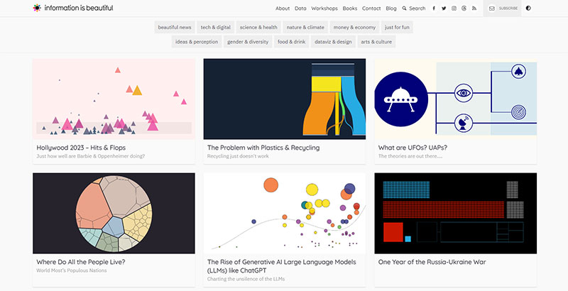
Okay, let’s get real. You know how sometimes data can be like dry toast? Information is Beautiful is like adding avocado and a sprinkle of chili flakes on top.
It’s all about making data not just digestible but downright delicious. This blog is a smorgasbord of visually stunning infographics and data visualizations.
It’s where data meets design in a harmonious blend. If you’re looking for eye-candy that’s also brain food, you’ve hit the jackpot.
Flowing Data
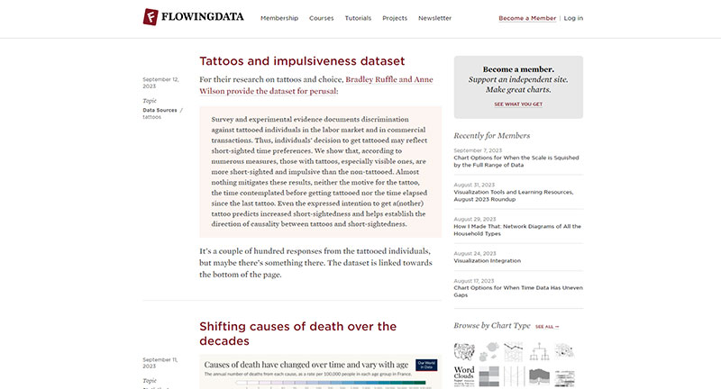
Ever felt like you’re drowning in data? Flowing Data is your lifebuoy. This blog is all about making sense of the data ocean we’re swimming in.
It’s like your personal data DJ, mixing stats and visuals into a rhythm you can groove to. From tutorials to real-world examples, it’s got everything to keep you afloat in the data stream.
If you’re looking to catch the wave of data visualization, this is your surfboard.
Visualising Data
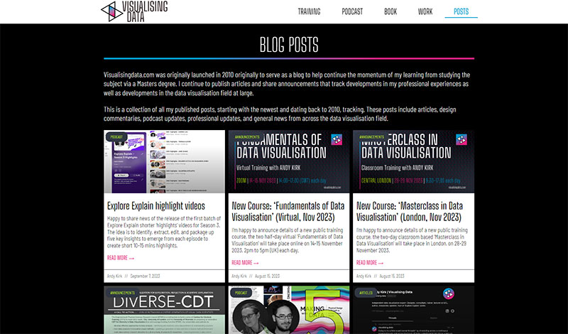
The blog itself is known for bridging the gap between data and understanding.
It’s like the Rosetta Stone for data visualization.
When it’s up and running, it’s a treasure trove of resources, from training to podcasts. So, keep an eye out for this one.
Junk Charts
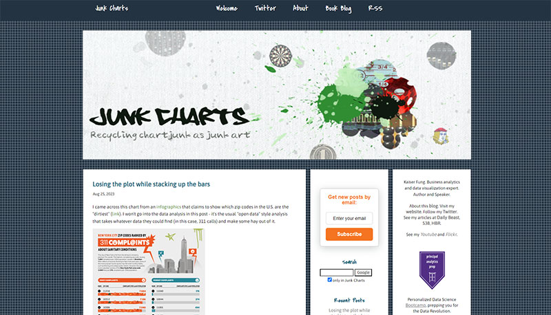
Think of Junk Charts as the Gordon Ramsay of data visualization blogs. It doesn’t just show you how to cook up some data; it critiques the whole kitchen.
This blog dives deep into what works and what doesn’t in the world of data visualization. It’s like a reality check for your charts and graphs.
If you’re looking to up your game and avoid rookie mistakes, this is your mentor in the making.
Cool Infographics
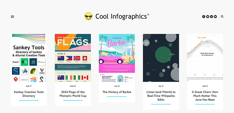
You know that feeling when you stumble upon a treasure trove of infographics? That’s Cool Infographics for you. It’s like a buffet, but instead of food, you’re feasting on visually appealing data.
From climate change to the Women’s World Cup, this blog covers a wide range of topics.
It’s the kind of place where you can get lost for hours, just munching on data eye-candy. If you’re into infographics, this is your Disneyland.
Michael Sandberg’s Data Visualization Blog
Michael Sandberg’s blog is like that cool professor who makes even the most complex topics feel like a breeze.
This blog is all about getting you pumped about your data.
If you’re looking to get excited about data, this is your hype man.
FAQ On Data Visualization Blogs
What’s the Big Deal About Data Visualization Blogs Anyway?
Ah, you’re curious, huh? Well, data visualization blogs are like your go-to guides for making sense of the data jungle.
They break down complex topics into visually appealing charts, graphs, and whatnot. It’s like translating geek-speak into a language we all understand: visuals.
So, if you’re looking to get insights without the headache, these blogs are your best pals.
Are These Blogs Suitable for Beginners?
Absolutely, yes! Most data visualization blogs cater to a wide audience, from newbies to pros. They often have tutorials, how-tos, and beginner guides that walk you through the basics.
What Types of Data Can I Visualize?
Oh, the possibilities are endless! You can visualize anything from sales metrics to social media engagement, from healthcare data to climate change stats.
How Often Should I Check These Blogs?
Well, the data world is ever-changing, my friend. I’d say, make it a weekly ritual. Most blogs update regularly with fresh content, new techniques, and industry trends.
You don’t wanna miss out on the good stuff, trust me.
Can I Trust the Information on These Blogs?
Generally speaking, yes. Look for blogs with a solid reputation and expert contributors.
How Do I Make My Visualizations More Engaging?
Ah, the million-dollar question! The key is to keep it simple but impactful. Use colors wisely, opt for clean layouts, and please, for the love of data, avoid 3D pie charts.
Your goal is to communicate information, not dazzle with special effects.
Do I Need to Know Coding?
Not necessarily. Many tools are drag-and-drop, designed for the coding-averse among us.
But knowing a bit of Python or R can give you more control and customization options. So, it’s a good skill to have in your back pocket.
Conclusion On These Data Visualization Blogs
You’ve cruised through the fascinating world of data visualization blogs. Wild, right?
Now, you’re probably thinking, Why the buzz about colors, shapes, and funky graphs?
Well, here’s the idea:
- These blogs? They’re the gateway to transforming jumbled numbers into art.
- And this art? It’s not just for the ‘Gram. It speaks; tells stories way better than any spreadsheet ever could.
It’s like giving data a makeover. And who doesn’t love one of those?
If you liked this article about data visualization blogs, you should check out this article about scientific data visualization.
There are also similar articles discussing data visualization challenges, data visualization for marketers, data storytelling examples, and data journalism examples.
And let’s not forget about articles on big data visualization, visualizing large data sets, financial data visualization tools, and data visualization trends.


