
Data can be messy, and turning it into something that makes sense (and looks good) is an art form. Enter the maze of data visualization challenges.
Why should you care? Well, first off, I live and breathe web design and data visualization. And trust me, even the pros sometimes scratch their heads when it comes to representing complex data effectively. If they can trip up, so can you.
In this article:
- You’ll learn about the big no-nos in the data viz world,
- Get the scoop on common pitfalls,
- And of course, tricks to make your data sing (not literally, but you get it).
Table of Contents
Fundamental Principles of Good Data Visualization
Aesthetics vs Functionality
Color Choices
Chart created with wpDataTables
Those colors gotta serve a purpose. Like, ever seen a pie chart with such similar shades of blue that you can’t even tell what’s up?
That’s a data visualization challenge for you!
Too many colors or the wrong ones can confuse the heck out of your audience. But also, we can’t just go all grayscale—color helps your audience “get it” faster. Balance is key.
Font and Scale
Alright, let’s dive into fonts. You might think Arial or Times New Roman are all you need, but hey, fonts set the mood.
A funky font might be cool for a birthday invite but could be an eyesore in a business report. Also, don’t make people squint or pull out a magnifying glass. Make sure the text is readable across all devices.
Data Integrity
Source Reliability
Trustworthy sources! That’s the foundation. If you’re getting data from some random website that your buddy sent you, you’re in for a world of data visualization challenges.
Reliable sources can make or break your visualization. Because you can make the prettiest chart, but if it’s built on shaky data, then it’s essentially useless, isn’t it?
Data Accuracy
Real talk—data changes. If you’re using outdated stuff, you’re doing a disservice to everyone involved. Always update your stats and facts before you make your visuals.
This makes sure you’re always relevant and, well, accurate.
Accessibility
Inclusion
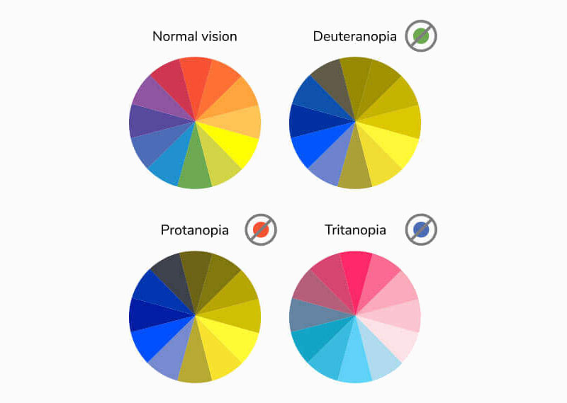
Here’s the thing, not everyone experiences the web in the same way. Some folks use screen readers, others might be colorblind.
You’ve got to make sure your visuals aren’t just beautiful, but that they can be accessed and understood by as many people as possible. That’s one of those data visualization challenges that often gets overlooked.
Adaptability
So your chart looks fab on a 27-inch monitor. But what about on a smartphone? If it’s not adaptable, you’re cutting out a massive chunk of your audience.
And trust me, pinching and zooming just to read a pie chart is no one’s idea of a good time.
Your beautiful data deserves to be online
wpDataTables can make it that way. There’s a good reason why it’s the #1 WordPress plugin for creating responsive tables and charts.

And it’s really easy to do something like this:
- You provide the table data
- Configure and customize it
- Publish it in a post or page
And it’s not just pretty, but also practical. You can make large tables with up to millions of rows, or you can use advanced filters and search, or you can go wild and make it editable.
“Yeah, but I just like Excel too much and there’s nothing like that on websites”. Yeah, there is. You can use conditional formatting like in Excel or Google Sheets.
Did I tell you you can create charts too with your data? And that’s only a small part. There are lots of other features for you.
Common Challenges in Data Visualization
Misleading Representations
Scale Manipulation
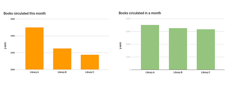
Scale manipulation is like the optical illusion of data. But tweaking the scale? Nah, that’s a major data visualization challenge that needs solving.
Imagine you’re pitching your eco-friendly project, and your graphs make it look like CO2 levels dropped like an EDM bassline.
Everyone’s pumped, right?
But then, it turns out you just messed with the scale. The environment is still crying, my dude.
Omitted Data
You know what’s another tricky one? Leaving stuff out. Seriously, this is like the diet version of lying. Cherry-picking info can totally sway what people think, and that’s a no-go.
We all have biases, sure. But being selective with what data you show is like playing a rigged game.
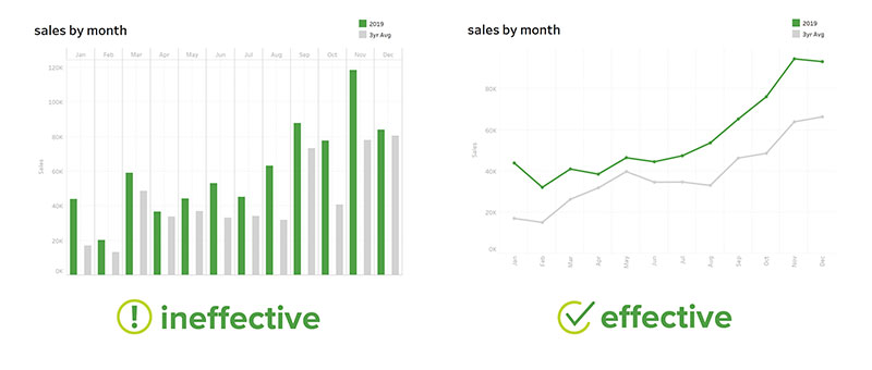
Overcomplication
Too Much Information
TMI, people. It’s not just for awkward dates; it’s also a massive data visualization challenge. Just because you can show all the data doesn’t mean you should.
I mean, would you mix every color in your paint set and expect a masterpiece? Nah. Pick the essential bits, the ones that tell the story, and keep the rest in the appendix or something.
Unnecessary Complexity
Complexity is cool if you’re into rocket science or philosophy. But let’s keep it chill in the data visualization world.
Who needs a 3D exploding pie chart with eight different patterns and a disco light feature? No one, that’s who. I mean, it sounds fun, but it’s not really helping anyone understand anything better, is it?
Interactivity Challenges
User Engagement
Here’s the tea: if your chart or graph is more boring than watching paint dry, no amount of interactive buttons will save it.
Seriously, it’s one of those data visualization challenges we don’t often think about. The goal is to engage, right? But throwing in random interactive elements like they’re condiments? Nah, it’s not a burger; it’s a visual representation of data.
Usability
Every interactive bit should have a reason to be there. If you’re gonna include a button, slider, or whatever, it should actually help the viewer get more out of the data.
Otherwise, it’s just decoration.
Mistakes to Avoid
Ignoring the Audience
Lack of Context
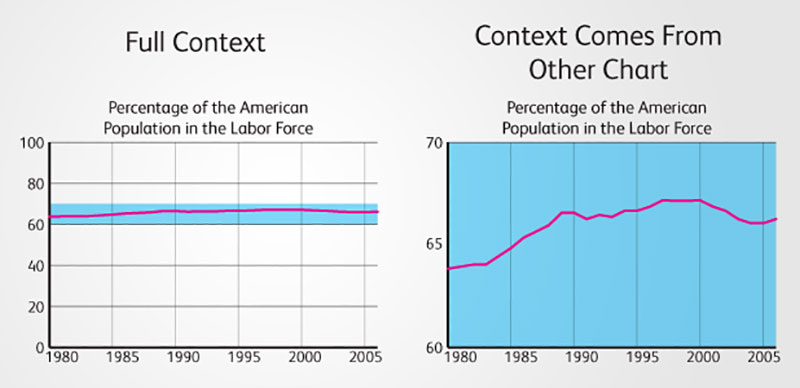
Alright, ever walk into a movie halfway through? Confusing, right? Data is the same way.
Imagine you’re staring at a bar graph full of tech jargon or medical terms, and it’s like, “What’s going on?” Context is king, peeps.
If your audience doesn’t get the setting, the background, or the why-the-heck-should-I-care factor, you’ve landed right in one of those classic data visualization challenges.
Overuse of Jargon
We all love to sound smart. Who doesn’t? But throw too much industry lingo into your visuals, and it’s like speaking a foreign language at a spelling bee.
Seriously, don’t make people Google every term just to understand your pie chart. If you’re not mindful of who’s viewing your data, then you’re basically throwing it into the void.
Data Overplotting
Crowded Visuals
In the world of visuals, chaos is one of those data visualization challenges we can all live without.
So, give your data some room to breathe, okay?
Overlapping Data
Another head-scratcher. Say you have multiple data points that overlap. Kinda looks like an abstract painting, doesn’t it?
Problem is, we’re not in an art gallery; we’re trying to understand something complex in a simple way.
So, unless you want your audience to play “Where’s Waldo” with your data points, avoid the overlap mess.
Inaccurate Data Mapping
Geographical Mistakes
Data mapping has to stay true to real-world layouts. Otherwise, you’re misleading your audience and adding another entry to the data visualization challenges hall of fame.
Temporal Errors
You know those movies that mess with timelines, jumping here and there until you don’t know what’s past, present, or future?
Yeah, it can be cool in a sci-fi flick, but in a graph? Nope.
FAQ On Data Visualization Challenges
What are the Most Common Mistakes in Data Visualization?
Well, there’s a laundry list, but some top contenders are: using too many colors, not considering your audience, and scaling issues.
These might sound trivial, but they can distort your message big time.
Why is Proper Scaling Important?
Think about it: you wouldn’t use a sledgehammer to crack a nut, right? Scale matters because improper scaling can lead to misleading visuals.
Your audience might walk away with a completely skewed perspective if you don’t get this right.
How Can Color Choices Affect Interpretation?
Color is not just eye candy, my friends. Using reds and greens together, for example, can be confusing for color-blind folks.
Plus, colors carry emotional weight. You don’t want to trigger unintentional reactions.
Is 3D Visualization Better than 2D?
3D can look fancy and futuristic, sure, but it often makes things complex and hard to understand.
Stick to 2D unless you’ve got a really good reason to venture into the third dimension.
How Important is the Data Source?
Hugely important! Your visuals are only as good as your data. A corrupted or biased data source will lead to corrupted and biased visuals.
So, double-check your sources, always.
Do I Need Special Software?
Not necessarily. Even Excel or Google Sheets can get you pretty far.
But if you’re diving deep, specialized software like wpDataTables, Tableau, or Power BI can offer more flexibility and capabilities.
Your choice should depend on your project’s complexity.
How to Make Data Viz Accessible?
Inclusivity should be the name of the game. Use alt text for images and ensure that your color schemes are accessible to those with vision impairments. Make it a point to be ADA compliant.
What’s the Role of Interactivity?
Interactivity isn’t just for kicks; it can help users engage more deeply with the data. But don’t go overboard.
The key is to enhance understanding, not to turn your data viz into a video game.
Can Bad Data Visualization Have Real-world Consequences?
You bet. In sectors like healthcare, finance, or public policy, bad data visualization can lead to misunderstandings that have serious repercussions. Lives and big bucks could be at stake.
Conclusion On Data Visualization Challenges
You’ve seen the pitfalls, right? Like misusing color and messing up the scale. Seems trivial but, trust me, they can lead you down a misleading path.
Then, we dove into tools. You don’t need to break the bank; sometimes, simpler is better.
Data visualization isn’t just slapping on some colors and shapes. It’s storytelling, precision, and a dash of creativity rolled into one.
If you liked this article about data visualization challenges, you should check out this article about data visualization blogs.
There are also similar articles discussing scientific data visualization, data visualization for marketers, data storytelling examples, and data journalism examples.
And let’s not forget about articles on big data visualization, visualizing large data sets, financial data visualization tools, and data visualization trends.


