
Ever found yourself scrolling through social media and stopping on that funky, colorful chart or graph? That’s data visualization for marketers at play.
It’s not just about slapping numbers on a canvas but painting a narrative, a story that’s super digestible and fun to look at.
Imagine a world where marketing is just blocks and blocks of numbers. Snoozefest, right? Well, with data visualization, the game totally changes.
Now, every marketer’s got this super cool tool that doesn’t just inform, but entertains.
You know, sometimes raw data feels like staring at a bowl of uncooked pasta. But data visualization? It’s like turning that into a mouth-watering spaghetti carbonara.
You see, it’s not just about presenting numbers, but about stitching together a gripping narrative. When we visualize data, it’s not only clearer, it’s transformative.
One second you’re looking at percentages, and the next, you’re absorbing a whole tale of what consumers are digging right now.
Table of Contents
Why Marketers Need Data Visualization
If you’re in marketing and aren’t leveraging this gem, dude, you’re missing out.
Rapid Interpretation of Complex Data
Time is money. And no one, especially in marketing, wants to spend hours sifting through numbers. With cool visual tools, we can get the gist in like, a second.
More time for coffee breaks, am I right?
Making Informed Decisions
Gone are the days of shooting in the dark. With clear visuals, decisions aren’t just faster, they’re smarter. Imagine having a roadmap with clear markers versus a messy scribble.
That’s what data visualization does.
It also helps your project prioritization techniques and ensures that your team is aligned and focused on the most important tasks.
Enhancing Audience Engagement
Last but the juiciest bit: it’s all about the audience, baby! We’re in an age where people’s attention spans are like…oh look, a squirrel!
So, to get them to care, we need more than just numbers. We need a visual feast, a story, an experience. That’s data visualization for marketers in its prime.
Man, there’s so much more to unpack here. But for now, chew on this. Data visualization isn’t just the future, it’s the now. So, whether you’re a newbie or a pro, dive deep into it. It’s a game-changer.
Best Practices in Marketing Data Visualization
Hey, remember those times when you tried to assemble that flat-pack furniture without instructions and ended up with something that, well, kinda resembled a bookshelf?
Yeah, not fun.
Just like that, diving into data visualization for marketers without some best practices can leave you with visuals that don’t quite hit the mark.
Let’s fix that, shall we?
Choosing the Right Visualization
Data is like clay, and choosing the right visualization is like deciding what you want to sculpt. So, where do we start?
Bar Charts vs. Line Charts
Chart created with wpDataTables
Okay, think of bar charts as those straight-up-and-down pals telling you about stuff like sales in each region. Simple, straightforward, no fuss.
Line charts? They’re like your favorite soap opera or Netflix series, showing you the ups, downs, drama, and trends over time. Want to see how your product sold throughout the year? Line chart’s your buddy.
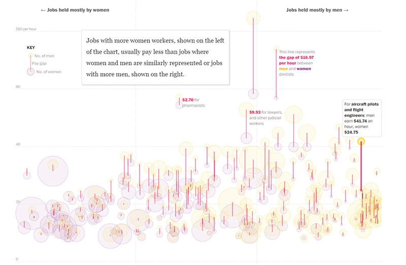
Pie Charts vs. Treemaps
View this post on Instagram
Pie charts. Mmm… pie. These are great when you want to break down a whole into yummy slices. Like, how much of your budget went into ads, events, or buying coffee for the office.
Treemaps, though? Imagine a crazy jigsaw puzzle. Perfect for when you’ve got a lot of pieces (data points) and want to see how they fit together in a big picture. They’re flashy, colorful, and give a clear snapshot.
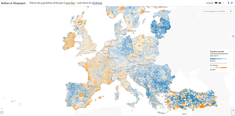
Geographic Heatmaps
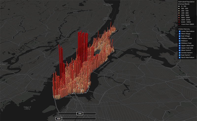
Ever wanted to play detective and spot where the action’s hot or not?
Geographic heatmaps are like thermal cameras for your data. Darker shades?
That’s where the party’s at. Lighter shades? Might need some extra love there.
Design Principles for Effective Visualization
Simplicity and Clarity
Think minimalist. Less is more. It’s like when you declutter your room and suddenly, everything feels zen.
Your visuals should be clean, easy to understand, and not look like a Jackson Pollock painting (unless that’s the vibe you’re going for).
Use of Color and Contrast
Colors are the spices of your data dish. Use them wisely. You wouldn’t dump a whole jar of chili flakes onto your pasta, right?
Similarly, use colors to highlight, differentiate, and make your data pop. Oh, and make sure they’re easy on the eyes. Neon green on electric blue? Ouch.
Interactivity and Dynamic Data Representation
Let your audience play! Interactive charts and graphs are like video games for data nerds. They let your audience dive in, explore, and get hands-on.
Think of it as turning your data into a theme park. Who wouldn’t want to ride?
Common Mistakes and How to Avoid Them
Not Testing on Different Devices
Imagine designing the most fabulous data visualization for marketers and then realizing it looks wonky on mobile. Major bummer.
Always test on different screens.
Too Much Info
Overloading your visuals is like trying to cram a year’s worth of groceries into a single cart. Things spill, it gets messy, and nobody knows where the cookies are.
Streamline your data, and keep it crisp.
Ignoring Your Audience
Your mom and a CEO might not vibe with the same kind of visuals. Know your audience. Tailor your graphics to who’s looking. Like dressing appropriately for an event.
Key Data Visualization Tools and Platforms for Marketers
Just like when you’re shopping for the right outfit, picking the best tool to visualize your marketing data is crucial. Let me break it down for you!
wpDataTables
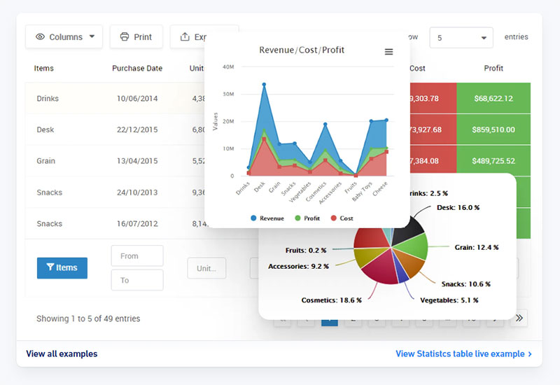
wpDataTables is a premium WordPress table plugin tailored for creating, managing, and editing dynamic and responsive tables and charts.
It’s not just a simple table generator; it’s a powerful tool that can even generate SQL queries and assist in building a CRM.
With over 70,000 companies and individuals placing their trust in wpDataTables, it’s obvious that the plugin is a top choice for handling various types of data, including financial, scientific, statistical, and commercial.
What sets wpDataTables apart?
- Versatility: Whether you’re looking to create a statistics table, a product catalog, a pricing table, or even a cryptocurrency table, wpDataTables has got you covered. It’s designed to simplify the process of data representation, making it quick and effective.
- Extendable Features: The core functionality of wpDataTables can be further enhanced with powerful addons. These addons introduce features like advanced filtering, master-detail tables, and integration with popular form builders.
- User-Friendly: Creating tables and charts is a breeze. Users can provide data through various means, including uploading files, pasting MySQL queries, or even manually inputting data. Once the table is set up, it can be fine-tuned for responsiveness, editability, and conditional formatting before being published on a post or page.
- Responsive Design: Tables created with wpDataTables are natively responsive, ensuring they look great and function seamlessly across all device types.
- Performance with Large Tables: The plugin is optimized to work swiftly with large tables, handling up to millions of rows efficiently with server-side processing.
- Advanced Features: From advanced filters and search capabilities to editable tables and conditional formatting, wpDataTables offers a plethora of advanced features. Plus, each table can serve as a data source for creating real-time updating charts.
Power BI
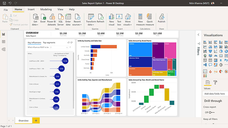
Now, think of Power BI as the transformer toy you had (or always wanted) as a kid. It starts simple but can morph into this ultra-powerful machine.
It’s owned by Microsoft, so yeah, it’s pretty robust. It’s perfect for those of you who want to level up and get deep into your marketing data visualization.
Google Data Studio
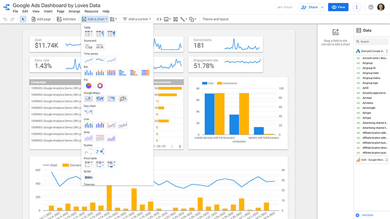
Ah, our ever-reliable friend from Google. Google Data Studio is like the handy toolbox you have at home.
It’s straightforward, integrates with all your Google tools, and you can’t really go wrong with it. For most marketing data visualization needs, this one’s a solid pick.
Tableau
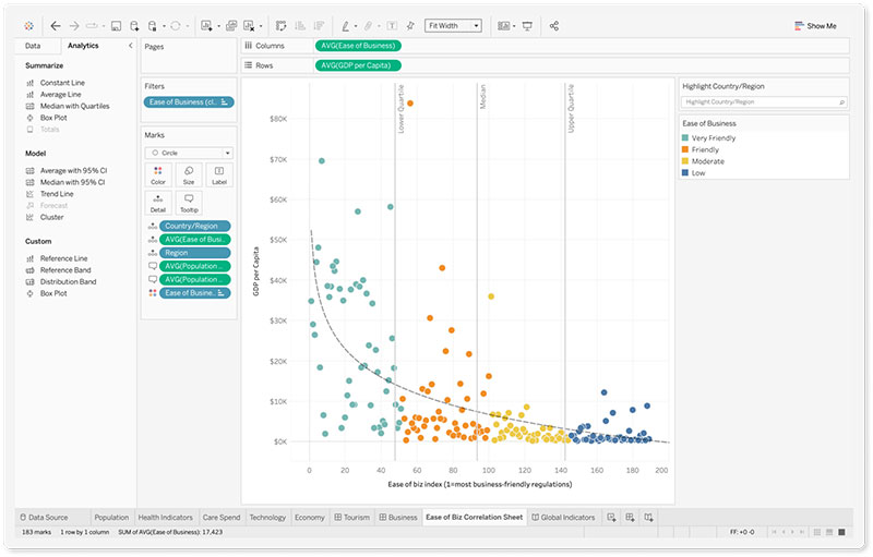
Tableau is the art kit of data visualization tools. It’s sophisticated, powerful, and lets you paint your data in all kinds of intricate ways.
If you’re the artsy type or want to create visuals that leave people going “Wow!”, this is the one for you.
Comparing Features and Use-Cases
So now that we’ve got our options, let’s compare, shall we?
Customization Capabilities
Customization in the world of data visualization for marketers is like being given a blank canvas. Some tools, like Tableau, hand you an entire palette of colors and brushes.
You can get super intricate, tailor-make your visuals, and really let your brand shine. On the other hand, Google Data Studio keeps it sweet and simple. Enough to let you personalize, but without overwhelming you.
Integration with Marketing Platforms
Power BI and Google Data Studio are champs here. They play well with others, integrating seamlessly with many marketing platforms.
wpDataTables is fantastic for WordPress users.
Cost and Scalability
Money talks. When we’re diving deep into data visualization for marketers, the budget can’t be ignored. Google Data Studio is generous – offering a lot for free.
Tableau and Power BI can get pricey, but they’re like those designer brands – you get what you pay for.
And as your business grows, you want a tool that grows with you, right? So always consider scalability. You might start small, but who knows where you’ll be in a year or two?
FAQ on Data Visualization for Marketers
Why is data visualization crucial for marketing?
Well, here’s the thing. Marketing is all about telling a story, right? And in our world of information overload, data visualization simplifies complex data.
It makes insights pop and helps marketers convey their message clearly. It’s like showing a movie instead of just narrating it. Way more engaging.
What tools should marketers use for data visualization?
Ah, the golden question! There are so many out there. But some fan-favorites are wpDataTables, Tableau, Power BI, and Google Data Studio. You’ll often see these mentioned alongside popular form builders, since both types of tools play a key role in collecting and presenting data effectively.
Each has its quirks, but it really boils down to your needs and budget. Dive in, experiment, and find what jives with your style.
How can I make my charts and graphs more engaging?
Ah, the art of the chart! Think about your audience first. Use colors strategically, opt for interactive charts when you can, and always keep it simple.
Too much clutter? A big no-no. You want folks to get your data at a glance.
What mistakes should I avoid in data visualization?
Oof! There’s a bunch. Top of my mind? Avoid using too many colors, ensure data accuracy (can’t stress this enough!), and don’t overcrowd your visuals.
Remember, the aim is clarity. If your grandma can’t understand it, you might wanna take a second look.
How do I choose the right type of chart or graph?
Hey, it’s a bit like matching your shoes to your outfit. Line charts are perfect for trends, pie charts for proportions, and bar graphs for comparisons.
Think about the story you’re trying to tell, then pick the chart that tells it best.
Can I integrate real-time data into my visuals?
Absolutely! And it’s super snazzy. Tools like Tableau and Power BI support real-time data integration. It keeps your visuals fresh and timely.
Especially great if you’re presenting stuff that changes often. Keep your audience on their toes!
How does color theory apply to data visualization?
Color theory? Oh, it’s major! Colors evoke emotions. For instance, red might mean danger or urgency. Use colors to highlight, contrast, or group data.
But, a word of caution: be consistent and keep your palette limited. You don’t want a rainbow explosion, trust me.
How can data visualization improve ROI in marketing campaigns?
Good question! By visualizing data, you pinpoint what’s working and what’s not. Maybe a channel is outperforming others, or a campaign’s not pulling its weight.
Visuals help marketers tweak strategies on-the-fly, optimizing spend and boosting ROI. It’s all about that visual feedback loop.
What’s the role of interactivity in data visualization?
Interactivity is like that sprinkle of magic. It lets your audience play around, explore, and dive deeper into the data.
Instead of static visuals, you give them a dynamic experience. It’s like turning a museum visit into a hands-on workshop. Fun and enlightening!
How can I ensure my data visualizations are accessible to all?
Inclusivity for the win! Use high-contrast colors, ensure text is readable, and avoid color combinations problematic for color-blind folks. Many tools offer accessibility features. Utilize them. Everyone should be able to dive into your data stories, no exceptions.
Conclusion on Data Visualization for Marketers
Visualizing data? It’s like turning number-jumble into a storybook. We’ve got tools like Tableau and wpDataTables, each adding its own sparkle.
Today’s world’s swamped with data. Visuals? They’re your lifeboat. They grab attention and spill the tea on what’s happening behind the scenes.
So, marketers, if your data’s still in snooze-mode, jazz it up.
If you liked this article about data visualization for marketers, you should check out this article about data visualization blogs.
There are also similar articles discussing scientific data visualization, data visualization challenges, data storytelling examples, and data journalism examples.
And let’s not forget about articles on big data visualization, visualizing large data sets, financial data visualization tools, and data visualization trends.


