
Picture this: a symphony of pixels dancing across the screen, each movement revealing a story within your data. Interactive data visualization is not just a buzzword; it’s a revelation. In a world brimming with information, these visual symphonies guide us through complex narratives, transforming raw numbers into relatable tales.
Here we delve into a treasure trove of compelling, interactive data visualization examples. Unearth how dashboards become decision-making sanctuaries, and static charts evolve into dynamic explorations. A map isn’t just a map anymore—it’s an invitation to voyage through trends and patterns.
Expect enlightenment—a journey through interactive graphs that pulsate with life, driven by the heartbeat of real-time analytics. Data storytelling takes center stage, revealing the potency of well-crafted, user-oriented visual narratives.
Stay tuned as we unfold layers of visual communication, translating quantitative whispers into qualitative roars. Engage with the visuals; let the data respond to your touch. By the article’s end, you’ll not only appreciate the eclectic beauty of these examples but grasp their strategic brilliance in presenting data that talks back.
Table of Contents
Interactive Data Visualization Websites That Will Inspire You
The Colors of Motion

This website brings an astonishing data visualization option. It allows users to explore the use of colors within movie posters. In other words, the website breaks down every frame into a color. Then, it stacks all the colors together, forming mesmerizing charts that represent posters from iconic movies. Some of the posters you’ll find are, “A Beautiful Mind,” and “Blade Runner 2049.”
After Babylon
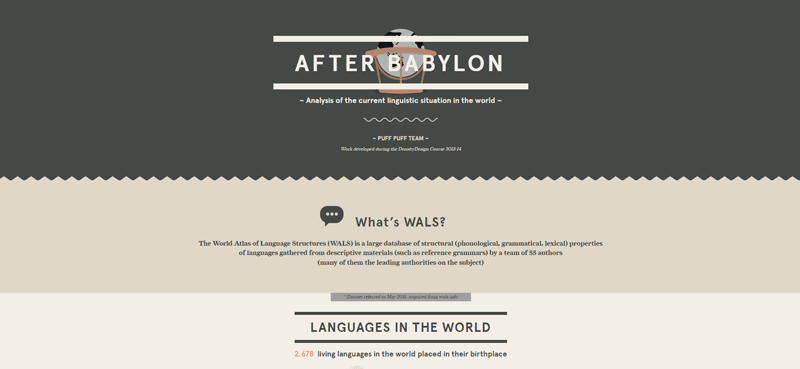
Studying language proliferation is quite challenging. With the number of tongues spoken these days, data analytics are hard to process. For example, one may find it difficult to analyze the language families, the number of people that speak it, their prevalence across the world, and how they influence one another.
This project brings an excellent solution to data visualization thanks to the World Atlas of Language Structures. Thus, the 2,678 languages in the world are displayed on an interactive map.
Users will be able to understand insights like exchanged words, relationships between languages, families, loanwords, etc.
Streamgraph of Immigration to the US
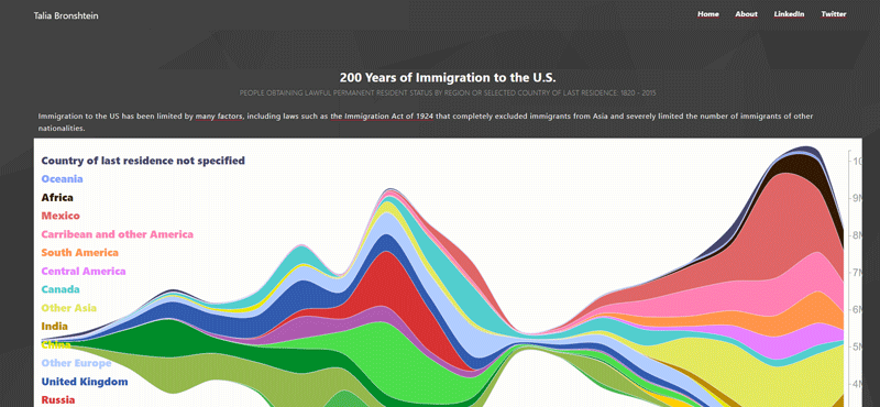
The history of U.S. immigration is very interesting, and this visualization tool displays it beautifully.
Journalist Talia Bronshtein created this streamgraph showing the arrival of immigrants to the U.S. from 1820 to 2015. Thanks to the stunning visualizations, the information jumps right at you. You’ll learn that during World War II, immigration to the US was practically zero. It also became evident that, before the war, people came mostly from Austria, Hungary, Italy and Russia. However, towards the late 2000s, most of the immigrants came from South America and Asia.
Pinellas County’s Public School Inequalities for Black Pupils
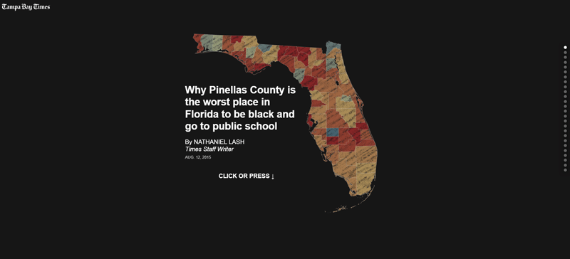
If you want to see a good visual representation of dynamic charts, take a look at this example. The results show a direct relationship between increasing segregation and decreasing performance of students in Pinellas County, Florida.
They also indicate that five out of 150 elementary schools in the county have exceptionally low performance. Thanks to the graphs, it becomes clear that these schools are located in areas with the highest levels of segregation. Interactive data visualizations like this help local authorities make the best choices to tackle the issue.
The investigation was conducted by the Tampa Bay Times based on information collected by the Florida Department of Education.
The Evolution of Trust
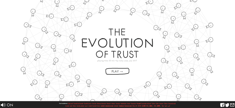
Unique concepts and original ideas are always the best way to approach data visualization. In “The Evolution of Trust,” for example, Nicky Case makes a point by inviting us to play a little game.
In only 30 minutes, visitors corroborate that cheaters may win in the short term, but eventually end up losing. Being fun and educational, this game is worth your time.
Your beautiful data deserves to be online
wpDataTables can make it that way. There’s a good reason why it’s the #1 WordPress plugin for creating responsive tables and charts.

And it’s really easy to do something like this:
- You provide the table data
- Configure and customize it
- Publish it in a post or page
And it’s not just pretty, but also practical. You can make large tables with up to millions of rows, or you can use advanced filters and search, or you can go wild and make it editable.
“Yeah, but I just like Excel too much and there’s nothing like that on websites”. Yeah, there is. You can use conditional formatting like in Excel or Google Sheets.
Did I tell you you can create charts too with your data? And that’s only a small part. There are lots of other features for you.
Gender Pay Gap—U.S.
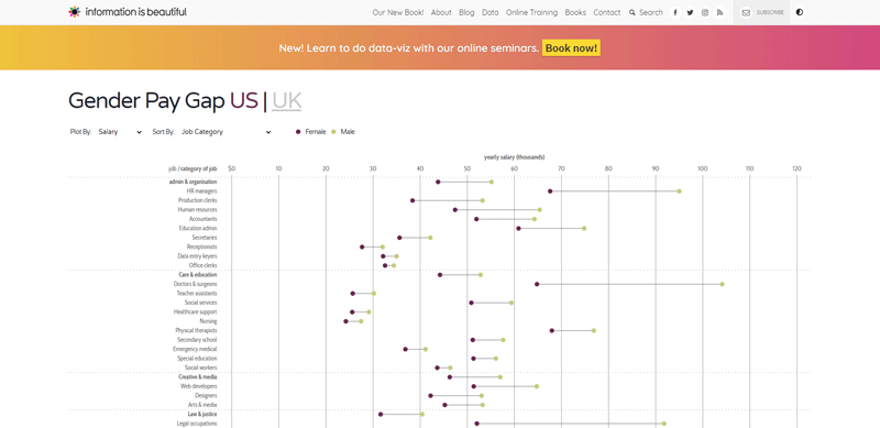
Our list of interactive data visualizations cannot overlook this topic. With information from the U.S. Bureau of Labor Statistics, David McCandless and his team present this chart.
The visualization is as beautiful as it is accurate, presenting information from various sources, including areas like sales, media, education, law, science, manual labor, and data engineering.
McCandless’s website displays this information in simple visualizations. Thus, he shows the difference between professions and the pay gap between genders.
Fossil Fuels
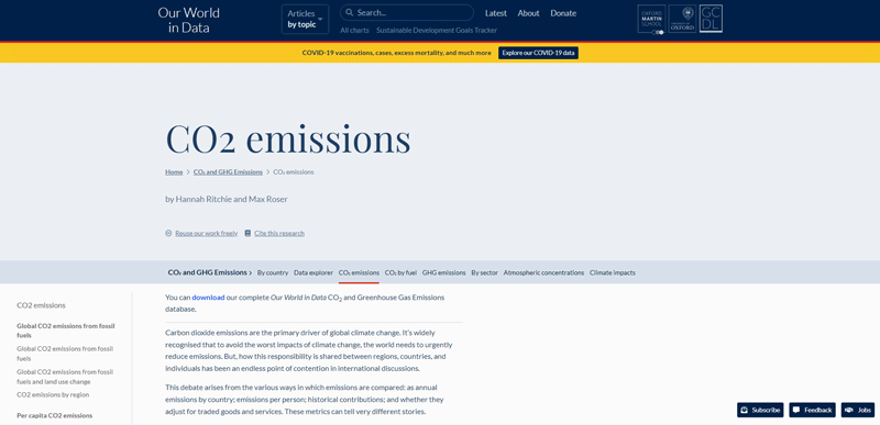
Now we’ve reached a point in which data shows more concerning results. These data visualizations represent complex data stories about the most pressing environmental issues. In this case, data visualization tools are used to show the increased curve of carbon dioxide in the atmosphere.
It’s not only bad enough that CO2 is causing climate change, but the trends show that it will keep increasing. The information speaks for itself, bringing valuable insights. For example, we can notice a slight but steady increase since the Industrial Revolution and a more abrupt curve towards 2100.
Largest Vocabulary in Hip Hop
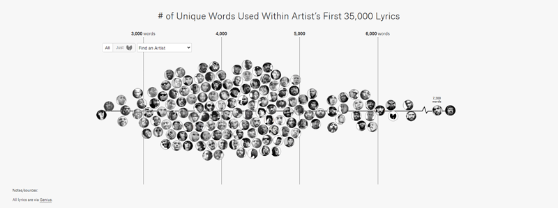
Interactive data visualization not only helps visual learners, but can also tell a story. Some examples on this list bring useful insights into various areas of knowledge. On the other hand, others are meant to be just for fun.
It all started when Matt Daniels stated that literary circles love to quote Shakespeare,, even though he uses only 28,829 words. Then, he suggested that he knew more than 100,000 words.
Thus, Daniels and his detail-oriented team managed to create interactive data visualizations representing the U.S. with the country being formed by the faces of hip hop musicians. In other words, the interactive data compares the number of words in different hip hop artists. For a fair comparison, the team only considered the first 35,000 lyrics. Artists like Jay-Z can be compared to less prolific artists like Drake.
Check out “The Largest Vocabulary in Hip Hop” to see a true data storytelling model.
How State Populations Have Shifted
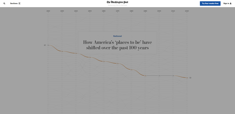
This graph shows the population of each state since 1920. Users can isolate individual states to see how their population changes, increasing or decreasing over time.
Cell Towers Map of the World
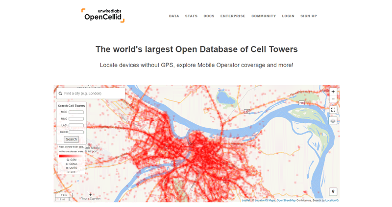
“The World’s Largest Open Database of Cell Towers” is one of the best interactive data visualization examples on this list. With an elegant style, the graphs show 40 million cell towers around the world.
The user experience couldn’t be better as they can see how the tower lights up around major metropolitan areas. Also, the interactive map shows vast areas of digital “wilderness.” In the northern regions of Russia and Canada, we can see a lower density due to the harsh climate. The same happens with cell towers in Central Africa and Mongolia.
The map is based on OpenCelliD, which is the largest cell tower database.
Virus Explorer

As its name suggests, this website presents interactive visualizations of viruses. Thus, users study and examine the specimens through 3D models. The possibility to view them in different sizes is a great plus.
These features are ideal to understand insights such as genome type, virus structure, available vaccines, etc.
Steer through the Suez Canal
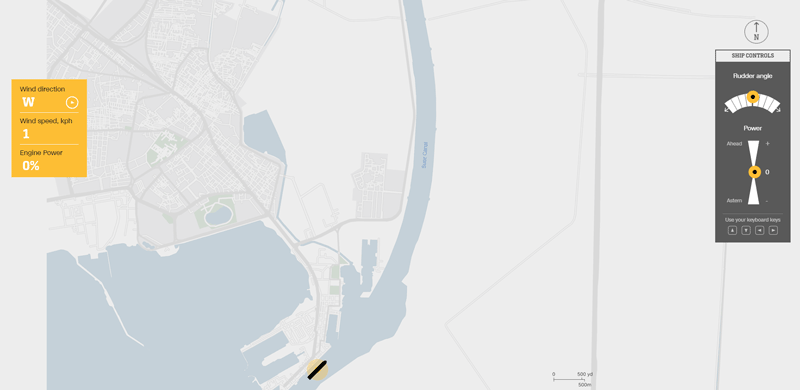
In 2021, maritime traffic stopped as a cargo ship became stuck on one of the world’s most important water passages. We’re talking about the Suez Canal. If you thought that you could have done it better, here is an interactive data visualization by CNN that allows you to try it for yourself.
NYPL’s Public Domain Library
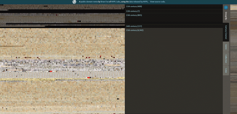
The NYPL has created a digital library that is by far one of the best data visualizations. Their data-oriented app is extremely interesting, as it includes letters by historical figures, vintage photos, and many other items dating back to the 11th century.
Explore the seventh map of Europe along with other wonders. The best part is that the app allows you to sort by collection, genre, color and century.
Satellites Orbiting Earth
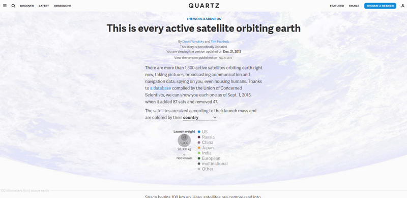
Explore this interactive data visualization based on data collected by the Union of Concerned Scientists. Created by Tim Fernholz and David Yanofsky, this graph displays a visualization of the 1,300 satellites orbiting the Earth. Find a variety of data like path, region, weight, and which satellites provide GPS or internet services.
Interactive Real-Time Map of Berlin Traffic
Many cities would love a graph like this one. Users can explore the location of buses, trains, trams, and ferries. Through advanced filters, they can narrow their search to a specific street. Thus, you’ll get a clear picture of the traffic situation, including lines, stops, stations and communication means. By zooming in, people can see services like parking lots, taxis and car/bike sharing.
Keep in mind that if you look at the map overall, you’ll just see what looks like hundreds of ants frantically moving around. These types of tools become useful when you zoom in on a specific location.
All in all, this is an excellent example of a useful interactive visualization.
How Billboard’s Top Hits Changed

Here’s a great visualization tool for music fans. The software enables users to see the top Billboard songs every week, spanning 60 years (from 1960 to 2019). Users have the ability to explore the music hits throughout history while they listen to the music.
COVID-19 Vaccination Tracker
![]()
![]()
Check out this COVID-19 vaccination tracker, which covers different countries and all U.S. states. The data shows people who have at least one dose of the vaccine. It’s one of the best tools to track progress in the fight against the coronavirus with simple visualizations.
The data was sourced from a project at Oxford University called “Our World in Data.” Users can see the seven-day vaccination average and sort out the percentage of the vaccinated population.
The Demographics of Others
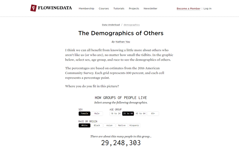
Based on the American Community Survey from 2016, these graphs explore demographics in the United States. Nathan Yau is in charge of this project. He stated that this complex data story teaches us about our differences and similarities with others.
Through various filters (ethnicity, age and sex) you can see the demographic data visualizations changing. You’ll probably find the “Demographic of Others” to be simple, but it helps to conduct intuitive data analytics. The extra animation when you toggle between the filters is a nice touch.
Selfiecity – The Science of Selfies
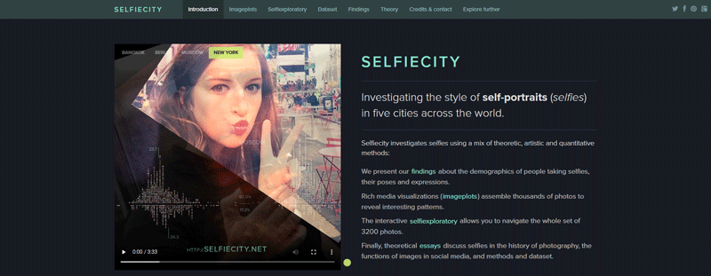
Here’s another interesting study that goes straight to our century’s roots. By analyzing selfies from Moscow, Berlin, Bangkok, New York and São Paulo, the project managed to create interactive data visualizations.
If you ever wonder who takes more selfies (men or women) and what people do when taking them (tilt their heads, crop the picture, smile), visit these graphs. Any data enthusiast will be happy to learn these interesting facts.
Results are displayed with cool visualization features showing interactive data. There’s also the ability to apply filters and delve deeper into the data.
What’s Really Warming the World?
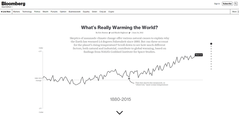
Employing dynamic charts is a great idea to tell complex data stories. In this case, environmentalists have an excellent data visualization model.
Created by Bloomberg Business, this chart is for every person who is concerned about global warming. You’ll find more than the main factors that contribute to rising temperatures; readers can find the answer to what factors are causing global warming.
Skyscraper Page
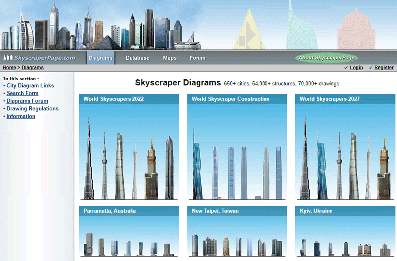
Visit the Skyscraper Page to see a comparison of every skyscraper in the world. Moreover, the information is quite easy to grasp. The website is based on a database that holds tens of thousands of buildings you can compare by placing them side by side.
Use categories such as cities or countries to compare different buildings. If you are eager to learn, you’ll be pleased to find all sorts of information, including the building date, height and other interesting details.
How Music Taste Evolved
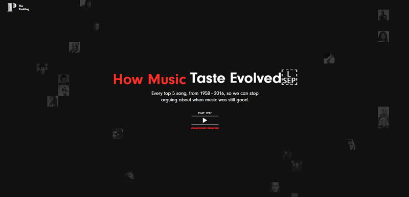
Although this may not be the most useful interactive data visualization, it’s surely interesting. Have you ever heard that music was better in “the old days?” Now you have a chance to prove it for yourself.
“How Music Taste Evolved” enables users to glance at the past. They’ll find the tunes that reached Number 1 on the Billboard Hot 100 from 1958 to 2015. The interaction is very engaging because the graphs move as you click through the years and experience the changes in people’s musical taste.
With this chart, we have a clear example of convincing data storytelling.
Gravitational Waves
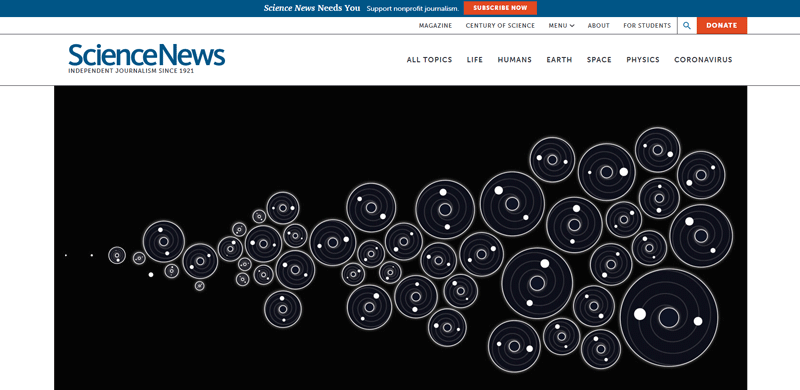
Astronomers will love this project based on interactive visualizations of gravitational waves. “Gravitational Waves” has been created for Science News and boasts an informative and minimalistic design.
Users will find all sorts of information, such as the mass and size of mergers. All this is supported by tasteful animations that convey a clear message while sharing useful data.
Worldshapin
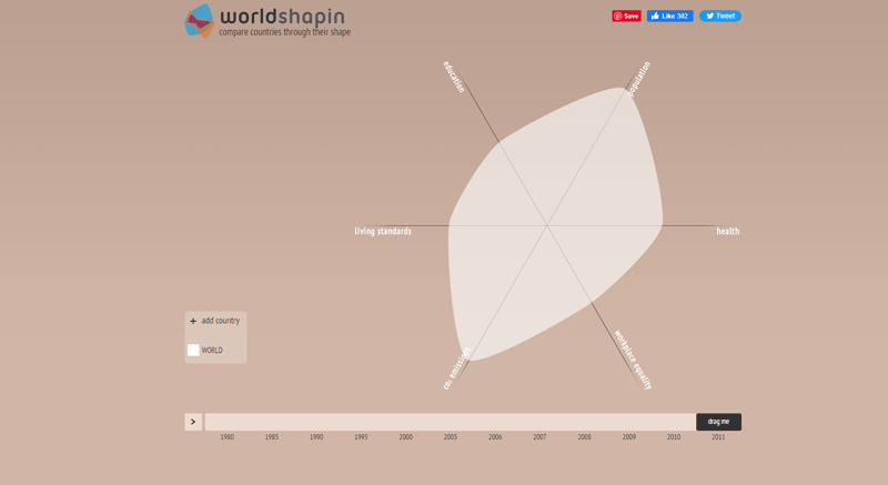
Worldshapin stands out for its uniqueness. Its dashboard visualizations show development factors from various countries and compare them in a very interesting way.
You can drag your cursor across a timeline and thus manipulate the colored shapes. These represent the changes that happened in a region over time. The chart is easy to read, and its interactive data visualizations are highly informative.
NYC Street Trees
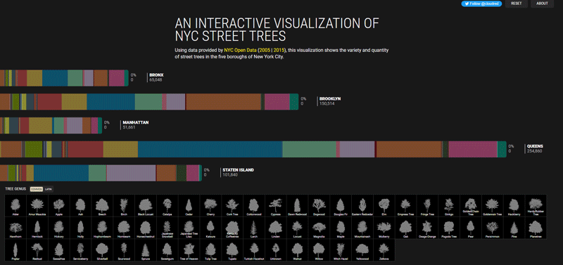
Based on information from NYC Open Data, NYC Street Trees shows the wide variety of trees that you can find in the Big Apple. There are over 67 genii of trees across the five boroughs (Manhattan, Queens, Staten Island, Brooklyn and the Bronx).
Every Upcoming Solar Eclipse (until 2080)
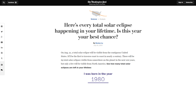
Solar eclipses are a wonderful event both for professional astronomers and for amateurs. The solar eclipse that took place in 2017, for example, was the first one to travel from coast to coast across the U.S. in almost a century.
After this event, the Washington Post built an interactive visualization globe showing paths of future eclipses with the exception of the year 2028.
Check it out and find a stunning visual representation in the form of a globe. The globe spins, showing future paths of total eclipses. Click on the globe to see the information in more detail, for example, when and where eclipses will occur. The paths are marked in different shades of purple, with the darker ones happening sooner.
An interesting feature is the ability to enter your year of birth and see how many eclipses you’ll be able to see in your lifetime.
PBDB Navigator
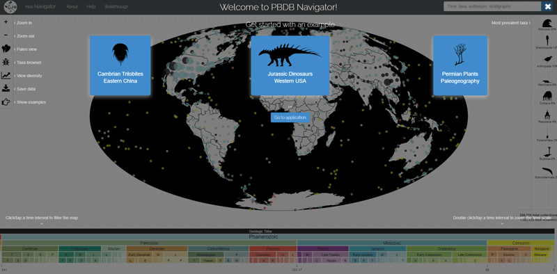
Among the many learning tools on this list, this is one of the best. Perfect for paleobiology students, PBDB Navigator shares valuable insights.
As you browse through the timeline, you’ll see how the world was at a particular age, such as the Jurassic Period or the Cenozoic Era. Thus, you’ll see the types of organisms living at the time, their percentage and their zones.
The Big Mac Index
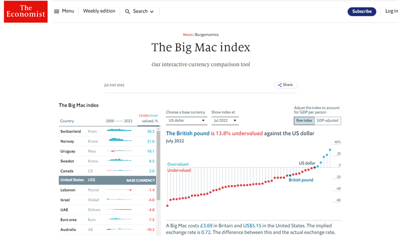
The Economist popularized what is known as “The Big Mac index.” Here, they compare the prices of this meal across different jurisdictions. But why would The Economist choose this particular product?
This McDonald’s special represents several factors that are worth considering. This includes input costs from various economic sectors (labor, agricultural commodities, rent, real estate costs and advertising). According to this, the Big Mac is a standardized product from which you can measure a country’s economy.
When you log in to the Big Mac Index you’ll see a visualization feature that shows if the currencies are at the “right” level. Experts analyze this according to the “purchasing power parity theory,” which states that exchange rates should move to balance an identical basket of food and services in the long run. In this case, The Economist takes the Big Mac as a solid indicator.
Non-fiction Books Everyone Should Read
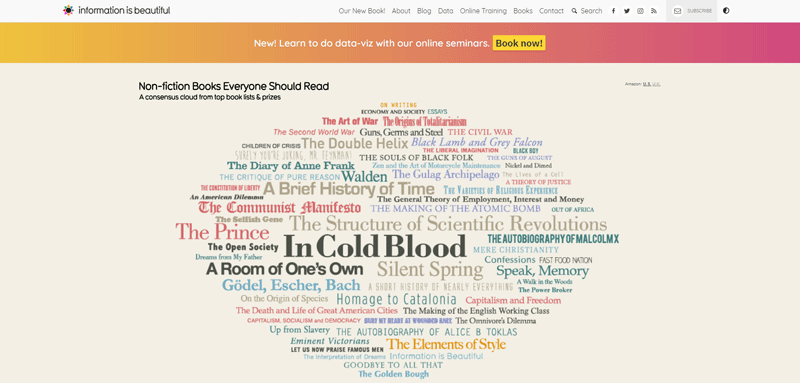
Last but not least, we have the visualization that every avid reader will love. The chart is based on data from review sites, awards and public opinions.
Information is displayed in a cloud-like shape representing different book titles with various colors and fonts. When users click on a link, it leads them to the Amazon page where they can purchase the book.
Check out the genres below and choose your favorite one, from social, science, biography, history and philosophy, to guidebooks and politics. Thus, you’ll see the books standing out from others.
FAQ on Interactive Data Visualization
What’s the big hook with interactive data visualization?
It’s all about engagement. Imagine diving into the ocean of data and interacting with it like a dolphin with the currents. Interactive visualizations make dry numbers a raucous tale, turning passive viewers into active participants. It’s not just looking; it’s discovering.
How do interactive visualizations improve decision-making?
They’re a game-changer. Interactive tools, like dashboards, light up patterns and trends in the blink of an eye. This isn’t just about pretty graphs; it’s about slicing through the noise for razor-sharp insights that drive smarter, swifter decisions.
Is there a steep learning curve to creating these visuals?
Honestly, it varies. Some tools come user-friendly, akin to a warm handshake, while others are more like a tough climb. But that’s where the juice is—conquering the challenge to craft visual stories that resonate.
Can interactive data visualization handle big data?
Big time. This is the playground where big data kicks the ball. We’re talking robust platforms like Tableau and D3.js that not only handle hefty datasets but also make them do the salsa.
Are these visualizations mobile-friendly?
You bet. Developers don’t just slap on the ‘interactive’ tag for a desktop gig. They’re sharpening their CSS swords and wielding the Canvas API like a pro, ensuring that your data looks crisp on every device.
What sectors benefit most from interactive visualization?
It’s a wide cast. From high-flying finance to pulsating public health, nifty non-profits to eminent education sectors, interactive data visualization is the universal translator making sense of the data babel.
Can I share interactive data visualizations easily?
Sharing is in their DNA. Whether it’s embedding them on a website with HTML5 or firing off a tweet, these visuals are designed to travel across the digital landscape at lightning speed.
How do they improve user experience?
It’s like a magic potion. With user-centric data design and thoughtful UX, these visualizations invite audiences to an immersive experience. They get to drive, navigating through data lanes like a pro, discovering insights on demand.
What role does AI play in interactive data visualization?
AI (Artificial intelligence) is the invisible conductor. Think predictive analytics and machine learning, all stirring the pot behind the scenes to tailor visualizations that not only react but predict—now we’re talking next-level interaction.
Can I use open data with these tools?
Open data, open arms. Interactive data visualization champions open-data platforms, turning public datasets into public knowledge. Now, that’s democratic design at its finest.
Conclusion
And there you have it, the curtain drops on our visual virtuoso, the showcase of interactive data visualization examples you’ve just feasted your eyes upon. Let them linger in your mind. They’re more than just eye candy; these examples are power tools, transforming the abstract data landscape into tangible insights.
- Visual storytelling illuminated
- Dashboards that turned data whispers into shouts
- Charts and graphs that practically conversed with you
Each example a beacon, guiding us through the oft-murky waters of statistical analysis and big data. Let’s face it, grappling with numbers can be daunting. But these dynamic marvels? They bridge gaps—a translator for the data, a handshake between number crunchers and decision-makers.
Remember, each pixel, each line—heck, each hover effect—serves a purpose: to illuminate the path from data points to strategic points. Carry these insights with steadfast confidence as you venture forth into your own data-driven odysseys.
If you liked this article about interactive data visualizations, you should check out this article about open-source data visualization.
There are also similar articles discussing data visualization javascript libraries, WordPress data visualization, misleading data visualization examples, and data visualization tools.
And let’s not forget about articles on data visualization color palettes, data visualization best practices, data visualization examples, and weather data visualization.


