Picture this: a graph so skewed, it might as well be a funhouse mirror reflection of the truth. We’ve all seen them — those pesky charts and graphs that snag our eyes yet lead our minds astray. Misleading data visualization examples aren’t just minor slip-ups; they’re critical errors that can shape opinions, policies, even economies, under false pretenses.
As a web designer, I’ve witnessed firsthand how an innocent bar chart could whisper sweet lies of distorted graphs and deceptive statistics. It starts subtle — a snip off the y-axis here, a convenient omission of outliers there. Suddenly, we’re neck-deep in visual fallacies, knee-jerk conclusions clutched in our fists.
But here’s the deal: by the end of this revelation, you’ll navigate these treacherous waters like a seasoned skipper. From dissecting dubious bar charts to unveiling the cunning of selective data reporting, you’ll emerge with a staunch toolkit to discern and design with integrity.
Dive into an exposé of visual deceit, where you unravel the craft, peel back the curtain on manipulation tactics, and champion the crusade for graphical integrity.
Table of Contents
Scale Truncation
Bar charts are some of the most popular data visualization examples. It gives a quick idea of relative size by comparing bar heights. They are easy to make and everybody understands them.
The bar chart in this example compares the net revenue that Coca-Cola had over the past years. The vertical scale runs from 0 to 48 bln. That is logical and correct. The Y-axis in the next example starts at 28bln which makes the following years’ revenue growth look like it ballooned to the stratosphere.
Chart created with wpDataTables
Cutting off part of the vertical axis emphasizes differences in the size of the different bars. Some use this trick to fool people into assuming that differences in data are bigger than they are. Keep in mind that each and every misrepresentation of data can lead to poor marketing decisions, which is why this practice should be avoided at all costs.
Chart created with wpDataTables
Here is another example. It compares Apple’s revenue per region between 2017 and 2018. At first glance, it seems that Apple performed much better in Japan than in Europe.
Is that true, or is this an example of poor data visualization? If you look closer, you will notice the truncation of the Y-axis. This results in a misrepresentation of the data.
This is how it should actually look like:
Chart created with wpDataTables
Manipulation of the Y-Axis
Further manipulation of the y-axis leads to more data visualization mistakes. You can show the entire vertical axis and still change it in such a way that it loses all meaning. One way is by changing the scale so that it overemphasizes the data differences.
This axis changing is a very common example of bad data visualization. Social media is full of this misrepresentation. It pushes false narratives.
For example, someone may represent small temperature changes in a graph. To make the curve as insignificant as possible, they use a vertical scale ranging from -10 °C to 100 °C. That is a common trick to deny the effects of global warming.
Small changes can have large effects and change the story behind a data set. Look at these examples. A credit score of 634 out of 700
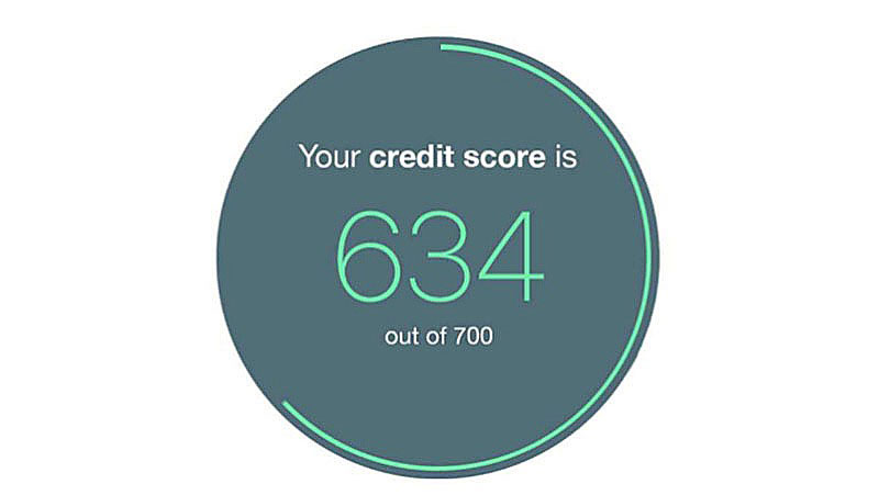
does not look the same as a credit score of 634 out of 850.

Hiding Relevant Data
Lying about data is a bad thing. But it is as bad as leaving out data points because they don’t suit your purpose.
Leaving out some data focuses the attention of the audience on a specific part of positive information. That goes at the cost of accuracy and understanding the complete story. Every data point has a story to tell and can convey important information. Yet, each data point can be misleading when there is no relevant context.
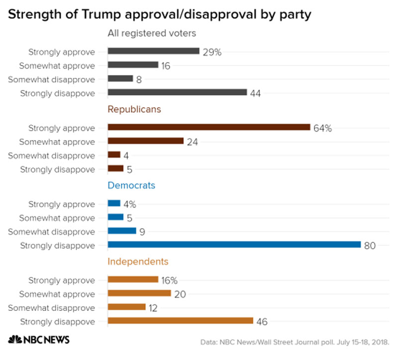
Analyze this next example on the list of misleading data visualization examples. In 2018, the Pew Research Center published a survey on social media use.
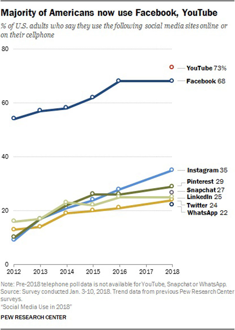
A bad example of data visualization would overemphasize the fact that 68% of Americans use Facebook.
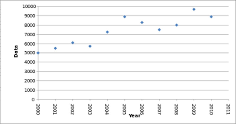
This example shows how someone could leave out data points to give a different impression of the growth progression. You see a smoother growth if you show the data points for every second year
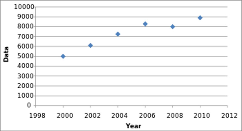
instead of every year. But that is not what reality looks like.
Companies use this misleading data visualization by omitting big outliers in sales or profit. It makes it look like the company is more stable and predictable than it is. It masks the true capriciousness of the market. When you make data visualizations, make sure to give access to all the information.
Your beautiful data deserves to be online
wpDataTables can make it that way. There’s a good reason why it’s the #1 WordPress plugin for creating responsive tables and charts.

And it’s really easy to do something like this:
- You provide the table data
- Configure and customize it
- Publish it in a post or page
And it’s not just pretty, but also practical. You can make large tables with up to millions of rows, or you can use advanced filters and search, or you can go wild and make it editable.
“Yeah, but I just like Excel too much and there’s nothing like that on websites”. Yeah, there is. You can use conditional formatting like in Excel or Google Sheets.
Did I tell you you can create charts too with your data? And that’s only a small part. There are lots of other features for you.
Correlation and Causation
Showing correlations between data is a good way of helping the audience to understand the topic better. You can do this by making overlays of datasets in one graph. The combination of the oral and visual explanation can help viewers to make certain important connections. A warning is in place as well. Too many overlays obscure information rather than highlight connections.
Chart created with wpDataTables
When used in the wrong way, overlays can imply causations that are not there. Here is a well-known example. It suggests a relation between ice cream consumption and violent crime. In reality, they are both the result of warm weather.
Causation is not the same as a correlation in data. Now that data sets are becoming bigger and bigger, correlation is much more emphasized. It is easier to detect a correlation rather than establish a true causality between two phenomena.
There is an important reason why causation does not equate to correlation. Comparing two variables can obscure the presence of a third confounding variable.
An unknown third variable can affect two other variables. It may give the suggestion of the presence of a causal relationship between the two. No one may realize the presence of that third variable and it is impossible to establish causation.
Cherry Picking
Cherry picking is one of the many misleading data visualization examples known. This data visualization form omits certain sources or pieces of information.
The purpose is to show a cleaner or more predictable set of results and extract a nonexistent trend or pattern. It is dishonest and not objective. The results become inaccurate and incomplete and do not convey actual knowledge.
Cherry picking is a form of bad data visualization often seen in the pharmaceutical industry. Careful review can show it in the presentation of clinical trial results. An example would be antidepressants. It becomes clear by comparing the data with the results of government-funded investigations of the same drug.
The example above shows how dangerous data cherry-picking can be. A clinical trial can reveal certain subtle complexities. These are only extractable by considering unadulterated data.
Unclear Logarithmic Scaling
The value between two points on a linear axis is always the same. In the case of a logarithmic scale. the value between two points differs according to a certain pattern. That is the easiest way to see the difference between a linear and a logarithmic scale.
That doesn’t mean that a logarithmic representation is a form of misleading data visualization. It can be a very effective way of extracting an important relationship in the data set. Of course, it is important to show that the graph uses a logarithmic scale. If that is not the case, it can lead to the loss of data significance.
The two graphs below show two ways of presenting the same data. One uses a linear scale,
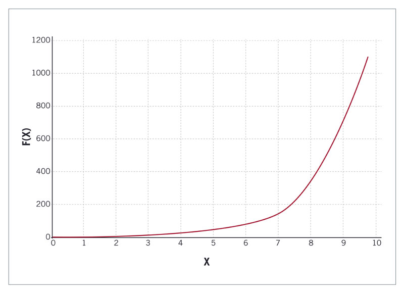
whereas the other uses a logarithmic scale. Both representations are, in essence, correct, but they look different.
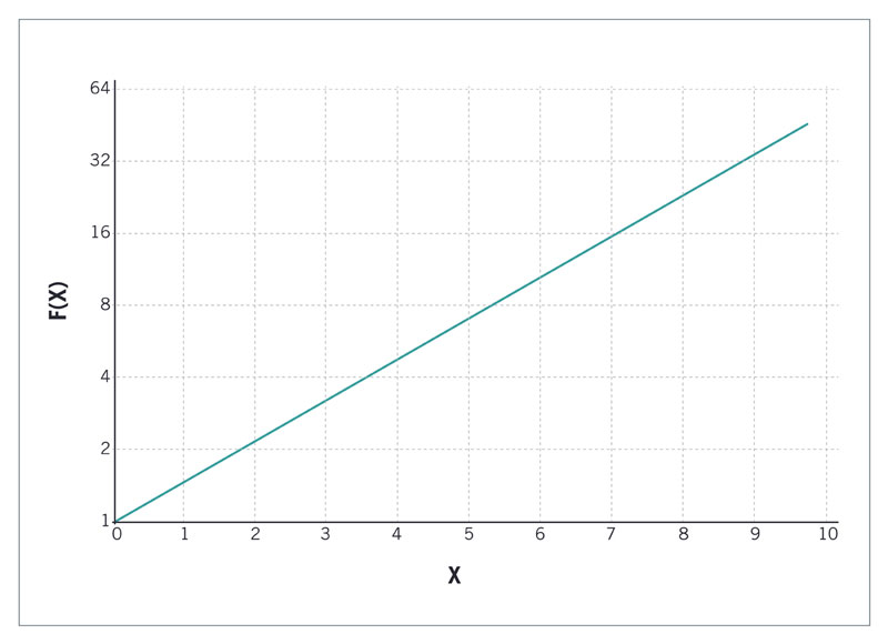
The lesson is that you can use a logarithmic scale, but somehow you need to make that clear to the viewer.
Unconventional Visualization
Data visualization elements have an effect on human psychology. Colors, fonts, and icons all have a certain deeper connotation. They influence the way the viewer perceives the information. Ignoring or abusing these facts are misleading data visualization examples.
The importance of data visualization should not be underestimated. When the brain takes in new information, it takes time to analyze the meaning of certain design elements.
Being creative is good and can add meaning to data visualization. But don’t distract the audience with unusual applications of usual visual associations as in this example

or this one on gun deaths.
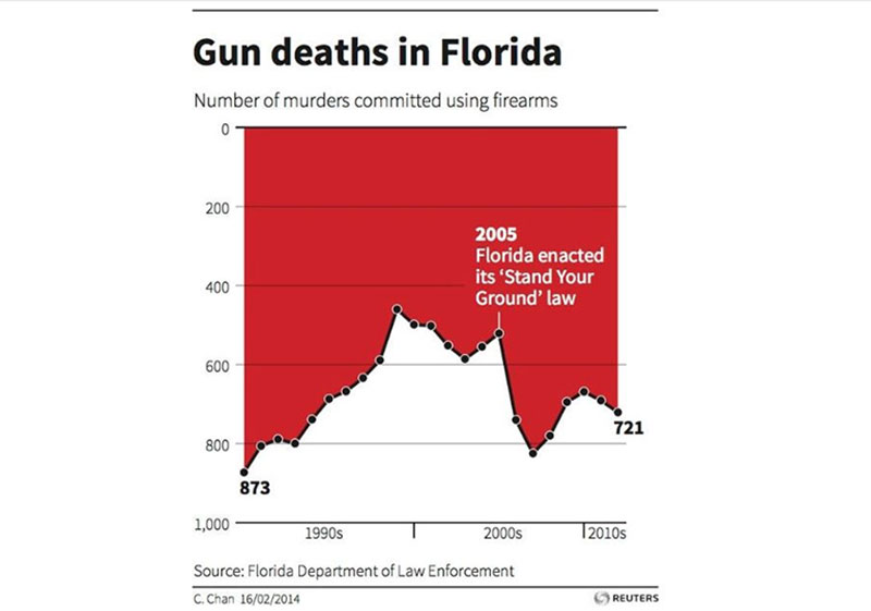
The second example is one of the worst examples because it is obvious what the maker is trying to say below the surface. It is an unconventional upside down representation. It gives the impression that gun deaths are on the decline in Florida when the opposite is true.
Here is another example. It shows a map of the United States with the virus infection rates per state.
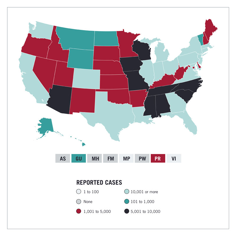
It shows the rate with different colors. In similar maps, different shades of the same color show the concentration. The darker the color, the higher the infection rate. This map does not follow this convention. The result is very confusing and may be misleading.
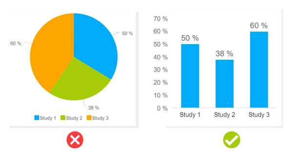
Misleading Pie Charts
One of the most common, when it comes to misleading data visualization examples, is the pie charts. By definition, a complete pie chart always represents a total of 100%. This becomes confusing or misleading when it comes to using pie charts for showing the results of surveys with more than one answer.
The example in this chart is correct.
Chart created with wpDataTables
The percentages in the pie chart add up to 100%. Now imagine a survey where one of the questions allows the candidates more than one answer. For example, “Where would you move to for a better economic situation?” Some might give two answers, for example, Australia and Europe. Then a pie chart doesn’t work anymore.
If someone would use this chart type, the information becomes distorted and inaccurate. A Venn diagram would be a better choice in this case.
Cumulative vs. Annual Data
A cumulative representation adds successive inputs. In that case, the graph goes up with each data point.
Annual data will show the absolute data results for a specific year. The graph can go up and down. In some cases, this might be a more honest representation of the results.
The Worldometer COVID-19 graph serves to illustrate this point.
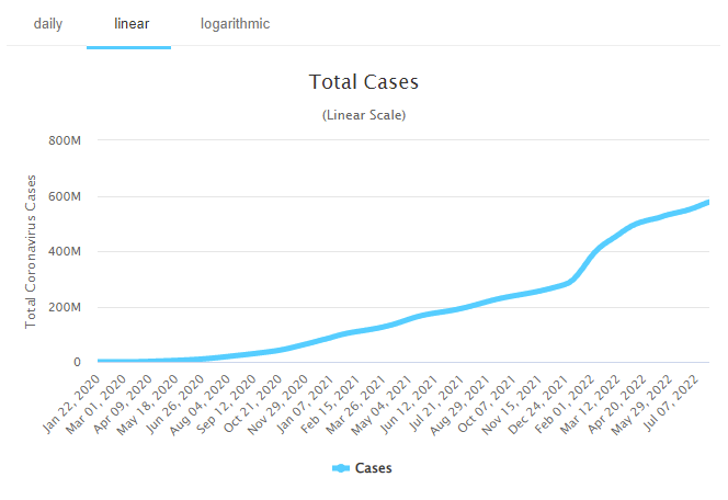
And indeed, cumulative graphs were very popular during the pandemic period.
Also, many companies use cumulative graphs to show off their results. It makes sales results appear better than they are but don’t let them fool you.
In 2013, Apple’s CEO, Tim Cook, received much criticism because he used a cumulative data visualization to show iPad sales. Many people felt that Apple tried to cover up the decreasing sales of their products.
There is nothing wrong with showing cumulative data representations if you do it in the right way. It does highlight, for example, changes in growth. Before using it, think about what you want to show and what impression you want to give.
Too Many Variables
You need to make big decisions when you make a design for a visual data representation. What do you include and what do you exclude? You want to be honest, but the presentation must be clear as well. The more data you have and the more interesting the details, the harder the decisions.
This is an example of how not to do it.

The graph contains too much information and the lines make it hard to distinguish any data point. You may even wonder if the designer tried to obscure some data. If that was the aim, they may have well succeeded. At any rate, the result is useless.
A closer inspection showed that the graph represented the number and range of exam students over a long period. The point was that universities admitted more students from minority groups and lower incomes. Inspection showed that within these groups the average scores increased.
When you start working on your data visualizations, first think of what you want to show and what data you need to achieve that. The number of data variables will determine what kind of data visualization you will use. So ask yourself, what data format will be most effective in communicating my point clearly?
Wrong Use of 3D Graphics
There is no doubt that your audience will love 3D graphs. But you need to be cautious when you use three-dimensional data visualizations. Here is why.
Take a look at this example.
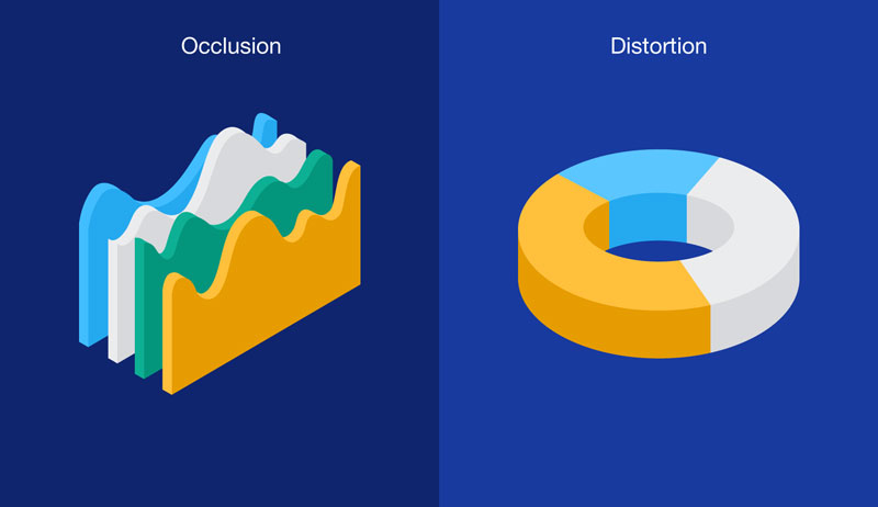
As you can see on the left, a 3D graph can obscure data by blocking other parts of the chart. This is because a 3D graph mimics natural space. This is a problem when it doesn’t allow visual access to important data points. This could create false hierarchies and emphasis on certain pieces of information.
Distortion is another issue associated with three-dimensional data visualizations. It is the result of foreshortening. This is common in pictures because objects closer to us appear larger than the ones far away. But in data visualization, this is a problem. It gives the impression of hierarchies that don’t exist and skews data relationships.
Using the Wrong Chart Type
A pie chart works best when there are two to three items. That is a good number for the human eye to distinguish. Most people will have trouble understanding a pie chart with four or more items. This pie chart exemplifies the point.
Chart created with wpDataTables
Which one is bigger, China or Other?
Specific data types ask for a specific chart type. Certain chart types are useful for presenting data of a different kind. You can run into big trouble when you try to use the wrong visualization approach.
Most of the time the kind of data you have determines the way you visualize it. First of all, consider whether your data is qualitative (descriptive) or quantitative (measures). Qualitative information lends itself to pie and bar charts. It is best to use histograms and charts for quantitative data.
Take a look at this example.
It shows the same data in a pie chart and in a bar chart. The pie chart is not the best data visualization option. The bar chart represents the numbers in a more accurate way. The data in a pie always adds up to 100%, but that is not the case here.
Not Using Annotations
It is up to you to use annotations or not. It is not obligatory to do it, but it is good practice. Make it a habit to do it every time you make a chart.
People with different backgrounds will look at your data visualizations. Some will only look at the visuals, others will want a bit more information. They may need text and numbers to clarify the doubts they have.
Here is an example that illustrates the point.
Chart created with wpDataTables
Everything looks good and the data is correctly presented. But, when you look at the data itself, you might wonder why there is such a big spike in 2019. Annotations can help you to clarify the issue.
FAQ on Misleading Data Visualization
What exactly qualifies as misleading data visualization?
Think of it as a costume party for numbers where graphs and charts dress up in deceptive garb. Misleading data visualization rears its head when the actual data gets distorted by visual means. It’s the difference between what your eyes see and what the facts really say, like y-axis manipulation or selective reportage.
Why do people create misleading data visualizations?
Sometimes, it’s no accident; it’s a sly weapon to push an agenda. Other times, a designer might just fall prey to poor data visualization best practices or, ye know, that itch to make data seem more impressive. And then there’s genuine unawareness, a sheer lack of data literacy that leads to visual blunders.
How can you spot a misleading data visualization?
Start with a skeptic’s lens. Peek especially close at those scales. Does the y-axis start at zero? It should. Are data points conveniently missing? That’s a red flag. Does the visualization push you to a snap judgment? Take a breath, then dive deeper into the details.
Can misleading data visualizations be legally considered false advertising?
Oh, it’s a murky pond. If a visualization’s main purpose is to sell, and it skews facts to do so, the hammer of the American Statistical Association could slam down for unethical conduct. In severe cases, it’s false advertising. But proving intent? That’s a whole other adventure.
What are the adverse effects of misleading data visualizations on society?
It’s like a contagion of misinformation. Misleading data visualization can misshape public opinion, skew voter choices, or dribble poison into investment decisions. They breed misconceptions, erode trust, and in some grim scenarios, they can influence significant policy decisions based on misrepresented facts.
How has the digital age impacted the occurrence of misleading data visualizations?
Digital age, eh? Kind of a double-edged sword. Tools for data visualization are now abundant and facile, lowering the bar for creating graphs, yet upping the chance for faux pas. Social media then flings these visual titbits far and wide, faster than you can scream, “Check your sources!”
What should you consider when creating your own data visualizations to avoid being misleading?
A mantra for you: Simplify, don’t distort. Stay honest with scaling and labelling. Juxtapose wisely, avoid inducing false causality, and keep it accessible. Most vitally, wear a hat of ethical data reporting and ensure your visualization tells the true tale, with no gimmicks to hoodwink your audience.
Are there any industry standards or guidelines for data visualization to prevent misleading representations?
You bet, there are guideposts! From the nitty-gritty set by the Data Visualization Society, to the wisdom within books like “How to Lie with Statistics”. Highfalutin standards include transparency, accuracy, and rightly representing the data’s context, minus any visual hyperbole.
What role do cognitive biases play in data visualization?
The brain loves a shortcut, right? Cognitive biases tango with data visualization by nudging us toward what we want to believe, not what’s actually there. Confirmation bias can turn an innocent pie chart into the devil’s advocacy. Always critical: encourage viewers to venture beyond their cognitive biases.
How can education in data literacy aid in combating misleading data visualizations?
Education in data literacy is the shining armour against these visual villains. By teaching folks the A-to-Z of stats and ethical information design, they turn into savvy consumers and creators of data visualizations. Knowledge is power, and with it, they can fend off the charms of deceitful charts.
Conclusion
We embarked on a trek, untangling distorted graphs and deceptive statistics with a fine-tooth comb, didn’t we? Out there, it’s a visual smorgasbord of biased data presentation and selective data reporting, masked so cunningly, you’d think they’re harmless.
Yet, here we stand, far wiser than when we began. You’ve now unlocked the ability to spot the sneakiest of visual fallacies with the sharpness of a data literacy ninja. Armed with the essentials of graphical integrity and the blueprint of data visualization best practices, head forth and champion the crusade for truth in visualization.
Remember, the power to shape perspective is a hefty one. Use it responsibly. And may your graphs always tell the story as it is, no frills attached.
If you liked this article with misleading data visualization examples, you should check out this article about open source data visualization.
There are also similar articles discussing data visualization javascript libraries, WordPress data visualization, interactive data visualization, and data visualization tools.
And let’s not forget about articles on data visualization color palettes, data visualization best practices, data visualization examples, and weather data visualization.


