Imagine splashes of data springing to life, stories told not in words, but with lines, bars, and dots. That’s the magic of JavaScript data visualization libraries—your toolkit to transform raw data into interactive, visual narratives that unfold with a click or a scroll.
In an era buckling under data overload, it’s clear: we need not just to see data, but to understand and interact with it. JavaScript, the script of the web, brings this possibility to your fingertips, offering a suite of tools to breathe dimension into numbers and facts.
In this dive, you’ll unlock the secrets to presenting data in ways that resonate, using tools like D3.js, Chart.js, and Highcharts. We’ll traverse the realms of SVG graphics, chart through the Canvas API, and animate data with WebGL.
By the end, you’ll have a map to harness JavaScript’s library landscape, giving life to data, crafting stories that engage, inform, and inspire. Prepare to navigate through the essentials of data visualization, from foundational concepts to state-of-the-art techniques, and the best practices in responsive design for your visual masterpieces.
Table of Contents
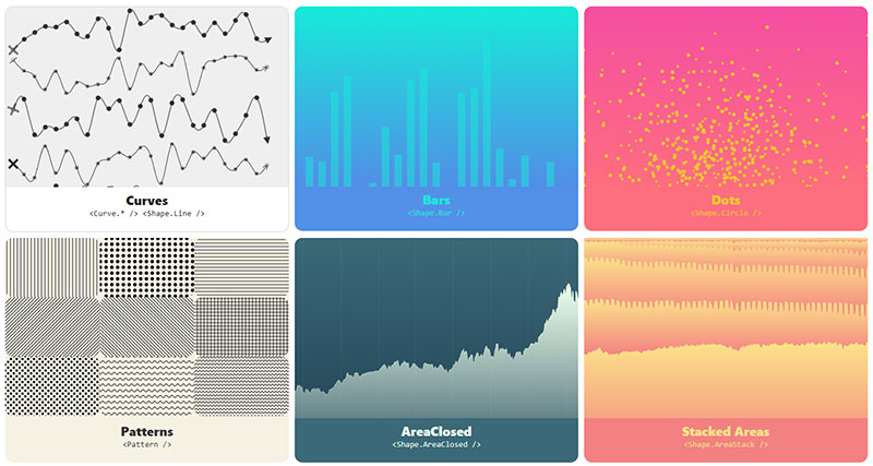
Awesome JavaScript Data Visualization Libraries
| Library Name | Focus Area | Ideal Usage | Unique Feature | Integration & Compatibility |
|---|---|---|---|---|
| FusionCharts Suite | Comprehensive charting solution | Corporate dashboards, reports | Wide variety of chart types | Cross-platform compatibility |
| Google Charts | Easy-to-use, interactive charts | Quick and shareable insights | Seamless Google product integration | High cross-browser compatibility |
| Chart.js | Minimalistic, responsive charting | Fast, attractive visualizations | Canvas rendering | Responsive, cross-platform |
| D3.js | Custom, data-driven visualizations | Complex, interactive displays | Data-binding to DOM elements | Requires more in-depth JS knowledge |
| three.js | 3D graphics via WebGL | Immersive data presentations | Real-time 3D rendering | Requires understanding of 3D concepts |
| React-vis | React-focused charting library | React apps with chart components | Thematic visuals for React | Made for React ecosystem |
| Chart.xkcd | Whimsical, hand-drawn style charts | Unique, engaging data stories | Cartoonish chart styles | Simple to use, open-source |
| Victory | Modular charting components for React | Customizable React charts | Deep customization options | Built for React |
| Deck.gl | Web-based geospatial visualizations | Mapping and spatial analytics | Layering for geospatial data | Integrates with React, Mapbox |
| Apache ECharts | Charting with a focus on interactivity | Dynamic, data-rich applications | Responsive, interactive options | Suitable for large datasets |
| MetricGraphics.js | Simplified time-series visualization | Monitoring metrics over time | Minimalist approach | Built on D3.js, lean learning curve |
| Highcharts | User-friendly, interactive charts | Business analytics | Exporting and printing options | Commercial licensing for extensive use |
| Raphaël | Vector graphics on the web | Data presentations across browsers | Cross-browser vector graphics | Works with older browsers too |
| visx | Custom JSX-friendly D3 visualizations | Building visualization components | Uses D3 with React-like patterns | React-based, works with D3.js |
| ApexCharts | Modern, interactive data visualizations | Contemporary web applications | Rich interactive behavior | Open-source, real-time data support |
| Flexmonster | Interactive pivot table tool | Complex data analysis | Powerful data slicing | Works with any front end |
| React Virtualized | Rendering large datasets in React | High performance data grids | Efficient, long list management | Made for React, highly performant |
| Sigma.js | Network graphs, graph drawing | Relationship and network data | Advanced graph algorithms | Open-source, interactive graphics |
| TradingVue.js | Financial and trading data visualizations | Stock market data analysis | Dedicated to trading charts | Designed for financial metrics |
| C3js | Simplified D3.js chart creation | Easy-to-develop visualizations | Easy D3.js syntax | Open-source, beginner-friendly |
| JSXGraph | Interactive mathematical graphics | Educational purposes, math visuals | Interactive geometry teaching | Focus on mathematical computations |
FusionCharts Suite
Imagine painting your data story on a digital canvas that’s both vibrant and smart—that’s FusionCharts Suite. This comprehensive library shines in creating delightful interactive data visualizations suitable for corporate environments.
- Rich chart variety including 2D/3D charts
- Real-time data support
- Extensive documentation and demos
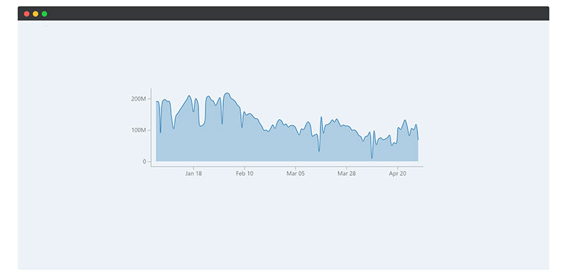
Google Charts
Google Charts example created with wpDataTables
Google Charts works like a charm when you want to sprinkle some Google magic onto your data. It’s a breeze to use, turning numbers into insights with an array of charts that are clean, and oh so shareable.
- Integrates with Google products
- Customizable and interactive
- Supports a variety of chart types
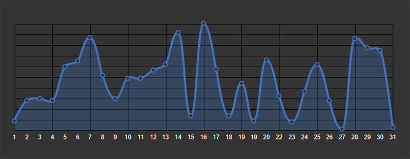
Chart.js
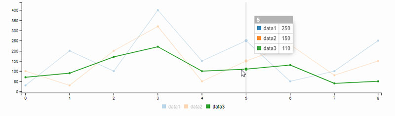
Chart.js example created with wpDataTables
Chart.js is like your go-to wrench in the visualization toolbox. It’s minimalist but punches above its weight, offering responsive charts that sing across devices with Canvas elements. It’s perfect for those fast-paced projects needing quick, attractive graphs.
- Simple API
- Open-source goodness
- Responsive designs
D3.js
D3.js is the wizard of the web, empowering you to conjure up data-driven documents that are as flexible as they are beautiful. It’s all about giving you the power to create complex, interactive visualizations with a personal touch.
- Robust handling of SVG graphics
- Data-driven approach
- Highly customizable
three.js

Step into the 3D realm with three.js, where data leaps off the screen in three dimensions. It’s not just any visualization library – it’s a gateway to WebGL landscapes, crafting scenes that add a whole new depth to data.
- Real-time rendering
- Support for interactive 3D graphics
- Extensive community support
React-vis
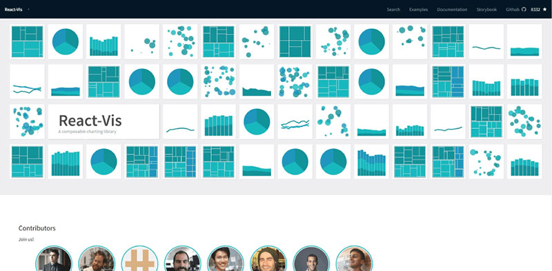
React-vis comes from the kitchen of Uber, and it serves up a delectable spread of charts tailor-made for React environments. It’s the easy pick for those already living in the React ecosystem, craving quick and thematic data rendering.
- React-friendly
- Customizable styles and layouts
- Cross-browser compatibility
Chart.xkcd
Chart.xkcd is the quirky artist in the bunch. If you’re looking to infuse some humor and personality into how you present data, these hand-drawn-ish charts inspired by the XKCD comic won’t disappoint.
- Unique, whimsical style
- Easy to use
- Open-source delight
Victory

Victory is the name, and elegant data charts are the game. Crafted for React, it’s modular and mighty. Whether you need simple line charts or complex scatter plots, Victory takes aim and… wins.
- Powerful customization
- Interactive graphs
- Seamless integration with React
Deck.gl

For those data stories that need to unfold over maps, Deck.gl is your navigator. It harmonizes beautifully with geospatial data, turning complex datasets into captivating, multilayered visual experiences.
- Excellent for large-scale datasets
- Advanced WebGL overlays
- Compatible with React and Mapbox
Apache ECharts
Apache ECharts puts the ‘easy’ in ‘easily understood dashboards and reports.’ It’s a heavyweight in the arena of charting libraries, juggling interactivity, and customization with a kind of grace that makes data dance.
- Rich selection of chart options
- Responsive design graphs
- Real-time data visualization
MetricGraphics.js
If you have metrics to monitor and you need them clean and to the point, MetricGraphics.js steps up. Specially designed for simplicity and time-series visualization, it brings clarity to the chaos of continuous data.
- Optimized for time-series data
- Minimalist design
- Built on D3.js
Highcharts
Highcharts example created with wpDataTables
Highcharts whisks you to the summit of simplicity without skimping on sophistication. Businesses love it for its comprehensive options and easiness, turning complex datasets into web-friendly visuals that engage stakeholders at first glance.
- Comprehensive API
- Interactive features
- Export and print capabilities
Raphaël
Raphaël sketches a world where cross-browser compatibility meets vector graphics. It’s all about giving life to your data through shapes and curves, welcoming you to a dynamic visualization dance that waltzes from IE to Safari.
- Focused on vector graphics
- Great for simple animations
- Cross-browser support
visx
VX stands at the crossroads of power and simplicity. Combining the might of D3.js with the neatness of React, it offers a kit to assemble your very own visualization component that fits right into your project’s puzzle.
- Combines D3.js with React
- Reusable chart components
- Elegant and efficient
ApexCharts
ApexCharts example created with wpDataTables
ApexCharts brings a modern touch to your data. Smooth and svelte, its lineup of interactive charts adds a layer of fresh aesthetics to your dashboards and reports, ensuring viewers stay glued to the data stories you’re unfolding.
- Rich interactive features
- Real-time updates
- Open-source and intuitive
Flexmonster
Flexmonster is the Swiss Army knife for those in need of heavy-lifting in data presentation. This pivot table tool slices and dices data, serving up multidimensional reports that can drill down to the nitty-gritty details of your data.
- Pivot table integration
- Supports large datasets
- Multidimensional data analysis
React Virtualized
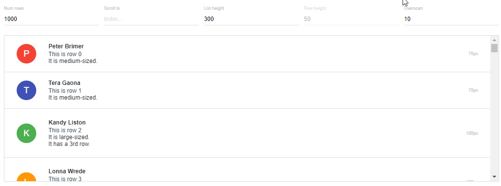
React Virtualized is all about not letting massive datasets drag you down. It ensures your user interfaces remain nimble, virtualizing long lists and grids that maintain lightning speed without breaking a sweat.
- Efficient rendering of large lists
- Highly performant
- Tailored for React
Sigma.js
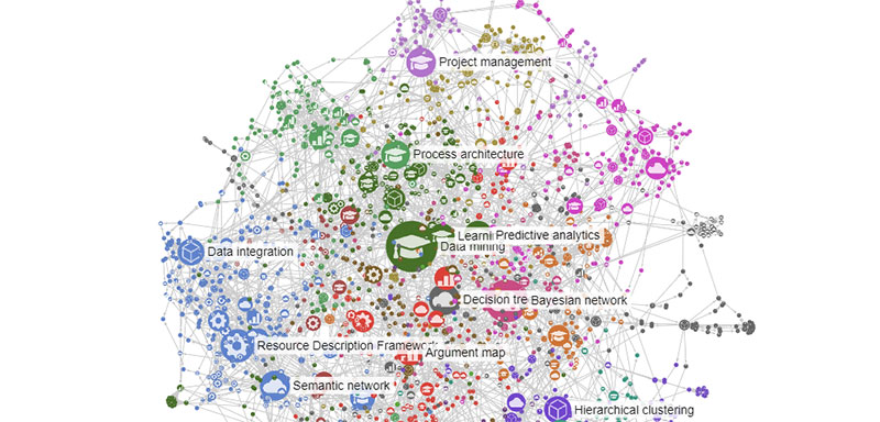
Sigma.js takes graph drawing to mesmerizing heights, focusing on the complex web of relationships in your data. Ideal for network graphs, it thrives in disentangling the intricate threads of nodes and edges, making for visuals that are as informative as they are attractive.
- Advanced graph algorithms
- Interactive 3D graphics
- Extensible plugins
TradingVue.js
TradingVue.js is the ticker tape of data visualization tools, specially tuned for the highs and lows of financial data. It’s purpose-built for crafting charts that thrive in the fast-paced world of trading, where data’s as dynamic as the market.
- Tailored for financial data visuals
- Real-time financial charts
- Interactive graphs
C3js
C3js takes D3.js’s versatility and wraps it in a more approachable package. Charts come to life with less fuss, less code—giving you more time to interpret your data instead of wrestling with it.
- Simplified D3.js-based syntax
- Customizable chart design
- Open-source and easy to use
JSXGraph
JSXGraph sketches out a landscape where education and interactivity play nice. It’s a tool aimed at teaching and learning, where interactive graphs and constructions translate complex mathematical ideas into visual form, one coordinate at a time.
- Specializes in mathematical graphics
- Interactive and educational
- Supports geometry and calculus
FAQ on JavaScript Data Visualization Libraries
What Makes D3.js Special Among JavaScript Data Visualization Libraries?
D3.js harnesses the full potential of modern web standards, chiefly SVG, HTML5, and CSS. It’s a bit like clay—moldable and flexible, which makes it stand out. You get to craft highly interactive, dynamic visualizations tailored to any dataset you throw at it.
How Do Data Visualization Libraries Like Chart.js Simplify Creating Graphs?
Chart.js strips down the process to the essentials. Think of it as the friendly neighborhood toolbox—quick, responsive, and no fuss. You get a collection of simple yet beautiful charts that are cross-browser compatible and work out of the box.
Can I Create Real-Time Data Visualizations with JavaScript Libraries?
Absolutely, and it’s a game-changer for dashboards and live updates. Libraries like Plotly.js and Highcharts make it almost a breeze to set up visualizations that update in real-time, keeping your visuals as current as your data.
Are JavaScript Data Visualization Libraries Only for Web Developers?
Not at all! These libraries come with extensive documentation and communities. So, even if you’re more “data enthusiast” than “web guru,” as long as you’ve got a grip on the basics of JavaScript, there’s a lot you can do. Besides, everyone starts somewhere, right?
What About Responsiveness in Data Visualization?
Key question in today’s mobile-first world. Most libraries, like ECharts and FusionCharts, are designed with responsive web design in mind. They adjust effortlessly to different screen sizes. Your graphs will look sharp on a phone, tablet, or desktop.
How Do I Deal with Browser Compatibility?
Well, let’s face it, browser compatibility can be a bit of a tangle. But, most reputable libraries have thought this through. They’ve put in the work so you don’t have to. Your visuals should run smoothly across modern browsers.
Is It Hard to Learn About Data Visualization in JavaScript?
It’s got its challenges, but don’t sweat it. Each library has a learning curve, yes. However, resources like tutorials, forums, and online documentation are plenty—golden nuggets that can smooth out the ride. Plus, experimenting is half the fun.
What’s the Deal with Data Privacy and Security in JavaScript Visualization?
It’s on you to make sure your implementation is tight. Most libraries process data client-side, minimizing server interaction. But whenever data’s involved, be proactive—sanitize inputs, secure your code. Keep your data and users safe.
Can I Integrate These Libraries With Other Web Frameworks?
You bet. Whether you’re jazzing up a React app or adding sparkle to Angular, JavaScript visualization libraries play nice with others. They’re flexible enough to fit into your architecture, adding that extra layer of interactivity without a hitch.
What’s the Cost of Using JavaScript Data Visualization Libraries?
The price tag ranges from “zero” to “it depends.” Many libraries are open-source—free treasures ready for the taking. Others, often with more advanced features, might have licensing fees. Always check the terms, especially for commercial use.
Final Words on These JS Data Visualization Libraries
So, we’ve embarked on this visual quest together, unraveling the threads of JavaScript data visualization libraries. Cool, right? We traveled through the valleys of charting tools and soared over the peaks of interactive graphs. It’s like we’ve been handed a magic wand — the power to turn endless rows of data into storytelling.
In every byte and pixel, there’s a takeaway: these libraries are your allies. They stand ready to transform the abstract into the concrete. From D3.js and its delightful dance with SVG graphics, to the snappy simplicity of Chart.js—you’re now equipped to make numbers sing and dance.
And if nothing else sticks, remember this: wherever your data lives, there’s a library to match. It’s all about finding that sweet spot, where your tale of data finds its best voice. So grab one of these tools and start sketching; the digital canvas awaits your masterpiece.
If you liked this article about data visualization javascript libraries, you should check out this article about open-source data visualization.
There are also similar articles discussing WordPress data visualization, interactive data visualization, misleading data visualization examples, and data visualization tools.
And let’s not forget about articles on data visualization color palettes, data visualization best practices, data visualization examples, and weather data visualization.


