
Beyond cold numbers and raw stats, there’s magic in visual storytelling. Here, in this vibrant space of pixels and plans, open-source data visualization tools are the unsung heroes. They empower us to turn complex data into compelling narratives that everyone can grasp, appreciate, and act upon.
You’re about to embark on a journey where charts and graphs aren’t just informative—they’re captivating. Whether you’re a novice data enthusiast or the seasoned analyst, this article is your entry ticket to a realm where data becomes art, and sharing knowledge is free and unrestricted.
By the final punctuation mark, you’ll not only grasp the power of tools like D3.js and Plotly, but you’ll also wield them with the finesse of a data virtuoso. We’ll plot our course through the versatility of Python libraries, the agility of interactive graphs, and the community-driven evolution of big data visualization.
Ready to let the data speak in color and shape? Let’s dive in.
Table of Contents
Open-Source Data Visualization Tools To Check Out
| Tool Name | Type | Interactivity | Data Input Formats | Notable Features |
|---|---|---|---|---|
| wpDataTables Lite | WordPress plugin | Yes | MySQL, Excel, CSV, JSON, XML | Responsive, Conditional formatting |
| Candela | Web-based library | Yes | Varies with implementation | Extensible, integrates with R, Python, and web applications |
| Chart Studio | Web application | Yes | CSV, XLS, Google Sheets | User-friendly interface, collaborative features |
| Gephi | Desktop application | Limited | CSV, GEXF, GraphML, Excel | Network analysis and visualization, plugin ecosystem |
| Polymaps | JavaScript library | Interactive | GeoJSON | Maps creation, SVG-based, customizable |
| Tableau Public | Desktop & Web app | Yes | Excel, Text file, JSON, and others | Intuitive drag-and-drop, dashboard creation |
| Redash | Web application | Interactive | SQL, NoSQL, JSON, Google Sheets, etc. | Query editor, dashboarding, alerting |
| RawGraphs | Web application | Limited | CSV, TSV, Delimited text | Customizable outputs, simple workflow |
| Chartist | JavaScript library | Interactive | Data crafted in JavaScript | Responsive, SVG-based, simple API |
| Charted | Web application | No | CSV, Google Sheets | Automatic data updates, link sharing |
| Google Charts | Web-based library | Yes | JSON, Google Spreadsheets, and others | Wide chart variety, integrates with Google products |
| ParaView | Desktop application | Interactive | CSV, Excel, binary and more | 3D visualization, large data handling |
| D3.js | JavaScript library | Highly interactive | JSON, CSV, GeoJSON, and others | Immense customization, powerful data-driven approach |
| Datawrapper | Web application | Yes | CSV, Excel, Google Sheets | No coding required, readily shareable |
| ColorBrewer | Web tool | No | N/A | Color advice for cartography, pre-built color schemes |
| Grafana Labs | Web application | Highly interactive | SQL, NoSQL, JSON, Prometheus | Real-time monitoring, alerting, plugins |
| Plotly | Web & Python lib. | Highly interactive | Excel, CSV, SQL, and others | 3D plot capabilities, collaborative dashboards |
| Orange | Desktop application | Interactive | CSV, Excel, Google Sheets | Machine learning and data mining, visual programming interface |
| dygraphs | JavaScript library | Interactive | CSV, TSV | Designed for large datasets, zoomable interface |
| Leaflet | JavaScript library | Interactive | GeoJSON, TopoJSON, and others | Mobile-friendly maps, extensive plugin ecosystem |
wpDataTables Lite
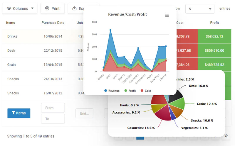
This popular plugin for WordPress allows you to create charts and tables quickly. You can use several data sources like Excel, JSON, XML, PHP, and CSV files. With wpDataTables Lite, you can do more than simply create tables. You’ll be able to access them from all your devices thanks to the app’s responsive charts.
We keep the operations in an SQL database, which makes it easier to find all the needed information in just a few clicks.
For all the professionals who want to visualize data efficiently, wpDataTables Lite offers a brilliant solution. Explore this option and enjoy a smooth experience with fully customizable tables.
In addition, your data visualization elements will be responsive regardless of the source. . Hence, charts derived from Excel, CSV, or JSON will work fine on any device. You can also choose which columns you want to hide or show on tablets or mobile platforms.
Finally, turn tables into interactive charts to display complex data.
Using the premium version, though, is what you need
wpDataTables can make creating data visualizations easy. There’s a good reason why it’s the #1 WordPress plugin for creating responsive tables and charts.

And it’s really easy to do something like this:
- You provide the table data
- Configure and customize it
- Publish it in a post or page
And it’s not just pretty, but also practical. You can make large tables with up to millions of rows, or you can use advanced filters and search, or you can go wild and make it editable.
“Yeah, but I just like Excel too much and there’s nothing like that on websites”. Yeah, there is. You can use conditional formatting like in Excel or Google Sheets.
Did I tell you you can create charts too with your data? And that’s only a small part. There are lots of other features for you.
Candela
JavaScript users will love this open-source data visualization tool. Based on interoperable visualization elements, Candela is the best alternative. With this software, you can create charts that are informative and look fantastic at the same time.
It includes a wide variety of features for data scientists. However, they must integrate it with their web pages if they want Candela to work. Luckily, the software comes with a guide on R, JavaScript, and Python integration.
If you can handle the integrated components or have someone to help you like the Python development team, you’ll love Candela. It will provide you with many options, like line and bar charts, geographic data, box plots, and others.
Chart Studio
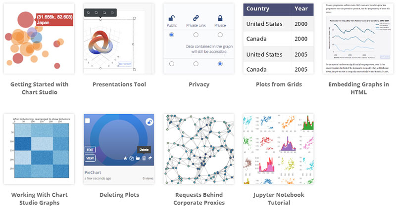
You don’t have to be an expert in coding to use Chart Studio. You’ll be able to connect to the SQL through the drag-and-drop function. This makes it intuitive and accessible for non-technical users.
One of its best features is that it allows you to share data securely. In this aspect, it works similarly to Google docs. The possibility of creating charts and embedding them on your dashboard, reports, and wikis is a big plus.
As an open-source tool, Chart Studio is based on several similar elements. The free version allows you to access live updates, dashboards, and public charts. As well, if you want a more professional finish, you can choose between the “student”, “personal”, and “professional” plans. The three of them include a package with 25 charts.
Gephi
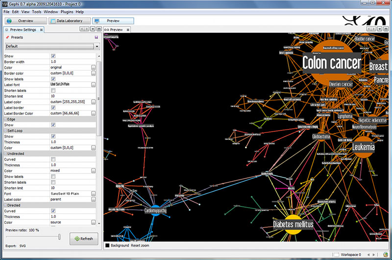
Gephi is an all-in-one open-source data visualization tool. You can use it to create all kinds of graphs and charts.
Simplicity sometimes is necessary. This is where Gephi comes in handy. If you need to manage simple data analytics, check this option. Manipulate structures and colors, and interact with the representations. In doing so, you’ll be able to discover hidden data patterns.
For a free tool, Gephi includes excellent social media features. It improves quality and efficiency through advanced algorithms.
Regarding analyzing, Gephi won’t disappoint you as it comes with metric frameworks so you can analyze your results. The visualization tool to understand the evolution of a network is simply exceptional.
Polymaps
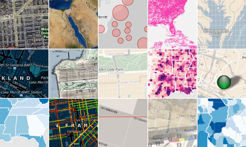
Creating dynamic maps for modern web browsers is possible. Check out this open-source JavaScript library and see all the things you can do.
CSS customization will be easier thanks to Polymaps’ SVG functionalities. This will allow you to enable interactive charts.
Presenting data is important and even more important is how you present it. “Polymaps” allows you to display information from a country level to a unit. Thus, displaying information becomes easier. Share data sets like population growth, state-level data, cities, neighborhoods, and even streets.
Although it is a free tool, you can access a wide range of features. Finally, you can conceal the information under interactive views and display it as a drill-down.
Tableau Public
Tableau Public is a great data visualization tool that comes with a free version. We’re talking about a platform that allows you to explore and share data freely.
They call interactive data visualizations “vizzes”, a name that helps users understand data under any topic. In addition, they can share visualized data.
Users can choose from 3 million “vizzes” that were created by approximately 1 million users worldwide. This makes Tableau Public a unique free data visualization tool and an infrastructure that supports millions of viewers.
Redash
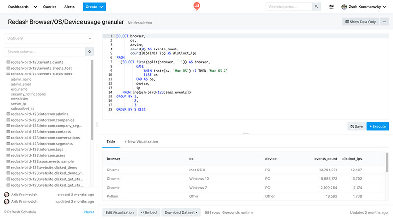
Redash is a top-notch tool, a great option to manage analytics and data visualization. . It runs on an SQL server while supporting an online SQL editor. At first, Redash had a self-hosted version, but now it only works as an open-source tool.
Thus, Redash allows you to gather information from various data sources and allows for smart queries. One of its top features is the ability to gather different data into one unit so every team member can access the information easily.
Redash’s scope of options is impressive. It includes a pie and bar charts, line graphs, tables, scatter graphs, interactive and dynamic maps, and more.
Lastly, you can set up alerts for certain events that may be useful as a data source.
RawGraphs
Like its counterpart, Charted, Raw Graphs targets casual users, but it’s also an excellent tool for data scientists and data visualization experts. However, Raw Graphs exceeds Charted because of its toolbox. With this feature, you can create charts of all kinds (line, bar, pie, etc.). You can also build diagrams and infographics hassle-free.
The process is simple: cut-paste or copy-paste the link to the data that you need to process. RawGraphs then automatically creates different visualization options.
RawGraphs includes tutorials for you to learn how to use its features. Even though the software is a free data visualization tool, you can donate money to the developers. This contribution is key to improving the software.
Chartist

This is another free tool that you’ll find useful. If you want to create responsive charts easily, this is the best option. Users can customize style sheets on CSS, allowing animated data visualization and full customization. Some of them use SVG, which is short for “scalable vector graphics”. Simply put, you can add interactive charts that adapt to any screen without losing quality or resolution.
“Chartist” provides flexibility and a clear separation of concerns. You can also use convention over configuration on a user-friendly platform. The software doesn’t depend on DPI and allows configuration with media queries. As well, you can customize it with Sass.
Thanks to its animation API, you can create multiple animations and set up various chart behaviors.
Charted
Running on the MIT license, Charted is one of the best open-source data visualization tools. Originally, the blogging platform “Medium.com” developed this software.
Its biggest advantage is the ability to automate data visualization. From the user’s point of view, everything is quite simple. Simply provide the link to the data and the system does the rest. Thus, you can set up a group of data that’s clear and easy to access.
As a user-friendly tool, you’ll find that Charter’s interface only has the key features. This makes the platform easy to use and understand. In addition, the system automatizes most processes.
If responsiveness is important to you, Charted is a great option. It displays all its results on various types of screens.
The file support system is another strong feature. It includes different options like CSV files (comma-separated values), TSV (tab-separated values), Google sheets, and Dropbox share links.
Google Charts
Google Charts is another good example of data visualization. Being cloud-based, it provides many resources, including a library of charts.
Thanks to its default options, you can work much faster. It also has plenty of customization features so that you can add your style. The Google Charts forum is a great place for users to connect and help each other.
Users don’t need plugins as they can access the tools from any browser. Aside from that, they can create multiple dashboards and adapt the colors according to their brand.
If you’re looking for a comprehensive solution to data analysis, check out Google Charts. You’ll love the possibility of connecting the charts with real-time data.
ParaView
Analyzing data from multiple platforms is challenging. But this is not a problem for ParaView users. This is one of the best tools out there if you work with visualized data.
Specially built to analyze large data sets, its flexibility allows for small data management as well. ParaView shows a high level of performance, which makes it a great option for universities, laboratories, and businesses.
ParaView has excellent data exploration features, allowing you to use 3D interactive data visualizations.
Thanks to its wide set of features, this tool allows developers to build specific applications. This can be quickly done and applied to specific problem domains.
Finally, you’ll love the fact that its interface is user-friendly. The supported distributed computation models are a great tool for processing large data sets.
D3.js
The D3.js visualization libraries will help you develop top-notch data visualizations. You are welcome to use HTML, CSS, and SYG. “D3” is short for “data-driven documents” with a document being a DOM (document object model). The whole point of this approach is being able to use all the capabilities of modern browsers. Thus, you can create visualizations without “having to try it yourself”.
However, D3.js presents a larger learning curve. For this reason, it’s not the best option for beginners. Since this is not a “drag-and-drop” tool, it will be useful in the hands of coding experts. It does, though, bring many benefits. If you’re looking for unlimited features in terms of design and creativity, and are not afraid of using coding, D3.js may be your ideal choice.
Datawrapper
Datawrapper has been providing state-of-the-art data visualization features since 2011. Although it has a free version, you can also access paid packages.
This software is not only one of the best data visualization tools for journalists, but researchers and experts in data science also use it.
Just like RawGraphs and Charted, Datawrapper does not require coding skills. You’ll find an intuitive platform that you can set up by copying and pasting elements. Embed all your creations on your website and make your charts available to your visitors.
Don’t hold back from exploring Datawrapper and its features. You won’t be disappointed as it’s a comprehensive tool for conducting data analysis.
ColorBrewer
Color is a very important tool in your charts and interactive maps. It does more than make your content beautiful: it helps viewers read the data.
With ColorBrewer you can see different colors on complex maps which opens a world of opportunities. Although it is not a diagnostic service, it helps you to test every color scheme on your visualizations.
By choosing different settings, you can apply the desired color to the background, the content, and specific hues.
Its creators at Penn State University built a comprehensive data solution in a way that all you need is a flash plugin to use ColorBrewer.
Grafana Labs
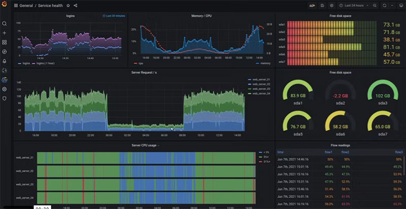
Take some time to check out this superb data analytics tool. Distributed under an AGPL 3.0 license, this is one of the best options you’ll find in this field.
Being more than just an excellent open-source data visualization software, Grafana lets you access information virtually anywhere.
Once you have accessed the data, you can visualize it easily and question it thanks to Grafana.
Besides the ability to create dynamic and reusable dashboards, the system allows you to share them with members of your team. This is possible thanks to Grafana’s excellent collaborative features.
When having to blend pieces of information from different sources, Grafana is one of the best options available. Users can even display data from different sources in a single chart.
Plotly
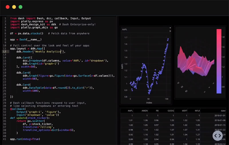
If you work with Matlab, Python, or other similar programming languages, this is the option for you. This sophisticated data tool, Plotly, is a great alternative for users who lack coding skills.
Along with your team members, you’ll be able to manage and edit graphical data, as well as create, edit, and share visualizations.
The opportunity to build maps and charts with your team simplifies processes and optimizes results. Thus, you can speed up your data representation tasks.
In addition, you can connect your SQL database or simply upload excel files. Before you know it, you’ll have eye-catching D3.js visualizations.
If you choose one of the paid plans, you can collaborate with other members of your staff and share visualizations with them.
Orange
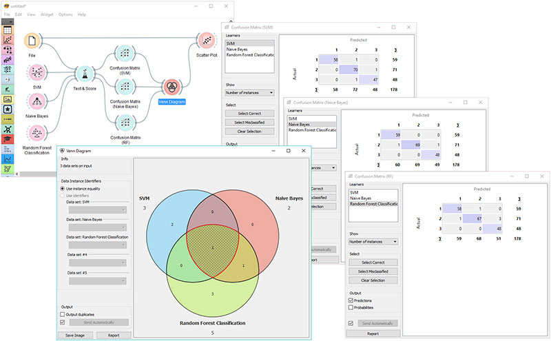
Check out Orange and discover its top-notch data visualization tools. Based on machine learning technology, this open-source software brings a comprehensive solution to data analytics.
Orange is based on Python, thus helping both inexperienced and advanced users. Among other things, you’ll be able to conduct simple data analysis. The brilliant visualization options it provides will surprise you.
With Orange, you can explore scatter spots, statistical distributions, tree examples, or Venn diagrams. Heatmaps and linear regressions are also available.
Make your multidimensional data sensible in 2D as well. Then, use the software’s data visualization tools to uncover hidden patterns. A tool like this is very useful for analyzing data.
Finally, you have the option of modeling visualizations like silhouette plots and dendrograms.
dygraphs
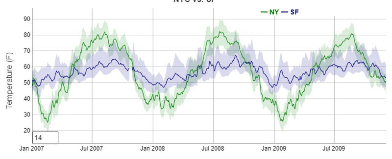
DyGraphs comes with a free Javascript library. This open-source program helps you organize heavy data sets and process them easily. The support for error bars is a big plus.
Simply put, this is a way to estimate how reliable your graphics are. Besides the obvious advantages, DyGraphs has other perks. For example, it includes tutorials which can assist you in learning how to use the software.
Leaflet
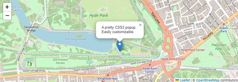
Many users choose Leaflet as their favorite open-source data visualization tool. The reason is simple: it allows you to create interactive maps.
As it is responsive software, Leaflet supports many plugins. It also supports other preferences including desktops and mobile platforms.
To make sure your mobile app built with Leaflet performs well and meets the necessary mobile app requirements, you may need to optimize its resource usage and functionality. This could involve techniques such as caching, lazy loading, and minimizing network requests to ensure that the app is both efficient and fast.
Besides keyboard navigation and map scaling, users can enjoy many other features. These are enhanced by the possibility of integrating many plugins.
Regarding flexibility, Leaflet is one of the best options in the data analysis world. It’s interactive, user-friendly, and compatible with many other software options.
In addition, it comes with performance features such as zoom, user interaction, drag panning inertia, and hardware acceleration. Scaling, mapping controls, and layer-switchers are also part of the package. If you have issues with access to one of these tools, you can use an unblocked VPN to solve this. While using VPNBrains, users can securely access data from various locations without compromising their privacy.
Finally, as you will see, Leaflet is easy to use thanks to its multi-zoom datasets. Set it up in the blink of an eye using its wide documentation.
FAQ on open-source data visualization
What’s the catch with using open-source data visualization tools?
No catch, really, but there’s a trade-off. Open-source tools demand a bit more tech-savviness. Since they’re community-driven, you might not get the hand-holding support that paid services offer. It’s a small price for the freedom and flexibility to customize your data charts to tell a compelling story.
Can anyone use these tools, or do you need to be a developer?
Absolutely, anyone can dive in! Sure, a developer would be in paradise with the endless possibilities, but even without coding chops, with patience and curiosity, you’ll find tools that don’t require a single line of code.
Are open-source data visualization tools really free?
Yes, they are! The beauty lies in the community’s spirit to share knowledge. And by free, we mean freedom, too. Freedom to tweak, adapt, and even improve. Take Plotly or Vega—powerful, customizable, and no hidden fees.
How do open-source tools compare to paid ones?
They often stand shoulder to shoulder. Open-source tools like D3.js even offer more flexibility for customization. Paid tools might offer more user-friendly interfaces, but if you’re open to exploring and learning, open-source options don’t disappoint.
What support can I expect with open-source visualization tools?
Here’s the cool part: communities! Think of forums, GitHub discussions, or Jupyter Notebooks filled with examples. There’s no 24/7 customer service hotline, but the wisdom of fellow users is priceless.
What about updates and new features?
Thanks to a network of passionate contributors, updates roll out regularly. New features? Well, they’re often a result of what the community needs or decides to develop. Unlike commercial software, it’s not about profit but progress.
How secure are these open-source visualization tools?
Security’s robust if you stick to reputable projects. They’re transparent—you can see and vet the code. Regular updates from the community often patch up vulnerabilities swifter than some commercial counterparts.
Can I use these tools for commercial projects?
Most of the time, yes. Many open-source licenses are generous. They allow commercial use, making professional-grade data representation accessible to all. Always double-check the specific license, though.
What programming languages do I need to know?
Depends on your tool of choice. For D3.js, JavaScript’s your jam. If you lean toward R or Python, libraries like ggplot2 or Matplotlib fit like a glove. Some tools need no coding at all!
How customizable are open-source data visualization tools compared to closed-source options?
Customization is where open-source shines. You can get into the nitty-gritty—the source code itself. If you can imagine it, and code it, you can probably create it. That’s something closed-source options can’t always match, bound as they are by their predefined capabilities.
Conclusion
And there you have it. We’ve waltzed through the digital art gallery of open-source data visualization tools. Interactive graphs, data exploration, custom visual analytics—it’s all in your hands now. And the best part? We’ve only scratched the surface.
- Plot a course
- Chart new tales
- Unleash data like never before
It’s about that aha moment when numbers morph into insights. It’s about community and collaboration, the heart and soul behind the coolest interactive graphs and sleekest information graphics you could ask for.
So, go on. Give these tools a spin. Whether you’re crafting visual stories that will change the world or just trying to make sense of the one we’ve got, remember, it’s freedom on a whole new scale.
If you liked this article about open-source data visualization, you should check out this article about data visualization javascript libraries.
There are also similar articles discussing WordPress data visualization, interactive data visualization, misleading data visualization examples, and data visualization tools.
And let’s not forget about articles on data visualization color palettes, data visualization best practices, data visualization examples, and weather data visualization.


