
Imagine sifting through a mountain of data, seeking that golden nugget of insight—only to realize it’s hidden within a thicket of numbers and confusing charts. It’s a common plight, right? The art and science of data visualization aren’t just about making pretty pictures; it’s the backbone of translating complex data into actionable knowledge.
In an ever-accelerating digital world, where data is the new currency, mastering the craft of clear and compelling visual analytics is no longer a luxury—it’s a necessity. It’s about harnessing visualization tools and graph design techniques to craft a narrative that turns raw data into a fluent story, one that captivates and informs.
By the end of this deep dive, you’ll have a toolkit brimming with data visualization best practices honed from the fields of Information design to UX design—strategies pivotal for anyone aiming to distill statistical graphics and big data visualizations into meaningful insights.
We’ll wade through principles of effective chart design, uncover the secrets of visual data exploration, and elevate your dashboard layouts to unlock the full potential of your data story. No fluff, just the hard-hitting, transformative how-tos that will reshape the way you view and present data.
Table of Contents
The 14 Best Practices for Good Data Visualization
Define the Purpose of Your Graphic
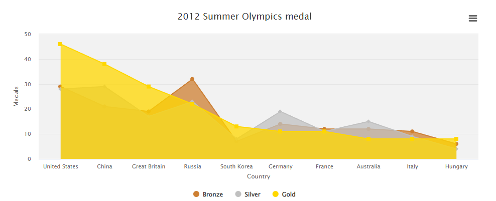
Chart created with wpDataTables
Before you even start inputting data, think about the purpose of your data. Doing this will help you to choose which data points you want to focus on and help build a compelling story with your data. Here are some good questions to ask yourself.
- Who is this graphic for?
- What do they need to know?
- What questions may they have after my data visualization project, and how would I answer those questions?
Using great data visualization techniques will help answer important questions, and may be a critical factor in the decision-making process. When you decide what the purpose of your data set is, the result will be more streamlined and more interesting.
Identify Your Graphics’ Target Audience and Their Needs
Chart created with wpDataTables
If your target audience cannot understand your graphic, it has failed its purpose. That is why it is so important that you know who your target audience is, as well as how you should show your sequential data to them.
As an example, if you are making a graphic titled “Hair Salon Revenue in 2025,” your target audience is most likely hair salon owners. Then you should show your data in a visually appealing way for that specific audience. Focus your data on valuable information that will be useful for this audience and help draw attention to your main points.
It is often a good idea to also identify the “highest priority persona” in your audience. This often includes using empathy and putting yourself in their shoes. Ask yourself, “What difficulties or roadblocks are they going through, and how can the right chart help?” Doing this will help keep users engaged as well as provide context to your graphic.
Your beautiful data deserves to be online
wpDataTables can make it that way. There’s a good reason why it’s the #1 WordPress plugin for creating responsive tables and charts.

And it’s really easy to do something like this:
- You provide the table data
- Configure and customize it
- Publish it in a post or page
And it’s not just pretty, but also practical. You can make large tables with up to millions of rows, or you can use advanced filters and search, or you can go wild and make it editable.
“Yeah, but I just like Excel too much and there’s nothing like that on websites”. Yeah, there is. You can use conditional formatting like in Excel or Google Sheets.
Did I tell you you can create charts too with your data? And that’s only a small part. There are lots of other features for you.
Clean Your Data
Chart created with wpDataTables
Before you start your graph, you want to clean your raw data. This means filtering out anomalies or inaccuracies so that you can accurately represent your data.
This can be essential for future uses of your data, in case you want to make another graphic later. Inaccuracies can also skew decision making, which can have terrible effects on your data sets.
Choose the Style of Your Data Visualization
Chart created with wpDataTables
Now you are almost ready to get started on your graphic; all that you have to do is choose the style that you want to use for your data visualization process.
Not only will the right chart help display data in an easy-to-understand way, but a good chart can also help present it accurately. Before you decide which data visualization tool you want to use, think about the data that you want to convey, and who it’s for.
Here are a couple of suggestions.
- Scatter plot charts are very useful if you want to show correlations between data sets.
- Using a line chart can be great if you want to show patterns or changes over some time.
- Donut charts can be great if your data contributes to a meaningful whole. You can also use donut charts whether you’re using seven different categories of data sets or only
Can’t Decide? Try Bar Charts!
Chart created with wpDataTables
You may wonder why bar charts have their own subpoint, but the truth is that bar charts simply work wonderfully. You can almost never go wrong with a bar chart, and they should always be considered.
This isn’t to say that the bar chart is perfect. Due to the style of the chart, many people don’t scan the entire bar itself. This means that people often assume that the bars in a bar chart will start at 0, which may not always be the case. If you have this problem, try starting the y-axis at the value of 0, and if that is not possible, mark otherwise.
Using bar charts primarily can be a great way to keep your data clean, accurate and clear. This is not to say that there is no use for the pie chart; all charts have different uses. It’s your decision whether to use a pie chart or a bar chart, but bar charts can be a great place to start.
Use Text Sparingly
Chart created with wpDataTables
Using text can be a dangerous game; using too much text makes the chart busy and boring, but only using visuals may not be sufficient. If you do decide to use text, make sure that you only use it for important details.
For vital points, try using the top left corner. This is the first place that the human brain tends to look at first. After that, try using about three to four different views, one of the most common data visualization best practices out there. The reason for this practice is mainly to prevent the use of too many graphs, as that would make it difficult to understand.
Try to Cluster, But Don’t Clutter
Chart created with wpDataTables
No matter how much you keep your data visualizations simple, complex data will arrive. There’s only so much data simplification you can do before the story of your graph will fade away.
This means that you will have to cluster your data, but make sure that it doesn’t start to clutter. You can do this by using two recognizable patterns: proximity and similarity.
- “Proximity” is when you move objects or data closer to each other or group them together.
- “Similarity” is when you group objects or data that are similar together. This is often done using a color palette.
Label Your Chart in Effective Ways
Graphs can help identify patterns in categorical data quickly, but sometimes they can’t show specific values. This means that if you have a value of particular importance, you need to use labels to visualize data effectively.
This means more than just the figure itself; you need to show why this data is important. A caption can be perfect for this and should always accompany your figure. This caption should explain why the figure is important, as well as give additional precision in places not often possible when showing data graphically.
Use a Pattern For Your Data Visualizations
Humans love patterns—it’s in our nature. Our eyes want to tell us the most important information first, and patterns are the first thing that our eyes will notice. We naturally look for patterns. Random patterns make things difficult to understand, whereas good patterns help us understand information more quickly. Naturally, patterns are one of the most important of all data visualization best practices today.
We can capitalize on patterns by making more data patterns within our graphs. This can be done numerically, sequentially or alphabetically.
If you are using a chart, make sure that the connections you have within your data are made clear. You interpret data; don’t force your viewers to do so as well.
Use Color to Your Advantage
Colors can be a great help for effective data visualization. Not only can it help you communicate important information, but it does so without taking up any extra space.
Be careful, though. Too many colors can make a graph unusable, and too much of one color can make your data blend together. Also make sure you use colors that work well together, as this will greatly assist how consistent your visualizing data will be.
Use Size to Your Advantage
Size can help you to emphasize important information as well as give context. Shape can even be as effective as color to help differentiate data values.
Size can also be used to great effect with maps. Whenever you have multiple data points that all are the same size, they can easily blend. If you make their size relative to their value, the data visualization will be easier to navigate as a result.
Use Dashboards
For the most effective data visualization, you will need to know what dashboard you are giving your audiences. There are three different dashboards that you can use.
Strategic
Strategic dashboards are designed for C-Suite personnel and department heads to show success concerning KPI metrics.
Analytical
Analytical dashboards are made to be interactive. They give team members a way of experimenting and researching the data for stakeholder concerns.
Operational
Operational dashboards are made to be frequently updated with new information. This helps them to contain information about everyday operations that aren’t restricted to high-level viewers.
Make Your Data Visualizations Inclusive
If you have been following the points in this article so far, you are probably using color to great effect in your charts. This is great, but make sure that you are using multiple colors.
Charts that use too many similar colors without enough contrast are difficult enough to read for the average person, but people who don’t have perfect vision may not be able to read your information at all. The WHO estimates that about 253 million people are visually impaired, so it is a good idea to prepare for this.
Luckily, many tools can help you check how people with impairments see your graphs. An example of this would be the color blindness proofing in Adobe Illustrator or Photoshop. Other than that, make sure that you use large fonts and sufficient contrast between the background and your text. With the right data visualization tool under your belt, you will be fine.
Last of All, Keep It Simple

Most content marketers know that content needs to be short and sweet, and this applies to your data visualizations as well. You want your data visualization to be designed to make the maximum impact that it can make.
When you format your data visualization with the data visualization best practices, you will help your audience:
- More readily use your data visualizations to answer questions and strategize effectively
- Help themselves to more information as needed
- Quickly understand high-level overview information
Remember that you are trying to be succinct and clear, so explain your story in the simplest way you can.
FAQ about data visualization best practices
How do you choose the right chart type for your data?
The trick is to match your data’s story with the right visual partner. Bar charts are ace for comparisons, while line charts show trends over time. Pie charts? Best for illustrating parts of a whole. Always aim for clarity—let your data’s nature dictate the chart, not the other way around.
What are the top data visualization tools available today?
Tableau and Power BI stand out for their comprehensive features and ease of use, tailor-made for non-coders. For the coding wizards, D3.js offers unparalleled flexibility. Tools like Infogram and Google Charts provide quick, user-friendly options for crafting clean, interactive visualizations.
What role does color play in data visualization?
Color is a power player—it highlights, differentiates, and evokes emotion. But with great power comes great responsibility. Use a color palette that’s not only visually appealing but functional—contrasting colors for distinction, consistent hues for similar data types, and avoid the rainbow effect to keep from overwhelming viewers.
How can interactivity enhance data visualization?
Interactivity is like inviting your audience to a conversation with your data. Instead of static images, users can click, hover, or drill down into the data. This hands-on approach empowers viewers, allowing for personalized exploration and deeper understanding—think interactive dashboards that reveal layers of insights.
What are some common pitfalls to avoid in data visualization?
Overcomplication is the bane of good visualization. Avoid the clutter—too many colors, excessive use of 3D, or jam-packing every data point into one epic chart. Keep it simple, focused, and audience-centric. Remember, if your audience can’t grasp the key message at a glance, it’s back to the drawing board.
How important is storytelling in data visualization?
Storytelling is the soul of data visualization. It’s not just about the numbers; it’s crafting a narrative that engages and drives home insights. A well-told data story can sway opinions, spur action, and linger in memory. It’s the art of weaving context, clarity, and emotional resonance through visual means.
How does user experience impact data visualization design?
User experience is the linchpin. Your visualization could be the Mona Lisa of charts, but if it’s not user-friendly, it’s a no-go. Prioritize intuitive layouts, logical flow, and legibility—your visual should guide the user on a seamless journey through the data, without confusion or frustration.
What’s the significance of dashboard layout in data visualization?
Dashboards are your control panels for data insights—layout is critical. The top real estate holds your most vital metrics. Group related data visually, and keep an eye on balance and alignment. Think of it as feng shui for your data; harmony in your layout facilitates intuitive analysis and decision-making.
How can data visualization drive business decisions?
It’s a catalyst for informed decisions. Data visualizations translate complex datasets into clear, actionable insights, highlighting trends, outliers, and patterns that can guide strategic moves. Essentially, it’s giving decision-makers a high-powered lens to view the data landscape and navigate through the noise with laser precision.
What’s the best way to improve skills in data visualization?
Practice, critique, learn—rinse and repeat. Dive into projects with diverse datasets, experiment with various tools, and pull inspiration from mavens like Edward Tufte and Stephen Few. Dissect remarkable visualizations, decode their success, and stay updated with the latest trends and technologies. The path to mastery is a mosaic of continuous learning and doing.
Conclusion
Wrapping up, embracing data visualization best practices is akin to finessing a master chef recipe—measure with care, balance the flavors, and present with flair. You’ve got the ingredients now: from the vital use of color theory and effective chart design, to the nuanced storytelling that makes data dance.
- Keep dashboards decluttered,
- Make interactivity a delightful discovery, and
- Let visual data storytelling forge a memorable connect with your audience.
What’s next? Play the cards you’ve been dealt; apply these nuggets of wisdom to your own tapestry of data. The crux of the story is this, let the visuals do the heavy lifting, translating digits and stats into compelling tales. And remember, at the heart of all this, it’s about making data simple, accessible, and, dare we say, enchanting.
Stand on the shoulders of giants, leverage these practices, and watch your data visualization elevate from informative to insightful. It’s your move now—go forth and visualize!
If you liked this article about data visualization best practices, you should check out this article about open-source data visualization.
There are also similar articles discussing data visualization javascript libraries, WordPress data visualization, interactive data visualization, and misleading data visualization examples.
And let’s not forget about articles on data visualization tools, data visualization color palettes, data visualization examples, and weather data visualization.


