
Picture this: You’ve got a sea of data, numbers piled upon numbers—a story hidden within, waiting to burst forth. Now, how do you turn that data monolith into a clear picture that pops with understanding? The answer, my friend, is right inside the toolbox of WordPress data visualization plugins.
In the digital tale we weave online, data’s the main character that often gets lost in translation. But those days are history. With the right plugin, you can transform WordPress into an artist, painting insights with every chart and graph.
By the end of our chat, you’re going to know how to make your data sing.
From dynamic data rendering to crafting visual analytics dashboards, I’ll guide you through the best plugins out there. Interactive visualization? Check. Real-time data WordPress magic? You got it.
Table of Contents
WordPress Data Visualization Tools To Check Out
| Plugin Name | Chart Types Supported | Data Source Integration | Responsiveness | Customizability | Unique Feature |
|---|---|---|---|---|---|
| wpDataTables | All major types | Excel, Google Sheets | Full | High | Advanced data management with real-time capability |
| WPForms | — | — | Full | Moderate | Drag-and-drop form builder with templates |
| Formidable Forms | — | — | Full | Advanced | Transform entries into directories and views |
| Graphina | Dynamic charts | — | Full | Moderate | Elementor integration with animations |
| Data Tables Generator by Supsystic | Tabular only | CSV, Excel | Yes | Moderate | Front-end editing capabilities |
| UberChart Plugin | Extensive range | CSV, Excel | Yes | Very high | Massive customization options |
| MonsterInsights | — | — | — | — | Real-time website analytics and performance tracking |
| WP Charts and Graphs | Basic types | Various data sources | Yes | Limited | SEO-friendly charts |
| Visualizer | All major types | CSV, Excel, Google Sheets | Full | Moderate | Library of chart templates |
| TablePress | Tabular only | CSV, Excel | Yes | Limited | Data manipulation with shortcode embedding |
| UberChart | Extensive range | CSV, Excel | Yes | Very high | Pre-built color schemes |
| Infographic Maker – iList | Infographics only | — | Yes | High | Pre-designed infographic templates |
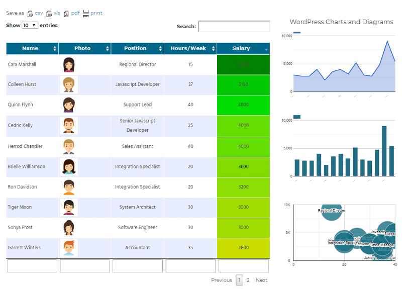
Recommended: wpDataTables
wpDataTables can make it that way. There’s a good reason why it’s the #1 WordPress plugin for creating responsive tables and charts.

And it’s really easy to do something like this:
- You provide the table data
- Configure and customize it
- Publish it in a post or page
And it’s not just pretty, but also practical. You can make large tables with up to millions of rows, or you can use advanced filters and search, or you can go wild and make it editable.
“Yeah, but I just like Excel too much and there’s nothing like that on websites”. Yeah, there is. You can use conditional formatting like in Excel or Google Sheets.
Did I tell you you can create charts too with your data? And that’s only a small part. There are lots of other features for you.
WPForms
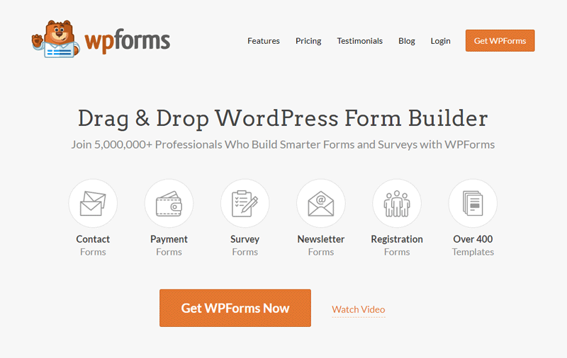
Imagine you’re crafting a digital conversation starter. That’s WPForms. It’s friendly, almost like chatting over coffee, and it makes form building as easy as pie. Think of it as your digital handshake, welcoming users and getting the info you need without the fuss.
Features:
- Drag-and-drop form builder
- Email notifications
- Pre-built form templates
Formidable Forms
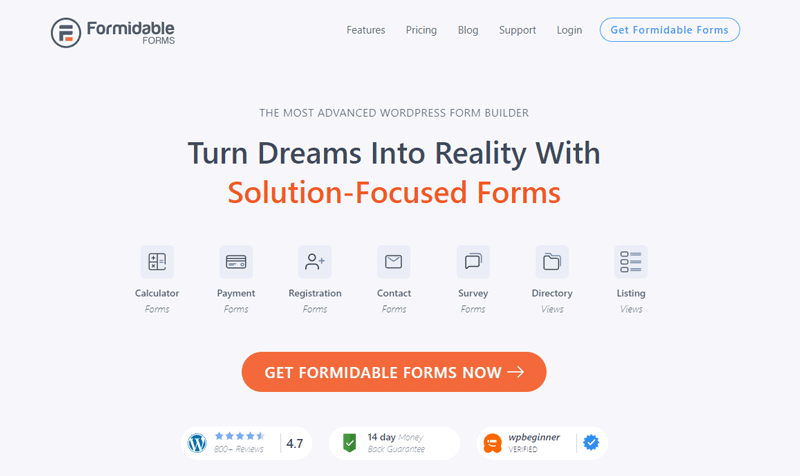
Welcome to the Swiss army knife of WordPress form builders—Formidable Forms. It doesn’t just collect data; it’s like a genie that transforms entries into content, lists, or even directories, right before your eyes.
Features:
- Advanced data management
- Visual data reporting
- Integrated Views for displaying user-submitted data
Graphina – Elementor Charts and Graphs
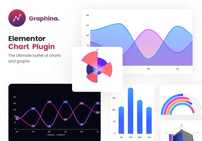
It’s all about visuals with Graphina. For folks using Elementor, it’s a playground of charts and graphs that slip right onto your pages, no sweat. Your data will pop, lock, and drop with stunning animations that grab your visitors by the eyeballs.
Features:
- Dynamic chart animations
- Interactive visualization
- Elementor integration
Data Tables Generator by Supsystic
All aboard the data express! Data Tables Generator is like your personal data conductor, guiding your masses of info into organized, searchable, and sortable tables that don’t just look smart—they act it.
Features:
- Advanced data table configuration
- Responsive design
- Front-end table editing
UberChart Plugin
UberChart is like a candy store for data lovers. Knuckle deep in customization, you can tweak and finagle every pixel until your chart is the sharpest tool in the shed. Big data? Big designs? Bring it on.
Features:
- Extensive customization options
- Interactive elements
- Large dataset management
MonsterInsights

It’s your website’s heartbeat monitor—MonsterInsights. With just a glance, grasp how folks find and use your site. This plugin takes the guesswork out, painting a clear picture of your online presence’s pulse.
Features:
- Real-time analytics
- Content performance tracking
- User behaviour understanding
WP Charts and Graphs
Squint at spreadsheets no more; WP Charts and Graphs is the visual whisperer turning snooze-worthy data sheets into snappy, shareable info bites. It plays nice with various data sources, turning them into digestible charts and graphs.
Features:
- Integrations with multiple data sources
- Live updates
Visualizer
A little pixie dust for your data, Visualizer waves its wand and whoosh—your info is now engaging charts easy on the eyes and a breeze to understand. It’s like giving your data a makeover; they’ll come out the other side looking runway-ready.
Features:
- Responsive visualizations
- Interactive charts
- Library of chart templates
TablePress
TablePress is your ticket to tables that talk the talk. It’s not about the numbers; it’s about the stories they tell. With features like sorting and filtering, your data steps up, speaking clear and confident.
Features:
- Row sorting
- Data import/export
- Shortcode embedding
UberChart
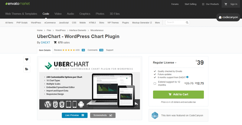
Not to double-dip, but UberChart deserves a second scoop for its heavyweight title in the WordPress chart-building ring. Customization’s its middle name, and complexity’s its game. It’s like the bespoke tailor of the data vis world.
Features:
- Custom-designed charts
- Advanced data series tweaking
- Pre-built color schemes
Infographic Maker – iList
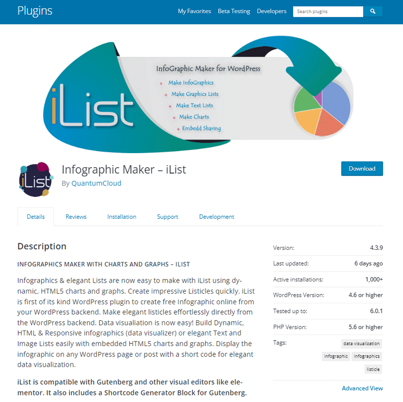
Sometimes data wants to party, and iList is the DJ, spinning bland bullet points into eye-candy infographics that get your message thumping. It’s about visuals that stick, turning “meh” into “more, please!”
Features:
- Data storytelling
- Pre-designed templates
- Interactive options
FAQ about WordPress data visualization
What’s the best WordPress data visualization plugin out there?
Oh, talk about a loaded question. It’s like picking your favorite ice cream flavor—there’s no one-size-fits-all. But, wpDataTables often hits the top spot. It’s super user-friendly and chock-full of features, from interactive charts to responsive designs that play nice with mobile devices.
Can I create real-time data visualizations with WordPress plugins?
Absolutely. Real-time data visualization is like the pulse check of your site. Plugins such as WPDataTables can handle that in style. They let you hook up with external API data integration, pulling in fresh data to keep those charts dancing right on the beat.
Is it difficult to set up a data visualization plugin in WordPress?
Not really, nah. Most WordPress data visualization plugins are about as hard to set up as a new app on your phone. Usually, it’s a quick install plus a bit of drag-and-drop. If you can whip up a post in WordPress, you’re golden.
How do I make my data charts and graphs mobile-responsive?
Oh, mobile users will love you for even asking. So, listen up. Most top-tier data visualization tools—like Highcharts—are built to automatically size right for all screens. They’re like those stretchy jeans that just fit, no matter what. Check the plugin’s settings for responsive options, and you’ll be set.
Do these plugins support data import from sources like Excel or Google Sheets?
Oh yeah, they’re like the best pen pals with Excel and Google Sheets. Tools like TablePress make it super easy to import your spreadsheets and get them looking sharp on your site. Just export your data as a CSV, and the plugin should handle the rest.
Can I customize the look and feel of my data charts?
Customization is the name of the game. Slap your brand colors on there, adjust the fonts—make those charts your own. Plugins like Chart.js are especially big on letting you get creative, so your charts fit your style like a tailored suit.
Do I need to know any coding to use WordPress visualization plugins?
Not a single line, my friend. Think of these plugins as your code translators. They get techy so you don’t have to. If you do want to dabble in the digital dark arts, some tools will let you tweak the HTML and JavaScript, but it’s totally optional.
How secure are WordPress data visualization tools?
Security’s tighter than a drum. Most reputable plugin developers are on the ball, keeping things locked down. But hey, this is the web, right? Keep that theme and plugins updated, and don’t shy away from the occasional security check-up.
Are these data visualization plugins capable of handling large datasets?
You bet. Some plugins swing heavy with big data sets, like wpDataTables, throw gigabytes at them and they won’t even flinch. But, watch out for slower load times with huge numbers. That’s where D3.js flexes—good for data-dense projects. For colossal data, consider a dedicated hosting solution so your site doesn’t crawl.
Can I use these plugins to create interactive maps?
Not just maps, we’re talking about interactive data mapping WP masterpieces here. Want to chart a treasure hunt? Go for it. WP Google Maps and similar plugins let you lay down markers, set routes, and even drop some trivia along the way. It’s like turning your data into a game people want to play.
Conclusion
So, we’ve danced around the digital landscape, exploring the ins and outs of WordPress data visualization plugins. As we pull down the curtain, just remember—the right tool transforms numbers into stories, and data into decisions.
Let’s recap the high beats:
- You’ve got powerhouses like Visualizer for plug-n-play simplicity.
- Craving more? Chart.js is your canvas for full-on artistry.
Think about all those sleepy eyes you’re going to wake up with snazzy infographics and dynamic data rendering. And when someone spills coffee trying to digest a spreadsheet, you’ll be the hero turning tables into tidy, talking graphs.
Now, go ahead and pick your visual sidekick. Whether it’s getting real with real-time data or charting a course through complex analytics, let your stories shine. Dust off the data. Make every point count. And watch—just watch—as your insights stand up and strut.
If you liked this article about WordPress data visualization, you should check out this article about open source data visualization.
There are also similar articles discussing data visualization javascript libraries, interactive data visualization, misleading data visualization examples, and data visualization tools.
And let’s not forget about articles on data visualization color palettes, data visualization best practices, data visualization examples, and weather data visualization.


