Gauge charts are vital for anyone needing to present data as a visual instrument cluster. These dial charts are indispensable in dashboard indicators, helping users quickly assess metrics like speed, temperature, or fuel levels. With a clear, graphical indication, gauge charts offer an intuitive way to monitor performance and efficiency.
You’ll find these charts everywhere from tech analytics dashboards to industrial meters, offering real-time feedback and insights. In this article, you’ll learn how to effectively create and implement gauge charts to enhance your data visualization efforts.
By the end of this read, you’ll be equipped to design intuitive gauge charts for your needs. We’ll dive into types of gauge charts, their applications, and best practices for implementation, ensuring you leverage these tools to the fullest.
This is your go-to guide for mastering gauge charts, from the basics to advanced uses, making your data presentation both compelling and effective.
Table of Contents
- What Is A Gauge Chart?
- Gauge Chart Example
- When To Use A Gauge Chart
- How To Read A Gauge Chart
- Types Of Gauge Charts
- How To Make A Gauge Chart In WordPress
- How To Make A Gauge Chart In Excel
- How To Make A Gauge Chart In Google Sheets
Table of Contents
What Is A Gauge Chart?
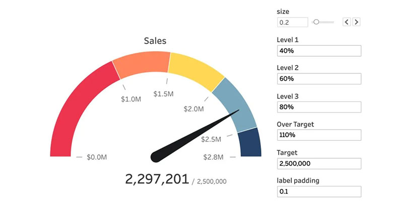
A gauge chart is a visual tool used to display single-value metrics effectively. It resembles a car’s dashboard gauge, employing a needle or similar indicator to show where a measurement lands within a predefined range, making it ideal for illustrating performance, like progress toward a target or goal.
Gauge Chart Example
Chart created with wpDataTables
When To Use A Gauge Chart
When simplicity hits the sweet spot, that’s gauge chart territory. Picture this:
- Aiming to spotlight a crucial stat? Check.
- Need to showcase progress towards a goal? Absolutely.
- Dashboard flavor of the month? You bet.
Imagine a scenario: a single value that needs shouting from the rooftops—profit margins, customer satisfaction, the classic sales targets. Steer clear if you’re juggling a heap of numbers or tracking trends over eons. But for that singular, stand-out metric, gauge it up—front and center. Make that needle point straight to what matters.
How To Read A Gauge Chart

So, you’ve locked eyes with a gauge chart. Now what? Chill. It’s straightforward.
- Zero in on that needle or dial.
- It’s your compass—north, south, east, west of your data world.
- The backdrop’s got numbers, right? Ranges, typically.
- Where that needle’s pointing? That’s the tale of the tape. Your current stat’s home turf.
Now, most have colors coded like traffic lights. Green usually screams “all good,” while red? Well, no prizes for guessing—that’s your signal to buckle up and take action. Read it in a snap. No need to squint over lines or bars. Gauge charts—get the picture fast, move even faster.
Types Of Gauge Charts
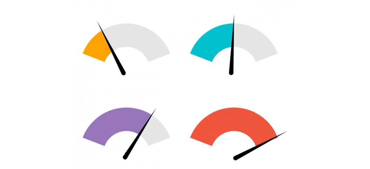
Let’s slice through the gauge chart pie; it’s not just one flavor.
- Solid Gauge: Compact, modern, a minimalist’s best friend.
- Speedometer: Classic. Feels like you’re checking your car’s dashboard.
- Donut Gauge: A sleek twist—think of a speedometer sans the center.
- Linear Gauge: Breaks the mold, stretches out like a horizon. Different, right?
Each one has its stage where it shines. Dials for dynamic impact. Donuts for a dash of contemporary. And that linear type? Perfect when vertical or horizontal space is the canvas. Pick your poison; let that data sing.
How To Make A Gauge Chart In WordPress
Here’s the approach that could be applied to creating a gauge chart with wpDataTables:
- Open the Chart Creation Wizard:
- Navigate to your WordPress admin panel, go to wpDataTables -> Create a Chart.
- Assign a name to your chart for easy identification and select a rendering engine (Google Charts, Highcharts, Chart.js, or ApexCharts might be available options, depending on the plugin’s updates).
- Define the Data Source:
- Choose the table that will serve as the data source for your new chart. This is typically done through a simple selection box within the wizard.
- Set the Data Range:
- Specify which parts of your data table you want to include in the chart. This involves selecting the columns (and possibly rows) that contain the data points you wish to visualize in your gauge chart.
- Formatting and Preview:
- Customize the appearance and settings of your chart. While gauge charts might have specific options, you generally have the ability to adjust aspects like chart titles, colors, and possibly the range of values displayed on the gauge.
- Use the live preview feature to review the chart’s appearance. If it’s not exactly as you want, you can go back and adjust the settings as needed.
- Finalize and Insert the Chart:
- Once you’re satisfied with the chart, save your work. The plugin will generate a shortcode for your new gauge chart.
- Use this shortcode to insert the gauge chart into your WordPress posts or pages.
How To Make A Gauge Chart In Excel
To create a gauge chart in Excel, which combines a Doughnut chart and a Pie chart into a single visualization, follow these steps:
- Prepare Your Data:
- Set up your data in a way that supports the creation of a gauge chart. Typically, this involves arranging your data points in two series: one for the Doughnut chart and one for the Pie chart.
- Select Data Range:
- Select the range of data that you will use for the gauge chart. For example, select the range H2:I6.
- Insert Custom Combo Chart:
- Go to the
Inserttab, click on theCombochart symbol in the Charts group, and then selectCreate Custom Combo Chart.
- Go to the
- Configure Chart Types:
- In the Insert Chart dialog box, set the chart type for the Doughnut series to
Doughnutand for the Pie series toPie. - Plot the Pie series on the secondary axis.
- In the Insert Chart dialog box, set the chart type for the Doughnut series to
- Customize the Chart:
- Remove the chart title and legend for clarity.
- Select the Pie series, go to the
Formattab, and use theFormat Selectionoption to change the angle of the first slice to 270 degrees. - Adjust the fill color of each point in the Pie series to create the gauge needle effect: make one point black (the needle) and the others transparent.
- Repeat the customization for the Doughnut series, assigning different colors to each segment (e.g., red, yellow, green) and making one segment transparent to create the gauge look.
- Adjust Chart Area:
- Select the chart area, and in the
Shape Stylesgroup on theFormattab, set the Shape Fill toNo Filland the Shape Outline toNo Outline.
- Select the chart area, and in the
- Use a Spin Button (Optional):
- If you want to make the gauge interactive, you can use a Spin Button to adjust the value dynamically. This involves changing a cell value (e.g., cell I3) that influences the gauge’s needle position.
How To Make A Gauge Chart In Google Sheets
To create a gauge chart in Google Sheets, follow these steps:
- Enter the Data:
- Start by entering your data into Google Sheets. For example, you might enter metrics for a football team in two columns: one for the metric names (e.g., Offense, Defense, Special Teams) and one for their corresponding values.
- Create the Gauge Chart:
- Highlight the cell range containing the metric you want to create a gauge chart for (e.g., A2:B2 for the Offense metric).
- Click on the
Inserttab along the top ribbon, then selectChart. - In the Chart editor panel that appears on the right side of the screen, click the dropdown menu for
Chart typeand selectGauge chart. A gauge chart will automatically be created based on your selected data.
- Modify the Gauge Chart:
- To customize the gauge chart, such as changing its colors, click on the
Customizetab within the Chart editor. - Click the dropdown arrow next to
Gaugeto access customization options, where you can specify colors for various maximum and minimum values on the gauge chart. The colors on the gauge chart will automatically update based on your selections.
- To customize the gauge chart, such as changing its colors, click on the
- Create Multiple Gauge Charts (Optional):
- If you want to create multiple gauge charts for different metrics, you can change the
Data rangein the Chart editor to include the additional metrics (e.g., change to A2:B4 to create a gauge chart for each metric listed in rows 2 through 4).
- If you want to create multiple gauge charts for different metrics, you can change the
FAQ About Gauge Charts
What are gauge charts used for?
Gauge charts are used to visually represent data in a clear, concise manner. Typically found in dashboards, they display metrics like speed, temperature, or performance indicators, making it easy to monitor key data points at a glance. This helps in quick decision-making and performance tracking.
How do I create a gauge chart?
Creating a gauge chart involves selecting a tool or software, like Excel or specialized data visualization software. You’ll input your data, customize the dial chart settings, and adjust the needle to reflect your metrics accurately. Adding labels and color coding can enhance clarity.
Where can I use gauge charts?
Gauge charts are versatile and can be used in various fields such as business analytics, industrial monitoring, and digital dashboards. They’re commonly seen in performance monitoring tools, speedometers, thermometers, and control panels, offering a quick visual indicator of key metrics.
What are the different types of gauge charts?
There are several types of gauge charts, including radial gauges, speedometers, and circular gauges. Each type serves a different purpose. Radial gauges are great for showing progress, while circular gauges typically display range-based metrics, like fuel levels or pressure readings.
What software can I use to create gauge charts?
You have multiple options for creating gauge charts. Popular choices include Microsoft Excel, Google Data Studio, and specialized tools like Tableau, Power BI, and D3.js. Each offers unique features and customization options to suit your data visualization needs.
How do I read a gauge chart?
Reading a gauge chart is straightforward. Typically, they feature a needle pointing to a value on a dial. The dial is divided into sections indicating different ranges, such as low, medium, and high. The position of the needle gives a quick indication of the metric’s status.
What industries benefit most from gauge charts?
Industries such as manufacturing, IT, automotive, and healthcare frequently use gauge charts. They help monitor vital statistics like machine speed, system performance, and patient vitals. These charts provide real-time feedback and are crucial for maintaining operational efficiency.
Can gauge charts display multiple metrics?
Yes, multi-gauge charts can display several metrics simultaneously. This involves combining multiple dials into one visual panel, each showing a different measurement. It’s useful in dashboards where monitoring diverse data points, like temperature and pressure, is necessary for comprehensive oversight.
What are the limitations of gauge charts?
Gauge charts can be less effective for displaying complex data sets or multiple variables due to their simplicity. They are best suited for displaying single metrics. Overloading them with too much information can reduce readability and effectiveness, making them challenging to interpret at a glance.
How do gauge charts enhance dashboards?
Gauge charts enhance dashboards by providing intuitive, real-time visual indicators of key performance metrics. They help users quickly grasp important data points, facilitating faster decision-making. When integrated into dashboards, they offer a clear snapshot of performance, improving data monitoring and analysis efficiency.
Conclusion
Gauge charts are essential for efficient data visualization in dashboards and control panels. They simplify complex data into a visual format that is easy to interpret. Gauge charts provide quick, actionable insights and help monitor key metrics like speed, temperature, and performance indicators.
To effectively utilize gauge charts, remember:
- Choose the right type (radial, circular, etc.) for your data.
- Use software like Excel, Tableau, or Power BI for creation and customization.
- Ensure they are clear and easy to read to maximize efficiency.
By now, you should understand various applications, creation methods, and best practices for utilizing gauge charts to enhance dashboards. Implement these insights to improve data presentation, make informed decisions quickly, and keep your performance metrics in clear view. This knowledge will allow for more robust, intuitive data visualization strategies.
If you liked this article about gauge charts, you should check out this article about line charts vs candlesticks.
There are also similar articles discussing box plots, scatter plots, funnel charts, and pie charts vs bar charts.
And let’s not forget about articles on pie charts vs donut charts, scatter charts, histograms, and how to choose the right chart for your data.


