Imagine a canvas, vast and blank, awaiting your masterpiece. The brush? It’s the fonts on your WordPress site; they are the very strokes that captivate and engage your audience.
Typography is not just the art of words — it’s pivotal in shaping user experience and brand perception. It’s an essential tool in your design kit, powering readability, mood, and even influences user behavior.
By selecting the best WordPress fonts, you ensure your website isn’t just spoken but emphatically heard.
Dive into an array of Google Fonts that can dramatically alter your website’s aesthetic and functionality.
By the end, expect more than just knowledge; anticipate a transformed WordPress canvas that speaks volumes, literally.
Table of Contents
12 of the Best WordPress Fonts
| Font Name | Category | Styles Available | Characteristics | Best Use Cases |
|---|---|---|---|---|
| Noto Sans | Sans-serif | 4 styles | Clean, simple, multilingual | General web text, UI/UX design |
| Roboto | Sans-serif | 12 styles | Functional, geometric | Mobile and web interfaces |
| Mina | Serif | 2 styles | Readable, straightforward | Long-form content, blogs |
| Open Sans | Sans-serif | 10 styles | Friendly, legible | Web and mobile design, body text |
| Playfair Display | Serif | 6 styles | Stylish, high-contrast | Headlines, titles, and elegant designs |
| BenchNine | Sans-serif | 3 styles | Lightweight, tall | Decorative display, headers |
| Slabo | Serif | 2 styles | Slab serif, precise | Online advertising, web content |
| Lato | Sans-serif | 18 styles | Professional, warm | Corporate sites, body copy |
| Oswald | Sans-serif | 6 styles | Compressed, contemporary | Headlines, banners, caps text |
| Lora | Serif | 4 styles | Brushed curves, balanced | Editorial content, body text |
| Montserrat | Sans-serif | 18 styles | Geometric, urban | Signage, headers, logos |
| Source Sans Pro | Sans-serif | 12 styles | Versatile, clean | User interfaces, documentation |
Noto Sans
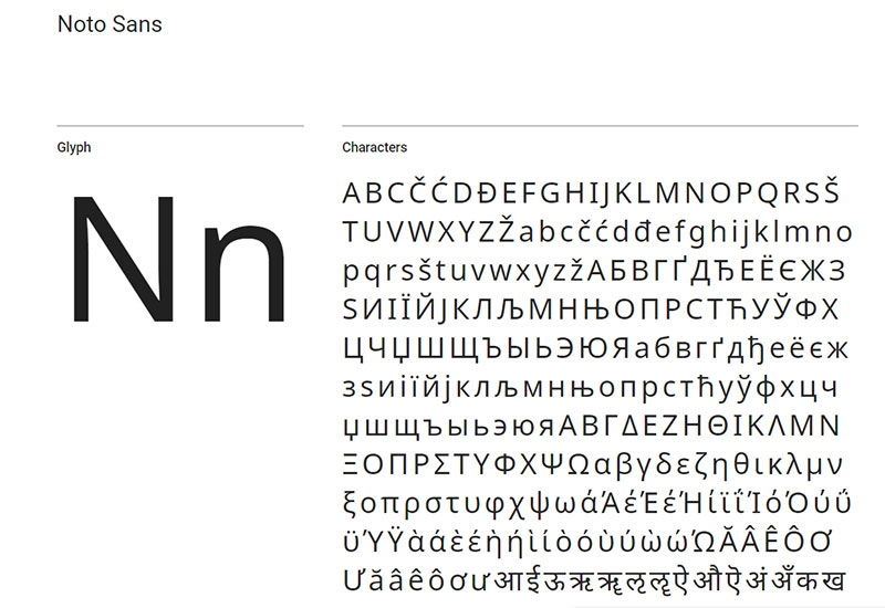
Noto is great if you have a multi-language website, yet you want to maintain the same font on all site versions. This WordPress font supports no less than 30 scripts and it plans to add Unicode to the list as well.
You can choose between Regular, Bold, Italic, or a combination of styles. This sans serif font is actually derived from Droid, so if you know it and you’ve been using it before, you’ll definitely like this one as well.
Roboto
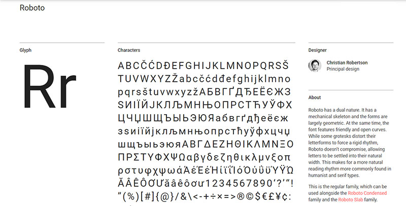
Roboto is one of the best WordPress fonts for modern websites. It is mostly based on abstract geometric shapes and interesting curves. It works well both for titles and body content, which makes it versatile and adaptable to different scenarios.
You can combine it with other Google fonts as well. Roboto also comes in a condensed version, which is called Roboto Condensed and it is popular among WordPress users today.
Mina
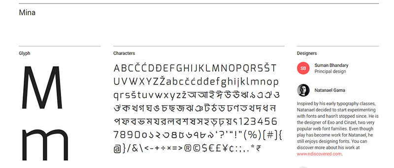
A lot of websites use Mina according to its Google fonts page. In fact, the Google API system discovered that this font was displayed no less than 180,000 times during the past few weeks. Imagine how happy users are with the readability of this WordPress font.
It is a sans-serif font combined with the Banga and Latin families. The former is based on sharp geometric shapes.
You can use this sans-serif font as both Regular and Bold, but it has no Italic version. Mina appeared as an extension of Exo, a font created by Natanael Gama, being part of the Latin family. It is mostly used in a smaller size.
Open Sans
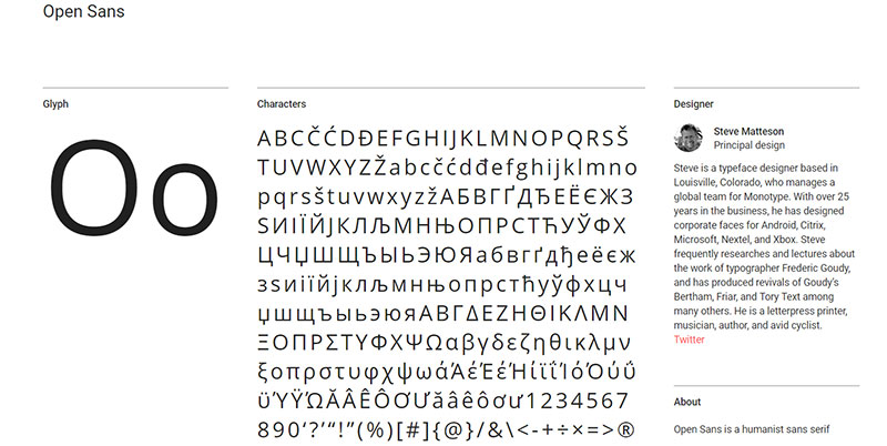
Open Sans was created by Steve Matteson. If you fancy Sans-Serif fonts, Open Sans will play nicely with your overall style. In fact, the Google colossus uses Open Sans on some of its websites and you can see it on printed materials too.
It is one of the cleanest, simplest font choices one can make. Open Sans can be used for all sorts of purposes – websites, mobile interfaces, print materials, and more.
Hey, did you know data can be beautiful too?
wpDataTables can make it that way. There’s a good reason why it’s the #1 WordPress plugin for creating responsive tables and charts.

And it’s really easy to do something like this:
- You provide the table data
- Configure and customize it
- Publish it in a post or page
And it’s not just pretty, but also practical. You can make large tables with up to millions of rows, or you can use advanced filters and search, or you can go wild and make it editable.
“Yeah, but I just like Excel too much and there’s nothing like that on websites”. Yeah, there is. You can use conditional formatting like in Excel or Google Sheets.
Did I tell you you can create charts too with your data? And that’s only a small part. There are lots of other features for you.
Playfair Display
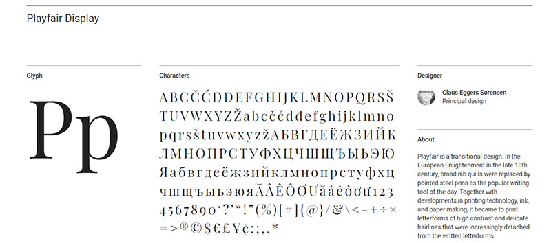
Playfair Display appeared in 2013 as a creation of Claus Sørensen and it’s still going strong today. If you need an extra-large font, Playfair will do the job for you.
If you have an image of the 18th-century printing technology writing in your head, you can imagine how this font looks, as it is entirely inspired by that.
It is similar to Baskerville and Martins’ Boydell Shakespeare font. Use it only for titles and headlines for maximum impact.
BenchNine

BenchNine is one of the best fonts for blogs that have a vintage look. It is inspired by ink bleeds and borrows characteristics from the vernacular woodcut type. If you’re looking to expand your collection, you can find more fonts here.
Slabo
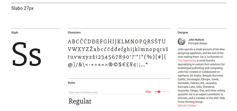
Have you ever used WordPress fonts that are specifically designed for a certain size?
Well, if not, here’s your chance to try it.
You can use it for both body text (13px) and headlines (27px), depending on your own needs.
The font was developed by John Hudson and looks best at the specified sizes.
Lato
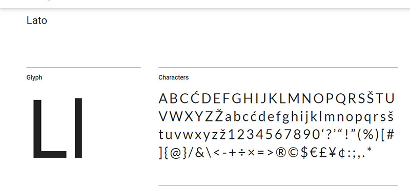
Lato is a hit in the USA – it has no less than 8 billion displays according to the Google API. Lato, which translates as “summer” from Polish, is a Sans-Serif font developed by Łukasz Dziedzic in 2010. The sans-serif font remains popular to this day because of its elegance and simplicity.
If you have a WordPress website and this one didn’t come by default with a WordPress theme, it would be quite a surprise
Oswald
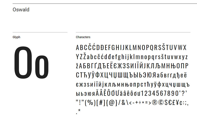
If you are familiar with the Alternate Gothic typeface that everyone was crazy about at a certain point in the past, you’ll be happy to learn about Oswald, an updated version of this cherished font choice.
In a world where everyone spends most of their time in front of a device, Oswald is needed to bring us back to the historical writing style. Keep in mind that this font is very tight in terms of letter spacing.
Lora
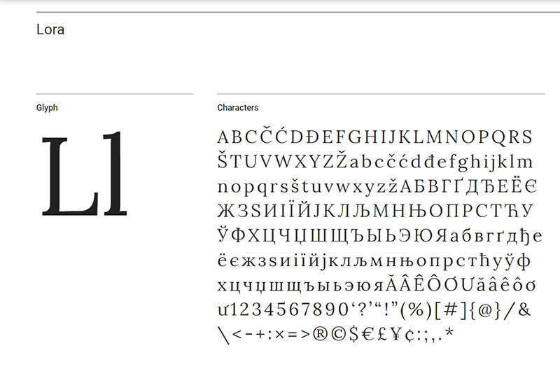
For a more elegant look, Lora is placed among the best WordPress fonts for modern websites. It is a balanced Serif font, inspired by the curviness of calligraphy. The font is well-suited for body text, but you can use it in a combination for headings as well.
It is definitely a memorable font and Lora would look great on storytelling or art-related websites.
Monserrat
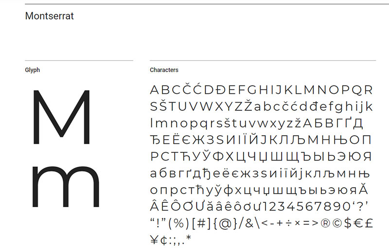
You’ve almost certainly already seen Monserrat around. It is a highly popular font, used for all sorts of purposes. It is suitable for professional websites that want to keep everything simple, yet easy to read. It is used by around 5 billion websites all around the world.
Combine this font with Lato or Open Sans for an interesting look.
Source Sans Pro
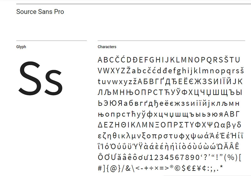
Another one of the best WordPress fonts, Source Sans Pro was developed by Adobe to fit all sorts of user interfaces. Since then, the font is used on 4 billion websites in the US and France alone. Users prefer to combine it with bolder fonts like Oswald or Roboto.

FAQs about the best WordPress fonts
What are the best WordPress fonts for readability?
Readability is key. Fonts like Arial, Verdana, and Times New Roman stand out for their clarity and ease of reading. They’re web-safe options that ensure your content is accessible to a wide audience, essential for enhancing user experience metrics on your site.
How do I change the font on my WordPress site?
To change fonts, navigate to the Customizer in your WordPress dashboard, often located under Appearance. Here, you can typically adjust your fonts via the custom fonts plugin or directly with CSS if you prefer a more manual approach.
Are Google Fonts compatible with WordPress?
Absolutely, Google Fonts are fully compatible with WordPress. Easily integrate them using plugins or by enqueuing the fonts in your theme’s functions.php file. This integration not only expands your typographic palette but also ensures great font performance across devices.
What are the best free WordPress fonts?
Google Fonts offers a vast repository of free fonts that are perfect for WordPress. Popular choices include Roboto, Open Sans, and Lato. These fonts are not only stylish but also optimized for web use, balancing design and practicality.
How can I ensure my WordPress fonts are mobile-friendly?
Prioritize responsive typography. Choose fonts that are legible on small screens and test them across various devices. Utilizing CSS media queries can help adjust font sizes and line heights to improve readability on mobile devices.
Can custom fonts slow down my WordPress site?
Yes, overloading with custom fonts can slow down your site. Most of the times, having a simple website is better. Optimize by choosing only the necessary font weights and styles, and consider using a font display swap to minimize visible delays in text rendering.
What’s the best way to pair fonts on my WordPress site?
For a harmonious look, combine a serif and a sans-serif font. Use the serif for headings to grab attention and the sans-serif for body text for readability. Tools like Font Pair can help you visualize and select complementary pairings.
How do I add a new font to my WordPress theme?
To add a new font, you can use a plugin like Easy Google Fonts or manually add it by embedding the font file in your theme and using CSS to apply it site-wide. Ensure you respect font licensing and copyright.
Are there any SEO advantages to choosing the right WordPress fonts?
According to the SEOpowerplays newsletter and professionals gathering on the platform, fonts themselves don’t impact SEO directly. However, the readability and user experience they provide can influence engagement metrics. Improved user engagement can indirectly boost your site’s SEO ranking.
What should I consider about font licensing on WordPress?
Always ensure that the fonts you use are properly licensed. Unauthorized font use can lead to legal issues. Most free fonts come with licensing for commercial use, but double-check to avoid any potential pitfalls.
How do I choose the right font for my WordPress website?
The goal, audience, and brand identity of your WordPress website should all be taken into account while selecting the typeface.
A decent rule of thumb is to pick a typeface that complements the look and feel of the website while still being simple to read. To find the ideal combo that best suits your business, you can also experiment with different font combinations.
Conclusion
Choosing the best WordPress fonts isn’t merely about aesthetic appeal; it’s about creating readable, accessible content that enhances user experience and complements your site’s design.
By incorporating responsive typography and opting for web-safe options, you ensure that your WordPress site remains functional and appealing across different devices and browsers. The right typography, from Google Fonts to custom font plugins, can drastically shape the perception of your site and, by extension, your brand.
As you apply these insights:
- Prioritize readability
- Ensure mobile-friendly design
- Optimize font loading speeds
Remember, the fonts you select weave the visual story of your site. They’re not just characters on a screen; they’re the very foundation of your site’s user engagement and visual impact. Moving forward, let these typographical choices reflect the core of your brand’s online identity, ensuring every word strikes with purpose and clarity.
If you enjoyed reading this article on the best WordPress fonts, you should check out this one about WordPress footer plugins.
We also wrote about a few related subjects like WordPress menu plugin, WordPress login plugin, WordPress gallery lightbox, jQuery plugins, WordPress portfolio plugin and WordPress lightbox plugins.