
Ever scroll through a sea of numbers and just… glaze over? It’s like trying to read a novel in an alien language. But imagine those same numbers turned into a vibrant graph, a funky chart, or a slick interactive dashboard. That’s the magic of data visualization principles.
We’re living in an age where data is the new gold. It’s everywhere. But raw data? That’s like having a block of marble. The real art is in chiseling that marble into a masterpiece. By the end of this article, you’ll uncover the secret sauce to turning drab numbers into meaningful visuals.
Why should you care? Because in our digital playground, visuals rule. They communicate faster, clearer, and pack a punch. Whether you’re presenting to your boss, impressing a client, or just satisfying your own curiosity, mastering the craft of data representation is your ticket to stand out.
Table of Contents
Understanding Data Visualization
Data visualization is all about taking complex info and turning it into visual stories. It’s a mix of art and science.
Why?
Because our brains are wired to process visuals way faster than boring old text. Think about it: you see a pie chart, and boom! Instantly, you know who ate the most slices at the party.
Now, about the significance. Imagine you’re at a concert, right? If the artist just talks about the notes and the chords without playing them, would you enjoy it?
Nah.
Similarly, data needs a stage, a spotlight. And that’s what data visualization gives it. It’s like the rock star version of data.
Benefits of Effective Data Visualization
- A clearer message: Think about it. You’re more likely to remember that wild, colorful graph than a page of numbers.
- Faster decision-making: It’s like seeing a red light while driving. No need to read a sign; you just stop.
- Easy spotting of patterns: It’s the difference between looking at a starry sky and a mapped constellation. Patterns just pop!
Alright, cool. So we’ve got the basics down. But like every art, there are some data visualization principles to keep in mind.
Core Principles of Data Visualization
Truthfulness in Representation
Oh boy, this one’s big. Like, superhero-movie-finale big.
Ever seen those graphs in news articles that just don’t feel right? Maybe the numbers are squished or the bars are all out of proportion. Yep, that’s where truthfulness comes in.
Avoiding Misleading Graphs
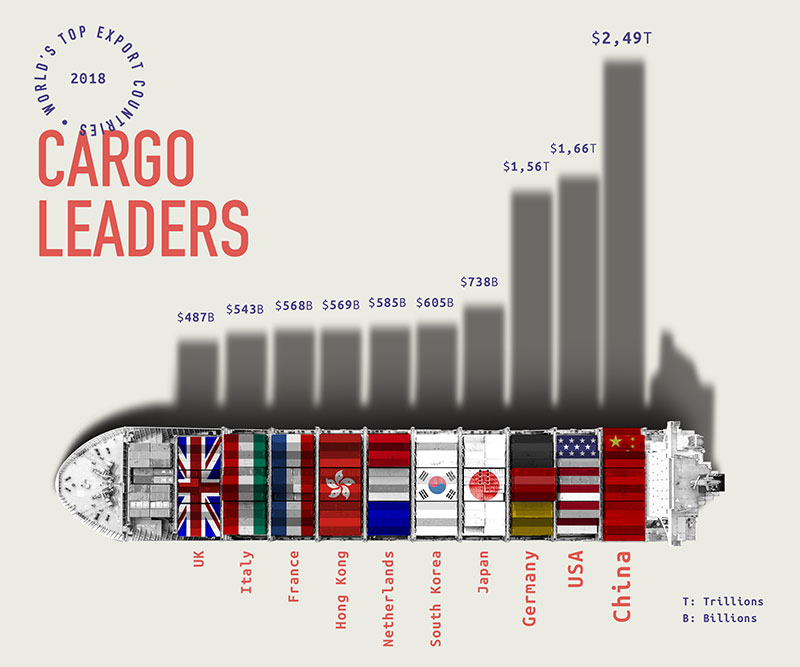
Chart created with wpDataTables
Rule number one in the Data Viz Club? No misleading graphs. And trust me, it’s easier to mess up than you’d think.
Like, ever shown only a tiny part of the y-axis to make a difference look bigger? That’s a big no-no. It’s like using a filter to make the sky look super purple. Might look cool, but ain’t honest.
Importance of an Honest Baseline
Bars starting from, well, the base. The bottom. The zero.
Adhering to Conventions
Okay, it might sound a bit boring, but it’s like the grammar of visuals. We all kinda need to follow the rules, or else things get chaotic.
Think of it as the unspoken dress code at events. You wouldn’t wear a swimsuit to a winter party, right? Similarly, certain types of graphs work best for certain types of data.
Design and Aesthetics
Design isn’t just about making things look pretty (though that’s a big part). It’s also about making sure folks can understand what they’re looking at.
The Art of Visual Clarity
This one’s simple. Clear visuals, clear message. Muddy visuals? Well, you get the drift. So, keep things crisp. It’s like when you declutter your room; suddenly, you find stuff you never knew you had.
Emphasizing Key Data Points
It’s like highlighting the main bits in your notes. You want to make sure the super important stuff stands out. Use color, size, or placement – whatever does the trick.
Balance in Design Elements
Every element should harmonize, like a band where each member knows when to rock out and when to lay low. Too many loud elements? Noise. Too few? Yawn fest.
Storytelling with Data
Man, have you ever sat by a campfire, listening to someone weave a tale so mesmerizing you forget the world around you?
That’s kinda what we’re aiming for with data too. It ain’t just about the numbers, folks. It’s the story those numbers tell.
Setting the Scene with Data
Imagine you’re directing a movie. Before you hit the climax, you need the setting, the context. So, with data, you gotta set the scene. Give people the backdrop.
Highlighting Complications and Details
In our world, that’s the intricate patterns, the outliers, the surprising bits of data that make you go, “whoa, didn’t see that coming!”
Providing Resolutions and Actionable Insights
And bam! The climax. What’s the grand takeaway? For us, it’s those big insights that can spark change. It’s the “Aha!” moment, if you will.
Engaging the Audience
Alright, so you’ve got this dope visual. But if it doesn’t engage, it’s like a song with no rhythm.
Interactive Data Visualization Tools
Think of these as video games for data. Let folks play around, explore, dive deep. Drag stuff, zoom in, click on things. Make it an experience, not just a view.
There are a few data visualization tools to create interactive data and you need to try them.
Captivating the Audience with Relevant Data
Tailor-make it. Customize. Know who you’re talking to and show them the stuff they care about.
Simplicity and Clarity
Ever heard the phrase, “less is more?” Well, it’s golden. Especially here.
Avoiding Information Overload
You don’t wanna drown folks in data. It’s like pouring a whole bottle of hot sauce on a taco. Intense, but not enjoyable.
Making Visuals Easy to Understand
Clean. Simple. Intuitive. The last thing you want is someone squinting at your visual, utterly lost. Make it a breezy read.
Meaningful Interpretation
Getting data is one thing. Making sense of it? That’s the real magic.
Linking Data to Actionable Insights
Why does this data matter? What can we do with it? This is the bridge from “cool info” to “let’s do something about it!”
Providing Context to the Data
Don’t let your data float in space. Ground it. Connect it to the real world. It’s the difference between a random fact and a useful piece of knowledge.
Avoiding Distortions
This is where the integrity check comes in. Keep it real, keep it honest.
Steering Clear of Misleading Formats
It’s like those fish-eye lens photos. Sure, they’re fun, but they don’t really show reality.
Ensuring Accurate Data Representation
Check, double-check, triple-check. And then, check again. Precision is the name of the game.
Your beautiful data deserves to be online
wpDataTables can make it that way. There’s a good reason why it’s the #1 WordPress plugin for creating responsive tables and charts.

And it’s really easy to do something like this:
- You provide the table data
- Configure and customize it
- Publish it in a post or page
And it’s not just pretty, but also practical. You can make large tables with up to millions of rows, or you can use advanced filters and search, or you can go wild and make it editable.
“Yeah, but I just like Excel too much and there’s nothing like that on websites”. Yeah, there is. You can use conditional formatting like in Excel or Google Sheets.
Did I tell you you can create charts too with your data? And that’s only a small part. There are lots of other features for you.
Advanced Techniques in Data Visualization
Diving into the deep end now! Ever tried to pull off a skateboard trick that made your friends go, “Whoa, how’d you do that?” Advanced data visualization is kinda like that.
Incorporating Interactivity in Graphs and Charts
Imagine if your favorite video game was a flat picture. Boring, right? But add some buttons, some movement, some choices, and bam!
Hours of fun. Same with your data. Let your peeps play around, explore, and find their own path.
Why Interactivity Rocks
- Engagement Boost: It’s like the difference between watching a concert on TV and being right there, in the pit.
- User-Driven Exploration: They drive. They explore. They discover. It’s their journey.
- Endless Possibilities: Like an open-world game. Every time, a new adventure.
Using Patterns for Similar Information
Patterns are rad. Our brains love them. They help us see connections and make sense of chaos. So, why not sprinkle some of that magic on your visuals?
The Beauty of Repetition
It’s like your favorite song’s chorus. Familiar, comforting, and super catchy. Patterns give your data rhythm.
Side-by-Side Comparisons for Better Understanding
Ever tried to choose between two outfits without seeing them side by side? Tough, right? Data’s the same. Show them the options. Lay it all out. Let the comparisons begin!
The Power of Perspective
One solo graph is cool. But two together? That’s where the sparks fly. It’s all about giving context and perspective.
Common Pitfalls and How to Avoid Them
Alright, so here’s the tea. Even the best of us can trip up. But knowing where the banana peels are? That’s half the battle.
Misleading the Audience with Skewed Data
Picture this: you’re watching a movie, and the main character suddenly starts acting all out of character. Feels wrong, yeah? Same with data. Keep it real. No twist endings.
The Straight Talk on Skew
Skewing data is like Photoshopping a pic until it’s unrecognizable. Might get likes, but it ain’t the truth. Stick to the facts.
Overcomplicating Visuals
Too many ingredients can spoil the soup. And too much clutter can drown your data. Keep it sleek. Keep it chic.
The Minimalist Vibe
Less really is more. A clean, simple design lets your data shine, without all the extra fluff.
Ignoring the Target Audience
You wouldn’t wear beachwear to a snowstorm, right? Knowing your audience is key. Give them what they want, how they want it.
FAQ On Data Visualization Principles
What exactly are data visualization principles?
Ah, kickstarting with the basics! Think of it as the unwritten rules or guidelines that help turn raw data into clear, engaging, and insightful visuals.
Dive deep, and it’s like the grammar for visual storytellers. It’s all about presenting data in a way that’s easy to digest, comprehend, and act upon.
Why are they so darn important?
Imagine trying to read a book with no punctuation. Confusing, right? Data visualization principles are the punctuation of the data world.
They give structure, clarity, and, most importantly, meaning to all those numbers and facts. It’s about making data relatable and ensuring your message isn’t lost in translation.
Can I just use any chart or graph for my data?
Ah, the classic mistake! Not all data are created equal, and neither are their visual representations. Different charts convey different stories.
Bar graphs, pie charts, scatter plots – each has its unique flair and purpose. Picking the right one? It’s like pairing the right wine with your dinner.
How do colors come into play?
Colors aren’t just there to make things look pretty. They’re like the spices in a dish. Too little and it’s bland, too much and it’s overwhelming.
Colors can highlight, differentiate, or set the mood. And, oh boy, choose wisely. Your choice can either enhance or distort the data’s message.
Isn’t simplicity key in data visualization?
Totally! But there’s a thin line between simple and oversimplified. The goal is clarity. You want to strip away the fluff, but not at the expense of vital information.
It’s a balancing act. Like making sure your coffee has that perfect brew – not too bitter, not too watered down.
What role does storytelling play?
Data alone is just… well, data. It’s the narrative that brings it to life. Storytelling transforms numbers into a compelling narrative.
The highs, the lows, the plot twists – it’s what keeps your audience hooked and invested.
Are interactive visuals really the future?
You bet! Interactive visuals are like the cool new kid on the block. They allow the viewer to engage, explore, and even play around with the data.
It’s like giving them the keys to their own data-driven adventure.
How do I avoid misleading my audience?
Transparency and honesty. Avoid manipulating scales or using fancy visuals that could misinterpret the actual data. Remember, trust is hard to gain but easy to lose.
You want your visuals to be credible, accurate, and a true reflection of the facts.
Does my target audience really matter?
Absolutely! Always design with your audience in mind. What’s clear to a data scientist might be Greek to someone else.
It’s like when your friend recommends a movie. They know what you’ll love or hate. Tailor your visuals to fit the knowledge and preferences of your viewers.
How do I keep up with evolving data visualization techniques?
Stay curious and never stop learning. The world of data visualization is dynamic and ever-changing.
From new tools to innovative techniques, there’s always something fresh brewing. Attend webinars, join forums, or just play around and experiment.
Conclusion on These Data Viz Principles
No longer are we staring at endless rows of numbers, feeling that brain fog. Instead, we’re given vibrant stories, painted with data.
- We’ve unlocked the secret language of the digital realm.
- We’ve grasped the art of translating number talk into visual symphonies.
- And boy, have we learned the power of telling compelling tales with every chart and graph.
If you liked this article about data visualization principles, you should check out this article about categorical data examples.
There are also similar articles discussing nominal vs ordinal data, discrete vs continuous data examples, descriptive statistics, and different types of data.
And let’s not forget about articles on how to present data visually, real-time data visualization, primary data vs secondary data, and the advantages of secondary data.


