
Ever find yourself drowning in a sea of survey numbers and percentages, struggling for a breath of clarity? That’s where survey data visualization tools swoop in as lifesavers—because numbers don’t have to be nightmares.
Imagine transforming those static digits into dynamic, colorful insights. You’re not just looking at data; you’re experiencing it. And guess what? It’s easier than you think.
In this deep dive, we’ll unlock the power of visual storytelling for your data. Gone are the days of scratching heads over sheets of figures. We’re talking interactive charts, real-time graphs, and infographics that practically dance with information.
I’ll walk you through selecting the right data analysis software, crafting visuals that speak volumes, and even mastering the art of predicting survey result trends. By the time you reach the last line, you’ll be ready to turn any set of survey results into a compelling, visual journey that everyone can follow.
Ready to give those numbers the makeover they deserve? Let’s light up the dark with data.
Table of Contents
Survey Data Visualization Tools To Check Out
| Tool Name | Core Functionality | Ease of Use | Integration Capabilities | Best for |
|---|---|---|---|---|
| wpDataTables | Creating responsive tables and charts in WordPress | User-friendly | WordPress integration | WordPress users needing dynamic tables |
| Survey Maker | Building and analyzing surveys | Intuitive | Limited third-party integrations | Quick survey creation with analysis |
| Infogram | Designing infographics and interactive visual content | Easy with templates | Social media sharing | Non-technical users creating infographics |
| Visualizer | WordPress chart and graph integration | Simple | WordPress sites | WordPress users with basic visualization |
| SurveyMonkey | Comprehensive survey creation and analysis | Easy to advanced | Many integrations, including apps | Extensive surveys and data analysis |
| Visual.ly | Custom visual content created by professionals | Professional service | N/A (service-based) | Custom data stories and infographics |
| Jotform | Form builder with data analysis features | Very user-friendly | Numerous integrations, including CRM | Form building with strong data management |
| datapine | Business intelligence with advanced analysis | Moderate to advanced | Various business system integrations | Businesses with BI and complex data needs |
| ChartBlocks | Web-based chart builder | Easy with wizard tool | Diverse import options | Simple online chart creation |
| Tableau | Business intelligence and interactive data visualization | Moderate to advanced | Broad connectivity | Professional BI users |
| BizViz | Real-time business analytics | Moderate | Enterprise system integration | Enterprise-level analytics |
| Zoho Survey | Survey creation with comprehensive features | User-friendly | Zoho suite integration | Zoho platform users |
| Sisense | Data analytics with interactive dashboards | Moderate to advanced | Multiple third-party integrations | In-depth data analysis |
| IBM Watson | AI-powered analytics and predictive modeling | Advanced | IBM suite integration | Large-scale data projects with AI needs |
| SurveyLegend | Mobile-ready surveys with live analytics | Simple | Limited integrations | Visual, mobile-friendly surveys |
| Venngage | Infographic creation tool | Simple | Limited integrations | Quick, visually engaging infographics |
| Google Charts | Chart integration with Google services | User-friendly | Google services | Users of Google ecosystem |
| Microsoft Power BI | Comprehensive business analytics platform | Moderate to advanced | Microsoft apps and services | Microsoft users with BI needs |
| Plotly | Data visualization with advanced programming | Advanced | Programming languages APIs | Programmers and data scientists |
| GetFeedback | Customer feedback visualization | User-friendly | Salesforce integration | Salesforce users focusing on CX |
wpDataTables

First, we have the leading survey data visualization tool in the market. People choose it because it’s flexible and user-friendly. Besides, it comes with plenty of resources and runs on any WordPress website.
If you want to visualize a survey results report in a way that the audience will appreciate, use the wpDataTables Forminator integration to build charts for your survey results report. These work well with Forminator PRO and wpDataTables Premium and their advanced features.
To get started, go to wpDataTables and click “create a Table.” Then select “Create a table linked to an existing data source,” and tap “Next”.
Select “Forminator Form”. Then choose a quiz, poll, or form from the “Choose a Forminator Form” select-box.
When the box “Choose fields to show as columns” appears, select the quiz, form, or poll fields to use as columns.
We detailed this process further in an article that you can check out.
All in all, wpDataTables allows you to insert tables much easier. With the time you’ve freed up using wpDataTables, you can focus on clients and important business matters.
You’ll love the fact that this WordPress plugin is compatible with several data entry software. This includes XML, JSON, Excel, and CSV. The best part is that you don’t need to be a coding expert to use it.
After creating a poll/form/quiz, you can begin the creation of your wpDataTable. With special add-ons, you can showcase your data through attractive charts.
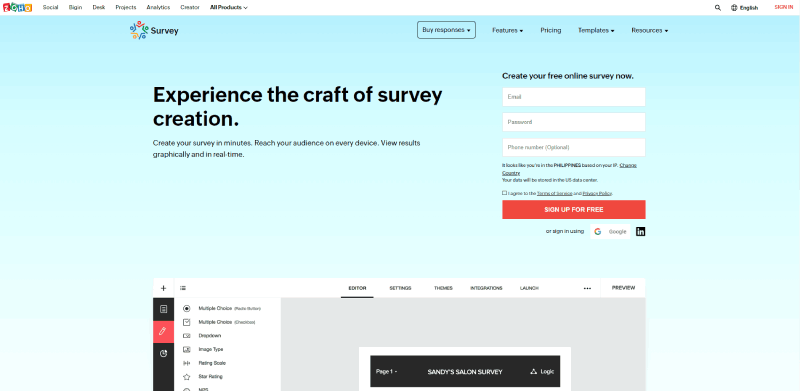
Survey Maker

This WordPress Survey plugin is a great tool for making surveys on WordPress. It’s easy for beginners and doesn’t need any coding skills. You can choose from various survey templates and customize them. All you have to do is write your questions, or you can use existing ones and adjust the templates to fit your needs. You can create different types of surveys and even make them show up as a chat, a pop-up, or create special surveys that work best for you.
This survey maker lets you create as many questions, sections, and surveys as you want. If you want to create surveys anonymously, export and import them, and get clear insights the Survey Maker is all you are looking for. You can design a contact form quickly and display it for your website visitors.
If you go for the premium version, you can get even more features. You can use 22 different question types, send emails to people taking the survey, and connect with Google Sheets, Zapier, Mailchimp, or other integrations. You are free to set limits on how many times someone can take the survey, and who can take it based on their role. So, if you need to make advanced surveys, don’t waste time and use the Survey Maker plugin to create high-level surveys in a very short time.
Infogram
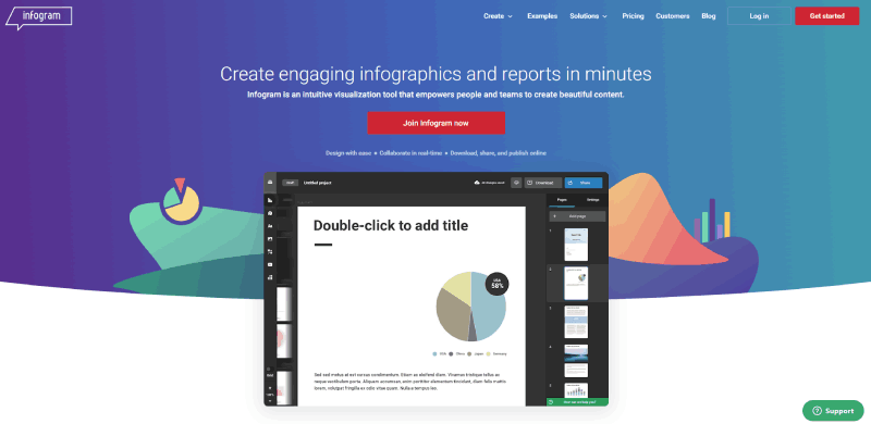
Infogram is that one friend who can take a dusty attic of data and turn it into a shiny museum exhibit. It’s packed with infographics, hypnotic visual elements, and layouts that bring your survey results into the limelight. It’s not just data visualization; it’s data artistry.
Best Features:
- Wide array of interactive charts and layouts
- Impressive library of images and icons
- Social sharing for insights on the go
Visualizer
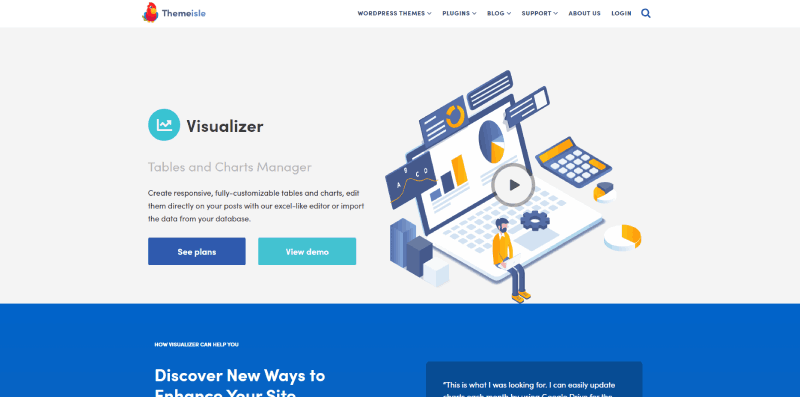
Visualizer is the quiet yet powerful sidekick in your WordPress toolkit. It takes the grunt work out of creating charts and graphs, seamlessly integrating within your site. It’s like having a secret ingredient that instantly boosts the taste without anyone knowing how easy it was.
Best Features:
- Wide range of chart types
- Interactive charts with tooltips
- Easy data import from various sources
SurveyMonkey
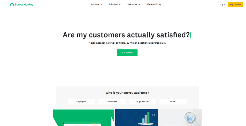
SurveyMonkey is the OG, the LeBron James of survey tools. It’s not just about asking questions; it’s about listening to the answers and translating them into action. With its built-in visualization features, SurveyMonkey wraps up the feedback in a neat package, easy to understand and share.
Best Features:
- Comprehensive survey creation tools
- Advanced analytics capabilities
- Collaborative features for team insights
Visual.ly
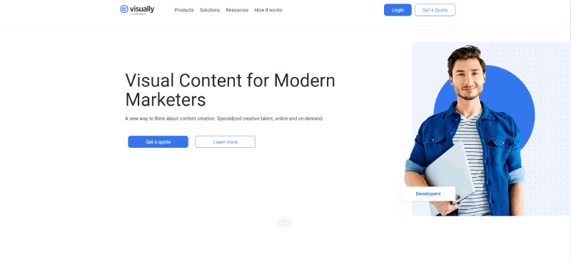
Visual.ly is less of a tool and more of a creative partner. It marries the power of storytelling with the precision of data to craft visuals that are as engaging as they are informative. It’s about taking the viewer on a journey, one chart at a time.
Best Features:
- Customized infographics and visual content produced by professionals
- Variety of visual formats
- Collaboration with a community of designers
Jotform
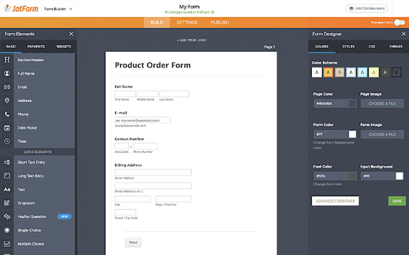
Think of Jotform as the Swiss Army knife of online form builders. Not only does it whip up forms and surveys in a snap, but it also sticks around to help sort and make sense of the responses. It’s the tool that keeps on giving, from creation to data analysis.
Best Features:
- Diverse templates and widgets
- Advanced data management
- Integration with various platforms
datapine
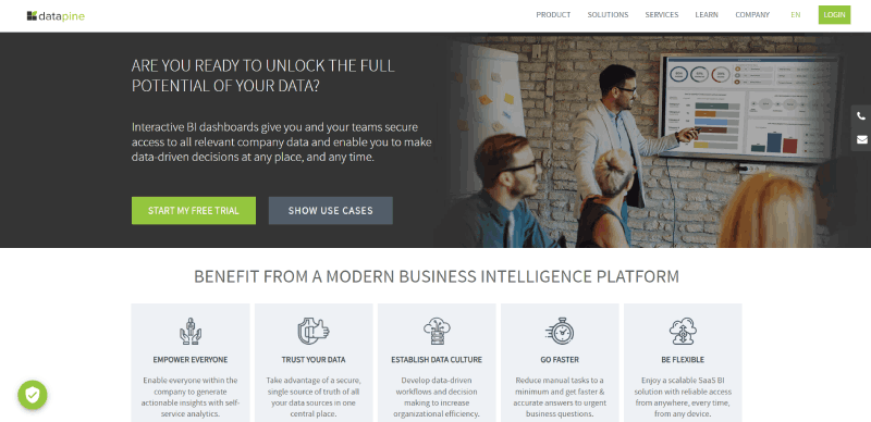
Datapine is like a wise old sage for data. It gives you the power to slice and dice your survey data, dig deep with analytics, and surface gems of insight. It’s an all-seeing eye for your business, making sense of complex information with charts and dashboards that tell the full story.
Best Features:
- Sophisticated dashboard creation
- Drag-and-drop interface
- Powerful BI functionalities
ChartBlocks
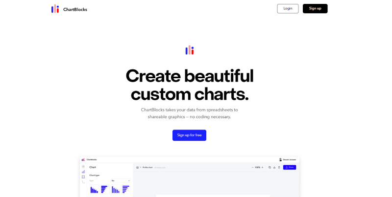
ChartBlocks is your personal data DJ, letting you mix and mash your data into charts that dance to the rhythm of your survey’s story. It’s user-friendly, scalable, and totally web-based, so you can whip up visuals anywhere, anytime.
Best Features:
- Easy chart builder wizard
- Customizable elements for branding
- Flexible data import options
Tableau
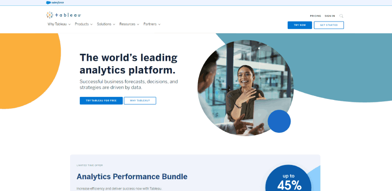
Tableau is the Iron Man suit for data geeks. It’s powerful, sleek, and makes you feel like a superhero when you turn complex datasets into stunning visuals. Elaborate dashboards and deep-diving analytics become child’s play when you suit up with Tableau.
Best Features:
- Robust data connectivity
- Interactive dashboard capabilities
- Massive community and resource library
BizViz

BizViz is the maestro of the boardroom, orchestrating data from various sources to perform harmoniously. It’s the tool that helps you see beyond numbers and into the realms of actionable insights, all with the flair of a seasoned conductor.
Best Features:
- Real-time business analytics
- Comprehensive reporting tools
- Seamless integration with enterprise systems
Zoho Survey
This is your minimalist, yet sophisticated survey solution. Zoho Survey brings a touch of elegance to data collection, wrapping it in a simple, intuitive interface that’s as pleasing to the eye as it is to the user experience.
Best Features:
- Easy customization and branching options
- Integration with Zoho’s suite of tools
- Multilanguage support for global reach
Sisense
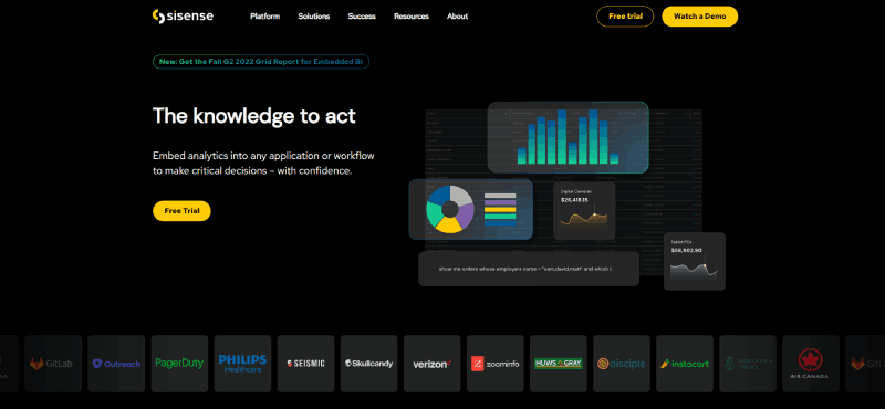
Strap yourself in because Sisense is about to take you on a roller coaster of data discovery. This powerhouse slices through massive data sets with the precision of a laser, revealing insights in ways that will make your head spin – in a good way.
Best Features:
- Advanced analytics engine
- Interactive data visualization features
- Scalable solution for growing data needs
IBM Watson

IBM Watson isn’t just smart; it’s a genius. It dives into your survey numbers, swims around, and surfaces with patterns you didn’t even know existed. And with AI capabilities, it’s like having a data scientist on your team, sans the coffee breaks.
Best Features:
- AI-powered analysis
- Predictive modeling
- Cognitive insights for deeper understanding
SurveyLegend
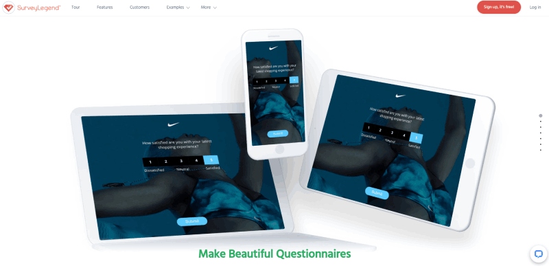
SurveyLegend strolls in with style, offering a visually arresting survey experience that’s modern and mobile-ready. It makes collecting responses as much of a joy for the users as it is for you when you see the data in all its graphical glory.
Best Features:
- Engaging survey design
- Live analytics dashboard
- Flexible distribution options
Venngage
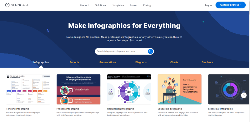
If data visualization had a poster child, Venngage would be it. Crafting infographics which users can’t help but share is its playground. It’s all about making your data not just seen but also remembered.
Best Features:
- User-friendly interface
- Rich template library
- Brand customization options
Google Charts
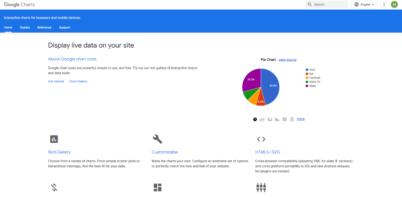
Get ready for a tool that plays nicely with the tech you already use. Google Charts is nimble, robust, and gets along with your web pages like they’re old pals from school. Its integration with Google’s tools makes collaboration and sharing a breeze.
Best Features:
- Integration with Google products
- Wide range of chart types
- Customizable and interactive options
Microsoft Power BI

Microsoft Power BI is the Gandalf of business intelligence – wise, resourceful, and incredibly powerful. It takes you from data novice to guru with its suite of analytics tools, all while nestled comfortably within the familiar Microsoft ecosystem.
Best Features:
- Deep integration with Microsoft applications
- Extensive visualization options
- Comprehensive BI and reporting features
Plotly
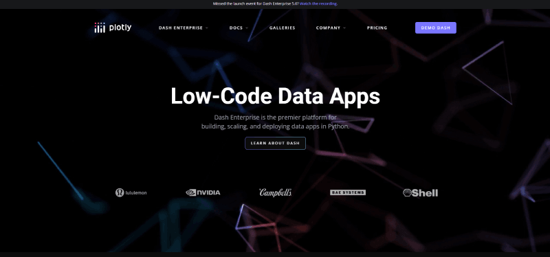
Flexibility and sophistication are Plotly’s middle names. This tool brings the power of programming languages like Python to create bespoke, interactive, and incredibly detailed charts that answer “What if?” with a resounding “Here’s how!”
Best Features:
- Advanced graphing libraries
- Customizable dashboards
- Collaboration-friendly platform
GetFeedback
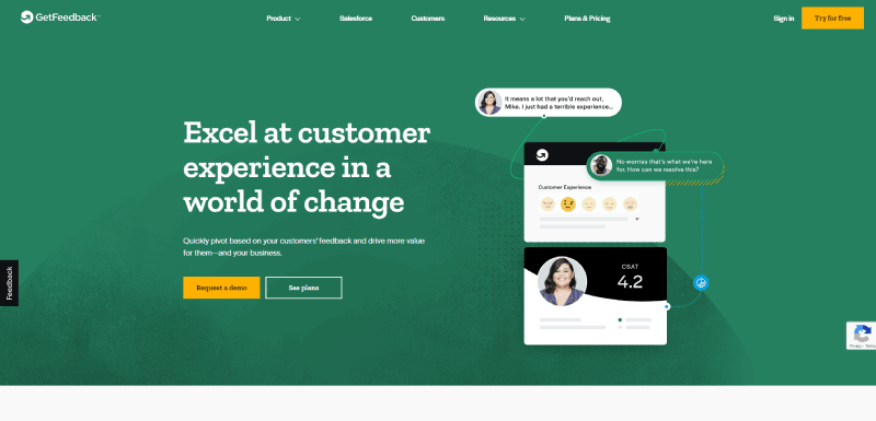
GetFeedback waltzes into the feedback game with a focus on customer experience. It turns customer insights into visually appealing stories, making it simple to understand and act upon what your customers are really saying.
Best Features:
- Seamless Salesforce integration
- User experience-focused design
- Actionable insights for customer-centric decisions
FAQ on These Survey Data Visualization Tools
What exactly are survey data visualization tools?
They’re the wizards behind the curtain, turning raw, often bland survey data into vibrant charts and graphs. Think of them as digital paintbrushes that help anyone make sense of numbers by creating visual narratives.
How do they make spotting trends in data easier?
By letting you see the big picture. Trends that may hide in rows and columns pop out in a bar graph or line chart. Colors and shapes do the heavy lifting, making it a breeze to spot patterns and outliers that numbers alone might not reveal.
Can these tools help me predict future trends from survey results?
Absolutely, they’re like crystal balls for data. Tools like predictive analytics sift through the past and present, giving you a glimpse into potential patterns and behaviors. They aren’t fortune tellers, but they sure give you a leg up on forecasts.
What’s the learning curve for using data visualization software?
Depends on the tool, but there’s good news: most are designed for user-friendliness. You’ll find drag-and-drop interfaces, intuitive controls, and even some real-time survey graphs that update as you watch. A bit of practice, and you’ll have it down.
Can visuals from these tools be integrated into presentations?
Slide right on in! Whether it’s for stakeholders or students, these visuals can be exported to fit into your PowerPoints, reports, or even emailed directly. The goal? Making your findings presentation-ready in a few clicks.
Are these tools only for people with technical backgrounds?
Not at all. While there’s sophistication under the hood, the user experience is all about simplicity. Tools like Google Charts and Tableau cater to everyone, not just the data analysts.
Is my survey data safe with these tools?
Security is top-notch with reputable providers, employing measures like encryption and secure cloud storage. Still, always do your homework on a tool’s privacy policy before you commit.
How do survey data visualization tools handle real-time data?
Ever been in a thunderstorm, watching the rain paint patterns on the window? These tools do that—taking live data and updating visuals on the fly. For quick decisions, this feature is the golden ticket.
Aren’t all these charts and graphics just eye candy?
Far from it. Visuals can be all fun and flash, sure, but at their core, infographics and dynamic charts are about comprehension. They deliver complex info in digestible bites, making the insights within the reach of anyone interested.
How do I choose the right tool for my needs?
Think of your data as a unique story. What’s the best way to tell it? If you crave simplicity, lean towards apps with template galleries. For depth, go for tools that allow cross-tabulation and advanced analytics. It’s all about the best fit for your narrative.
Conclusion
We dived into the world of survey data visualization tools, sailed through the techno-jargon, and emerged on the other side with the know-how to tell compelling stories with our data. It’s clear these tools aren’t just a pretty face on a screen; they’re powerhouses that can take all those numbers and make them sing.
Whether you’ve got a penchant for pie charts or a hankering for histograms, there’s a data viz tool out there waiting for you. With features like predictive analytics and real-time graphs, they’re built to simplify your life and amplify your work.
So, as we close the curtain on this show, remember that your survey results have stories to tell, and with the right tools, you’re the perfect storyteller to bring those narratives to life. Clarity, insight, and maybe even a bit of fun—that’s what awaits when you embrace the art of data visualization.
If you liked this article about survey data visualization, you should check out this article about dynamic data visualization.
There are also similar articles discussing text data visualization, table data visualization, infographics and data visualization, and effective data visualization.
And let’s not forget about articles on visualizing Google Sheets data, misleading statistics, data visualization skills, and what data visualization to use.


