Picture this: You’ve got a mountain of data in front of you, and it’s your job to make it sing. But how?
Data visualization.
A game-changer that turns numbers into narratives. It’s not just about making pretty pictures but about choosing the right visual sidekick to unleash the stories hiding in the data. The different types of charts – like pies, bars, or lines – aren’t just random picks. They’re your arsenal for clarity and insight.
By the end of this dive into visualization, you’ll know exactly what data visualization to use and when. Whether it’s a sleek line graph for trends or a vivid heat map for spatial data, you’ll be calling the shots like a pro.
You’ll learn the ropes of:
- Matching your data type with the perfect chart
- Leveraging visualization tools for polished presentations
- Harnessing visual storytelling to captivate and inform
Let’s unlock the power of your data and make it unforgettable.
Table of Contents
10 Popular Data Visualization Types
| Visualization Type | Purpose | Data Dimensions | Best Use Case | Interactivity Level |
|---|---|---|---|---|
| Bar Chart | Compare quantities | 1-2 | Comparing different categories | Low-Medium |
| Line Graph | Show trends over time | 2 or more | Time-series analysis | Low-Medium |
| Pie Chart | Display parts of a whole | 1 | Proportional representations | Low |
| Scatter Plot | Show relationships between variables | 2 | Correlation between variables | Medium-High |
| Histogram | Show distribution of a variable | 1 | Frequency distribution | Low-Medium |
| Heat Map | Represent intensity of variables | 2 or more | Data density on maps or matrices | Medium-High |
| Area Chart | Emphasize volume or density | 2 or more | Cumulative trends over time | Low-Medium |
| Bubble Chart | Scatter plot with volume representation | 3 | Multivariate data comparison | Medium-High |
| Treemap | Illustrate hierarchy and parts of a whole | 2 (hierarchical) | Hierarchical data organization | Low-Medium |
| Box Plot | Show data distribution summary | 1 | Statistical spread of data | Low |
| Stacked Bar Chart | Compare parts of a whole | 2 or more | Comparison of segments within categories | Low-Medium |
| Radar Chart | Show multivariate data | 3 or more | Comparing multiple variables of an entity | Low-Medium |
| Waterfall Chart | Visualize a running total | 1-2 | Sequential changes of a quantity | Low |
| Gantt Chart | Represent timing of tasks | 2 (tasks and time) | Project scheduling | Medium |
| Sankey Diagram | Show flow and relationships | n-dimensional (flows) | Visualizing energy, material, cost transfers | Medium-High |
| Choropleth Map | Shade areas proportionally | 2 (geography, var.) | Spatial distribution of a variable | Medium |
| Dot Plot | Compare quantities using dots | 1-2 | Simplified comparisons | Low |
| Funnel Chart | Represent process stages | 1-2 | Conversion analysis in processes | Low |
| Network Diagram | Show relationships and flows | n-dimensional | Network structures, influences | High |
| Word Cloud | Display text data frequency | 1 | Visualizing key themes in text | Low |
Bar Chart
Chart created with wpDataTables
Bar charts are the bread and butter of data viz. Each bar represents a value; longer bars mean bigger numbers. They’re like a city skyline made of data, perfect for comparison at a glance.
What you can use it for:
- Comparing sales numbers
- Showing survey responses
- Tracking changes over time with horizontal bars
What we like about it: Bar charts make complex data super approachable, great for reports or presentations where clarity is key.
Line Graph
Chart created with wpDataTables
A line graph is like a data timeline, mapping points in a journey. Connected by a line, these points tell a story of rise and fall, ebb and flow over time.
What you can use it for:
- Tracking stock market trends
- Monitoring temperature changes
- Analyzing website traffic over time
What we like about it: The way it shows trends is unbeatable—you see the direction at a glance.
Pie Chart
Chart created with wpDataTables
Pie charts are like the wheel of fortune for your data, each slice representing a portion of the whole. Ideal when you need to show how different parts make up a whole.
What you can use it for:
- Displaying market share
- Showing demographic distributions
- Budget allocations
What we like about it: They’re visually appealing and make percentages pop with minimal effort.
Scatter Plot
Chart created with wpDataTables
Scatter plots throw your data into a cosmic dance on a grid, revealing clusters and patterns between two variables that might be doing a tango or going freestyle.
What you can use it for:
- Finding correlations
- Outlier detection
- Displaying scientific data
What we like about it: Their ability to show nuanced relationships—simply dots making sense of the complex.
Histogram
Histograms are like bar charts’ statistical cousins, organizing continuous data into bins to show distribution. It’s like taking your data for a fitness checkup – too skinny, just right, or overweight.
What you can use it for:
- Displaying frequency of scores
- Analyzing age distributions
- Understanding population growth
What we like about it: You’ll get the ‘shape’ of your data instantly—it’s data distribution at a glance.
Heat Map
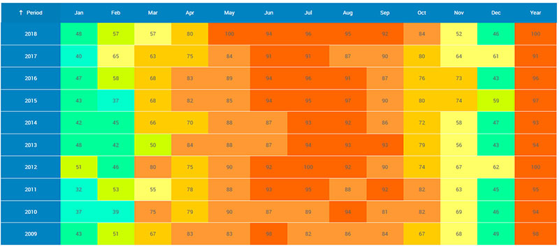
Monthly summary report table created with wpDataTables
Heat maps simmer your data down to a color-coded matrix, hotter shades indicating higher values. They’re your go-to for spotting trends in dense datasets, like a thermal camera for numbers.
What you can use it for:
- Web page analysis for user activity
- Geographic data representation
- Market research heat zones
What we like about it: They turn dense data into a visual sauna of insights, ready to reveal hotspots.
Area Chart
Think of an area chart like a line graph with a passion for art—filling in below the line for more drama. It’s perfect for showing how different components stack up over time.
What you can use it for:
- Cumulative changes over time
- Stock volume tracking
- Comparing multiple quantities
What we like about it: It adds weight to your trends, making the ups and downs even more vivid.
Bubble Chart
Chart created with wpDataTables
Bubble charts are like scatter plots that had too much soda—each data point is a bubble, its size adding another layer of information. It’s chaotic fun that tells a multi-variable story.
What you can use it for:
- Comparing financial data
- Environmental data impacts
- Social media engagement levels
What we like about it: They’re a playful way to convey three dimensions of info, with size adding the zing.
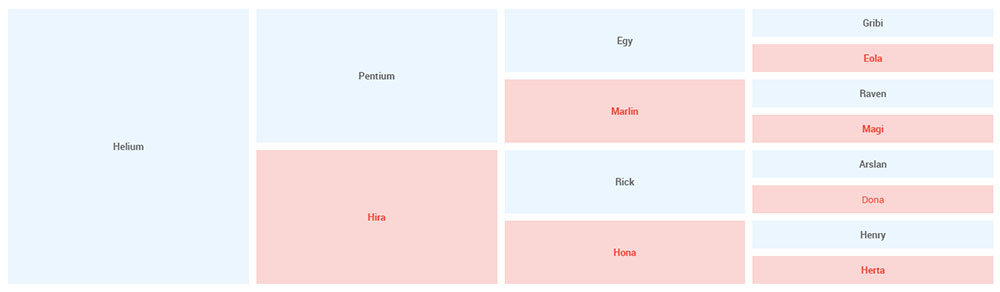
Treemap
Treemaps are the organizational wizards of the visualization world, turning hierarchical data into nested rectangles—it’s a family tree on a data diet.
What you can use it for:
- Breaking down budget allocations
- Organizing inventory categories
- Displaying file and folder structures
What we like about it: They’re dense with detail but still visually intuitive—big impact in tight spaces.
Box Plot
Box plots, or box-and-whisker plots, give you the data’s five-number summary in a neat package. They’re like the Swiss Army knife for descriptive statistics—compact and full of features.
What you can use it for:
- Summarizing test scores
- Analyzing medical data
- Comparing performance metrics
What we like about it: They pack a bunch of stats into a tight visual, ideal for spotting outliers and range.
Stacked Bar Chart
Stacked bar charts are multitaskers, layering different data categories on top of each other in a single bar—it’s like seeing your entire outfit in one hanger.
What you can use it for:
- Visualizing product sales by region
- Tracking time allocation
- Assessing resource usage
What we like about it: Their compact storytelling—you get the full picture without flipping through pages.
Radar Chart
Chart created with wpDataTables
Radar charts are the spiderwebs of the data world, each axis a thread that combines to form a data polygon—it’s like giving your stats an aerial choreography routine.
What you can use it for:
- Skill assessments
- Product comparisons
- Performance analysis across multiple factors
What we like about it: They give a 360-degree view on multiple metrics, perfect for all-round comparisons.
Waterfall Chart
Waterfall charts show the sequential flow of data changes, bridging the gap from start to finish. It’s like watching your data take a dive and swim to the end.
What you can use it for:
- Tracking profit and loss
- Visualizing budget adjustments
- Explaining sequential data narratives
What we like about it: It’s a storyteller, unfolding the cumulative effect of sequentially occurring data.
Your beautiful data deserves to be online
wpDataTables can make it that way. There’s a good reason why it’s the #1 WordPress plugin for creating responsive tables and charts.

And it’s really easy to do something like this:
- You provide the table data
- Configure and customize it
- Publish it in a post or page
And it’s not just pretty, but also practical. You can make large tables with up to millions of rows, or you can use advanced filters and search, or you can go wild and make it editable.
“Yeah, but I just like Excel too much and there’s nothing like that on websites”. Yeah, there is. You can use conditional formatting like in Excel or Google Sheets.
Did I tell you you can create charts too with your data? And that’s only a small part. There are lots of other features for you.
Gantt Chart
Gantt charts are the project managers of the chart world—carefully plotting out timelines and task durations. They’re the visual to-do list that keeps everyone on the same page.
What you can use it for:
- Project management
- Event planning
- Product development timelines
What we like about it: Their unrivaled ability to keep complex projects visually organized and team members aligned.
Sankey Diagram
Sankey diagrams are visual melodies, flowing from one aspect to another, demonstrating how different parts are connected with the smoothness of a river. They show the movement and quantity in a single swoosh.
What you can use it for:
- Energy distribution
- Material flow in manufacturing
- Website traffic paths
What we like about it: Their elegant flows make understanding complex transfer systems feel like a walk in the park.
Choropleth Map
Choropleth maps drape your geographic data in a quilt of colors, each shade representing a value. It’s like turning a plain map into a storytelling tapestry.
What you can use it for:
- Election result distributions
- Population density
- Disease prevalence by region
What we like about it: They make locational analyses pop with just a glance—intuitive and informative.
Dot Plot
Dot plots are minimalist masterpieces, using simple dots to convey frequency or distribution. They’re like impressionist art for your stats—simple, yet revealing.
What you can use it for:
- Comparing frequency counts
- Displaying group rankings
- Identifying patterns within categories
What we like about it: Their understated elegance delivers straightforward representations of categorical data.
Funnel Chart
Funnel charts mirror the narrowing stages of a process, from the broad beginning to the pointed end—it’s like visualizing a journey down the decision-making slide.
What you can use it for:
- Sales conversion rates
- Lead generation to closing
- Website visitor drop-off
What we like about it: They pinpoint bottlenecks and conversion rates in processes, crystal clear for strategizing.
Network Diagram
Network diagrams are the social butterflies, showing how different points, or ‘nodes’, interact and connect—it’s the gossip of the data visualization party.
What you can use it for:
- Social network connections
- Organizational structures
- Tech network design
What we like about it: They’re the masters of relationship mapping, revealing the intricate web of interconnectivity.
Word Cloud
Word clouds are the abstract poets, giving weight to words based on frequency, in a scattered artful array. It’s like grabbing a handful of words and letting them fall where they may—bigger words, bigger deal.
What you can use it for:
- Text analysis for most mentioned topics
- Customer feedback themes
- Keyword research for SEO
What we like about it: Their offbeat visual emphasis on what’s being talked about most—perfect for impactful presentations.
FAQ on the Data Visualization To Use
How do I pick the right chart for my data?
Always think about your data’s story. Line graphs are your go-to for trends over time. Bar charts? They’re perfect for comparing categories. And if you’re about proportions, a pie chart will slice it up nicely. Tailor your choice to your data’s narrative for maximum impact.
When should I use an infographic instead of a traditional chart?
Infographics are best for weaving data with visuals to tell a more comprehensive story. They’re ideal when your goal is to engage and educate, especially if you’ve got a mix of stats and need to add some narrative flair. Use them to make data digestible and memorable.
What’s the best way to represent complex data simply?
Simplicity is key in data visualization—go with a clean dashboard with clear graphs. Use interactive visualizations to allow users to explore the intricacies without getting overwhelmed. Dashboards with widgets and toggle options can display complexity in layers, offering simplicity and depth all at once.
How can I use color effectively in my data visualizations?
Color can make or break a visualization. Use it to guide the eye and group related items, but don’t let it distract. Keep colorblind viewers in mind, using texture or patterns as backup. Stick to a complementary palette for harmony, and resist the rainbow—except for heat maps, where it’s a natural fit.
Can I make my data visualization interactive, and how?
Absolutely, interactive visualizations are like a playground for the curious mind. Think sliders, hover-over effects, and drill-down capabilities. Tools like Tableau and D3.js can elevate static charts into immersive experiences. Embrace the interactivity to make your data a conversation rather than a monologue.
Why should my visualization be responsive on various devices?
Responsiveness equals accessibility. You want your visual data interpretation to shine, whether it’s on a massive monitor or a smartphone screen. It ensures broader reach and usability, accommodating your audience’s diverse tech habits. A flexible design means your data’s story is told, no matter the viewport.
What kind of data is best represented with a scatter plot?
Scatter plots are the detectives of the data visualization world. They’re fantastic for spotting correlations—or the lack thereof—within numerical data. Put them to work when you’ve got two or three variables and a bunch of data points. They’ll show relationships or clusters that can provide insights at a glance.
How much data is too much for a single visualization?
It’s less about quantity, more about clarity. Too many data points can turn your chart type comparison into a messy brawl. If the user can’t quickly grasp the key insights, it’s time to break it down. Segment the data or consider a series of visualizations.
Should I animate my data visualizations?
Animation can be a powerful tool when used wisely. It should enhance understanding, not distract. Use it to show changes over time or to add emphasis to specific data points. But remember, subtlety is your friend here. The data story should captivate, not the razzle-dazzle of unnecessary special effects.
Can visualizations help predict future trends?
Yes, and it’s called predictive analytics. Line graphs and area charts can extend beyond current data to project future trends based on historical patterns. Pairing your charts with forecasting models can turn present data into a crystal ball, giving you a peek into potential futures—priceless for strategic planning.
Final Thoughts
You’ve seen how picking the right chart is like choosing the perfect outfit: it’s gotta match the occasion, or in this case, the data story.
- Bar charts are like your trusty jeans – solid for comparing things.
- A pie chart? That’s your statement tee, breaking down the parts of a whole.
- Those line graphs are your classic sneakers, tracking the rhythm of change over time.
Keep things simple, make it engaging, and always choose the kind that makes your data not just seen, but understood. Remember, the goal is clarity and insight, whether that’s with an interactive dashboard or a static infographic.
The take-home message? Let your data’s inner voice be heard loud and clear, and always keep your audience front and center in your visual narrative. Now, go on and make that data dazzle!
If you liked this article about what data visualization to use, you should check out this article about dynamic data visualization.
There are also similar articles discussing text data visualization, table data visualization, infographics and data visualization, and survey data visualization.
And let’s not forget about articles on effective data visualization, visualizing Google Sheets data, misleading statistics, and data visualization skills.


