Descriptive statistics are the GPS of data analysis. Imagine you’ve got a bunch of numbers, data points, or observations. Descriptive statistics is all about summarizing this heap into something digestible and insightful.
What are descriptive statistics?
Descriptive statistics are the art of turning raw data into meaningful info. It’s the initial step in data analysis, laying the groundwork for all that fancy stuff like inferential statistics.
But hey, don’t underestimate it!
Descriptive statistics gives you the power to describe the basic features of data in a study. It’s like taking a bunch of puzzle pieces (your data) and starting to put them together to see part of the picture.
Now, why bother with it?
Without descriptive statistics, we’d be lost in a sea of numbers. It’s like trying to read a book without knowing the alphabet. By using techniques like statistical summarization and data visualization methods, we make sense of the chaos.
We’re talking frequency distribution, central tendency measures (like your good pals mean, median, and mode), and variability in statistics (think range and standard deviation). It’s all about getting the gist of what your data is trying to say.
Importance in Quantitative Research
In the realm of quantitative research, descriptive statistics is your trusty sidekick. It’s the first step in understanding what your data is all about.
Whether you’re dealing with something as complex as quantitative data assessment or as straightforward as statistical graphs and charts, it’s all about making data understandable and, dare I say, interesting.
From data visualization methods to summarizing vast datasets, descriptive statistics is everywhere. It’s in businesses analyzing data for improving sales forecasts, in healthcare monitoring patient recovery rates, even in your fitness app tracking your weekly run times.
It’s the unsung hero of the data world, making sure everything makes sense before taking any leaps of conclusions.
Table of contents
- Types of Descriptive Statistics
- Measures in Descriptive Statistics
- Univariate, Bivariate, and Multivariate Analysis
- Graphical Representation of Data
- Descriptive vs. Inferential Statistics
- Practical Applications and Examples
Table of Contents
Types of Descriptive Statistics
Alright, let’s break down the types of descriptive statistics. It’s like having different lenses to view your data.
Each type gives you a unique perspective, helping you to understand the full story behind those numbers.
Distribution
First up, distribution. This is all about understanding how your data is spread out. Ever seen a bunch of numbers and wondered how often each one pops up?
That’s where frequency distribution comes into play. It’s like taking attendance for your data points, noting who’s present and how many times.
And how do we show this off? Through tables and graphs for summarization, like histograms or pie charts. It’s a bit like different Instagram filters for your data – each one highlights different aspects.
Central Tendency
Next, we have the cool crew of Central Tendency. These guys are the popular ones in the data party – mean, median, and mode. They’re like the trendsetters, showing what’s common in your dataset.
When we talk mean, we’re averaging things out. Add all the numbers up, divide by how many there are, and boom, you’ve got your mean.
The median?
That’s the middle dude when you line everyone up in order. And the mode? He’s the one who shows up most often at the party.
Variability
Last but not least, Variability. This one’s about measuring the spread of your data. Imagine you’re looking at the heights of a basketball team.
Variability tells you how much the players’ heights differ.
We’ve got the range (shortest to tallest), the variance (how spread out the heights are), and the standard deviation (a fancy way of measuring differences from the average). It’s like understanding the diversity in the team.
Measures in Descriptive Statistics
Now, let’s check out the tools we have on board.
Measures of Central Tendency
Alright, imagine you’re at a party, and you want to know what’s trending.
In the world of data, this is where Measures of Central Tendency come into play. They’re like the social media influencers of the data world.
Calculation and Examples
- Mean: Picture this – you’ve got a pizza cut into equal slices. The mean is like everyone getting an equal piece. You add up all the values and divide by the number of values. It’s your average, the go-to guy.
- Median: Now, let’s say you’re lining up for a concert. The median is the person smack in the middle of the line. It’s the midpoint of your data set, splitting it in half. If the data were heights of people, the median would be the height of the person standing right in the middle of a sorted line-up.
- Mode: Think of the mode as the most popular song at the party. It’s the value that shows up the most. If everyone’s dancing to the same tune, that tune is your mode.
Measures of Variability
Variability is like the spice of your data dish. It tells you how much your data varies.
Calculating Range, Variance, and Standard Deviation
- Range: Simple yet effective. It’s like looking at the shortest and tallest person in a room. You take the largest value and subtract the smallest. This gives you the spread of your data.
- Variance: Get this – it’s like measuring how far each person in a room is from the average height. Variance is a bit more complex. It’s the average of the squared differences from the Mean. Sounds like a mouthful, but it’s super useful.
- Standard Deviation: This one’s a rockstar. It’s the square root of variance and gives you a solid idea of how spread out your data is. If it’s low, everyone’s kind of similar. If it’s high, you’ve got a diverse crowd.
Interpretation and Application
Interpreting these measures is like reading a story where the characters are numbers.
- With mean, you get the overall gist of the story.
- The median shows you the middle path.
- The mode tells you about the recurring theme.
- Range introduces you to the extremes.
- Variance and standard deviation bring in the drama of the story, showing how much the characters (data points) differ from each other.
Univariate, Bivariate, and Multivariate Analysis
When you dive into the world of descriptive statistics, it’s like exploring different layers of a game. Each level – Univariate, Bivariate, and Multivariate – offers a unique challenge and perspective on your data.
Univariate Analysis
Analysis of a Single Variable
So, you’re starting with Univariate Analysis.
Like when you’re checking out your daily step count on a fitness app – that’s univariate analysis in action. It’s straightforward, like listening to a single instrument in a song.
Application and Examples
You see Univariate Analysis everywhere. From analyzing frequency distributions in surveys to measuring central tendency (like the mean, median, and mode) in test scores.
It’s your go-to for a quick, clean look at one aspect of your data. Simple yet powerful, like a catchy melody that sticks in your head.
Bivariate Analysis
Simultaneous Study of Two Variables
Next up, Bivariate Analysis. Now we’re talking duets. This is where you pair up two variables to see how they dance together.
It’s like looking at how your coffee intake correlates with your energy levels. Are they best buds, or do they barely know each other?
Use of Contingency Tables and Scatter Plots
Bivariate Analysis shines with tools like contingency tables and scatter plots.
You’re not just looking at numbers anymore; you’re seeing relationships and patterns, like a graph showing the link between study time and exam scores.
Multivariate Analysis
Analysis Involving More Than Two Variables
Welcome to the party – Multivariate Analysis. This is the ensemble cast, where you bring in more than two variables.
It’s like conducting an orchestra where each instrument (variable) plays a part in the symphony (your data analysis).
Complex Data Interpretation and Application
Here, things get intricate. You could be looking at how age, income, and education level all contribute to buying preferences.
Multivariate Analysis is like a detective novel, with multiple characters influencing the plot.
It’s essential for complex data interpretation and finding hidden patterns in statistical data representation.
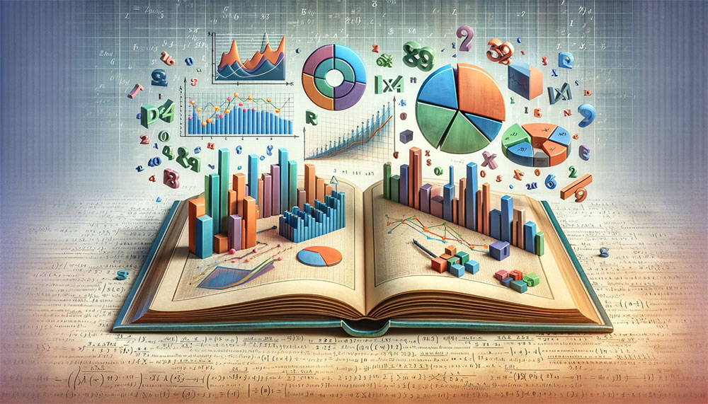
Graphical Representation of Data
Importance of Visual Summaries
Role in Enhancing Understanding of Data
Visuals are powerful. They can turn a snooze-fest of numbers into something you can grasp in a glance. Just look at this lovely table and graph created with wpDataTables:
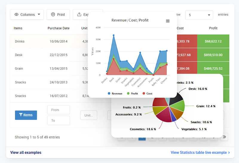
Imagine trying to explain how different age groups use social media just with numbers. Now, picture a colorful bar chart showing the same thing.
That chart isn’t just easier to digest; it’s like a shortcut to understanding.
Types of Graphical Representations
From pie charts to line graphs, each type of graphical representation has its vibe. They’re like different genres of movies – each tells a story in a unique way.
You’ve got histograms showing frequency distributions, scatter plots for spotting trends and relationships, and so much more.
Your beautiful data deserves to be online
wpDataTables can make it that way. There’s a good reason why it’s the #1 WordPress plugin for creating responsive tables and charts.

And it’s really easy to do something like this:
- You provide the table data
- Configure and customize it
- Publish it in a post or page
And it’s not just pretty, but also practical. You can make large tables with up to millions of rows, or you can use advanced filters and search, or you can go wild and make it editable.
“Yeah, but I just like Excel too much and there’s nothing like that on websites”. Yeah, there is. You can use conditional formatting like in Excel or Google Sheets.
Did I tell you you can create charts too with your data? And that’s only a small part. There are lots of other features for you.
Examples of Graphical Methods
Frequency Distributions, Histograms, and Scatter Plots
Let’s break it down:
- Frequency Distributions: These are like the playlists of your data. They show how often each value occurs. It’s like counting how many times your favorite song got played at a party.
- Histograms: Think of these as the blockbusters of data visualization. They take your frequency distributions and turn them into visual masterpieces. It’s all about showing the spread and shape of your data in a way that’s instantly clear.
- Scatter Plots: Here’s where things get interesting. Scatter plots are like the detective stories of data visualization. They help you spot correlations and patterns between two variables. It’s like putting two characters in a scene and watching their interaction tell the story.
Descriptive vs. Inferential Statistics
Descriptive and inferential statistics are like two different types of magic tricks in the world of data.
One shows you what’s up right now, and the other predicts what might happen next. Let’s jump in and see the difference.
Key Differences
Purpose and Application in Research
Descriptive statistics are like the here and now. They tell you what’s happening with your data at this moment.
It’s about data visualization methods, statistical summarization, and getting the lay of the land. Like, if you were looking at the heights of people in a room, descriptive statistics would give you the average height, the tallest, the shortest – the works.
Inferential statistics, on the other hand, is like looking into a crystal ball. It takes the data you have and makes predictions or inferences about a larger group.
It’s about taking a sample and saying, “Hey, based on this, we think the whole population might look like this.” It’s less about statistical data representation and more about making educated guesses.
Examples Illustrating the Differences
Imagine you run a bakery. Descriptive statistics is when you tally up today’s sales – how many cupcakes, cookies, and pies you sold. It’s all about quantitative data assessment for the day.
Inferential statistics? That’s when you start predicting next month’s sales based on trends you’ve seen. It’s like using today’s weather to guess tomorrow’s – not always spot-on, but usually pretty close.
Complementary Roles
How Both Types Contribute to Comprehensive Data Analysis
Now, these two aren’t rivals. They’re more like dance partners. Descriptive statistics sets the stage. It gives you the basics, the foundation. Without it, inferential statistics would be shooting in the dark.
Inferential statistics takes it further. It uses that foundation and builds on it, making predictions, testing theories, and often leading to those “Aha!” moments. It’s like using the notes from a music sheet (descriptive) to play a full song (inferential).
Practical Applications and Examples
Let’s talk real-world stuff. Descriptive statistics isn’t just some fancy term you toss around in a math class. It’s out there, in the wild, making sense of the world in ways you might not even notice.
Real-life Applications
Imagine you’re running a business. Descriptive statistics are like your financial dashboard. It’s crunching sales numbers, customer demographics, and product performance, kind of like this dashboard from Amelia, our WordPress booking plugin:
It’s all about quantitative data assessment, helping you make smarter decisions without getting lost in the number soup.
Or picture a hospital. Here, descriptive statistics plays a crucial role in patient care. It’s tracking recovery rates, treatment effectiveness, and disease outbreaks. It’s the backbone of statistical data representation, turning patient records into life-saving insights.
FAQ on Descriptive Statistics
How Do Descriptive Statistics Differ From Inferential Statistics?
Descriptive and inferential statistics are like two sides of the same coin. Descriptive is all about summarizing what’s in front of you – like the average or range of your data.
Inferential, on the other hand, takes this info and makes predictions. It’s like the difference between describing what kind of clothes people wear today (descriptive) and predicting fashion trends for next year (inferential).
What’s the Role of Graphs in Descriptive Statistics?
Graphs in descriptive statistics? They’re super important. They turn numbers into pictures. So instead of just seeing a bunch of figures, you get visuals like bar charts or pie charts.
This makes it way easier to spot patterns and understand your data. It’s like the difference between reading a recipe and seeing a photo of the finished dish – the picture just makes it clearer.
Can You Explain Mean, Median, and Mode?
Sure thing! These are like the three musketeers of descriptive statistics. The mean is your average – add up all the numbers and divide by how many there are.
The median is the middle value when you line up all your numbers. And the mode? That’s the number that shows up the most. They each give you a different angle on your data.
Why Are Range and Standard Deviation Important?
Range and standard deviation are key players in descriptive statistics. The range gives you the spread of your data – like how far apart the highest and lowest scores are.
Standard deviation goes deeper, showing how much your data varies from the average. It’s like telling you how consistent or spread out your data points are, which is crucial for understanding the overall picture.
What is Frequency Distribution in Descriptive Statistics?
Frequency distribution is about counting how often each value in your data set appears. It’s like taking a poll on people’s favorite ice cream flavors and seeing which flavors are the most and least popular.
This helps you understand the patterns in your data – what’s common, what’s rare. It’s a fundamental aspect of organizing and interpreting your data.
How Do Descriptive Statistics Apply in Real Life?
Descriptive statistics pops up in everyday life more than you’d think.
Businesses use it to analyze sales data, schools use it to evaluate test scores, and healthcare professionals use it to understand patient trends.
It’s all about taking a bunch of data and making it understandable so you can make informed decisions, like figuring out which product sells best or which treatment is most effective.
What Are the Limitations of Descriptive Statistics?
Descriptive statistics has its limits. It’s great for giving you a snapshot of your data, but it doesn’t dive into why things are the way they are.
It won’t tell you about cause and effect or predict future trends. So, while it’s a fantastic starting point for understanding your data, it’s just one part of the bigger picture.
How Is Variance Used in Descriptive Statistics?
Variance is a big deal in descriptive statistics. It measures how much your data points differ from the average.
Think of it like measuring the variety in a group of friends’ heights. If everyone’s around the same height, variance is low. But if heights are all over the place, variance is high. It gives you a sense of the diversity in your data.
What Skills Are Needed to Understand Descriptive Statistics?
To get the hang of descriptive statistics, you don’t need to be a math whiz, but some basic skills help.
Understanding averages, percentages, and how to read graphs and charts is crucial. It’s also about being able to think critically about what the data is telling you.
A bit of curiosity and attention to detail goes a long way in making sense of the numbers and patterns.
Conclusion
Alright, let’s wrap this up. Descriptive statistics is more than just crunching numbers. It’s about telling stories with data, unveiling patterns, and shining a light on insights you never knew were there.
From businesses to healthcare, education to personal fitness, it’s a tool that helps make sense of the world. It’s the foundation of data analysis, the first step in understanding what your data is trying to say.
Remember, in the vast ocean of data, descriptive statistics is your compass. It guides you through the waves of information, helping you navigate towards clearer, more informed decisions. So next time you’re faced with a heap of data, think of it as a treasure chest, with descriptive statistics as the key to unlocking its secrets.
If you liked this article on descriptive statistics, you should check out the following on primary data vs secondary data, advantages of secondary data, and data visualization principles.
If you liked this article about descriptive statistics, you should check out this article about categorical data examples.
There are also similar articles discussing nominal vs ordinal data, discrete vs continuous data examples, different types of data, and how to present data visually.
And let’s not forget about articles on real-time data visualization, primary data vs secondary data, advantages of secondary data, and data visualization principles.


