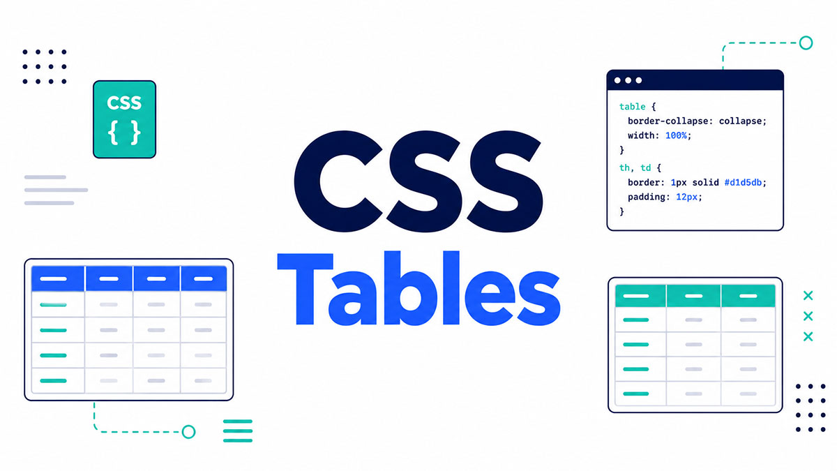
Most HTML tables look broken straight out of the box. Browser defaults disagree with each other, cell spacing is unpredictable, and raw table markup has no visual hierarchy to speak of.
CSS sorts all of that. With the right mix of border-collapse, table-layout, nth-child selectors, and CSS custom properties, a plain data table turns into something that holds up across devices and color schemes.
What follows works through eleven practical CSS table examples, each with full code, from basic, striped, hoverable, and bordered tables to responsive, sticky header, dark mode, fixed-width, sortable, borderless, and comparison layouts. Every one is built on CSS properties you’d actually use in production.
Table of Contents
What Are CSS Tables?
The term refers to the styling rules applied to HTML table elements, table, tr, td, th, thead, tbody, and tfoot among them. CSS table formatting controls how tabular data looks on screen without touching the underlying HTML structure.
That distinction earns its keep. HTML defines the data structure, CSS defines how that structure looks, and the two jobs are separate. Blur them together and you create maintenance problems down the line.
The State of HTML 2024 survey found that 51% of developers listed data tables among the three HTML elements they most want improved (web.dev, 2024), which says plenty about how much tables still matter in real projects.
HTML table structure vs. CSS table presentation
The structure side is the HTML elements themselves, which carry the semantic meaning. The presentation side is the CSS, properties like border-collapse, border-spacing, table-layout, width, padding, and text-align handling every visual decision.
There’s also display: table, which extends table behavior to non-table HTML elements. A div set to display: table behaves like a table element for layout. It comes up in edge cases, but it’s not something most projects reach for regularly.
Why browser default table styles are inconsistent
Chrome, Firefox, and Safari each ship their own user-agent stylesheets, and those defaults disagree on cell spacing, border rendering, and font sizing. Without a CSS reset or an explicit border-collapse declaration, the same HTML table looks noticeably different across all three.
Nearly 44% of developers in the CSS 2024 survey have less than ten years of experience (State of CSS, 2024). Plenty of them have never had to debug browser default table inconsistencies firsthand, which is exactly why it’s such a common source of layout bugs.
The fix is simple enough. Set border-collapse: collapse and explicit padding values on the table element before you add anything else, and you’ve got a predictable baseline across every browser.
For a wider look at HTML table design patterns and structural decisions, that covers the full range of layout approaches used in production.
What Are the Main CSS Properties Used to Style Tables?
The properties that apply specifically to table elements are border-collapse, border-spacing, table-layout, vertical-align, and caption-side. They control rendering behavior that the standard box-model properties can’t reach.
The general ones, width, padding, margin, color, background-color, font-size, apply to table elements the same way they apply to any other HTML element.
border-collapse vs. border-spacing
See the Pen
border-collapse vs border-spacing – Interactive CSS Table Reference by Bogdan Sandu (@bogdansandu)
on CodePen.
border-collapse takes two values, collapse or separate, and the difference is both visual and structural.
| Value | Cell borders | border-spacing works? | border-radius works? |
|---|---|---|---|
collapse |
Adjacent cells share one border | No | No |
separate |
Each cell keeps its own border | Yes | Yes |
border-spacing only activates when border-collapse: separate is set. It takes one or two length values, one for horizontal spacing and one for vertical, like border-spacing: 4px 8px.
Here’s the thing that catches people: you can’t use border-radius on table cells while border-collapse: collapse is active. Switch to separate if rounded corners on cells matter to your design.
table-layout: fixed vs. table-layout: auto
See the Pen
table-layout: fixed vs table-layout: auto – Live CSS Demo by Bogdan Sandu (@bogdansandu)
on CodePen.
Auto is the default. The browser reads all the cell content before working out column widths, which renders slower on large tables because it has to process everything first.
Fixed flips that. The browser calculates column widths from the first row alone (or from explicit col width declarations), so it renders faster, not waiting on all the content to load.
table-layout: fixed needs a set width on the table element to work properly. Leave that off and the fixed algorithm has no reference width, so it falls back to auto-like behavior.
On data-heavy admin panels or dashboards, table-layout: fixed paired with overflow: hidden and text-overflow: ellipsis on td elements is a practical combination, because it stops long strings from blowing up your column layouts.
vertical-align and caption-side
See the Pen
CSS Table Properties: vertical-align & caption-side by Bogdan Sandu (@bogdansandu)
on CodePen.
vertical-align on td and th takes top, middle, or bottom, defaulting to middle. For tables with multi-line cell content, vertical-align: top usually reads better.
caption-side positions the caption element above or below the table, accepting top (the default) and bottom. The HTML table headers guide covers semantic markup for captions and header cells in depth.
You can create responsive tables without writing a line of CSS
wpDataTables, the best tables plugin makes it easy. There’s a good reason why it’s the #1 WordPress plugin for creating responsive tables and charts.
And it’s really easy to do something like this:
- You provide the table data
- Configure and customize it
- Publish it in a post or page
And it’s not just pretty, but also practical. You can make large tables with up to millions of rows, or you can use advanced filters and search, or you can go wild and make it editable.
“Yeah, but I just like Excel too much and there’s nothing like that on websites”. Yeah, there is. You can use conditional formatting just like when embedding Excel or Google Sheets.
Did I tell you you can create charts too with your data? And that’s only a small part. There are lots of other features for you.
Explore wpDataTables pricing plans and start creating tables similar to these examples.
wpDataTables Tables Examples
From Keywords to Content Map: Build with Intent
| Funnel Stage | Topic Cluster | Keyword Example | Content Type |
| TOFU | WordPress booking | "best WordPress booking plugins" | Blog post, Listicle |
| MOFU | Booking tools | "Amelia vs. Bookly" | Comparison page |
| BOFU | Amelia features | "WP booking plugin with payment gateways' | Landing page |
| *Retention | Feature How-Tos | "how to add Stripe" | Tutorial, Help Doc |
| wdt_ID | wdt_created_by | wdt_created_at | wdt_last_edited_by | wdt_last_edited_at | Technique | What It Is | How It Helps | Example |
|---|---|---|---|---|---|---|---|---|
| 1 | Tamara | 21/11/2024 12:22 PM | Tamara | 21/11/2024 12:22 PM | 1. Load Data Asynchronously via AJAX | AJAX enables background data fetching without refreshing the entire page, loading only necessary data as requested. | - Reduces the initial load time by only fetching the data that is needed. - Keeps the page responsive during data fetching. | An e-commerce product table that loads product details as the user scrolls, ensuring a smooth browsing experience. |
| 2 | Tamara | 21/11/2024 12:22 PM | Tamara | 21/11/2024 12:22 PM | 2. Virtual Scrolling for Extensive Datasets | Virtual scrolling renders only the visible portion of the table, and additional rows are loaded dynamically as the user scrolls. | - Reduces memory and CPU usage by not rendering the entire dataset at once. - Provides a seamless user experience even with massive datasets. | A financial dashboard displaying stock data where only the visible rows are loaded, and more are added as the user scrolls down. |
| 3 | Tamara | 21/11/2024 12:22 PM | Tamara | 21/11/2024 12:22 PM | 3. Utilize Content Delivery Networks (CDNs) | A CDN distributes content across multiple servers worldwide to deliver data from the server closest to the user. | - Reduces latency by serving data from the nearest server. - Speeds up load times for users in different regions. | A product catalog with static data, served via a CDN to provide faster load times globally. |
How to Create Interactive Data Tables for WordPress Sites
| Tips | Tricks | |
| Start with clear, concise column headers | Keep column headers short and descriptive so users can quickly understand what each column represents. Avoid overly technical terms or jargon where possible to ensure broader accessibility. | Use tooltips if you need to clarify details without cluttering headers—wpDataTables allows you to add tooltip text to provide extra context. |
| Prioritize essential columns for mobile optimization | Not all data columns are equally important on mobile devices, so focus on displaying only the most crucial ones for smaller screens. | In the responsive settings, use the “Hide on Mobile” option to remove less important columns on smaller screens, making the table easier to navigate on mobile. |
| Use conditional formatting to highlight key data | ||
| Add filters and search options for large datasets | ||
| Implement calculated columns for dynamic data insights | ||
| Make use of chart integration for visual impact | ||
| Use pagination to improve load speed and readability | ||
| Test your tables across devices and browsers | ||
| Optimize table load speed for large datasets | ||
| Update data tables regularly to keep information fresh |
| wdt_ID | wdt_created_by | wdt_created_at | wdt_last_edited_by | wdt_last_edited_at | Name | Age | Date of Birth | GPA | Profile Picture | Interview DateTime | Website | CV | Application Submitted: | |
|---|---|---|---|---|---|---|---|---|---|---|---|---|---|---|
| 1 | Sara | 06/08/2024 11:11 AM | Sara | 12/08/2024 12:44 PM | Jane Doe | 29 | 15/02/1994 | 3.75 |  |
20/08/2024 12:00 AM | [email protected] | Jane's Financial Report | 09:29 AM | |
| 2 | Sara | 06/08/2024 11:11 AM | Sara | 12/08/2024 12:46 PM | Michael Smith | 35 | 20/06/1988 | 3.60 |  |
21/08/2024 12:00 AM | [email protected] | Michaels' Statistics | 07:29 PM | |
| 3 | Sara | 06/08/2024 11:11 AM | Sara | 12/08/2024 12:51 PM | Emily Johnson | 42 | 30/04/1981 | 3.85 |  |
22/08/2024 12:00 AM | [email protected] | Emily's Market Research | 01:29 AM | |
| Name | Age | Date of Birth | GPA | Interview DateTime | Website | CV | Application Submitted: |
Pricing table
STARTER
1 Webiste / YEAR
|
FREELANCE
10 Webistes / YEAR
|
PROFESSIONAL
1000 Webistes / YEAR
|
What Does a Basic CSS Table Example Look Like?
A basic CSS table comes down to border collapse, cell padding, and text alignment on a standard HTML table structure. Those three properties alone wipe out the browser inconsistencies and give you a clean, readable table.
What each rule does
border-collapse: collapse removes the default double border between adjacent cells. Without it, every shared cell edge renders two separate borders.
padding: 12px 16px on th and td adds vertical and horizontal breathing room. Tables with no cell padding feel cramped and are harder to scan.
text-align: left overrides the browser default of center-aligned header text. Left-aligned reads more easily in data tables, especially once you’re past three columns.
background-color on th creates a visible header row with no extra markup. A subtle gray or brand color does the job. Steer clear of high-contrast header backgrounds that fight the data itself for attention.
Without CSS vs. with base CSS applied
With no CSS at all, the browser renders the table with no borders, inconsistent spacing, and center-aligned header text. It looks unstyled and, in most contexts, unreadable.
With the base CSS above, you get clean single-pixel borders, consistent padding, left-aligned text, and a distinct header row. This is the starting point every more advanced example builds from.
For a deeper look at how styling HTML tables works across different use cases and content types, that resource covers the full range of styling patterns in practical detail.
What Does a Striped CSS Table Example Look Like?
See the Pen
Static Reference Table – SaaS UI Component by Bogdan Sandu (@bogdansandu)
on CodePen.
A striped table puts alternating background colors on the odd and even rows using the :nth-child() selector. The pattern, often called zebra striping, is one of the most widely used table styles in web UI.
The CSS for zebra-striped rows
tbody tr:nth-child(even) {
  background-color: #f9f9f9;
}

tbody tr:nth-child(odd) {
  background-color: #ffffff;
}
The selector targets tbody rows specifically so the alternating pattern doesn’t bleed onto the header row. Using table tr:nth-child(even) without scoping to tbody can accidentally stripe the thead row.
Color contrast and readability
WCAG AA wants a minimum contrast ratio of 4.5:1 for normal text against its background. Your striped backgrounds have to stay light enough that text in both the even and odd rows clears that threshold.
The common mistake is a striped color that’s too dark. Something like #f2f2f2 against #ffffff gives a subtle, readable separation with no contrast problems on either row.
Combining stripes with hover states
Hover states and zebra striping interact. If your hover background color isn’t set to override both the odd and even row colors, the hover effect only shows up on one row type.
tbody tr:hover {
  background-color: #e8f0fe;
}
Putting the tr:hover rule after the nth-child rules means the hover background applies on top of both stripe colors, thanks to cascade order. No !important needed. Just keep the declaration order right.
Striped tables work especially well in dashboards, admin panels, and any interface where people scan across multiple columns. The alternating rows cut down the chance of an eye jumping to the wrong row mid-scan.
What Does a Hoverable CSS Table Example Look Like?
See the Pen
Responsive SaaS Data Table With CSS Grid by Bogdan Sandu (@bogdansandu)
on CodePen.
A hoverable table highlights the row under the cursor with tr:hover and a background-color change. Add a CSS transition and the color shift goes smooth instead of snapping.
tbody tr {
  transition: background-color 0.2s ease;
}

tbody tr:hover {
  background-color: #e8f0fe;
}
The transition goes on the base tr rule, not the :hover rule, and this is the detail that trips a lot of people up. Put the transition only on :hover and the color animates in but snaps back instantly when the cursor leaves.
Cursor styling on interactive rows
If your table rows are clickable, say clicking a row opens a detail view, add cursor: pointer to tbody tr. Without it, the cursor stays a default arrow even though the row is interactive.
tbody tr {
  cursor: pointer;
  transition: background-color 0.2s ease;
}
This is the pattern apps like Airtable and Notion use for their table views: a hover highlight plus a pointer cursor signals interactivity without needing any extra UI.
Combining hover with striped rows
Cascade order matters here. Place the tr:hover rule after the :nth-child stripe rules so the hover color always wins, regardless of which stripe the row sits on.
And if the hover color is too close to the even-row stripe color, the hover effect goes invisible on those rows. Pick a hover color with enough visual distance from both stripe values. Blue tones like #e8f0fe and #dbeafe work well against white or light gray stripes.
For JavaScript-driven interactions like click-to-sort, the JavaScript sorting tables guide covers how hover states fit with dynamic row reordering in detail.
What Does a Bordered CSS Table Example Look Like?
See the Pen
CSS Table Border Sides by Bogdan Sandu (@bogdansandu)
on CodePen.
A bordered table applies explicit border styles to table, th, and td. How you do it splits depending on whether you want outer-only borders or full cell borders on every edge.
Full-border table: all-cell borders
table {
  width: 100%;
  border-collapse: collapse;
  border: 2px solid #333;
}

th, td {
  border: 1px solid #ccc;
  padding: 10px 14px;
  text-align: left;
}

thead {
  border-bottom: 2px solid #333;
}
The border-collapse: collapse on table merges the outer table border with the cell borders at the edges, which prevents the double-border effect where the table’s outer border and the cell’s outer border stack on top of each other.
The thead bottom border uses a heavier weight (2px solid) to draw a clear line between the header row and the data. It’s a small detail that makes a real difference to scannability.
Outer-only border vs. all-cell borders
| Approach | Best for | Feel |
|---|---|---|
| All-cell borders | Dense data tables, spreadsheet-style layouts | Structured, formal |
| Outer border only | Minimal UI, content-first tables | Clean, modern |
| Bottom border per row | Settings panels, feature lists | Lightweight, open |
Bordered tables fit anywhere people need precise cell boundaries: financial data, specifications, comparison grids. They turn visually noisy in editorial or marketing contexts, where a borderless or bottom-border-only approach reads better.
Figma’s component library uses a thin 1px solid #e5e7eb border on all cells for its design token tables. It’s subtle, but it gives enough structure for multi-column data without feeling heavy.
For more context on how table borders in HTML work at the markup level alongside CSS declarations, that guide covers the full range of border styling decisions across both layers.
What Does a Responsive CSS Table Example Look Like?
A responsive CSS table stays usable on small screens. Mobile accounted for 61% of global web traffic at peak in 2024, and that figure held around 59.7% through 2025 (StatCounter, 2025). Tables that overflow horizontally on mobile break the experience for most users across plenty of site categories.
You’ve got two CSS-only techniques here, and each makes a different trade-off.
Horizontal scroll technique
See the Pen
CSS Block Reflow – Responsive Table Demo by Bogdan Sandu (@bogdansandu)
on CodePen.
Wrap the table in a div and put overflow-x: auto on the wrapper. The table keeps its full column structure, and people scroll horizontally to see all the columns.
.table-wrapper {
  overflow-x: auto;
  -webkit-overflow-scrolling: touch;
}
This suits data tables where the column relationships matter, financial reports, statistics tables, comparison grids, because horizontal scrolling keeps the full structure and column alignment intact. The trade-off is that people have to scroll to reach all the data, and on narrow screens important columns can sit off-screen with no obvious cue that there’s more.
Block stacking technique
See the Pen
CSS Block Reflow – Responsive Table Demo by Bogdan Sandu (@bogdansandu)
on CodePen.
At a media query breakpoint, switch table, thead, tbody, th, td, and tr to display: block. Each cell stacks vertically. Add data-label attributes to the cells and use td::before { content: attr(data-label); } to show the column labels inline.
@media (max-width: 600px) {
  table, thead, tbody, th, td, tr {
    display: block;
  }

  thead tr {
    position: absolute;
    top: -9999px;
    left: -9999px;
  }

  td {
    position: relative;
    padding-left: 50%;
  }

  td::before {
    content: attr(data-label);
    position: absolute;
    left: 10px;
    font-weight: bold;
  }
}
This one fits simpler tables with three to five columns, where readability on mobile counts for more than keeping the column layout. Each row turns into a card-like block that reads naturally top to bottom. The trade-off is that the column alignment disappears, so comparing values across rows gets harder once the columns no longer line up.
WebAIM’s 2025 analysis found that 91.3% of screen reader users access content on mobile devices (WebAIM, 2024). Block stacking can break the programmatic header-cell relationships screen readers rely on, so ARIA labels or scope attributes on the header cells become important whenever you use this method.
For a deeper resource on how to make a table responsive across different breakpoints and content types, that covers both techniques with extra implementation detail.
The mobile-friendly tables guide also gets into performance considerations and touch interaction patterns specific to tabular data on small screens.
What Does a Styled Table Header Example Look Like?
See the Pen
Responsive SaaS Data Table With CSS Grid by Bogdan Sandu (@bogdansandu)
on CodePen.
A styled table header uses CSS on the th elements to set them apart from the data rows. The three techniques you see most are background color, text transform, and sticky positioning.
Base header styling
The core moves on th elements are a background color to separate them from tbody, font-weight: 600 for emphasis, text-transform: uppercase with letter-spacing: 0.05em for a small-caps effect, and a color contrast above the WCAG AA threshold of 4.5:1.
th {
  background-color: #1e3a5f;
  color: #ffffff;
  font-weight: 600;
  text-transform: uppercase;
  letter-spacing: 0.05em;
  padding: 12px 16px;
  text-align: left;
}
Sticky table header with position sticky
Browser support for position: sticky on table elements reached 98% of users as of 2024, with full table-cell support in Chrome 91+, Firefox 59+, and Safari 13+ (Greenlit Content, 2024).
thead th {
  position: sticky;
  top: 0;
  z-index: 2;
  background-color: #1e3a5f;
}
The z-index: 2 is required. Without it, cell content scrolls over the sticky header in some browsers. The background color on th also has to be set explicitly, since sticky headers go transparent by default once content scrolls beneath them.
Figma uses sticky plan-name headers on its pricing comparison table. As people scroll through the feature list, the column labels stay visible so nobody loses track of which plan they’re comparing (Powered By Search, 2024).
The HTML table with fixed header and scrollable body guide covers how to combine sticky headers with a constrained tbody height for fully scrollable data tables.
What Does a Dark Mode CSS Table Example Look Like?
See the Pen
Modern Project Dashboard Table by Bogdan Sandu (@bogdansandu)
on CodePen.
A dark mode CSS table leans on CSS custom properties defined on :root and overridden inside a @media (prefers-color-scheme: dark) block. That approach saves you from writing every color declaration twice.
Nearly 82% of smartphone users have dark mode active as of 2024 (Earthweb, 2024), and 64.6% of users expect a website to match their system color scheme automatically (Accio, 2024). Tables with hardcoded hex values break for every one of them.
CSS custom properties setup
:root {
  --table-bg: #ffffff;
  --table-stripe-bg: #f5f5f5;
  --table-border: #dddddd;
  --table-header-bg: #1e3a5f;
  --table-header-text: #ffffff;
  --table-text: #222222;
}

@media (prefers-color-scheme: dark) {
  :root {
    --table-bg: #1a1a2e;
    --table-stripe-bg: #16213e;
    --table-border: #2d2d4e;
    --table-header-bg: #0f3460;
    --table-header-text: #e0e0e0;
    --table-text: #d1d1d1;
  }
}
Then apply the variables to the table elements:
table {
  border-collapse: collapse;
  background-color: var(--table-bg);
  color: var(--table-text);
}

th {
  background-color: var(--table-header-bg);
  color: var(--table-header-text);
}

td {
  border: 1px solid var(--table-border);
  padding: 12px 16px;
}

tbody tr:nth-child(even) {
  background-color: var(--table-stripe-bg);
}
Why hardcoded colors break dark mode
A hardcoded background-color: #ffffff on a table cell renders white no matter what the user’s system is set to. Inside a dark interface, a white table creates a harsh contrast that works against readability.
CSS variables fix this because they resolve at render time, not parse time. Change the variable value once on :root and every element using var(--table-bg) updates on its own.
The light-dark() function, available across all major browsers since May 2024, offers an even shorter syntax: color: light-dark(#222222, #d1d1d1). It does away with the need for a separate @media block on individual property values (MDN Web Docs, 2024).
What Does a CSS-Only Sortable Table Example Look Like?
A CSS-only sortable table adds visual sort indicators to th elements through ::after pseudo-elements. CSS handles the appearance of the sort state, while JavaScript applies the sorted class and does the actual row reordering.
Sortable tables are standard across most data-heavy web apps. Accessible sortable headers need aria-sort on the th element, which takes ascending, descending, or none (Adrian Roselli, updated 2024).
Sort indicator with ::after pseudo-element
th {
  cursor: pointer;
  position: relative;
  padding-right: 24px;
}

th::after {
  content: '\2195';
  position: absolute;
  right: 8px;
  opacity: 0.4;
}

th.sorted-asc::after {
  content: '\2191';
  opacity: 1;
}

th.sorted-desc::after {
  content: '\2193';
  opacity: 1;
}
For the characters: \2195 is the up-down arrow for the neutral state, \2191 is the up arrow for ascending, and \2193 is the down arrow for descending.
What CSS can and cannot do here
CSS controls three things in this pattern: the arrow character that renders, the opacity of the indicator, and the cursor shown on hover.
What CSS can’t do is reorder tr elements. Row sorting needs a small JavaScript function that reads cell values, reinserts the rows in the right order, then toggles the .sorted-asc or .sorted-desc class on the active th.
Keep that script minimal. CSS does the visual work, and the JS should only handle class toggling and DOM reordering. No library needed for a basic version.
For complete JavaScript-driven sort and filter behavior, the filter a table with JavaScript guide covers both features with full code examples.
What Does a Minimal Borderless CSS Table Example Look Like?
A borderless table drops all the cell borders and leans on padding and subtle row backgrounds for its structure. The result is clean and open, and it works well in modern dashboards, pricing pages, and settings panels.
The CSS
table {
  width: 100%;
  border-collapse: collapse;
}

th, td {
  padding: 14px 16px;
  text-align: left;
}

th {
  font-weight: 600;
  color: #555555;
  text-transform: uppercase;
  font-size: 0.75rem;
  letter-spacing: 0.08em;
  border-bottom: 2px solid #eeeeee;
}

tbody tr {
  border-bottom: 1px solid #f0f0f0;
}

tbody tr:last-child {
  border-bottom: none;
}
The border-bottom on each tr gives you row separation without boxing in every cell. The last-child rule pulls the bottom border off the final row, so the table doesn’t trail a stray line below the last entry.
When borderless works, when it does not
| Context | Borderless table | Bordered table |
|---|---|---|
| Pricing comparison | Good | Overkill |
| Financial data (many columns) | Too open | Better |
| Settings panel | Good | Visually heavy |
| Dense data grids | Rows blur together | Better |
Linear uses borderless tables throughout its settings and project views. The row-separation-only approach keeps the interface feeling light, even with long lists of data on screen.
The table UI design guide covers the full decision tree for choosing between bordered, minimal, and borderless approaches based on content density and context.
What Does a CSS Table with Fixed Column Widths Example Look Like?
See the Pen
CSS Fixed Column Width Table with Ellipsis Truncation by Bogdan Sandu (@bogdansandu)
on CodePen.
A fixed-column-width table uses table-layout: fixed with explicit widths on the table element. The browser works out the column widths from the first row alone and renders without waiting on all the cell content to load.
Code: fixed layout with truncation
table {
  width: 100%;
  table-layout: fixed;
  border-collapse: collapse;
}

th:nth-child(1), td:nth-child(1) { width: 40%; }
th:nth-child(2), td:nth-child(2) { width: 30%; }
th:nth-child(3), td:nth-child(3) { width: 30%; }

td {
  overflow: hidden;
  white-space: nowrap;
  text-overflow: ellipsis;
  padding: 10px 14px;
  border: 1px solid #e0e0e0;
}
The text-overflow: ellipsis earns its place here because, with table-layout: fixed, cells don’t expand to fit their content. Long strings overflow and get cut, and the ellipsis tells people the content’s truncated rather than silently hiding it.
Fixed vs. auto: when to use each
Fixed layout renders faster on large tables, since it doesn’t need to scan every row before settling the column widths. It reads the first row (or the col element widths), sets the columns, and renders.
Auto layout is the flexible one. Column widths adjust to the content, which is better for tables with unpredictable data lengths where showing all the content matters more than a consistent layout.
Airtable uses table-layout: fixed with explicit column widths throughout its grid view. The columns stay stable as data loads, and people can drag to resize individual columns, which writes new width values straight to the cells in the first row.
For turning data from external sources into fixed-layout tables, the JSON to HTML table guide covers how to build the markup structure that fixed-column CSS needs.
What Does a CSS Comparison Table Example Look Like?
See the Pen
SaaS Pricing Comparison Table – Pure CSS & HTML by Bogdan Sandu (@bogdansandu)
on CodePen.
A CSS comparison table sets multiple options side by side across shared criteria. It’s the most common table pattern on SaaS pricing pages, and Figma, Vercel, and ClickUp all use sticky column headers, highlighted featured columns, and checkmark/cross indicators in theirs (Powered By Search, 2024).
Structure: 4-column layout with a featured column
table {
  width: 100%;
  table-layout: fixed;
  border-collapse: collapse;
}

th, td {
  padding: 14px 16px;
  text-align: center;
  border: 1px solid #e5e7eb;
}

td:first-child, th:first-child {
  text-align: left;
  font-weight: 500;
  background-color: #f9f9f9;
  position: sticky;
  left: 0;
  z-index: 1;
}

/* Highlight the featured column */
th:nth-child(3),
td:nth-child(3) {
  background-color: #eff6ff;
  border-color: #3b82f6;
}

th:nth-child(3) {
  background-color: #3b82f6;
  color: #ffffff;
}
Checkmark and cross indicators via CSS
Using data- attributes with ::before pseudo-elements keeps the markup clean. No icon fonts or SVGs needed for a simple check/cross display.
td[data-value="yes"]::before {
  content: '\2713';
  color: #16a34a;
  font-weight: bold;
}

td[data-value="no"]::before {
  content: '\2715';
  color: #dc2626;
}
Add data-value="yes" or data-value="no" to the cells in your HTML and let CSS handle the rendering. The text content in those cells should be empty, or carry screen-reader-only text through aria-label.
Sticky first column for horizontal scrolling
On narrow screens, comparison tables scroll horizontally, and the first column of feature labels needs to stay put as people scroll right, or they lose the context for what each row means.
position: sticky; left: 0 on td:first-child and th:first-child holds the label column in place. The z-index: 1 stops the scrolling columns from rendering on top of it, and the background color has to be explicit, same as with the sticky header.
For the full range of real-world comparison table patterns, the comparison table guide covers layout options, column highlighting techniques, and responsive behavior in detail.
Looking at complete pricing table examples across SaaS, e-commerce, and subscription products also shows how the comparison pattern adapts across different business contexts.
FAQ on CSS Tables
How do I add a border to a CSS table?
Set border-collapse: collapse on the table element, then apply border: 1px solid #ddd to th and td. That removes the default double-border gap between adjacent cells and gives every cell a clean single border.
What is the difference between border-collapse collapse and separate?
Collapse merges adjacent cell borders into one shared border. Separate keeps each cell border independent, with the spacing controlled by border-spacing. Collapse is more common in production. Separate is what you need when you want border-radius on individual cells.
How do I make a CSS table responsive?
Wrap the table in a div with overflow-x: auto for horizontal scrolling on small screens. Or use a media query at max-width: 600px to switch all the table elements to display: block, stacking the cells vertically for mobile readability.
How do I create zebra striping in a CSS table?
Use tbody tr:nth-child(even) with a light background color like #f9f9f9. Scope the selector to tbody so you don’t stripe the header row. Place any tr:hover rule after the nth-child rules so hover always overrides the stripe color.
What does table-layout: fixed do in CSS?
table-layout: fixed tells the browser to calculate column widths from the first row only, ignoring the rest of the content, which renders faster on large tables. It needs an explicit width on the table element, otherwise fixed layout falls back to auto behavior.
How do I create a sticky table header with CSS?
Apply position: sticky; top: 0; z-index: 2 to thead th. Set an explicit background-color on the header cells, since sticky elements go transparent by default when content scrolls underneath. Full table-element sticky support needs Chrome 91+, Firefox 59+, or Safari 13+.
How do I style a CSS table for dark mode?
Define your table colors as CSS custom properties on :root, then override them inside @media (prefers-color-scheme: dark). That avoids writing every color declaration twice. The light-dark() function, available since May 2024, offers an even shorter single-property syntax.
How do I highlight a column in a CSS comparison table?
Use th:nth-child(n) and td:nth-child(n) to target a specific column, then apply a distinct background-color and border-color to both the header and the data cells. It’s the standard CSS pattern on SaaS pricing and feature comparison pages.
Can I sort a table using only CSS?
No. CSS handles the visual sort indicators only, using ::after pseudo-elements to render the up and down arrow characters. The actual row reordering needs JavaScript to read cell values, reinsert rows in order, and toggle the active sort class on the relevant th.
What CSS properties control table cell spacing and padding?
Cell padding is set with the padding property directly on td and th. Spacing between borders uses border-spacing, which only works when border-collapse: separate is active. With border-collapse: collapse, border-spacing has no effect.
Conclusion
This conclusion is for an article presenting CSS tables examples across 11 real patterns, from basic cell padding and zebra striping to sticky headers, dark mode variables, and comparison grids.
Every example shares the same foundation: border-collapse, explicit padding, and deliberate table-layout choices made before any visual styling is added.
Get those right, and the rest follows cleanly.
Responsive table design, fixed column widths, and nth-child selectors handle the practical edge cases that raw HTML markup cannot.
Dark mode support through CSS custom properties and prefers-color-scheme is no longer optional. Most users have it active.
Pick the patterns that match your content type, test across browsers, and keep the CSS lean.